Painting an accent wall is the easy part. Living with it — and loving it at 9 a.m., at sunset, and under lamplight at night — is where most living rooms quietly go wrong. The color that looked rich on a small swatch turns flat after dark. The edge where the bold wall meets the pale one bleeds in two places. The sofa disappears into the dark paint behind it, the artwork looks lost, and within a month there is a pale scuff at chair height that nobody knows how to fix without repainting the whole wall.
The ten tips below assume you have picked your wall and your color — or are about to — and focus on the execution moves most articles skip: how to test properly, how to get an edge you could run a fingernail along, how to style furniture and art against a strong background, and how to keep the wall looking freshly done a year from now. If you are still at the decision stage, our complete accent wall ideas guide covers choosing the wall, the material, and the color from the start.
1. Test the Color on a Large Board You Can Move Around
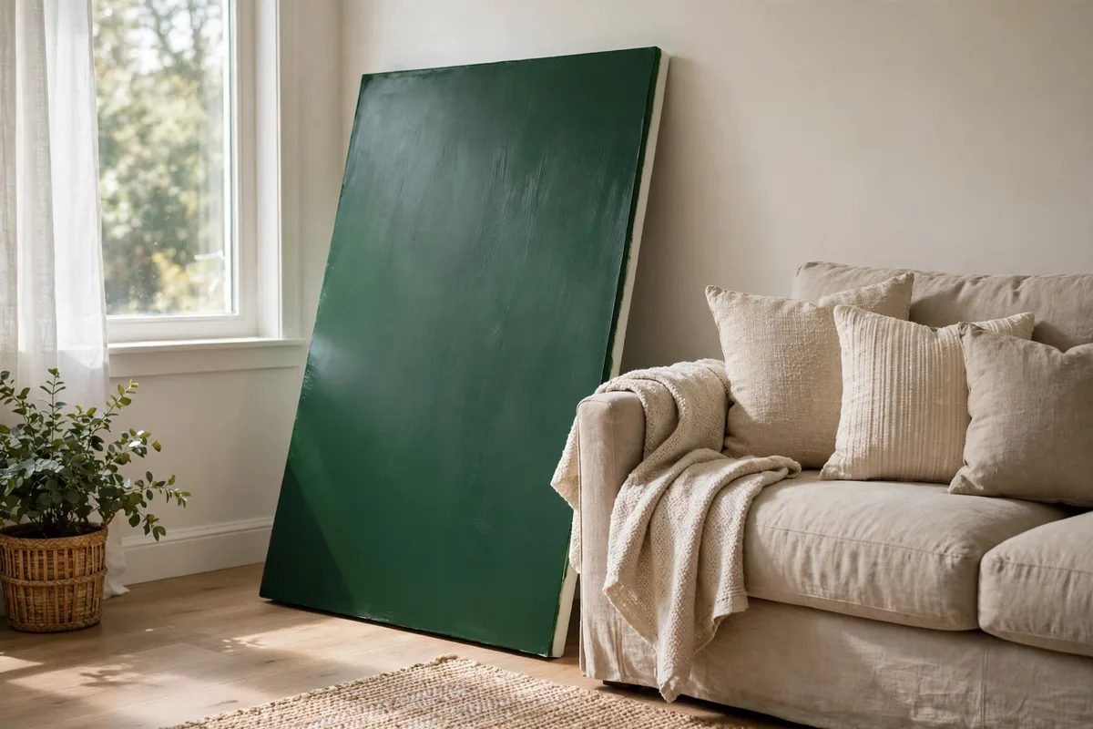
Skip the row of tiny swatches painted in a grid. Instead, paint two generous coats of your shortlisted color onto a large piece of foam board, primed cardboard, or a leftover sheet of lining paper — at least the size of a big picture frame, and bigger if you can manage it. Let it dry fully before you judge it, because wet paint always looks darker and glossier than the finished wall will.
Then move the board, do not just look at it. Prop it behind the sofa in the morning and note how it reads in cool daylight. Move it to the corner the sun hits in the afternoon. Stand it where the floor lamp shines in the evening. A deep green that looks jewel-like at noon can turn almost black under warm lamplight, while a terracotta that seems too orange at midday may settle into exactly the warmth you wanted at night.
The three-light test
- Morning: board on the accent wall, viewed from the room’s entrance.
- Afternoon: board moved to the brightest and the darkest ends of the wall.
- Evening: board under your actual lamps, with overhead lights off, as the room is really used.
- Only commit when you like the color in at least two of the three — no color wins in every light.
2. Seal Painter’s Tape With the Base Color for a Crisp Edge
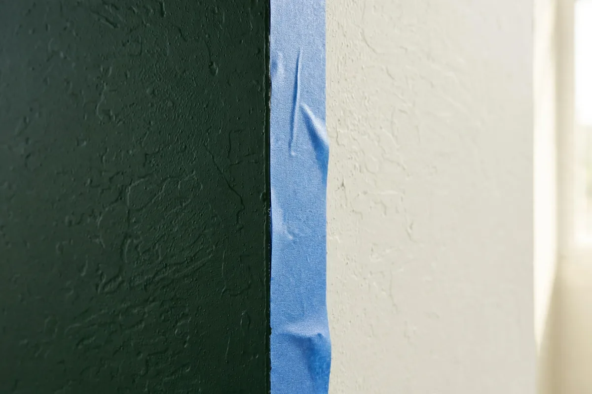
The line where a bold accent wall meets a pale side wall is the detail everyone notices up close, and it is the one most likely to let you down. Painter’s tape alone rarely seals perfectly on real walls, which have slight texture, so the strong color creeps underneath in tiny bleeds. The professional fix costs nothing: after taping, paint a thin stripe of the existing base color — the pale color already on the side wall — along the tape edge first, and let it dry.
Then paint your accent color right up to and slightly over that sealed edge, in two coats as normal. Peel the tape while the final coat is still slightly tacky, pulling it back on itself at a low angle, and you will lift away a line sharp enough to look cut with a ruler.
Edge technique, step by step
- Press tape down firmly along its full length, especially over any bumpy texture.
- Brush the base color stripe onto the accent-wall side of the tape and let it dry completely.
- Apply two coats of accent color, keeping a wet edge as you work.
- Remove tape before the paint fully hardens — tacky, not wet — for the cleanest release.
3. Carry the Color Onto the Trim Returns for a Finished Edge
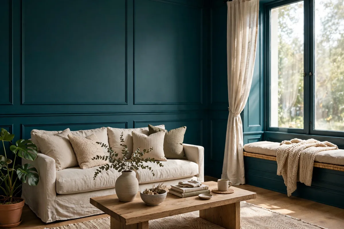
A painted accent wall can look oddly unfinished when it stops dead at the corner and every scrap of trim stays bright white. The eye reads the white skirting and the thin white return at the corner as a frame that was never decided on, and the wall ends up looking pasted onto the room rather than built into it. The fix is to decide the edge treatment on purpose: carry the accent color onto the skirting board along that wall, and onto the narrow return where the accent wall turns the corner.
Painting the skirting in the same color makes the wall read as one tall, deliberate block of color from floor to ceiling, and it has a practical bonus — dark skirting hides the scuffs from vacuum cleaners and shoes far better than white does.
Where the color should stop
- Skirting on the accent wall: same color as the wall, in a tougher finish than the wall paint.
- Architrave around a door on the wall: match it to the door decision in Tip 8.
- The corner itself: one deliberate choice — sharp stop or short wrap — never a wobbly drift.
4. Style Furniture So Its Silhouette Reads Against the Wall
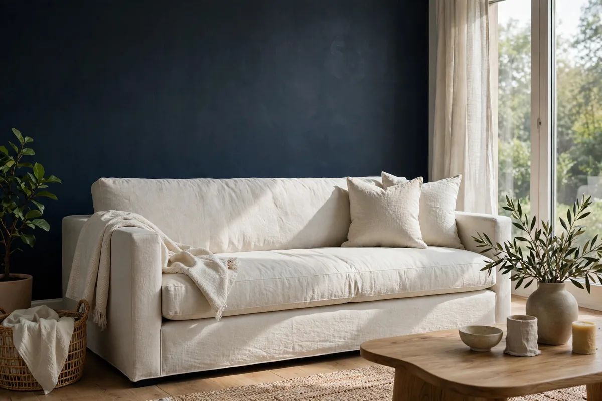
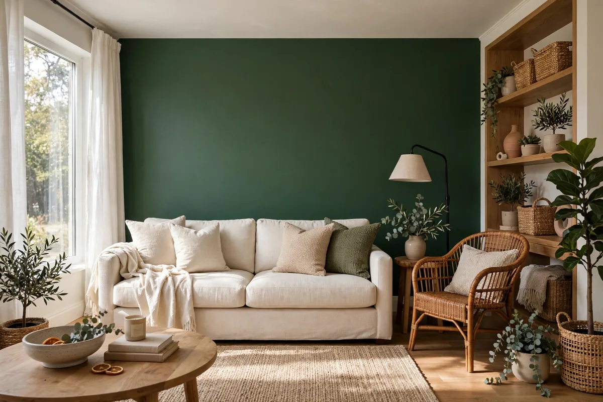
An accent wall is a backdrop, and a backdrop succeeds or fails on silhouettes. Place a dark navy sofa against a dark navy wall and both vanish into one shapeless mass; place a pale linen sofa against that same wall and its outline becomes the crispest thing in the room. Before you arrange anything, stand at the doorway and squint: you should be able to trace the outline of every major piece sitting against the wall. If two shapes merge, one of them needs to change value — lighter or darker — not necessarily color.
You rarely need new furniture to fix this. A light throw folded over the back of a dark sofa creates the separating line where the sofa meets the wall. A pair of pale cushions does the same job at seat level.
Silhouette checks that take a minute
- Photograph the wall from the doorway and look at shapes, not details.
- Every piece against the wall should differ clearly in lightness from the paint behind it.
- Use throws and cushions as adjustable contrast — they are cheaper than repainting or reupholstering.
- Leave some empty wall visible around the furniture group; a wall-to-wall row of furniture hides the accent entirely.
5. Hang Art at the Right Height and Scale on a Bold Wall
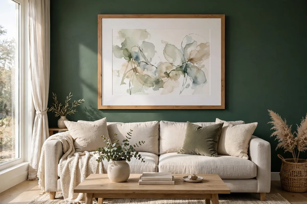
Art behaves differently on a strong wall. A picture that held its own on white can look undersized and apologetic on deep color, because the wall’s visual weight dwarfs it. Two adjustments solve most of it: hang art so its center sits at roughly eye level when standing — a widely used guide is around 57 to 60 inches from the floor to the center of the piece — and size it generously relative to the furniture below it. Over a sofa, a single piece or a grouped arrangement should span roughly two-thirds of the sofa’s width; much narrower and it floats, much wider and it fights the furniture.
The frame and mount matter more here, too. A wide pale mount inside the frame gives the artwork a breathing border that separates it from the strong color, which is why gallery-style framing works so well on dark walls. Thin black frames on a near-black wall almost disappear, taking the art’s edges with them — a light wood, white, or metallic frame keeps the boundary clear.
| Art situation | Height and scale guide |
|---|---|
| Single piece above a sofa | Center at eye level; width about two-thirds of the sofa; bottom edge 6 to 8 inches above the sofa back |
| Grouped arrangement | Treat the group as one picture: same center height, 2 to 3 inches between frames |
| Art with no furniture below | Center around 57 to 60 inches from the floor |
| Very large statement piece | Let it sit slightly lower than standard so it feels grounded, not perched |
| Small art on a bold wall | Add a wide pale mount and a contrasting frame so it does not get swallowed |
6. Wash the Wall With Light So Dark Color Does Not Go Flat
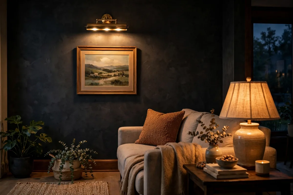
Dark and saturated colors absorb light, which is why a rich accent wall can look velvety at noon and dead by dinner. The answer is not a brighter ceiling light — that flattens everything equally — but light aimed at the wall itself. A picture light mounted above artwork, a pair of wall washers, or even a simple uplight on the floor behind a plant sends a soft gradient across the paint, and that gradient is what reveals depth, texture, and the color’s true character after dark.
Aim for grazing light where you have texture: position the source close to the wall and angled across it, and every subtle ripple in plaster or brushwork casts a tiny shadow that makes the surface feel crafted.
A simple evening lighting recipe
- One light washing the wall itself: picture light, uplight, or an angled floor lamp.
- One light at seated height nearby, so faces are lit and the wall is the backdrop, not a cave.
- Overhead light off or dimmed — it is the main culprit when a bold wall looks flat.
- Walk to the doorway and check: the wall should glow gently, with no single hot spot.
7. Repeat the Wall Color in Exactly Two Soft Furnishings
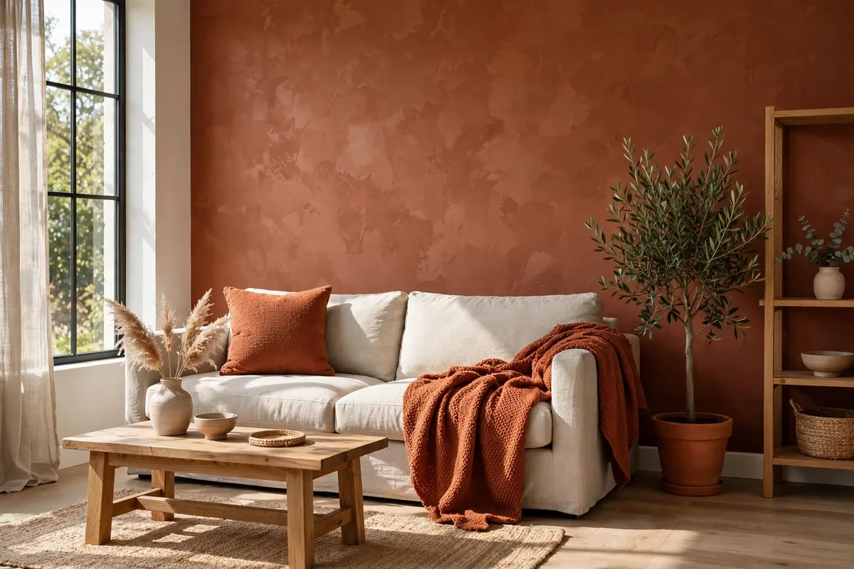
Every designer will tell you to repeat the accent color elsewhere in the room so the wall feels connected. What they rarely say is when to stop — and stopping is the whole skill. Repeat the color in exactly two soft furnishings: for example, two cushions on the sofa, or one cushion and a throw, or a throw and the edge of a rug. Two repetitions create a deliberate echo the eye can follow around the room. Five or six create a theme, and a theme is where stylish rooms tip into showroom matching.
Texture does quiet work here too — the same color in velvet, linen, and wool reads as three related notes rather than one note repeated.
Choosing your two echoes
- Pick items at different heights — one at seat level, one lower or draped — so the color travels.
- Vary the material: velvet cushion plus woven throw beats two identical cushions.
- Near-match is better than exact-match; related tones look intentional, clones look staged.
- When in doubt, photograph the room: if your eye lands on the wall color more than three times, edit.
8. Paint Doors and Radiators Into the Wall Instead of Around Them
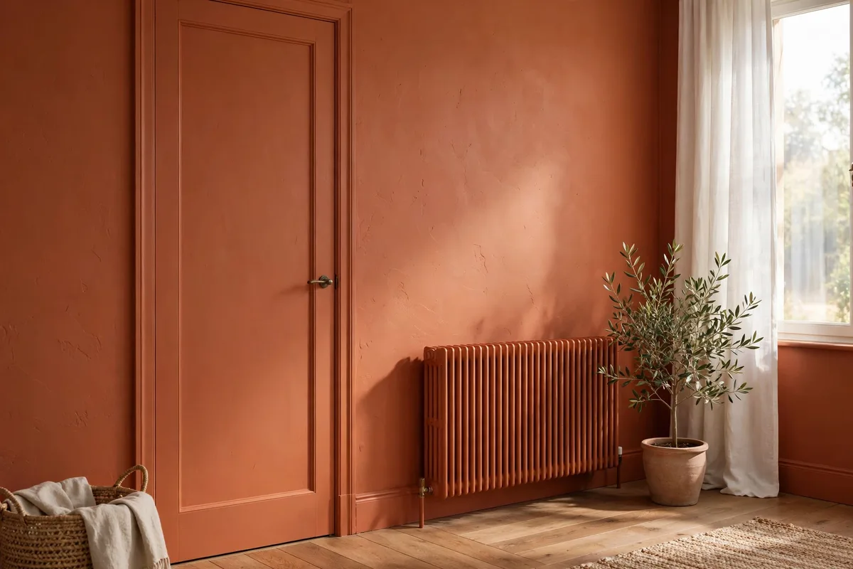
Most real living rooms have an interruption on the accent wall: a door, a radiator, sometimes both. Competitor advice usually says to avoid such walls entirely, but if that is your room’s natural focal wall, avoiding it is not an option — absorbing the interruptions is. Paint the door, its frame, and the radiator in the same color as the wall and they recede dramatically. The door becomes a quiet panel in the surface instead of a bright white rectangle chopping your color in half, and a radiator — almost never a thing of beauty — sinks into the background where it belongs.
Use the right paint for each surface. Doors take knocks, so a tougher satin or semi-gloss finish in the same color outlasts the wall’s matte finish and the slight sheen difference is barely noticeable. Radiators need paint suitable for heated metal — standard wall paint can discolor or smell when hot — applied to a cold, clean, dust-free radiator in thin coats.
Absorbing interruptions, in order
- Decide first: door fully color-matched (calmest) or left neutral as a deliberate feature (bolder).
- Paint frame and door in the same color, tougher finish; paint skirting to match, per Tip 3.
- Radiator: cold, cleaned, thin coats of heat-suitable paint in the wall color.
- Finish with hardware that belongs on the color, not hardware left over from the white-wall era.
9. Photograph the Wall at Night Before You Buy Any Accessories
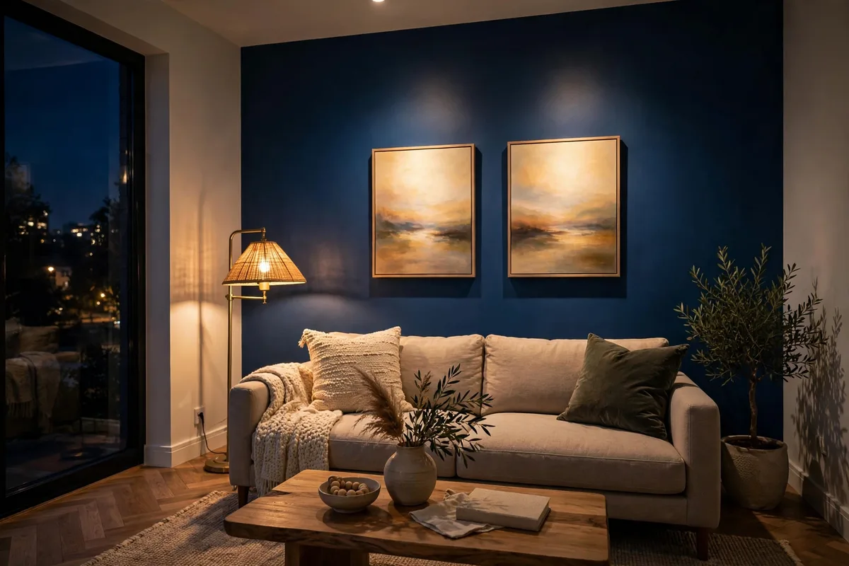
Here is a ten-minute test that saves real money. Once the wall is painted and the furniture is back, wait until evening, turn on the lamps you actually use, and photograph the wall from the doorway and from your usual seat. Phone cameras are brutally honest about accent walls: they expose the hot spot from a badly aimed lamp, the artwork that has shrunk to a postage stamp, the cushion that clashes, and the stretch of wall that is somehow both empty and unfinished. Things your eyes have already started forgiving, the photo shows plainly.
Work through the photo like an editor. Is the wall’s color even, or does one patch look like a different paint? Does the furniture silhouette read (Tip 4)? Is the art the right size (Tip 5)? Only after answering those questions should you make a shopping list — and the list usually shrinks, because half the accessories people buy for accent walls are attempts to fix lighting or scale problems that no cushion can solve.
What the night photo reveals
- Flat or patchy color where the light does not reach — a lighting fix, not a decor fix.
- Art and mirrors at the wrong scale, obvious in a photo, easy to miss in person.
- Silhouettes merging into the wall where contrast is missing.
- The one empty area that genuinely needs something — buy for that spot only.
10. Keep a Labeled Touch-Up Kit So Scuffs Never Become Repaints

Accent walls show marks differently from pale walls: a scuff that would vanish on white appears as a pale streak on deep color, and a chip reads like a missing tooth. The difference between a wall that looks freshly painted for years and one that looks tired in six months is a small, boring kit assembled on day one, while the paint is still in your hand. Decant some leftover paint into a small sealed jar — not the big tin, which will skin over and rust — and label it with the color name, the finish, the room, and the date.
Store the kit where you will actually reach for it: the jar, a small artist’s brush for chips, a mini roller for larger scuffs, a damp microfiber cloth, and a note of the paint details in case the jar’s label fades. Most marks need triage before paint — many scuffs are surface deposits that wipe off with the damp cloth alone, and painting over them seals the dirt in permanently. For a true chip, feather a tiny amount of paint with the artist’s brush rather than dabbing a blob; two thin passes blend better than one thick one.
The touch-up kit checklist
- Small sealed jar of the exact paint, labeled with color, finish, room, and date.
- One artist’s brush for chips, one mini roller for scuffs wider than a coin.
- A microfiber cloth — try wiping first; half of all “damage” is surface dirt.
- Paint details written down separately, stored with household paperwork as backup.
Frequently Asked Questions About Living Room Accent Walls
How big should a paint sample be for an accent wall?
Much bigger than a swatch card. Paint two coats on a board or sheet of lining paper at least as large as a big picture frame, let it dry fully, and move it around the wall at different times of day. Small patches mislead because color reads stronger and richer at full-wall scale.
Why does my dark accent wall look black at night?
Because dark colors absorb light and most rooms have no light aimed at the wall itself. Add a picture light, an uplight, or an angled lamp to wash the surface (see Tip 6), use warm bulbs, and the color’s depth returns. It is almost always a lighting problem, not a paint problem.
How do I get a perfectly straight line between two wall colors?
Tape the edge, then seal the tape by painting a stripe of the existing base color along it and letting it dry before applying the accent color. Any bleed is then base-colored and invisible. Peel the tape while the final coat is still slightly tacky, pulling it back at a low angle.
Should skirting boards on an accent wall be painted the same color?
Painting them the same color usually looks more finished: the wall reads as one deliberate block of color and dark skirting hides scuffs better than white. Use a tougher finish than the wall paint, since skirting takes knocks from shoes and vacuums.
How high should I hang art above a sofa on an accent wall?
Aim for the center of the piece at roughly eye level, with the bottom edge about 6 to 8 inches above the sofa back, and the art — or the grouped arrangement — spanning about two-thirds of the sofa’s width. On a bold wall, add a wide pale mount so the art does not get swallowed by the color.
How many times should I repeat the accent color in the room?
Twice is the sweet spot: two soft furnishings, such as a cushion and a throw, in related rather than identical tones. That is enough for the eye to connect the wall to the room. More repetitions in the exact same color tend to look matched and staged.
Can I paint a radiator the same color as the wall?
Yes, and it is one of the best tricks for an interrupted wall — the radiator visually disappears. Use paint suitable for heated metal, apply it to a cold, clean radiator in thin coats, and never use ordinary wall paint, which can discolor and smell when the heating runs.
What do I do about a door on my accent wall?
Paint the door and its frame in the wall color, in a tougher satin or semi-gloss finish, so it reads as a quiet panel in the surface. Then choose handle hardware in a finish that suits the color. Leaving one bright white door in the middle of a bold wall chops the color in half.
Why does my accent wall look patchy in photos?
Usually because of uneven light rather than uneven paint: one area catches a lamp’s hot spot while another sits in shadow, and cameras exaggerate the difference. Wash the wall with softer, angled light, turn off harsh overheads, and photograph again before assuming the paint job is at fault.
How do I touch up a scuff without repainting the whole wall?
First wipe it with a damp microfiber cloth — many scuffs are surface deposits. For real chips, feather a tiny amount of the saved, labeled paint with an artist’s brush in two thin passes. Keeping a small jar of the exact paint and finish from day one is what makes invisible repairs possible.
Conclusion
An accent wall is not finished when the paint dries. It is finished when the edge is crisp, the trim belongs to it, the furniture reads clearly against it, the art is the right size, the light brings it alive after dark, and a small jar of its own paint sits ready for the first scuff. Those are not talent or budget — they are the ten finishing moves in this article, and every one of them can be done with what you likely already own: a sample board, a roll of tape, a tape measure, a lamp you can angle, and an evening spent looking at one honest photograph.
Work through them in order if your wall is still bare, or pick the one that matches the niggle you notice every time you sit down, if yours is already painted. Accent walls fail quietly, in edges and shadows and small mismatched repeats — which means they also succeed quietly, one deliberate detail at a time, until the wall stops looking decorated and starts looking inevitable.