
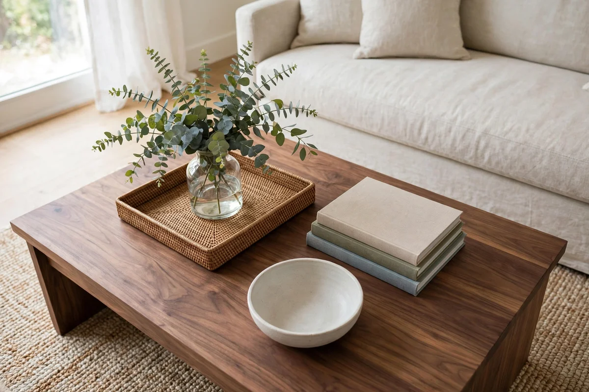
Two coffee tables can hold the same tray, books and vase, and one looks art-directed while the other looks accidental. The difference is rarely the objects. It is the pattern they form together: the invisible lines, grids and triangles connecting them across the tabletop. Stylists call that pattern the layout, the most copyable part of any photograph you have saved. You can redraw their geometry on your own table in ten minutes.
This article is a pattern library, nothing else: six reusable layout patterns, then maps for round, rectangular, oval, square and nesting tables. If you want the full start-to-finish styling process first, work through our complete coffee table styling guide, then come back and choose the pattern that will organise everything you place.
And if a coffee table layout will not settle, it is one of these five failures — each diagnosed, with its one-move fix, in the final section:
Collapsed triangle — Push the middle unit forward or back until the triangle reappears.
Broken line — Pull it back into the run or move it decisively off-line as a satellite; halfway is the only wrong answer.
Heavy quadrant — Move one piece across the centre cross into the lightest cell.
Drifted satellites — Gather them back onto their orbit ring.
Blurred layers — Rotate the middle layer slightly and re-crown the top accent.
In this guide: Start With a Layout Skeleton, Not With Objects · The Rule-of-Thirds Grid Layout · The Linear Run Layout for Long Tables · The Triangular Grouping Layout · The Quadrant Layout for Square and Large Tables · The Centrepiece-Plus-Satellites Layout · The Stacked-Layer Layout · Layouts for Round Tables: Cluster, Crescent and Compass · Layouts for Rectangular and Oval Tables: Thirds, Ends and the Long Axis · Layouts for Square and Nesting Tables: Grids, Diagonals and Split Levels · Frequently Asked Questions About Coffee Table Layouts · Conclusion
1. Start With a Layout Skeleton, Not With Objects
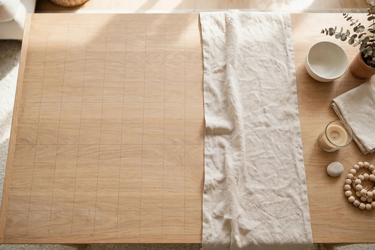
Every strong tabletop begins as a skeleton: a geometric plan drawn in your head, or honestly in painter’s tape, before anything is placed. The skeleton decides how many groupings there will be, where their centres fall, and what lines connect them. Objects then fill a structure that already works, instead of being shuffled around in search of one.
Begin by counting visual units, not objects: a stack of three books is one unit, a tray holding a candle and a box is one unit, a vase with branches is one unit. Most tabletops need only two to four units in total, and every pattern here is described in units, because the eye reads units. Nine loose objects look chaotic; the same nine corralled into three units look composed.
The six patterns at a glance
| Layout pattern | How it is built | Best table shapes | Character |
|---|---|---|---|
| Rule-of-thirds grid | Groupings centred on the intersections of a 3 x 3 grid | Rectangular, oval | Relaxed, editorial, asymmetric |
| Linear run | Units following one line along the table’s length | Long rectangular, oval | Calm, ordered, gallery-like |
| Triangular grouping | Three units forming a loose triangle | Round, square, medium rectangular | Balanced movement, classic stylist’s default |
| Quadrant layout | Surface divided into four weighted cells | Square, large rectangular | Structured, generous, symmetrical or diagonal |
| Centrepiece plus satellites | One hero unit orbited by two or three small units | Round, small square | Focal, formal, easy to read |
| Stacked layers | Units built vertically on trays and book platforms | Small tables of any shape | Compact, tall, collected |
Choose the skeleton by shape and mood, not by the objects you own. Almost any collection fits any of these patterns, which is why the pattern comes first.
2. The Rule-of-Thirds Grid Layout
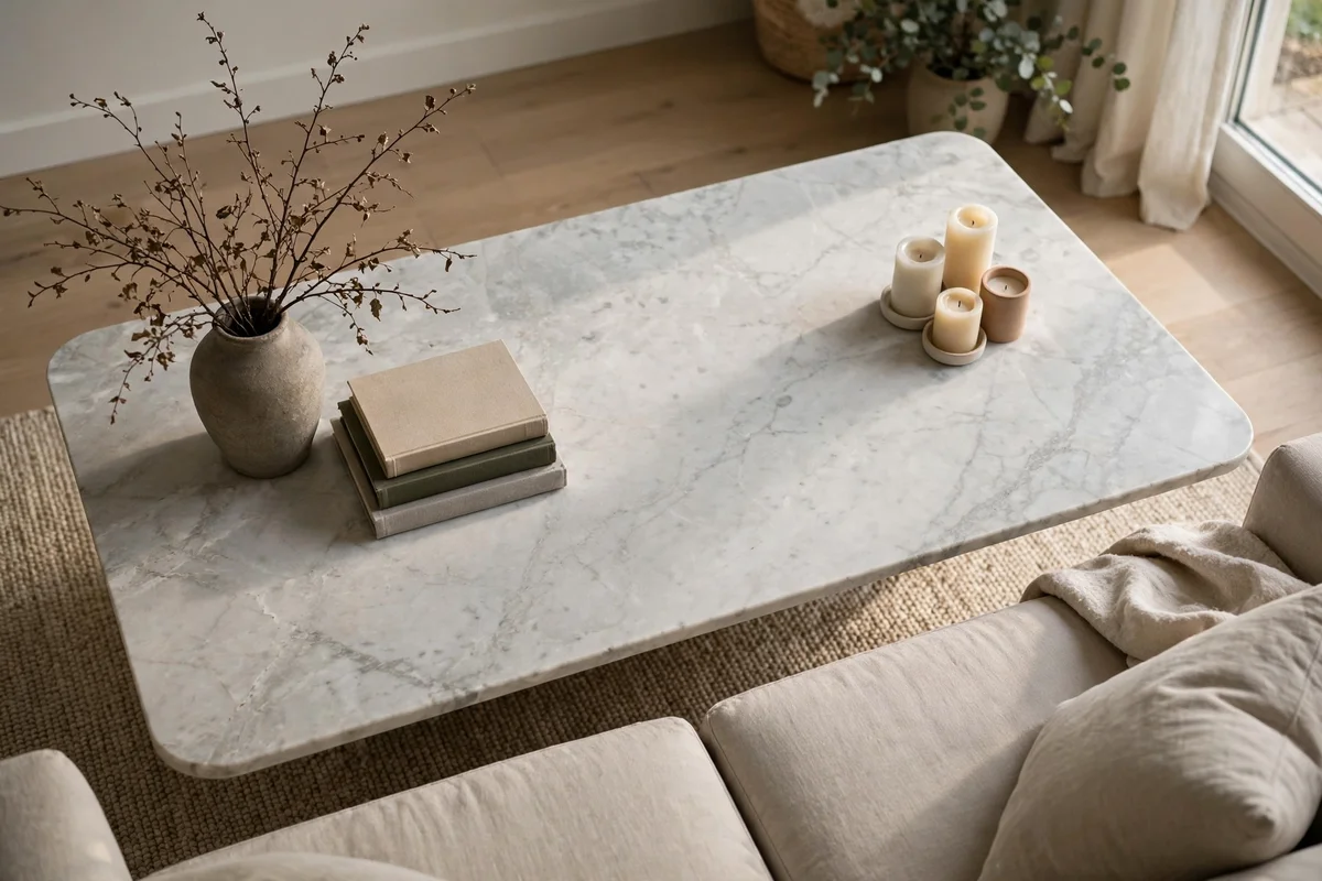
The thirds grid is the most useful skeleton in this library. Divide the tabletop into three columns and three rows, making nine cells, and note the four points where the inner lines cross. Those intersections are the strongest positions on the surface. A grid layout puts its groupings on intersections and grid lines, and leaves the exact centre empty or nearly so. The result is the relaxed asymmetry of magazine rooms: balanced, never stiff.
The classic build uses two groupings. Place the main grouping on one of the two back intersections, furthest from the main sofa, and a smaller, lower grouping on the diagonally opposite front intersection. That diagonal is the engine of the pattern: the eye travels from the tall back grouping down to the low front one, and the journey makes a still arrangement feel alive. A single grouping works too, parked on one back intersection with the grid left open.
Drawing the grid without tape
- Use the objects as rulers: A large book is roughly one cell wide on a medium table; three book-widths across gives you the columns.
- Check the diagonals: Confirm the two groupings sit on opposite corners of the central cell, not side by side.
- Keep units inside their cells: A grouping swelling across two grid lines dissolves the pattern; shrink its footprint first.
Once the grid holds, minor nudges are safe: the geometry survives even when pieces are swapped with the seasons.
3. The Linear Run Layout for Long Tables

Long rectangular and oval tables invite the simplest pattern of all: a line. In a linear run, every unit sits on or near one straight axis running the table’s length. The line gives a long surface a spine. Without it, groupings drift into disconnected islands, each too small for the length it has to fill, and the table reads as storage rather than styling.
Build the run in three beats: a tall beat at one end, a low wide beat in the middle, a medium beat at the far end. Vary the heights so the silhouette rises, rests and rises less high. Keep the gaps uneven; equal spacing turns a run into a queue. One longer pause in the line, a stretch of empty tabletop, makes the beats either side read as deliberate.
Three versions of the run
- Single centred line: All units on the centre axis. Most formal; best on narrow tables.
- Offset line: The axis shifted toward the back, leaving a clean front edge. Most liveable for everyday rooms.
- Broken line: Two short runs with a clear gap between them, so the table works in the middle while the pattern survives at both ends.
If a run looks like a parade, the fix is geometric: pull one unit a few inches off the axis. One deliberate step sideways breaks the marching rhythm while the line still reads.
4. The Triangular Grouping Layout

The triangle is the stylist’s oldest pattern, because three points give the eye a circuit to travel. Place three units so their centres form a loose triangle, one at each corner, and the arrangement gains movement a straight line or single cluster cannot produce. The triangle should not be neat: a stretched, uneven triangle, one long side and two short ones, looks more natural than a perfect equilateral shape.
Assign the corners by height. The tallest unit takes the back corner and anchors the composition. The medium unit takes one front corner. The lowest, widest unit, a bowl, a tray or an open book, takes the remaining front corner. From the sofa the silhouette steps down like a small skyline; from above, the three corners hold the surface in balance. Working in both elevation and plan is why the triangle suits tables seen from several seats.
Keeping the triangle alive
- Protect the corners: A fourth object must join an existing corner, never start one of its own.
- Mind the middle: The centre stays empty; filling it collapses the pattern.
- Rotate, do not rebuild: On round tables the whole triangle can turn a quarter-turn to face another seat without changing the pattern.
When a triangular layout looks wrong, one corner has usually drifted into line with the other two. Nudge it back out until the three points refuse to sit on one straight line.
5. The Quadrant Layout for Square and Large Tables
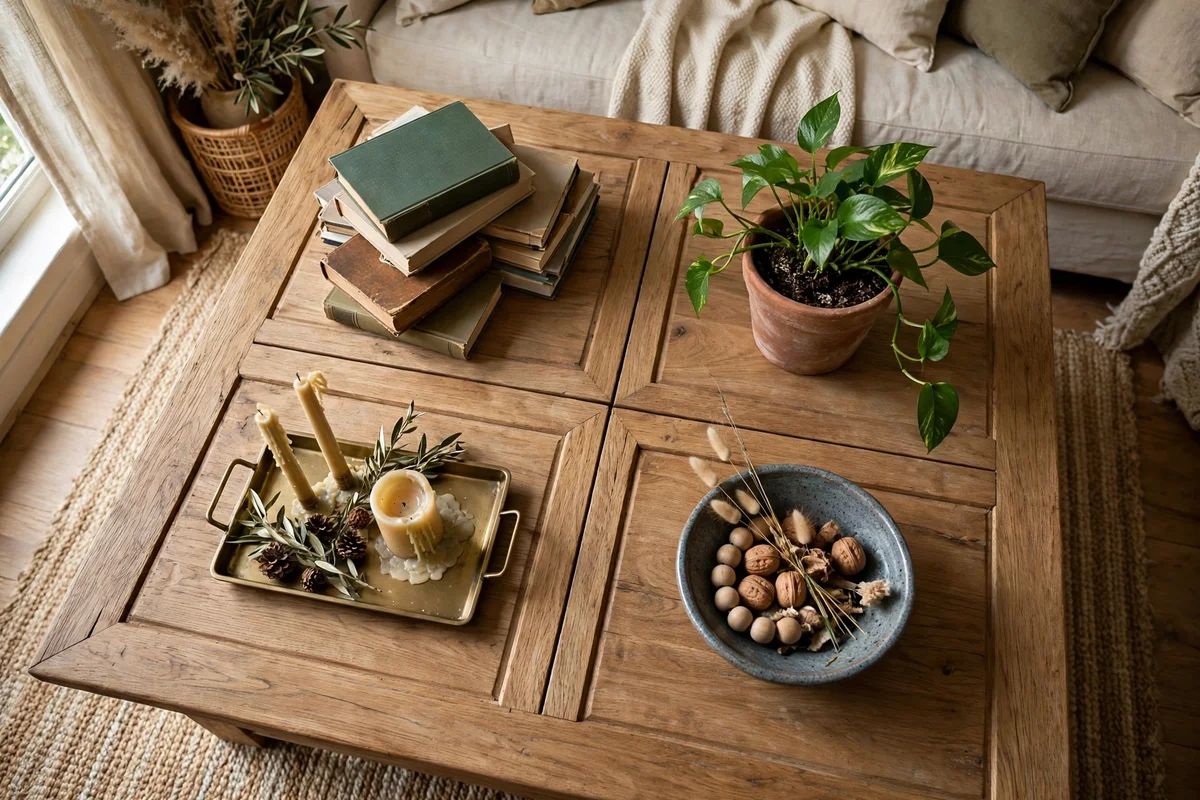
Square tables and large rectangles offer enough surface for the quadrant layout: divide the top into four equal cells. Filling all four cells works, but the pattern becomes far more interesting once the quadrants are weighted rather than simply filled. Weighting means deciding which cells carry the arrangement and which support it, because four equal groupings compete; weighted quadrants cooperate.
The most reliable weighting is three plus one: three styled quadrants, one left empty or holding only coasters. The empty quadrant is what lets the other three be generous. A second weighting works diagonally: two opposite quadrants carry the main units, tall in one, low and wide in the other, while the remaining two hold a small echo each, a candle answering a bowl across the diagonal. The diagonal version has the most movement and suits square tables read from all four sides.
Quadrant variations worth knowing
- Even four: One unit per quadrant, heights varied. Formal; best on very large squares.
- Three plus empty: The everyday favourite; styled cells in an L, open cell toward the busiest seat.
- Diagonal pair: Two weighted opposite quadrants, two light echoes. Most dynamic.
- Double-width scene: Two adjoining quadrants merged into one rectangular tray scene, with one unit in each remaining quadrant.
Whichever weighting you choose, keep each unit inside its quadrant’s borders. The invisible cross at the table’s centre is the scaffolding; units that straddle it blur the design.
6. The Centrepiece-Plus-Satellites Layout

Some tables want one hero. The centrepiece-plus-satellites layout builds the whole pattern around a single dominant unit, a large bowl, vase or tray arrangement, orbited by two or three much smaller units called satellites. The satellites are not a second arrangement. They measure the hero’s importance by contrast, the way small moons make a planet read as large. Remove them and the hero looks lonely; oversize them and the pattern dissolves into rivals.
Spacing is the whole craft here. Satellites sit on an invisible orbit ring around the centrepiece, close enough to belong to it, far enough that each reads separately. Test: the gap between hero and satellite should be at least the satellite’s own width. Place satellites at uneven points on the ring, at clock positions such as twelve, four and eight. A perfectly even ring reads as a place setting waiting for dinner.
Satellite rules
- Count: Two or three. One looks like a mistake; four starts a second pattern.
- Scale: Each satellite clearly smaller than the hero in footprint and height, roughly a third of its visual weight or less.
- Echo: Repeat one material or colour from the hero in a satellite, so the orbit reads as family.
This is the natural pattern for round tables and small squares, and the fastest to restyle: swap the hero seasonally; the satellites stay put.
7. The Stacked-Layer Layout

When a table is small, the layout grows upward instead of outward. The stacked-layer pattern builds one compact arrangement in storeys: a base platform, a middle stack, a top accent. A tray or large book forms the base and defines the footprint. A short book stack or lidded box forms the middle. One small object, a candle, a knot, a tiny plant, crowns the top. The footprint never grows; only the silhouette does, which is why they suit small tables.
The governing rule is that each storey is smaller than the one beneath it. A base wider than its stack looks stable; a stack wider than its base looks like a spill waiting to happen. Turn alternate layers a few degrees against each other, a book stack rotated slightly off the tray’s axis, so the layers read as styled rather than stored. Perfectly aligned edges are for shelving; a small rotation tells the eye this pile is a composition.
Layering beyond one stack
On a medium table, two layered stacks form their own mini-pattern: a tall stack and a short stack placed as the two groupings of a thirds grid or the heavy corners of a triangle. Keep the layering language consistent, trays or books as bases, one accent per crown, so the stacks read as siblings. For worked examples of stacks, trays and clusters arranged this way, browse these coffee table decor ideas and study the footprints, not just the objects.
8. Layouts for Round Tables: Cluster, Crescent and Compass
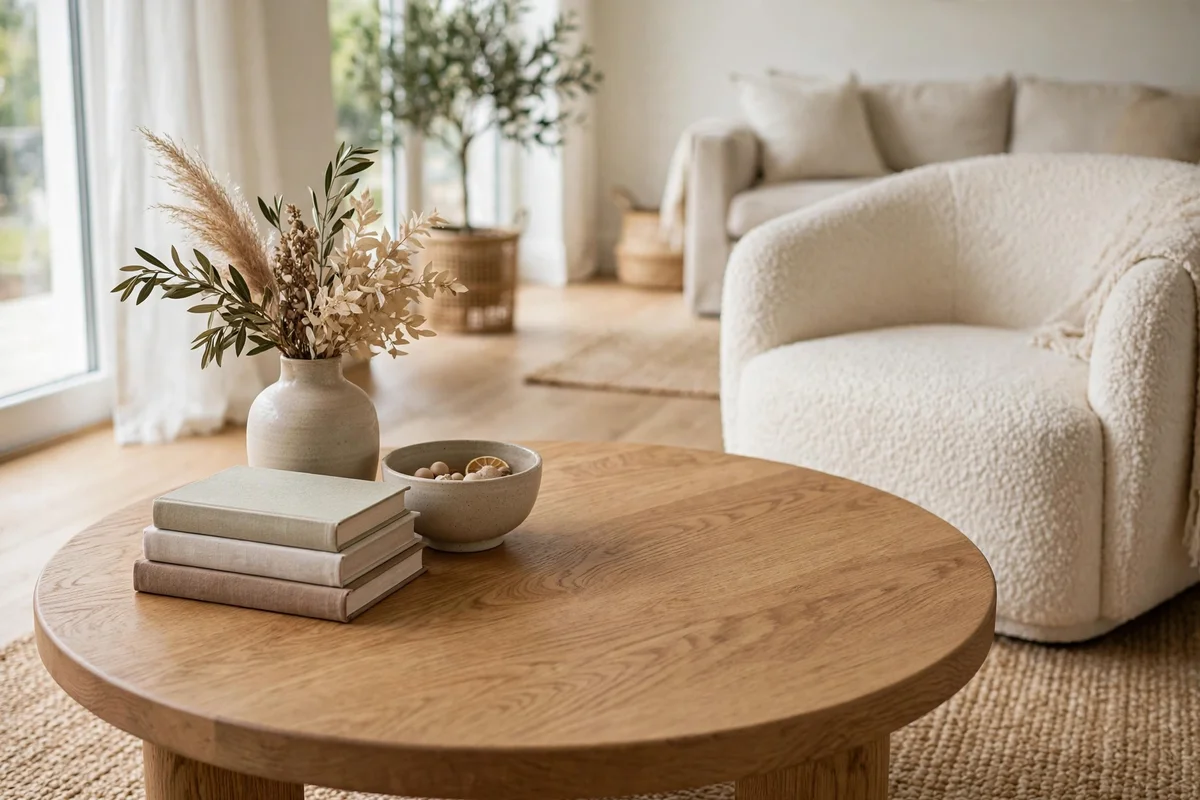
Round tables have no corners, no long axis and no natural front, so their layouts are built from curves and centres. Three patterns cover almost every round table. The first is the tight central cluster: a triangle or satellite pattern compressed toward the middle, leaving a clean ring of bare tabletop around it. The ring is essential: visible surface framing the arrangement on all sides is what makes a cluster look chosen rather than stranded.
The second pattern is the crescent: one compact grouping pushed to one side, leaving a wide crescent of empty surface sweeping around the other. It suits tables against a sofa, where the empty sweep faces the seats. The third pattern is the compass: a central unit with satellites at clock positions, twelve, four and eight, echoing the table’s own geometry. The compass is the most formal, and best for a round table centred in a seating group.
What round tables punish is the grid: forcing thirds or quadrants onto a circle leaves awkward slivers at the edges.
9. Layouts for Rectangular and Oval Tables: Thirds, Ends and the Long Axis

Rectangles are the most pattern-friendly shape, because their length creates real distance between groupings, and distance makes patterns legible. The thirds grid from section 2 is the default: two groupings on diagonal intersections. For very long rectangles, the linear run from section 3 takes over, turning the length into one composed line. A third option, the end-weighted layout, concentrates one generous grouping at a short end and leaves the remaining two-thirds as one long, calm expanse. The styled end and the usable end never negotiate.
Ovals share the rectangle’s long axis but soften every pattern built on it. Run the same thirds and linear layouts, then round off their geometry: groupings sit on the centre line rather than in corners that do not exist, and the curved ends stay empty, because objects near a curving edge look as if they are sliding off. An oval’s most elegant layout is the stretched cluster, a triangular grouping elongated along the axis, tall toward one end, low toward the other.
Rectangle and oval quick map
- Short rectangle: Thirds grid, two diagonal groupings.
- Long rectangle: Linear run, or end-weighted.
- Oval: Stretched cluster on the long axis, ends clear.
- Glass rectangle: Two groupings maximum, so the pattern stays airy through the top.
10. Layouts for Square and Nesting Tables: Grids, Diagonals and Split Levels
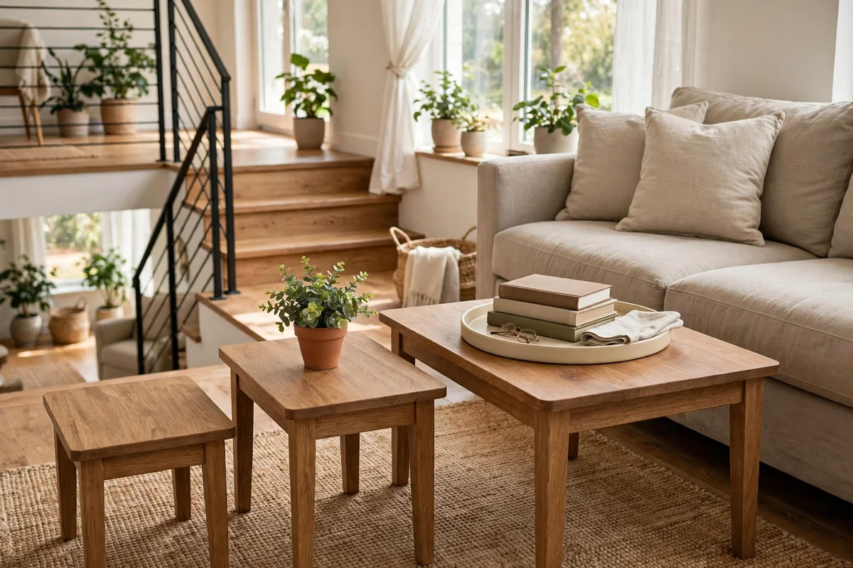
Square tables take the quadrant layout of section 5 as their home pattern, but they reward the diagonal most. A square’s longest visual line runs corner to corner, so arrangements that work the diagonal, a main grouping in one corner answered by a smaller echo opposite, feel larger and more dynamic than side-aligned ones. If a square table looks boxy and static, the pattern is almost certainly side-aligned; shifting its emphasis onto the diagonal fixes it without changing a single object.
Nesting tables split one arrangement across levels. Style the largest table with a complete small pattern, a compact triangle or a layered stack. Give the middle table a single echo unit repeating the main table’s material or colour. Leave the smallest table entirely bare: its job is to be the movable empty piece. The split reads as one layout only if the levels differ clearly in weight: full, echo, empty. Three equally styled nesting tables look like a shop display; a descending pattern looks like a home.
Diagnosing a layout that will not settle
- Collapsed triangle: Three units drifted into a line. Push the middle unit forward or back until the triangle reappears.
- Broken line: One unit sits far off the axis. Pull it back into the run or move it decisively off-line as a satellite; halfway is the only wrong answer.
- Heavy quadrant: One cell holds visibly more weight than the others. Move one piece across the centre cross into the lightest cell.
- Drifted satellites: Satellites crept outward and started a rival pattern. Gather them back onto their orbit ring.
- Blurred layers: A stack’s storeys aligned into a storage pile. Rotate the middle layer slightly and re-crown the top accent.
Diagnose the pattern before touching the objects: usually only the geometry needs repair.
Where the grouping sits relative to life — zones, landing, reach from the sofa — is our placement guide to coffee table decor styles.
Frequently Asked Questions About Coffee Table Layouts
What is the easiest coffee table layout for a beginner?
The centrepiece-plus-satellites layout is the easiest to build. Choose one hero piece, add two smaller pieces at uneven points around it, and stop. It needs no measuring and restyles by swapping the hero alone.
How do I draw a rule-of-thirds grid on my table?
Use painter’s tape first: two strips dividing the length into three, two dividing the width into three. Place grouping centres where the strips cross. After a restyle or two your eye finds the intersections unaided. Books work as rough measures too.
How many groupings should a coffee table layout have?
Most tables need two to four visual units. Small tables hold one grouping, medium tables two, large tables three or four. Count units, not objects: a tray of three items is one unit, a book stack is one.
Does the triangular layout work on a rectangular table?
Yes. Stretch the triangle along the table’s length: tall corner at one end, low wide corner at the other, medium corner stepped forward between them. It suits medium and large rectangles reliably.
What is the difference between a quadrant layout and a thirds grid?
The thirds grid places groupings on intersection points and leaves the centre open, producing asymmetry. The quadrant layout divides the surface into four cells, producing structure that can be symmetrical, diagonal or three-plus-empty. Grids suit rectangles; quadrants suit squares.
How do I keep a linear run from looking like a queue of objects?
Vary heights along the line, make gaps uneven, and allow one longer empty stretch. If it still marches, pull one unit off the axis; one step sideways breaks the queue.
Can I combine two layout patterns on one table?
Yes, and most good tabletops do. A layered stack can serve as one grouping inside a thirds grid, or nest a satellite pattern inside one quadrant. Combine at different scales: one pattern organises the whole surface, the other organises a single grouping.
What layout works best on a very small coffee table?
A single stacked-layer arrangement or one tight cluster. Small tables cannot support two groupings, so build upward in storeys or compress a triangle to the centre, letting the rest stay empty. Emptiness at small scale reads as calm, not unfinished.
How do I lay out decor on an oval coffee table?
Work along the long axis. Stretch a triangular grouping end to end, tall toward one end and low toward the other, or run a short line down the centre. Keep the curved ends empty; objects near a curving edge look unstable even when they are not.
Why does my arrangement look good from above but wrong from the sofa?
Because layouts are read in elevation as well as in plan. From the sofa, heights matter more than positions: check the silhouette steps down from back to front. Adjust heights first, positions second, and judge restyles seated, not from overhead.
Conclusion
A coffee table layout is a promise the objects make to each other: stand here, relate to this line, answer that corner. Learn the six patterns, the thirds grid, the linear run, the triangle, the weighted quadrant, the hero with its satellites and the stacked layers, and you will never arrange a table by shuffling objects and hoping. You will draw the skeleton first, count your units, and place each one where the pattern asks.
Start with the pattern matching your table’s shape, live with it a week, then diagnose it as section 10 describes before changing anything. Layout is a skill of small geometric repairs, not fresh shopping. Once the geometry is right, the decor you already own will look as if it was always meant to be exactly there.




Pingback: Coffee Table Decor Ideas: 15 Designer Styling Tips
Pingback: Coffee Table Decor Placement: Zones, Thirds and Corners