Two living rooms can own exactly the same tray, books, vase and bowl, and one table looks composed while the other looks like everything was set down mid-sentence. The difference is rarely the objects. It is placement: which part of the surface each piece occupies, how much clear space surrounds it, and whether the arrangement respects how people sit, reach and move around the table. Decor placed by geometry looks deliberate from every seat; decor placed by habit drifts, crowds the edges and blocks the space the table exists to provide.
This guide is only about position: surface zones, the rule of thirds on the tabletop, centre, off-centre and corner placement, and placement matched to your table’s shape and size. For the full styling process first, follow our complete coffee table styling guide, then return here to fine-tune where everything sits.
Coffee table decor placement begins with three zones: the display zone takes a third to a half of the surface and carries the grouping; the landing zone defends at least one clear patch — about a foot square, two mugs wide; and the pass-through is a low 6–8 inch band along the sofa edge that stays clear. Every rule below protects one of the three.
In this guide: Map the Surface Into Placement Zones First · Apply the Rule of Thirds to the Tabletop · Choose Centre Placement When the Table Earns It · Use Off-Centre Placement for a Relaxed, Lived-In Look · Try Corner Placement to Free the Middle Entirely · Protect Edge Clearances and Landing Space · Match Placement to Your Table Shape · Scale Placement to Your Table Size · Place for Sightlines From Every Seat · Place for Reach From the Sofa · Fix the Most Common Placement Mistakes · Frequently Asked Questions About Coffee Table Decor Placement · Conclusion
1. Map the Surface Into Placement Zones First
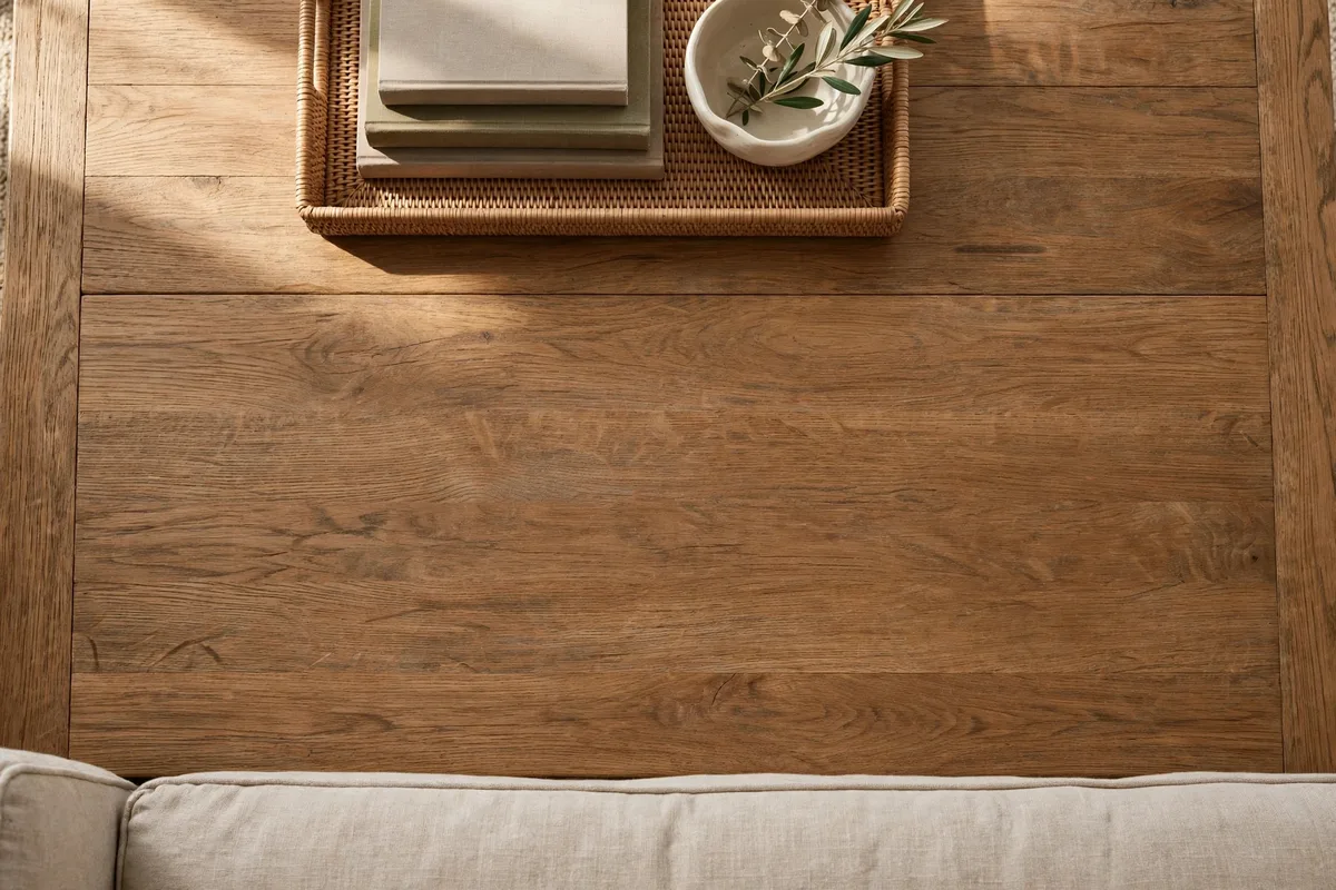
Before a single object moves, divide the tabletop in your mind into three working zones, each with a job. The display zone holds your main grouping, styled once and rarely touched. The landing zone stays deliberately empty, reserved for mugs, plates, a laptop or a game in progress. The pass-through zone is the strip people reach across most often, along the sofa edge, and it needs to stay low and clear so arms and drinks pass over it without catching on anything tall or fragile.
Most placement problems are really zone problems. A beautiful grouping fails in the landing zone, because life keeps evicting it, and clutter looks messy in the display zone, because the eye reads that area as the arrangement. Assigning zones first turns every later decision into one question: does this piece belong in this zone?
How to mark your zones
- Display zone: Roughly a third to a half of the surface, positioned as sections 3 to 5 suggest.
- Landing zone: At least one clear patch big enough for two mugs and a small plate, ideally reachable from the main seats.
- Pass-through zone: A low, unobstructed band about 6 to 8 inches deep along the sofa edge.
On very small tables the zones overlap, and that is fine. Even naming one corner as display and the rest as landing space stops the slow drift that makes small tables look permanently untidy.
2. Apply the Rule of Thirds to the Tabletop
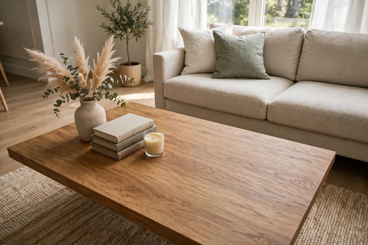
Photographers divide a frame into thirds because the eye finds objects on those lines and intersections more interesting than objects parked in the exact middle. The same grid works on a tabletop. Imagine two lines cutting the surface into three columns and two more into three rows. That nine-square grid has four inner intersection points, and they are the strongest placement targets on the table.
Place your main grouping so its centre sits on or near one intersection, not in the middle square. The arrangement instantly gains the relaxed tension centred displays lack. On a rectangular table, the back intersections are the classic spots for the main cluster, leaving the front intersections, nearest the seats, free for landing space.
Using the grid in practice
- One grouping: Centre it on a single intersection and leave the opposite front intersection empty.
- Two groupings: Place them on diagonal intersections so the eye travels across the table.
- Everyday items: Coasters and the remote caddy belong near the front intersections, inside easy reach.
Painter’s tape is the honest way to learn this. Tape the grid on, place your pieces, live with it for an evening, then remove the tape. Your eye quickly starts seeing the grid unaided, and every future restyle gets faster.
The thirds grid as a full pattern language — six patterns, shape maps and a diagnosis list — lives in our coffee table layout guide; this page uses the same grid only to position one grouping against the life of the table.
3. Choose Centre Placement When the Table Earns It
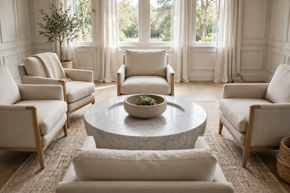
Centre placement, one grouping in the middle with clear space on all sides, is the most formal option and the one most people default to without thinking. It genuinely works in specific situations. A round table in symmetrical seating, approached from several sides, has no natural front or back, so a centred cluster reads correctly from everywhere. It also suits a single strong, low, wide piece, such as a large bowl or broad tray, designed to be looked down into.
The test is whether the centre is a destination or an obstacle. If people constantly lean around the grouping to set things down or talk, it has become an obstacle, and the same pieces will look better off-centre. Centred decor also consumes the most useful part of the surface, exactly where serving boards and games want to go.
Centre placement works best when
- The table is round or square and approached from several sides.
- The grouping is low and wide rather than tall, so it never blocks faces.
- The room is formal or symmetrical.
- The table is large enough that a centred grouping still leaves a usable ring of clear surface.
If none of those describe your room, treat the centre as a last resort rather than a default.
4. Use Off-Centre Placement for a Relaxed, Lived-In Look
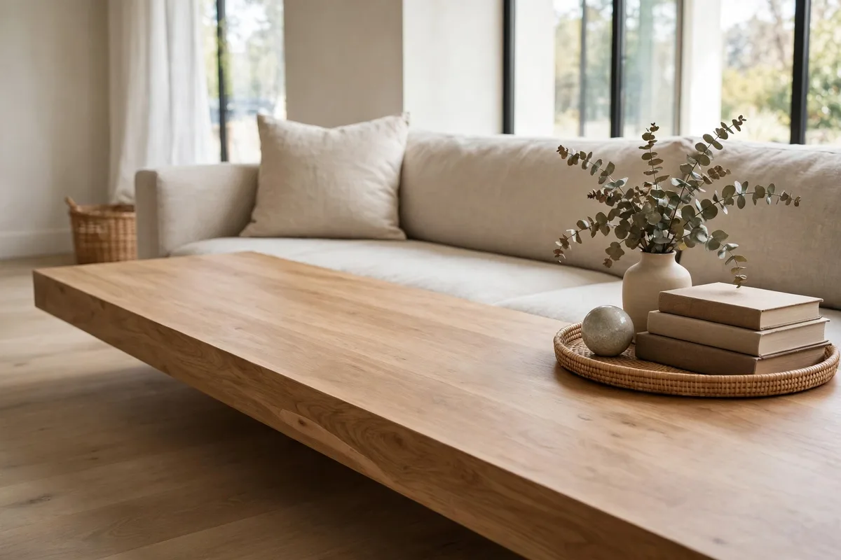
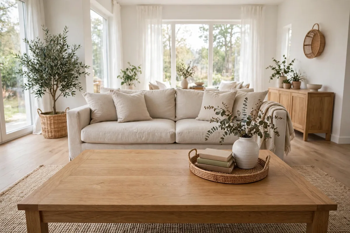
Off-centre placement moves the main grouping to one side, one end, or one intersection of the thirds grid, and leaves the rest of the surface open. It is the most versatile position in this guide and the one behind most magazine photographs, because it creates asymmetry the eye enjoys while returning most of the table to daily use. A grouping anchored at one end of a rectangular table, with two thirds clear, looks intentional precisely because the empty space reads as part of the design.
Balance is the skill here. An off-centre grouping needs visual weight, not more objects, to avoid looking accidental. Give it one taller, darker or larger piece so it holds its ground, then let the empty side stay truly empty. The contrast between a confident cluster and honest emptiness is the whole effect.
Off-centre positions to try
- End-anchored: Grouping at one short end of a rectangle, long clear run beyond it.
- Back-weighted: Grouping along the far edge from the sofa, front edge left as landing space.
- Diagonal: Grouping on a back intersection, balanced by one small item on the opposite front intersection.
For more inspiration, browse these coffee table decor ideas and notice how often the strongest examples park their grouping to one side.
5. Try Corner Placement to Free the Middle Entirely
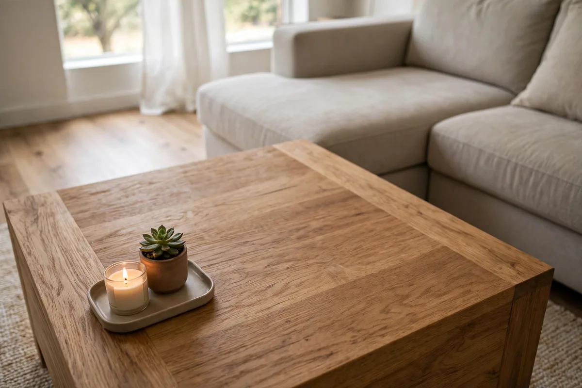
Corner placement pushes the grouping into one corner of a rectangular or square table and surrenders the entire centre to use. It is the most functional layout in this guide. Hosts love it because a serving board or a game can claim the middle without negotiating with the decor. It also suits tables by a sectional’s inner corner, where one table corner is naturally the least reachable and therefore the safest home for display pieces.
The risk is that a corner grouping reads as pushed aside rather than placed. Two fixes solve that. Angle the grouping slightly toward the room’s centre, which signals intention, and keep it compact and complete in itself, with varied heights, so it reads as a vignette that lives in a corner, not items exiled there.
Corner placement suits
- Family tables that host games, homework and meals in front of the television.
- Square tables, where one styled corner plus three open sides feels generous.
- Sectional layouts, where the corner nearest the inside angle gets the least traffic.
Avoid corner placement on round tables, which have no corner to claim.
6. Protect Edge Clearances and Landing Space
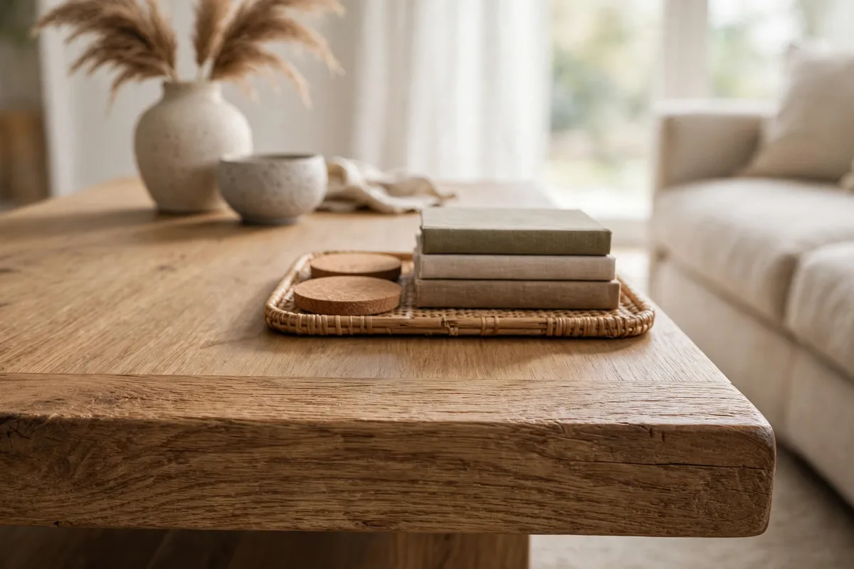
Placement is also about the space objects keep from the table’s edge, because edges are where sleeves, children and passing hips catch things. Pull every piece in at least 2 to 3 inches from the edge it faces. Tall or glass items need more, 4 inches or beyond, positioned away from the corners people round most often. A grouping that respects the inset rule immediately looks more settled, and it chips and topples less.
Pair that with the landing-space rule: reserve at least one clear area big enough for two mugs and a book, roughly a 12-inch square, and defend it weekly. Empty space is a placement decision, not leftover room waiting for more decor.
Clearance rules worth memorising
- Near the edge: Nothing fragile or tall within the outer 3 inches.
- Coaster rule: Coasters live where drinks land, in the landing zone, not stored under decor.
- Sofa distance: About 14 to 18 inches between sofa and table keeps reach comfortable; within that, keep the table’s front band low.
If pieces keep migrating to the edges, the grouping is too wide for the table. Shrink the display zone rather than fighting geometry with daily nudges.
7. Match Placement to Your Table Shape
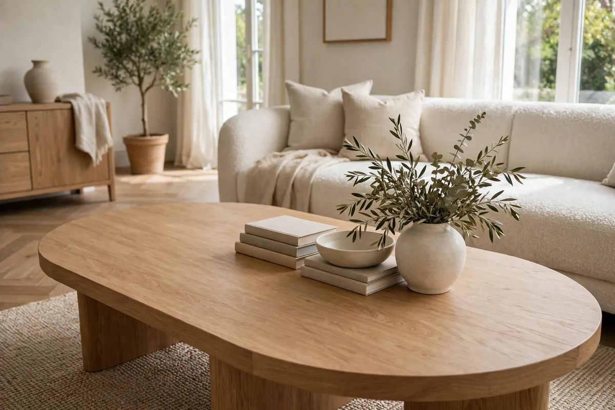
Each shape has a natural anchor point, and fighting it makes even good decor look unsettled.
| Table shape | Strongest placement |
|---|---|
| Rectangular | Off-centre grouping on a thirds intersection, long run of clear surface beyond it |
| Round | One centred, low, wide grouping, or one cluster offset slightly from centre toward the main view |
| Square | Corner placement, angled in, or a centred tray with one quadrant kept empty |
| Oval | Linear grouping running along the centre line, stopping short of both ends |
Glass-topped tables add one consideration: the arrangement is also visible from below and the side, so keep undersides tidy and avoid felt pads or coasters stored underneath where they show through. On nesting or lift-top tables, anchor the grouping to the part that never moves.
8. Scale Placement to Your Table Size
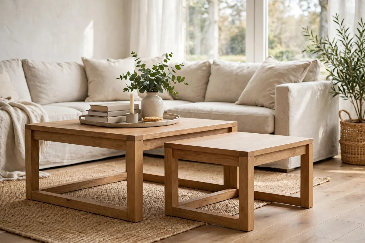
Proportions decide whether placement reads as designed or accidental, whatever the shape. A useful target is decor covering roughly a quarter to a third of the surface. Far less, and a good grouping still looks lost; far more, and the table stops functioning, however pretty each piece is. On a large table, one grouping at one third of the surface often is not enough visual mass, so use a main cluster plus one satellite item, such as a small stack of books, placed diagonally opposite on the thirds grid.
Height scales with footprint too. Low tables under about 14 inches let decor sit slightly taller without looming, while standard tables around 16 to 18 inches suit the familiar mix of books, a medium vase and one low bowl. Very small tabletops deserve one small, complete cluster and nothing else; completeness, not quantity, is what makes small-scale decor look styled.
Quick size checks
- Footprint: The grouping’s base should span about a third of the table’s length.
- Height: The tallest piece should stay below seated eye level when people face each other.
- Satellite rule: One satellite item maximum on big tables, zero on small ones.
9. Place for Sightlines From Every Seat
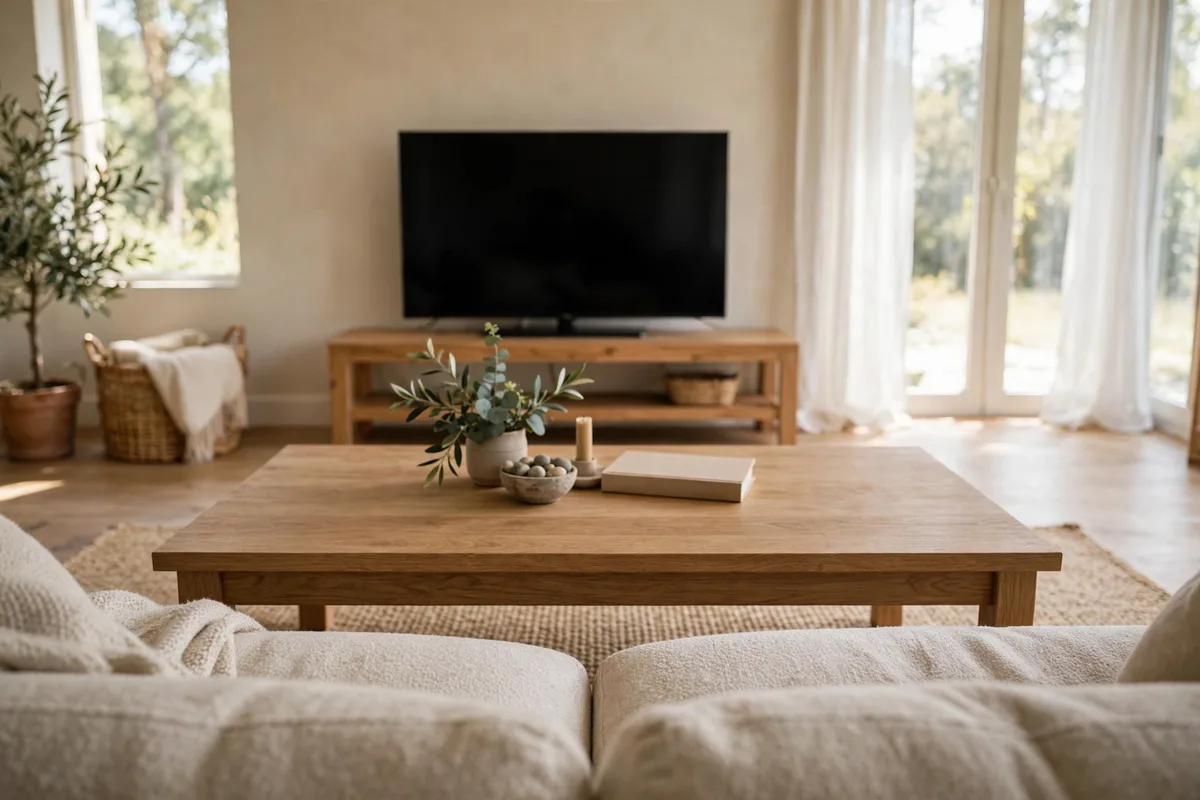
A table is viewed from a sofa, two chairs, the doorway and sometimes a dining area, and a grouping that only composes from one angle is only a third finished. After placing, sit in every main seat and look. The tallest piece should profile against something, wall, window or shelving, that makes it legible, not float against visual clutter. From the doorway, the arrangement should read as a shape with a clear silhouette, not scattered dots.
Television sightlines set a hard limit: nothing in the arrangement should cross the lower edge of the screen from any seat, which usually caps decor around 12 to 14 inches in typical rooms. Tall stems belong at the table’s back third, where they add height to the room picture without interrupting the room’s conversations or its screens.
The three-seat test
- Sofa centre: The grouping reads balanced, main weight slightly to one side.
- Armchairs: No tall piece blocks faces across the table.
- Doorway: One clear silhouette, nothing stranded at the far corners.
Photographing the table from each seat is the fastest audit; the camera shows crowding and strays your eye, loyal to your intentions, politely ignores.
10. Place for Reach From the Sofa

The final placement layer is ergonomics. Everyday objects earn the front third of the table, closest to the main seats: coasters, the remote, the book in progress. Display pieces take the middle and back. A comfortable seated reach is roughly an arm’s length without leaning, about 16 to 20 inches, so anything used daily that sits deeper than that will either be dragged forward nightly or resented quietly.
This is also where left- and right-handed reality matters. Place the landing zone in front of the seat actually used most, not the geometric centre of the sofa. Households sit in patterns; place for the pattern, and the arrangement stops being rearranged by life because it already agrees with it.
Reach-based placement checklist
- Coasters within reach of the two most-used seats.
- Landing zone directly in front of the primary seat.
- Nothing daily stored behind the display grouping.
- One low item, never tall, on the pass-through band.
11. Fix the Most Common Placement Mistakes
Five placement errors account for almost every table that feels wrong despite owning nice things. Dead-centre defaulting parks the grouping in the most useful space out of habit rather than choice. Edge creep spreads pieces toward the rim over weeks until the arrangement looks spilled. Lining decor along the back edge like a mantel flattens the table’s centre and wastes its depth. Scatter, several small items with no cluster anywhere, reads as pending tidying rather than styling. And symmetry addiction, matching pairs equidistant from centre, suits mantels and formal rooms but makes everyday tables feel stiff.
Each mistake has a one-move cure. Shift the grouping onto an intersection, gather the strays into one cluster, or deliberately break one pair. Placement problems are geometric, which is good news: they are fixed by moving what you already own, in minutes, for free.
Frequently Asked Questions About Coffee Table Decor Placement
Where should the main decor grouping sit on a rectangular coffee table?
Off-centre, on an intersection of the rule-of-thirds grid, is the strongest all-round answer. It leaves a long run of usable surface, looks composed from the sofa and the doorway, and works with almost any grouping. Centre it only if the table is approached symmetrically from several sides.
How much of the table should decor cover?
Roughly a quarter to a third of the surface. Below that, even good pieces look lost; above it, the table stops working for drinks, books and feet-up living. Reserve at least one landing patch around 12 inches square inside that budget.
How far from the edge should coffee table decor sit?
Keep everything at least 2 to 3 inches in from every edge, and tall or fragile pieces 4 inches or more, away from busy corners. The inset protects pieces from sleeves and hips and makes groupings look settled rather than parked.
Can I place decor in the centre of a round coffee table?
Yes, round tables are the exception where centre placement shines, because there is no front or back to argue with. Keep the grouping low and wide, like a broad bowl or a short stack with a plant, and leave a clear ring around it for drinks.
How tall can coffee table decor be without blocking the TV or faces across the table?
Keep decor below the screen’s lower edge from every seat — in typical rooms that caps pieces at roughly 12–14 inches. Tall stems belong in the back third, and the test is from every seat, not just the middle one.
Where should everyday items like coasters and the remote go?
On the front intersections of the grid and in the landing zone — within 16–20 inches of the most-used seats, so a hand finds them without leaning. Everyday items live in front of the display grouping, never stored behind it.
Conclusion
Placement turns objects into a composition: zones giving every piece a job, the thirds grid giving the grouping a strong anchor, clearances and landing space keeping the table useful, and reach and sightlines checked from the seats people actually use. None of it costs anything or requires new decor, only the willingness to move what you own with intent. Start with the grid and one honest landing zone, live with it for a week, and your table will keep the composed look that habit alone never holds.