
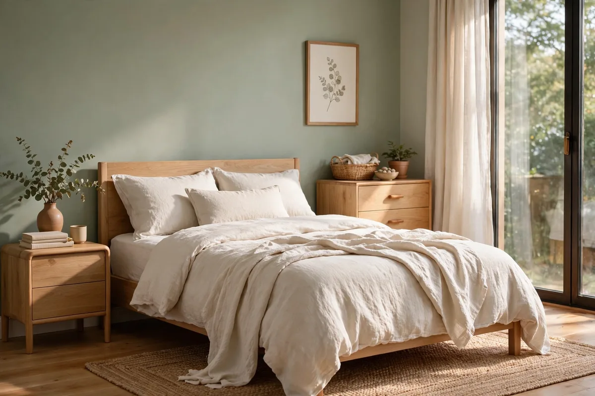
The right bedroom palette does more than look pretty — it sets the tone for how well you sleep. Soft, desaturated colors lower visual noise, quiet the mind, and make a room feel instantly calmer. What restful bedrooms share is a limited palette with one quiet hero color and plenty of warm neutrals to support it.
This guide walks through eight calming bedroom palettes, from soft sage to muted navy. Each one includes the key shades, the undertones to watch, the best light to pair it with, and simple bedding combinations — so you can pick a scheme with confidence and apply it the right way.
Below are eight calming bedroom color palettes, each with its undertone watched, its bedding paired, and its light specified.
In this guide: Soft Sage and Warm White · Warm Greige and Cream · Dusty Blue and Warm Wood · Muted Blush and Oat Linen · Deep Forest Green and Warm Cream · Warm Clay Accent Wall and Natural Linen · Pale Eucalyptus With Stone Grey · Muted Navy and Cream · Comparison Table: All Eight Palettes Side by Side · How to Apply Any Palette: The 60-30-10 Method in Practice · Frequently Asked Questions About Calming Bedroom Palettes · Conclusion
1. Soft Sage and Warm White
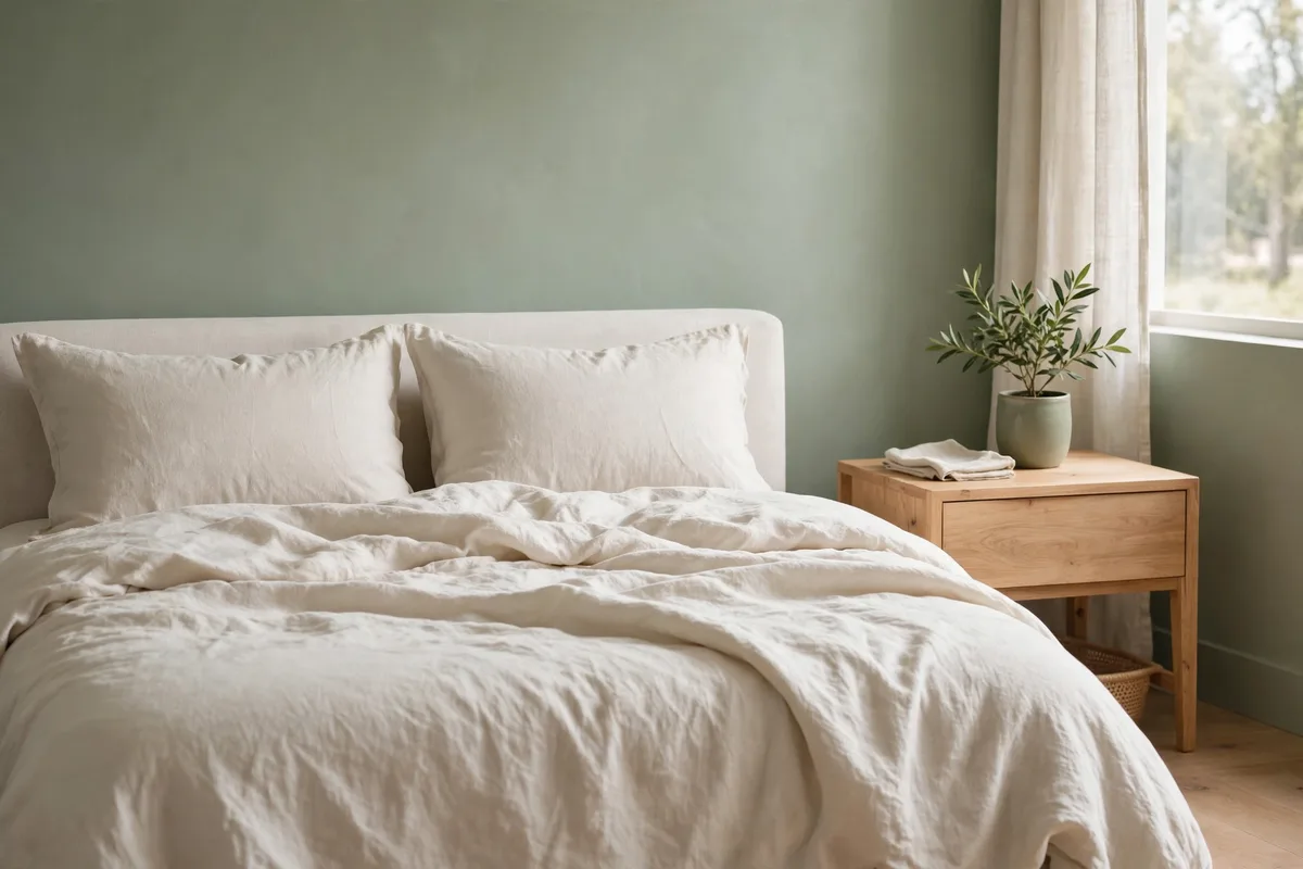
Soft sage is the quintessential calming bedroom color. This muted green-gray brings the outdoors in without feeling saturated, and it pairs beautifully with warm white bedding that keeps the look airy.
The Palette
- Walls: Soft sage with a gray undertone (avoid yellow-green versions)
- Bedding: Warm white linen or cotton with a slightly relaxed texture
- Accents: Pale oak, natural rattan, and one deep green plant
Paint to test first: Evergreen Fog by Sherwin-Williams — a starting point in this family, not a verdict; run it through the swatch test in the FAQs before committing.
Best Light
Soft sage glows in natural daylight and stays restful under warm 2700K bulbs at night. Avoid cool daylight bulbs, which can push the green toward mint.
2. Warm Greige and Cream
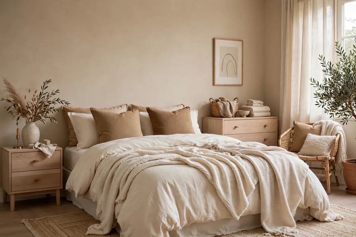
Greige — the blend of gray and beige — is the most forgiving neutral for a calm bedroom. Warm greige walls with cream bedding create a cocoon-like softness, while walnut accents add just enough depth to keep it from feeling flat.
The Palette
- Walls: Warm greige (look for beige-dominant shades, not gray-dominant)
- Bedding: Cream or ivory in washed cotton or linen
- Accents: Walnut wood, brushed bronze, and oatmeal throws
Paint to test first: Revere Pewter by Benjamin Moore — a starting point in this family, not a verdict; run it through the swatch test in the FAQs before committing.
Best Light
Warm greige loves warm light. Pair it with 2700K–3000K bulbs and sheer curtains that diffuse daylight for a soft, enveloping glow.
3. Dusty Blue and Warm Wood
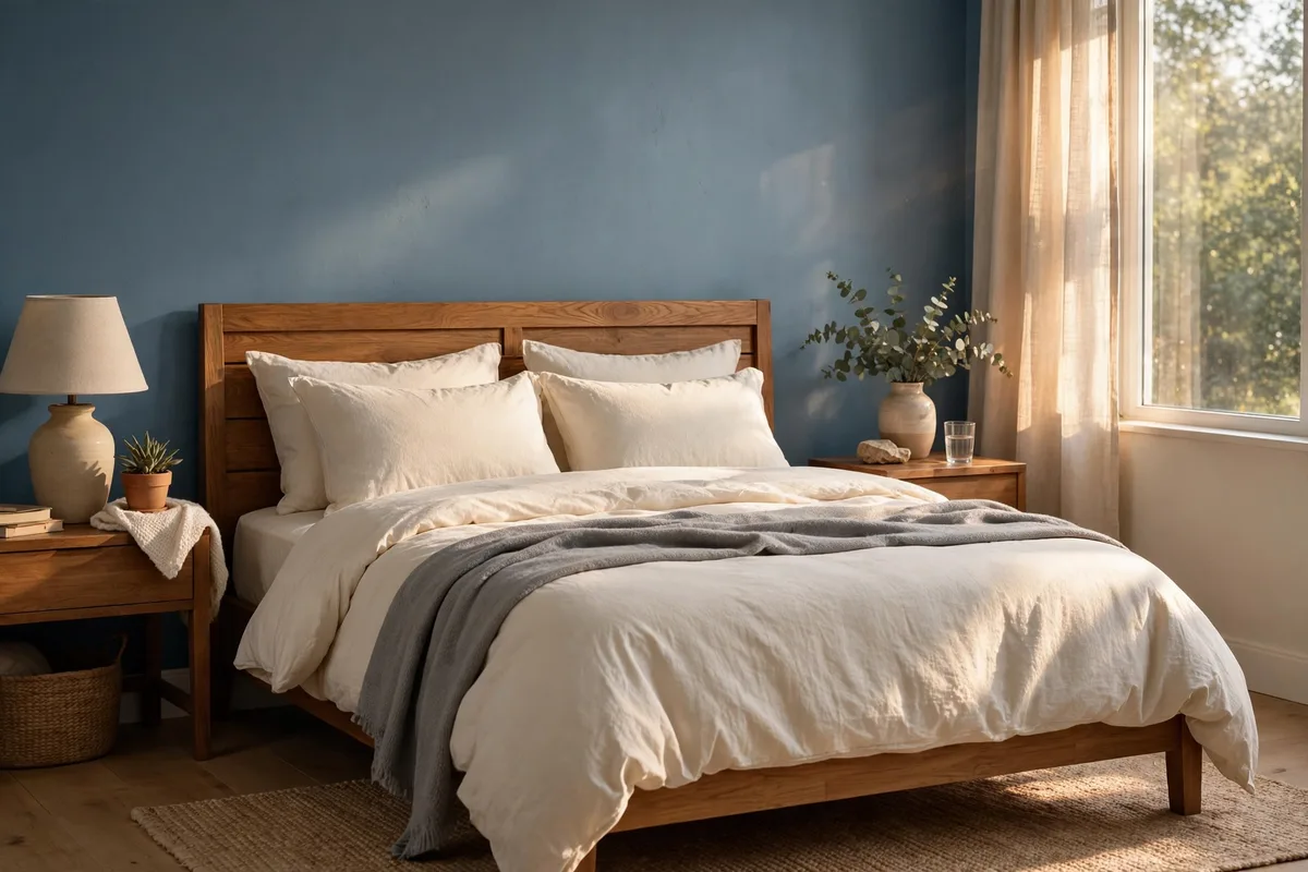
Dusty blue earns its restful reputation honestly: greyed and muted, it recedes rather than stimulates. Keep it muted and gray-based, then warm it up with a wood headboard and cream bedding so the room never feels cold.
The Palette
- Walls: Dusty blue with a gray undertone (think faded denim)
- Bedding: Cream or soft white with subtle texture
- Accents: Warm wood headboard, jute rug, matte black hardware
Best Light
Dusty blue shifts with the light. It looks serene in morning daylight and cozy under warm lamps. Test a swatch in both before committing.
4. Muted Blush and Oat Linen
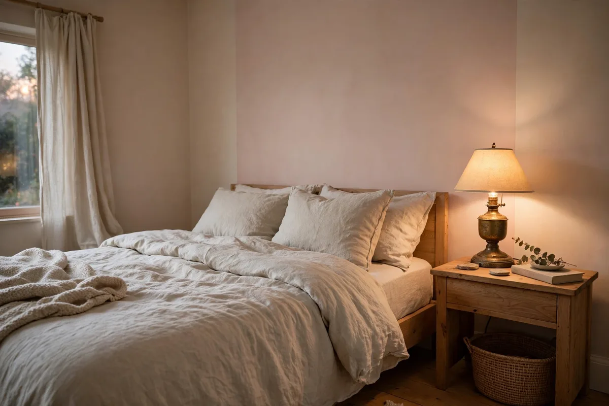
Muted blush — pink with the saturation turned way down — reads as a warm neutral rather than a statement. Layered with oat linen bedding and a brass lamp, it creates a bedroom that feels tender and calm without being precious.
The Palette
- Walls: Muted blush with a beige undertone (avoid anything bubblegum)
- Bedding: Oat or flax linen in natural, undyed tones
- Accents: Brushed brass lamp, pale wood, one charcoal cushion for grounding
Paint to test first: Setting Plaster by Farrow & Ball — a starting point in this family, not a verdict; run it through the swatch test in the FAQs before committing.
Best Light
Blush warms up beautifully under warm lighting. In north-facing rooms, choose a slightly deeper blush so it doesn’t wash out.
5. Deep Forest Green and Warm Cream
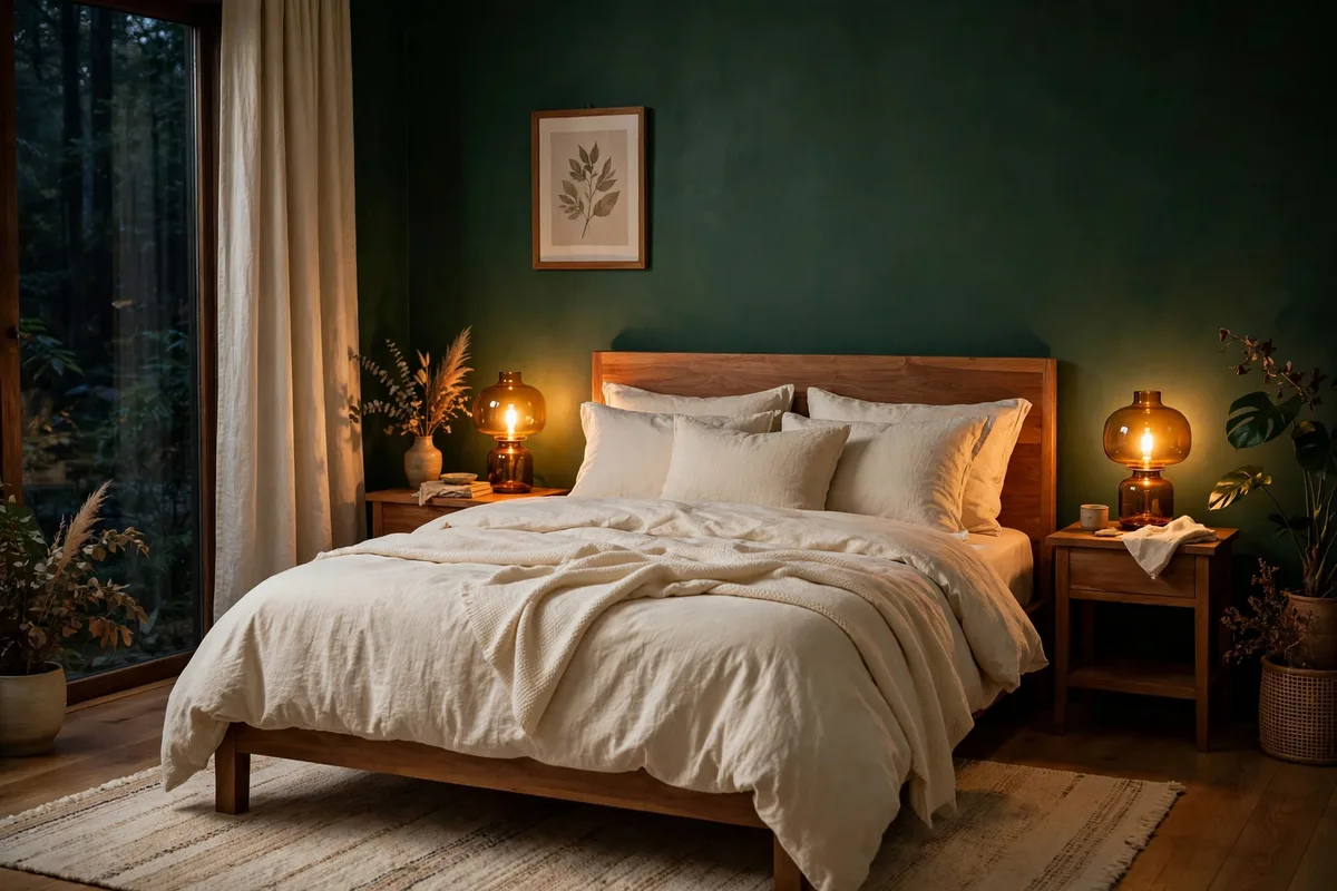
Deep forest green wraps a bedroom in cocoon-like calm — ideal if you want a dramatic but still restful space. The key is balancing the dark walls with warm cream bedding and plenty of soft lighting so it feels enveloping, not heavy.
The Palette
- Walls: Deep forest or pine green with a warm undertone
- Bedding: Warm cream in soft, rumpled linen
- Accents: Aged brass, cognac leather, and layered warm lighting
Best Light
Dark walls need layered light. Use table lamps, wall sconces, and warm 2700K bulbs at multiple heights to keep the green glowing rather than sinking.
6. Warm Clay Accent Wall and Natural Linen
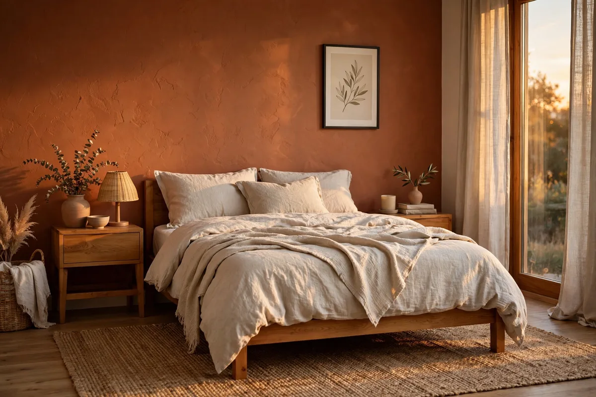
Warm clay — a soft terracotta — adds earthy warmth without the energy of true orange. Used on one accent wall with natural linen bedding everywhere else, it creates a calm, grounded focal point.
The Palette
- Walls: Warm clay on one accent wall; warm white on the rest
- Bedding: Natural undyed linen in flax and ivory
- Accents: Terracotta pottery, pale wood, woven textures
Best Light
Clay glows in afternoon sun and stays cozy under warm lamps. Keep the other walls warm white so the accent wall feels intentional. That accent wall as a full treatment — materials, effort and renter routes — is our bedroom accent wall guide.
7. Pale Eucalyptus With Stone Grey
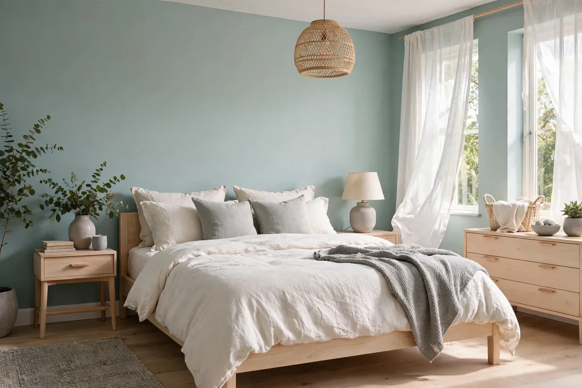
Pale eucalyptus is sage’s cooler, more silvery cousin — fresh, quiet, and effortlessly modern. Stone grey bedding and pale wood furniture keep the look serene and Scandinavian-inspired.
The Palette
- Walls: Pale eucalyptus with a silver-gray undertone
- Bedding: Stone grey in washed linen or percale
- Accents: Pale ash or birch wood, white ceramics, one soft black detail
Best Light
Eucalyptus looks crisp in daylight and calm under neutral-warm light. It’s a great pick for bright, south-facing bedrooms.
8. Muted Navy and Cream
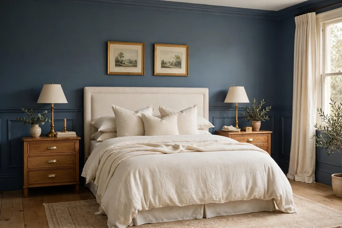
Muted navy brings the depth of the night sky indoors — grounding, enveloping, and surprisingly sleep-friendly. Cream bedding keeps it luminous, and warm wood furniture stops it from feeling stark.
The Palette
- Walls: Muted navy with a gray undertone (avoid primary blue)
- Bedding: Cream or warm white with a soft texture
- Accents: Warm wood furniture, brass details, and a plush neutral rug
Paint to test first: Hale Navy by Benjamin Moore — a starting point in this family, not a verdict; run it through the swatch test in the FAQs before committing.
Best Light
Like forest green, navy needs layered warm lighting. Add dimmable bedside lamps so you can tune the mood from reading-bright to sleep-soft.
9. Comparison Table: All Eight Palettes Side by Side

Here’s every palette at a glance, so you can compare undertones, lighting needs, and the rooms each one suits best.
| Palette | Wall Color | Undertone | Bedding | Best Light | Best For |
|---|---|---|---|---|---|
| Soft Sage | Muted green-gray | Gray-green | Warm white linen | Daylight + 2700K | Small, bright rooms |
| Warm Greige | Beige-gray blend | Warm beige | Cream cotton | 2700–3000K | Any room, rentals |
| Dusty Blue | Faded denim blue | Gray-blue | Cream, textured | Morning light | Restless sleepers |
| Muted Blush | Desaturated pink | Warm beige-pink | Oat linen | Warm lamps | North-facing rooms |
| Deep Forest | Dark pine green | Warm green | Warm cream linen | Layered 2700K | Large rooms, drama |
| Warm Clay | Soft terracotta | Earthy orange | Natural flax linen | Afternoon sun | Accent-wall lovers |
| Pale Eucalyptus | Silvery green | Cool gray-green | Stone grey linen | Bright daylight | Modern, airy spaces |
| Muted Navy | Dark gray-blue | Gray-navy | Cream, soft texture | Layered 2700K | Cocoon-like calm |
10. How to Apply Any Palette: The 60-30-10 Method in Practice
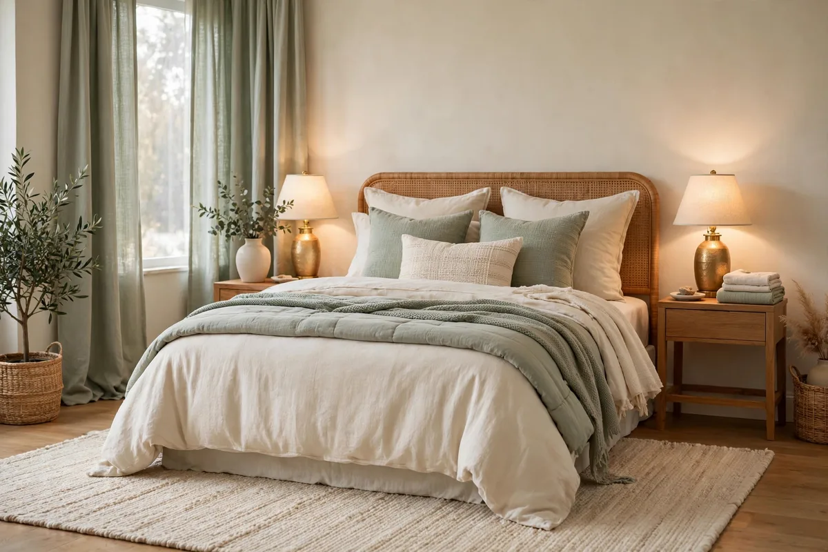
Whichever palette you choose, the 60-30-10 rule keeps it balanced and calm:
- 60% — the dominant color. Usually the walls (or bedding in a rental). This sets the room’s emotional temperature.
- 30% — the secondary color. Bedding, curtains, or a large rug. It should harmonize with the dominant shade, not compete.
- 10% — the accent. Lamps, cushions, artwork, plants. This is where warmth and personality live.
Start with bedding if you’re renting, walls if you own. Layer textures within your palette — linen, wool, wood, ceramic — because texture adds richness without adding visual noise. Finally, keep lighting warm (2700K) and layered: an overhead light alone will flatten even the best palette. That arithmetic, run as a whole-house system — a fixed base with rotating accents — is our year-round neutral base guide.
Frequently Asked Questions About Calming Bedroom Palettes
What is the most calming bedroom color?
Soft, desaturated blues and greens — like dusty blue and soft sage — consistently rank as the most calming. They lower visual stimulation and are associated with nature and rest.
Should bedroom walls be light or dark for better sleep?
Both can work. Light, muted walls feel airy and calm; deep, muted walls (forest green, navy) feel cocooning and can actually improve sleep by reducing light reflection. The key is keeping saturation low either way.
How do I test a bedroom paint color before committing?
Paint large swatches (at least 2×2 feet) on two walls and observe them in morning, afternoon, and lamplight for two to three days. Undertones shift dramatically with light.
Can I use a calming palette in a small bedroom?
Yes — stick with the lighter palettes (soft sage, warm greige, pale eucalyptus) and keep the 60% dominant color light. Use mirrors and sheer curtains to amplify the airy feel.
What bedding color works with every calming palette?
Warm white or cream bedding is the universal partner. It softens every palette in this guide and keeps the room feeling fresh and restful.
What colours should I avoid in a calming bedroom?
Anything that keeps the eye alert: high-saturation colour and pure brights, stark contrasts at the bed wall, and — just as much — the wrong light, since cool daylight bulbs can push a soft sage toward mint. The eight palettes above are all muted for a reason; if a colour feels energetic in the tin, it will not settle on four walls, so mute it, or keep it to pieces you can rotate out.
Conclusion
A calming bedroom palette is one of the simplest upgrades with the biggest payoff: better rest, every single night. Start with the palette that matches your light and your instincts, apply it with the 60-30-10 method, and layer in texture and warm lighting. Your future well-rested self will thank you.


Pingback: 100 Green Aesthetic Bedroom Ideas in Sage, Forest and Emerald
Pingback: Bedroom Accent Wall Ideas: 12 Rated Treatments