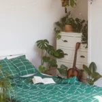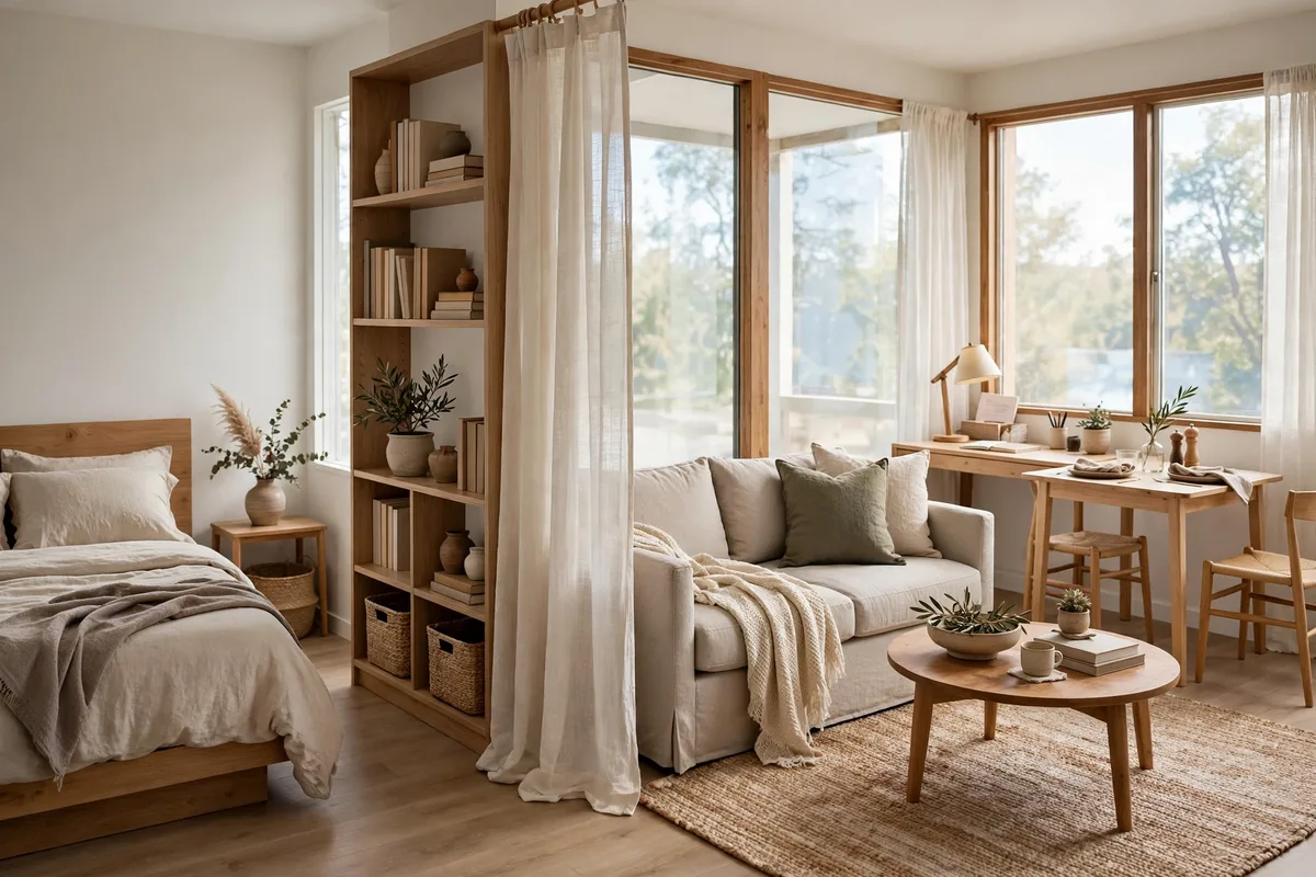
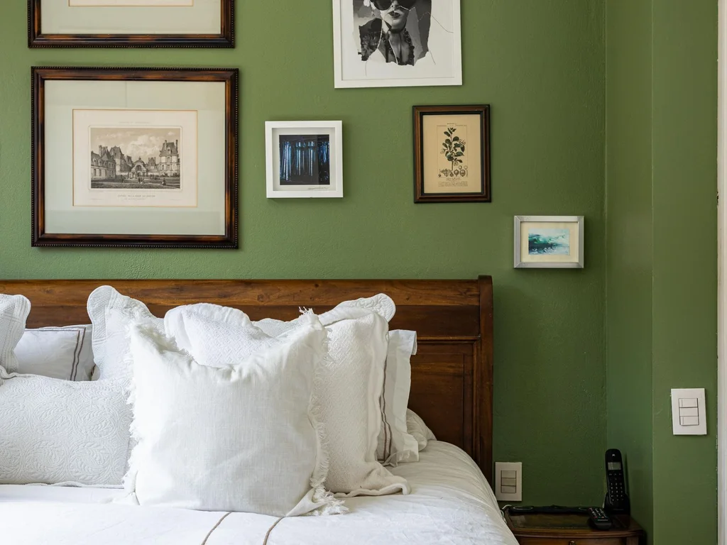
Green can be soft enough to disappear at bedtime and rich enough to make a plain room feel properly designed. The difference is rarely the colour itself — it is the shade, the finish, and what you place next to it. Sage with warm white bedding feels like a Sunday morning; forest green with brass and cream feels like a boutique hotel.
This guide is about colour first. For the leafy, living version, start with our greenery bedroom ideas, then come back here for the paint, fabric and furniture decisions. Pick the palette first and later choices — curtains, bedding, rug, even a second-hand dresser — all get easier.
Unsure where green sits among other restful shades? Our calming bedroom palette guide is a good check before buying paint, and our small bedroom design ideas help plan where colour should go. More guides sit in our Room design ideas category.
In this guide: Sage Green Aesthetic Bedrooms · Forest and Emerald Green Drama · Mint and Soft Pastel Green · Olive and Earthy Green Tones · Green with Cream and Warm White · Green and Gold Luxury Accents · Green with Natural Wood and Neutrals · Green Wallpaper, Patterns and Art · Small and Apartment Green Aesthetic Bedrooms · Green Aesthetic Updates on a Budget
Best Green Aesthetic Bedroom Ideas
The strongest schemes pick one lead shade, one support shade and one neutral: sage for calm, forest or emerald for drama, mint for light, olive for warmth. Repeat the lead shade three times — wall, fabric, small detail — then stop.
The Green Shades, Compared
| Shade | Best light | Room size | Mood | Pairs best with | Avoid if |
|---|---|---|---|---|---|
| Sage | Any — the most forgiving | Any, including small | Calm, restful, Sunday-morning | Warm white, blush, light wood | You want drama |
| Forest | Warm or bright light | Medium to large, or one wall in small rooms | Cocooning, boutique-hotel | Cream bedding, brass, cognac leather | The room is already dark |
| Emerald | Good natural light | Statement pieces in any size room | Luxe, jewel-like | Black accents, gold, cream | Used on all four walls in a dim room |
| Mint & pastel | Bright rooms | Small rooms and nurseries | Fresh, airy, retro | Crisp white, rattan, peach | Your light is warm/yellow (it can turn sickly) |
| Olive | Warm light, older houses | Any | Earthy, settled, warm | Terracotta, mustard, dark wood | You want a cool, crisp feel |
Light direction changes everything: North-facing rooms get cool, grey light: sage can turn cold and mint can turn blue, so choose warm-based greens (olive, warm sage) and warm white bedding. South-facing rooms get warm light that forgives almost anything — forest and emerald stay rich instead of murky. East and west rooms change through the day, so judge the colour at the hour you actually use the bedroom. Whatever the direction: paint a large sample on two walls and live with it for a full day before committing. Green shifts more with light than any other colour family.
Named paints worth sampling: For sage, readers most often land on Sherwin-Williams Evergreen Fog (SW 9130) or Benjamin Moore October Mist (1495). For a pale mint-grey, Dulux Tranquil Dawn is the classic. For deep forest drama, Farrow & Ball Studio Green (No. 93). Codes and availability vary by country — treat these as starting points for sample pots, not as promises.
1. Sage Green Aesthetic Bedrooms
Sage is the shade most people mean by a restful green bedroom. Greyed and quiet, it flatters warm and cool light and pairs with almost any bedding you own. Use it as your base, then vary depth and texture instead of adding more colours.
1. Sage Walls With Warm White Bedding
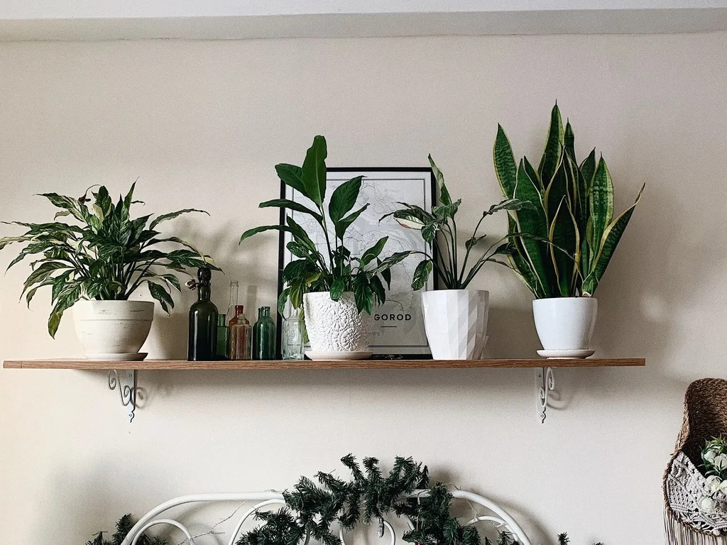
Paint all four walls mid sage in eggshell, then dress the bed in warm white or ivory linen, not bright blue-white. Stark white makes sage look cold; creamy white brings out its warmth, especially in north-facing rooms.
2. A Single Sage Wall Behind the Bed
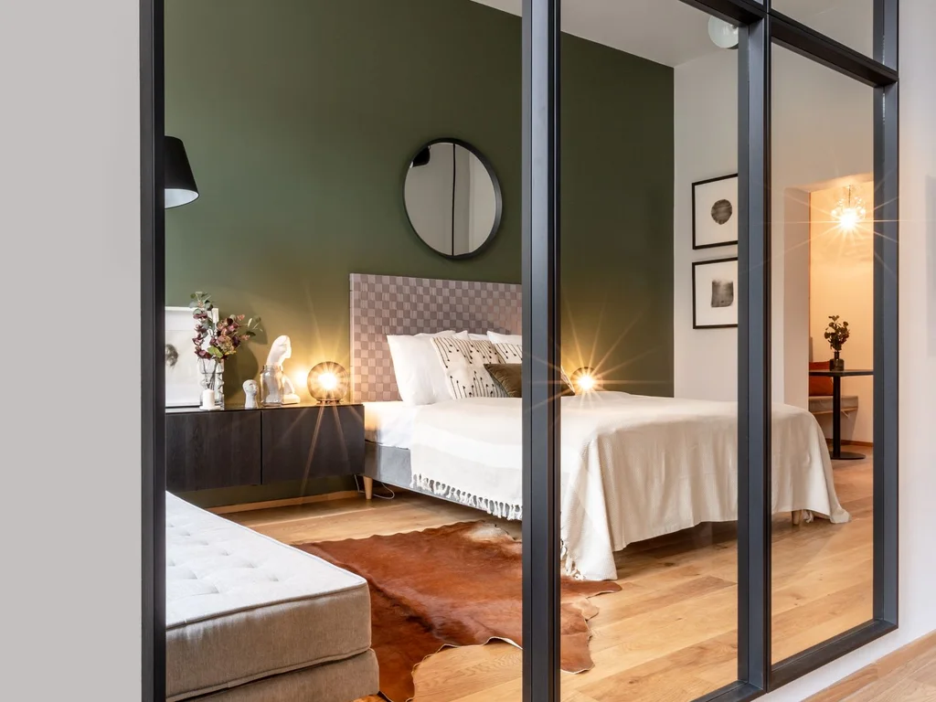
Paint only the headboard wall sage and leave the rest warm white. The bed becomes the focal point and light furniture reads cleaner against the contrast.
3. Sage and Blush Pink Soft Contrast
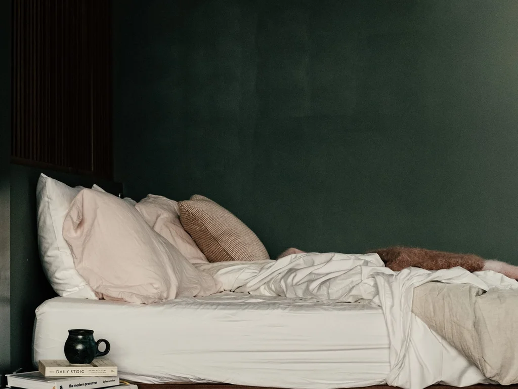
Add a dusty blush cushion, throw or lampshade against sage. The two colours lift each other without shouting, giving a gentle, romantic green bedroom aesthetic.
4. Layered Sage Bedding in Three Depths
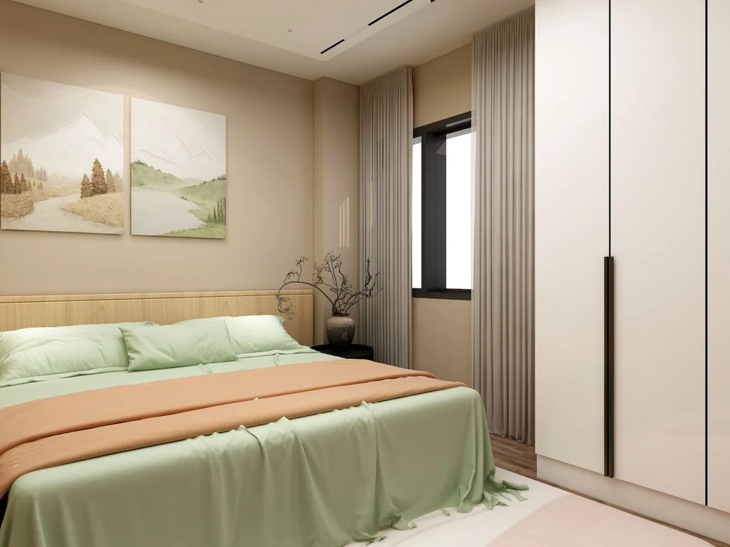
Layer a pale sage sheet, mid sage duvet and deeper eucalyptus throw instead of a matching set. Same hue, three depths looks collected and expensive, and linen or washed cotton shows the depth changes best in natural light.
5. Sage Panelled Headboard Wall

Add picture-frame moulding to the bed wall and paint it the same sage as the wall. One colour gives texture and shadow without a second shade to manage.
6. Sage With Grey for a Cool, Calm Room
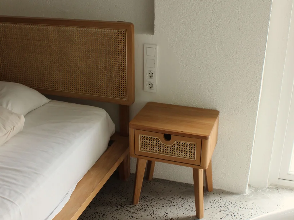
Pair sage with a grey upholstered headboard, pale grey curtains and a silver-grey rug for a cooler, minimal scheme. Keep metals matte — shiny chrome makes it feel like an office.
7. Sage Curtains Instead of Sage Walls
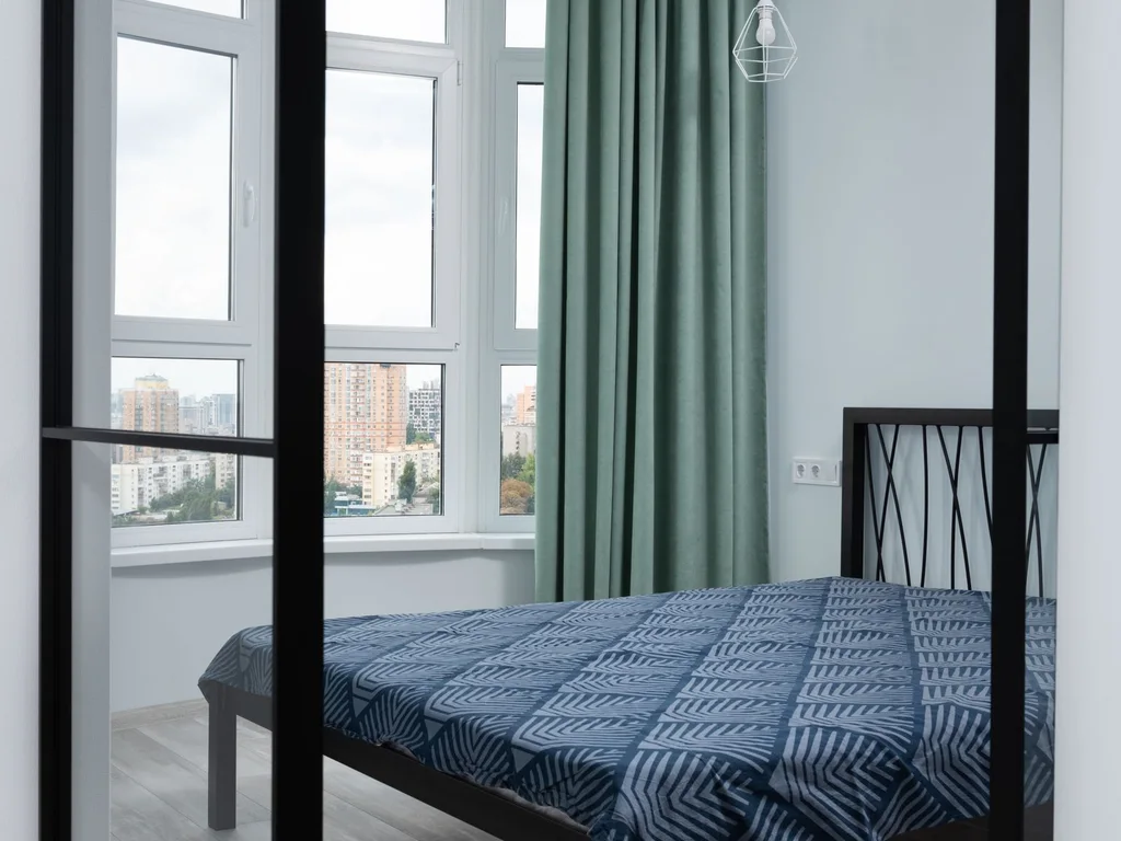
Floor-length sage curtains give renters the same mood on neutral walls. Fabric covers a large area cheaply, moves in the light and reads as a design decision.
8. Sage and Mustard for a Lifted Palette
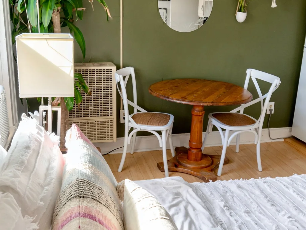
One mustard cushion, stool or lampshade lining stops an all-sage room feeling flat in winter light. Its warmth plays off sage’s coolness.
9. Two-Tone Sage: Dark Below, Light Above
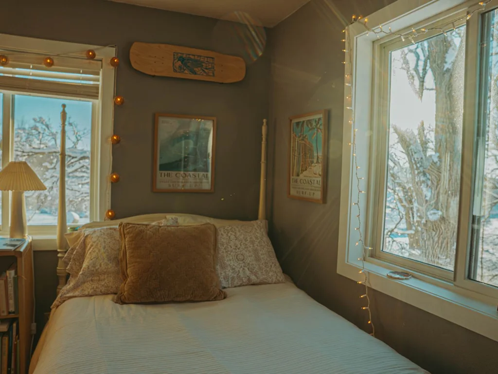
Paint the lower third of the wall in deeper sage and the upper part in a pale tint of the same colour. The dark band grounds furniture and hides scuffs near the bed.
10. Sage Checkerboard and Stripe Accents
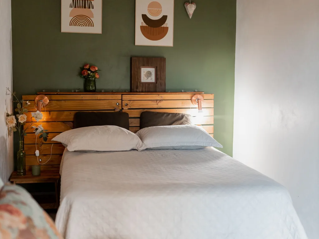
Bring pattern in small: one sage-and-cream checked cushion, striped throw or narrow runner. Small-scale pattern adds the playful quality people save as bedroom inspo, while walls stay calm.
2. Forest and Emerald Green Drama
Deep greens feel cocooning, not gloomy, when bedding stays light, lighting stays warm and one reflective surface gives the eye somewhere to land. Use these ideas where you want evenings to feel enclosed and deliberate.
11. Forest Green Walls With Cream Bedding
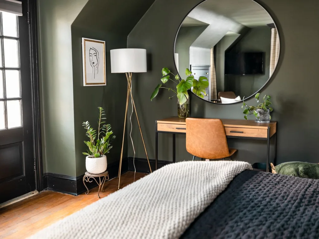
Commit to matte forest green on all walls, then keep the bed almost entirely cream — waffle throw, quilted coverlet, plain linen. High contrast is what makes deep green luxurious.
12. Emerald Velvet Headboard as the Statement
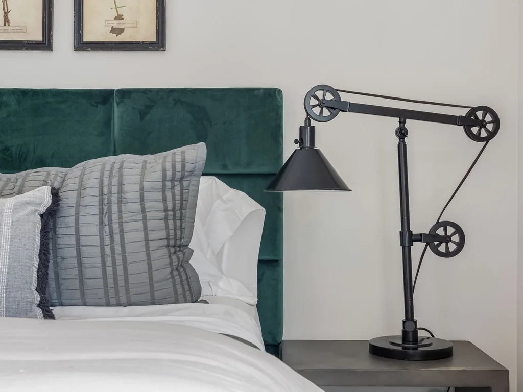
Spend the colour on one piece: a bottle-emerald velvet headboard. Velvet deepens green and changes through the day, so the room never looks flat.
13. Colour-Drenching in Deep Green
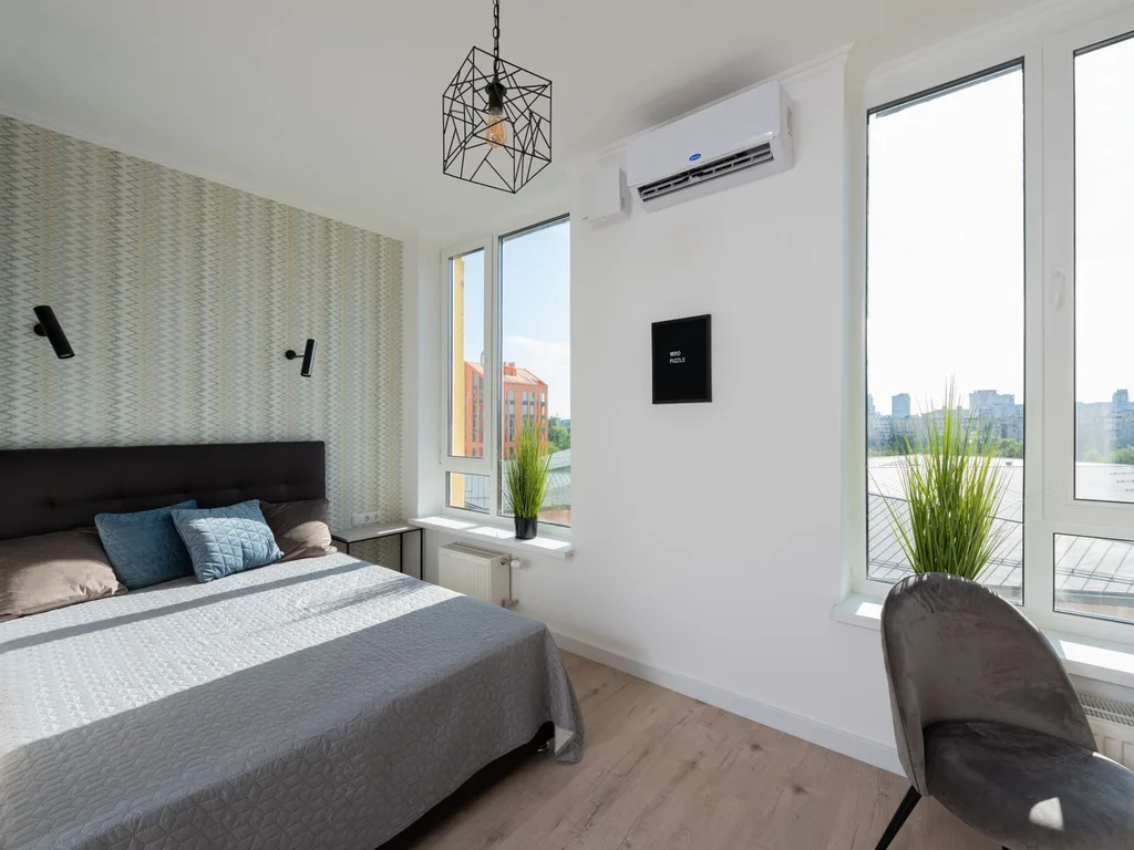
Paint walls, skirting, door and ceiling the same deep green so the room wraps around you. It suits small rooms, blurring corners and making them feel deliberate.
14. Emerald With Black Accents

Matte black lamps, frames or a slim metal bed frame sharpen emerald and keep it modern rather than fussy. Use black in three small places at eye level, not on large furniture, so green stays in charge with black as punctuation.
15. Forest Green and Cognac Leather
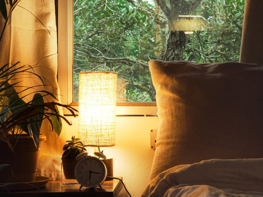
A cognac leather cushion, bench or vintage suitcase at the bed’s foot warms forest green beautifully — brown-orange tones make green richer. It suits a library-like mood.
16. Dark Green Ceiling, Light Walls
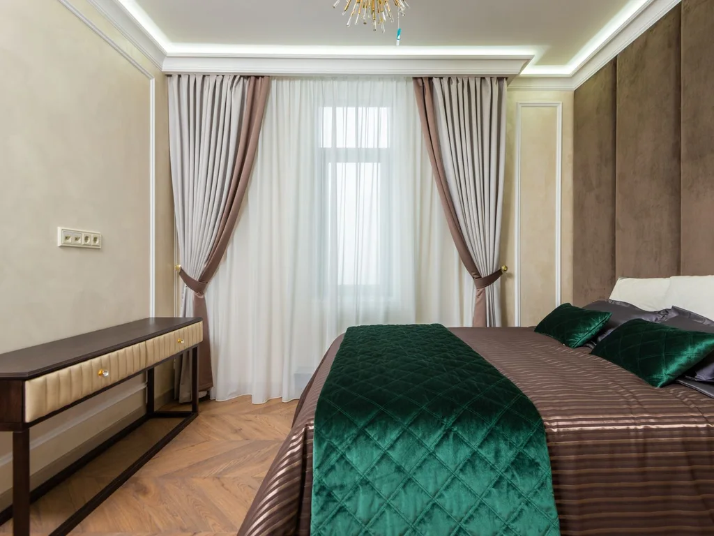
Reverse the rule: deep green on the ceiling only, pale walls below. It lowers a tall, boxy room and feels sheltered at bedtime, yet you mainly see it lying down.
17. Emerald Bedding on a Neutral Room
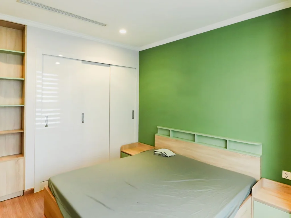
The lowest-commitment drama is an emerald duvet set in a calm neutral room. You get saturated colour where the eye rests, and can swap it seasonally.
18. Moody Green With Warm Wood Flooring
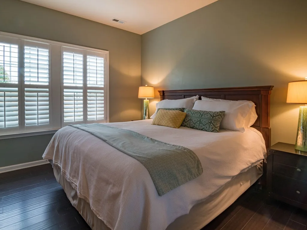
Deep green needs warmth underfoot: a mid-tone wood floor, or a rug in rust, terracotta or warm beige over a cold floor. On grey laminate, a large warm rug is not decoration — it is what makes the walls work.
19. Green and Navy for a Deep, Layered Scheme

Forest green and navy are close in depth, so they layer without clashing for a collected, formal feel. Use green on walls and navy in bedding or curtains, not fifty-fifty.
20. A Dark Green Reading Corner

Paint one corner or nook deep green, then add a lighter green or cream armchair, warm floor lamp and small side table. You get the cocoon effect in miniature while the main room stays light.
3. Mint and Soft Pastel Green
Mint and pastels bring the light back, suiting small rooms and anyone who found sage too grey and emerald too much. Ground them with wood, white and one deeper green somewhere, so the room does not float into sweetness.
21. Mint Walls With Crisp White Trim
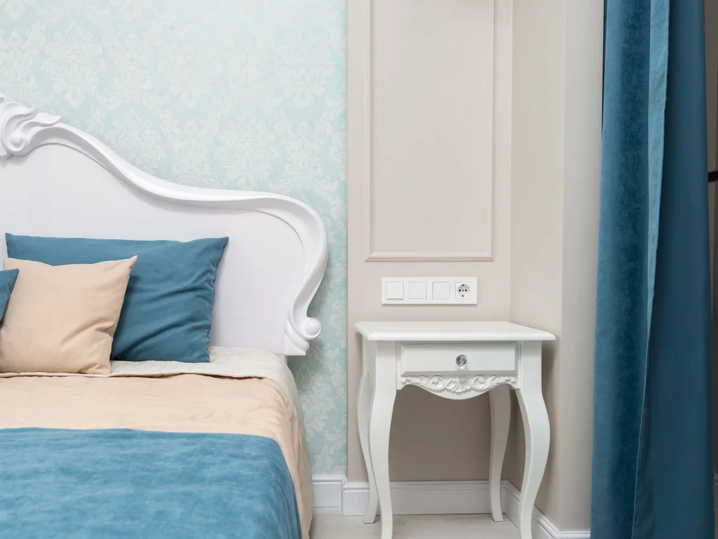
Pale mint with a hint of blue looks freshest against clean white woodwork and bedding, where it reads as colour, not tint. Go a touch greyer than the paint card — pastels intensify over four walls.
22. Pastel Green and Peach for a Soft Retro Feel
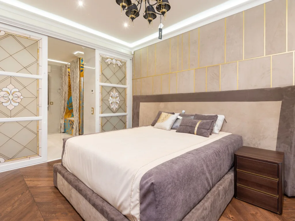
Mint with muted peach or apricot curtains, cushion or lamp has a gentle vintage character suited to older houses. Keep both colours desaturated so the pairing feels grown-up, and put a white bed between them to stop it turning sugary.
23. Seafoam Bedding With White Furniture
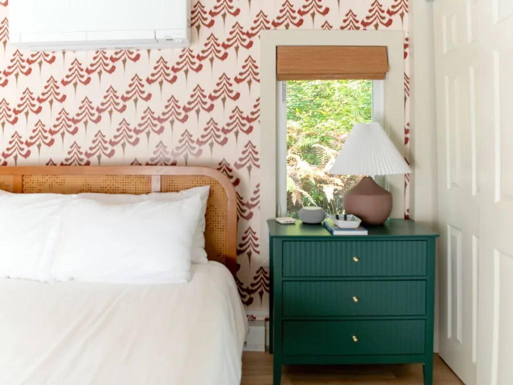
White painted furniture — dresser, nightstands, simple bed frame — with seafoam bedding gives a coastal, airy green bedroom aesthetic. Paint unifies mixed second-hand pieces.
24. Mint and Grey for a Modern Pastel Room
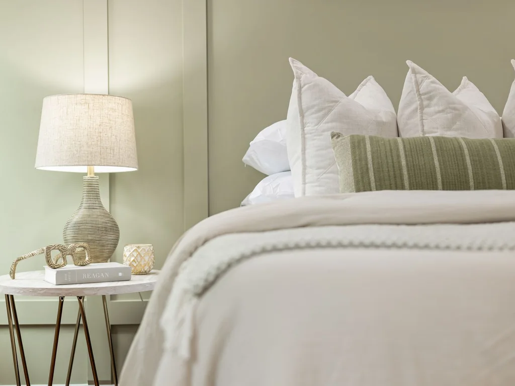
Swap white for pale grey and mint turns contemporary: grey curtains, grey chair, mint walls. It suits a guest room doubling as an office.
25. Pale Green Colour-Block Wall
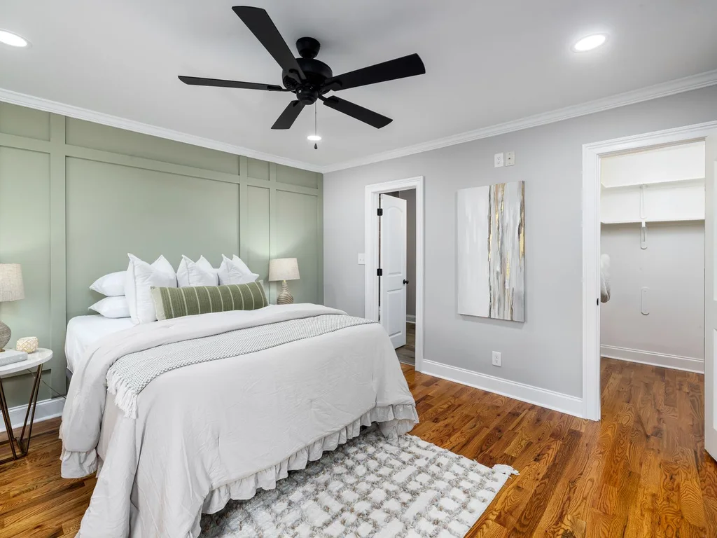
Paint one shape — an arch behind the bed, a rectangle over the desk area, or a wall’s lower half — in pastel green and leave the rest white. Arches soften boxy rooms; straight blocks suit minimal styles.
26. Mint With Natural Rattan and Cane
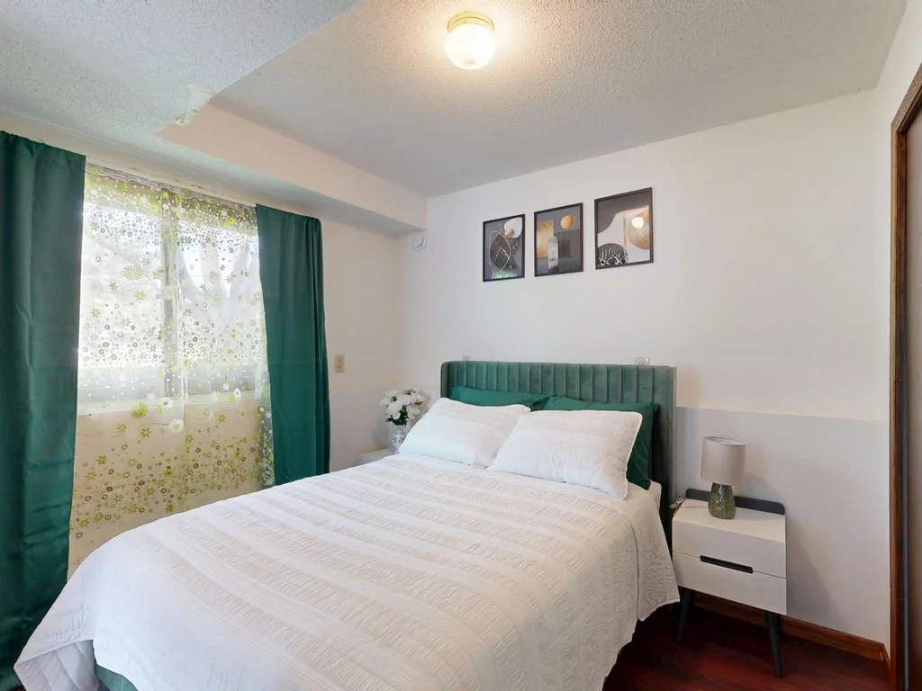
A cane headboard, rattan lampshade or woven basket adds the honeyed tone pastel green needs to feel grounded; without natural material, mint can look clinical. Two or three pieces, spread across the room rather than clustered, distribute the warmth.
27. Pastel Green Gingham and Cottage Checks
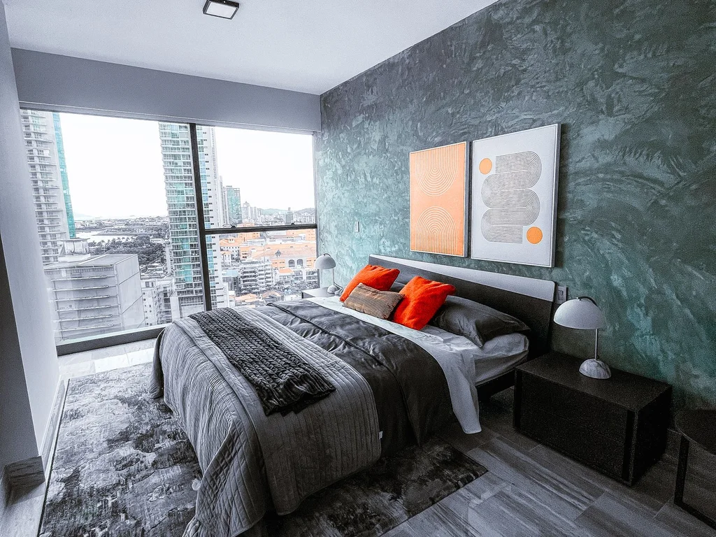
A pale green gingham duvet or checked curtain adds relaxed cottage pattern without darkening the room. Small checks feel modern, larger ones traditional.
28. Layering Mint, Sage and White
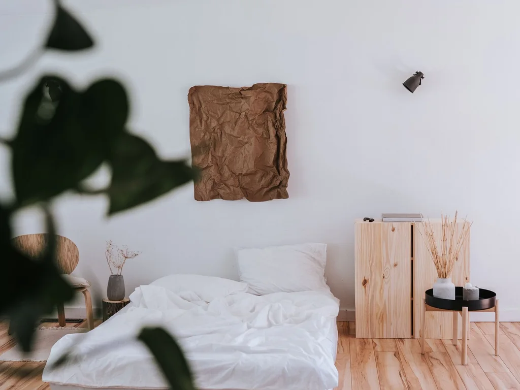
Layer two greens for depth: mint walls, sage bedding, white as breathing space between them. Close enough to harmonise, different enough to form a gentle gradient.
29. Soft Green Nursery That Grows Up
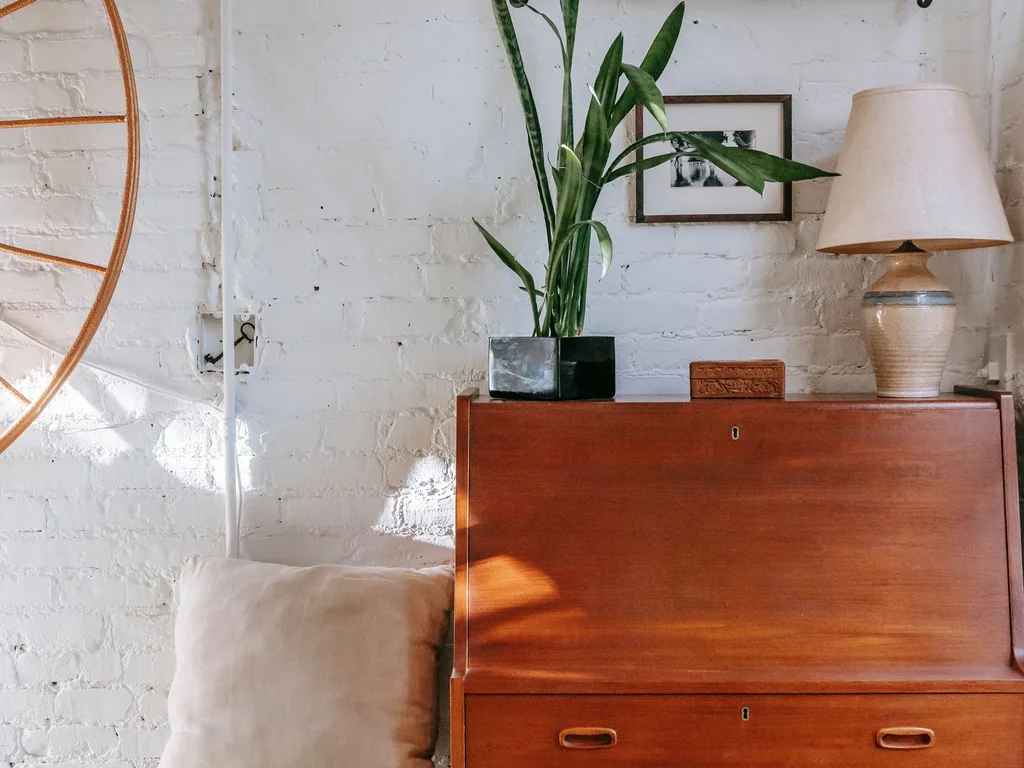
Pale sage-mint is a practical nursery colour because it suits no single theme or age. Paint walls once, keep furniture white or light wood, and change only textiles as the child grows.
30. Pistachio Accents in an All-White Room
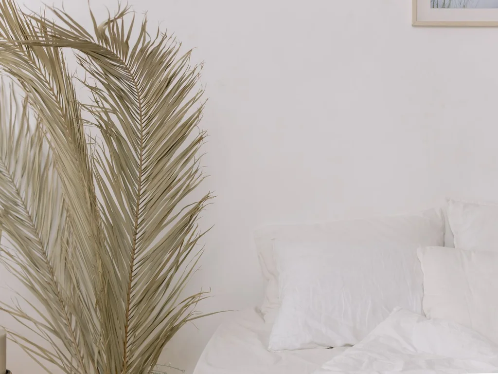
If walls must stay white, carry the aesthetic in pistachio cushions, a throw and one painted side table. Pistachio is warmer than mint, so it sits happily with warm white paint.
4. Olive and Earthy Green Tones
Olive, moss and other yellow-based greens are the warm end of the family. They suit warm wood, leather, terracotta and older furniture, and forgive yellowish household light. If sage tested too cool, olive is probably the shade you wanted.
31. Olive Walls With Terracotta Accents
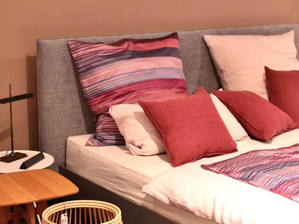
Olive walls with a terracotta throw, cushion or lamp base feel sun-baked and settled, because both are earth colours. The scheme loves natural light and warm wood floors.
32. Moss Green Upholstered Bed
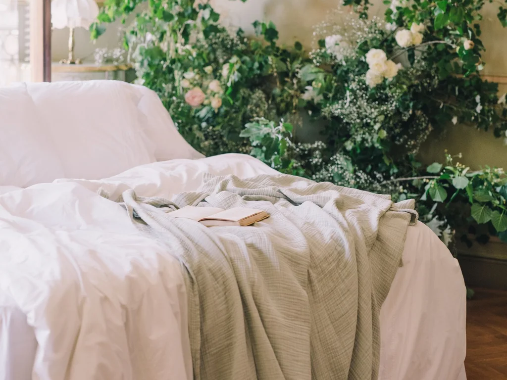
A bed upholstered in moss or olive linen or velvet anchors the room, letting walls stay warm neutral. Fabric softens these greens’ yellow base and shows them at their best.
33. Olive and Cream Farmhouse Styling

Olive with cream, checked cotton and simple wood furniture gives farmhouse character without the dated all-grey look. Add black in small doses — a lamp, a frame — to stop it drifting twee.
34. Earthy Green With Dark Wood Furniture
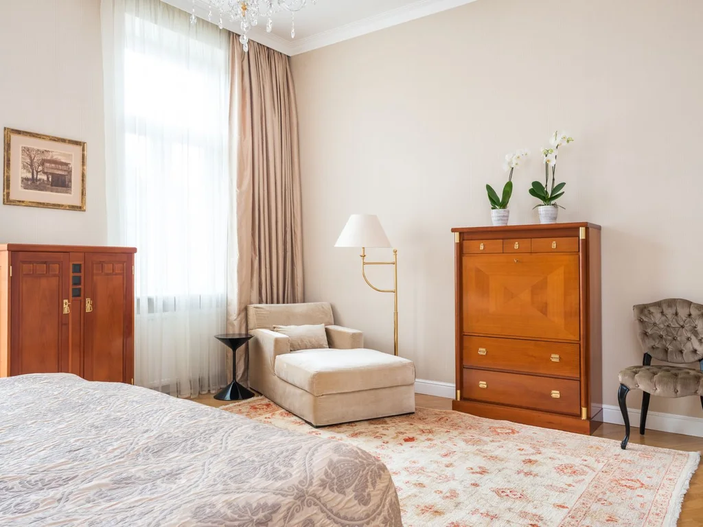
Walnut and other dark woods look rich against olive and moss because both share warm, brownish undertones. This is the scheme for inherited furniture you cannot replace — green makes it look chosen.
35. Olive Curtains and a Neutral Room
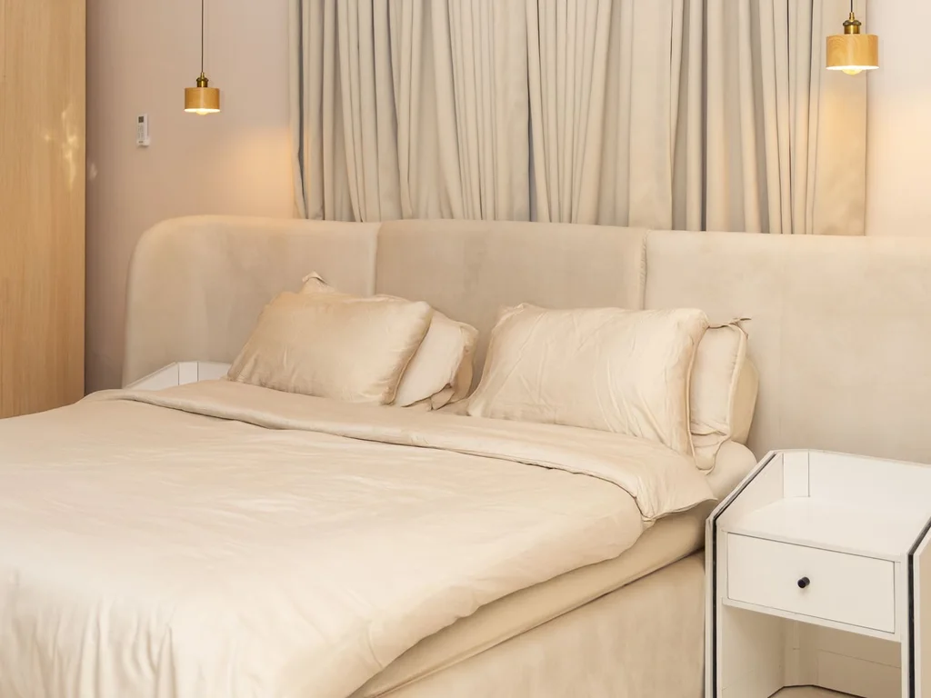
Full-length olive curtains add a large block of warm green without repainting, and frame a window attractively. Choose matte cotton or linen-look fabric; shiny olive reads dated.
36. Khaki Green for a Relaxed Scheme
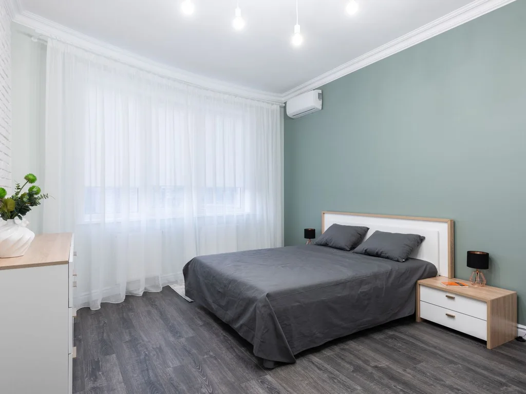
Khaki-leaning green, between olive and stone, makes a calm, understated room that pairs with grey bedding, black metal and plain wood. It is a good compromise for shared rooms.
37. Olive and Mustard: Warm on Warm
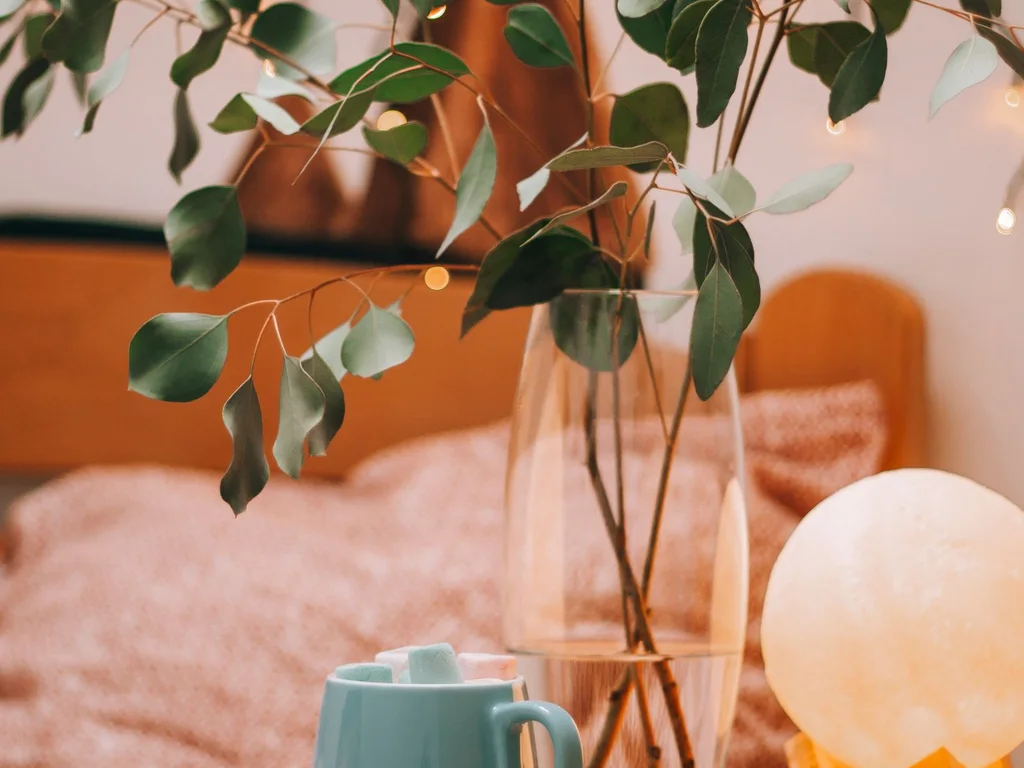
Olive layered with mustard or ochre gives softened 1970s warmth, balanced by cream walls and natural fibres. Keep mustard in changeable textiles — cushions, throw, rug — because it is the element you may tire of first.
38. Painted Olive Wardrobes and Doors
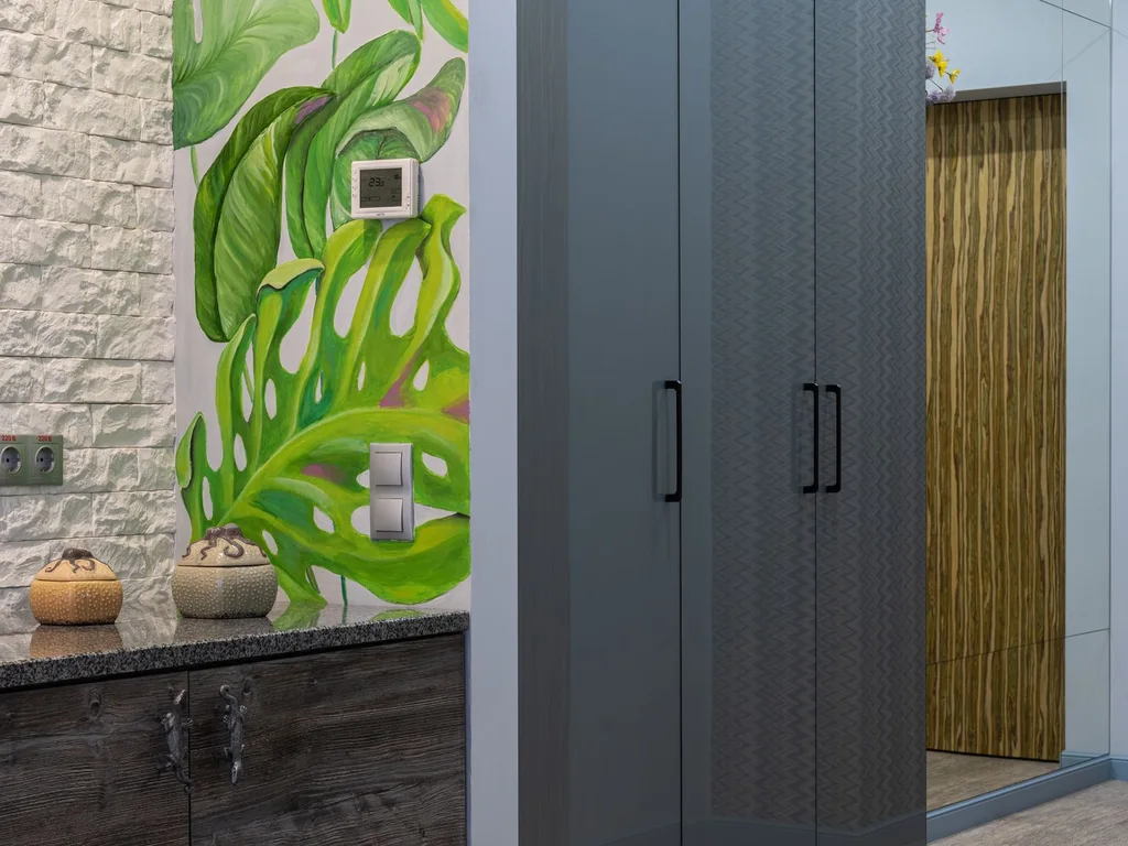
Paint built-in wardrobes, a door or a chest of drawers olive and leave walls warm white. Painted furniture carries colour in a crafted way, for less time and money than a full room.
39. Earthy Green With Stone and Clay Textures
Stone-coloured lamps, clay vases and travertine-look tables bring out the mineral quality of olive and moss. Matte, slightly rough surfaces are their natural partners; gloss looks out of place.
40. Olive Stripes and Washed Linen Layers
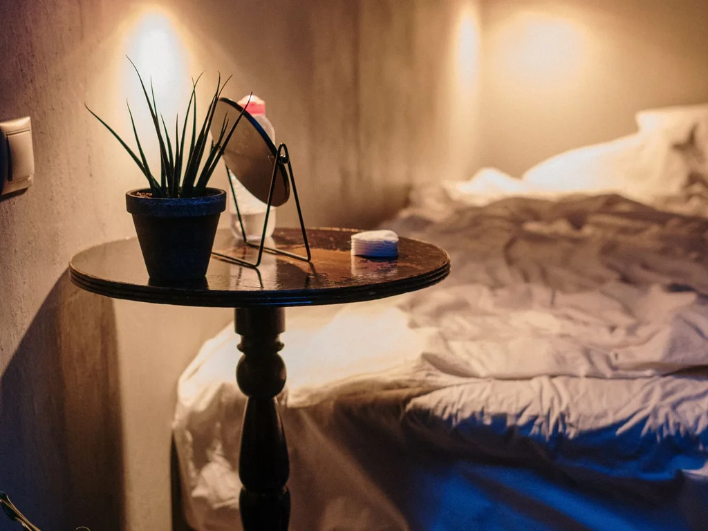
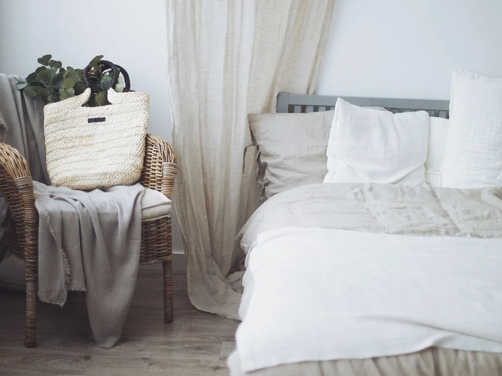
An olive washed-linen duvet with a cream stripe, or an olive-striped throw over cream bedding, gives pattern, texture and colour in one layer. Washed linen suits earthy greens and improves with washing, making it a sensible item to spend on.
5. Green with Cream and Warm White
Cream is green’s most reliable partner, softening every shade where bright white makes sage grey and emerald harsh. The bedroom galleries at House Beautiful return to this pairing constantly. These ideas use it at different strengths.
41. Sage and Cream: The Classic Calm Scheme
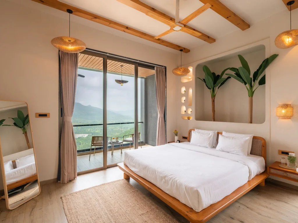
Sage walls, cream bedding and curtains and a light wood floor is the classic green aesthetic bedroom, and it is hard to get wrong. Keep creams consistent, though — a yellowy duvet against a pinkish curtain will quietly fight.
42. Cream Walls With a Green Bed as the Focus
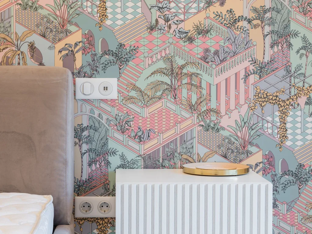
Reverse the usual plan: cream walls everywhere, all the green concentrated in duvet, throw, cushions and headboard. The room stays light and flexible, and seasonal change means changing bedding, not paint.
43. Layered Creams to Support a Dark Green
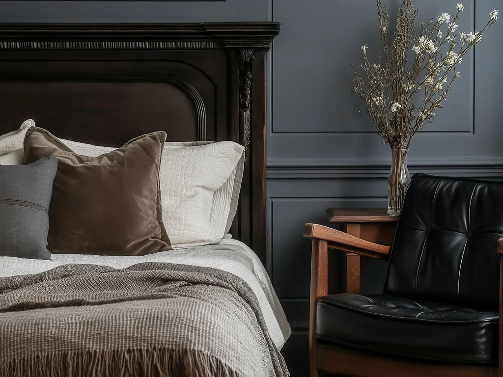
One cream looks flat against forest green, so layer three: ivory sheets, cream duvet, oatmeal throw. Slight differences create depth and stop high contrast looking like a flag.
44. Green and Cream Botanical Print Bedding
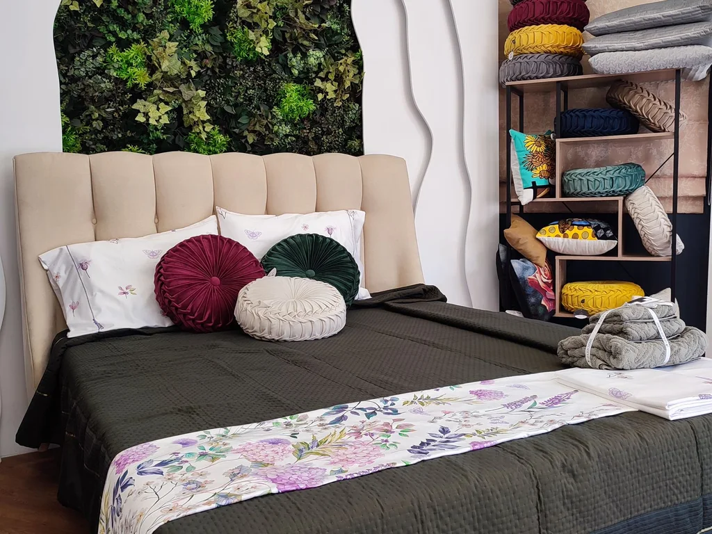
Cream bedding printed with a green botanical or toile pattern brings both colours together in one piece, making coordination easy. Keep walls plain cream or pale sage so the print breathes.
45. Warm White Panelling With Green Above
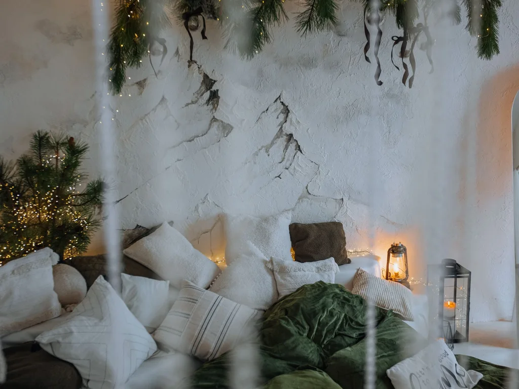
Paint panelling or the wall’s lower half warm white, with your green above. The white band keeps the room tall and classic while green sits at eye level, where it works hardest.
46. Cream Boucle and Textured Whites With Sage
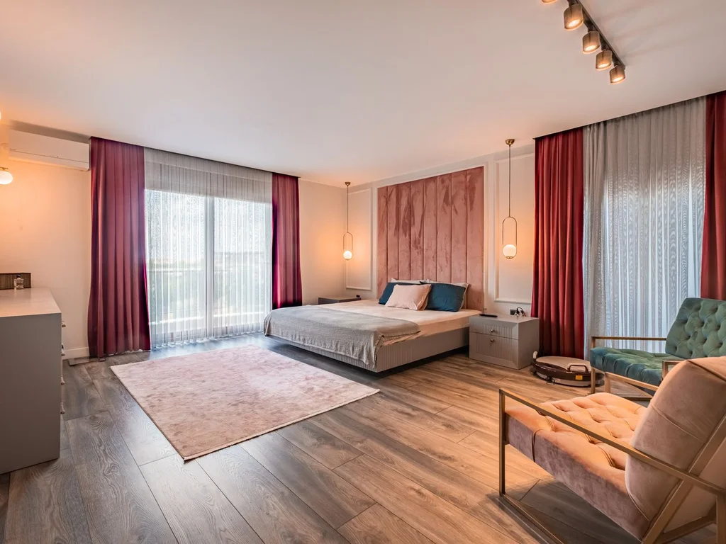
With colours this quiet, texture is the interest: boucle cushion, waffle cream throw, ribbed lampshade against smooth sage walls. Aim for three distinct textures on the bed alone.
47. Green Headboard Panel, Cream Everything Else
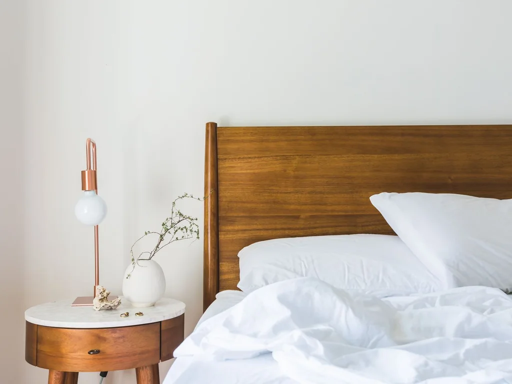
Paint only the wall section behind the bed, skirting to ceiling and slightly wider than the bed, in green, keeping everything else cream. It reads as a giant headboard and suits low or headboard-free frames, doing the framing work for you.
48. Cream Linen Curtains Softening Dark Green

Cream linen curtains introduce air and movement into a forest or emerald scheme, and glow when backlit in the morning. Avoid dark curtains with dark walls in smaller rooms — the window should stay the lightest rectangle in the room.
49. Two Greens Plus Cream as the Bridge
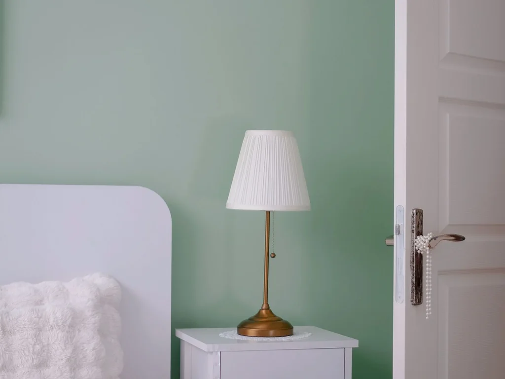
Two greens — sage walls, deeper green chair or cushions — can jar unless something mediates. Cream is the mediator: cream bedding between them, cream rug under the chair.
50. Cream Ceiling and Trim to Lift Green Walls
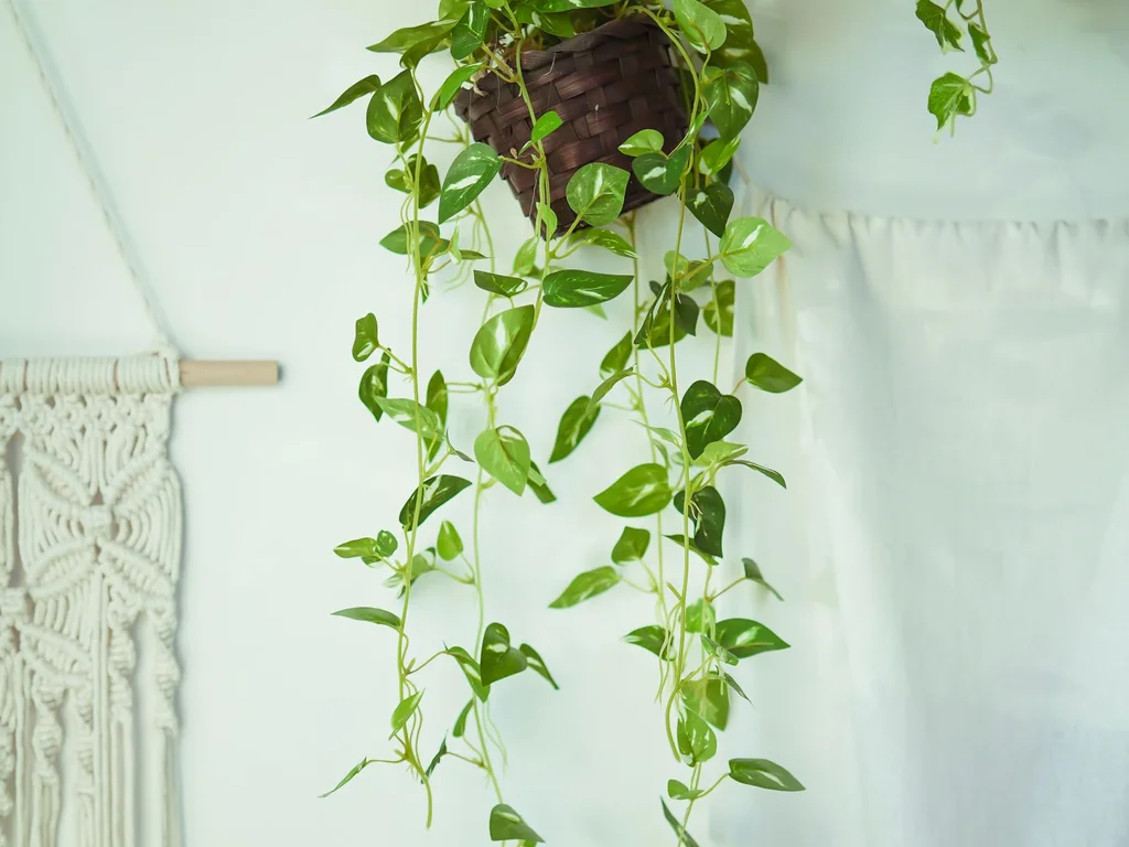
A warm cream ceiling and trim, rather than ceiling white, makes mid and dark green walls richer and the room cohesive, because no bright border stops the eye. It suits period homes with picture rails.
6. Green and Gold Luxury Accents
Green and gold is the pairing hotels use for expensive-feeling rooms, and it works at home in smaller doses than expected. Restraint is the secret: brushed or antique brass, not bright gold, two or three pieces, and green kept deep and matte so metal can shine.
51. Emerald Walls With Brushed Brass Lamps
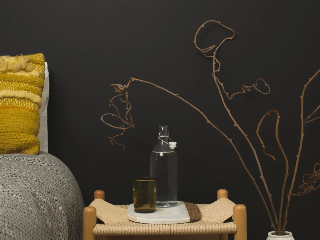
A pair of brushed brass bedside lamps against emerald walls is the most effective luxury move here. Warm metal catches lamplight and deepens the green by contrast.
52. A Gold-Framed Mirror Over the Dresser
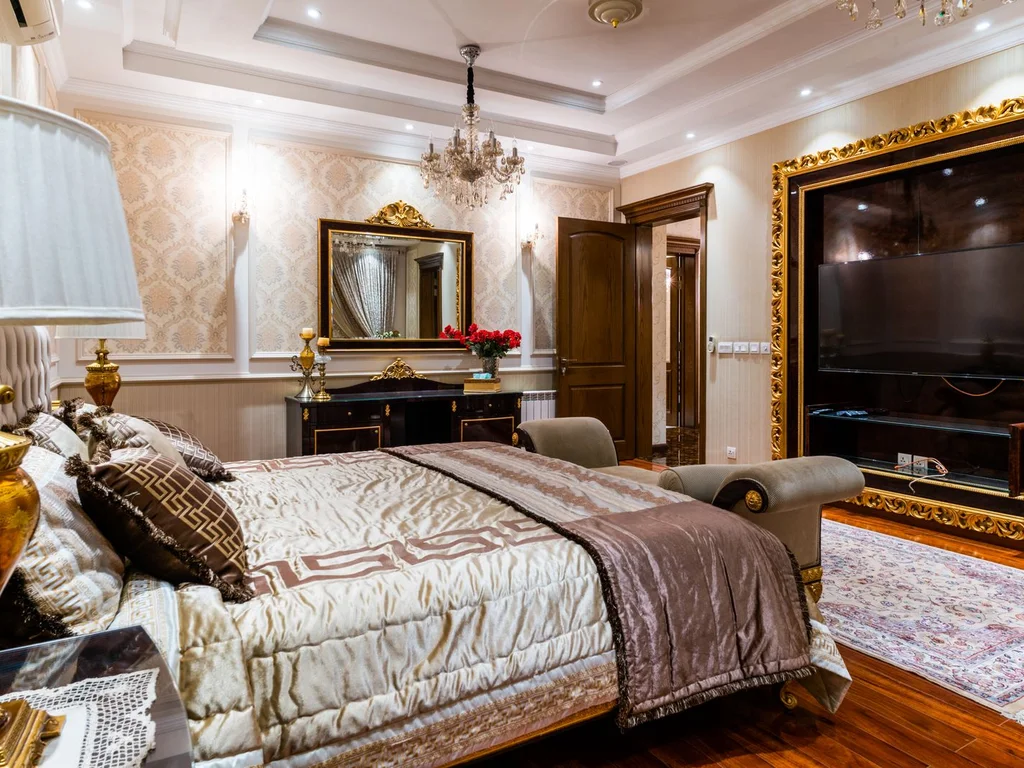
One generous mirror in a slim brass frame reflects light into a green room and adds a formal, styled note. Over a dresser it also creates a practical dressing area.
53. Sage and Antique Gold for Soft Luxury
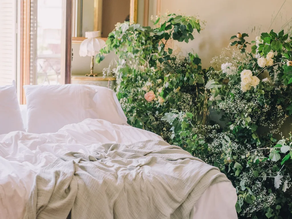
Sage with dulled antique gold — a vintage-look frame, muted brass lamp, aged mirror — gives quieter luxury for lighter rooms and older houses. Finishes should look found, not bought as a set.
54. Green Velvet With Gold Cushion Detail
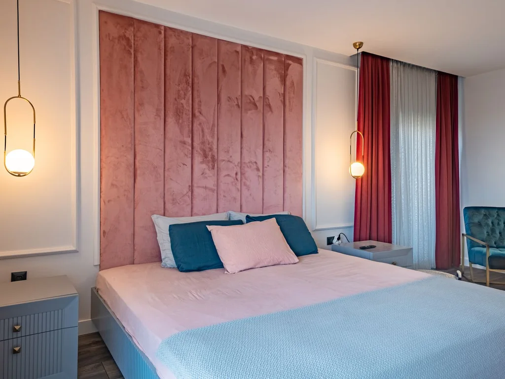
Forest or emerald velvet paired with one cushion with gold piping, tassels or metallic thread gives the hotel pairing in textiles alone — removable, seasonal and renter-friendly. Keep other cushions plain cream so the detailed one reads as jewellery, not clutter.
55. Brass Bed Frame Against Pale Green
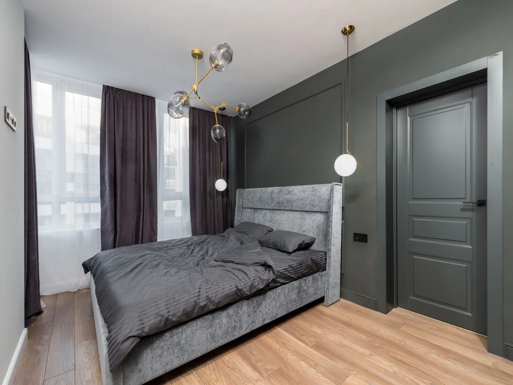
A slim brass bed frame against pale sage or mint walls inverts the scheme: metal becomes the warm statement, green the calm background. It suits smaller rooms wanting occasion without dark walls.
56. Gold Sconces Instead of Bedside Lamps
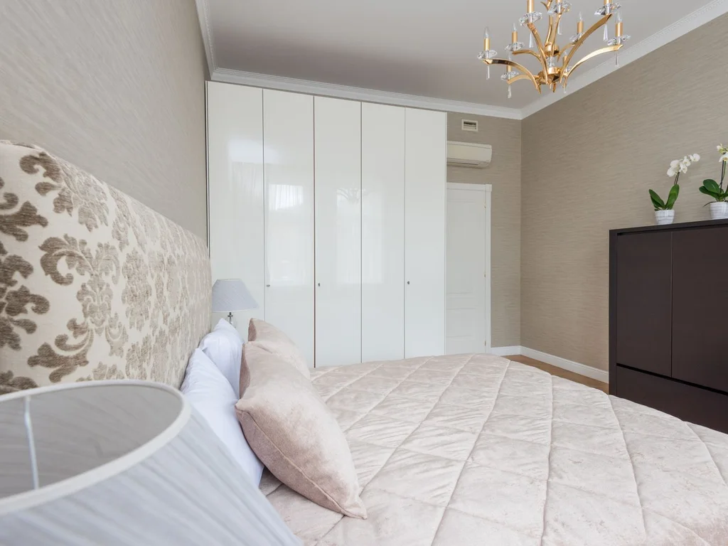
Brass wall sconces free nightstand space and place warm light exactly where deep green walls need it, creating a boutique, symmetrical look. No wiring budget?
57. A Green and Gold Dressing Table Corner
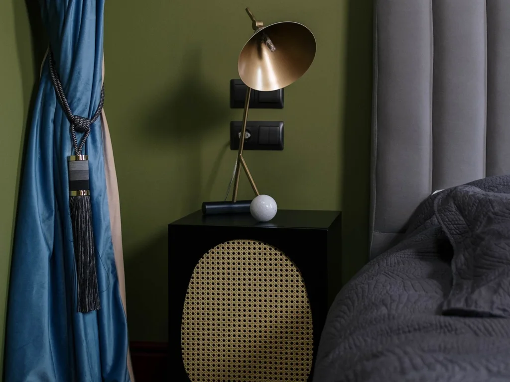
A deep green dressing table, gold-framed mirror and brass-handled stool create a distinct zone that helps larger rooms feel planned. You see it every morning, so keep the top almost clear — a tray, a lamp, one or two objects.
58. Metallic Gold Thread in Curtains and Throws
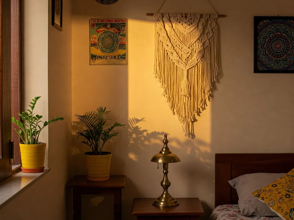
A faint metallic thread woven through curtains or a throw catches light as you move, rather than announcing itself. It works with sage and olive as well as deep greens, and tolerates other metals nearby better than solid gold pieces do.
59. Black, Green and Gold for a Tailored Look
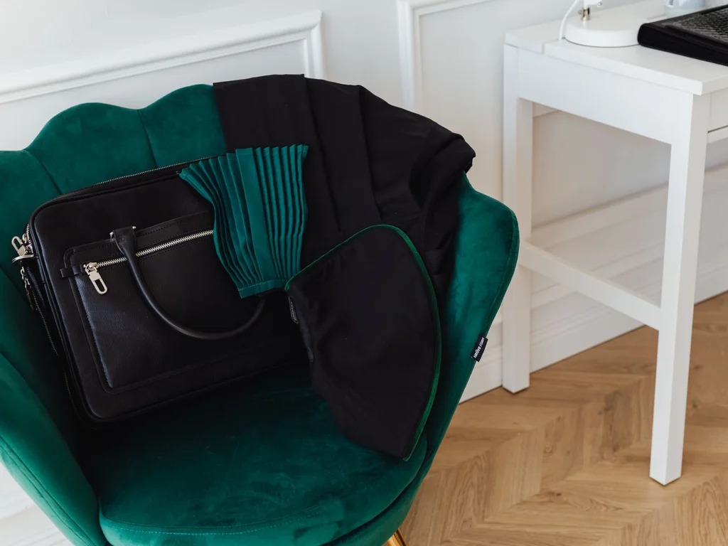
Black as a third element — lamp bases, frames with gold inner edges, a black throw — sharpens emerald and stops gold looking sweet. Keep proportions near sixty per cent green, thirty cream or black, ten gold for a tailored, confident scheme.
60. One Gold Statement Piece Only
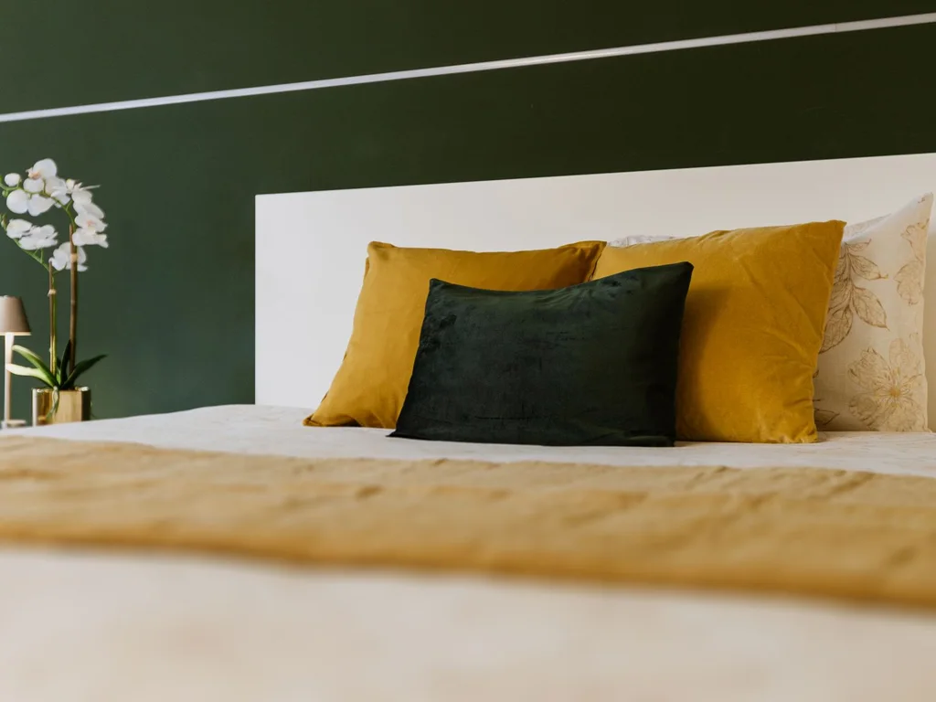
Unsure? Buy one gold piece — lamp, mirror or tray table — and live with it a month before adding more.
7. Green with Natural Wood and Neutrals
Wood is green’s natural companion, and warm neutrals give the eye rest between them. Match undertones: warm woods want yellow-based greens, pale woods suit sage and mint, and neutrals should lean warm, not blue-grey, for a restful night-time feel.
61. Sage Walls With Light Oak Furniture
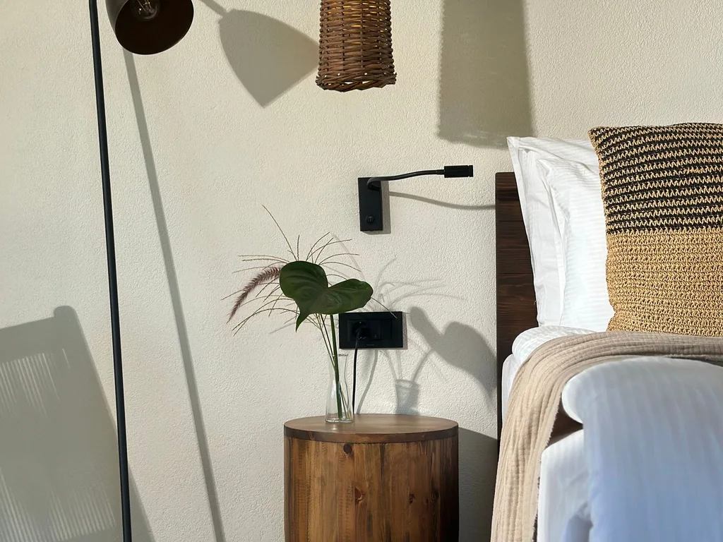
Light oak bed frame and nightstands, sage on one or two walls, cream bedding: a Scandinavian-leaning green aesthetic bedroom. Oak’s warmth stops sage looking grey; sage stops oak looking yellow.
62. Deep Green With Walnut for a Rich, Grounded Room
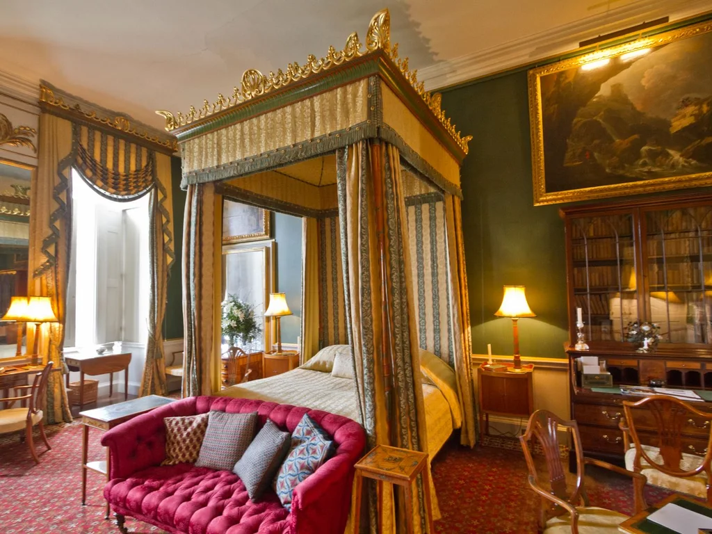
Walnut’s chocolate tones deepen forest and emerald schemes and make them feel established, not fashionable. A walnut dresser against dark green with cream bedding will not date quickly.
63. A Wooden Slat Accent in Stained Green
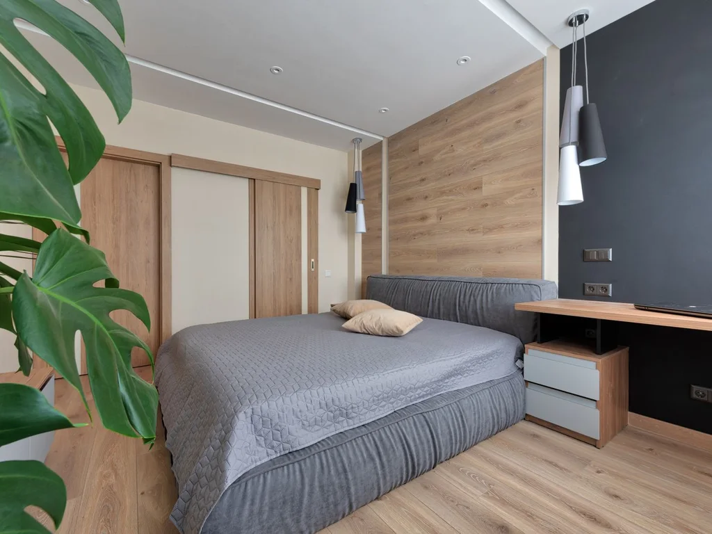
Wood slat panels or tongue-and-groove stained mid green give texture, shadow lines and colour in one feature, with grain showing through. It is a strong bed wall in modern rooms where flat paint feels dull.
64. Green and Warm Greige as a Flexible Base
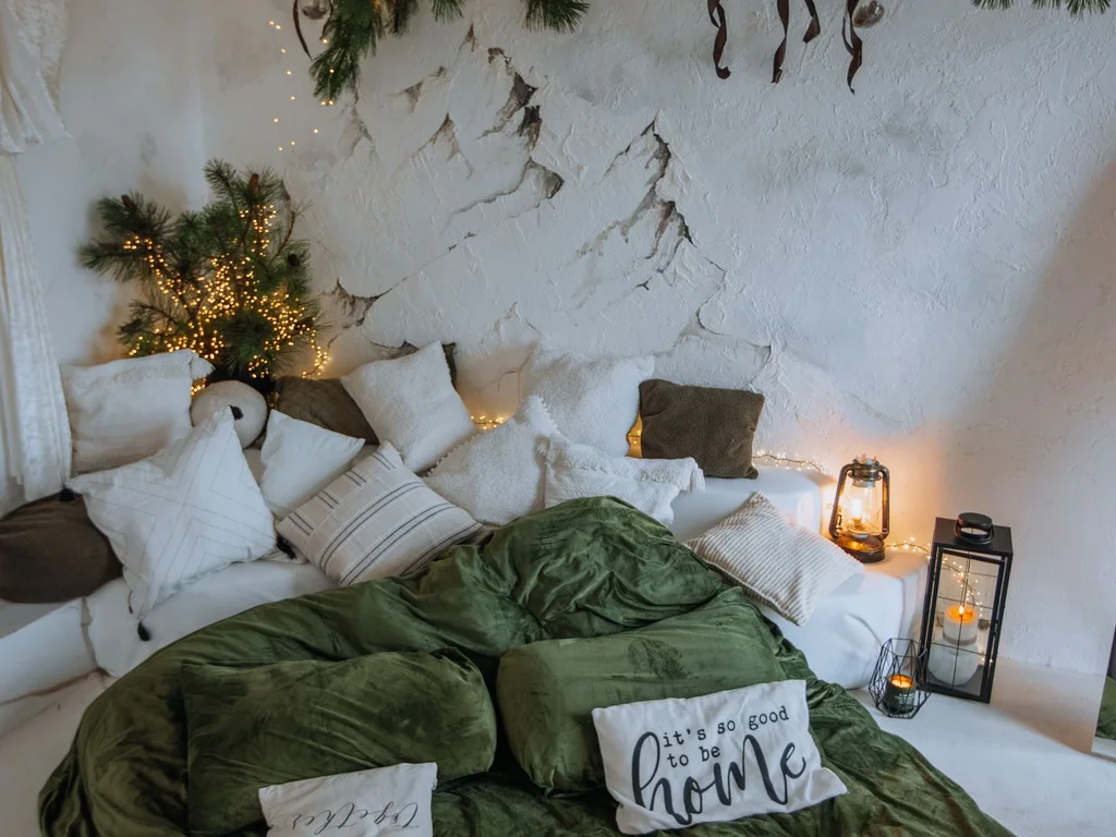
Warm greige walls with green bedding, curtains and one upholstered piece suit anyone wanting green accents in a neutral room. Greige flatters green where cool grey fights it, and textiles alone can turn the room more or less green.
65. Rattan and Cane Details With Mid Green
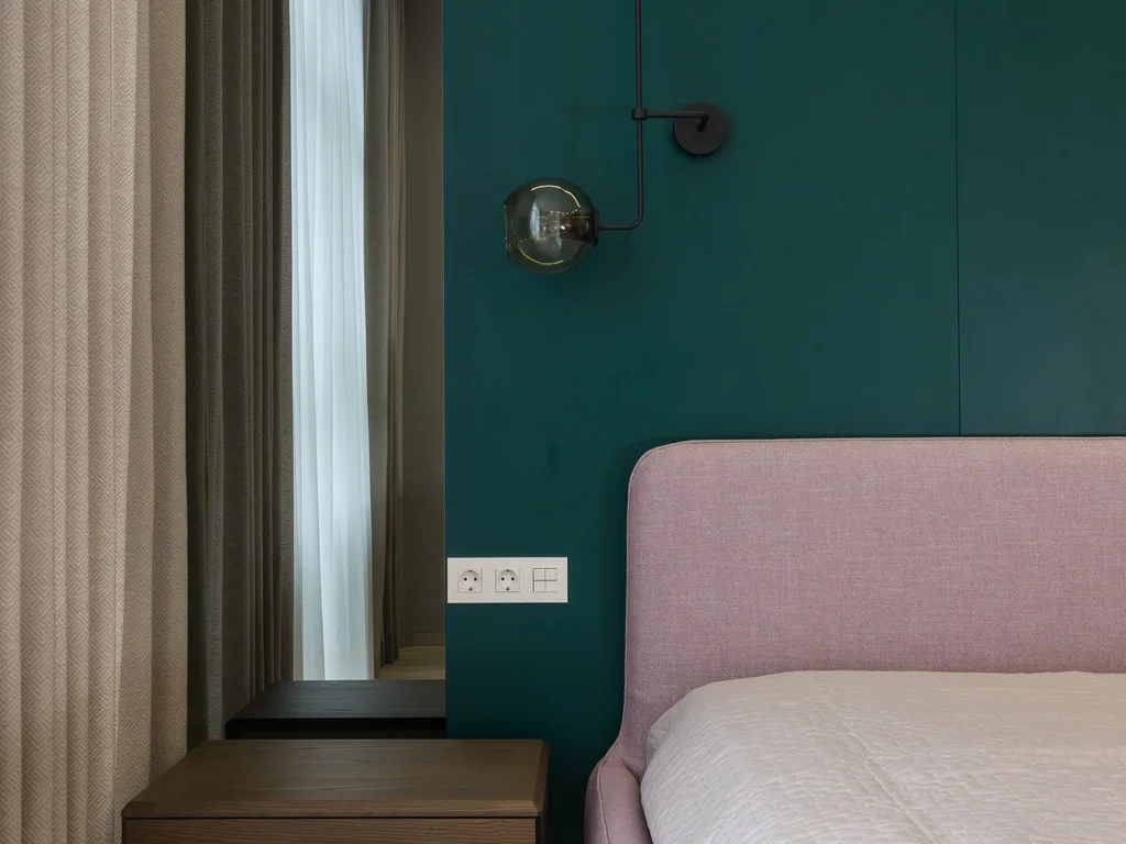
A cane-fronted door, rattan pendant or woven headboard brings honeyed texture that sage and olive need to avoid flatness, while physically lightening a small room. Two woven pieces, placed apart, set the character without turning the room into a theme.
66. Stone, Linen and Green: The Quiet Trio
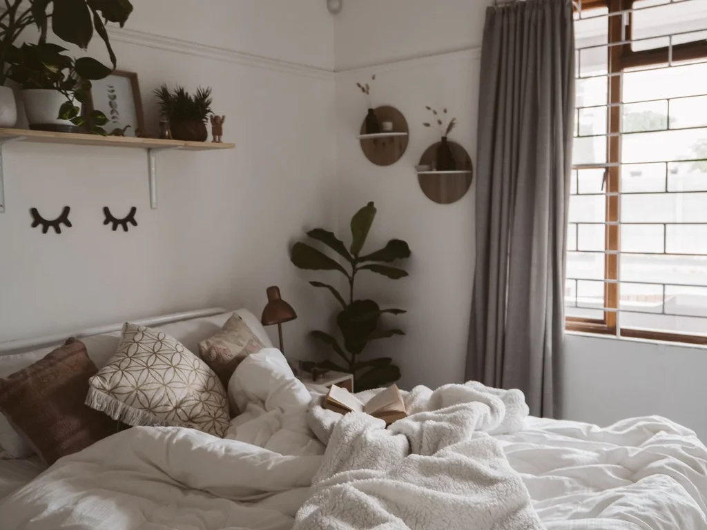
Mid green, stone-coloured linen bedding and one or two stone-effect objects — lamp base, tray, bookend — create a palette of undertone and texture that feels expensive and sleeps well. Keep patterns out entirely; interest comes from weave and depth of colour.
67. Green Painted Bed, Natural Wood Everything Else
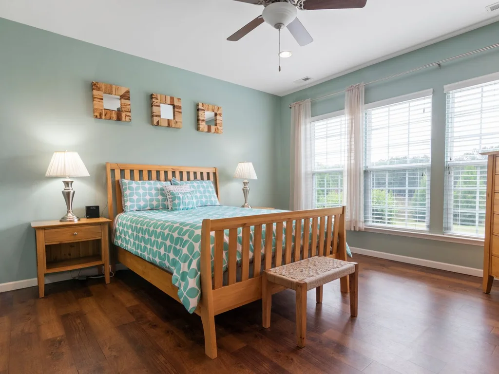
Paint a plain wooden bed frame in a confident mid or deep green and leave other furniture natural. It concentrates colour on the room’s largest furniture piece and upcycles a second-hand frame for a tin of paint.
68. Neutral Rug to Anchor a Green Scheme
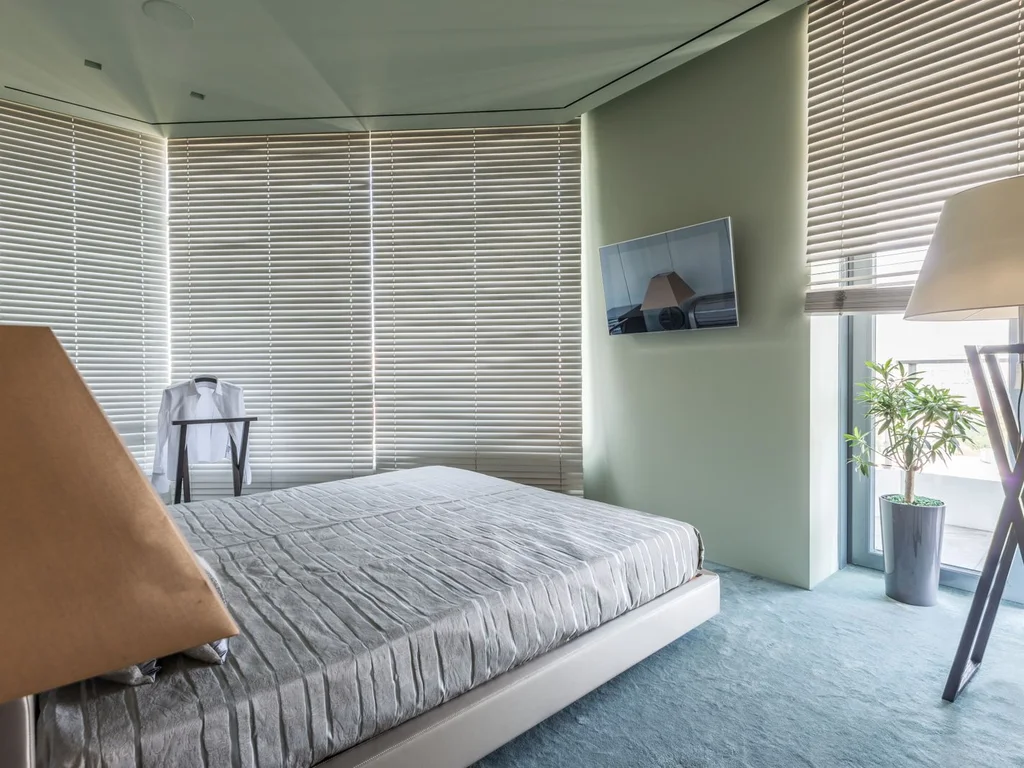
A large rug in oatmeal, undyed wool or subtle beige grounds green walls and gives wood furniture something calm to sit on. It sets the undertone at floor level for the whole scheme.
69. Mixing Wood Tones Carefully Around Green
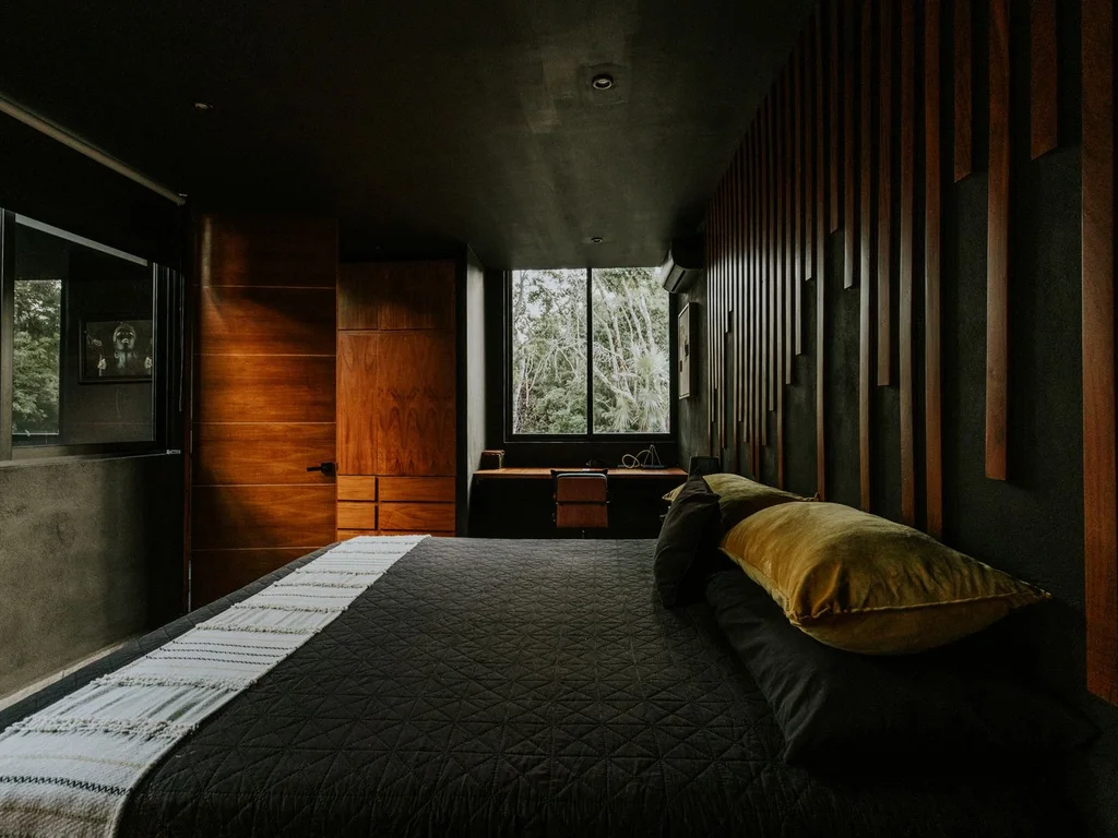
Light and dark woods can mix if green mediates: sage walls sit happily between an oak floor and walnut dresser because both relate to it. Repeat each wood tone at least twice and keep the green consistent.
70. Bare Wood and Green in a Minimal Room
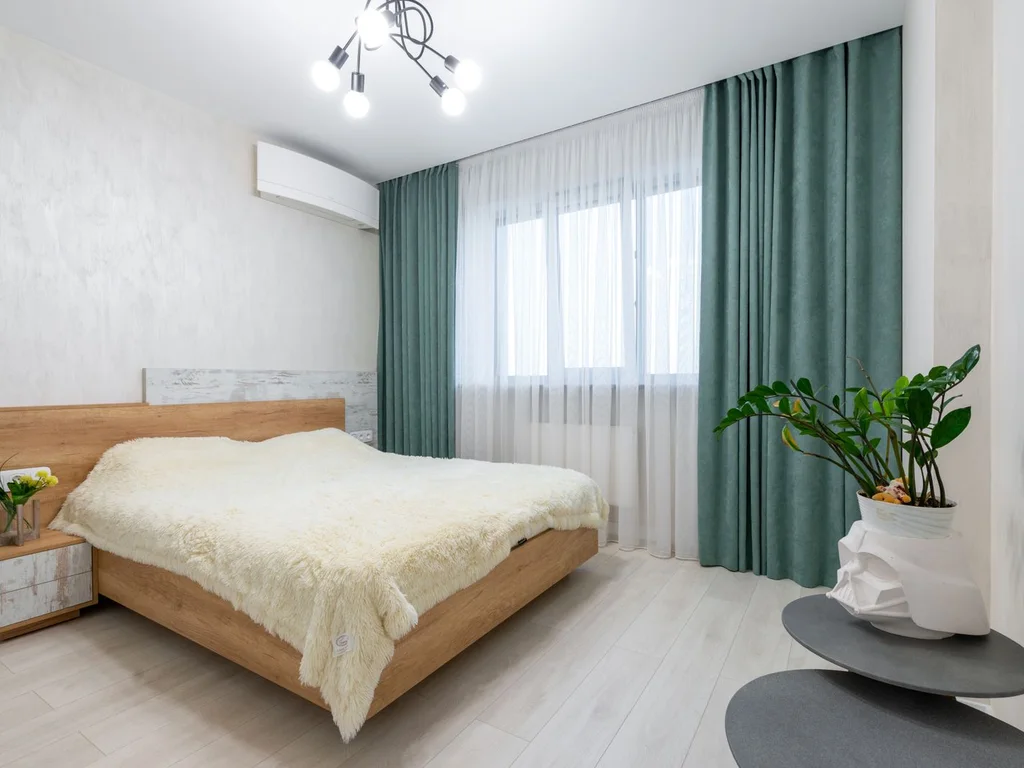
Strip back to three things: one green surface, natural wood furniture, plain cream bedding — nothing patterned, little on display. The green then feels like architecture, not decoration.
8. Green Wallpaper, Patterns and Art
Pattern gives a green bedroom personality without extra colours, letting you use several greens at once, held together by one design. Mind the scale: one large pattern, one small at most, and plain surfaces around them so the room can rest.
71. Botanical Print Wallpaper Behind the Bed
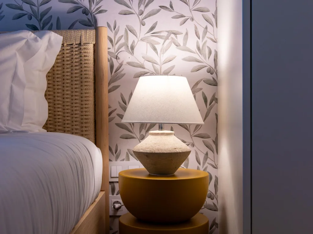
A leafy botanical wallpaper on the bed wall gives you many greens, arranged by a designer, in one application. Choose a cream background for light or a deep one for drama, then pull bedding colours directly from the paper.
72. Green Striped Wallpaper for Height

Fine vertical stripes in two greens, or green and cream, draw the eye up and make low ceilings feel taller. Stripes read as structure, forgiving older walls and mixed furniture.
73. A Mural-Style Green Landscape Wall
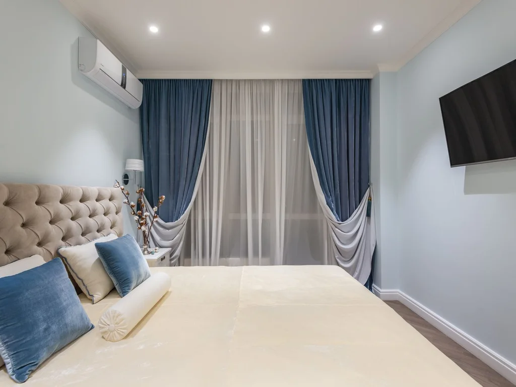
Large murals — misty forests, soft hills, washed oversized foliage — create depth flat paint cannot, suiting simple furniture. Treat the mural as the room’s artwork and keep everything else quiet.
74. Green Patterned Bedding on Plain Walls
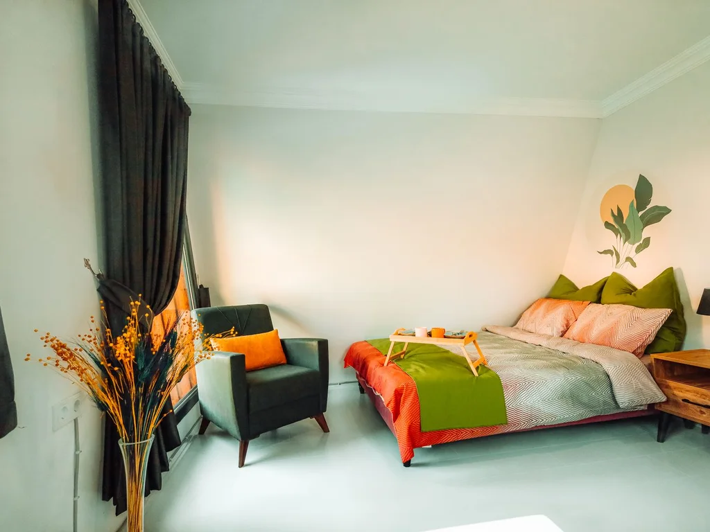
A patterned duvet — green floral, leaf print or fine stripe — delivers pattern at bed level, where it is easily changed. Plain sage or cream walls make it the star, and plain cushions in one of its greens tie the set together.
75. Artwork With Green as the Subject
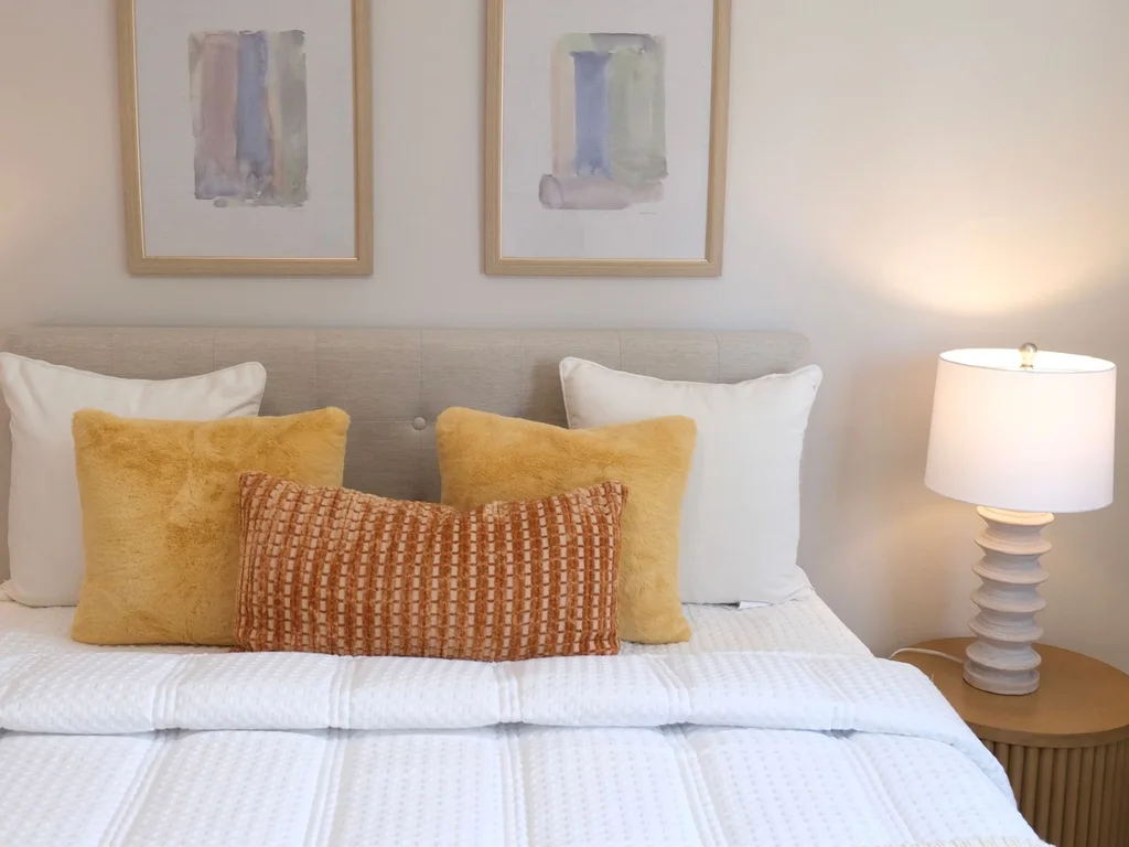
Large prints — landscapes, botanical studies, abstract greens — above the bed or dresser can set the palette of an otherwise neutral room. Choose art before textiles, then pull cushion and throw colours from it.
76. Mixing Two Patterns in the Same Greens
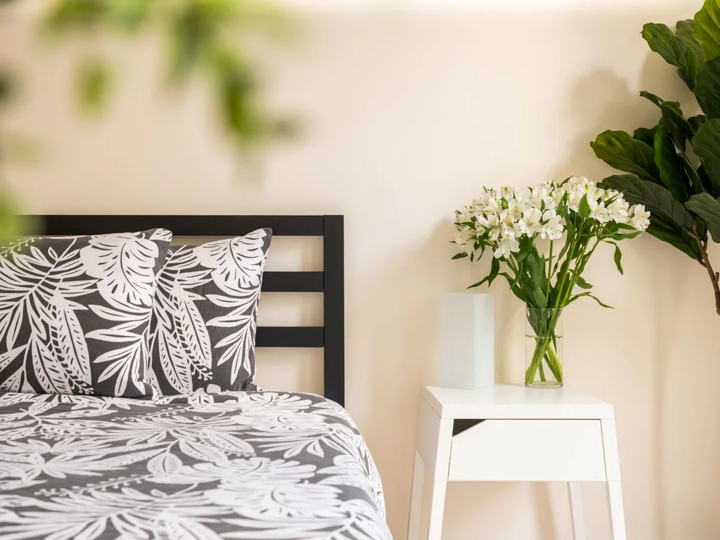
Two patterns can share a room if they share a palette and differ in scale: a large floral duvet with a small checked cushion, for example. Keep both backgrounds the same colour, such as cream.
77. Green Accents Carried Into an Ensuite
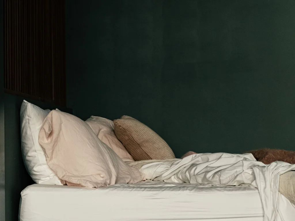
Where a bedroom meets an ensuite, echo one green across both — the bathroom’s green shade repeated in bedroom cushions or a throw — so the rooms feel planned as one suite. Match undertones, not exact shades; tile and fabric never read identically.
78. Vintage Green Prints and Second-Hand Pattern
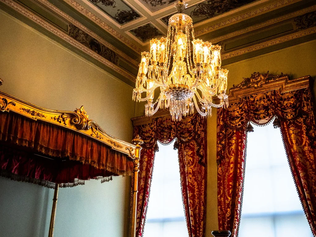
Old botanical prints, green glassware on a dresser and a pre-loved patterned quilt add collected character that matching new sets lack. Faded second-hand greens layer kindly with sage and olive.
79. A Green Accent Wall in Limewash or Textured Paint
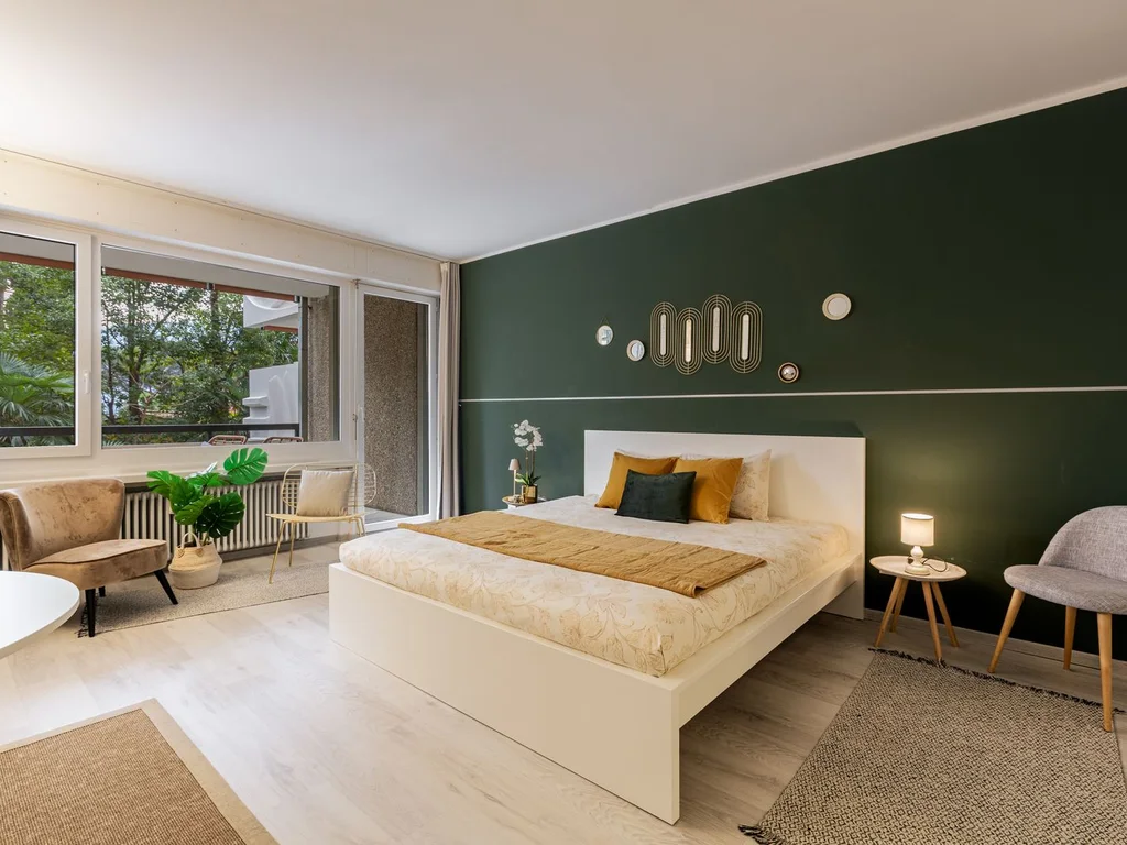
Limewash gives a green wall soft, cloudy movement that flat emulsion cannot, suiting sage, olive and pale greens. Subtle by day and richer at night, it also turns minor wall imperfections into part of the finish.
80. Patterned Green Rug as the Room’s Foundation
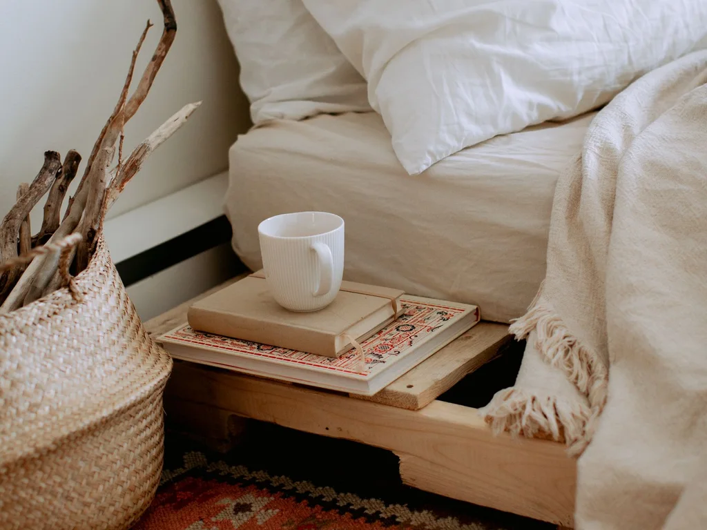
A green patterned rug — faded oriental, modern abstract or simple border design — can set the palette for plain walls and bedding. Lay the rug first, then choose paint and textiles from its colours.
9. Small and Apartment Green Aesthetic Bedrooms
Small rooms need colour in fewer, larger gestures, not less colour. One surface carrying green confidently, light furniture and pale bedding to keep light moving — that is the formula for a small green aesthetic bedroom, including rented apartments where painting is limited.
81. Pale Sage Everywhere in a Tiny Room
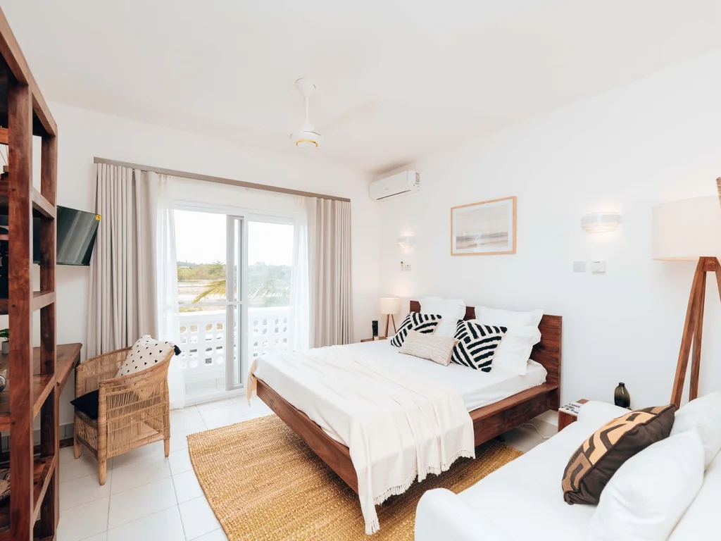
Painting walls, door and trim the same pale sage removes visual breaks that chop a tiny room up, making it read larger and calmer. Keep bedding cream and furniture light wood for airiness.
82. A Deep Green Wall in a Small Room, Done Right
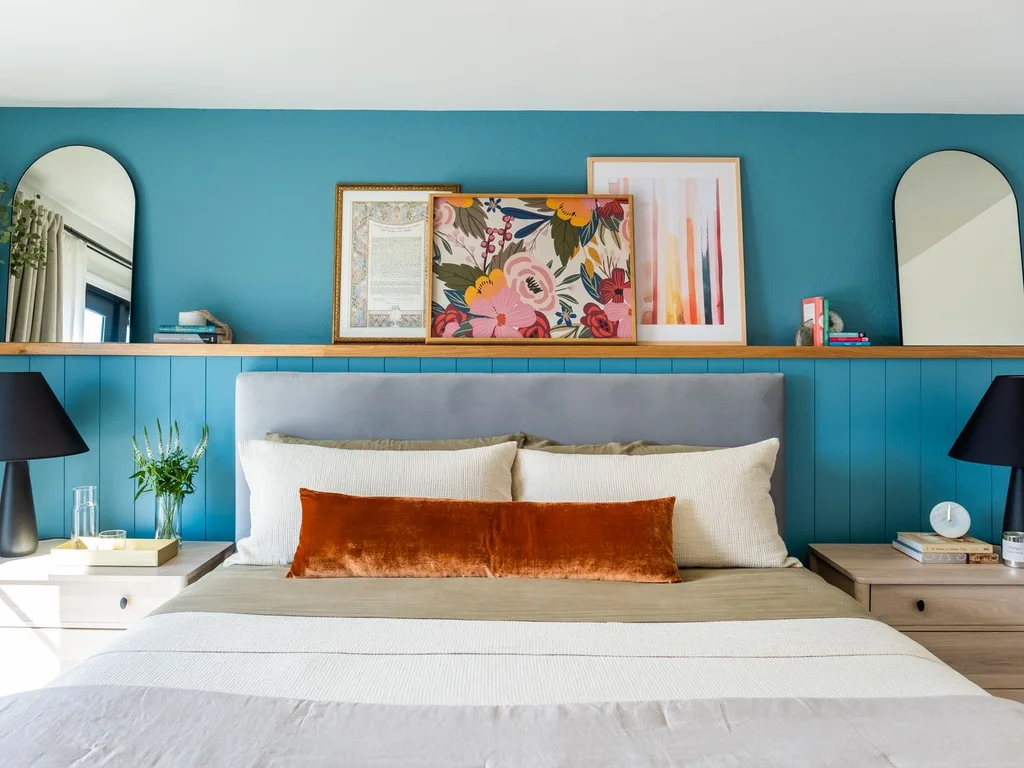
One deep green wall works in a small room if the bedding is light, other walls stay warm white and a mirror or pale art faces it. Choose the bed wall — it adds depth on entering and sits behind you while you sleep.
83. Green Bedding Only: The Studio Apartment Solution

In a studio, green bedding alone defines the sleeping zone without dividing the space. A sage or forest duvet read across the room says that corner is for rest.
84. Peel-and-Stick Green Wallpaper for Renters
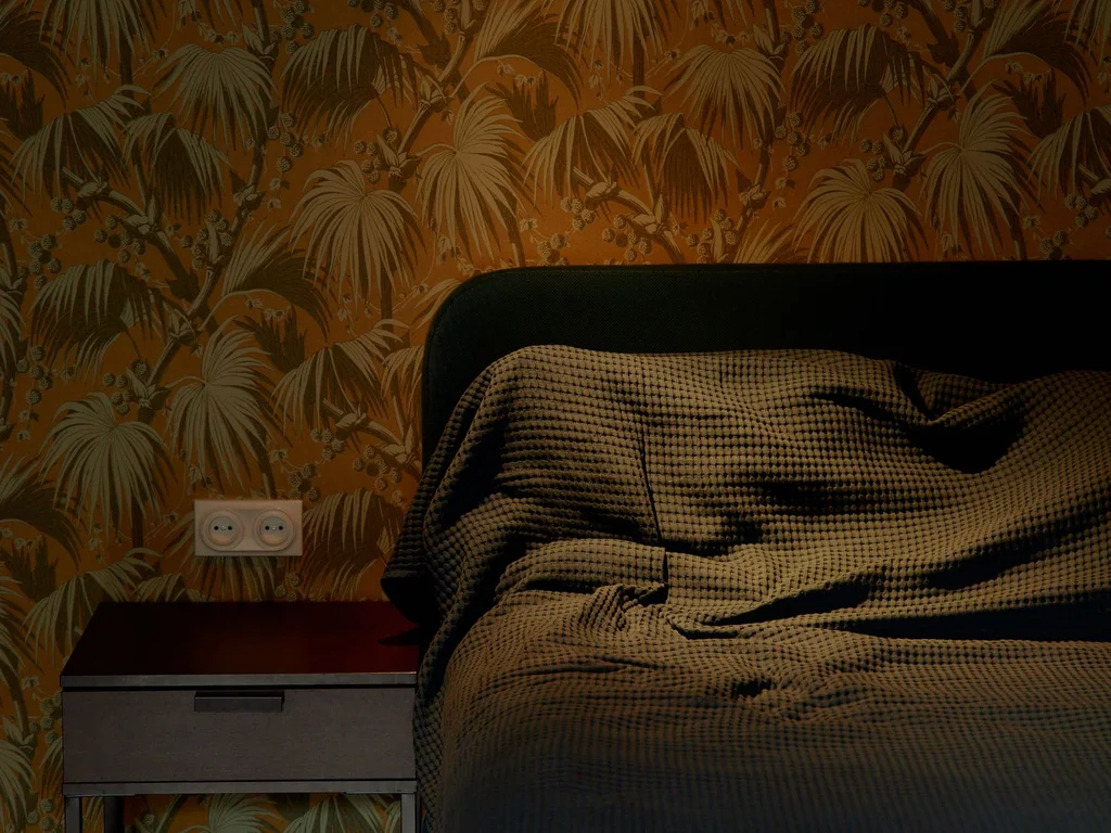
Removable wallpaper in a green print or plain texture gives renters an accent wall without risking a deposit, on one wall or inside alcoves. Buy one roll first and test removal behind furniture after a week — quality varies widely.
85. A Green Headboard Panel Instead of a Bed Frame
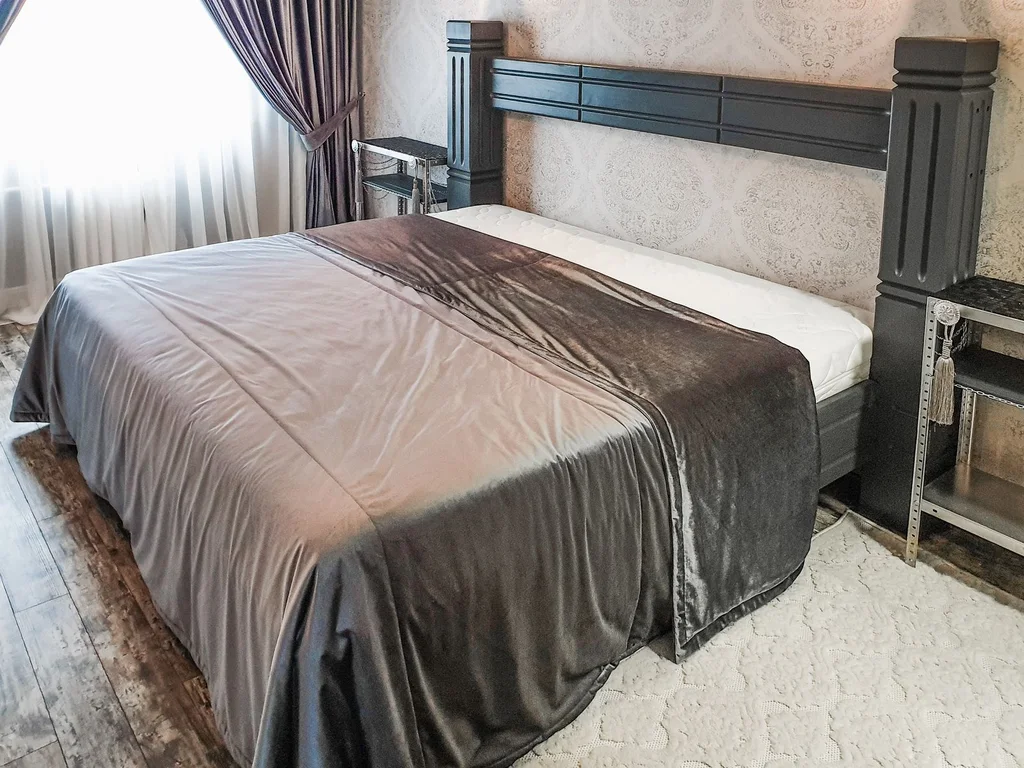
An upholstered or painted green panel fixed behind a plain divan creates an expensive-looking bed in very little depth — valuable in small rooms. Painted MDF in eggshell is the budget version; sage or emerald velvet-covered foam is the softer one.
86. Mirrors to Double a Small Green Room’s Light
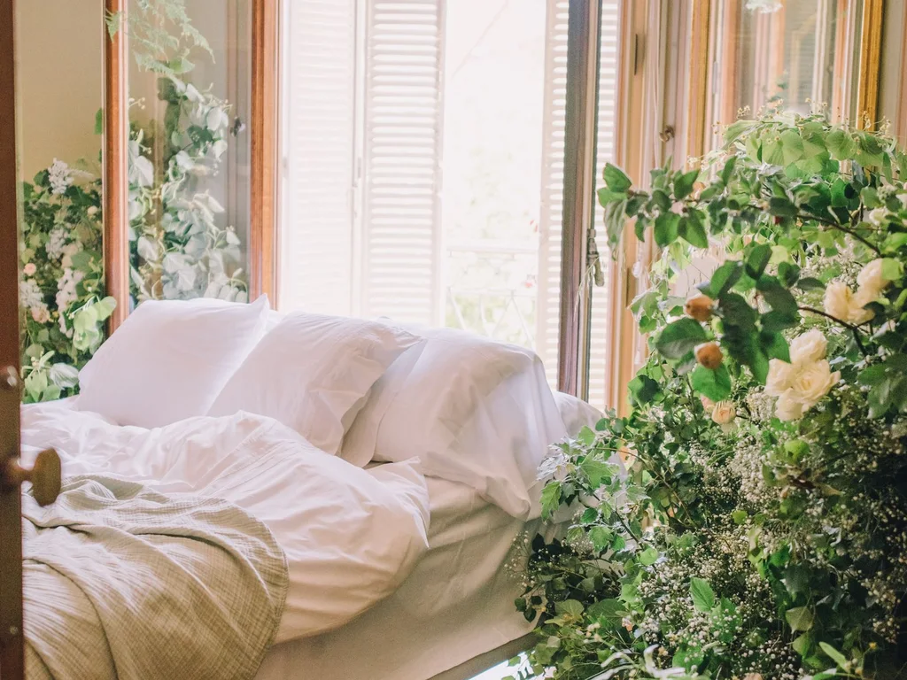
A mirror opposite or beside the window reflects daylight in and doubles the colour’s presence without more paint. Pale or unframed mirrors keep it light; brass links to a luxury scheme.
87. Green Storage That Earns Its Space
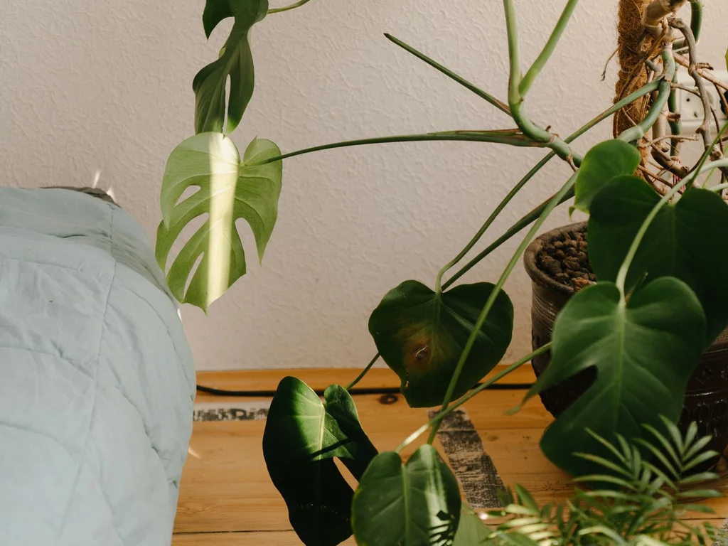
Storage dominates small rooms, so make it carry the palette: painted green drawers, sage boxes on shelves, an olive storage ottoman for bedding. When storage provides the colour, fewer decorative objects compete for the same surfaces.
88. One Colour, Every Textile: The Small-Room Shortcut
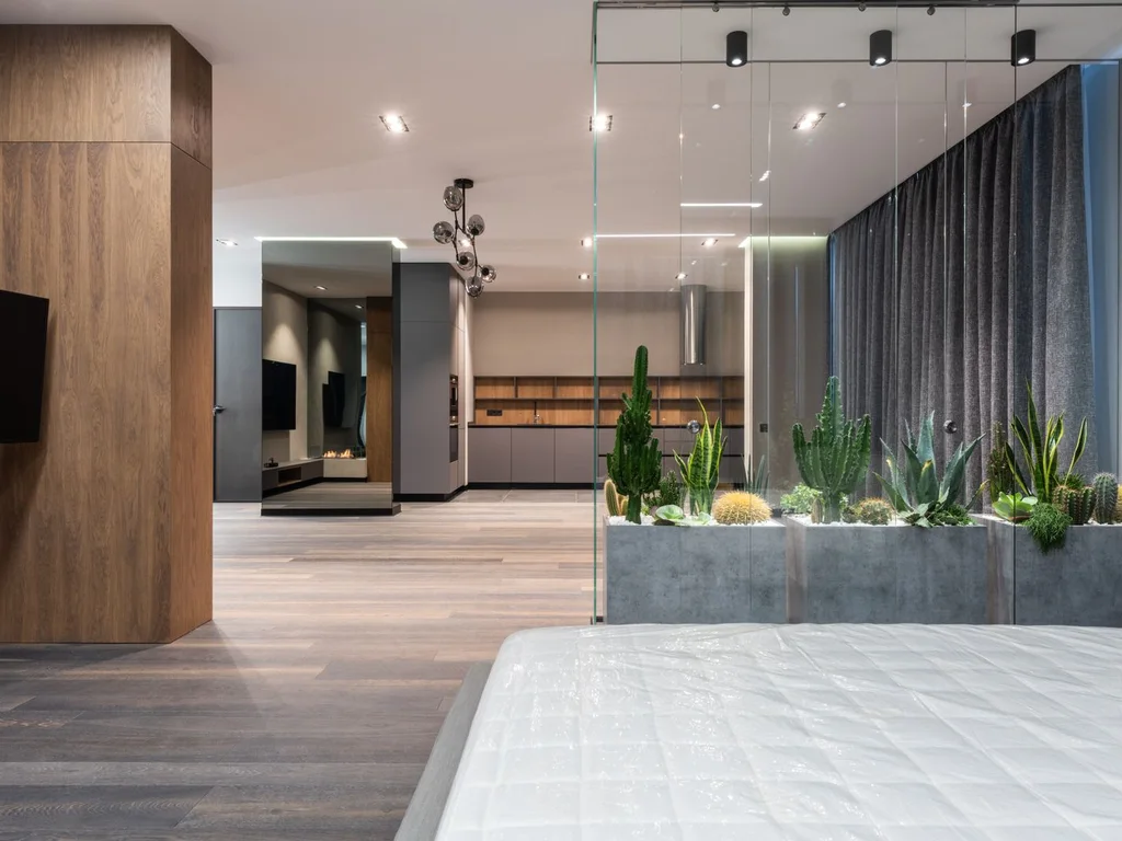
Use one green for bedding, curtains and cushions against neutral walls. Matching textiles look deliberate and spacious because the eye reads them as one scheme.
89. Light Green Above, White Below in a Box Room
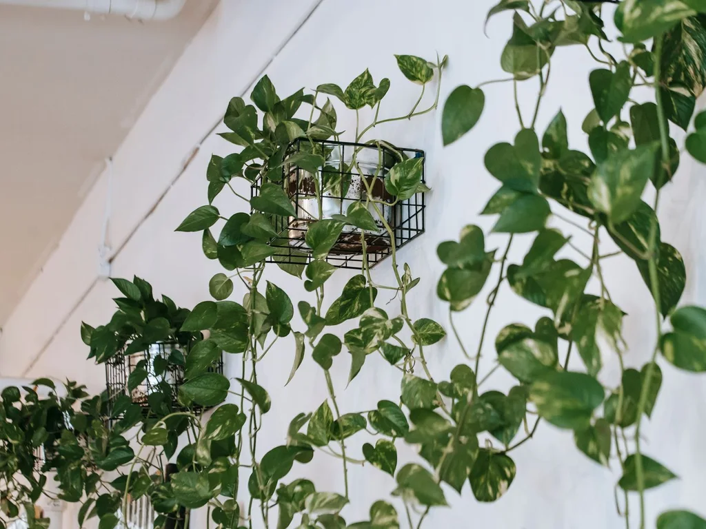
Paint upper walls and ceiling a very pale green tint and keep lower walls and woodwork white to lift a low box room without darkness at furniture level. Go paler than you think — ceiling colour reads stronger overhead.
90. Floating Furniture in Green Schemes
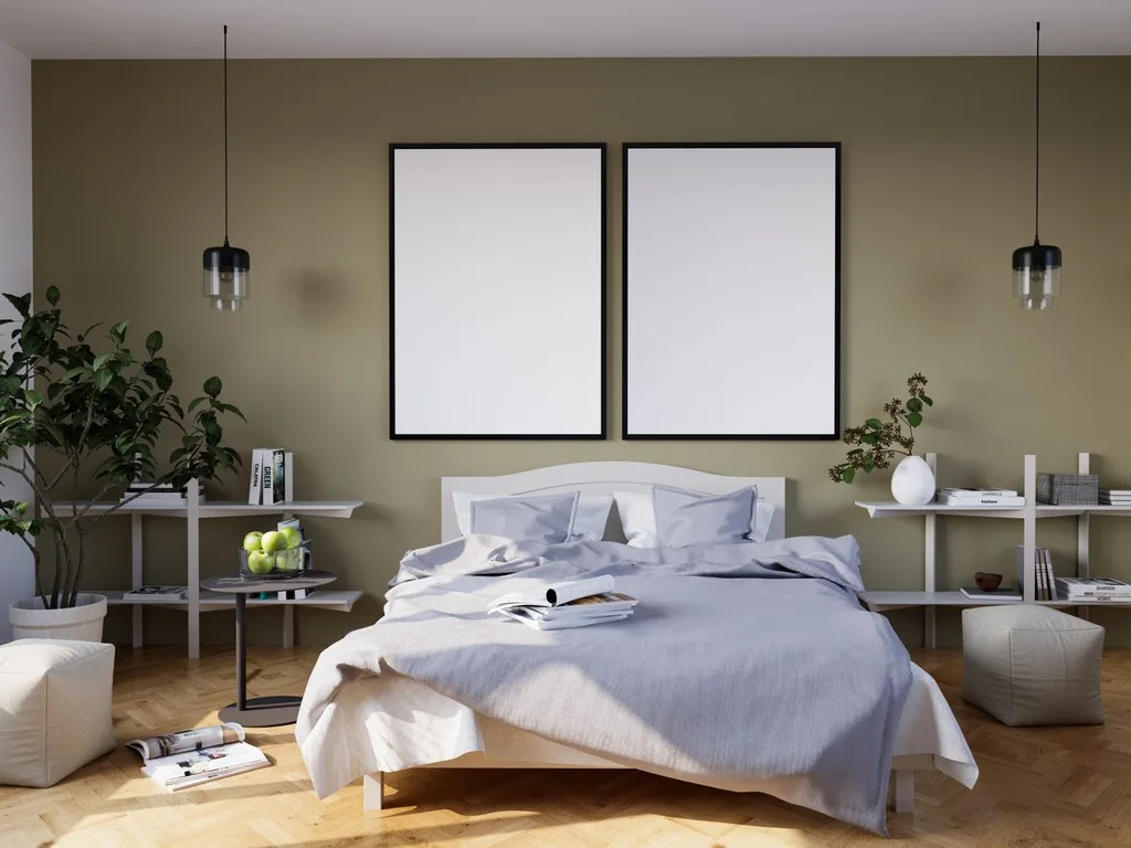
Wall-mounted nightstands, a folding desk and floating shelves keep floor visible, and visible floor makes rooms feel bigger. Paint a floating shelf your accent green and it disappears usefully into the scheme.
10. Green Aesthetic Updates on a Budget
Colour is one of the cheapest design levers: a tin of paint, a duvet set, a piece of furniture you already own, repainted. Spend largest surface first, smallest details last, and stop when the room reads green enough — most rooms need two of these, not ten.
91. Paint One Wall: The Biggest Change for One Tin

One tin of sage, forest or olive on the bed wall is the highest-impact, lowest-cost move in this guide. Sample carefully, because one wall concentrates colour, and choose eggshell to hide minor flaws.
92. A Green Duvet Set as an Instant Scheme
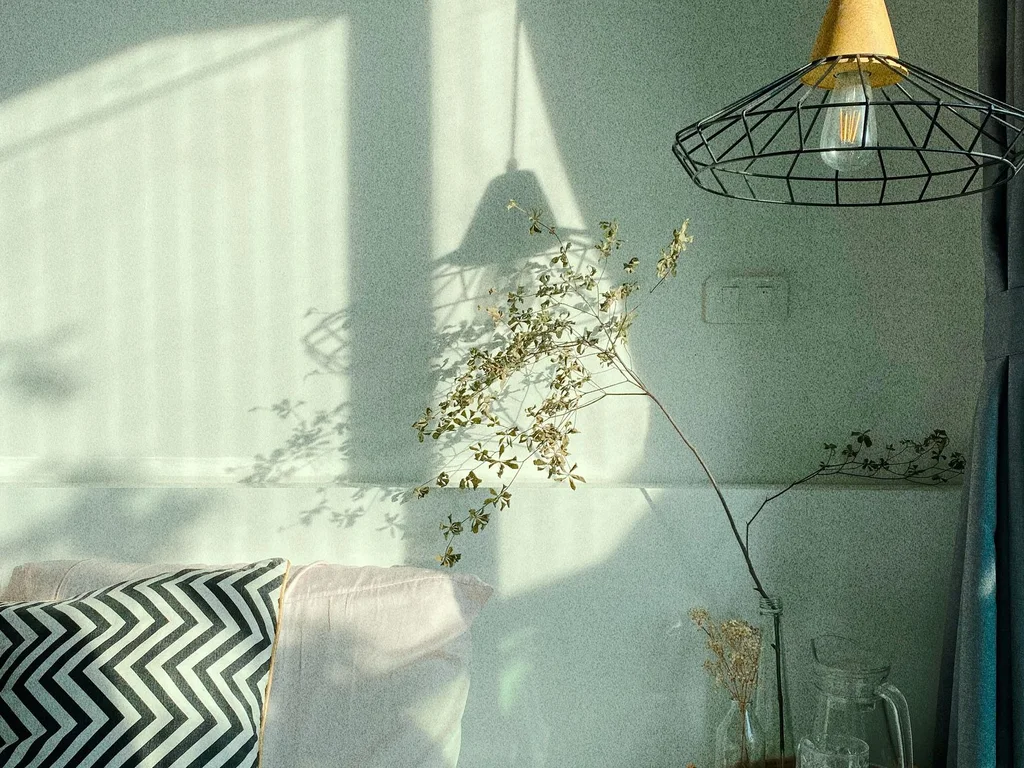
A sage, emerald or botanical-print duvet set changes the room’s largest surface for very little. Cotton or a cotton blend holds colour better than shiny microfibre, which makes strong greens look thin.
93. Paint a Second-Hand Dresser Green
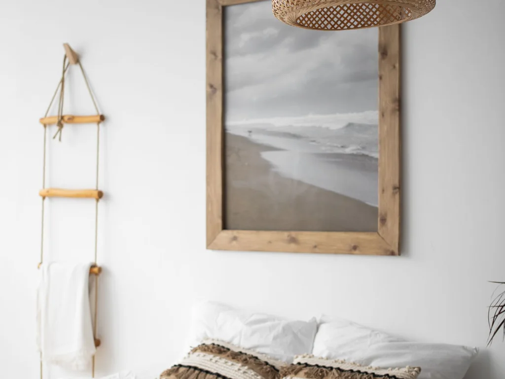
Second-hand dressers are plentiful, solid and transformed by green furniture paint and new handles. Olive and forest hide wear best; sage suits lighter rooms.
94. Cushions and a Throw in Three Greens
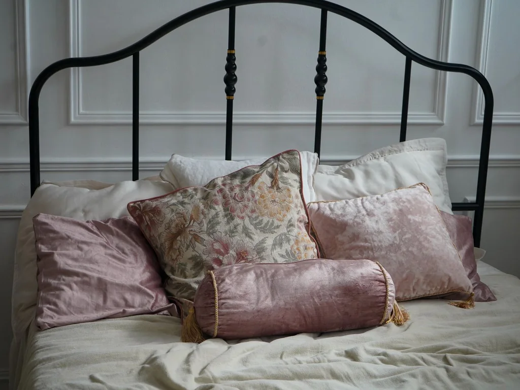
On a textile-only budget, buy three pieces in three depths of one family — pale cushion, mid throw, deep cushion — and arrange them on plain bedding. The gradient looks curated for little money, especially buying covers only and reusing inserts you own.
95. Green Curtains From the Sale Rail
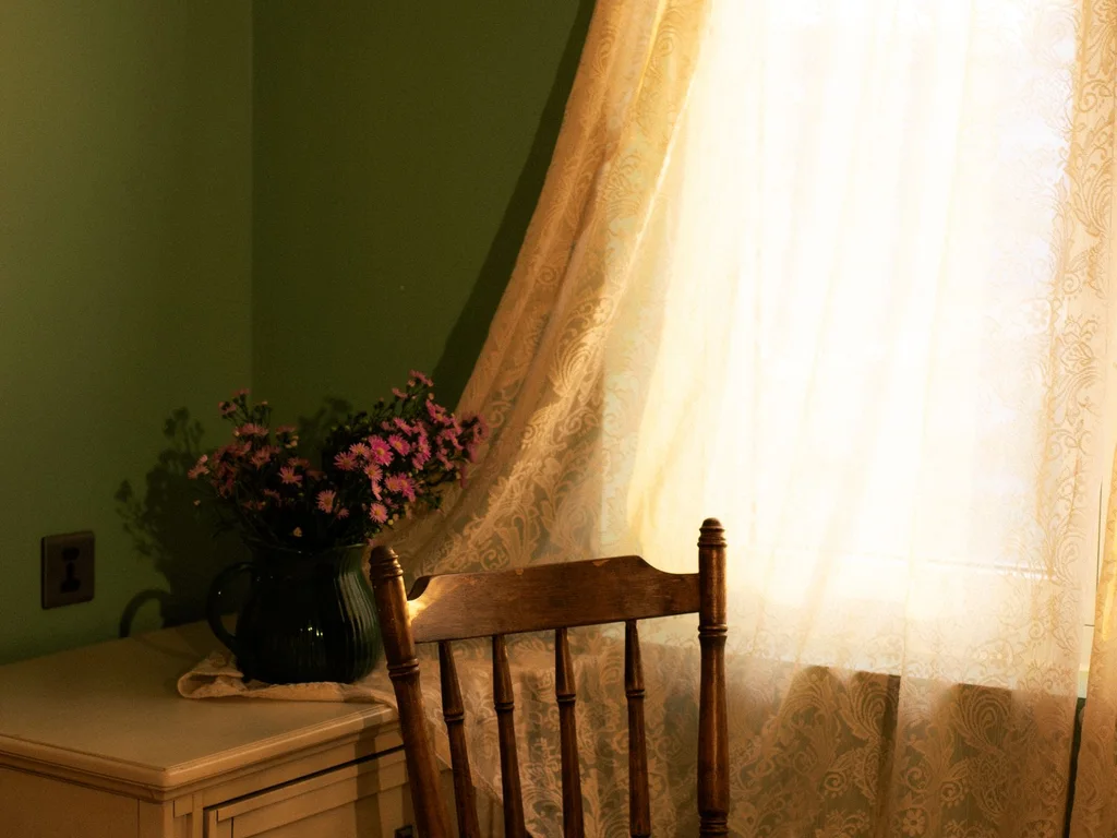
Curtains cover a lot of wall for their price, and end-of-line green linen-look curtains are a sale-rail staple. Measure generously so they look full, and hang high and wide.
96. Swap Lampshades and Bulbs Before Anything Else
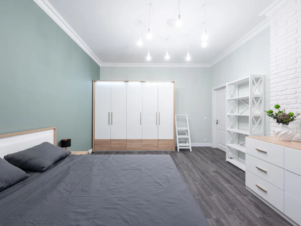
A green lampshade casts tinted, atmospheric light that test-drives a colour direction cheaply, and warm 2700K bulbs flatter any green you later paint. Live with the evening light for a week if you are torn between sage and forest — the decision will make itself.
97. Print-and-Frame Botanical Art at Home
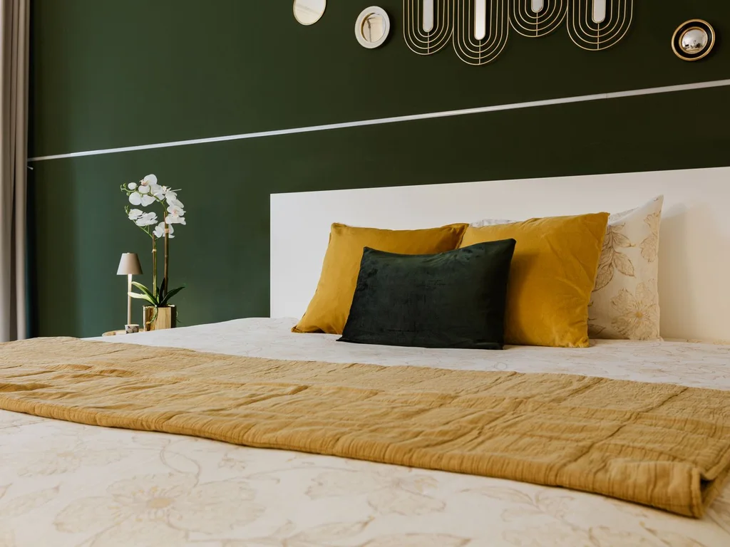
Public-domain botanical illustrations and landscape photographs print at copy-shop prices and look considered in matching second-hand frames painted black or wood-stained. A pair or trio in consistent frames reads as stylist-chosen at any budget, if the greens stay close to your palette.
98. A Painted Headboard Shape on the Wall

An arch, rectangle or half-circle painted green behind the pillows imitates a headboard for a sample pot and masking tape. It suits spare and rental rooms with plain, sound bed frames.
99. Green Bedding Layers From What You Own
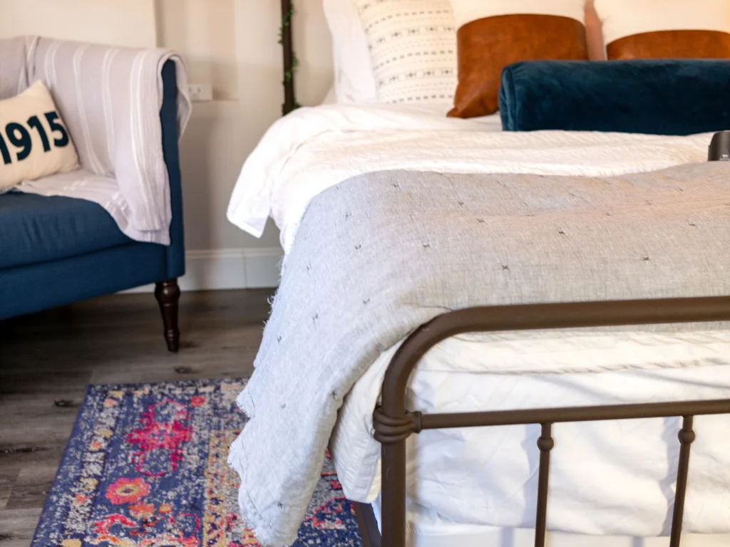
Before buying, gather every green textile in the house — sofa throw, spare cushions — and try layering them on the bed. Many schemes are already owned, just scattered.
100. The Painted Door: A Low-Risk Focal Point
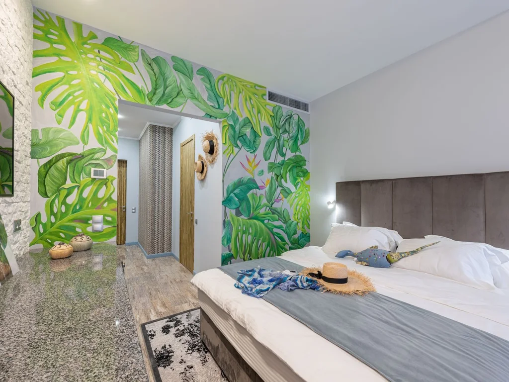
Paint the inside of the bedroom door — and wardrobe doors, if you like — in a confident green, leaving walls neutral. Doors are small, flat and quick to repaint, so they are the safe place for the deep shade you feared on a wall, and the scheme can grow from there.
Green Aesthetic Bedroom Mistakes to Avoid
Most disappointing green bedrooms share a few causes, and none is the colour itself:
- Testing on the card, not the wall. Green shifts more than most colours between daylight and lamplight. Paint large samples on two walls and check morning and night.
- Mixing warm and cool greens at random. Decide your family — warm olive, moss and pistachio, or cool sage, mint and emerald — and keep purchases inside it.
- Using bright white with mid and dark greens. Stark white greys sage and harshens emerald. Warm white and cream are almost always better partners.
- Too many greens, none repeated. A colour used once looks like a mistake; used three times, it looks like a scheme. Repeat your lead shade, then stop.
- Forgetting the light. Deep green with cool bulbs and heavy curtains becomes a cave. Warm bulbs, a mirror and pale bedding make dark schemes work.
- Pattern everywhere. Patterned wallpaper, bedding and rug in one small room compete all night. One hero pattern, supported by plains.
- Matching everything exactly. Identical greens in paint, fabric and furniture look flat, because materials render colour differently. Aim for close shades and varied textures.
Fix existing problems in that order — undertone, repetition, then light. Most green schemes are one cream bedding set and one warm bulb away from working.
Frequently Asked Questions About Green Aesthetic Bedrooms
Which green shade is best for sleep?
Soft, grey-leaning greens such as sage and muted eucalyptus are most restful, reading calm in low light. Saturated or yellow-heavy greens can feel energising. Deep forest also sleeps well if bedding is light and lighting warm — brightness at eye level matters more than wall colour.
Sage green or emerald green — how do I choose?
Choose sage for a light, flexible room that works across seasons and bedding changes. Choose emerald for a defined, dramatic room built around cream bedding, warm metals and warm light. Small or north-facing? Start sage. Large, sun-filled and bland? Emerald adds character.
Can I use dark green in a small bedroom?
Yes — on one wall, or all walls if bedding is pale, the ceiling stays light and a mirror moves daylight around. The bed wall is safest: it adds depth on entering and sits behind you as you sleep. Keep curtains light in dark schemes.
What colours pair best with a green aesthetic bedroom?
Cream and warm white suit every green. Then match by undertone: sage with blush, grey and light oak; emerald and forest with brass, cream and walnut; olive with terracotta, mustard and cream; mint with white, rattan and pale grey. Use navy and black sparingly as sharpeners.
Should I choose warm or cool greens?
Let the room decide. North-facing, low-light rooms usually suit warm, yellow-based olive, moss and pistachio, which counter blue daylight. Bright south-facing rooms can take cooler sage, mint and emerald. Judge your sample at the time of day you use the bedroom most.
What colour bedding works with green walls?
Cream or warm white bedding works with every green and is the right default, especially against mid and dark walls. With pale sage or mint, white feels fresh, deeper green gives a tonal layered look, and a cream-based botanical print adds pattern. Avoid a second unrelated strong colour.
What paint finish is best for a green bedroom?
Flat matt or soft eggshell for walls: matt hides imperfections and makes deep greens velvety; eggshell’s slight sheen suits pale greens and wipes clean. Use satin or eggshell furniture paint on wardrobes and doors. Keep gloss for tiny accents only — shine hardens green and shows marks.
How can renters get a green aesthetic bedroom without painting?
Concentrate green in things that leave with you: duvet set and throw, full-length curtains, a large framed print, a painted piece of your own furniture, and peel-and-stick wallpaper if your agreement allows. Repeat the shade three times across textiles and a rental room looks fully designed.
Which green is best for a north-facing bedroom?
Warm-based greens: olive, moss and sage paired with warm white rather than blue-white. North light is cool and grey, so it drains blue-based greens — mint and cool emerald can look chilly or slightly grey. Paint a large sample on the wall that gets least light and check it in the morning and evening before you decide.
Conclusion
A green aesthetic bedroom is not about chasing a trend. It is choosing one shade with a clear undertone, pairing it with cream or warm neutrals, and repeating it with a little discipline until the room feels settled. Start where your confidence is — a duvet set, a calm sage room, or a forest wall — and mix sections freely.
Ready for the next layer? Our guide to bedroom accent wall ideas will help you plan a feature wall that works with your green. Pick your shade this week, test it properly, and make the first change.