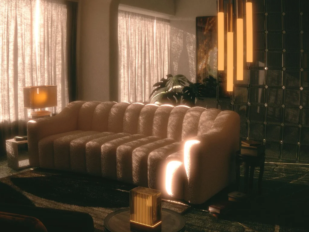
A beautiful home is rarely about one perfect room. It is about the feeling you get walking from room to room — colours that talk to each other, textures that repeat just enough, and a style that feels intentional without feeling staged. This guide collects 100 home decor aesthetic ideas for building that kind of cohesion, whether your taste runs minimal, warm modern, cottage, boho, coastal or moody and vintage.
Start by choosing one direction and letting it guide every later decision, from paint to pillow covers. If you love plant-filled rooms, our greenery bedroom ideas show how greenery fits a cohesive look, and our small bedroom design ideas prove that cohesion matters even more in compact spaces. For wider inspiration on whole-home styles, House Beautiful’s design inspiration is a reliable place to study how designers repeat a look across rooms.
Not sure what your aesthetic is? Read the style sections first — Minimal and Calm Aesthetics, Warm Modern and Japandi, Cottage and Romantic, Boho and Eclectic, Coastal and Airy, Dark Academia and Moody, and Vintage and Character — and notice which one you keep returning to. That instinct is your aesthetic. Then apply the colour-story and texture sections in that style’s language, and use the final section to carry it through every room.
In this guide: Choosing Your Home’s Colour Story · Texture Layering That Feels Rich · Minimal and Calm Aesthetics · Warm Modern and Japandi · Cottage and Romantic · Boho and Eclectic · Coastal and Airy · Dark Academia and Moody · Vintage and Character · Cohesion Across Rooms
How to Choose Your Home Aesthetic in 4 Steps
Step 1 — Collect before you commit. Save 20–30 photos of rooms you love over a week, without analysing them. Then look for the pattern: the same colours, woods and shapes will keep appearing — that pattern is your taste, stated honestly.
Step 2 — Name it loosely. Match your pattern to the closest style family in this guide — Japandi calm, cottage softness, boho layers, coastal light, moody depth. ‘Loosely’ matters: a name is a compass, not a rulebook, and most real homes blend two neighbouring styles.
Step 3 — Fix the palette and one texture. Choose your three colours and one signature texture (linen, boucle, rattan, velvet). Every later purchase gets tested against those two decisions, which is what keeps a home cohesive without effort.
Step 4 — Apply room by room, repeat the threads. One accent colour, one wood tone and one metal repeated in each room stitch separate rooms into one aesthetic — even if each room’s main colour differs.
The Main Aesthetics, Compared
| Aesthetic | Colours | Key materials & textures | Best for |
|---|---|---|---|
| Minimal | White, warm grey, black accents | Smooth wood, glass, matte finishes | Small rooms, calm minds, easy cleaning |
| Japandi | Beige, sand, soft white | Light oak, linen, paper, bamboo | Serene bedrooms and uncluttered living rooms |
| Cottage | Cream, sage, dusty pastels | Painted wood, floral cotton, wicker | Cosy kitchens and welcoming hallways |
| Boho | Terracotta, mustard, warm neutrals | Rattan, jute, macramé, layered textiles | Relaxed living rooms full of plants |
| Coastal | White, sand, sea blues | Driftwood, linen, rope, seagrass | Bright rooms and holiday-light feelings |
| Moody | Charcoal, deep green, navy | Velvet, brass, dark wood | Dining rooms, studies and dramatic bedrooms |
| Vintage | Warm whites, faded jewel tones | Aged brass, marble, carved wood | Character homes and collectors’ corners |
Which aesthetics blend? Neighbours mix best — Japandi with Minimal, Cottage with Vintage, Boho with Coastal. Opposite poles, like Moody with Coastal or Minimal with Boho, fight unless one clearly leads and the other appears only as an accent.
1. Choosing Your Home’s Colour Story
1. Pick One Palette of Three Colours for the Whole Home
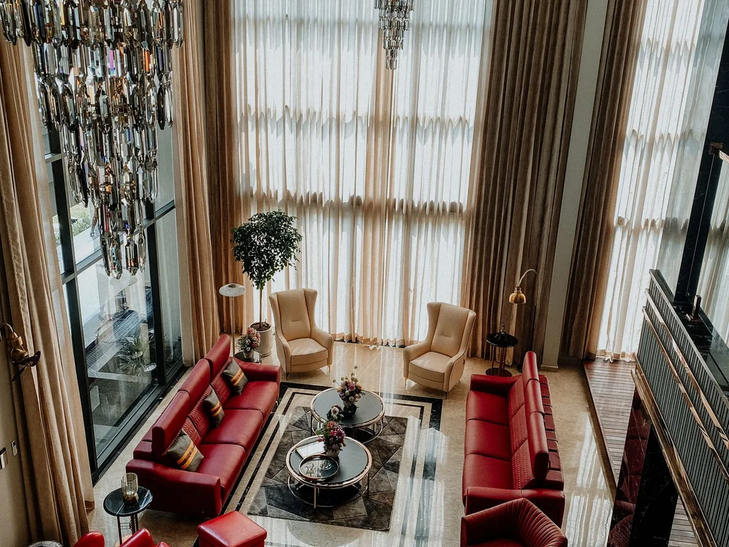
Choose a main neutral, a supporting colour and one accent, then use them in every room in different proportions. A kitchen may be mostly cream with sage accents, while the bedroom reverses the balance. The shared palette is what makes separate rooms feel like one home instead of a collection of unrelated spaces.
2. Build on Warm Neutrals for an Instantly Calm Base
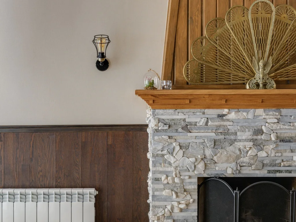
Warm whites, oatmeal, sand and soft taupe forgive mismatched furniture and make bold pieces feel welcome. Paint large surfaces in these tones and let colour arrive through smaller, cheaper items like cushions and art. When you tire of an accent, swapping textiles refreshes the home without repainting anything.
3. Try Cool Neutrals for a Crisp, Modern Feeling
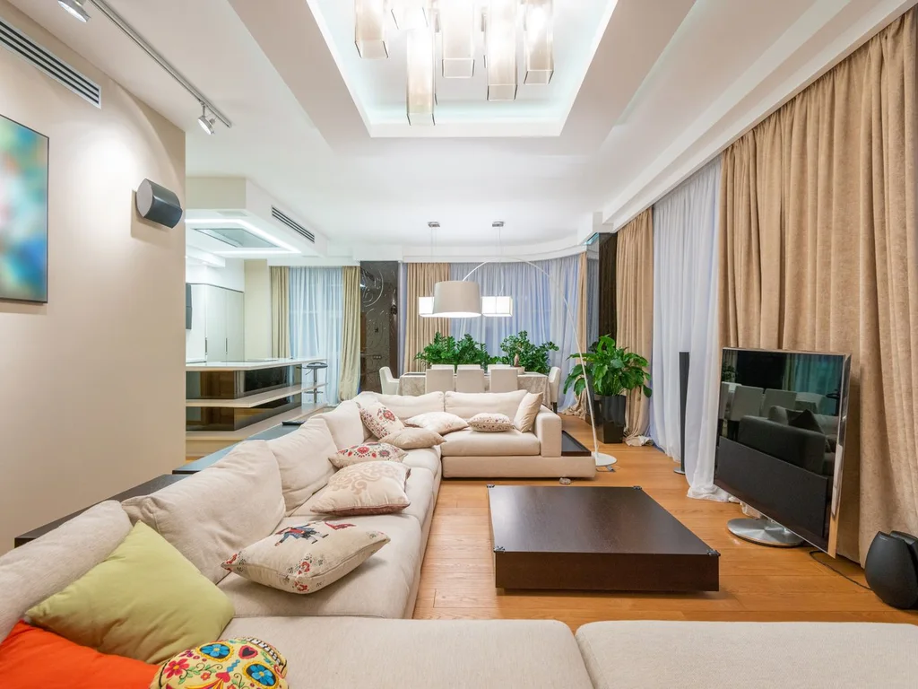
Cool greys, pale blues and crisp whites suit homes with strong daylight and simple furniture. Balance the coolness with warm wood and soft textiles, or the rooms can feel clinical. One warm element per room — an oak stool, a wool throw, a brass lamp — keeps a cool palette feeling like a home.
4. Use Earthy Terracotta and Clay Tones for Warmth
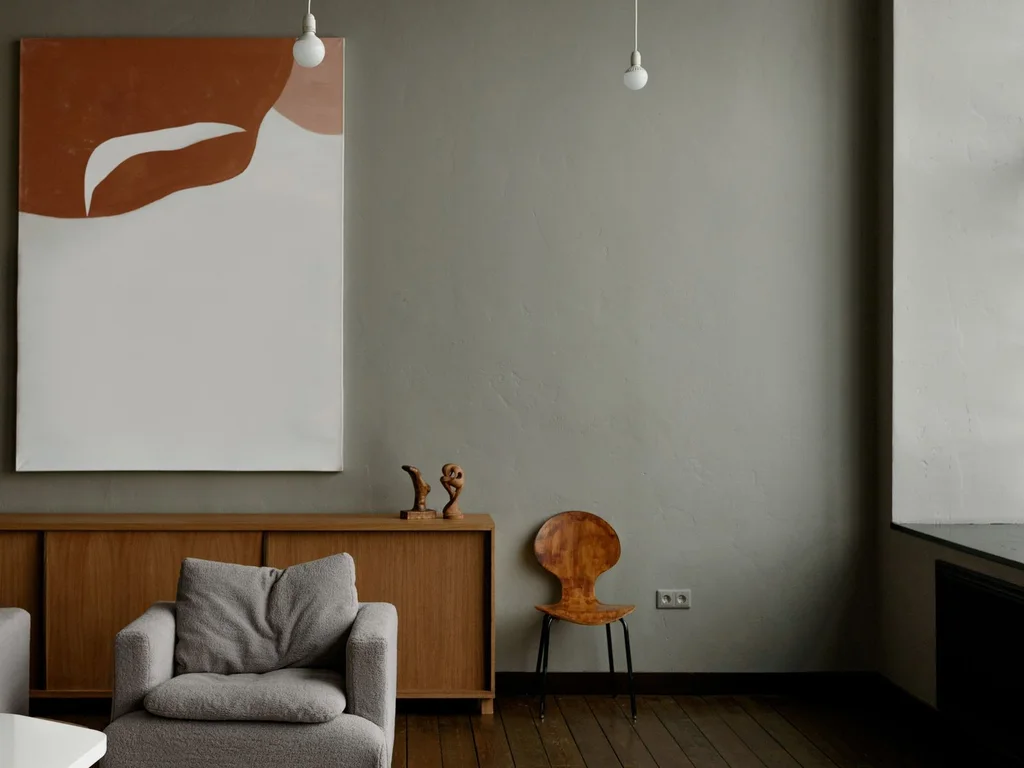
Terracotta, clay, rust and warm ochre bring Mediterranean warmth without shouting. Use them in pottery, a feature cushion or a single painted wall, and pair them with cream and natural wood. The effect is sunlit and grounded, especially in homes with wooden floors and plenty of daylight.
5. Layer One Colour in Many Shades for Depth
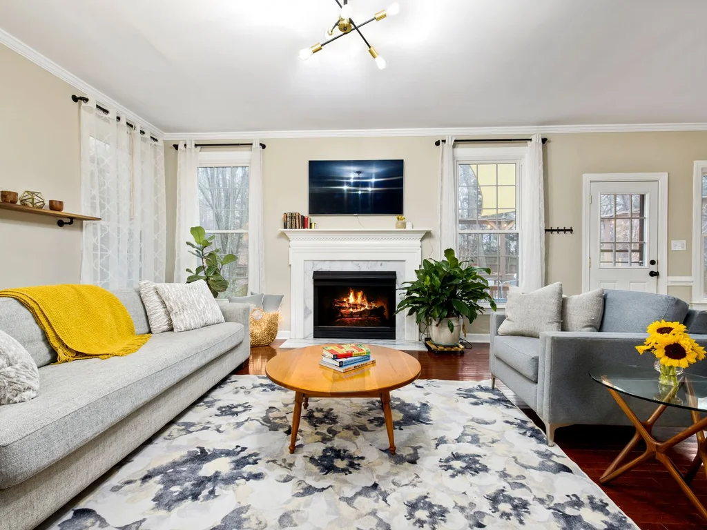
Monochrome does not mean boring. Layering sage with olive and deep forest, or blush with rose and burgundy, creates depth while keeping the palette disciplined. Keep the lightest shade dominant, the darkest as an accent, and let middle tones bridge furniture, textiles and walls.
6. Follow the Two-Colour Rule in Small Rooms
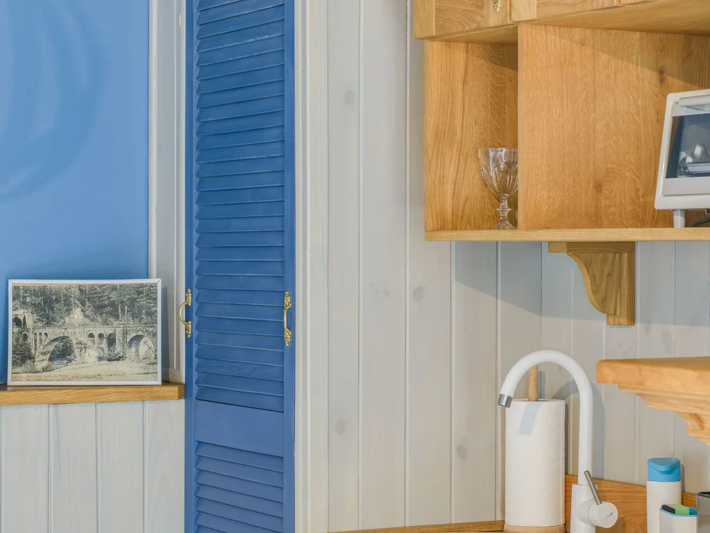
In compact rooms, limit the palette to two colours plus a neutral. Fewer colours mean fewer visual breaks, so the eye travels smoothly and the room reads larger. Add interest through texture instead — a ribbed cushion, a woven basket, a matte ceramic — rather than another colour.
7. Repeat One Accent Colour in Every Room
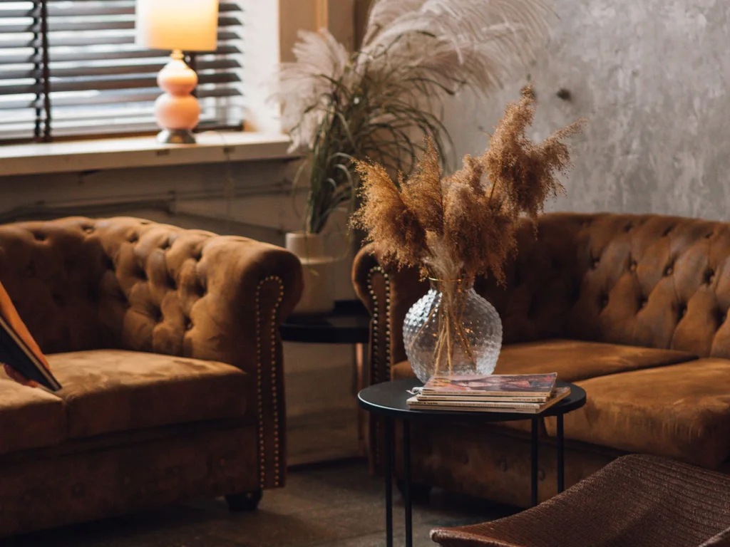
A single repeated accent — brass, forest green, burnt orange — acts like a thread stitching rooms together. It can appear as a vase in the living room, a towel in the bathroom and a frame in the hallway. The repetition is subtle, but visitors feel the cohesion even if they cannot name it.
8. Test Paint Swatches in Morning and Evening Light
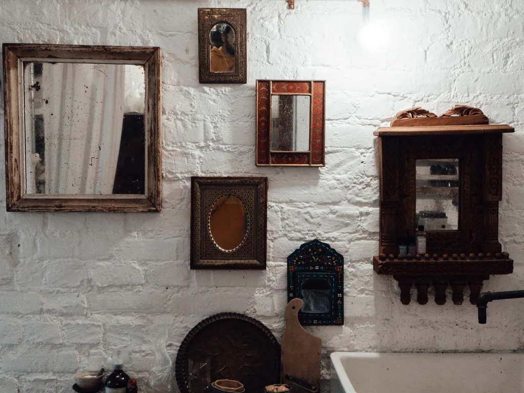
Paint changes completely between morning sun and evening lamps. Test large swatches on two walls and live with them for three days before committing. A colour that looks serene at noon can turn cold or muddy by night, and catching that early saves an entire repaint.
9. Let Hallways Carry the Transition Colour
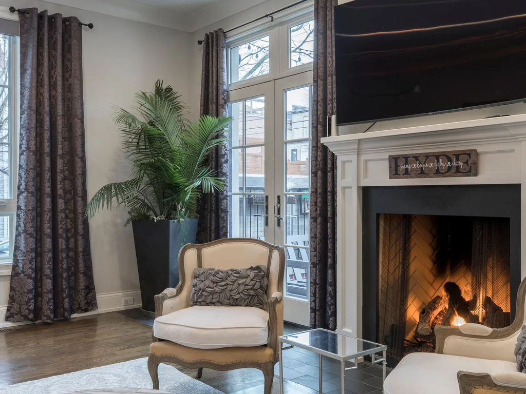
Hallways are the bridges between rooms, so paint them in a tone that sits comfortably beside both neighbours. A soft neutral that appears in each adjoining room prevents jarring jumps. Add one framed print in each room’s accent colour to make the journey feel deliberately designed.
10. Swap One Seasonal Accent Instead of Redecorating
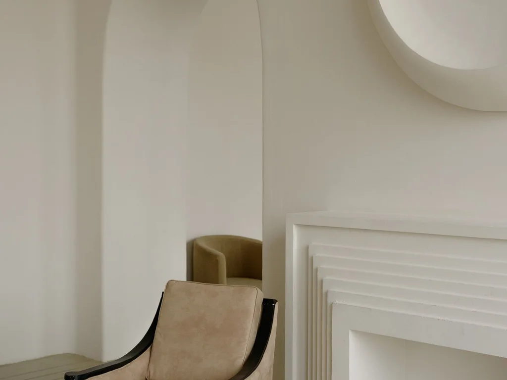
Keep the base palette permanent and change only one accent each season: mustard cushions in autumn, fresh green in spring, deep red at Christmas. The home feels new four times a year for the price of a few covers and candles, while the underlying aesthetic stays calm and consistent.
2. Texture Layering That Feels Rich
11. Mix Linen and Wool in the Same Room
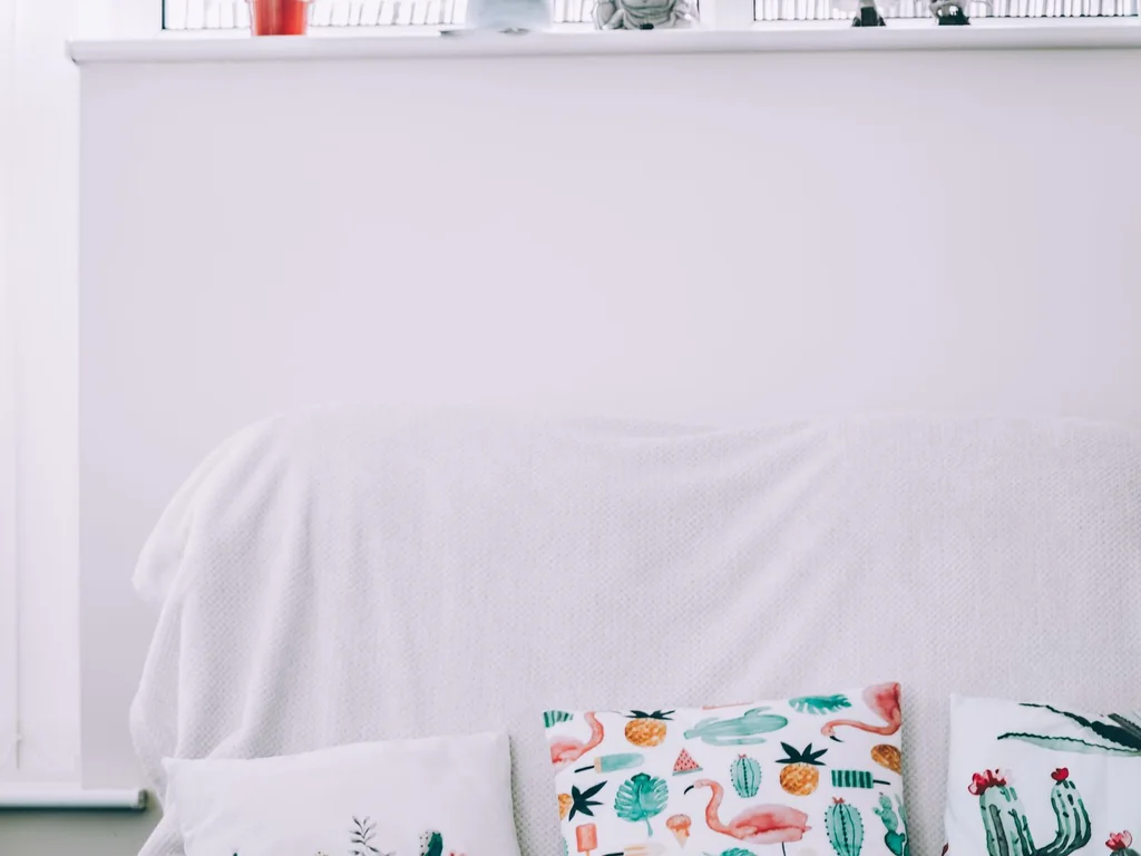
Linen’s relaxed slub against wool’s soft weight is one of the simplest luxury pairings. Use linen for curtains and light covers, wool for throws and heavy cushions. The contrast of textures stops a neutral room from looking flat, even when every colour in it is close in tone.
12. Add Boucle for Soft, Cloud-Like Seating
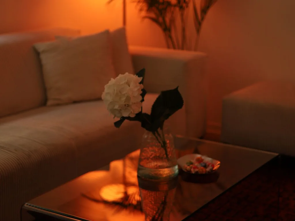
Boucle’s looped, nubby surface makes chairs and cushions look inviting from across the room. One boucle chair or a pair of boucle cushions is enough — too much can look heavy. Pair it with smooth wood and slim legs so the softness reads as deliberate, not bulky.
13. Use Velvet Sparingly as a Rich Accent
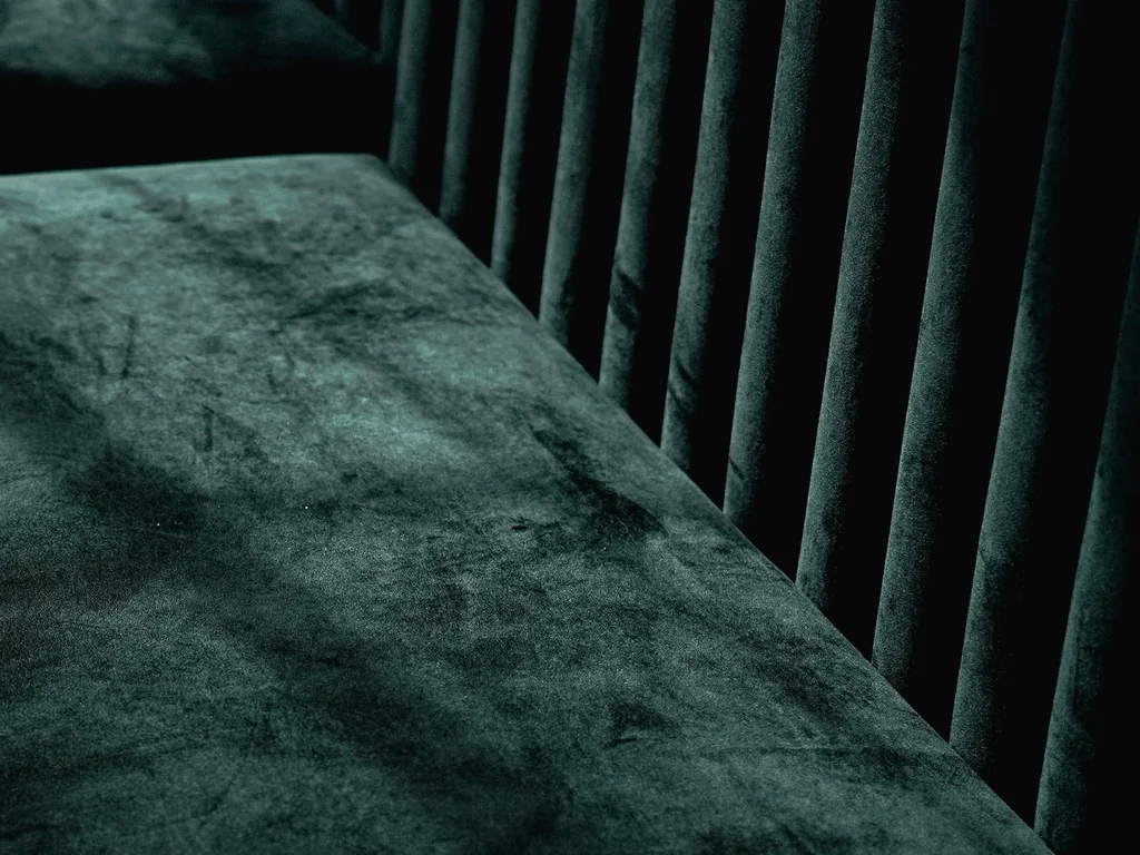
Velvet catches light beautifully, which is why a little goes a long way. Two velvet cushions, a velvet footstool or a single dining chair in velvet adds richness without turning the room into a theatre set. Deep jewel tones suit velvet best; pale velvet shows every mark.
14. Let Natural Wood Grain Be a Visible Texture
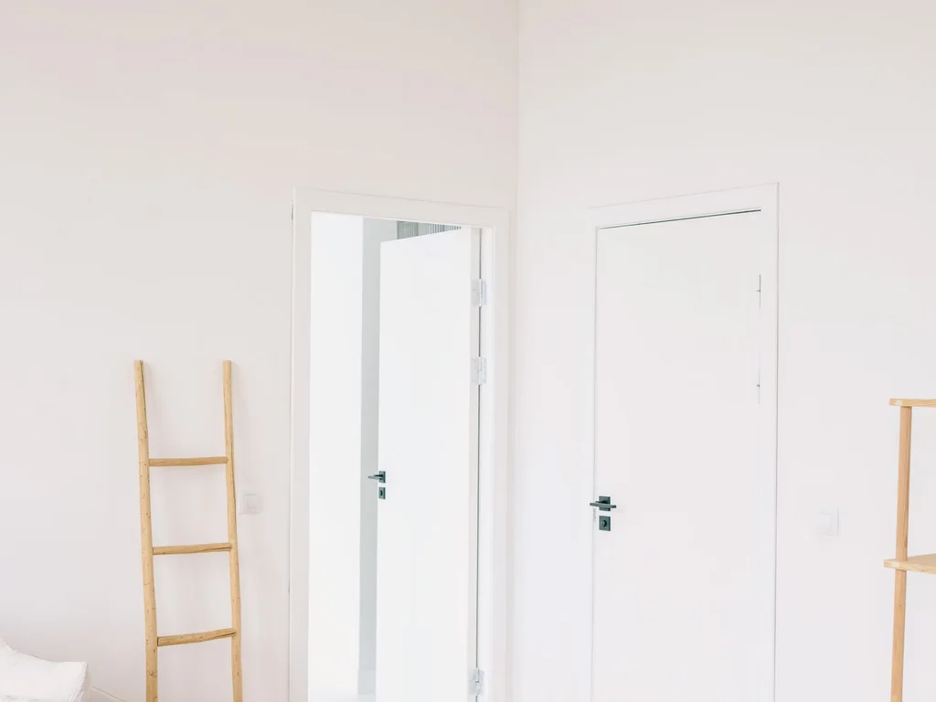
Wood grain is texture you do not have to buy — just leave it visible. Choose one dominant wood tone for larger pieces and let smaller items vary, so the room feels collected rather than matched. Oiled finishes show grain better than heavy varnish and age more gracefully.
15. Bring in Rattan and Wicker for Lightness
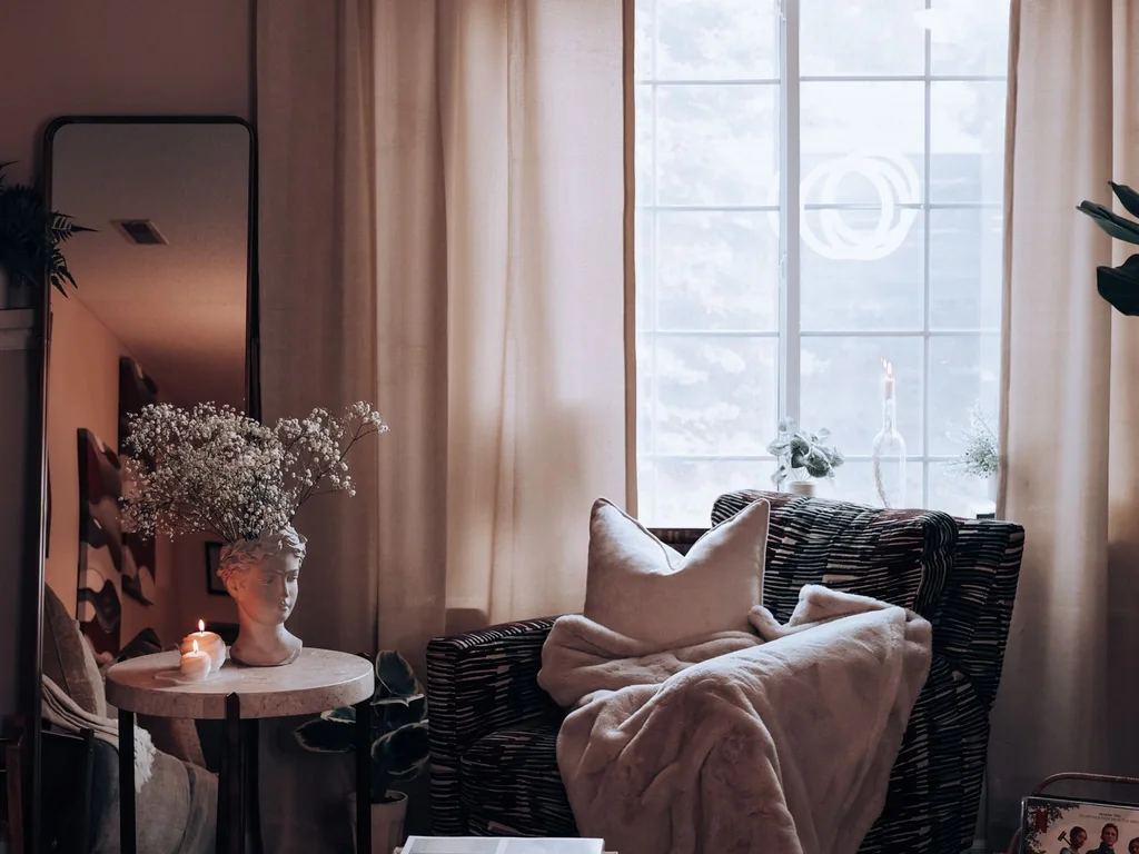
Rattan and wicker add an open, airy texture that balances heavy upholstery and solid wood. A rattan chair, a woven pendant or a cane-front cabinet lightens a room instantly. Keep it to two or three pieces per space so the look stays refined rather than beach-themed.
16. Add Stone and Marble in Small Doses
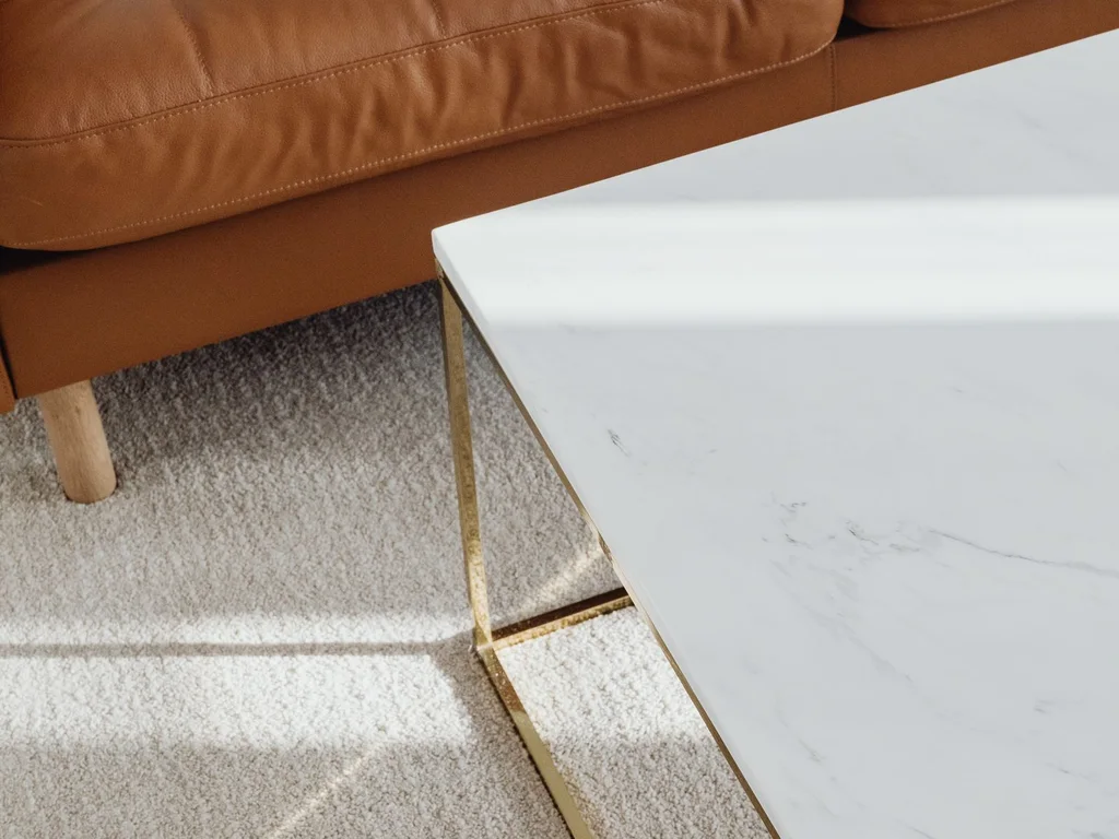
A marble tray, a stone vase or a travertine lamp base introduces cool, hard texture that contrasts with soft fabrics. Small stone pieces are affordable, easy to move and strong enough to anchor a styled surface. Avoid matching marble everywhere — one or two pieces per room is plenty.
17. Warm a Room With Leather, Even in Small Amounts
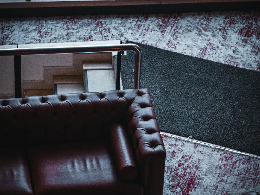
Leather adds warmth and age in a way fabric cannot. A leather chair, a pair of leather handles or a leather-bound tray brings patina that improves with use. Tan leather suits warm palettes; dark brown or black leather anchors cooler, more formal rooms.
18. Layer Knit Throws for Instant Cosiness
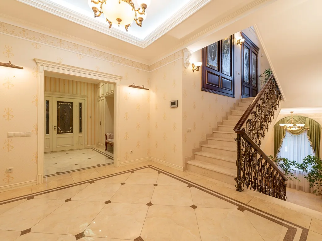
A chunky knit throw draped over a sofa arm or folded at a bed’s foot signals comfort immediately. Choose a knit in your palette’s neutral so it blends with every season’s accents. Keep throws washed and neatly folded — a tangled throw reads as clutter, not cosiness.
19. Balance Matte and Gloss Finishes
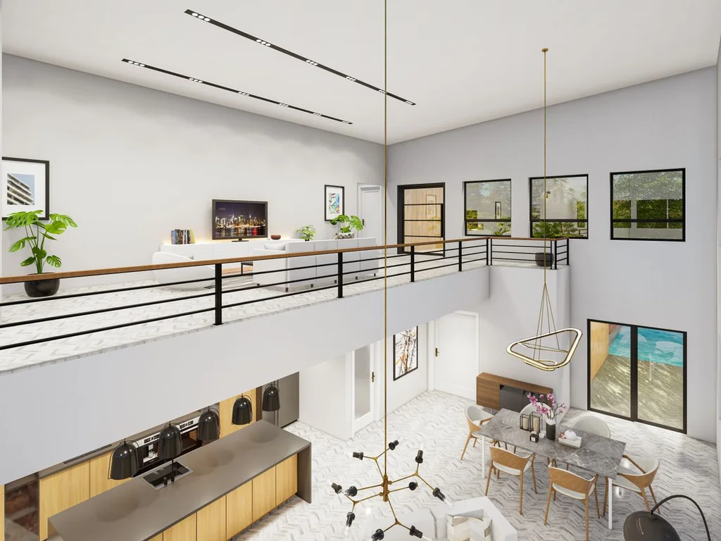
Rooms feel flat when everything shares one finish. Pair matte walls and linen with a gloss ceramic, a mirrored tray or a lacquered box. The small reflections catch the eye and give the room sparkle without adding colour or pattern.
20. Treat Mixed Metals as Texture, Not a Mistake
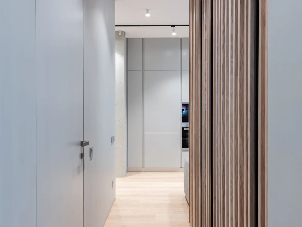
Brass, black metal and chrome can live together if one finish dominates and the others appear as accents. Use the dominant metal for hardware and lighting, and let the second metal appear in frames or small decor. The mix looks collected over time rather than bought in one afternoon.
3. Minimal and Calm Aesthetics
21. Leave Genuine Negative Space on Surfaces
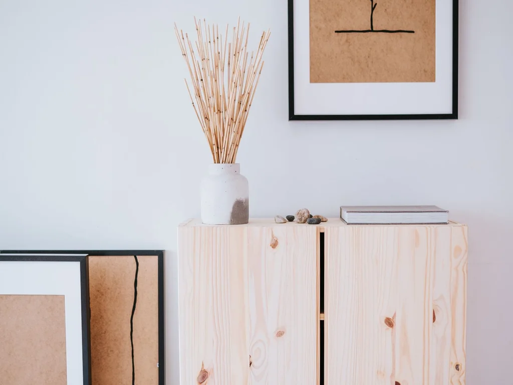
Minimal rooms are not empty rooms — they are rooms where every surface has breathing room. Leave a third of each shelf and table clear, and the objects that remain gain importance. If a surface looks crowded, remove one item at a time until the room feels calm rather than bare.
22. Hide Storage So Calm Surfaces Stay Calm
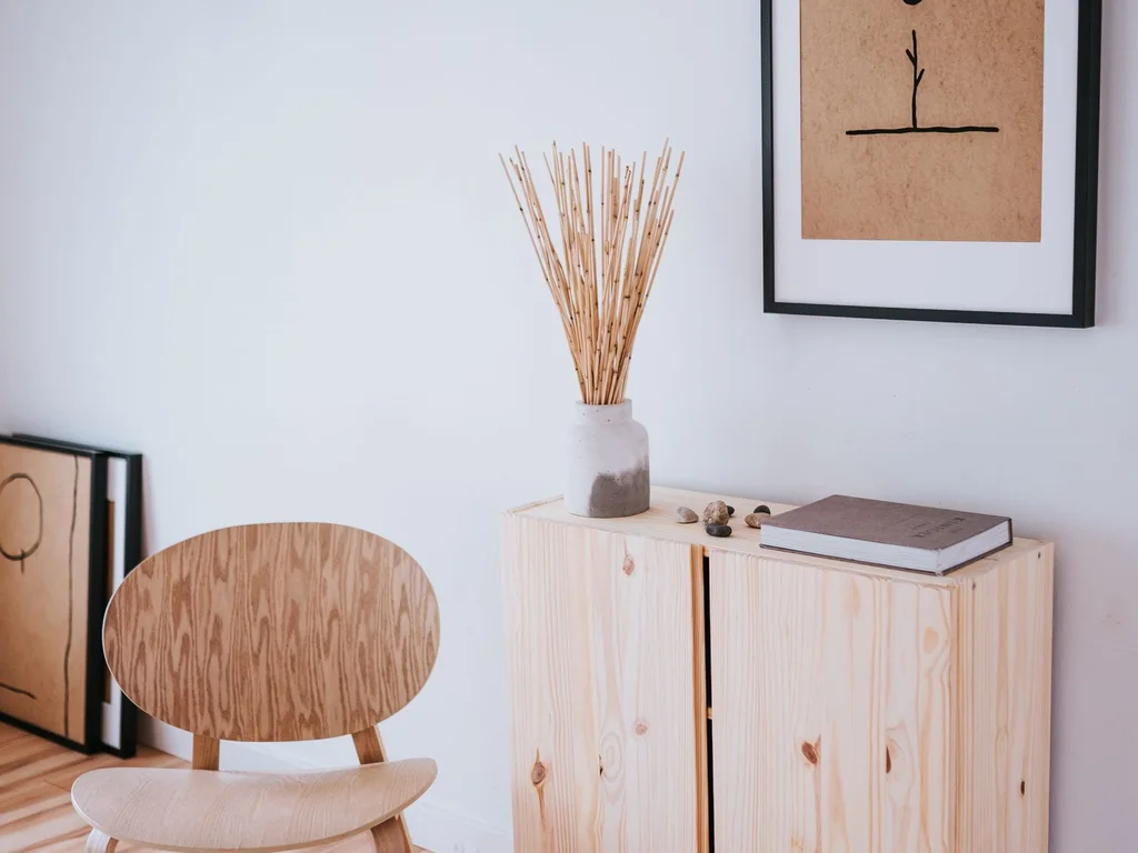
Closed baskets, lidded boxes and cabinets with doors are the backbone of a minimal aesthetic. Daily clutter lives behind them, so open surfaces can stay styled. Choose storage in your palette so even the baskets look like decor, not like an afterthought.
23. Choose One Hero Piece Per Room
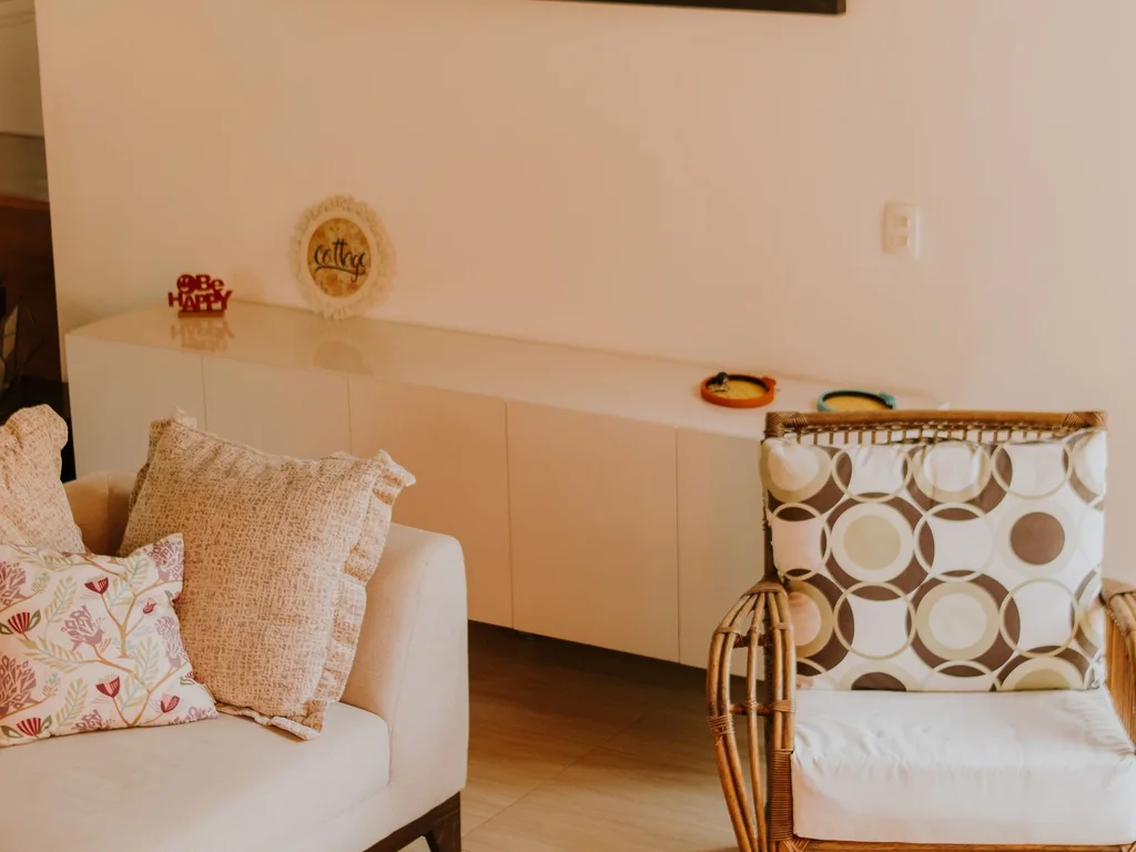
Give each room a single star — a sculptural lamp, an oversized artwork, a beautiful chair — and let everything else support it quietly. When two pieces compete, the eye does not know where to rest and the room feels busy. A hero piece also makes shopping easier: if it fights the hero, it does not come home.
24. Create One Quiet Corner for Doing Nothing
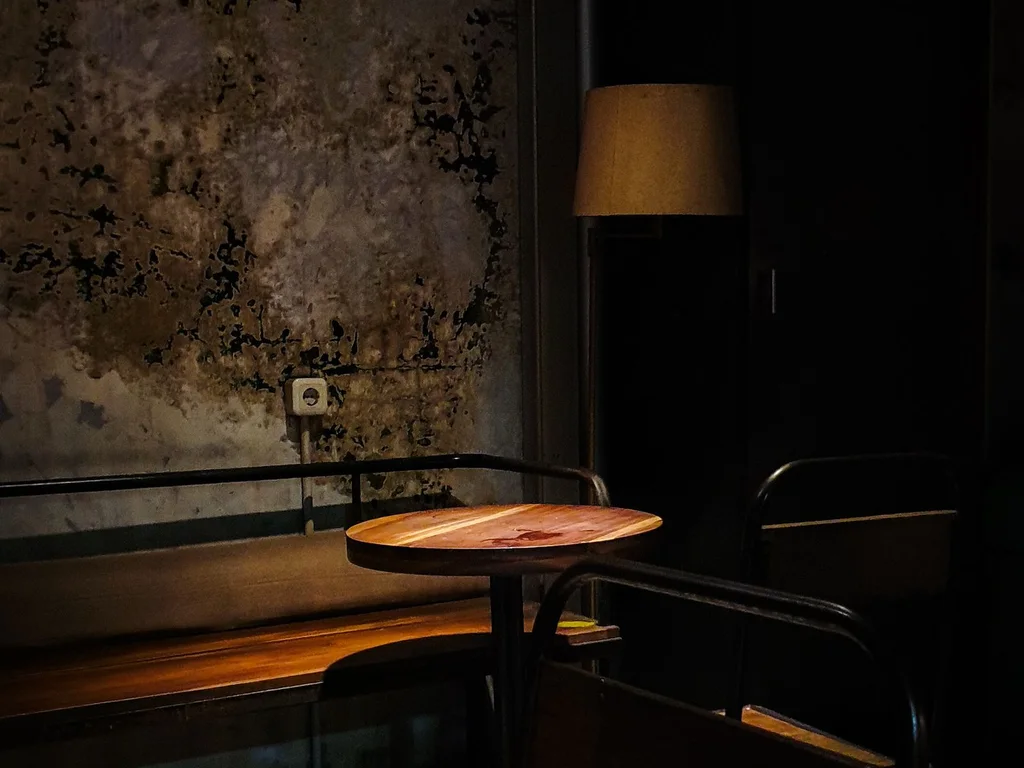
A small chair, a soft lamp and a side table by a window make a corner whose only job is rest. No television, no work, no storage pile. A home that includes a place to do nothing feels calmer overall, because the whole space seems designed around wellbeing, not just function.
25. Keep Furniture Low to Open Up the Room
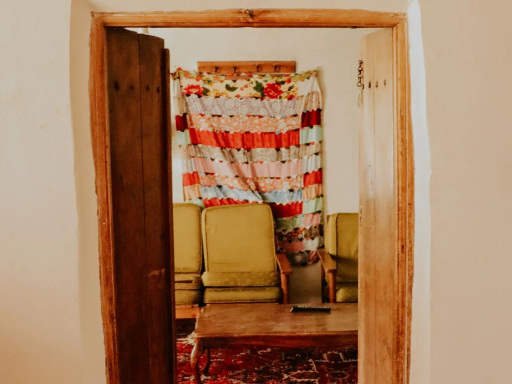
Low sofas, low beds and low cabinets let the eye travel to the windows and walls, making ceilings feel higher and rooms feel larger. This is especially powerful in small homes. Pair low furniture with tall, slim elements — a floor lamp, a tall plant — for balanced proportions.
26. Dress Rooms Tonally Instead of With Contrast
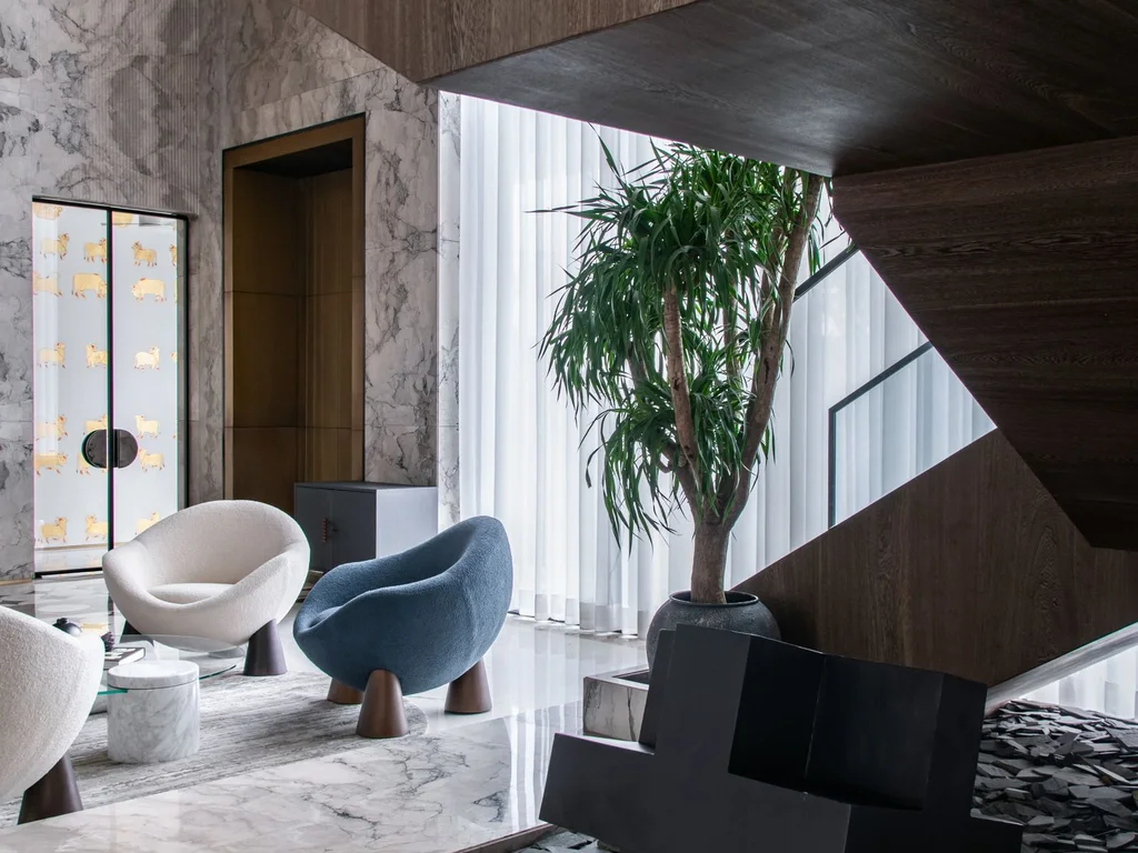
Tonal dressing means decorating in shades of one colour family: cream, beige and camel, or grey, slate and charcoal. Without sharp contrasts, the room feels like a single soft statement. Add one darker tone for grounding — a walnut frame, a charcoal cushion — so the softness does not drift into vagueness.
27. Set a Declutter Rhythm, Not a One-Off Purge
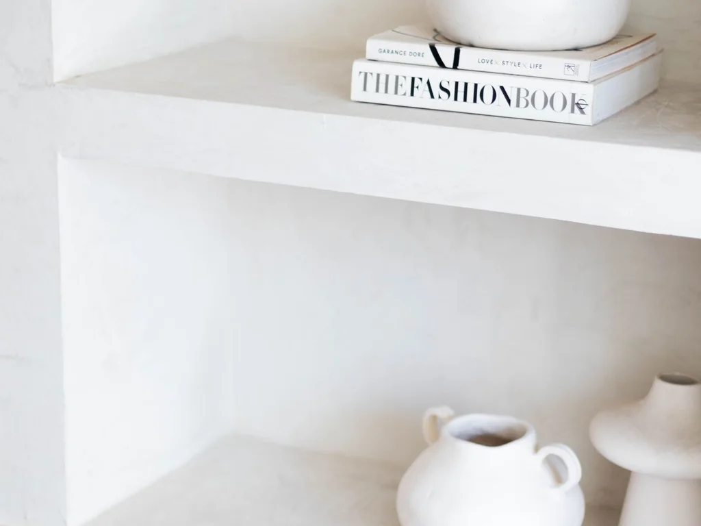
Minimal aesthetics fail when clutter returns, so build a small weekly habit: one drawer, one shelf, one surface, ten minutes. The aesthetic then maintains itself instead of collapsing between big clear-outs. A calm home is mostly a maintained home, not a perfectly bought one.
28. Rely on Soft, Layered Light Instead of One Bright Source
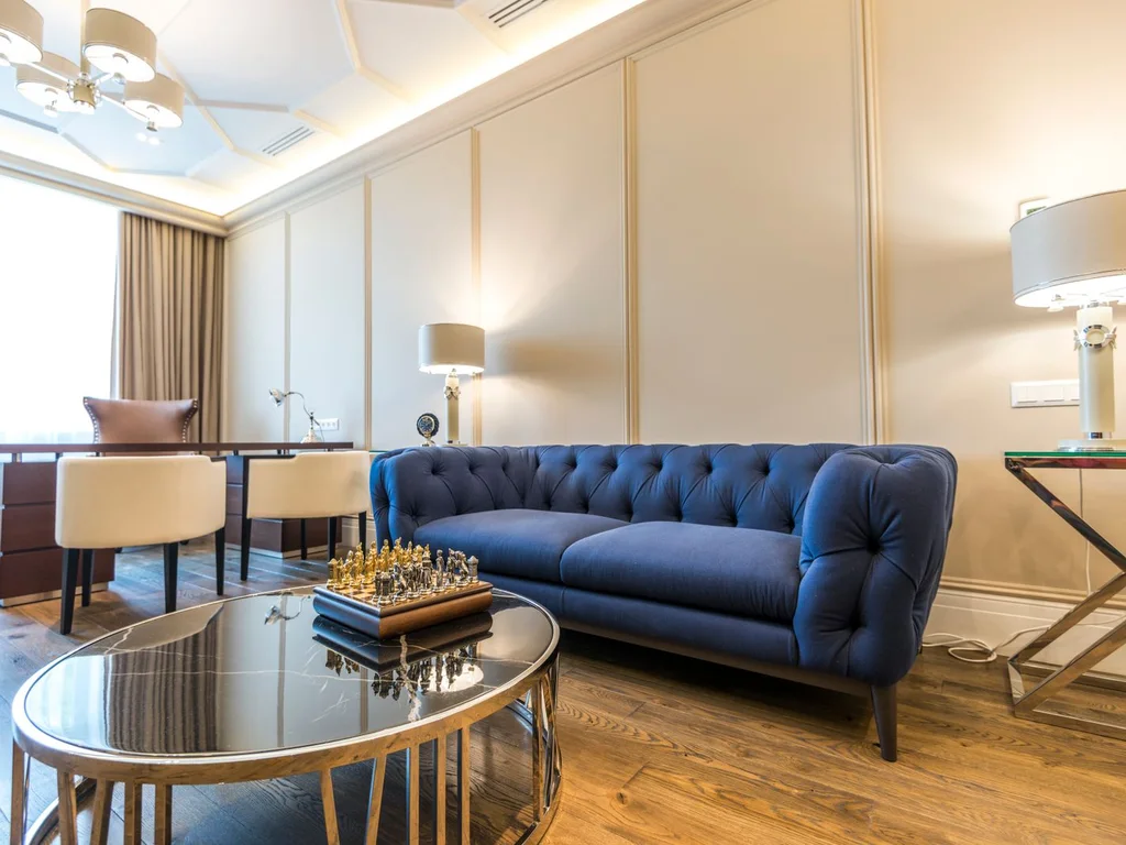
One ceiling light flattens a minimal room. Use lamps at different heights — floor, table and a small accent — all in warm tones, and the room gains depth and mood. Dimmers help more than any single fixture: calm light is adjustable light.
29. Limit Patterns to One Per Room
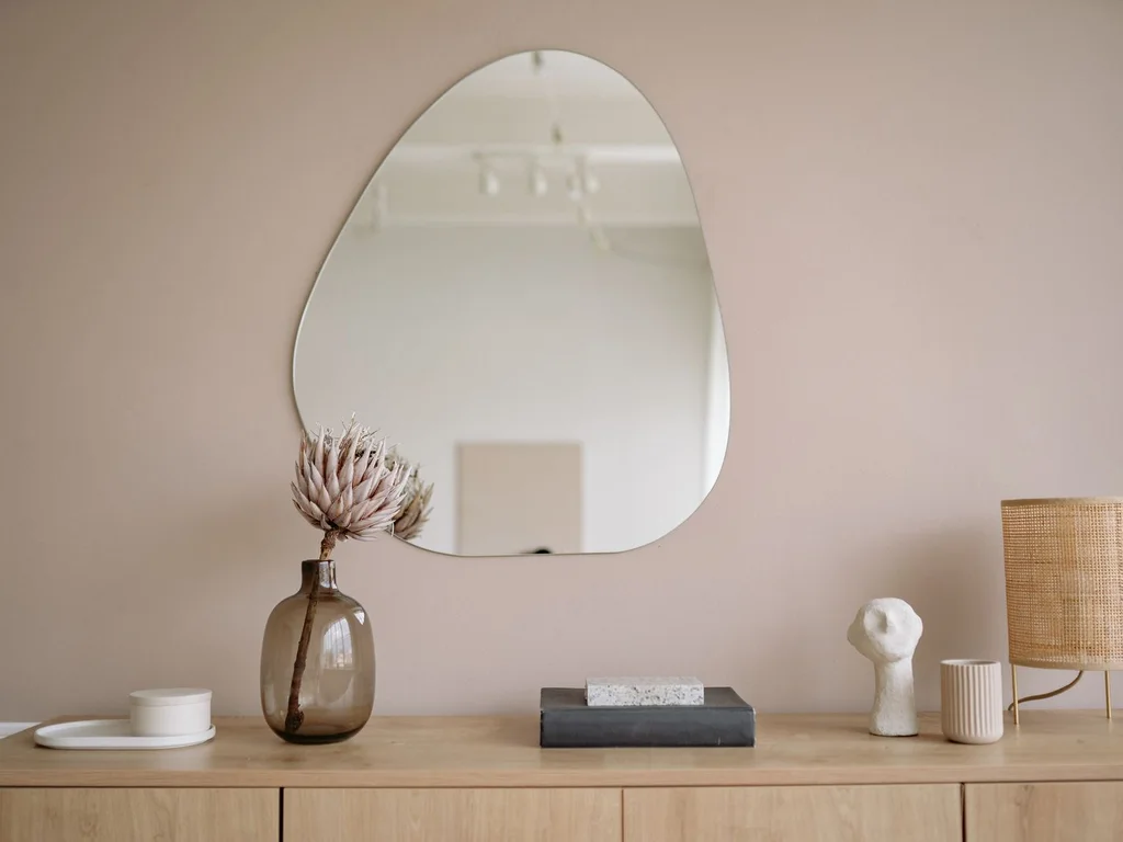
In a calm aesthetic, one pattern per room is plenty: a striped cushion, a geometric rug, a botanical print. Everything else stays plain, so the pattern reads as a deliberate accent rather than visual noise. If two patterns meet, keep them in the same colour family and different scales.
30. Make the Entry Calm to Set the Tone
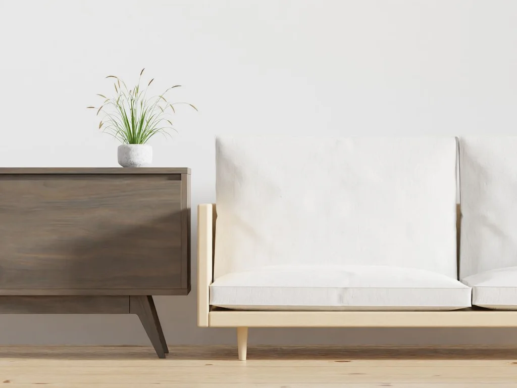
The entry is the first room anyone experiences, so it sets the home’s aesthetic promise. A clear console, one mirror, a bowl for keys and nothing on the floor tells visitors — and you — that this is a calm, cared-for home. Keep the entry’s palette identical to the living room’s for a seamless arrival.
4. Warm Modern and Japandi
31. Choose Low Oak Furniture as the Foundation
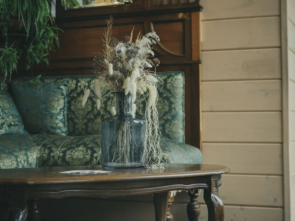
Japandi rooms rest on low, warm oak furniture with clean lines and visible grain. A low oak coffee table or bench sets the height and tone for everything else. Keep other furniture at similar heights so the room feels grounded and unhurried, never top-heavy.
32. Hang Paper Lanterns for Soft, Diffused Light
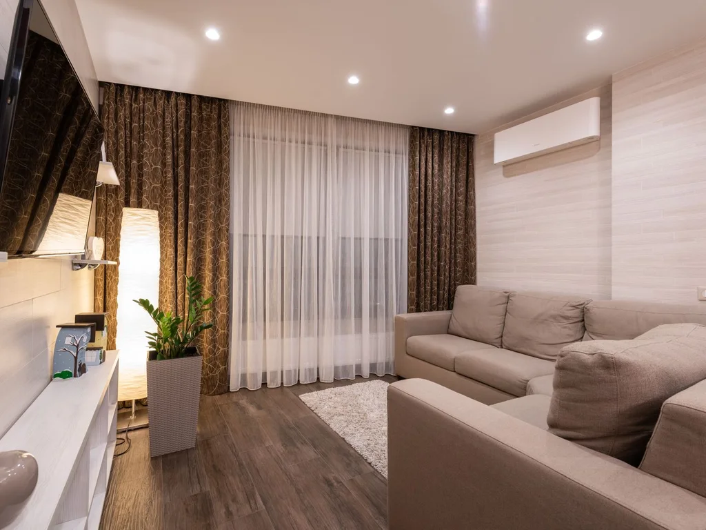
Paper lanterns scatter light gently in every direction, which is exactly the Japandi mood: soft, warm and shadow-free. Hang one large lantern over a table or a cluster of small ones in a corner. They are inexpensive, replaceable and instantly change a room’s atmosphere.
33. Display Wabi-Sabi Ceramics With Visible Imperfection
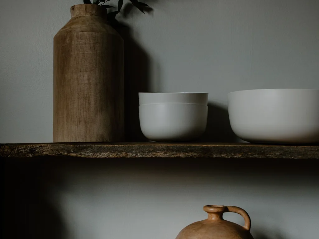
Wabi-sabi celebrates handmade imperfection: uneven glazes, rough edges, slight asymmetry. A few handmade ceramics on a shelf or table bring warmth that factory-perfect pieces cannot. Choose pieces you genuinely like touching, not just looking at — texture is half the point.
34. Favour Curved Shapes Over Sharp Corners
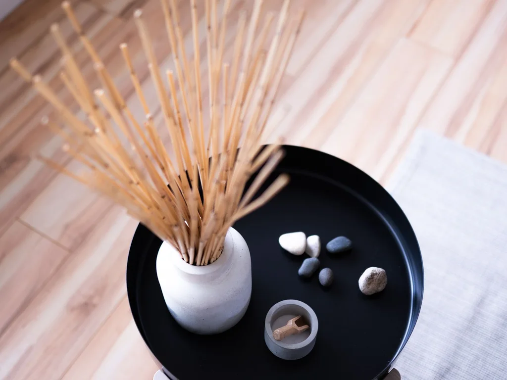
Rounded coffee tables, arched mirrors and curved chair backs soften a modern room and make it feel welcoming. Curves also make small rooms easier to move through, with no sharp corners to catch hips and shins. One or two curves per room is enough to change its whole feeling.
35. Warm Wood Tones to Balance Pale Walls
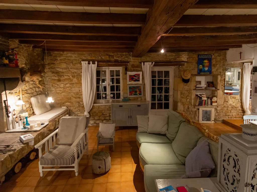
Pale walls with warm wood — oak, walnut, teak — is the Japandi formula in one sentence. If your walls are already pale, add warmth through wooden frames, a wooden tray or a timber stool before buying anything else. The room will feel finished with surprisingly little effort.
36. Use Black Sparingly as a Grounding Accent
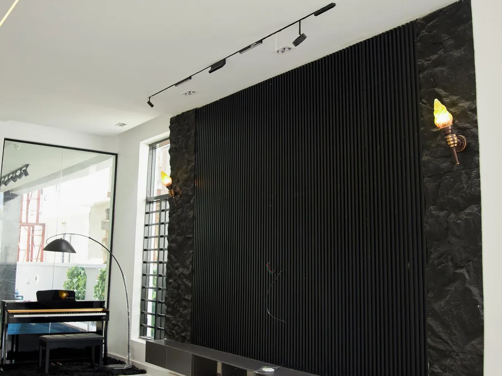
A thin black frame, a black lamp base or black cabinet handles give a pale room definition, like eyeliner on a face. Keep black to small, repeated details rather than large blocks, so the room stays warm. Black works best when it appears at least twice, tying two areas together.
37. Hang Linen Curtains That Filter, Not Block, Light
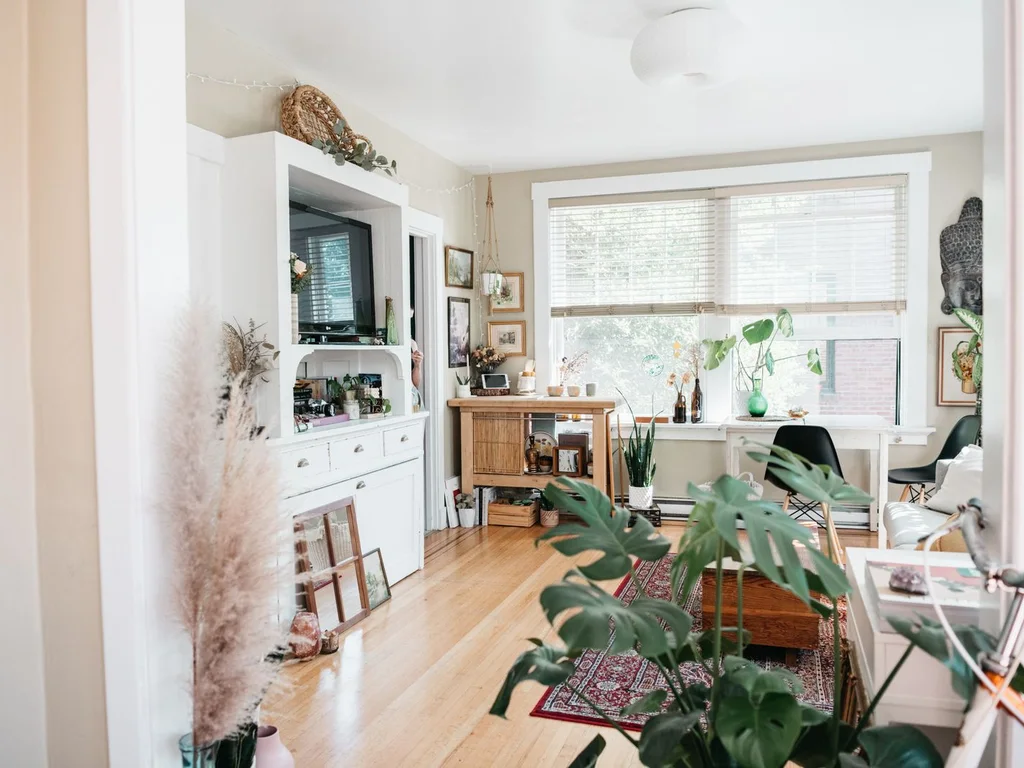
Unlined or lightly lined linen curtains soften daylight into a gentle glow while keeping privacy. Hang them high and wide so windows look larger, and let them puddle slightly on the floor for a relaxed, intentional finish. Linen wrinkles — that is part of its charm, not a flaw.
38. Blur the Line Between Inside and Outside
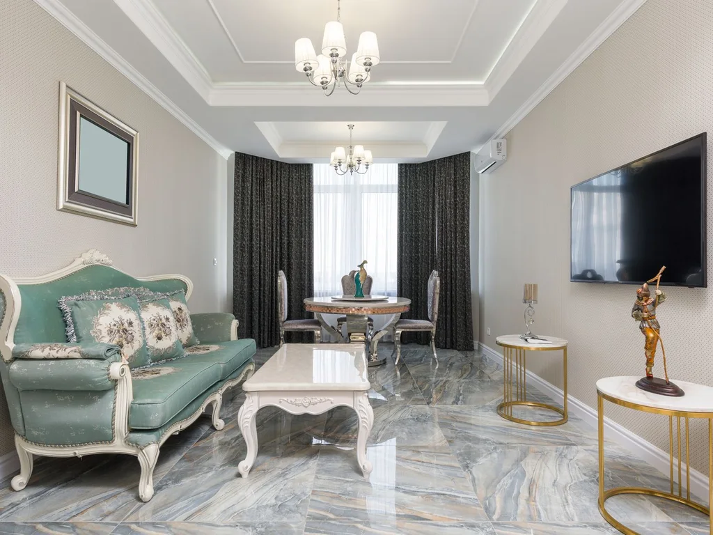
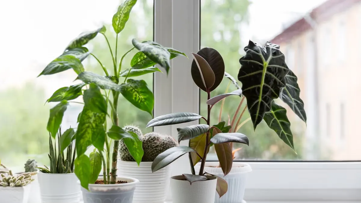
Place a plant by the door, use the same stone or wood inside and out, and keep window views uncluttered. When the garden or balcony feels like another room, the home feels larger and calmer. Even a single potted plant on the windowsill starts this connection.
39. Keep Handmade Ceramics in Daily Use
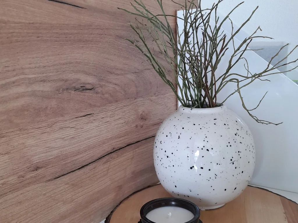
Japandi style is lived-in, not displayed. Drink from the handmade mug, eat from the stoneware bowl, and let daily use give the ceramics their patina. A home where beautiful things are used daily feels warmer than one where they sit behind glass.
40. Choose Quiet, Abstract Art Over Busy Prints
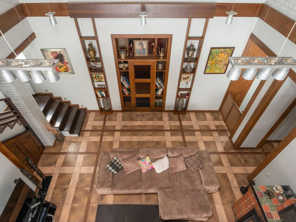
Large, quiet art — soft brushstrokes, earthy shapes, lots of empty canvas — suits warm modern rooms better than detailed, busy prints. One large quiet piece anchors a wall more effectively than a crowd of small frames. Hang it at eye level and give it empty wall around it.
5. Cottage and Romantic
41. Use Small-Scale Florals, Not Oversized Prints
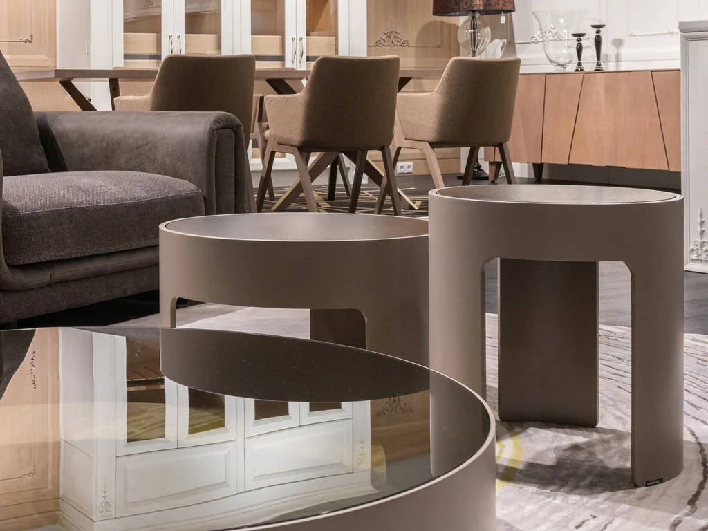
Small floral prints feel cottage-like and romantic without overwhelming a room. Use them on cushions, a lampshade or bedding, and keep the background colour pale so the pattern breathes. One floral pattern per room, mixed with stripes or checks, keeps the look fresh rather than fussy.
42. Mix Gingham and Checks With Plain Linen
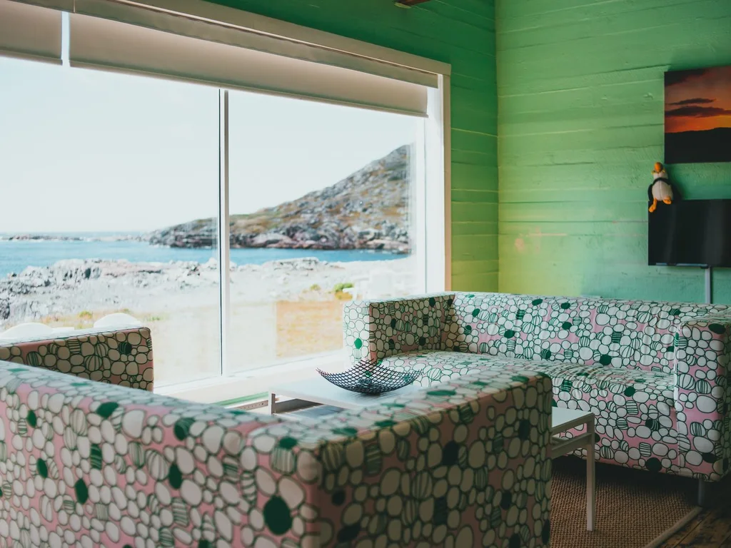
Gingham and small checks bring country charm, especially in kitchens and bedrooms. Pair a checked cushion or tablecloth with plain linen elsewhere so the pattern stays a feature, not a takeover. Soft colours — sage, dusty blue, cream — keep checks feeling romantic rather than picnic-like.
43. Hang Lace Sheers for a Soft, Private Glow
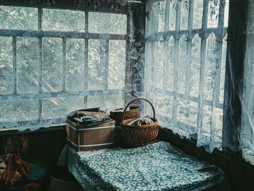
Lace sheers filter daylight into a dappled, romantic glow while keeping the room private. They suit cottage windows beautifully and cost very little. Layer them under heavier curtains so you can choose full softness by day and full privacy at night.
44. Paint Old Furniture in Soft, Chalky Colours
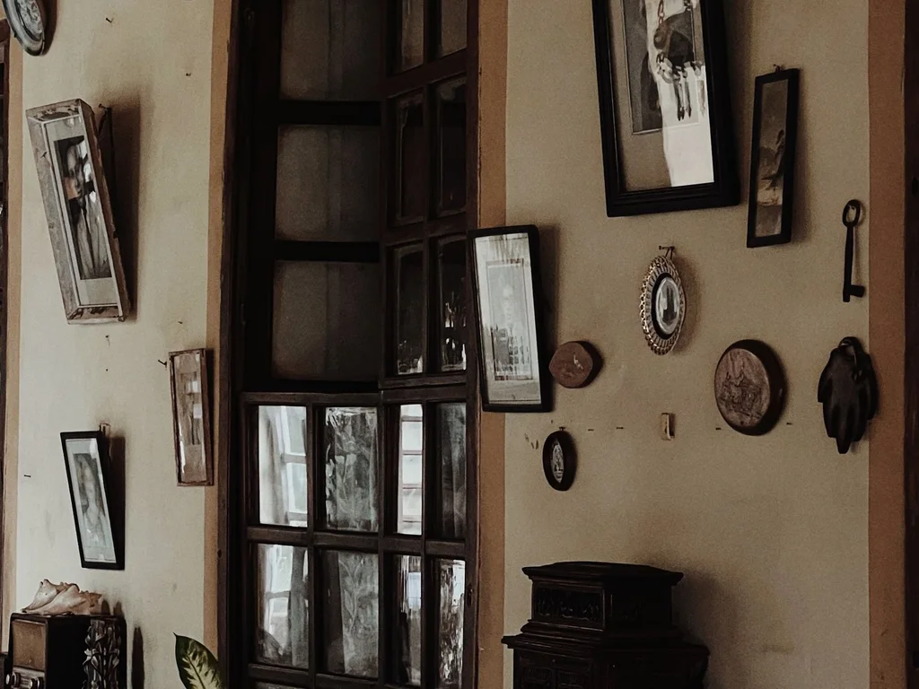
A tired wooden dresser or chair becomes a cottage centrepiece with chalky paint in sage, cream or dusty blue. Distress the edges lightly for a lived-in feel, and change the handles to ceramic or brass. Painting is the cheapest way to make mismatched furniture feel like a set.
45. Style Dried Flowers in Simple Glass and Ceramic
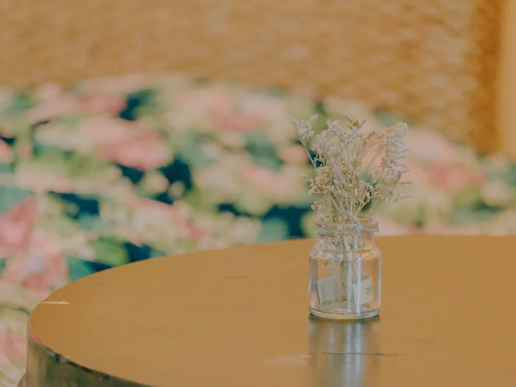
Dried lavender, wheat stems and eucalyptus last for months and suit cottage rooms better than fresh flowers that demand constant replacement. Keep arrangements loose and simple — a small bunch in a jam jar often looks better than a formal bouquet. Dust them gently now and then.
46. Hang a Vintage Mirror to Double Light and Charm
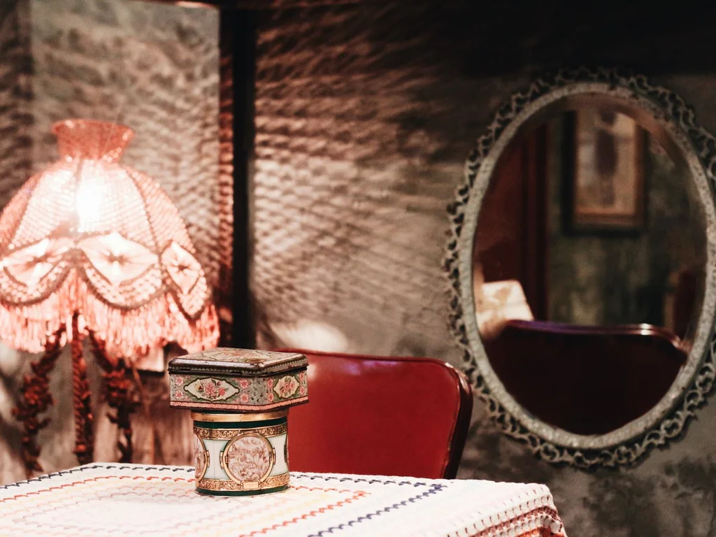
An old mirror with a slightly foxed or ornate frame doubles both light and character in a cottage room. Hang it opposite a window for maximum effect, or above a fireplace as a traditional focal point. Imperfect glass is a feature here, not a flaw to hide.
47. Keep Pastels Soft and Slightly Muted
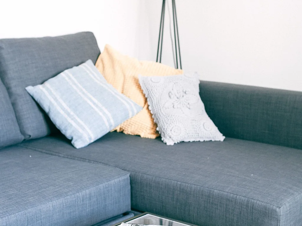
Romantic pastels work best when they are slightly greyed: dusty pink, sage green, powder blue, buttercream. Bright, candy pastels can feel childish, while muted versions feel grown-up and restful. Use pastels on textiles and small furniture, with cream walls as the calm backdrop.
48. Layer Quilts and Coverlets on the Bed
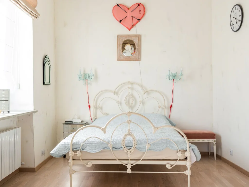
A quilt over a coverlet, with a folded throw at the foot, is the cottage bed formula. The layers add colour, pattern and warmth, and they invite you to adjust for the weather. Mix one floral with one plain layer so the bed looks styled, not like a fabric shop.
49. Display Pretty Dishes on Open Shelving
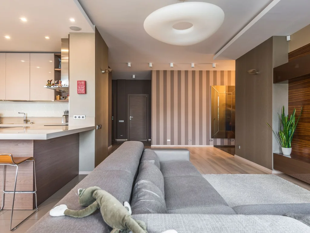
Open shelves in a kitchen or dining area turn everyday dishes into decor. Group by colour, keep stacks tidy, and leave some empty space so the display breathes. Pretty does not mean precious — use the dishes daily and the shelves will never look like a museum.
50. Build a Window Seat With Cushions and Books
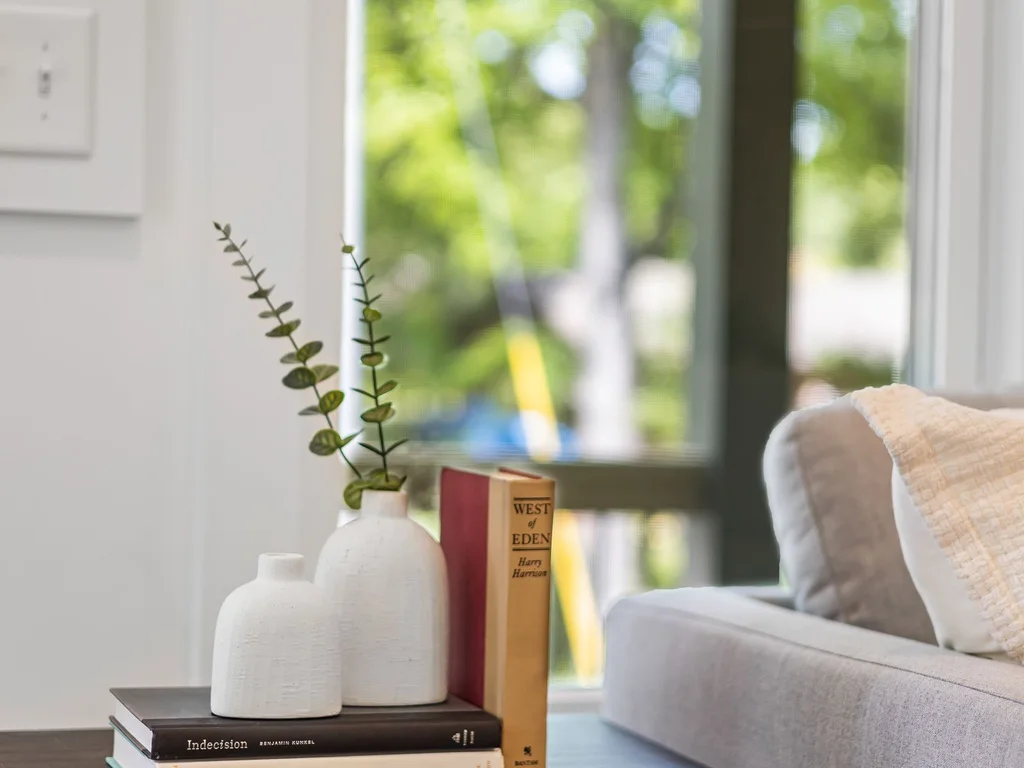
A window seat is the cottage dream in miniature: a bench, deep cushions, a throw and a small stack of books. Even a wide windowsill with a cushion can serve. It gives the room a destination and a story — a place for morning coffee, reading and watching the world go by.
6. Boho and Eclectic
51. Layer Two Rugs for a Collected, Boho Floor

Layering a large neutral rug under a smaller patterned one instantly creates a boho, well-travelled floor. Keep the larger rug plain and the smaller one bold, and make sure furniture sits on both so the layers feel anchored. This trick also rescues a rug that is slightly too small on its own.
52. Mix Global Textiles Without Matching Them
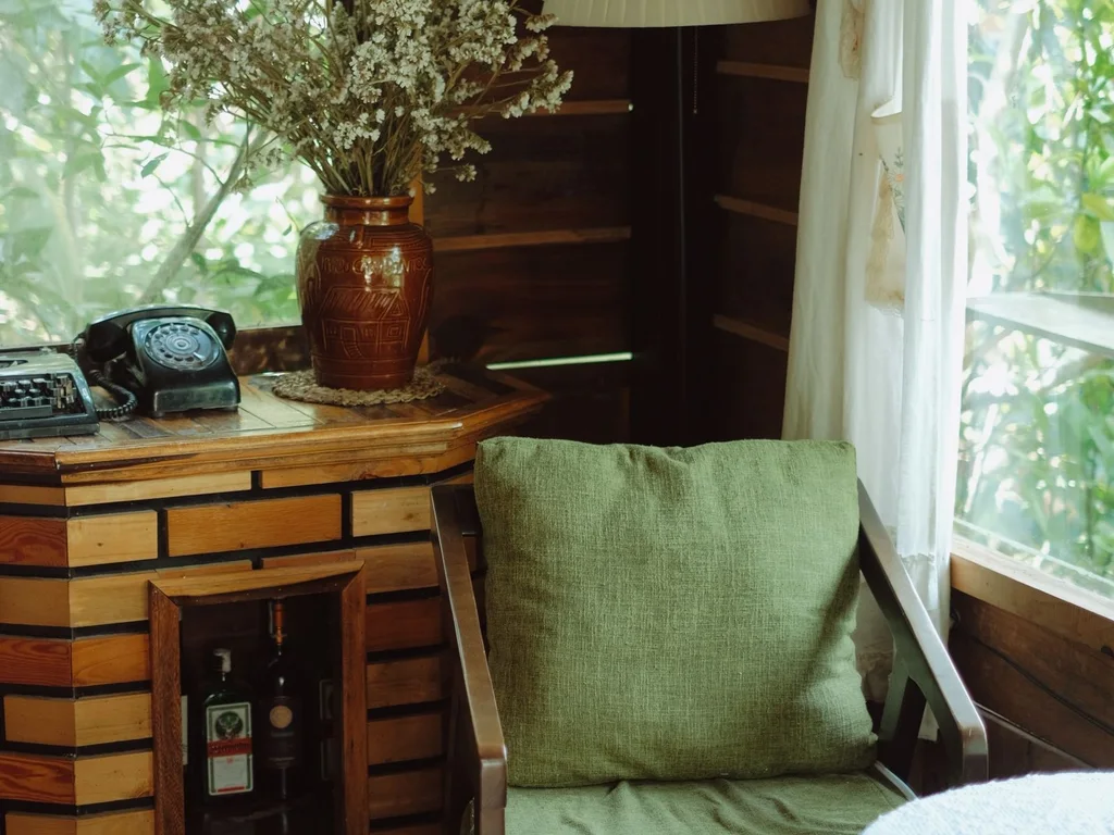
Boho style thrives on textiles from different traditions — a Moroccan cushion, an Indian throw, a Turkish towel — united by warm colours rather than matching patterns. Limit the colour family to two or three tones so the mix feels curated, not chaotic. One shared colour in every textile is the secret.
53. Hang Macrame as Soft Wall Art
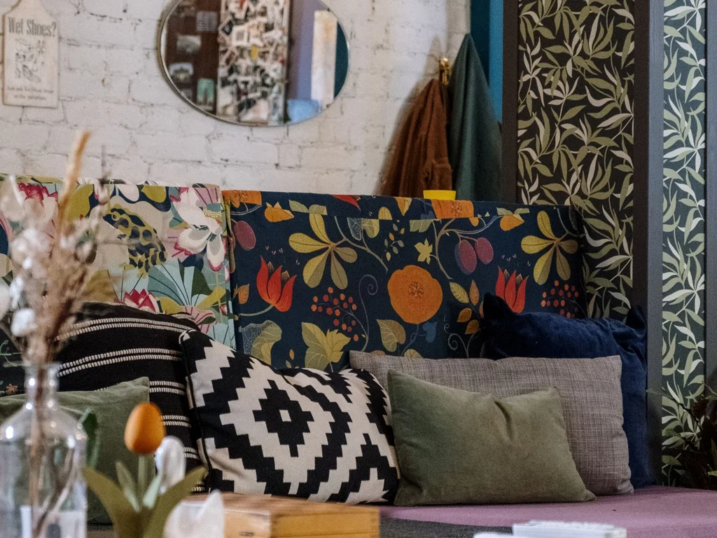
Macrame wall hangings add handmade texture and softness to walls that art alone cannot. Hang one large piece as a focal point or a few small ones as a cluster. Natural cotton tones suit most palettes, and the shadows they cast add gentle movement to the room.
54. Use Plants as Decor, Not as a Collection
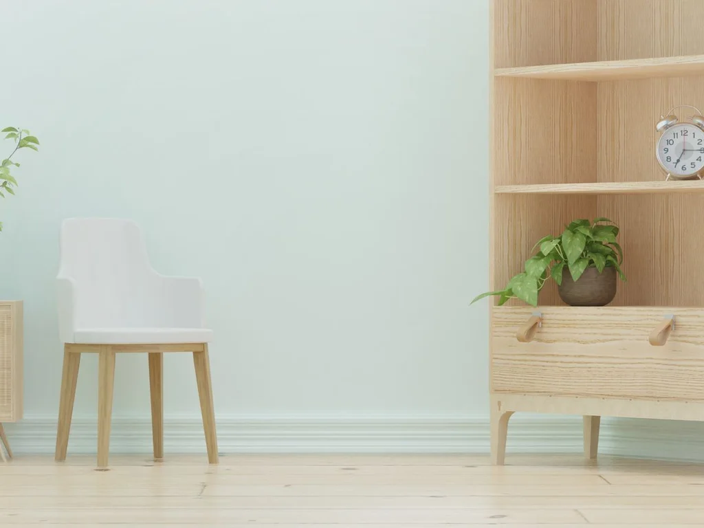
In a boho room, a few well-placed plants in woven baskets do more than a jungle of pots. Choose one tall plant for a corner, one trailing plant for a shelf and one small plant for a table. The plants then read as part of the decor scheme instead of competing with it.
55. Build a Gallery Wall of Mixed Frames and Art
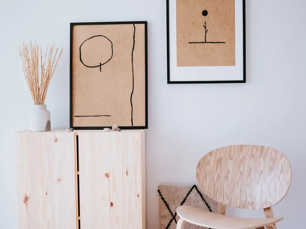
An eclectic gallery wall mixes frame sizes, colours and art styles — prints, photos, textiles and small mirrors. Lay the arrangement on the floor first, keep spacing even, and anchor it with one larger piece. The mix looks intentional when the spacing is consistent, even if the frames are not.
56. Hunt Thrifted Finds for One-of-a-Kind Character
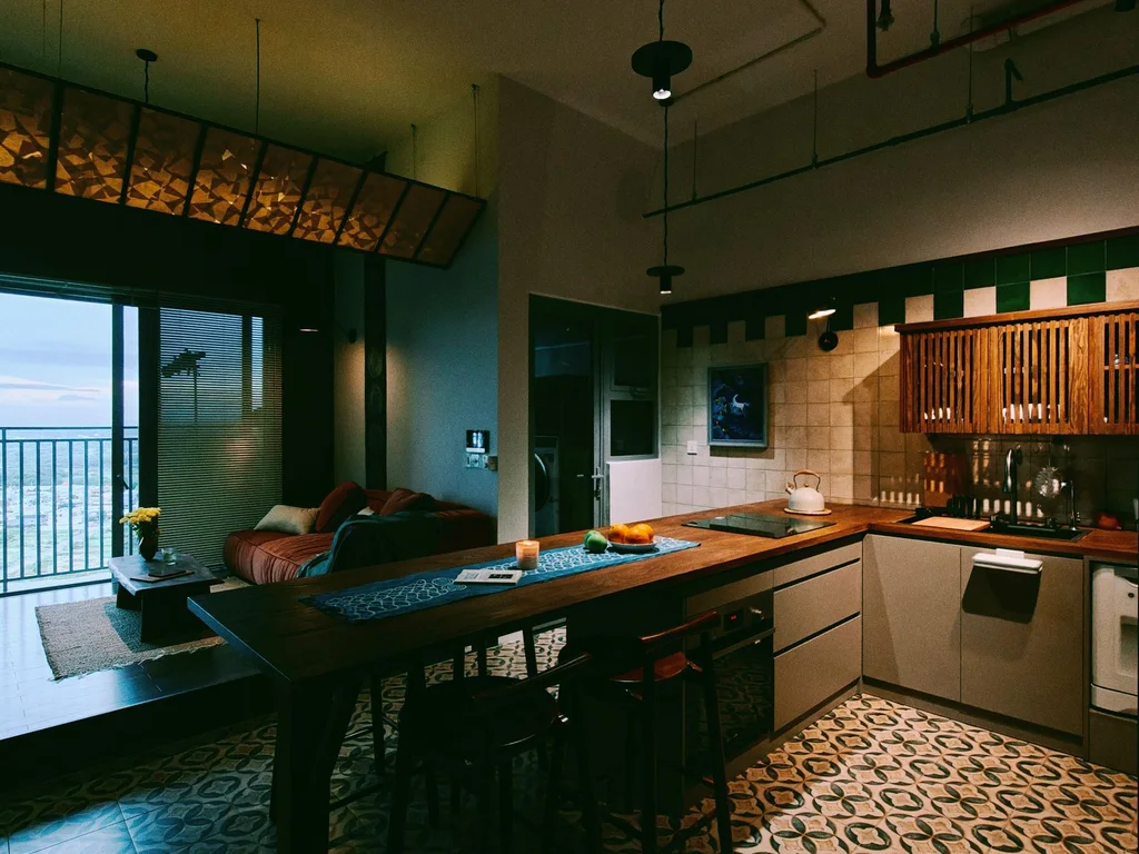
Thrifted vases, lamps and furniture give a boho home character no high-street set can match. Shop with a colour or material in mind — brass, wood, ceramic — so finds coordinate even when they are unrelated. One thrifted hero per room is plenty; more can tip into clutter.
57. Let One Room Go Bold With Pattern
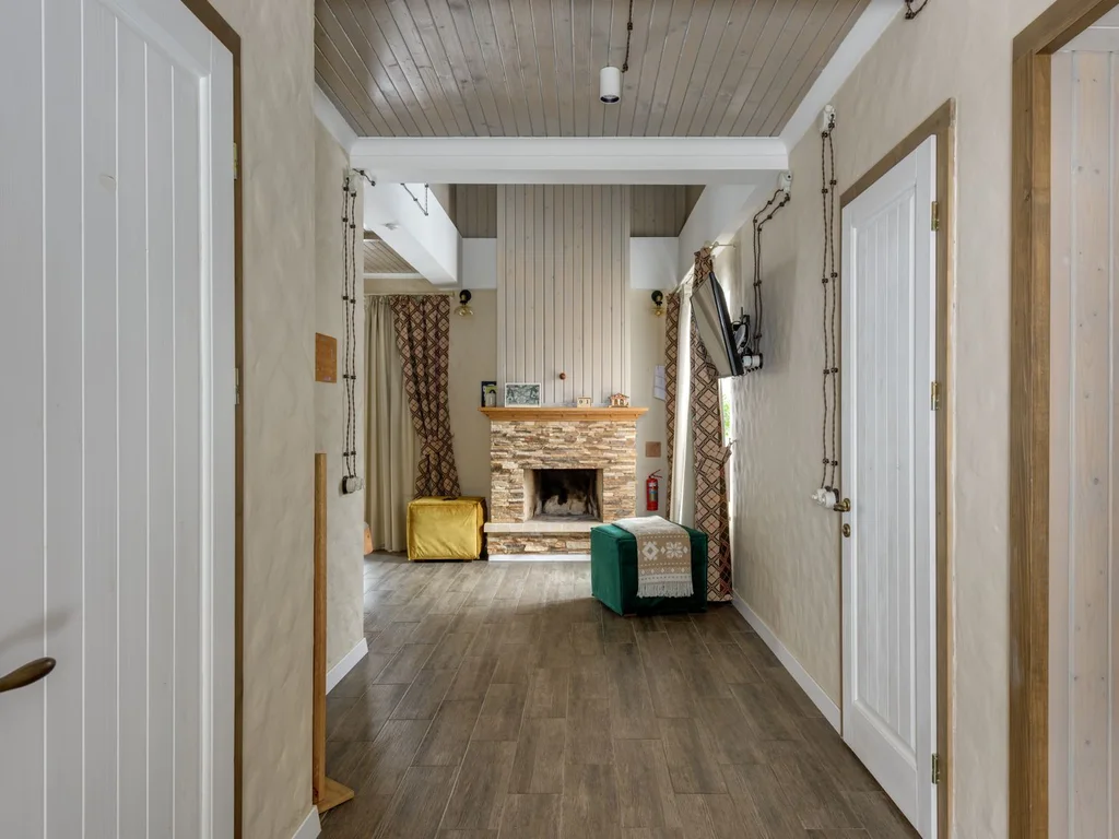
If most of your home is calm, let one room — a guest room, a study, a powder room — go fully bold with pattern. The contrast makes both the calm rooms and the bold room feel more deliberate. It also gives you a place to enjoy pattern without living in it everywhere.
58. Use Baskets as Beautiful, Honest Storage
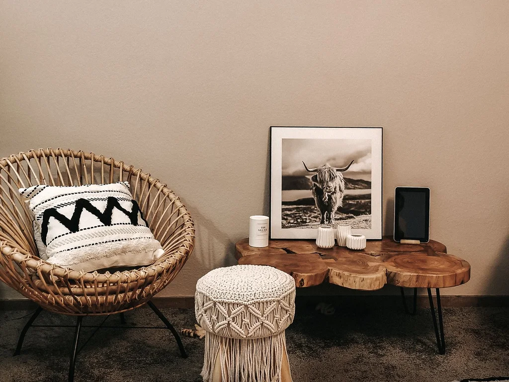
Woven baskets hold blankets, toys, magazines and firewood while looking like decor in their own right. Choose natural seagrass or rattan in your palette, and keep basket sizes consistent within a room. Open baskets work best for soft items you reach for daily.
59. Scatter Floor Cushions for Relaxed Seating
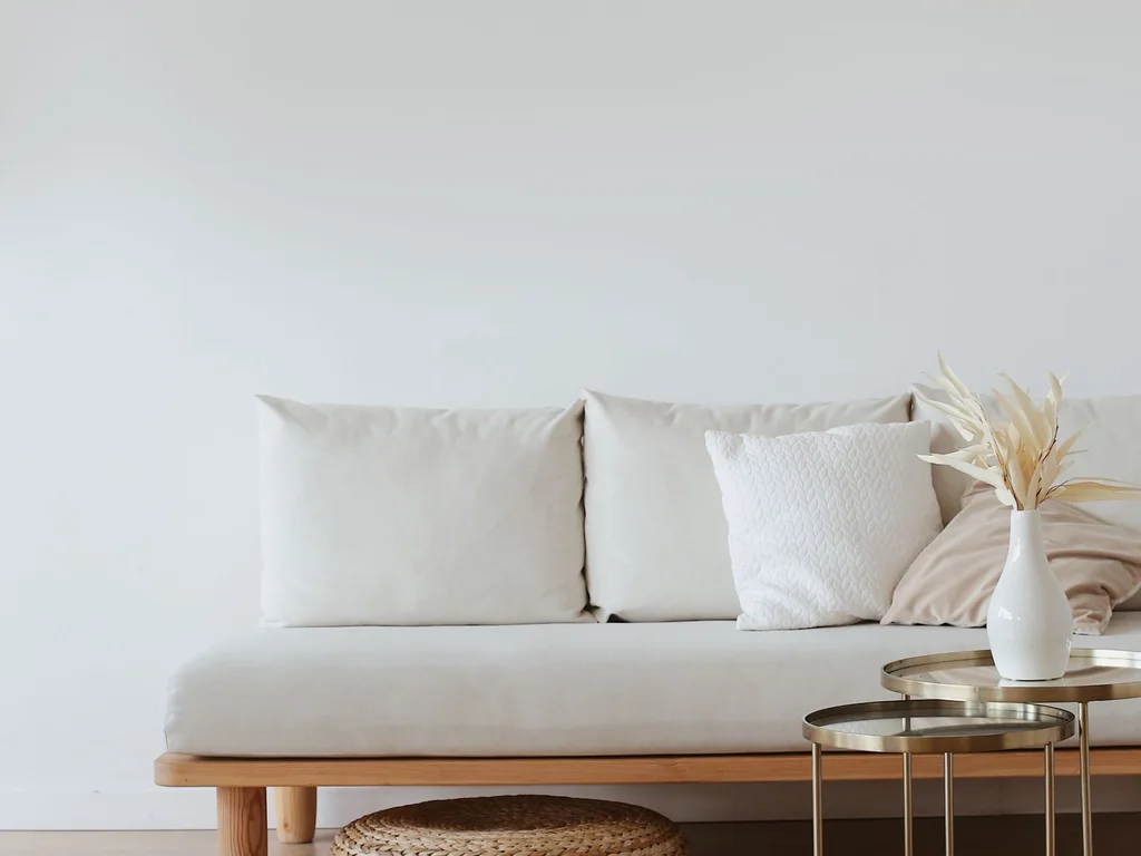
Floor cushions turn a living room into a relaxed gathering space, especially for evenings with friends or family movie nights. Choose washable covers in your palette and stack them in a basket when not in use. They are boho, practical and far cheaper than extra chairs.
60. Display Travel Souvenirs as a Curated Collection
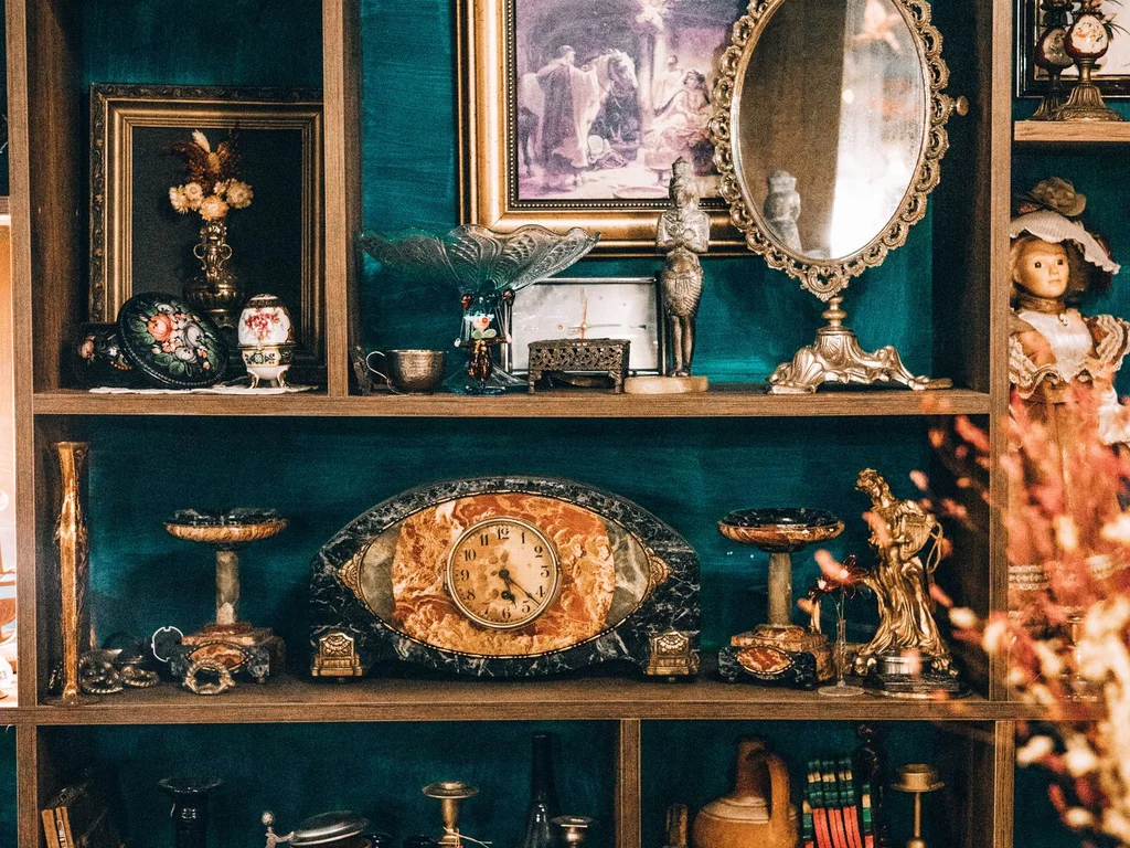
Souvenirs tell your story, but scattered everywhere they look like clutter. Group them by material or colour on one shelf or tray, edit ruthlessly, and give the collection a clear boundary. A curated shelf of travels feels personal and stylish; a houseful of ornaments feels like a shop.
7. Coastal and Airy
61. Whitewash Wood for Instant Seaside Lightness
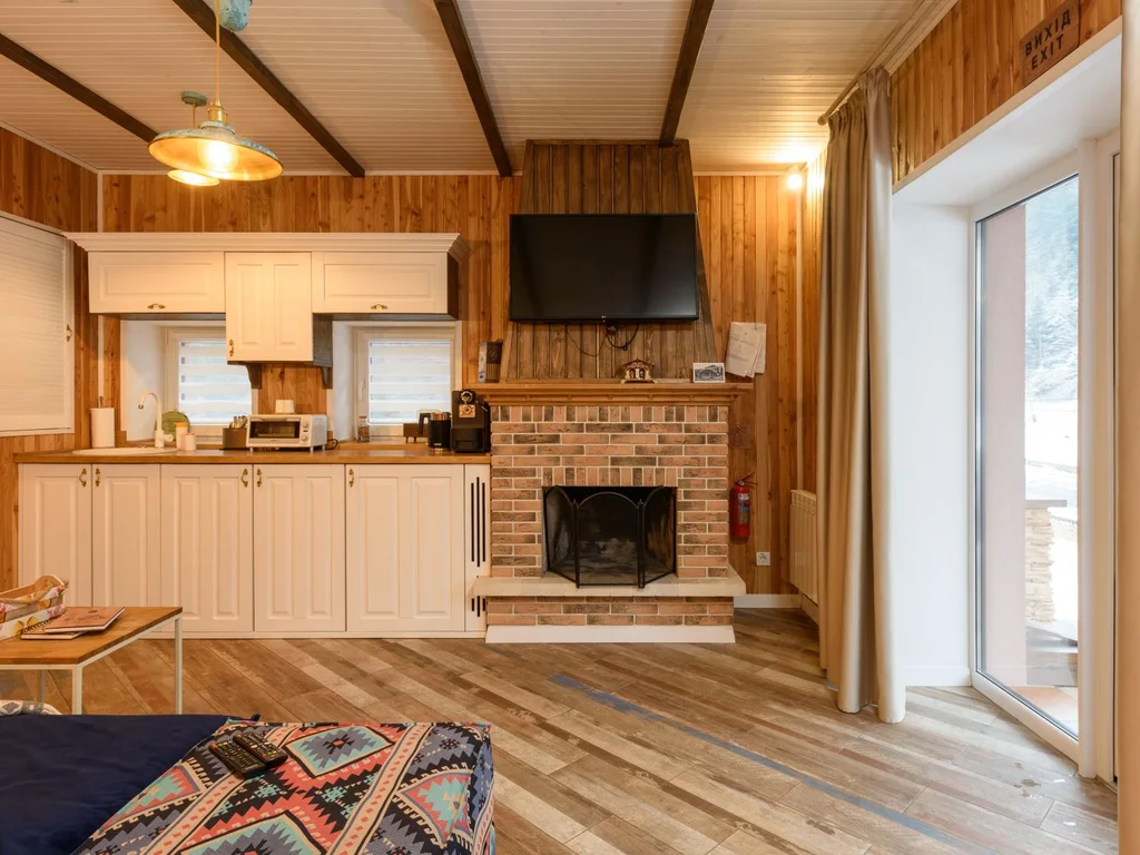
Whitewashing wooden furniture or panelling lightens it while keeping the grain visible, which is the coastal look in one technique. Use it on a single piece — a bench, a cabinet, a headboard — rather than every surface, so the room stays fresh instead of washed out.
62. Add Blue Accents in Sea and Sky Tones
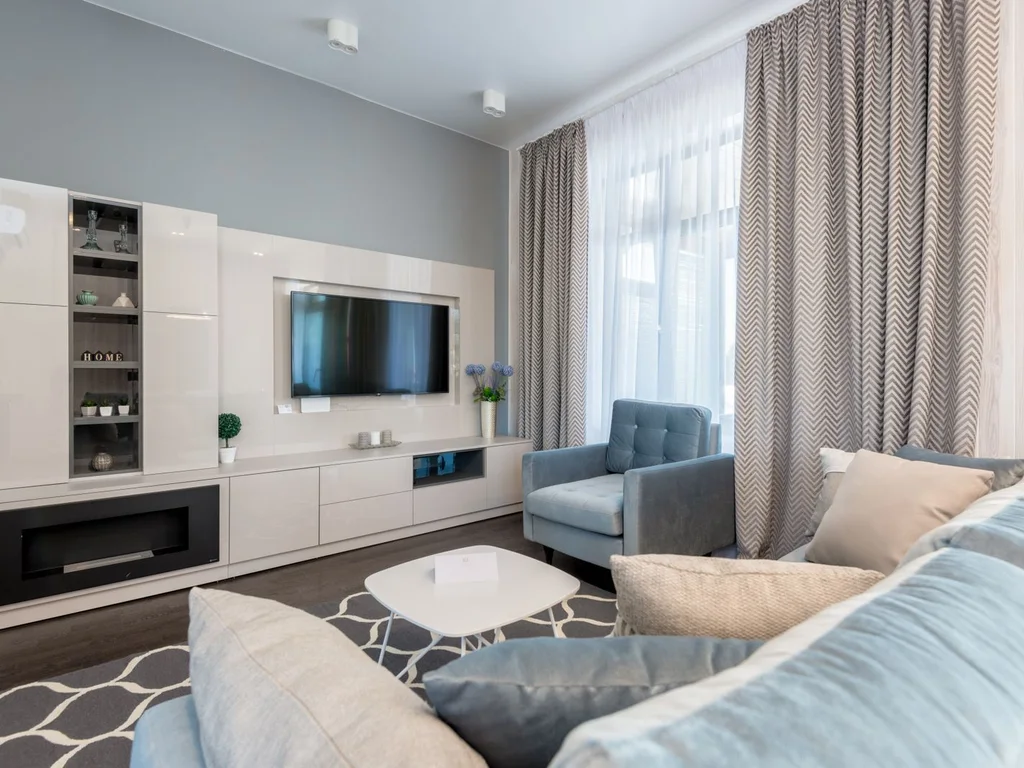
Coastal blue works best in a range from pale sky to deep navy, used as accents against white and sand. A navy cushion, a sky-blue vase and a denim throw together feel coastal; a single shade repeated everywhere can feel flat. Let the blues vary like the sea itself.
63. Choose Linen Slipcovers for Relaxed Seating
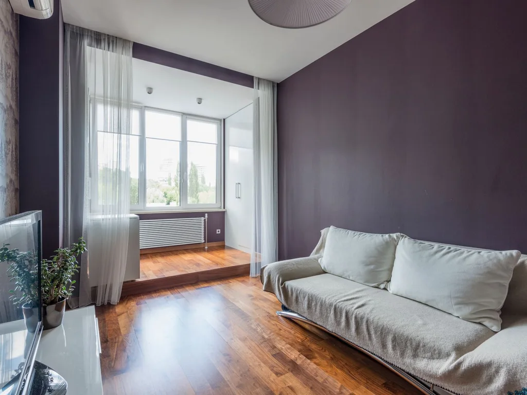
Loose linen slipcovers make sofas and chairs look relaxed, washable and beach-house ready. White or natural linen suits coastal rooms best, and the slight wrinkle is part of the charm. Slipcovers also let you refresh seating for the price of fabric, not furniture.
64. Use Rope and Jute as Natural Detailing
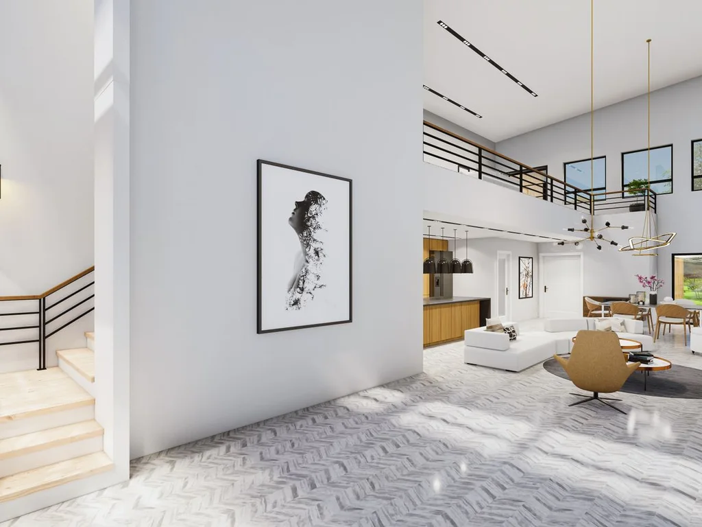
Rope-wrapped lamp bases, jute rugs and jute-trimmed baskets add coastal texture without a single seashell in sight. Keep rope details to two or three pieces per room so they read as texture, not theme-park decoration. Natural, undyed jute suits the widest range of palettes.
65. Bring in Sea-Glass Tones Through Glassware
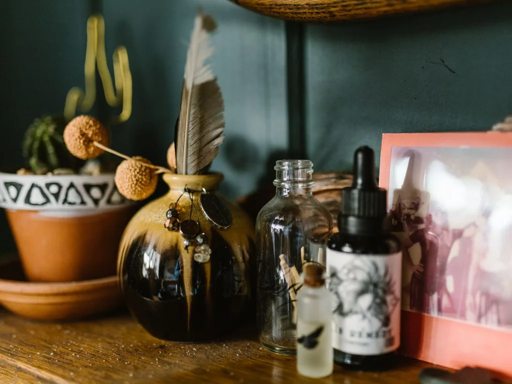
Sea-glass green and aqua, used in vases, bottles and candle holders, catch light beautifully on windowsills and shelves. Group odd numbers together and vary heights for a collected look. The translucent colours keep a coastal room feeling light even in winter.
66. Style One Piece of Driftwood as Sculpture
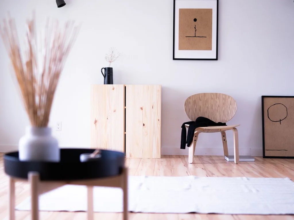
A single piece of driftwood on a console or mantel is coastal sculpture — natural, unique and free. Keep it alone or with one candle so its shape can be appreciated. One strong natural object beats a shelf of small beach finds every time.
67. Hang Sheer Curtains That Move With the Breeze
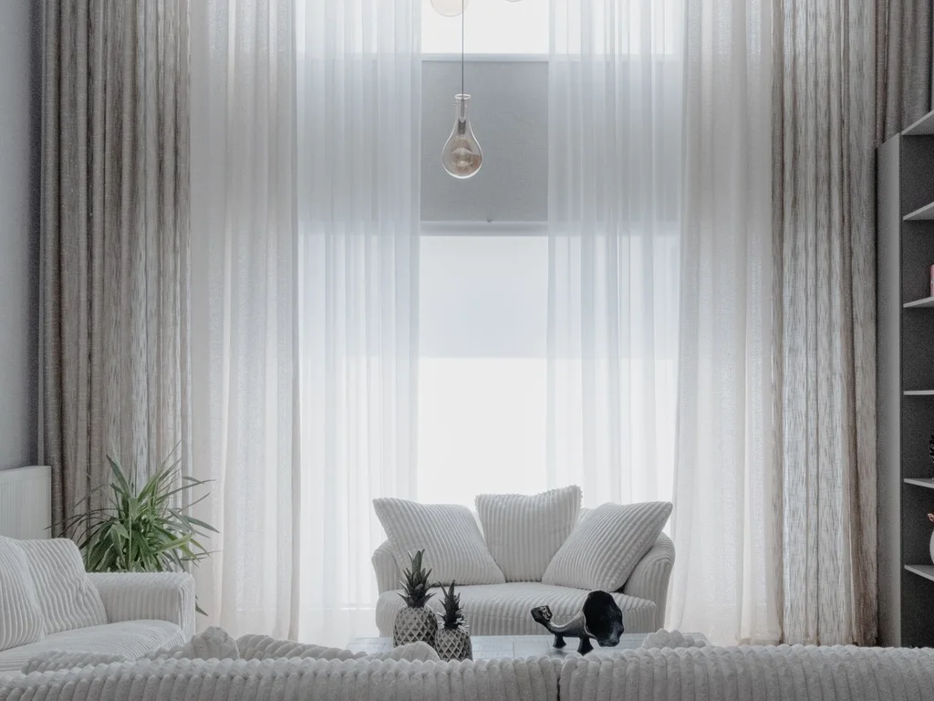
Sheer white curtains that billow gently are the coastal room’s signature movement. Hang them from ceiling to floor and let them float free of heavy tie-backs. Even without a sea view, the moving fabric makes the room feel airy and alive.
68. Keep Nautical Stripes Subtle and Classic
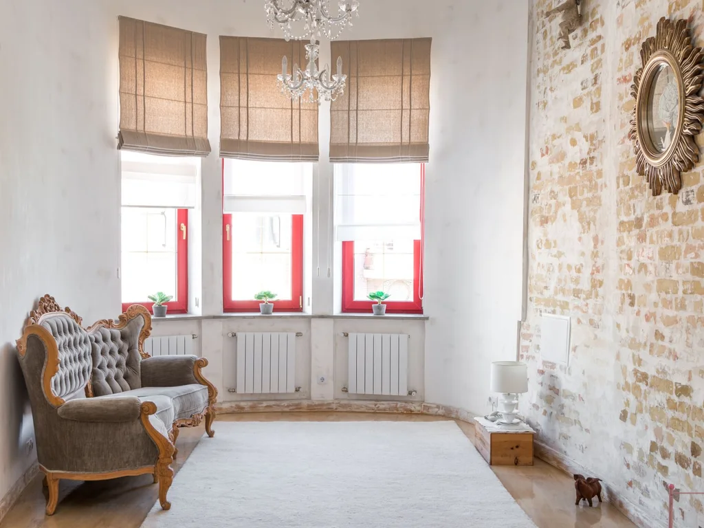
Breton stripes on a cushion, a throw or a rug nod to the coast without turning the room into a sailor’s cabin. Navy and white is classic; softer blue and cream feels more modern. One striped item per room keeps the reference elegant rather than literal.
69. Hang Coastal Art With Restraint
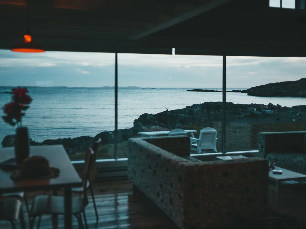
One large seascape or a pair of coastal prints anchors a room; a wall of beach photography can feel like a holiday rental. Choose art in your room’s palette so it blends with the scheme instead of shouting its theme. Abstract waves often age better than literal beach scenes.
70. Choose Light Floors or Light Rugs to Open Rooms

Light wood, pale rugs or whitewashed boards reflect daylight and make coastal rooms feel larger. If dark floors are fixed, layer a large pale rug over them to get the same effect. The lighter the floor, the airier everything above it feels.
8. Dark Academia and Moody
71. Paint One Room in Deep Green or Navy
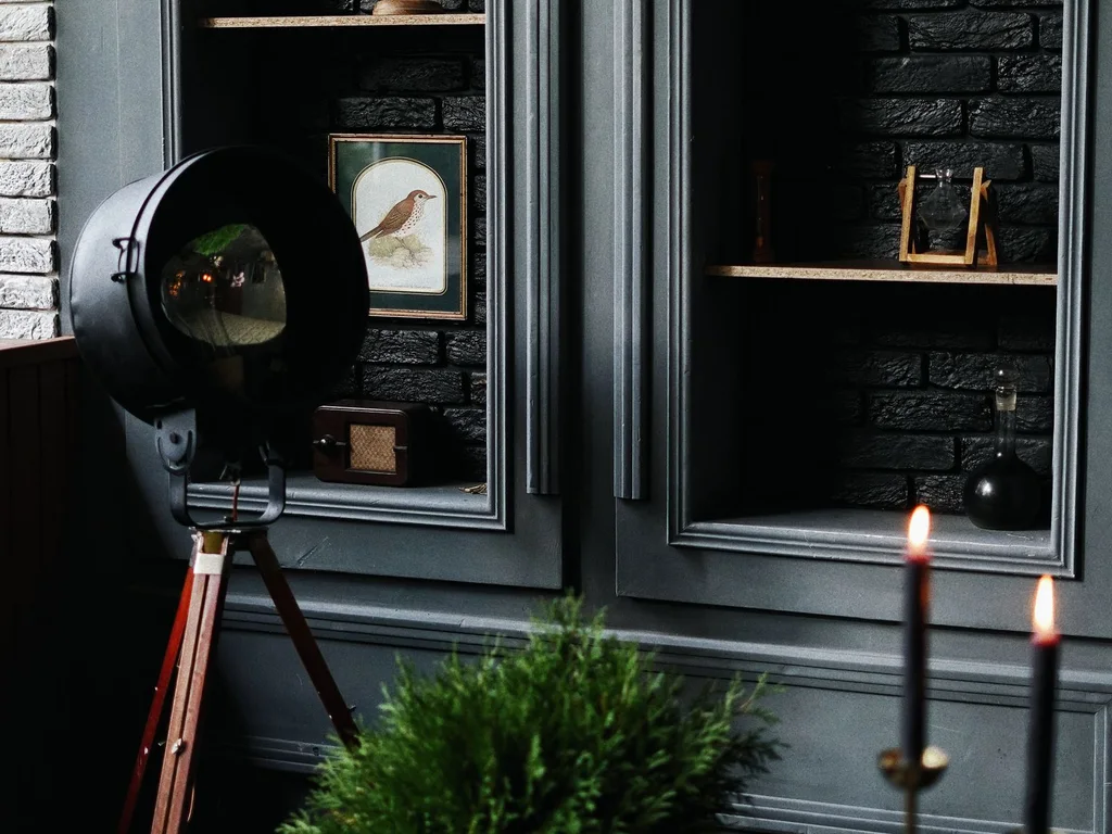
A deep green or navy room feels like a library — intimate, dramatic and surprisingly cosy. Paint all four walls, not just one, for a truly enveloping effect, and balance the darkness with warm lamps and pale art. Dark rooms need more light sources, not fewer.
72. Light With Brass Lamps for a Warm Glow
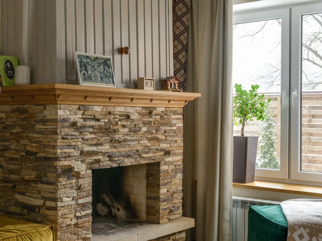
Brass lamps cast a warm, golden light that suits moody rooms perfectly. A brass desk lamp, a pair of brass sconces or a brass floor lamp adds both light and jewellery to the room. Unlacquered brass develops a patina that suits the academic, aged feeling.
73. Anchor the Room With a Leather Chair
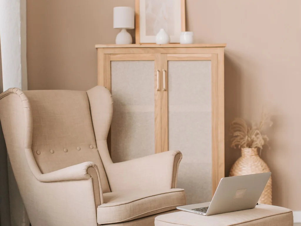
A worn leather armchair is the dark academia hero: comfortable, characterful and better with age. Place it by a lamp with a small side table and a stack of books, and you have an instant reading corner. Dark brown or oxblood leather suits the palette best.
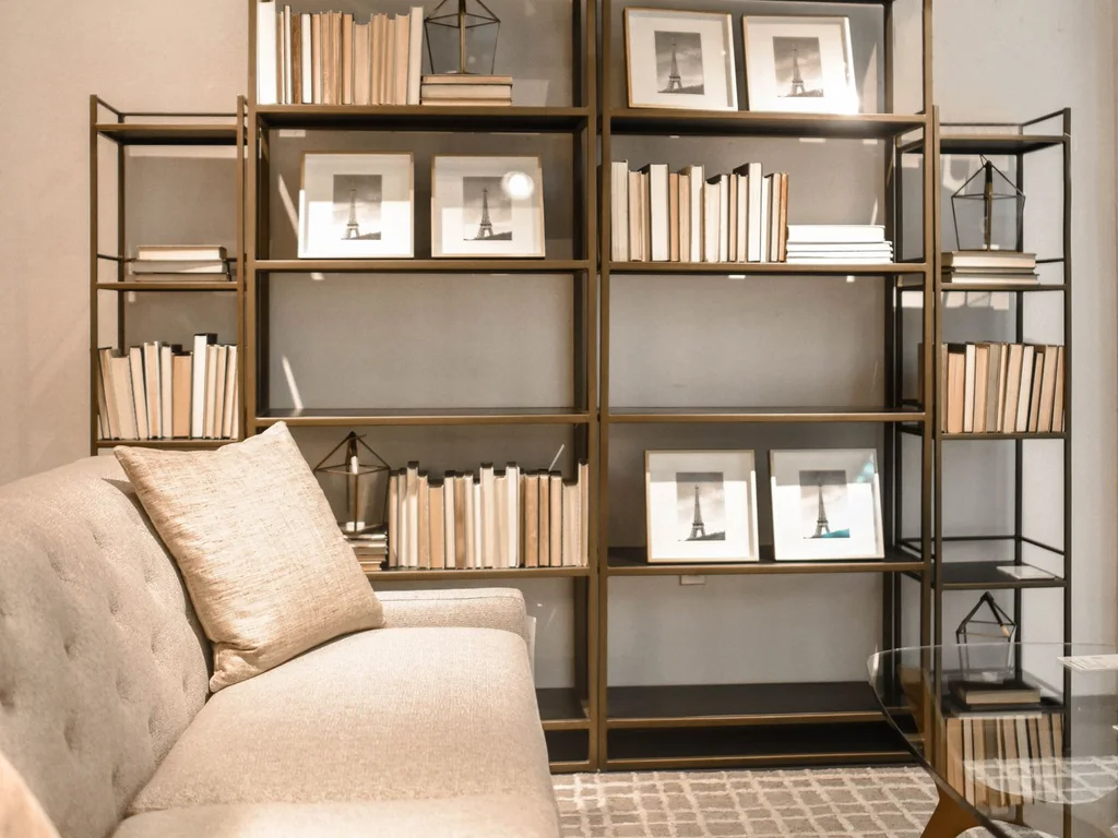
74. Fill Bookshelves Generously and Honestly
Dark academia bookshelves should look read, not staged. Fill them with real books, varied in height, with a few horizontal stacks and small objects breaking the rows. Books you love are the best decor — they tell your story and fill the room with colour and texture.
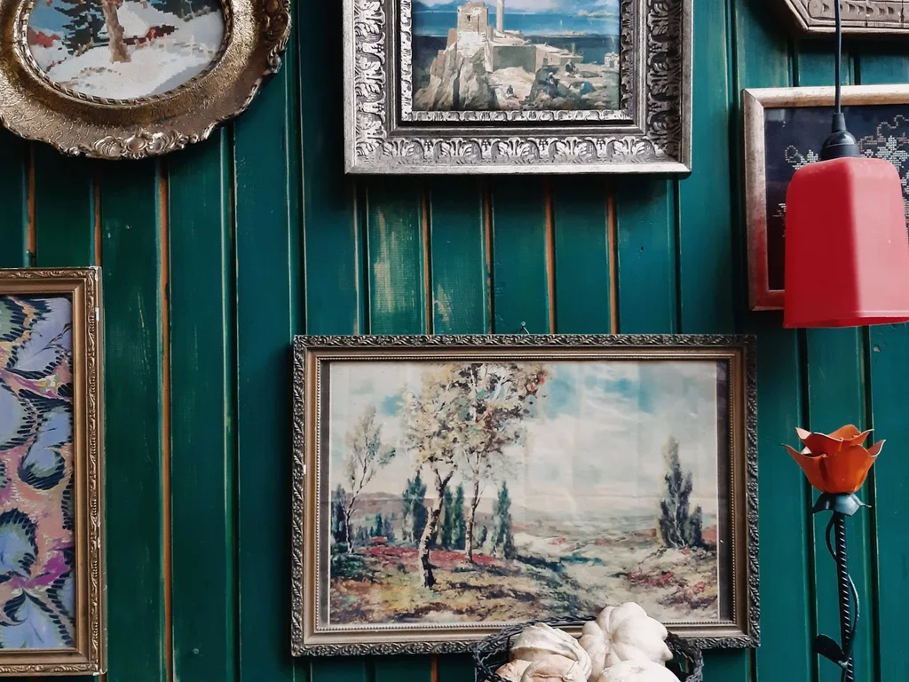
75. Hang Oil-Style Paintings in Ornate Frames
Traditional oil-style paintings in gold or dark wood frames bring instant gravitas to moody walls. Thrift shops and print shops offer affordable options; the frame matters as much as the art. Hang paintings slightly lower than usual so they feel part of the room, not a gallery.
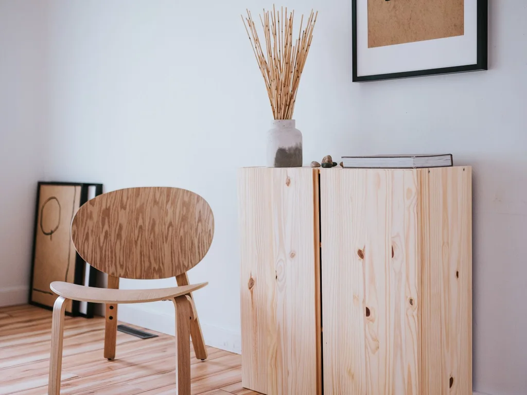
76. Use Dark Wood for Furniture and Frames
Mahogany, walnut and dark-stained oak ground a moody room and contrast beautifully with brass and cream. Use dark wood for shelves, frames and at least one large piece so the room feels anchored. Balance it with pale textiles so the darkness does not become gloom.
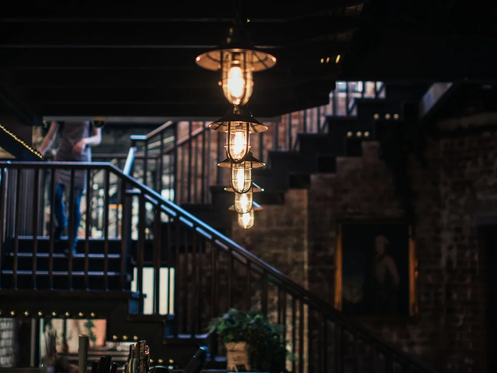
77. Add Candlelight as a Second Light Layer
Candles — real or good-quality flameless — add flickering warmth that electric light cannot match. Group candles of different heights on a tray, never leave real ones unattended, and use them in the evening to transform a moody room into a sanctuary.
78. Drape Plaid Throws for Scholarly Warmth
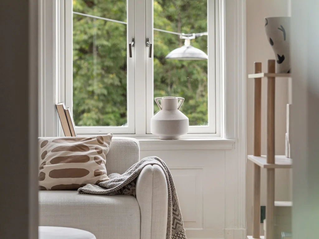
A plaid throw in deep green, navy or burgundy over a chair or sofa is shorthand for scholarly comfort. Choose wool or a wool blend for weight and warmth. One plaid per room keeps the reference clear; mixing several tartans quickly becomes visual noise.
79. Style a Vintage Globe or Map as a Talking Point
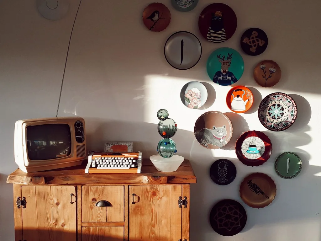
A vintage globe on a stand or a framed old map gives a moody room a story and a focal point. Place it where guests naturally pause — near the reading chair or by the door. Old maps in muted tones suit the palette far better than bright, modern prints.
80. Let the Hallway Go Moody Too
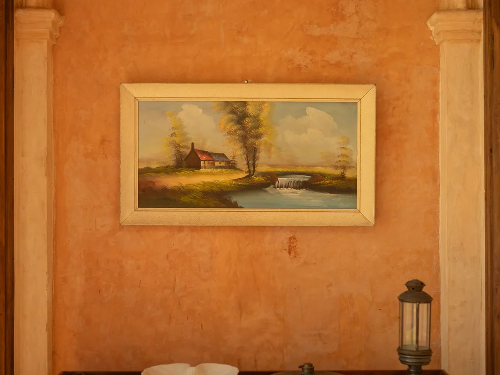
Moody homes should not have bright white hallways breaking the spell. Carry the deep colour, or at least a darker neutral, through hallways with warm sconce lighting. The journey between rooms then feels like moving through one world, not between two different houses.
9. Vintage and Character
81. Hang an Antique Mirror as a Statement
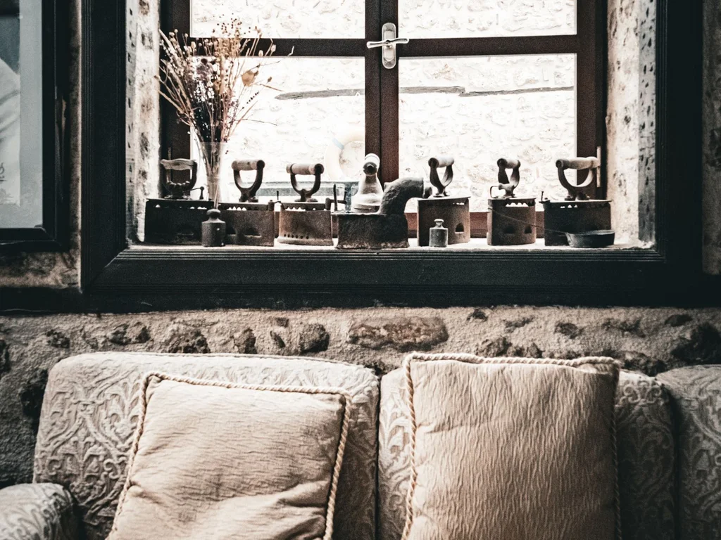
An antique mirror with a gilt or carved frame is both art and light-magnifier. Hang it where it reflects something beautiful — a window, a plant, a lamp — and it doubles the room’s best feature. One large antique mirror beats several small modern ones for character.
82. Keep One Heirloom Piece in Every Room
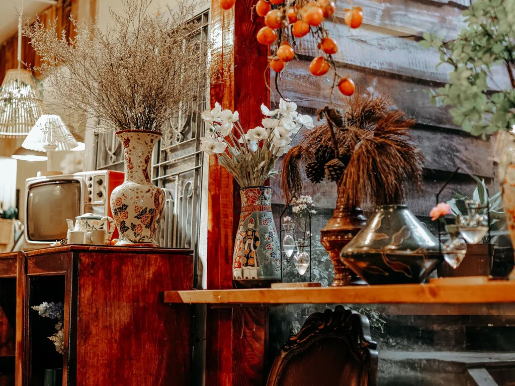
An inherited chair, a grandmother’s clock or a family quilt gives a room a story no shop can sell. Let the heirloom lead: build the room’s colours around it rather than forcing it into a scheme. Homes with heirlooms feel rooted and personal in a way new furniture alone cannot.
83. Choose Retro Lighting for Instant Era
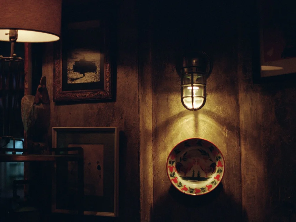
A mid-century pendant, an art-deco sconce or a 1970s arc lamp instantly dates a room — in the best way. Retro lighting is the fastest route to a vintage aesthetic because light shapes mood all evening. Rewire old lamps safely and fit warm bulbs to complete the effect.
84. Ground Rooms With a Vintage Rug
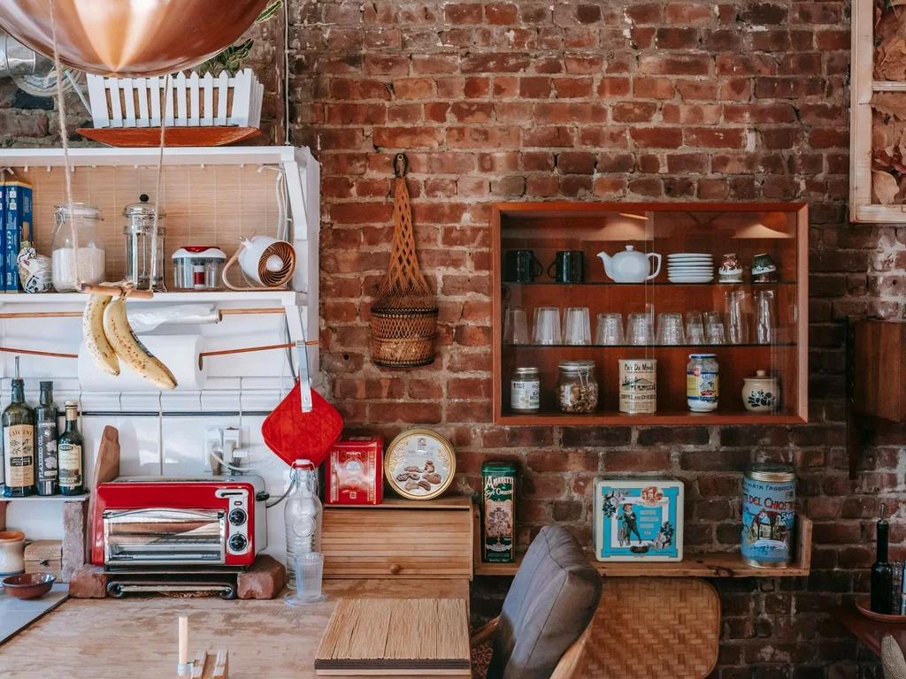
A genuinely old rug, with faded colours and soft pile, grounds a room like nothing new can. Vintage rugs are often cheaper than new ones of similar size, and their muted tones suit almost any palette. Layer a vintage rug over a plain larger rug if the size is slightly small.
85. Swap Modern Hardware for Brass Details
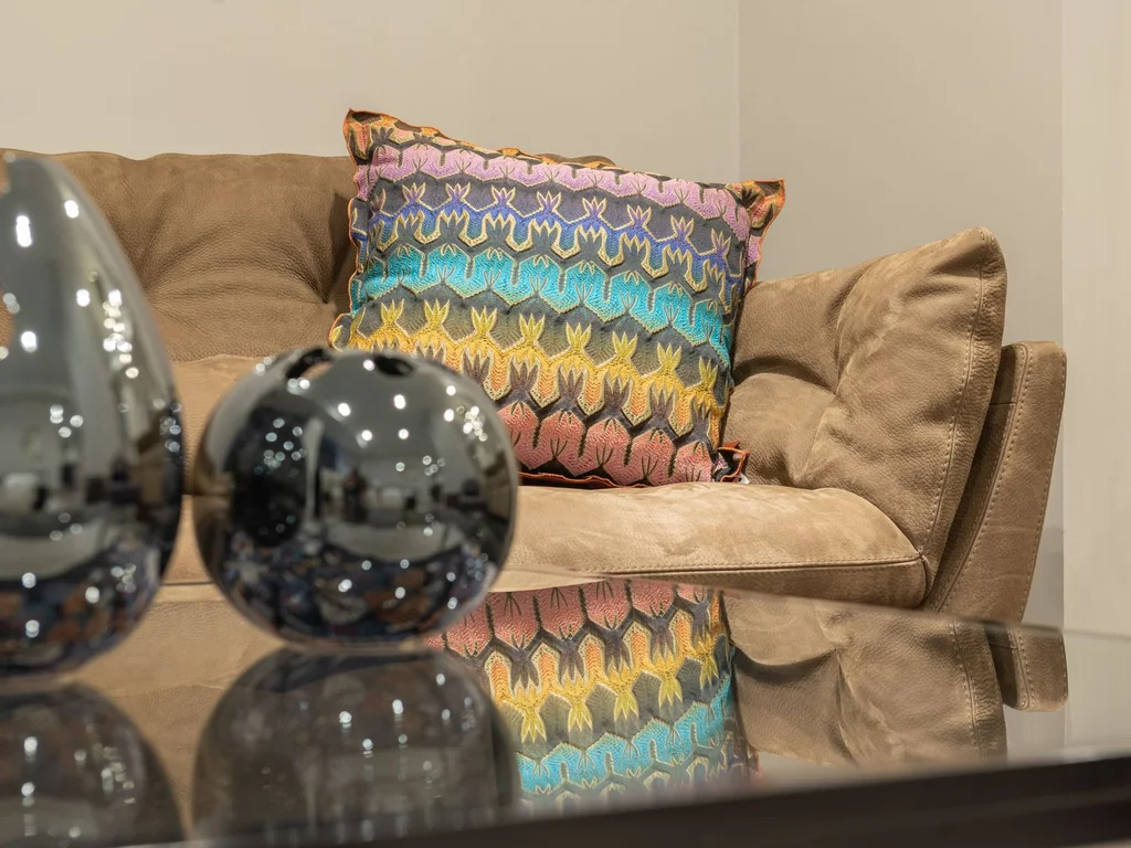
Changing drawer pulls, cabinet knobs and door handles to brass is a small job with an outsized effect. Brass warms kitchens, bathrooms and bedrooms alike and suits vintage, traditional and eclectic rooms. Keep the brass finish consistent within each room for a tailored look.
86. Style Old Books as Decor With Meaning
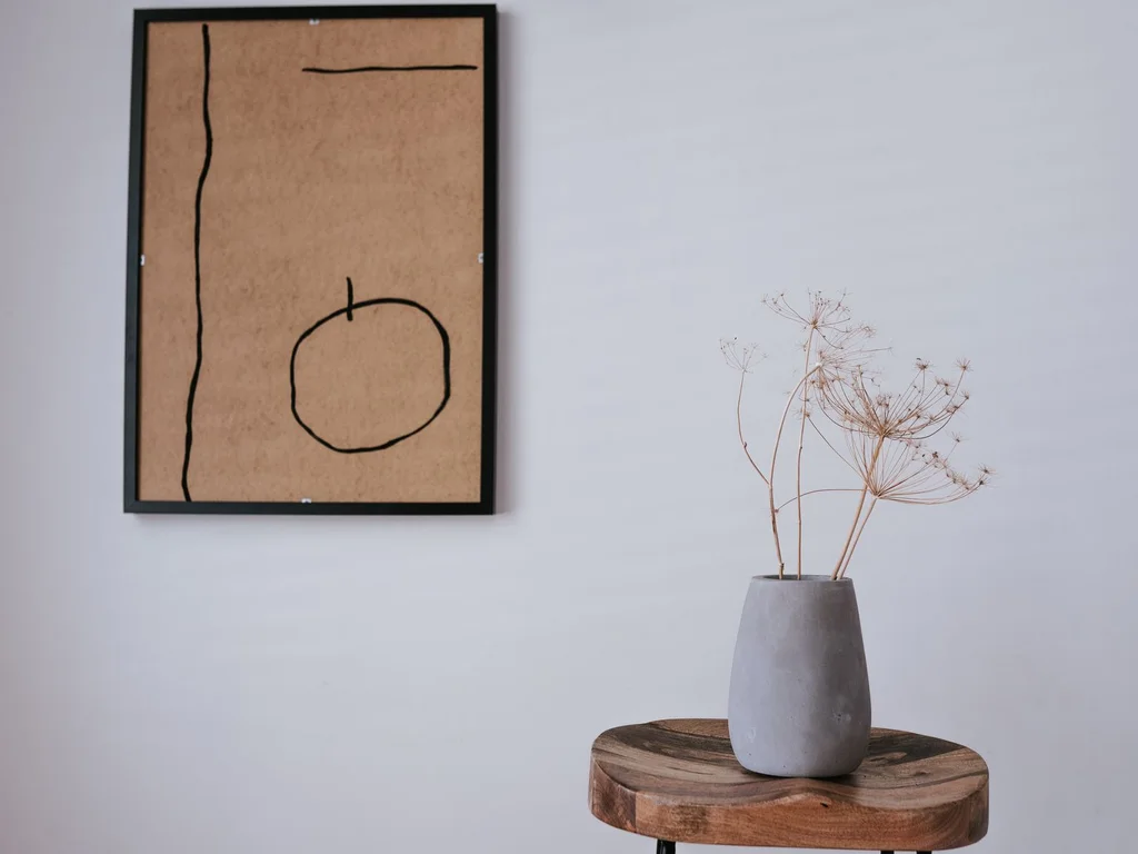
Old books with cloth bindings and gilt titles are beautiful objects in their own right. Stack them by colour or size on tables and shelves, open one to a favourite illustration, and let them be handled. Books chosen for love always look better than books bought by the metre.
87. Add One Retro Colour Pop Per Room
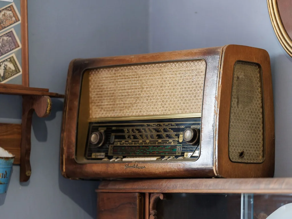
A mustard chair, a teal kettle, an orange vase — one retro colour pop per room keeps a vintage scheme feeling playful rather than period-perfect. The pop should appear at least twice in small doses, like a cushion echoing the chair, so it feels deliberate.
88. Buy Second-Hand Statement Pieces First
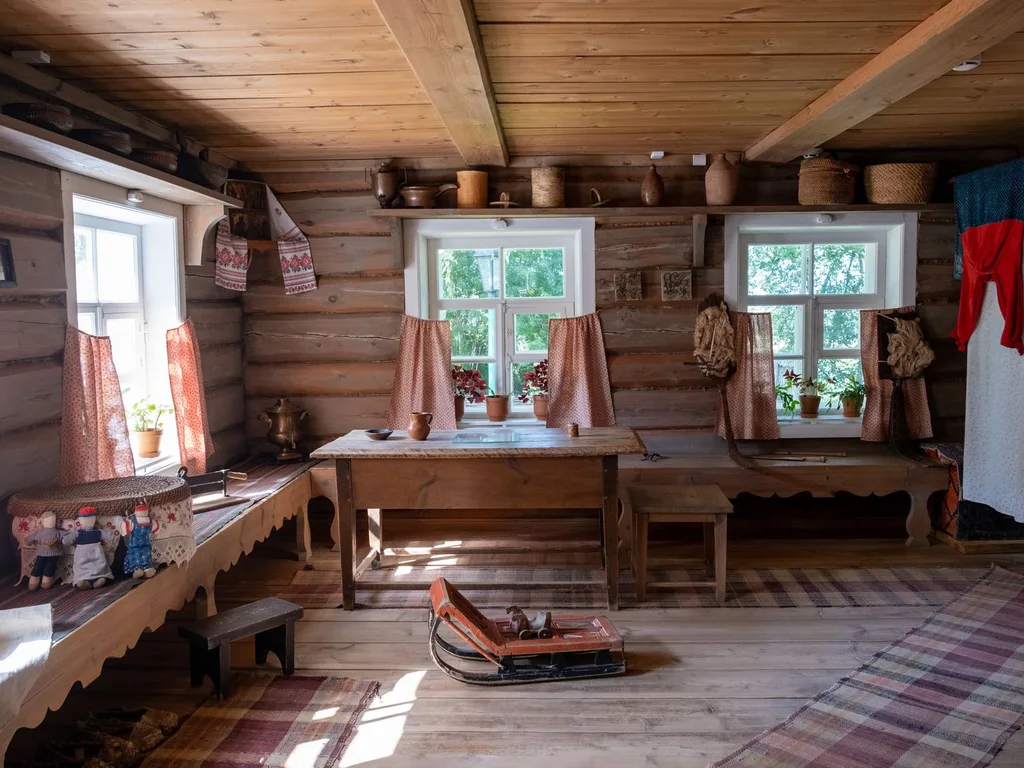
When furnishing a room, buy the statement piece second-hand first — a sideboard, a mirror, a lamp — then fill around it with simpler new items. The room gains character and history from the start, and often for less money. Check charity shops, auctions and local listings regularly.
89. Create a Family Photo Gallery With a Consistent Frame
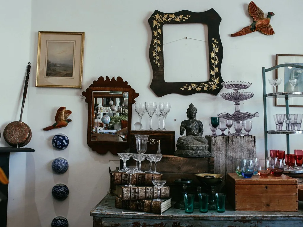
Family photos feel intentional when the frames match, even if the photos span decades. Choose one frame style — black, oak or brass — and print photos in similar tones. A consistent gallery wall feels like an exhibition of your life, not a random pinboard.
90. Embrace Patina Instead of Polishing It Away
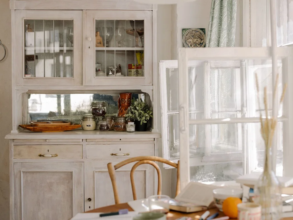
Scratches on wood, tarnish on brass and fading on fabric are evidence of a life lived with objects. Embrace patina on vintage pieces instead of restoring everything to new. A home that shows gentle wear feels welcoming and real, while a perfectly polished home can feel untouchable.
10. Cohesion Across Rooms
91. Repeat One Wood Tone Through the Home
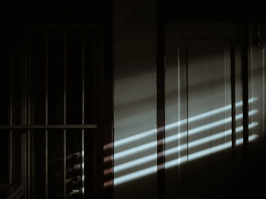
Choose one dominant wood tone — warm oak, walnut or pale ash — and repeat it in furniture, frames and shelving across rooms. Other woods can appear as accents, but the repeated tone is what makes the home feel unified. Photograph rooms side by side to check the wood reads consistently.
92. Use the Same Curtain Fabric in Adjoining Rooms
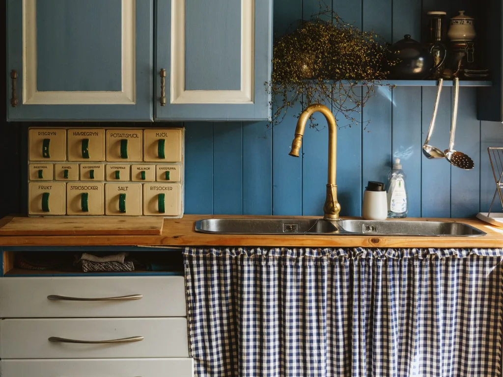
When living and dining rooms connect, using the same curtain fabric in both makes them read as one generous space. The fabric need not be identical in colour — the same weave in two tones of your palette works too. Consistent window dressing is one of the strongest cohesion tricks there is.
93. Keep Door and Cabinet Hardware Consistent
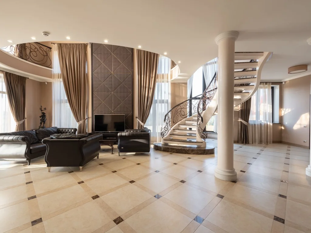
Hardware is touched daily and seen everywhere, so inconsistent handles quietly undermine cohesion. Standardise on one finish and style through the home, room by room as budget allows. Even changing just the most visible handles — kitchen, front door, living room — makes a noticeable difference.
94. Thread One Art Style Through Every Room
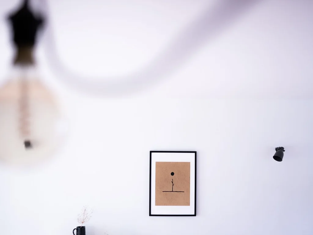
Art does not need to match, but a shared style — all abstract, all botanical, all black-and-white photography — threads rooms together. Choose a style you genuinely love, since you will live with it everywhere. One shared art style makes even very different rooms feel related.
95. Treat the Hallway as a Gallery Bridge
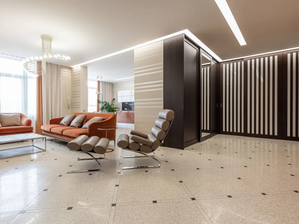
Use hallways to preview the art, colours and textures of the rooms they connect. A hallway gallery mixing one piece from each room’s style creates a visual bridge, so moving between rooms feels like turning pages of the same book rather than starting a new one.
96. Paint Interior Doors One Unified Colour
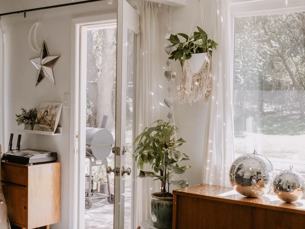
Interior doors are easy to overlook and hard to unsee once noticed. Painting all of them one colour — white, black or a deep tone from your palette — unifies the home instantly. It is a weekend job with a whole-home payoff, and it frames every room consistently.
97. Let Flooring Flow Without Harsh Breaks
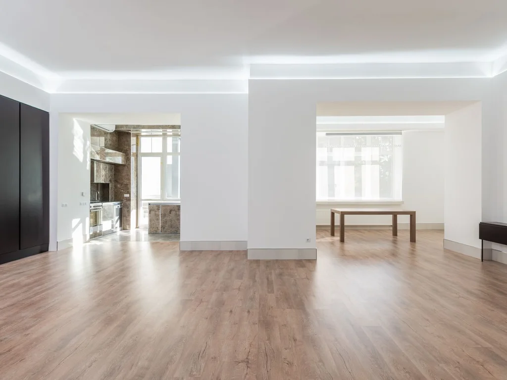
Wherever possible, run the same flooring through connected spaces and use thresholds only where materials must change. Continuous flooring makes rooms feel larger and more connected. If changing floors is impossible, use large rugs in a shared tone to visually bridge the break.
98. Repeat One Signature Object in Each Room
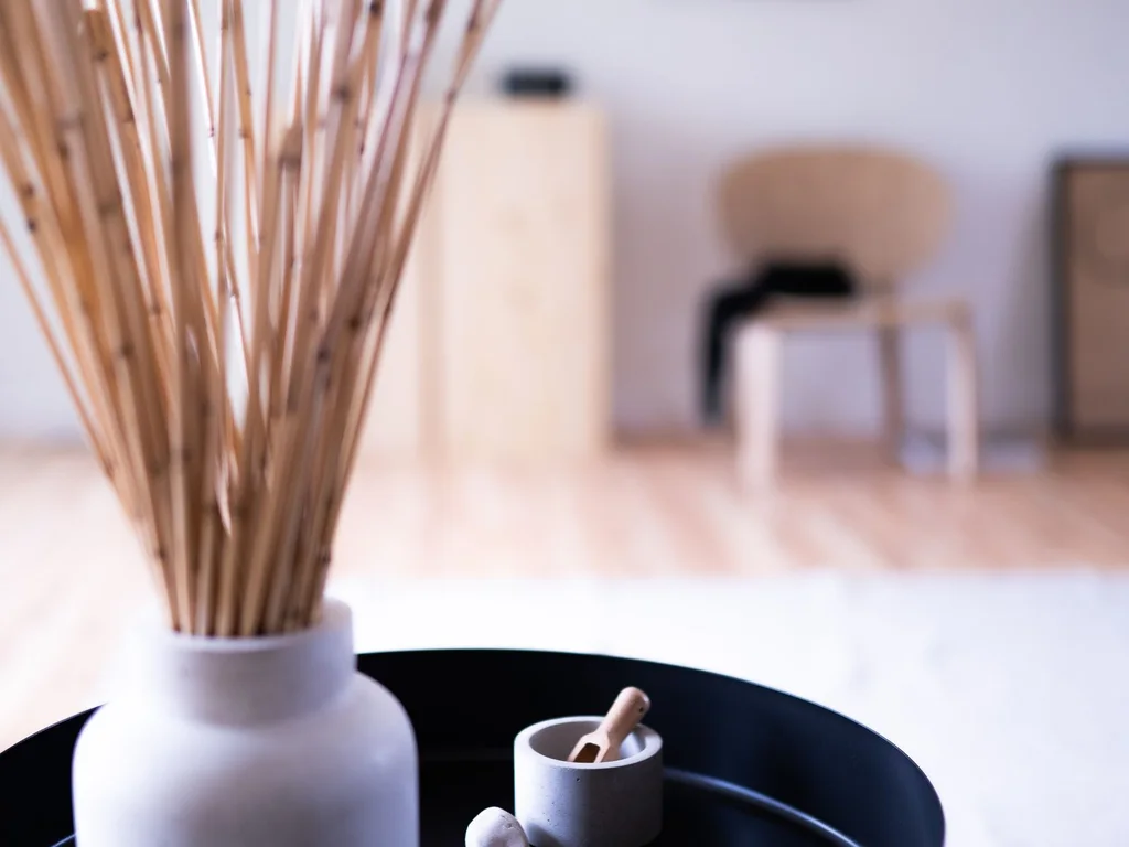
Pick one object type — a ceramic vase, a brass candle holder, a woven basket — and place one in every room. The repetition is quiet but powerful: the eye recognises the signature and reads the home as one designed whole. Vary sizes so it never looks like a matching set.
99. Keep Lighting Temperature the Same Everywhere
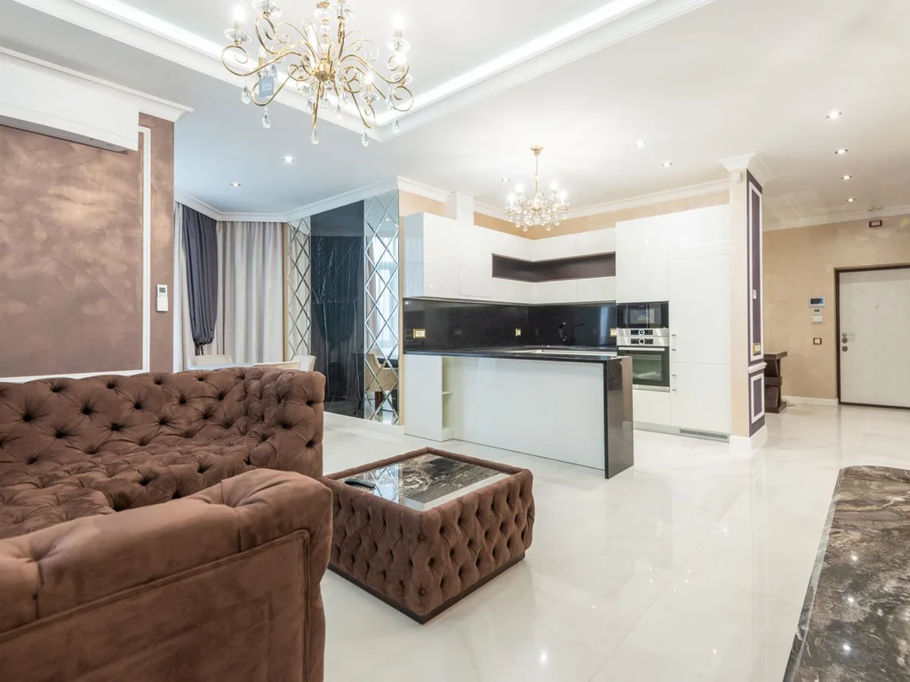
Mixed bulb temperatures — cool white in one room, warm yellow in the next — break cohesion more than most people realise. Standardise on one temperature, usually warm white around 2700K, for every bulb in the home. The rooms will feel like they belong to each other, day and night.
100. Step Back and View Rooms as One Composition
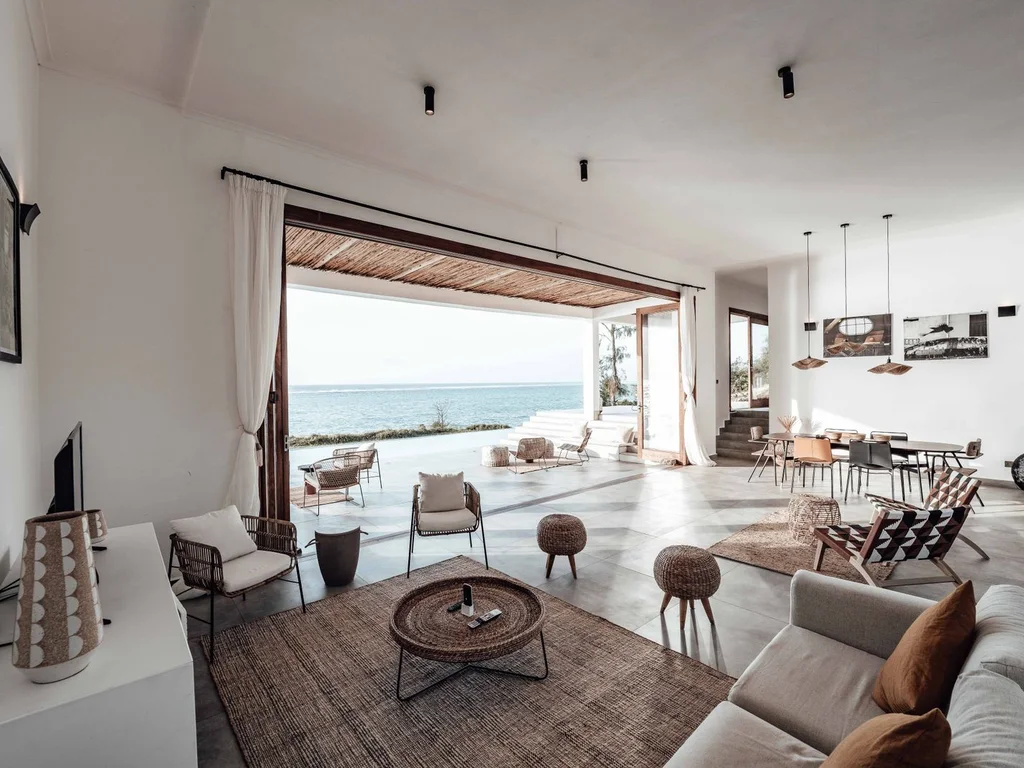
Finally, stand in each doorway and look through to the next room. Do the colours, wood tones and light temperatures sit comfortably together? Adjust the one thing that jars — usually a single cushion, frame or lamp — and the whole home snaps into focus. Cohesion is checked from doorways, not from inside single rooms.
Mistakes That Break a Home’s Aesthetic
The most common cohesion mistake is buying room by room with no shared palette, producing a house of unrelated showrooms. The second is following every trend at once, so nothing settles into a style. The third is decorating only at eye level and forgetting floors, ceilings and hallways. Avoid these three traps and most homes fall into a coherent aesthetic almost by themselves. See also our small bedroom design ideas for cohesion in small spaces.
Frequently Asked Questions
How do I choose one aesthetic for my whole home?
Start with the room you love most and name what you love about it — its colours, textures or mood. Turn that feeling into three words and use them as a filter for every purchase. If an item does not fit at least two of your three words, skip it.
Can I mix two aesthetics, like boho and minimal?
Yes — most beautiful homes do. Let one aesthetic lead about seventy percent of decisions and let the second appear as accents. A minimal home with boho textiles, or a boho home with minimal furniture, feels layered rather than confused.
What is the cheapest way to make my home look cohesive?
Paint is cheapest, followed by consistent hardware and matching curtains. One paint colour through hallways, one brass finish on handles and the same warm bulb temperature everywhere can unify a home for very little money.
How many colours should a whole home have?
Three is the classic answer: a dominant neutral, a supporting colour and an accent. Larger homes can stretch to four or five only as small accents. Fewer colours, used well, almost always look more expensive than many colours used randomly.
Does every room need the same style?
No — rooms can have their own personalities. What they need is a shared thread: a colour, a wood tone, a metal finish or an art style that appears in each room, so the home still reads as one place.
How often should I update my home’s aesthetic?
Refresh small accents seasonally and review the bigger picture every few years. A cohesive base — paint, flooring, major furniture — should last a decade, while cushions, throws and art can change as taste evolves.
What if my partner and I like different aesthetics?
Find the overlap first: most couples share at least one colour, material or mood. Build the shared palette around it, then give each person one room or accent area for their own taste. One bold personal room feels richer than a home where every room is a compromise.
What is the difference between an aesthetic and a theme?
A theme copies a look literally — anchors and shells for ‘nautical’, for example — and dates quickly. An aesthetic is a set of choices about colour, texture, light and shape that can flex across rooms and years. Build an aesthetic and your home can evolve; build a theme and it can only be replaced.
Conclusion
A cohesive home is not bought in a weekend — it is built choice by choice, with a palette you love, textures that repeat, and rooms that talk to each other through doorways. Start with your colour story, add texture slowly, and check every new purchase against the rooms beside it. Within a season, your home will feel less like a collection of rooms and more like one beautiful place. Explore more in our home design collection.