A TV wall rarely fails because of the screen, the paint, or the console. It fails because of the arrangement: the television sits a few inches off centre, a shelf floats at a height that relates to nothing, and frames hang close enough to feel crowded but not close enough to feel grouped. The fix is not more decor. It is choosing a layout pattern first, then placing every element so it obeys that pattern’s geometry.
This guide teaches layout itself: seven spatial patterns, the spacing rules that keep each one calm, and the alignment lines that hold everything together. If you are still choosing materials and finishes, start with these broader TV wall design examples, then come back here to arrange your choice properly. The finished rooms in the TV wall design ideas listicle all share the same secret: underneath the styling, each one is a single clear layout repeated with discipline.
The tv wall layout system runs on six gaps: screen to console 4–8 inches; screen to frame 3–5; frame to frame 2–3; the shelf above the screen 8–12; shelf to shelf 12–16; and console overhang 6–18 per side. The full spacing table — with the edge–clearance and bay rules — sits in the spacing section below.
In this guide: Start With the Centred-and-Grounded Layout · Build Symmetry With Flanking Built-Ins and Shelving · Wrap the Screen With a Gallery Layout · Try an Asymmetric Offset Layout for Awkward Walls · Use Panel and Slat Geometry to Frame the Screen · Layer Floating Shelves Without Crowding the Screen · Make a Corner Layout Feel Intentional, Not Accidental · Get the Spacing Between Every Element Right · Use Alignment Lines to Hold the Whole Wall Together · Sketch and Tape Out Your Layout Before You Drill · Frequently Asked Questions About Layout TV Wall Design Styles · Conclusion
1. Start With the Centred-and-Grounded Layout
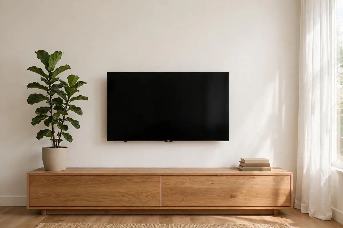
The centred-and-grounded layout is the foundation pattern: the screen sits on the wall’s centre line, a console wider than the screen grounds it from below, and nothing else competes for attention. It gives the eye one vertical axis — screen above, console below, same centre — and in a rectangular room, it is almost always the calmest answer.
Build it in order. Mark the wall’s centre and hang the screen on that line — as a one-line reference, its centre should sit near seated eye level. Choose a console roughly one and a quarter to one and a half times the screen width, and leave a deliberate gap of about four to eight inches between screen and console top, so the two pieces read as layered rather than stacked.
Keeping the centred layout from feeling plain
- Add width, not clutter. Low plants or baskets at the console’s ends extend the horizontal line without breaking the axis.
- Keep the top of the wall empty. The space above the screen is part of this design — resist adding a shelf above it.
- Style the console in a loose triangle. One taller object at one end, one low stack at the other, clear space in the middle.
If a fireplace, door, or window interrupts the wall’s centre, do not force this pattern — choose the offset layout in section four instead.
2. Build Symmetry With Flanking Built-Ins and Shelving
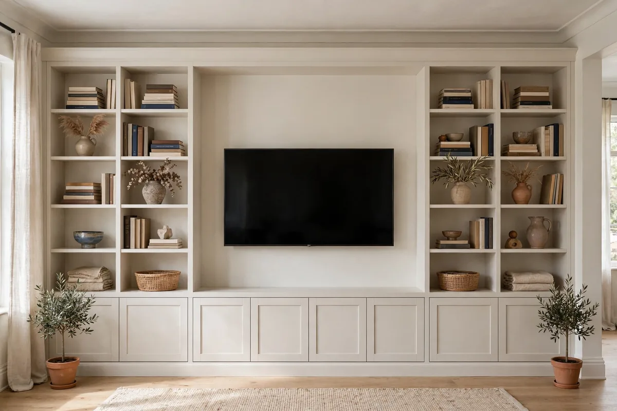
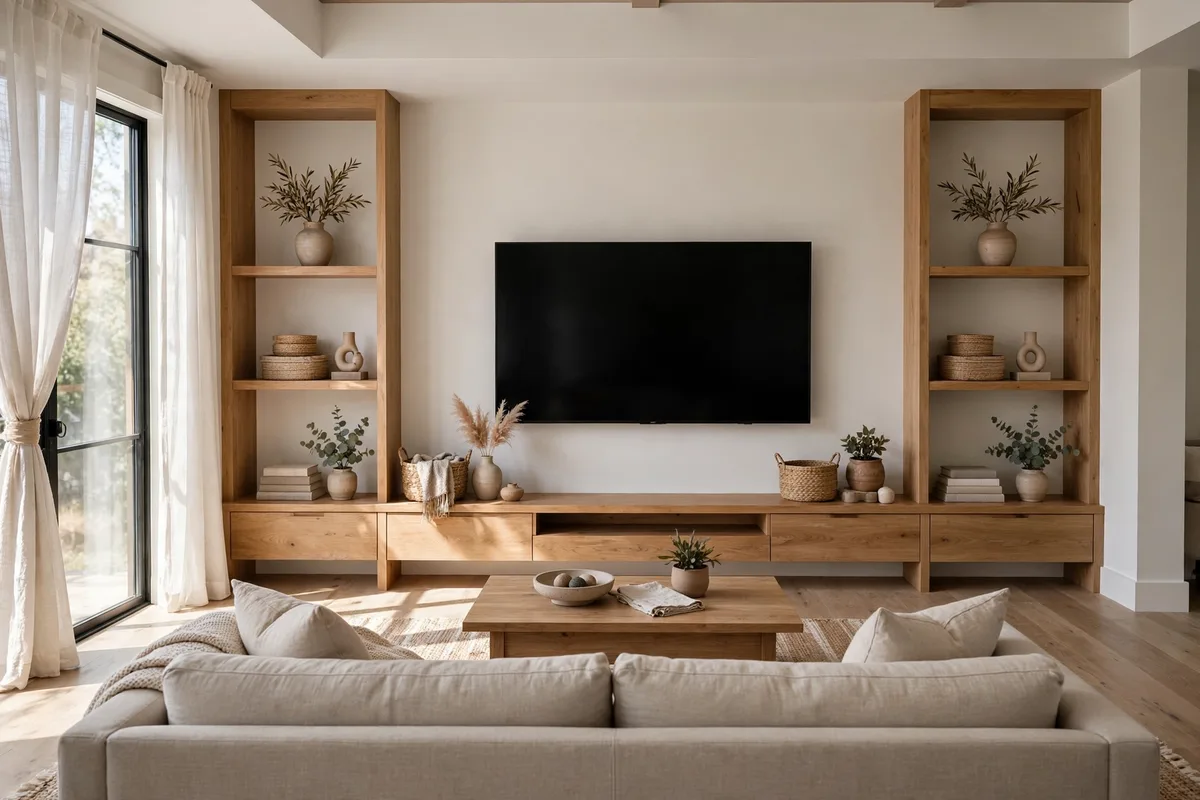
The flanking layout builds a frame around the centred pattern: identical shelving or cabinets on both sides of the screen, matched in width, height, and depth. Symmetry works because the brain reads it as intentional before it registers any detail. It suits wide walls and serious storage.
Divide the wall into three vertical zones: a centre bay for the screen and two equal side bays, with the centre bay giving the screen a few inches of breathing room each side. Side units work best between eighteen and thirty inches wide each — narrower feels like trim, wider swallows the screen. Run both flanks to one shared top line, because that continuous edge makes separate cabinets read as one wall of architecture. Of the seven patterns here, it offers the most storage and formality — and is the hardest to build.
Styling symmetrical flanks without mirroring them
Identical units do not need identical contents — exact mirroring looks staged. Style each side to similar visual weight instead: books on the left balanced by a vase and framed print on the right. Keep shelf heights aligned and leave roughly a third of each side empty, so storage reads as display.
3. Wrap the Screen With a Gallery Layout
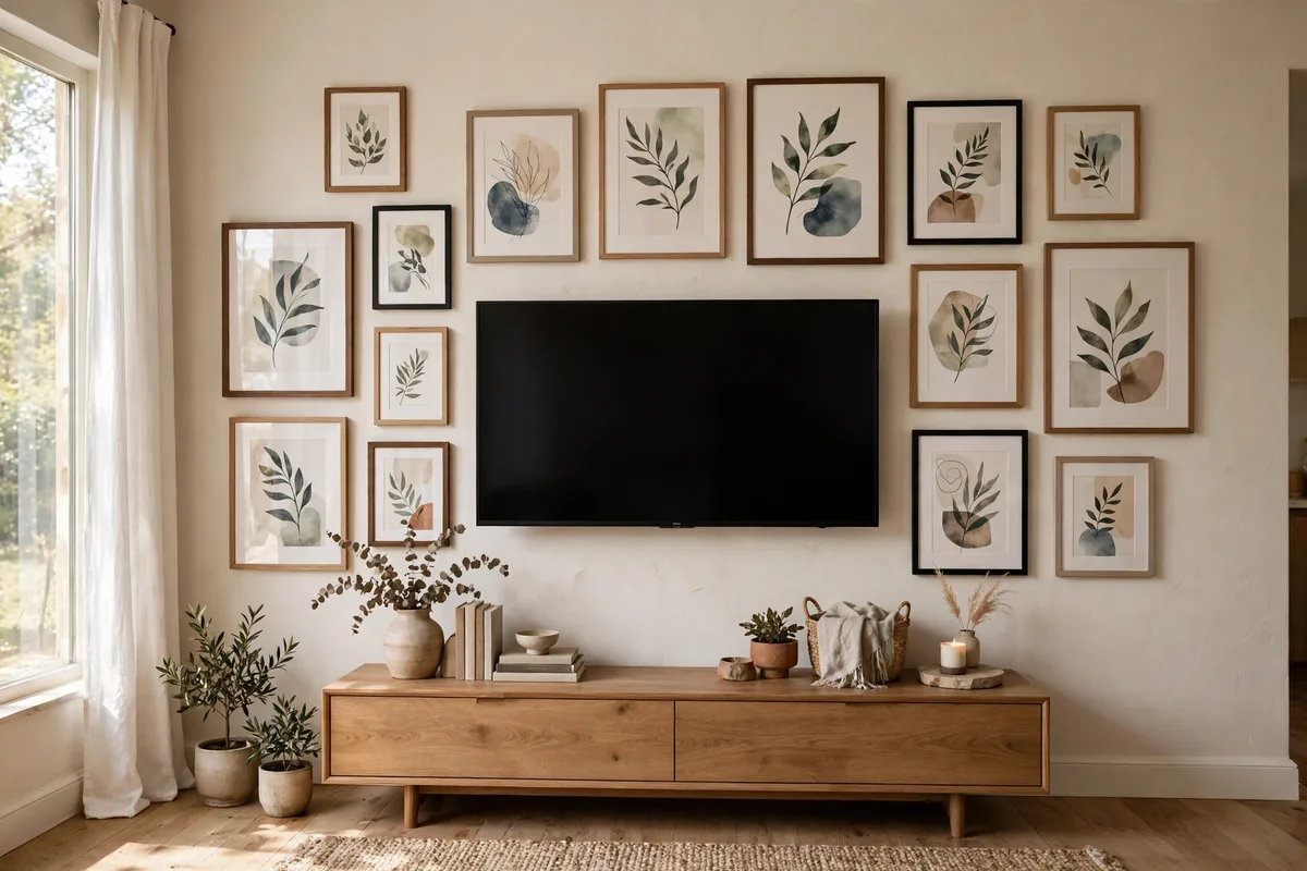
In a gallery layout, the screen becomes one large rectangle inside a bigger arrangement of framed art and photographs. Done well, it solves the black-box problem: switched off, the television sits inside the composition instead of dominating it. It suits large walls and art lovers.
Plan the outer boundary first, not the individual frames. Decide the full rectangle the gallery will occupy — extending beyond the screen on all sides, at least six to eight inches past it. Every frame lives inside that boundary and nothing crosses it. That invisible rectangle is the difference between a gallery wall and a scatter of pictures.
The spacing that makes a gallery read as one piece
- Frame to frame: A consistent gap of about two to three inches — consistency matters more than the exact number.
- Frame to screen: Slightly more clearance, about three to five inches, so the screen keeps a quiet halo.
- Mix sizes with discipline: Hang the largest pieces first, fill gaps with smaller ones, and keep frame finishes to two or three.
- Anchor it below: A console under the gallery gives the arrangement a base line.
Lay the arrangement on the floor first, photograph it, then transfer it to the wall using the tape method in section ten.
4. Try an Asymmetric Offset Layout for Awkward Walls
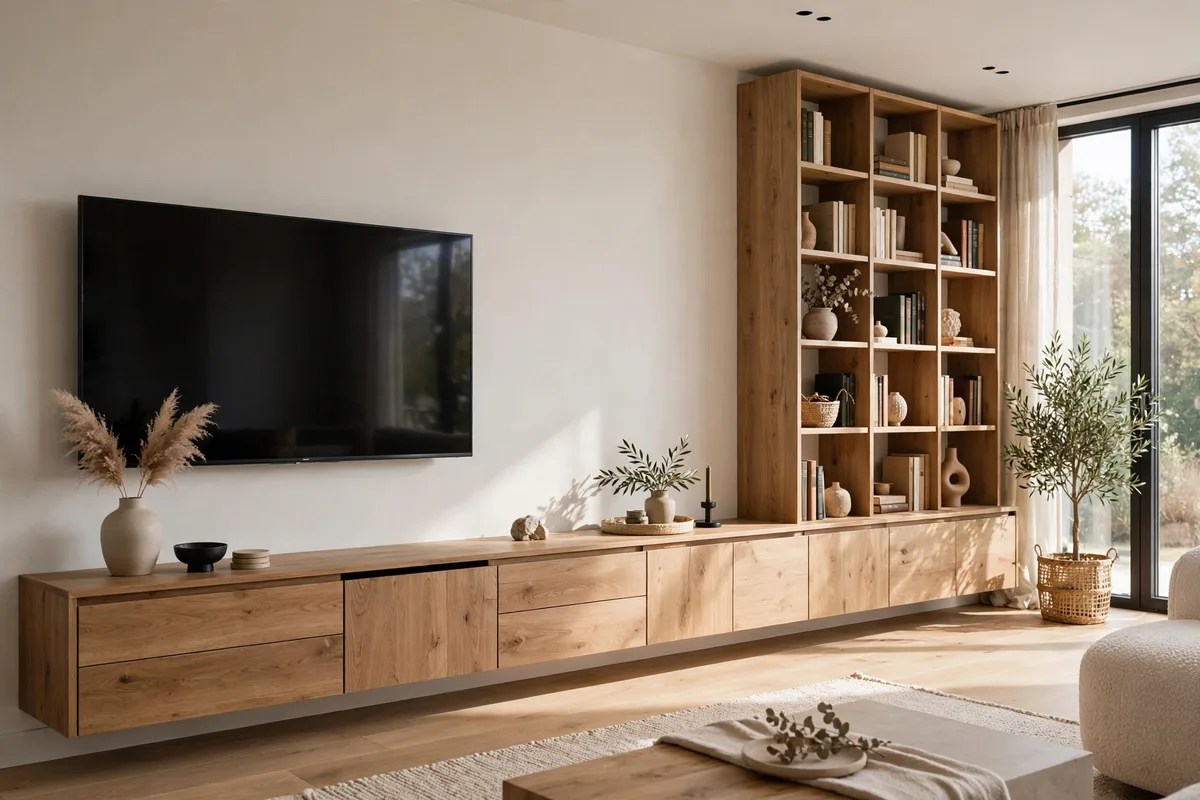
Many real walls refuse to be centred: a door opens at one end, a window eats one side, or the seating faces a point that is not the wall’s middle. The asymmetric offset layout stops fighting that reality. The screen shifts to one side — often aligning with the seating rather than the wall — and a taller element opposite balances its weight.
Balance here is about weight, not position. Think of the wall as a seesaw: the further an element sits from the centre, the lighter it can be. Use the rule of thirds — divide the wall into three bands, place the screen in one outer band, and give the remaining space one clear supporting element, such as a bookcase or shelf stack, rather than several small ones.
Making offset look deliberate, not like a mistake
- Repeat one line. Share one alignment between the sides: the tops of screen and bookcase, or the console’s top edge running under both.
- Extend the console toward the empty side. A long console under both elements stitches the two halves into one composition.
- Keep the empty side emptier. One strong element plus breathing room reads as confidence; scattered small objects read as leftovers.
Offset layouts fail when they are timid — a screen nudged six inches off centre just looks mis-measured. Commit to the asymmetry.
5. Use Panel and Slat Geometry to Frame the Screen
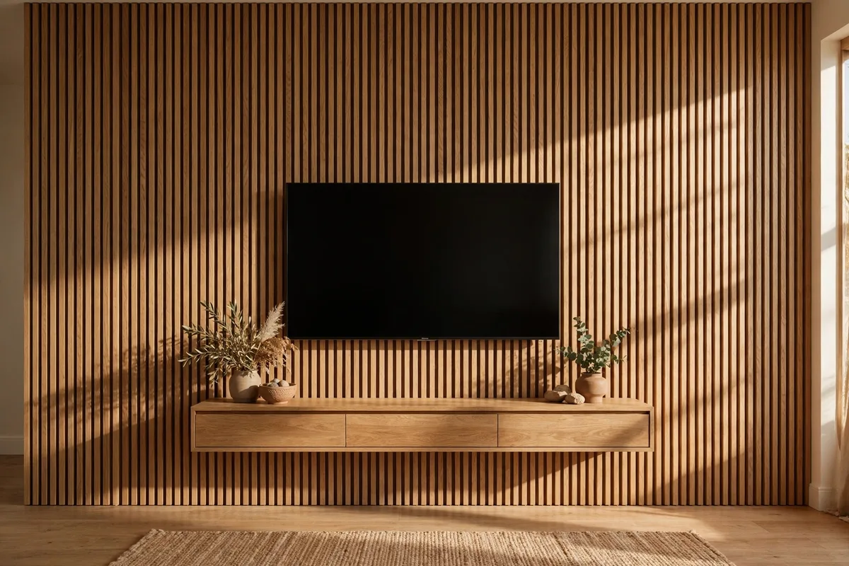
A panel or slat layout uses a defined field of material — vertical wood slats, panelling, a stone slab, or a painted panel — as a frame the screen sits inside. The material is not the layout; the geometry is. The panel establishes a clear inner zone, and everything else is arranged relative to its edges. Get the proportions right and even a plain screen looks architectural.
Size the panel from the screen outward: roughly one and a half to two times the screen’s width, leaving a visible border of material on both sides. Vertically there are two honest choices — run the field floor to ceiling, or stop it at a clean line such as the screen’s top plus a consistent margin. A panel stopping at a random height satisfies neither.
Centred panel or offset panel?
- Centred: Screen in the middle of the panel, panel in the middle of the wall, console centred below — calm and formal.
- Offset: The panel shifts to one side and carries the screen with it, while the remaining wall holds shelving — the slat version of the asymmetric layout.
- Partial width with a hard edge: End slats with clean trim. A deliberate edge is geometry; a ragged one is an unfinished job.
Keep the console decision separate: a centred floating console can quietly re-centre the wall’s lower half under an offset screen.
6. Layer Floating Shelves Without Crowding the Screen
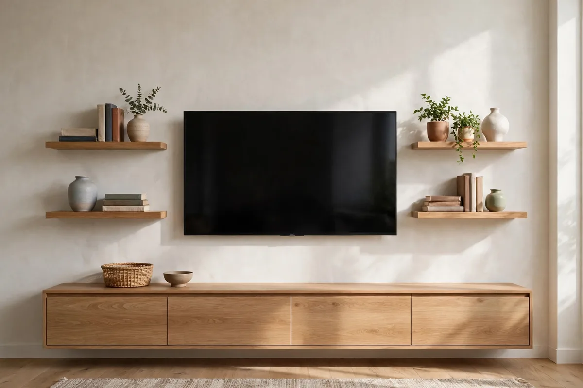
Floating shelves are the most flexible layout tool on a TV wall: no floor space needed, renter-friendly, and arrangeable as symmetry, an offset stack, or a single run. They are also the easiest to ruin, because shelves added one at a time gradually surround the screen with clutter at unrelated heights. Treat them as one layout from the start.
Three arrangements cover almost every wall. The flanking pair puts a column of shelves on each side of the screen at matched heights — a lighter cousin of the built-ins. The single stack places shelves on one side only, balancing an offset screen. The overhead run is one long shelf above the screen, about eight to twelve inches above its top edge, styled sparsely.
Shelf spacing and styling rules
- Vertical spacing: About twelve to sixteen inches between shelf surfaces for books and objects; tighter suits small items only.
- Depth: Keep shelves shallow, around eight to ten inches, so they sit behind the screen’s face.
- The near-screen rule: Low and simple objects closest to the screen; tall, busy ones at the outer edges.
- Empty space is a feature. Fill roughly two thirds of each shelf — crowded shelves read as storage.
End every shelf run on a shared line — the screen’s top or bottom edge, or the console’s ends — and the arrangement looks planned.
7. Make a Corner Layout Feel Intentional, Not Accidental
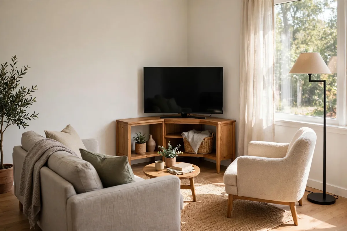
Sometimes the corner is the only workable position: the room is small, windows claim the flat walls, or the seating faces the diagonal. Corner layouts have a poor reputation because most are accidents — a screen wedged in at an angle with a cabinet that does not fit. A deliberate corner layout uses the corner as its organising idea instead.
Three corner patterns are worth knowing. The diagonal layout angles the screen across the corner, with seating on the opposite diagonal. The wrap layout places the screen flat on one wall near the corner and lets a console or shelving turn the corner in an L. The stacked corner keeps the screen low and builds one vertical element — a narrow bookcase or shelf column — into the corner, using height where width is unavailable.
Corner geometry that keeps it comfortable
- Mind the viewing angle. Angle the screen toward the main seat, not the room’s centre.
- Use the corner depth. The triangular space behind an angled console is dead storage; claim it for a router or power strip.
- Soften the opposite corner. A plant or floor lamp diagonally opposite balances the media corner.
A corner layout succeeds when a guest reads it as a choice: a console that fits the corner exactly and seating squared to the screen.
8. Get the Spacing Between Every Element Right
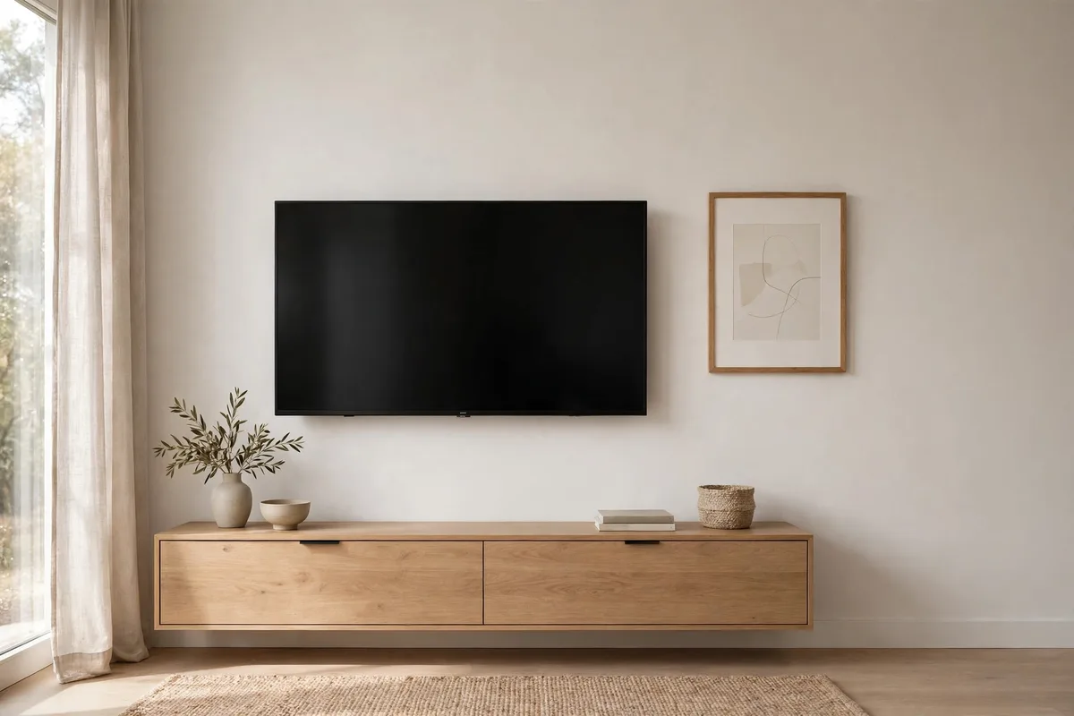
Every layout here stands or falls on a handful of distances. Spacing separates elements that belong together from elements that merely coexist, and it costs nothing but measuring. The principle is simple: gaps inside a group should be smaller than gaps between groups, and consistent wherever the eye can compare them.
| Gap | Recommended distance | Why it matters |
|---|---|---|
| Bottom of screen to console top | About 4 to 8 inches | Layers screen and console without a floating gap or cramped stack |
| Screen edge to nearest frame | About 3 to 5 inches | Gives the screen a halo and keeps art from competing |
| Frame to frame in a gallery | About 2 to 3 inches, consistent | Makes separate frames read as one arrangement |
| Screen top to shelf above | About 8 to 12 inches | Clears the picture and leaves room for objects |
| Between floating shelves | About 12 to 16 inches | Fits books and taller objects between shelves |
| Screen or panel edge to wall end | At least 6 to 12 inches | Stops the layout feeling squeezed against trim |
| Console end beyond screen edge | About 6 to 18 inches each side | Grounds the screen, prevents a top-heavy look |
| Centre bay clearance in built-ins | About 2 to 4 inches each side | Allows heat to escape and servicing |
Adjust for scale: a large screen on a wide wall can carry slightly larger gaps; a compact wall wants the lower end of every range. Never mix gaps randomly.
The two spacing mistakes to avoid
The first is the drift gap: an element just far enough from a group to look accidental — pull it into the group’s rhythm or move it decisively away. The second is edge squeeze: running a layout so close to a corner or door frame that the wall looks overfilled.
9. Use Alignment Lines to Hold the Whole Wall Together
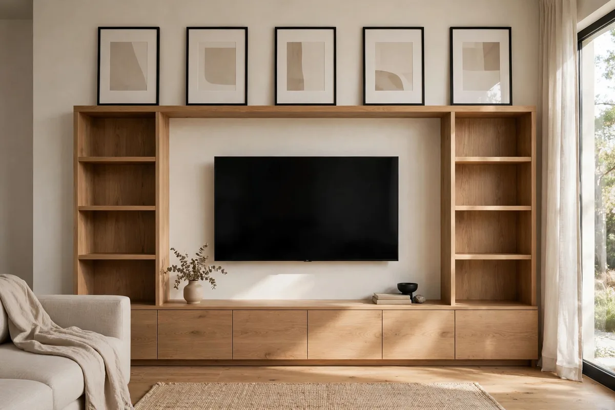
Alignment lines are the invisible edges your layout shares. Pick two or three, hang everything to them, and elements of different sizes will still read as one composition. It is the most useful idea in TV wall layout: you do not arrange objects, you arrange edges.
Start with the lines the wall gives you for free: the console’s top edge is a natural horizontal, the screen’s bottom edge another. Choose one as your primary line and align to it relentlessly — shelf bottoms, a gallery’s lower edge, a panel’s base. Then add one vertical line: the screen’s centre, or its outer edge extended through the console in an offset layout. Where a shelf end, a frame edge, and a console end land on the same vertical, the wall suddenly looks designed.
A practical way to choose your lines
- Line one, horizontal: The console top — align the screen’s gap to it.
- Line two, horizontal: The screen’s top edge or the gallery boundary’s top — align shelf tops, panel stops, and tall frames to it.
- Line three, vertical: The screen’s centre line, or a third-of-the-wall line for offset layouts — align console, panel, and shelving to it.
Limit yourself to three lines; more makes a wall feel like a spreadsheet, fewer than two and elements drift. Test them in tape before fixing anything.
10. Sketch and Tape Out Your Layout Before You Drill
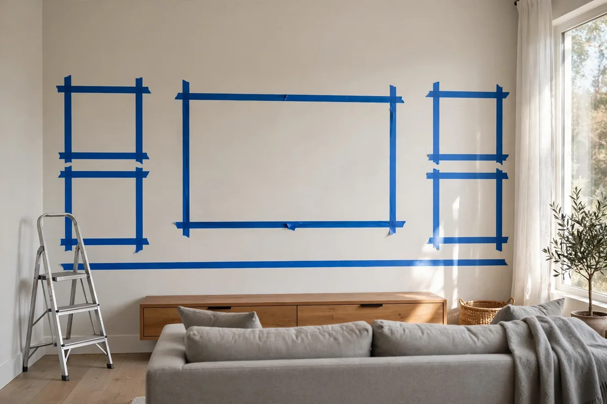
Every pattern in this guide ends the same way: rehearsed on the wall in tape before a single hole is drilled. A layout that looks right in your head can be six inches too wide in reality, and tape is the cheapest way to discover that.
Work in order. First, measure the wall, the screen, and every piece you plan to place, noting stud positions for anything heavy. Second, sketch the layout on paper at a rough scale — a quarter inch per foot is plenty — drawing the boundary, screen, and each element as rectangles. Third, transfer the sketch to the wall in painter’s tape, hung on your alignment lines from section nine.
Living with the tape before committing
- Sit in every seat. Check the taped screen from the sofa, side chairs, and doorway — a layout is viewed from seats.
- Leave it up for a day or two, and photograph it. A photo exposes drift your eyes forgive in person.
- Mark, then drill. Mark fixing points through the tape and install in order: panel or paint, screen mount, console, shelves, art.
Finish by editing once: remove the weakest element and recheck your alignment lines.
Once the layout is taped and lived with, execution is its own craft — studs and load, the labelled service loop, sound placement, glare fixed at source — and it lives in our tv wall design tips.
Frequently Asked Questions About Layout TV Wall Design Styles
What is the best layout for a TV wall in a small living room?
A centred-and-grounded layout or a single floating-shelf arrangement works best, keeping the composition to one axis and few elements. Use a console only slightly wider than the screen and gaps at the lower end of the recommended ranges. In a corner, use the diagonal layout and angle the seating to match.
How far should a console extend beyond the TV on each side?
Aim for roughly six to eighteen inches beyond the screen on each side — a console about one and a quarter to one and a half times the screen’s width. The overhang grounds the screen and leaves styling space at both ends; a console narrower than the screen looks top-heavy.
Can a TV wall layout work if the TV cannot be centred?
Yes — that is what the asymmetric offset layout is for. Shift the screen to align with your seating or clear a door, window, or fireplace, then balance its weight with one taller element opposite, such as a bookcase or shelf stack. Keep one shared alignment line and extend the console under both.
How much space should I leave between a TV and a gallery of frames around it?
Leave about three to five inches between the screen’s edges and the nearest frames — slightly more than the two to three inches between frames themselves. The extra clearance gives the screen a halo. Fix the gallery’s outer boundary first and keep every frame inside it.
What is the best layout for a corner TV?
The diagonal layout suits most rooms: angle the screen across the corner and arrange seating on the opposite diagonal. For more storage, use the wrap layout — screen flat on one wall, shelving turning the corner in an L.
How do I arrange floating shelves around a TV without it looking cluttered?
Choose one arrangement and commit: a flanking pair, a single stack, or one shelf above the screen. Keep shelves shallow, space them twelve to sixteen inches apart, place low, simple objects nearest the screen, and fill only two thirds of each shelf.
Should built-in shelving on both sides of a TV be exactly symmetrical?
The units should be symmetrical — equal widths, matched shelf heights, one shared top line — because that structure reads as architecture. The contents should not be mirrored: style each side to similar visual weight and leave about a third of the space empty.
How wide should a wood slat or panel section be behind a TV?
Use a panel field about one and a half to two times the width of the screen, leaving a visible border on both sides. Run it floor to ceiling, or stop it at a deliberate line such as the screen’s top edge plus a margin.
How do I test a TV wall layout before drilling holes?
Sketch the layout to scale on paper, then transfer it to the wall in painter’s tape — screen outline, console line, shelf positions, panel edges, gallery boundaries — all on two or three alignment lines. Sit in every seat, leave the tape up for a day, and photograph it before drilling.
What are alignment lines and why do they matter for a TV wall?
Alignment lines are shared edges that elements line up on — the console’s top edge, the screen’s top edge, its centre line. When a shelf end, a frame edge, and a console end land on the same line, different objects read as one composition. Choose two or three lines and hang everything to them.
Conclusion
A great TV wall is not a screen plus decorations. It is a layout: one pattern chosen on purpose — centred-and-grounded calm, built-in architecture, a gallery or offset arrangement, panel geometry, floating shelves, or a corner plan. Spacing gives the pattern its calm, alignment lines give it structure, and a tape rehearsal gives you the confidence to drill once and drill right. Pick the pattern your wall honestly suits, measure it, tape it, live with it for a day — then build it.