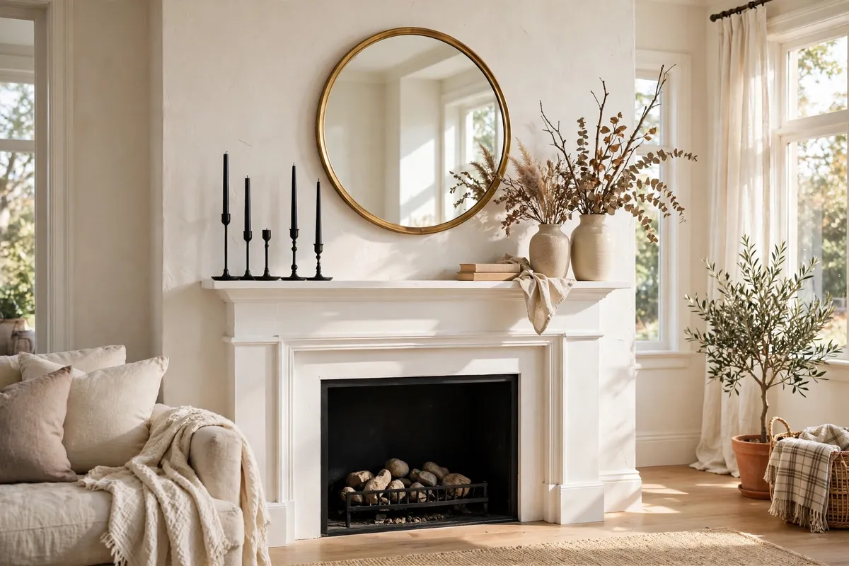
A fireplace mantel is the most-styled and most-misunderstood surface in the house. It gets more visual attention than any shelf or sideboard, yet most of us decorate it by placing objects in a row and hoping for the best. The difference between a mantel that looks accidental and one that looks designed has nothing to do with budget or square footage — it comes down to a handful of repeatable techniques professional stylists use every time.
This guide covers those techniques. Unlike a lookbook of fireplace mantel styling ideas — which is where to go when you want seasonal looks — this is a skills guide: the scale rules, composition formulas, and safety checks that make any mantel arrangement look intentional. Apply the ten tips below to whatever decor you already own, and the mantel will start looking like someone styled it on purpose. For finished looks in each major style, our fireplace mantel styling guide shows the complete arrangements these techniques produce, from modern and traditional to rustic.
1. Size Your Anchor: The Two-Thirds Rule

Every strong mantel starts with one anchor — a mirror, an oversized artwork, or a tall sculptural object — and the anchor’s size matters more than its style. The most common mantel mistake is choosing an anchor that is too small: a tiny frame above a wide firebox looks like it drifted up there by accident, and no amount of small accessories around it will fix the imbalance. The designer’s shortcut is the two-thirds rule: your anchor should span roughly two-thirds of the mantel’s width. That single proportion does most of the visual work, giving the arrangement a confident center of gravity that smaller pieces can orbit around.
Measure the mantel shelf first, then shop — or rearrange — to the number. Lean (rather than hang) the anchor so it rests slightly above the shelf; the casual lean reads more relaxed than a drilled mount, which is especially welcome on brick or stone you would rather not damage. If the wall above the mantel is tall, your anchor can also claim vertical height: aim for the top of the anchor to sit noticeably higher than anything flanking it, creating the peak of the whole composition.
Mantel scale cheat sheet
| Mantel shelf width | Anchor width (about two-thirds) | Anchor peak height above shelf |
|---|---|---|
| 48 inches (narrow) | 30–34 inches | 18–24 inches |
| 60 inches (standard) | 38–44 inches | 24–30 inches |
| 72 inches (wide) | 46–52 inches | 28–36 inches |
These are starting points, not building codes — a chunky wood-beam mantel can handle a slightly larger anchor than a slim floating shelf. But if your current anchor covers less than half the mantel width, scaling up is the single fastest upgrade you can make.
2. Group Objects in Odd Numbers

Look at any professionally styled mantel and you will find objects in threes and fives, rarely twos and fours. Odd-numbered groupings feel dynamic and natural to the eye, while even numbers tend to read as rigid pairs that split the mantel into mirror images. This is the classic rule of threes: cluster three candlesticks of different heights, a trio of ceramic vases, or five small frames arranged as one visual unit rather than five separate items.
The rule works best when the group varies in height and weight — three identical objects lined up like soldiers just create a shorter row. Try tall, medium, and short together, or one substantial piece flanked by two smaller ones. The eye travels across the uneven heights instead of getting stuck, which is exactly what makes the grouping feel styled rather than stored.
Putting odd numbers to work
- Candlesticks: three taper holders in staggered heights beat a matching pair every time.
- Vases: cluster three vessels of different shapes in the same color family.
- Frames: lean three small photos together at slight angles, overlapping slightly.
- Books: stack two coffee-table books, then top with one small object — a three-layer vignette.
The deliberate exception is formal symmetry, covered in tip 5: if you want a tailored, hotel-lobby look, identical pairs flanking a center anchor are the one place even numbers belong.
3. Build a Visual Triangle With Heights
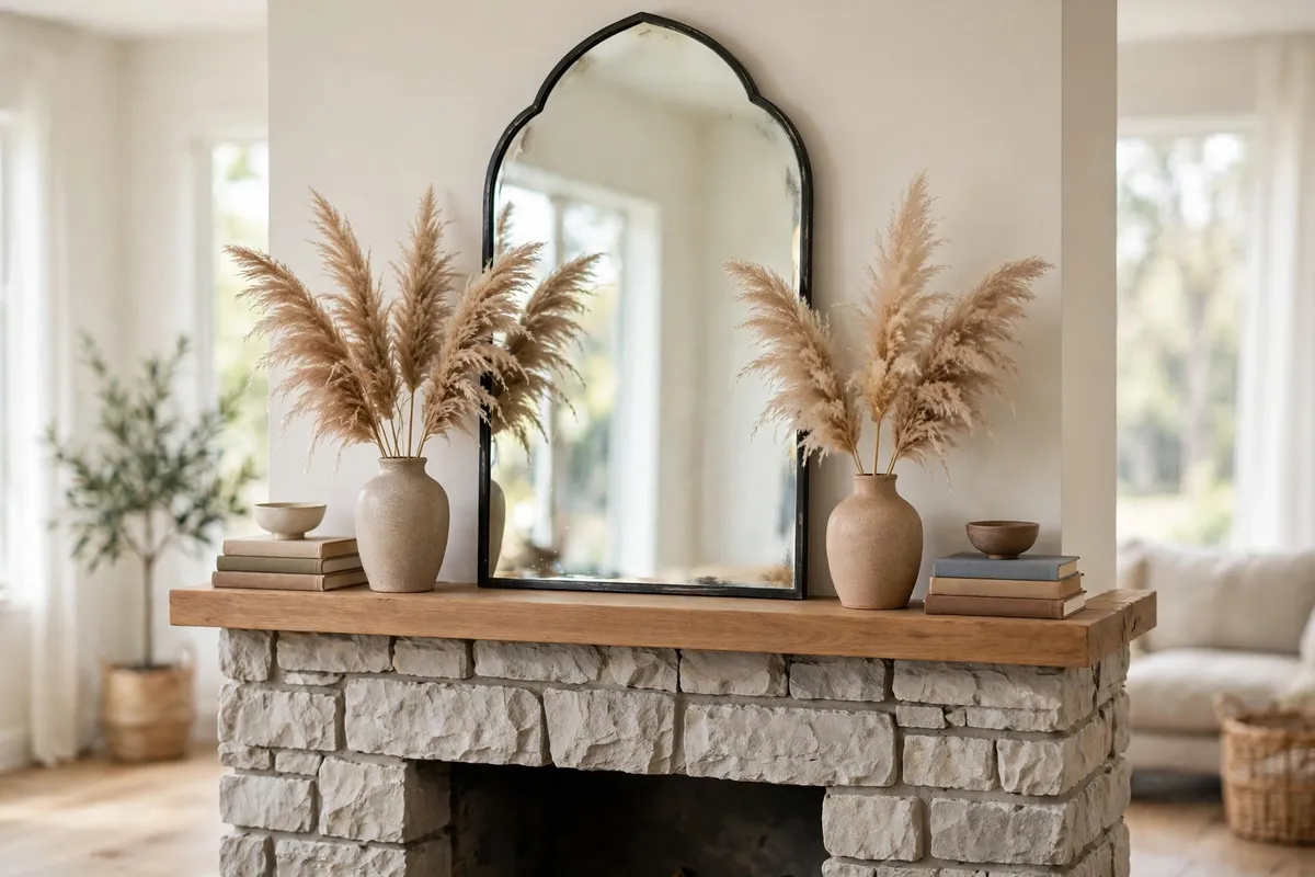
Once your anchor is set, arrange everything else into a triangle: one tall peak at or near the center, stepping down toward both ends. This visual triangle is the compositional backbone of almost every mantel you have ever admired in a magazine. It pulls the eye upward to the peak first, then lets it glide down each slope, which keeps the whole arrangement feeling connected instead of scattered.
Build it literally. Place your tallest object (the anchor) near the center, then add mid-height pieces — tall candlesticks, a vase of branches — partway along each side, and finish with low objects like stacked books, small bowls, or short pillar candles at the ends. The slope does not need to be perfectly even; in fact, slightly uneven slopes look more natural than a mathematically perfect pyramid.
Height guide for a 60-inch mantel
- Peak: the anchor, 24–36 inches above the shelf.
- Mid-slope: candlesticks or vases 12–18 inches tall.
- Ends: books, bowls, or low candles 4–8 inches tall.
Step back to the opposite side of the room when you are done. If the silhouette reads as a gentle hill with one clear peak, the triangle is working. If it looks flat — everything the same height — swap in something taller at the center or lower at the ends until the rhythm appears.
4. Layer Front to Back, Not Side to Side
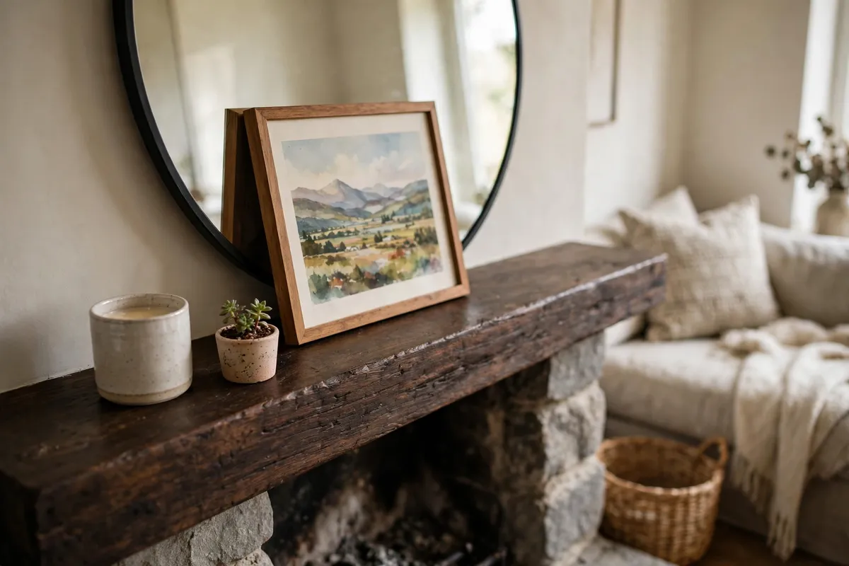
Amateur mantels read flat because everything sits in one straight line, like a police lineup. Designers create depth by layering in three planes: the background (the anchor — mirror or art — leaning against the wall), the midground (medium pieces like framed photos or vases), and the foreground (small, tactile objects like a candle, a small plant, or a decorative box). That front-to-back depth is what makes a mantel look dimensional from across the room.
Start with the anchor at the back, then place midground pieces so they slightly overlap the anchor’s lower edges — a small frame overlapping a mirror’s frame, for instance. Then push one or two small objects toward the front edge of the shelf. The overlaps are doing the real work: each layer partially hides the one behind it, which reads as intentional curation rather than a collection of separate items.
A few practical notes make layering easier. Keep the foreground objects small and low so they never block the anchor; use a dab of museum wax under anything leaning on glass or polished wood so it does not slide; and leave a finger’s width of shelf at the front edge so nothing feels perched on the brink. If your mantel is very shallow (less than eight inches deep), layering still works — just use flatter pieces in the midground, like leaning frames instead of round vases.
5. Use Asymmetry on Purpose
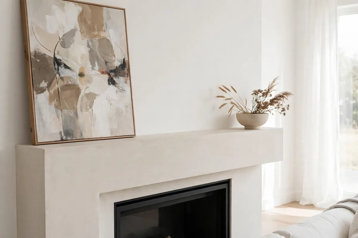
Symmetry is safe, but asymmetry is interesting. An intentionally off-balance mantel — a large artwork pushed to the left, balanced by a low cluster on the right — creates a relaxed, contemporary tension that reads as confident rather than careless. The key word is intentional: random asymmetry looks messy, while weighted asymmetry looks designed. The trick is to balance visual weight rather than matching objects one-for-one. A big, dark frame on one side can be balanced by a few lighter objects on the other, because weight comes from size, color depth, and height combined — not just from how many things are there.
The simplest formula: let your heavy side occupy about two-thirds of the shelf’s visual attention, and give the remaining third to one quiet grounding object plus open space. Negative space is part of the design — a bare stretch of shelf is not an empty spot waiting to be filled; it is what lets the styled portion breathe. Resist the urge to “fill the gap” with one more small thing, because that is precisely how asymmetry collapses back into clutter.
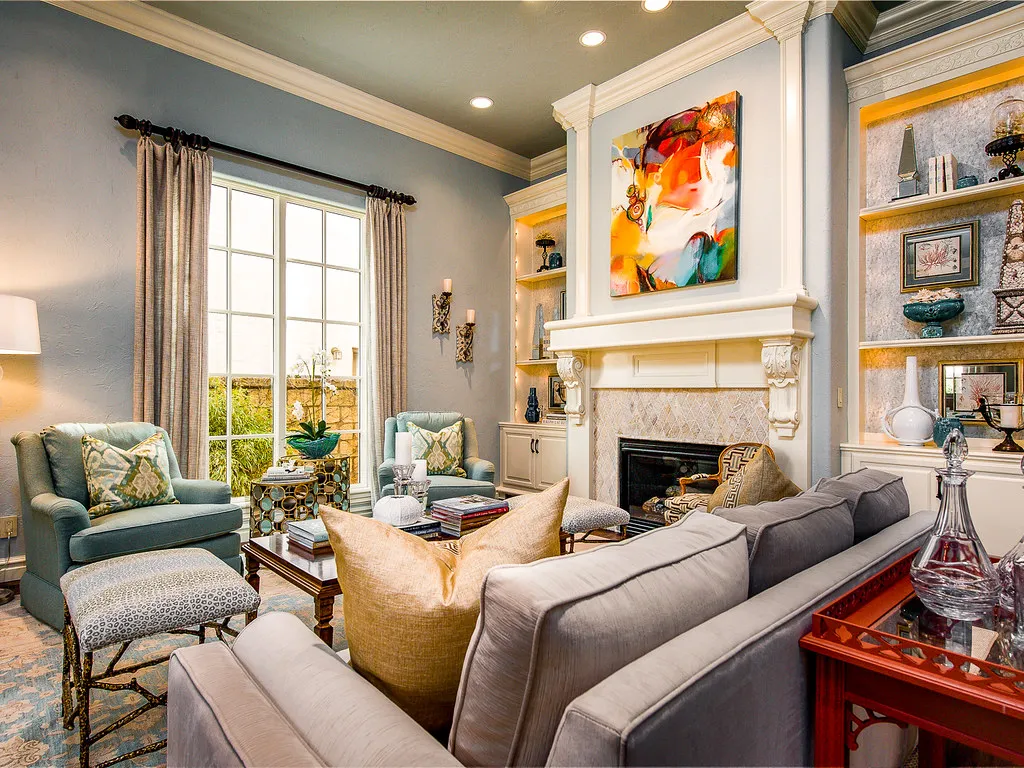
Asymmetry shines in modern, organic, and eclectic rooms, and it is especially forgiving on wide mantels where full symmetry would feel stiff. For a formal traditional room, classic mirrored symmetry still wins — just know that near-matches undermine it, so either go identical or go asymmetrical instead of landing in between.
6. Mix Textures, but Keep the Palette Tight

Richness on a mantel comes from contrasting textures, not from more color. A shelf of all-smooth, all-shiny objects looks flat no matter how expensive the pieces are; the same shelf with rough wood, nubby ceramic, polished brass, and soft greenery feels layered and expensive because each material catches the light differently. Think in texture families and aim for at least three in every arrangement: something hard and reflective (brass, glass), something matte and organic (clay, stone, raw wood), and something soft or alive (greenery, linen, dried stems).
While textures should vary, color should not. Restrict the palette to two or three hues — cream, black, and brass, for example — and repeat them across the pieces so the mantel reads as one composition. This restraint is one of the quiet features of a timeless living room, where disciplined color lets quality materials do the talking. A collected vintage mantel works the same way: aged brass, sepia prints, and worn leather books share warm tones even though nothing matches, which is why the mix looks curated instead of random.
Texture pairings that always work
| Anchor material | Pair with | Finish the look with |
|---|---|---|
| Brass or gilt mirror | Matte black candle holders | Trailing green plant |
| Textured plaster art | Raw oak or walnut bowl | Dried branches in stoneware |
| Black-and-white photography | Clear glass vase | Cream pillar candles |
| Weathered wood beam | Aged brass candlesticks | Woven basket or linen runner |
If the arrangement still feels busy after mixing textures, the palette is usually the culprit — remove the one object that introduces a fourth color and the composition will settle instantly.
7. Respect Heat: Clearance and Safe Materials

Beautiful means nothing if it is not safe. Heat rises, and the mantel shelf sits directly in its path, so every styling decision above a working fireplace starts with clearance. As a rule of thumb, keep the mantel shelf itself at least 12 inches above the fireplace opening — more if it projects far from the wall — and keep all flammable decor well back from the firebox opening. The Hearth, Patio & Barbecue Association advises keeping flammable decorations at least three feet from the fireplace opening as a general circle of safety (see their fireplace safety tips), so treat garlands, stockings, dried arrangements, and paper items as seasonal guests that come down whenever a fire is lit.
Material choice is the quieter half of the same rule. On a working fireplace, favor non-combustible and heat-tolerant pieces near the shelf: brass, ceramic, stone, glass, and metal all handle warmth gracefully. Move anything meltable, dry, or flammable — pillar candles, dried flowers, fabric banners, plastic or resin figures — to the outer ends of the shelf or off the mantel entirely while the fireplace is in use. Flameless LED candles are the stylist’s workaround: they deliver the same warm evening glow as real tapers with zero open flame above a firebox, and modern versions flicker convincingly enough that guests rarely notice.
Finally, check your fireplace manufacturer’s clearance specifications before hanging anything new — local building codes and manufacturer manuals outrank any decorating guide. Heat output varies enormously between a gas insert, an open wood fire, and an electric unit, and the right styling for one can be wrong for another.
8. Style Around the TV Above the Mantel
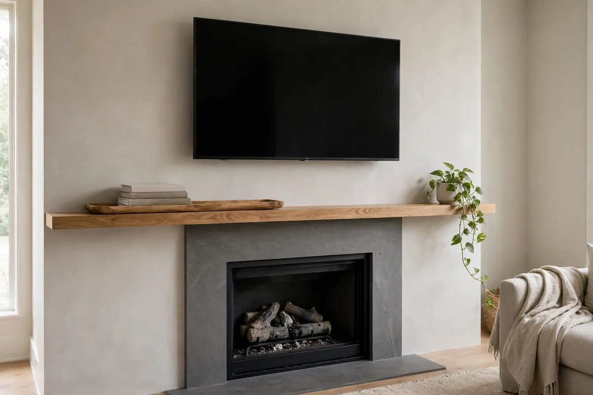
A television mounted over the fireplace is the modern mantel’s biggest design challenge: a large black rectangle dominates whatever sits beneath it. The goal is not to hide the screen but to keep it from swallowing the styling. The core technique is to go low and horizontal — long, shallow objects like stacked coffee-table books, an elongated tray, or a row of small potted plants stretch across the shelf without competing with the screen vertically. Tall vases that creep into the TV’s corners are the most common error; they fight the screen for attention and can block the remote sensor.
Balance the screen’s visual heaviness with asymmetry rather than symmetry. Matching sconces hard against the TV’s edges tend to emphasize the rectangle; a sconce or tall arrangement on one side with a low, trailing plant on the other breaks it up. Keep the palette muted and the textures organic — matte ceramics, wood, linen-bound books — because shiny, reflective decor competes with the screen’s glare. And if the TV is a frequent frustration, a Frame-style TV displaying art when idle, paired with one small physical frame leaned at its base, can make the whole wall feel like a gallery instead of an appliance.
One functional note: check your TV manufacturer’s guidance on heat clearance before mounting above a working fireplace, and leave a small gap below the screen so the remote sensor stays unobstructed. When the seating is arranged to face both the fire and the screen, the mantel styling beneath becomes part of the viewing experience — which makes seating layouts for small living rooms worth sorting out alongside the decor.
9. Adapt the Formula for Shallow Mantels, Rentals, and Electric Fireplaces
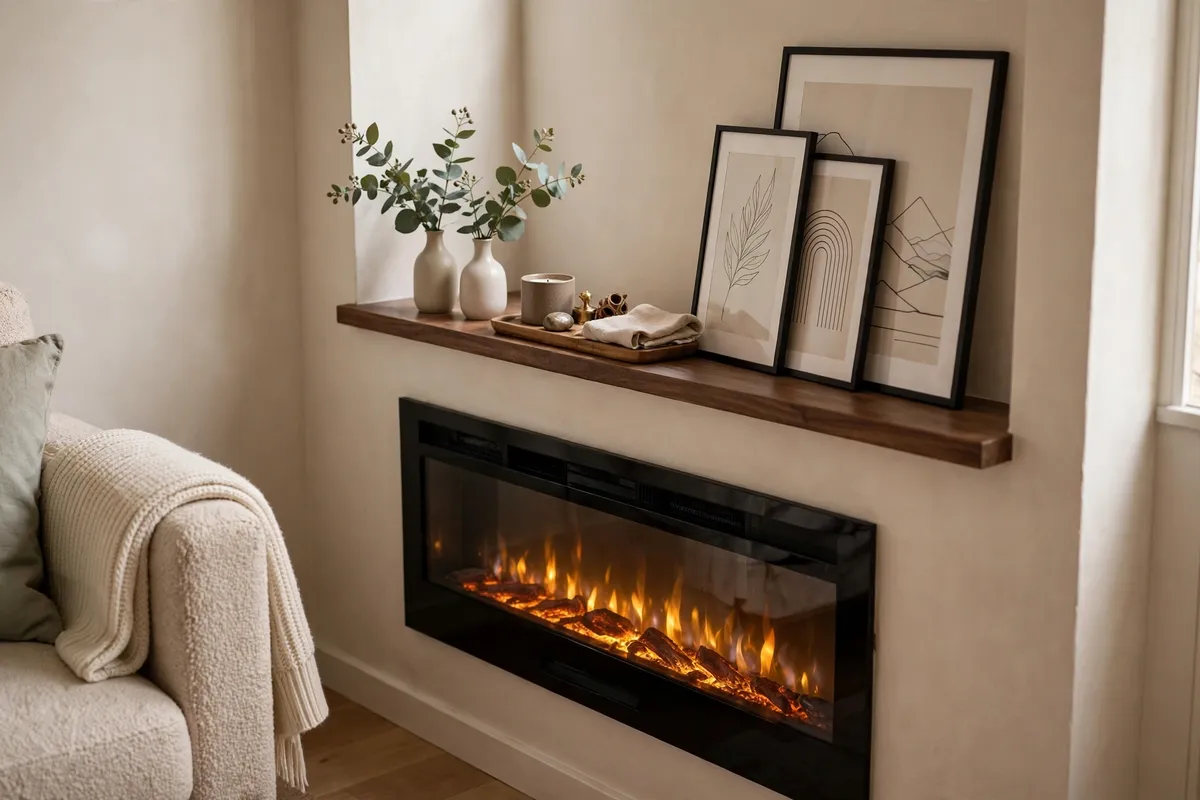
Not every fireplace cooperates. A mantel shelf less than eight inches deep, a rental you cannot drill into, or an electric fireplace with no real flame each demand a different version of the same techniques — but the techniques still work. For shallow mantels, go flatter and leaner: framed prints and mirrors leaned against the wall need almost no depth, small bud vases replace round vessels, and a slim picture ledge or narrow tray can corral small objects so nothing tips. The triangle and odd-number rules apply unchanged; you are simply building the composition in a shallower plane.
Renters should lean into damage-free styling entirely. Everything leans — art, mirrors, frames — and weight comes from objects rather than mounts. Removable adhesive strips hold lightweight frames in place, and a heavy, stable base (a stack of books, a stone bowl) anchors arrangements that might otherwise wobble. Because nothing is drilled, the whole mantel can be reconfigured in minutes, which makes seasonal refreshes nearly effortless.
Electric and faux fireplaces are the most forgiving case of all. With no real flame or meaningful heat rising past the shelf, the safety constraints of tip 7 relax dramatically: candles, dried arrangements, and fabric can live on the mantel year-round. The trade-off is that the firebox itself is part of the display, so style it too — a neat stack of birch logs, a cluster of pillar candles, or a low arrangement of lanterns turns an empty or artificial firebox into a deliberate part of the composition instead of a dead zone.
10. Edit Ruthlessly, Then Refresh With the Seasons
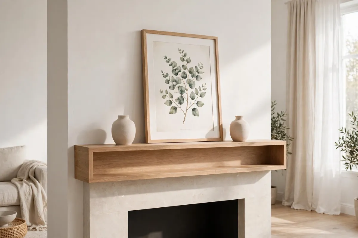
The final tip is the one that separates styled from stored: edit. Almost every cluttered mantel suffers from the same problem — too many small objects with no anchor and no breathing room. Once your arrangement is built, step back and remove one item. Then step back again. The goal is a mantel where every object earns its place and the negative space between them is doing as much work as the objects themselves. A mantel crowded edge to edge is one of the classic small living room decor mistakes because visual crowding makes the whole wall — and the room — feel smaller.
Editing is also what makes seasonal refreshing easy instead of exhausting. Keep your anchor, your tall pieces, and your texture mix in place year-round; those are the foundation. Then rotate only the small, perishable layer with the seasons: fresh stems in spring, airy grasses in summer, dried wheat or amber glass in fall, evergreen and candlelight in winter. A full refresh then takes twenty minutes and costs almost nothing, because you are changing accents, not rebuilding the composition. Photograph your mantel each season from the same spot — the side-by-side photos will teach you more about your own taste than any trend article, and they make it easy to recreate a look you loved.
Frequently Asked Questions About Fireplace Mantel Styling
How tall should mantel decor be?
Build a gentle visual triangle: a peak of about 24–36 inches above the shelf at the center, mid-height pieces of 12–18 inches along the sides, and low objects of 4–8 inches at the ends. Varying heights creates the skyline effect that keeps the eye moving across the arrangement.
Can I hang a TV above a working fireplace?
Yes, with care. Check your TV maker’s heat-clearance guidance, keep decor low and horizontal so nothing competes with the screen, and leave the remote sensor unobstructed. Above a wood-burning fireplace, extra clearance matters more because heat output is less predictable.
What is the biggest mantel styling mistake?
Choosing an anchor that is too small, followed closely by lining up many small objects in a row. An undersized mirror or artwork above a wide firebox looks lost, and a shelf of small, ungrouped items reads as clutter. One correctly scaled anchor fixes both problems.
How far should decorations sit from the firebox?
Keep flammable materials — dried greenery, fabric, paper, candles — at least three feet from the fireplace opening, per the Hearth, Patio & Barbecue Association’s safety guidance. Remove stockings, garlands, and dried arrangements entirely while a fire is burning, and never drape anything over the firebox edge.
Should mantel decor match the room’s colors?
It should coordinate, not match. Pick up two or three colors already present in the room — from the rug, cushions, or curtains — and repeat them across the mantel pieces. Shared tones tie the mantel to the room; identical matches across everything look flat.
Can I style a mantel on a tight budget?
Absolutely. Branches and greenery cost nothing, thrift stores yield frames and brass for very little, and rearranging what you already own is free. One well-scaled mirror from a discount store beats a shelf of small trendy accessories every time — scale impresses more than quantity.
What plants work best on a mantel?
Trailing plants like pothos or string of pearls soften the shelf’s hard edge with movement, while upright stems like eucalyptus or olive branches add height. Above a working fireplace, keep live plants toward the outer ends of the shelf, away from rising heat.
How do I style a very shallow mantel?
Lean flat pieces — mirrors, framed art, and prints — against the wall, swap round vases for slim bud vases, and corral small objects on a narrow tray so nothing tips. The same composition rules apply; you are simply building in a shallower plane.
Is symmetrical or asymmetrical styling better?
Neither is universally better — it depends on the room. Symmetry suits formal, traditional spaces; asymmetry suits modern, relaxed ones. Whichever you choose, commit fully: identical pairs for symmetry, or clearly weighted imbalance for asymmetry. Hesitant near-matches satisfy neither style and read as indecision.
How often should I restyle my mantel?
Keep the anchor and tall pieces year-round and rotate only the small accents with the seasons — about four times a year. Each refresh then takes under half an hour. Full rebuilds are rarely necessary once the foundation is right.
Conclusion
A well-styled mantel is not a talent; it is a checklist. Size the anchor to two-thirds of the shelf, group in odd numbers, build the triangle, layer front to back, and let texture do the work that color cannot. Respect the heat, give the TV its space, adapt the formula to shallow or rented mantels, and edit until the negative space feels as deliberate as the objects.
None of these techniques require buying anything new to start — most mantels improve dramatically from rearranging what is already there. And because the system is built on a permanent foundation with a rotating accent layer, the mantel stays looking intentional through every season without starting over. Step back, take a photo from across the room, remove one more thing, and enjoy the focal point you have built.