
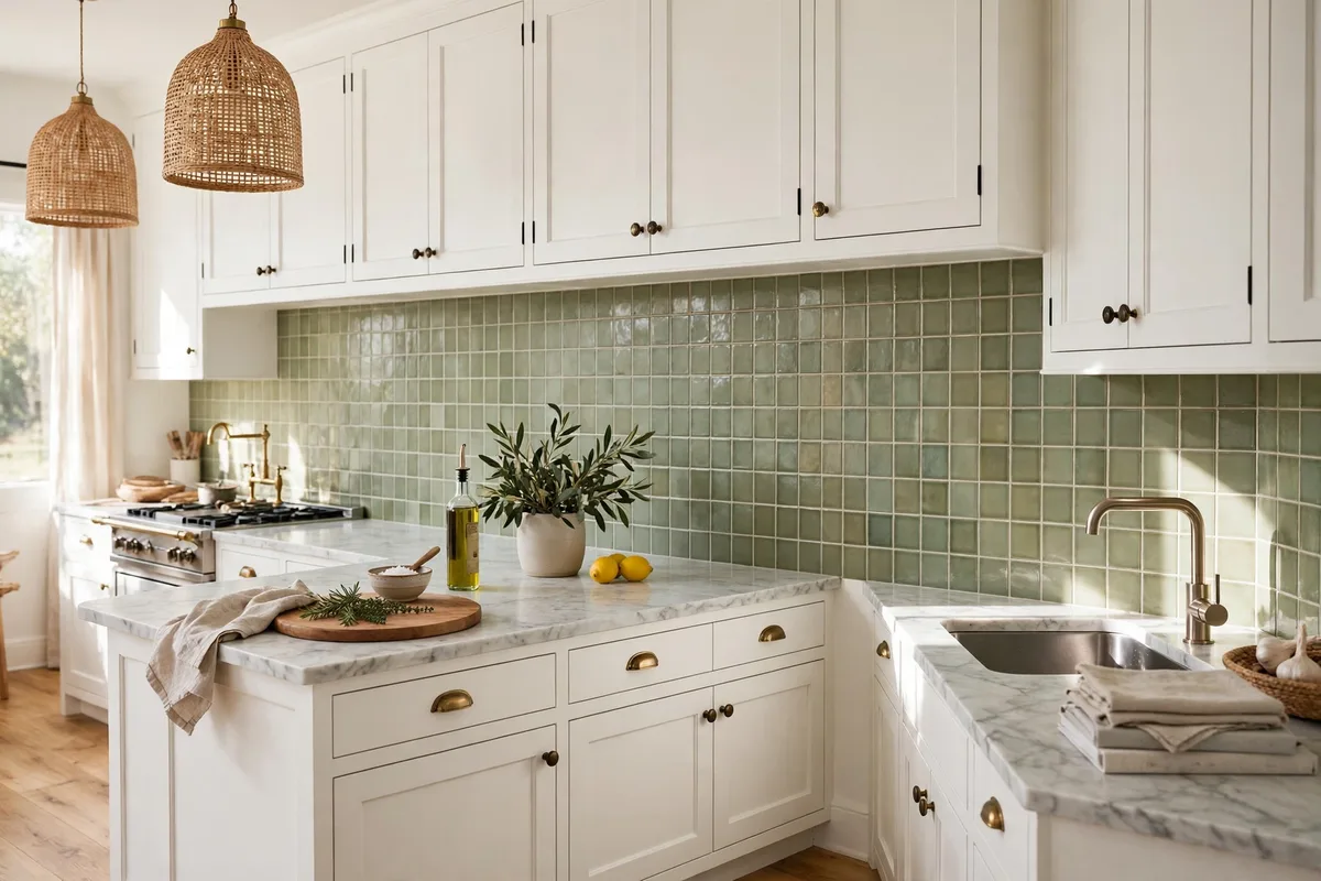
The backsplash is the smallest surface in the kitchen and the one most often chosen wrong — not because its colour is wrong, but because it was chosen first, or alone. A backsplash sits between two bigger decisions, cabinets below-and-above and the countertop beneath it, and its real job is mediation: blend with one, contrast with the other, and never start a third argument. Chosen in that order, with its grout treated as a second colour decision, the backsplash becomes the easiest surface in the room to get right.
Ten colour ideas organised by the thing that actually decides them — your cabinet colour — plus the grout and testing rules that finish the job.
In this guide: The Pairing Table at a Glance · 1. Choose Third: Cabinets and Counters Decide First · 2. White Cabinets: Everything Works, So Texture Decides · 3. Navy and Dark Cabinets: Keep the Wall Light and Warm · 4. Wood Cabinets: Warm Neutrals, Always · 5. Two-Tone Kitchens: Match the Uppers, Bridge the Lowers · 6. Green and Colour Cabinets: The Wall Goes Quiet · 7. Grey Cabinets: Warmth Is the Whole Decision · 8. The Statement Backsplash Colour on the Wall, Calm Everywhere Else · Now Check the Counter: Four Counter Cases · 9. Grout: The Second Colour Decision Hiding in Plain Sight · 10. Slab and Full-Height: Colour Without Grout Lines · 11. Test in Place: Samples, Your Light, the 18-Inch Reality · Frequently Asked Questions About Kitchen Backsplash Colors · Conclusion
The Pairing Table at a Glance
| Cabinets | Backsplash that works | Grout direction |
|---|---|---|
| White | Almost anything — texture decides | Matched for calm, charcoal for pattern |
| Navy / dark | Warm white, marble-look, light stone | Light, warm — keep the wall bright |
| Wood | Cream, travertine, warm neutrals | Ivory / beige family |
| Two-tone | Match the uppers, bridge the lowers | Neutral, mid-tone |
| Green / colour | Quiet warm white or cream | Matched — let the cabinets star |
| Calm cabinets, brave mood | The statement: navy, emerald, patterned | Matched to tile, or deliberate contrast |
| Grey cabinets | Warm white or cream tile (warm greys); a warm-toned tile or brick-look for cool greys — never tile in the exact cabinet grey | Matched warm-grey grout, one shade deeper than the tile |
The one rule under this whole table: Every pairing below is an undertone decision before it is a colour decision — warm rooms take warm tiles, cool rooms take cool, and nearly every backsplash that somehow looks wrong is an undertone fight, not a colour mistake.
1. Choose Third: Cabinets and Counters Decide First
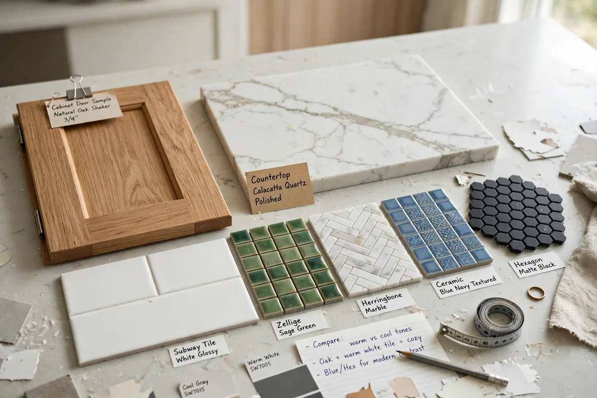
The order of operations is the whole secret: cabinets cover far more wall than the backsplash, and the counter is the surface the backsplash physically touches, so both are chosen first and the backsplash answers to them. Lily Ann Cabinets’ backsplash guide states the matching rule plainly: the backsplash should either blend with the cabinets or give a clear contrast — and the same “one star” rule applies throughout: if the cabinets are bold, the backsplash goes quiet; if the cabinets are quiet, the wall may speak.
It is the same architecture as our two-tone kitchen cabinets ideas: one element leads, the others support. The backsplash chosen as a solo star in a room that already has one becomes a rival, and rivalries in 18 inches of wall are unwinnable.
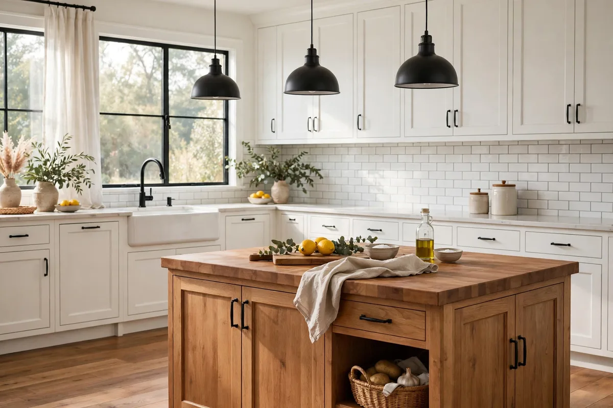
2. White Cabinets: Everything Works, So Texture Decides
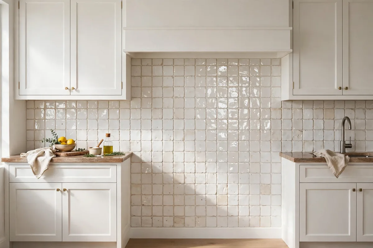
White cabinets are the backsplash’s blank canvas: soft grey for subtle contrast, navy or green for a statement, black for drama in a big room, white-on-white for seamless calm. That freedom moves the decision from colour to finish. A pure white tile against white cabinets can read clinical and flat; the fix is texture — handmade-look or zellige-style tile whose uneven glaze catches light differently on every piece, so a white wall gains depth without gaining a colour.
If you do add colour here, the white kitchen is where it is safest: the cabinets will keep any tile honest. Just spend the colour once (this wall) and let counters and hardware stay in their supporting roles.
Finish, Briefly
Colour is only half the delivery. Gloss and handmade variation bounce light and suit small or dark kitchens; a matte finish keeps a strong statement colour calm; large-format tile or slab removes grout lines where they would add visual noise. Changing the finish changes a pairing as much as changing the colour — sample both before you commit.
3. Navy and Dark Cabinets: Keep the Wall Light and Warm
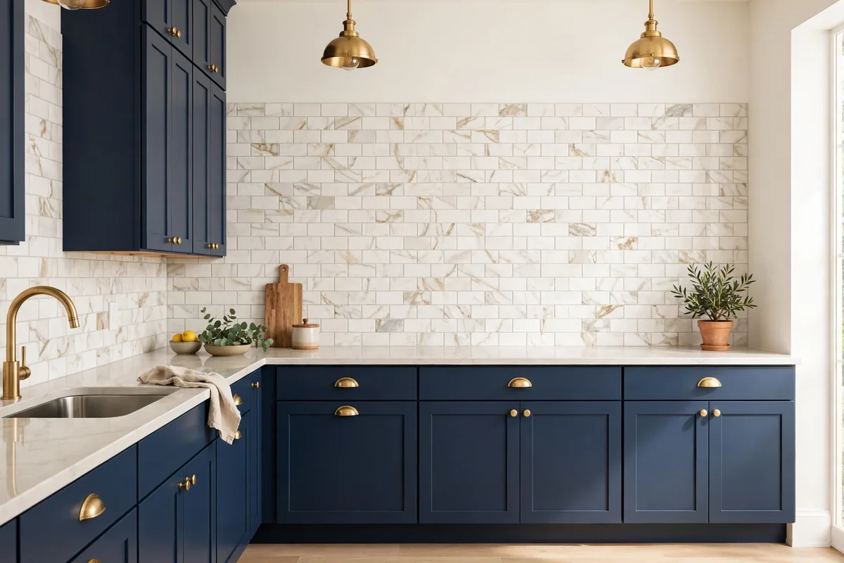
Dark cabinets absorb light; the backsplash is where the room gets it back. The reliable answer is a light tile — warm white, marble-look, pale stone — which gives crisp contrast without going cold. Lily Ann’s pairing table says the same: navy or other dark cabinets take white or light tile to keep the room bright and balance the dark. The specification that matters is warmth: a blue-white tile against navy reads icy, a warm white reads tailored.
A dark backsplash behind dark cabinets is the known trap — it closes the room in, especially under wall cabinets where light is already scarce. If you love the moody wall, pay for it with lighting (under-cabinet strips are non-negotiable) and keep it to one run, not the whole room.
Black cabinets are their own case: Black is not just darker navy. It takes a light, warm tile — cream, warm white, pale stone-look — to keep the 18 inches between counter and wall cabinets from disappearing. Black tile on black cabinets is a deliberate drama that only works with serious natural light and a lighter counter; in an ordinary kitchen it reads as a hole, not a feature.
4. Wood Cabinets: Warm Neutrals, Always
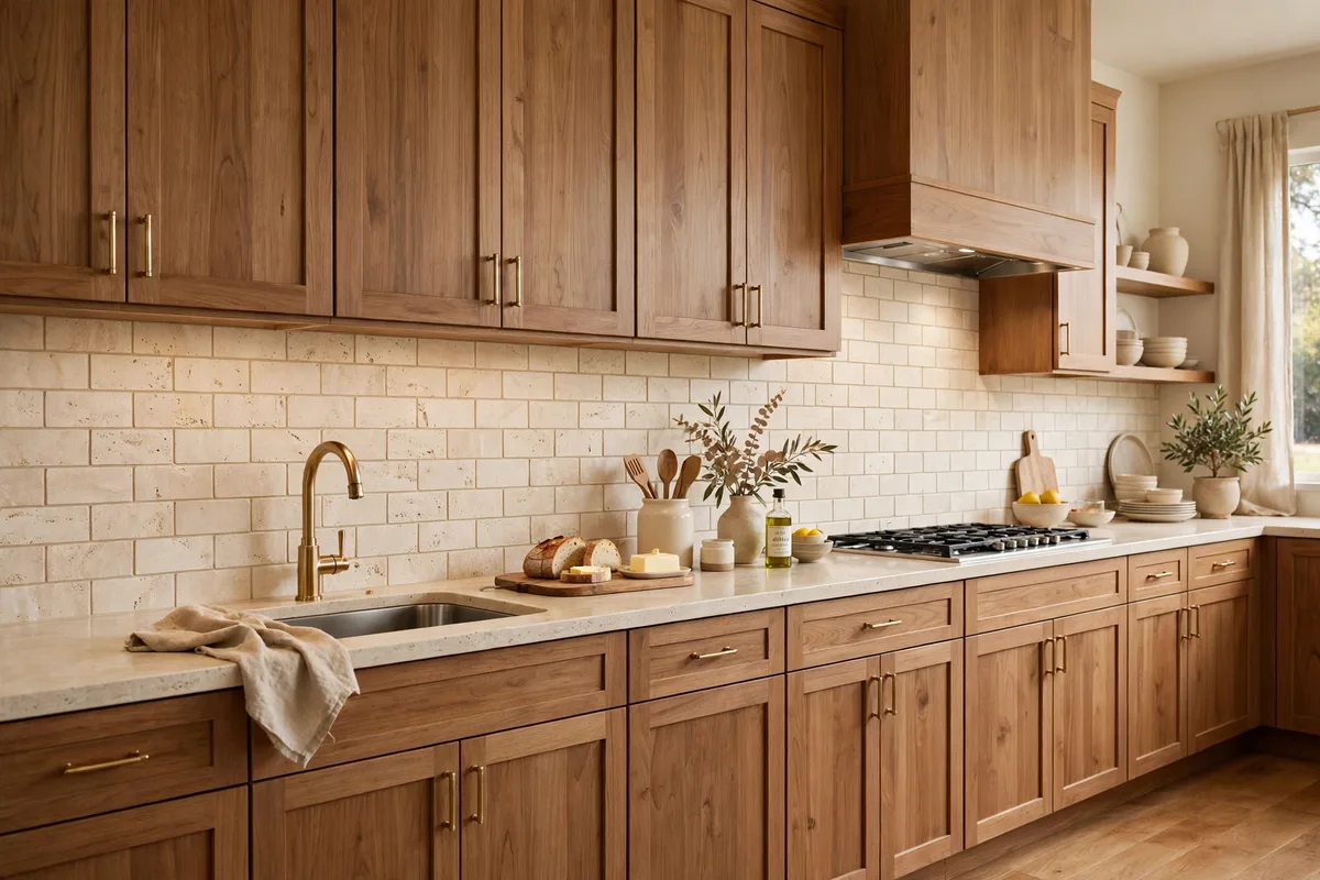
Wood brings its own colour and grain to the composition, so the backsplash’s job is harmony, not contrast: cream tile, travertine, brick, or a stone with warm undertones that picks up one of the wood’s quieter notes. Cool greys and blue-whites fight wood’s warmth the way mismatched undertones fight in any pairing — the same warm-family discipline dosed across whole rooms in our autumn color palette ideas — and the wall ends up looking dirty against the grain.
Busy is the second trap: a high-movement granite counter plus a patterned tile plus visible grain is three patterns in one sightline. With wood cabinets, choose the plainest member of the warm family and let the grain be the pattern — it has seniority.
5. Two-Tone Kitchens: Match the Uppers, Bridge the Lowers
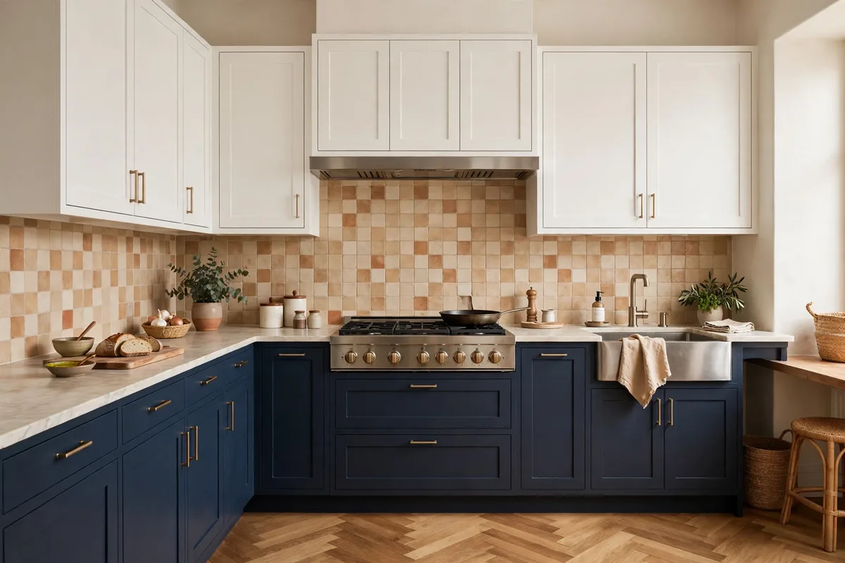
A two-tone kitchen gives the backsplash a diplomatic posting: it physically touches the upper cabinets and visually faces the lowers. Lily Ann’s rule for exactly this case: match the backsplash to the upper cabinets, since they sit right next to it. A warm neutral tile that carries a hint of each finish — the uppers’ lightness, the lowers’ temperature — keeps the room from feeling split in half, which is the outcome two-tone kitchens are always one bad tile away from.
Grout follows the diplomacy: a mid-tone neutral that neither shouts against the uppers nor disappears against the lowers. In two-tone rooms the grout is genuinely a third colour — §8 treats it that way.
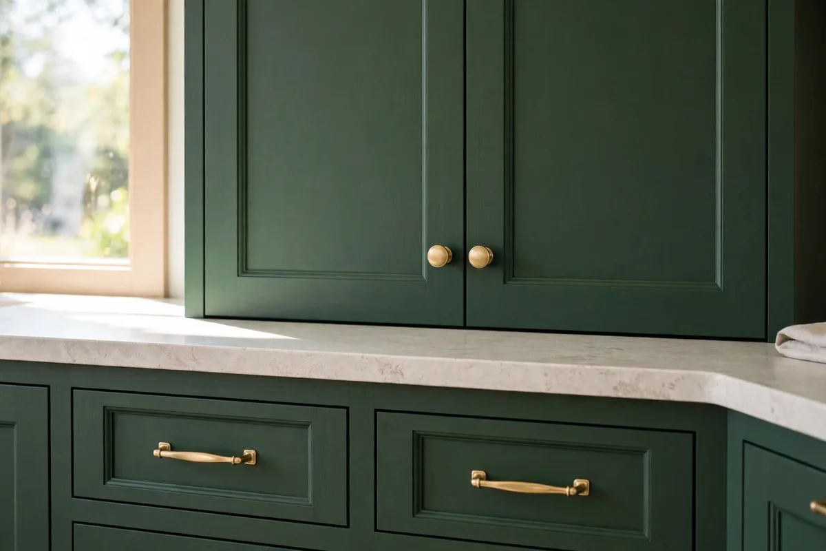
6. Green and Colour Cabinets: The Wall Goes Quiet
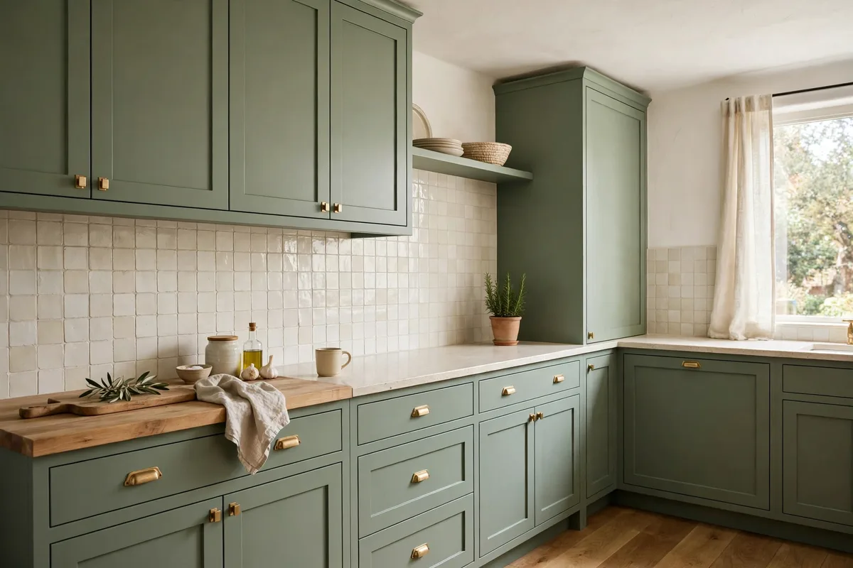
When the cabinets are the colour event — sage, hunter green, a real blue — the backsplash’s job description shrinks to one line: do not compete. A warm white or creamy tile (zellige again earns its place, texture without hue) lets the cabinet colour stay the focal point; a second strong colour on the wall turns the kitchen into a debate. This is §1’s one-star rule at its strictest, because colour cabinets are the loudest stars kitchens have.
The tone-on-tone exception: a tile in the same family, several shades paler — a whisper-green behind deep green — can work when it reads as a gradient rather than a pairing. Test it big; tone-on-tone fails by looking like a mismatch, not a mistake of courage.
7. Grey Cabinets: Warmth Is the Whole Decision
Grey is the cabinet colour with the widest range hiding inside one name. Warm greys (greige-leaning, brown-based) behave almost like a neutral wood: they take cream, warm white and soft stone-look tiles easily. Cool greys (blue-based) are the demanding ones — pair them with another cool surface and the whole kitchen turns cold and flat.
The one pairing to refuse is the exact match: tile in precisely the cabinet’s grey, at the same depth, reads as one flat mass with grout lines drawn on it. The wall needs to step away from the cabinets — lighter, warmer, or textured — so the two surfaces read as a decision rather than a default. A handmade-look warm white against cool grey cabinets is the combination that rescues most grey kitchens.
Bridge metals matter more here than anywhere: brass or warm wood accents (handles, stools, boards) pull a grey scheme back toward warm without changing either surface. Test grey pairings in your own light twice — morning and evening — because grey shifts undertone more than any other cabinet colour.
8. The Statement Backsplash: Colour on the Wall, Calm Everywhere Else
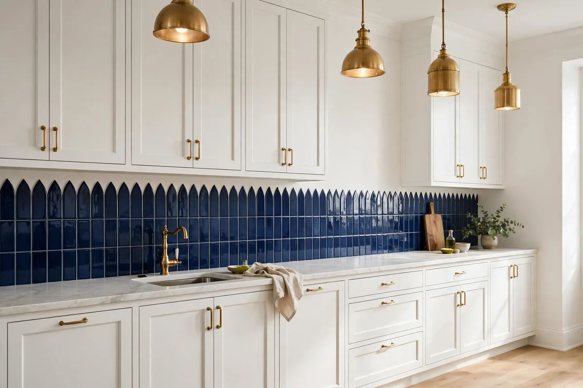
The inverse arrangement has its own logic: quiet cabinets, quiet counters — and the backsplash takes the colour budget for the whole room. Navy picket tile behind white cabinets, emerald behind cream, a patterned cement-look tile behind plain shaker doors. It works because the wall is a bounded stage: 18 inches of colour, framed by calm on every side, reads as art rather than noise. It is the backsplash version of the committed-colour confidence in our Jenna Bush Hager kitchen design feature — one surface, fully meant.
It is also the most reversible bravery in the kitchen: a backsplash is a fraction of the cabinetry’s cost and effort to change. If you are choosing where a fashionable colour should live, the wall that can be re-tiled in a weekend beats the doors that cannot — the same spend-the-colour-where-repainting-is-cheap logic as the two-tone island.
Now Check the Counter: Four Counter Cases
Busy stone counters: if the counter already moves — veined marble-look, busy granite — the backsplash goes quiet: the plainest tile in your pairing, matched grout, no pattern. Two patterns in the same eyeline is the trap this whole guide exists to prevent.
Plain quartz or laminate: a quiet counter hands the pattern budget to the wall. This is the case where the statement tile, the herringbone layout or the handmade variation earns its place.
Butcher block and warm wood: warmth answers warmth — warm whites, creams and soft sage sit naturally against wood counters; cold blue-whites fight them.
Dark counters: keep the wall light, or the band between two dark masses disappears and the kitchen feels shorter. A light tile over a dark counter is also the easiest brightness win in a north-facing kitchen.
And If the Kitchen Is Small
Small kitchens follow the same pairings with the contrast turned down: light, warm, low-contrast tile, grout matched to the tile so the grid quietens, and large-format tile or slab where you can, so grout lines stop chopping the wall into small pieces. Gloss or handmade variation bounces what light there is around the room.
9. Grout: The Second Colour Decision Hiding in Plain Sight
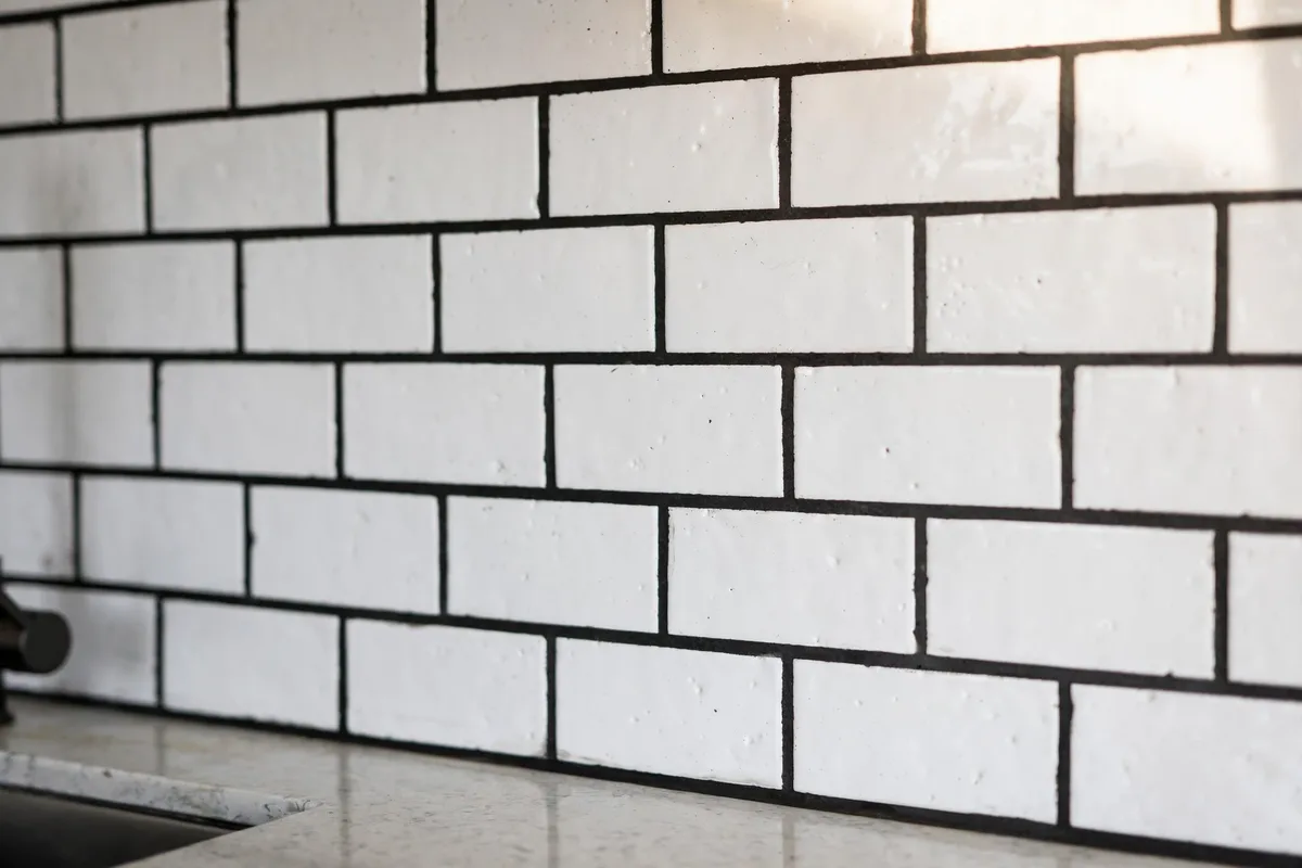
Every tile choice is secretly two choices. Matched grout makes the wall read as one calm surface; contrast grout turns the tile pattern into a graphic — white subway with charcoal grout is a different backsplash from the same tile with white grout. Precision Tile & Grout’s grout guide adds the maintenance reality designers quote to clients: white grout behind a stove looks dingy within about six months, while dark grout in the same spot can go two years looking fresh — choose grout by cooking habits, not just aesthetics.
Three more of its working rules: grout dries lighter than it looks wet, so test a patch; pure white is the one grout colour to avoid (off-white or light grey reads the same and forgives more); and under-cabinet lighting can yellow white grout, so judge the test under your actual lights. Grout is a colour — budget it the same care as the tile.
10. Slab and Full-Height: Colour Without Grout Lines
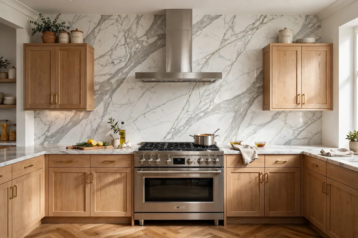
The maximal version of “match the counter”: run the countertop material up the wall as a slab backsplash, standard 18 inches or full-height to the hood. Colour-wise it is the calmest possible answer — one material, no grout lines, no second decision — and the easiest surface in the kitchen to wipe clean, which is why continuous nonporous surfaces top the maintenance rankings. Veined stone makes the wall a painting; quiet quartz makes it disappear.
Full-height changes the colour math: a whole wall of the counter’s colour is a much bigger commitment than 18 inches of it, so bold counters should stop at standard height and let tile take the upper wall, while calm counters can climb. The range wall is where full-height earns most — drama exactly where the eye lands.
11. Test in Place: Samples, Your Light, the 18-Inch Reality
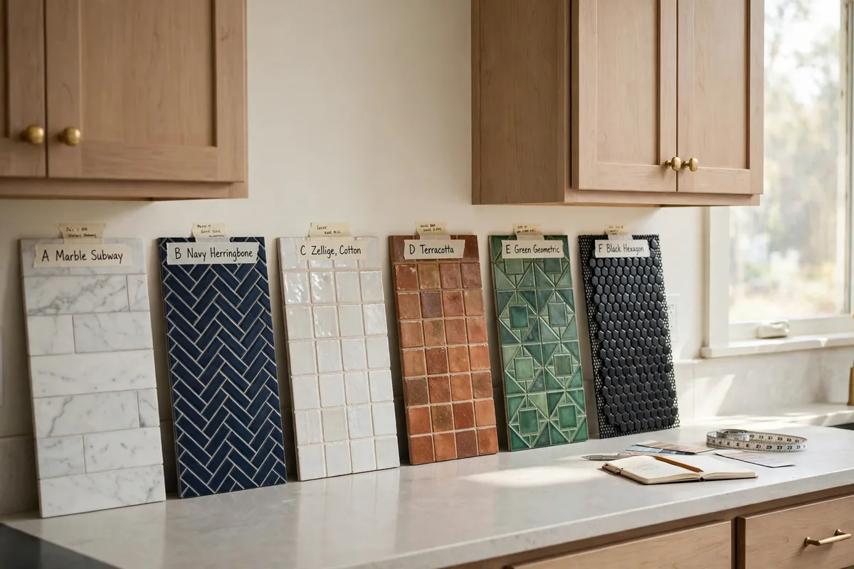
Every rule in this article ends at the same ritual: prop real samples in the actual gap — between your cabinets, on your counter, under your lights — and live with them for two days. Tile colour shifts brutally between the showroom and a north-facing kitchen; grout shifts again as it dries; under-cabinet light warms everything it touches. The 18-inch strip is small enough that a full sample board approximates the truth well.
This is also where the small-kitchen version of the test matters — the compact footprints in our best small kitchen design guide leave no hiding places: in a small kitchen the backsplash is a larger share of what you see, so its colour deserves the full two-day trial, not the showroom glance.
Where colour is heading: The direction of travel in current kitchen advice is warm: warm whites over bright blue-whites, greige over cool grey, handmade texture over flat gloss. This guide’s pairings already lean that way; the note matters because the cool-grey-and-bright-white scheme is the one most likely to date a kitchen that was renovated to escape exactly that.
Frequently Asked Questions About Kitchen Backsplash Colors
What backsplash colour goes with everything?
A warm white or soft light grey in a handmade-look tile is the closest thing to universal: warm enough for wood, calm enough for colour cabinets, bright enough for dark ones. The undertone matters more than the colour — warm neutrals mediate; blue-whites and cool greys argue with warm rooms.
Should the backsplash match the cabinets or the countertop?
It should relate to both and copy neither blindly. Blend or contrast clearly with the cabinets (in two-tone kitchens, match the uppers it touches), and pick up one tone from the countertop so the junction looks intentional. An exact countertop match is the slab option — a deliberate look, not a default.
What is the best backsplash colour for white cabinets?
Any colour can work, which makes finish the decider: white-on-white needs texture (zellige, handmade-look) to avoid reading flat or clinical. Soft grey is the most forgiving colour choice; navy or green is the classic statement; grout contrast can supply the interest if the tile stays white.
Does grout colour really change the look?
Completely. Matched grout reads as one surface; contrast grout turns the tile layout into a graphic pattern. It also changes maintenance: light grout behind a stove shows stains within months, dark grout hides them far longer. Grout dries lighter than it appears wet — always test a patch.
What backsplash works with navy cabinets?
Warm white, marble-look, or light stone — light and warm to return the light navy absorbs and contrast without going cold. Brass hardware ties the pairing together. Avoid a dark backsplash with dark cabinets unless the lighting is strong and the run is short.
Can the backsplash be the colourful part of the kitchen?
Yes — if everything around it stays calm. A statement tile behind quiet cabinets and counters reads as art, and a backsplash is the cheapest colourful surface to change later. The rule is singular: colour on the wall OR on the cabinets, not both at full volume.
How high should a backsplash be?
Standard is about 18 inches, counter to upper cabinets. Full-height to the hood or ceiling is the modern statement and the easiest to clean, especially behind the range. In colour terms, height multiplies commitment: the taller the splash, the calmer its colour should be.
What backsplash colour makes a small kitchen look bigger?
Light, warm, and low-contrast — matched grout, minimal pattern, a little gloss or handmade variation to bounce light. Dark or busy backsplashes advance toward the eye and shrink the wall; seamless pale ones recede. A slab or large-format tile minimises grout lines, which also helps.
Should backsplash colour match the floor or walls?
Neither is its job. It mediates between cabinets and counter, which it touches; floors and walls are context it should not fight. If a floor is strongly coloured or patterned, keep the backsplash quieter; the room only gets one loud horizontal and one loud vertical at most.
How do I choose between tile and a slab backsplash?
Tile offers colour, pattern and the grout variable at lower cost and easier replacement; slab offers seamless calm, the counter’s exact colour, and the easiest cleaning, at higher cost and commitment. Busy counters argue for plain tile or quiet slab; plain counters can carry either.
What backsplash colour works with grey cabinets?
Start with the grey’s undertone: warm greys take cream and warm white tile; cool greys need a warm tile or a warm bridge (brass, wood) or the room turns cold. The one pairing to avoid is tile in the exact cabinet grey at the same depth — it reads flat. The full reasoning is in this guide’s grey cabinets section.
Conclusion
Backsplash colour is a mediation, not a solo: choose it third, after cabinets and counters; let it blend with one and contrast the other; give colour cabinets a quiet wall and quiet cabinets permission to host the statement; and treat grout as the second colour it secretly is. Do that, and the smallest surface in the kitchen becomes the one that makes all the others look chosen.


Pingback: 10 Kitchen Window Styling Ideas (Sink-Safe, Light-Smart)