
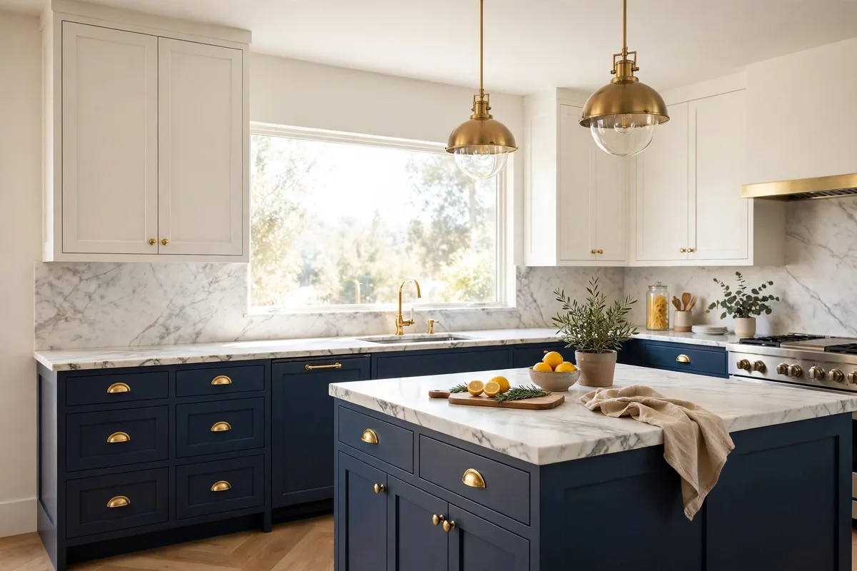
Two-tone cabinets are the highest-leverage decision in a kitchen: one room, two colours, and the relationship between them either reads as designed or as two kitchens arguing. Done well, it grounds the room, hides the wear where wear actually happens, and lets a bold colour in without letting it take over. Done casually, it splits the room at the wrong line in colours whose undertones fight. The good news: the failures are predictable, and so are the fixes — one placement rule, one undertone rule, and a handful of proven pairings.
Ten ideas, rules first and pairings second, so you can invent your own combination instead of copying someone else’s light.
In this guide: The Two-Tone Rules at a Glance · The Combination Library: 12 Pairings That Pass the Rules · 1. Dark Below, Light Above: The Golden Rule · 2. The Island Split: Bold Colour, Small Commitment · 3. Put the Split on a Real Line · 4. Match the Undertones, Not the Colours · 5. The Classic Pair: Navy Lowers, Warm White Uppers · 6. Wood Lowers, Painted Uppers: The Warm Organic Split · 7. Two Neutrals, Far Apart: The Tuxedo Kitchen · 8. Proportion: One Colour Leads, the Other Answers · 9. Small and Dark Kitchens: Soften the Contrast, or Split Only the Island · 10. Constants: One Hardware, One Door Style, Samples in Your Light · Frequently Asked Questions About Two-Tone Kitchen Cabinets · Conclusion
The Two-Tone Rules at a Glance
| Decision | The working rule | Why |
|---|---|---|
| Which colour where | Darker below, lighter above | Grounds the room; light uppers lift the ceiling |
| Lowest-risk split | The island alone | A self-contained object; bold colour, small commitment |
| Where the split lands | On an architectural line | Counter height, a corner, a run change — never mid-wall |
| Colour relationship | Match undertones, not colours | Warm-with-warm or cool-with-cool |
| Proportion | Roughly 2/3 to 1/3 | One colour must clearly lead |
| Constants | One hardware, one door style | The thread that makes two colours one kitchen |
Five Ways to Place the Second Colour
Upper/lower split — the classic: darker below, lighter above; the split follows the wall-cabinet line.
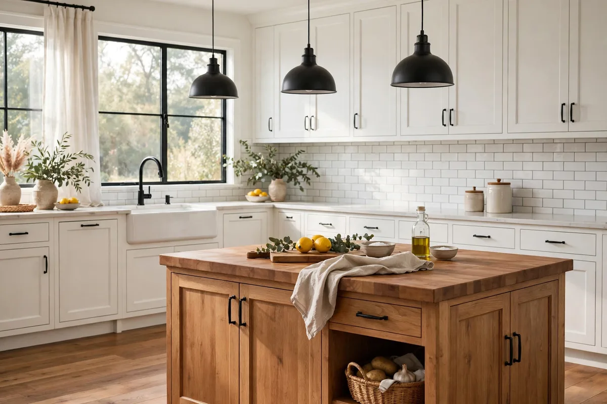
Island accent — the lowest-risk trial: the perimeter stays one colour, the island carries the second.
Tall-unit or pantry wall — a whole bank of tall cabinets in the second tone reads as furniture, not as a mistake.
Hutch or open-shelf accent — a shelving run finished in the second tone; the lowest-commitment accent there is, and the easiest to reverse.
Same-family layering — two depths of one family (the tuxedo greys in this guide) for kitchens that want difference without contrast.
The Combination Library: 12 Pairings That Pass the Rules
| Combination | Placement | Best for |
|---|---|---|
| Deep navy lowers + warm white uppers | Upper/lower split | The reliable classic — contrast with a safety net |
| Wood lowers + cream or warm-white painted uppers | Upper/lower split | Warmth below, light above; the most forgiving pairing here |
| Charcoal lowers + light grey uppers | Upper/lower split (tuxedo) | One-family depth for modern and transitional kitchens |
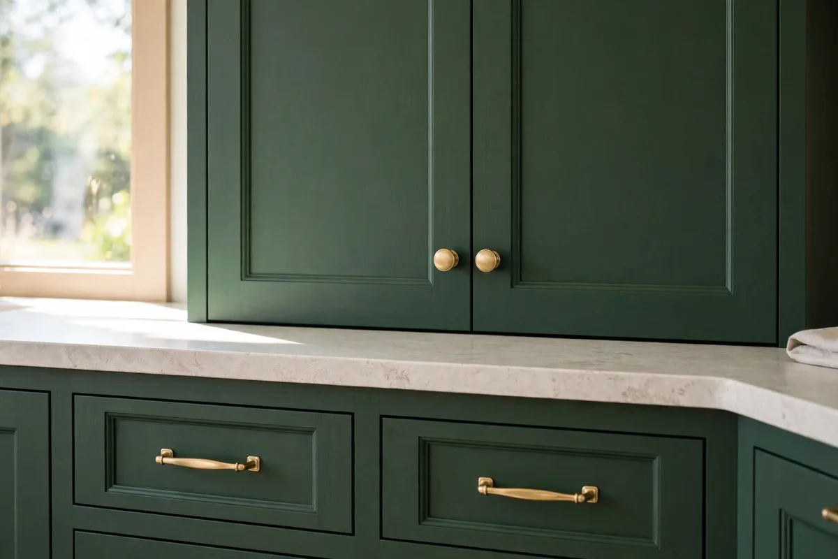
| Deep green island + white perimeter | Island accent | A coloured island that can be repainted without touching the room |
| White uppers + greige lowers | Upper/lower split | Small and low-light kitchens — contrast kept gentle |
| Sage lowers + white uppers | Upper/lower split | Soft colour that behaves like a neutral |
| Charcoal island + white perimeter | Island accent | Drama contained to one paintable block |
| Black lowers + natural wood uppers | Upper/lower split (flipped weight) | Bold, warm, and best with strong natural light |
| Cream uppers + espresso-stained wood lowers | Upper/lower split | Traditional kitchens wanting depth without black |
| Soft blue island + white perimeter | Island accent | Coastal-leaning colour, kept reversible |
| Natural wood uppers + painted lowers | Flipped split | Wood where hands do not reach; paint takes the knocks below |
| Greige lowers + white uppers | Upper/lower split | The soft-neutral split for open plans that must stay calm |
1. Dark Below, Light Above: The Golden Rule
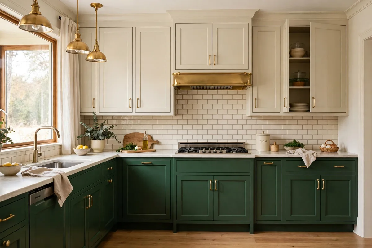
Nearly every successful two-tone kitchen obeys one geometry: the darker, heavier colour sits low and the lighter colour rides on top. HGTV’s two-tone cabinet guide gives both reasons. Visually, weight at the base reads grounded while weight at eye-and-ceiling level compresses the room and pulls the ceiling down. Practically, lower cabinets collect the scuffs, kicks, mop water and dog traffic — a darker finish hides all of it, while pale uppers stay clean because nothing touches them.
The exception proves the rule’s logic: dark-uppers-over-light-lowers only works with tall ceilings and strong natural light to pay the compression cost. Under a standard eight-foot ceiling in ordinary light, invert the split and the room feels like it is wearing a hat indoors.
The honest trade-off: dark lowers hide scuffs and kicks, but dark matte finishes show fingerprints, dust and wipe marks more readily than mid-tones — around the sink and dishwasher, expect to wipe more often.
2. The Island Split: Bold Colour, Small Commitment
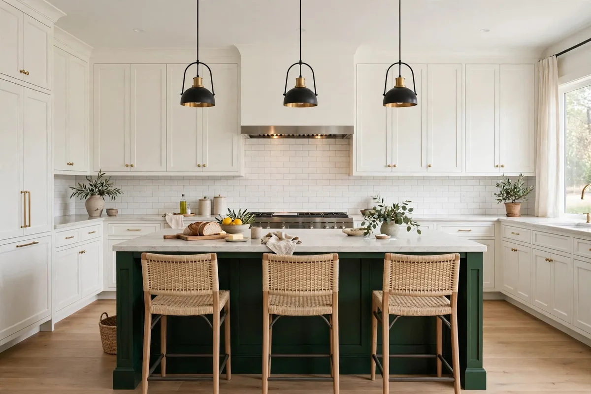
If the upper/lower split is the classic, the island split is the strategist: perimeter cabinets stay one calm colour and the island — a self-contained piece of furniture — takes the second. It is the lowest-risk place in the kitchen for a brave colour, because the island never has to blend with a wall or relate to a run of doors; it only has to be worth looking at. It is also the cheapest way to buy an expensive finish: the premium colour covers one object instead of twenty doors.
Two refinements make it read intentional: repeat the island’s colour once more, small — stool seats, a shelf, the range — so it looks chosen rather than leftover, and let counters and backsplash play neutral bridge between the two tones (a pairing question the backsplash article takes up in full). A deep green in the family of Benjamin Moore’s Salamander is the usual starting point — sample it on the island’s sunniest and shadiest faces before committing.
3. Put the Split on a Real Line
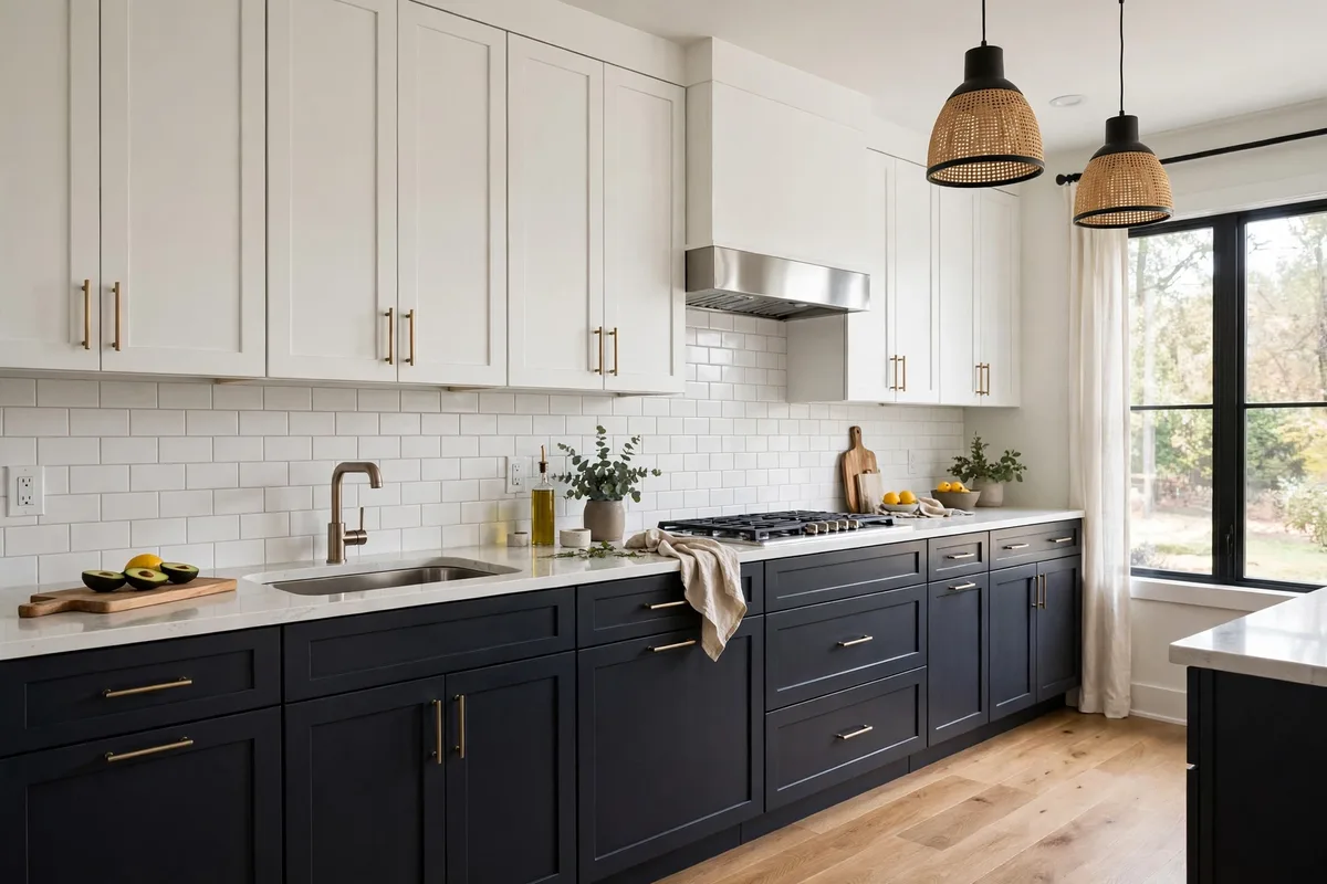
Where the two colours meet matters as much as which two they are. The split belongs on an architectural break the room already has: the countertop line (uppers one colour, lowers another), a corner where a run turns, the edge of a tall housing unit, or the island’s boundary. A colour change that lands mid-run — three doors navy, the fourth suddenly white, with no structure behind the decision — reads as an unfinished job or a stock shortage, no matter how good the colours are.
The same discipline applies vertically: a full-height bank (larder, oven housing) can take one colour as a block, giving the room a two-tone effect without splitting any run at all. Blocks, not fragments — that is the whole rule.
4. Match the Undertones, Not the Colours
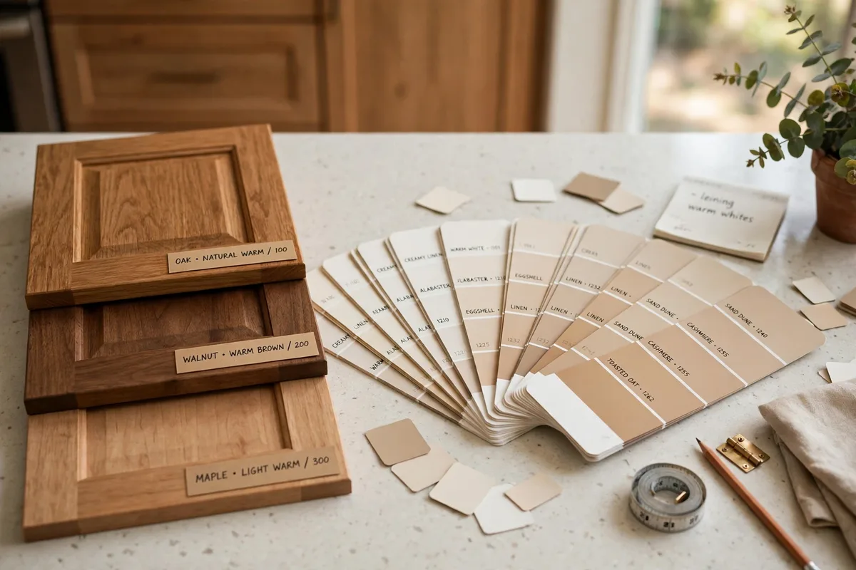
The most common two-tone failure is invisible on a paint chip and glaring in the room: a warm white paired with a cool grey, a warm wood against a blue-leaning green. Colours do not need to match; their undertones must pull the same direction. This is the cross-room principle our autumn color palette ideas doses by ratio — warm families together, cool families together, and the bridge materials (floor, counters) consulted before anyone commits.
Test like it matters, because it does: paint large sample boards, stand them in the actual kitchen, and judge at breakfast and at lamp-lit dinner. North light flattens blues; south light warms everything. HGTV’s guide ends on the same instruction — compare real finish samples inside your space — because the chip rack is the one place your kitchen’s light is not.
5. The Classic Pair: Navy Lowers, Warm White Uppers
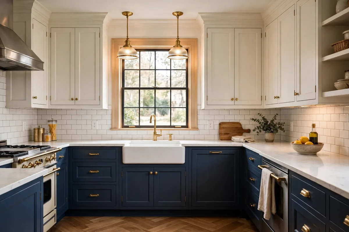
The pairing that never leaves the lists: deep navy below, warm white above. A Grateful Kitchen’s two-tone combinations guide calls it the perennial favourite for good reason — high contrast with a timeless palette, formal enough for traditional rooms, crisp enough for modern farmhouse. Its two specifications: the white must be warm (cream, off-white) or the pairing turns clinical against the blue, and the navy reads best with a whisper of grey or green in it, which keeps it deep rather than primary-school bright.
Hardware is this pair’s jewellery: brass warms it toward classic, brushed nickel cools it coastal. Either works — §10’s rule says only that you must pick one and run it everywhere. A deep navy in the family of Sherwin-Williams Naval is the standard starting point; the warm white above it matters more — sample two warm whites before you sample a second navy.
6. Wood Lowers, Painted Uppers: The Warm Organic Split
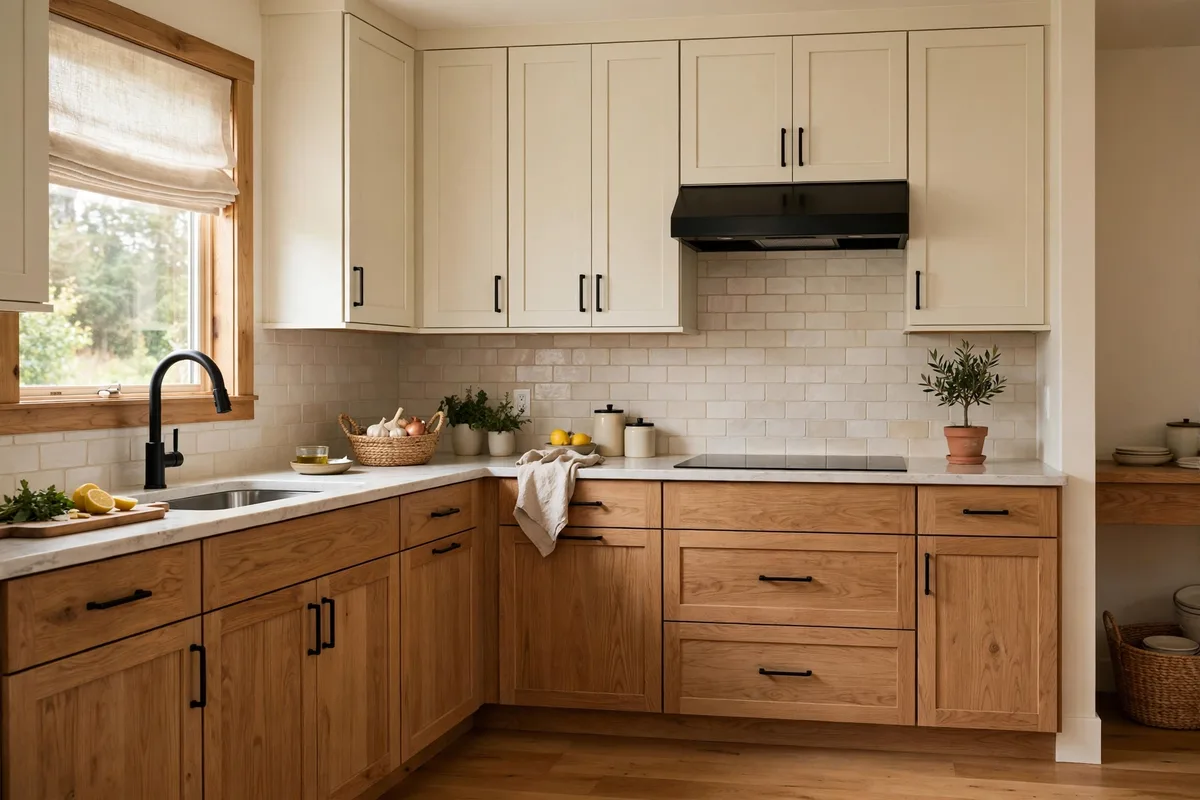
The lower-contrast, warmer dialect of the same language: natural wood where hands and scuffs live, a soft painted colour above. Wood is doing double duty — it is a colour and a texture, so the split reads gentler than any two paints can manage, and it hides wear better than either. White or off-white uppers over wood lowers is currently the most-chosen direction in new-kitchen round-ups.
Pairing discipline: wood is warm, so the painted upper should be warm too (§4) — cream, linen, a warm sage. Cool colours pair with wood more easily than warm ones clash with it, as HGTV notes — wood’s warmth complements cool paint. What fails is a red-toned wood under a pink-toned paint: two warms in different directions, arguing quietly forever.
7. Two Neutrals, Far Apart: The Tuxedo Kitchen
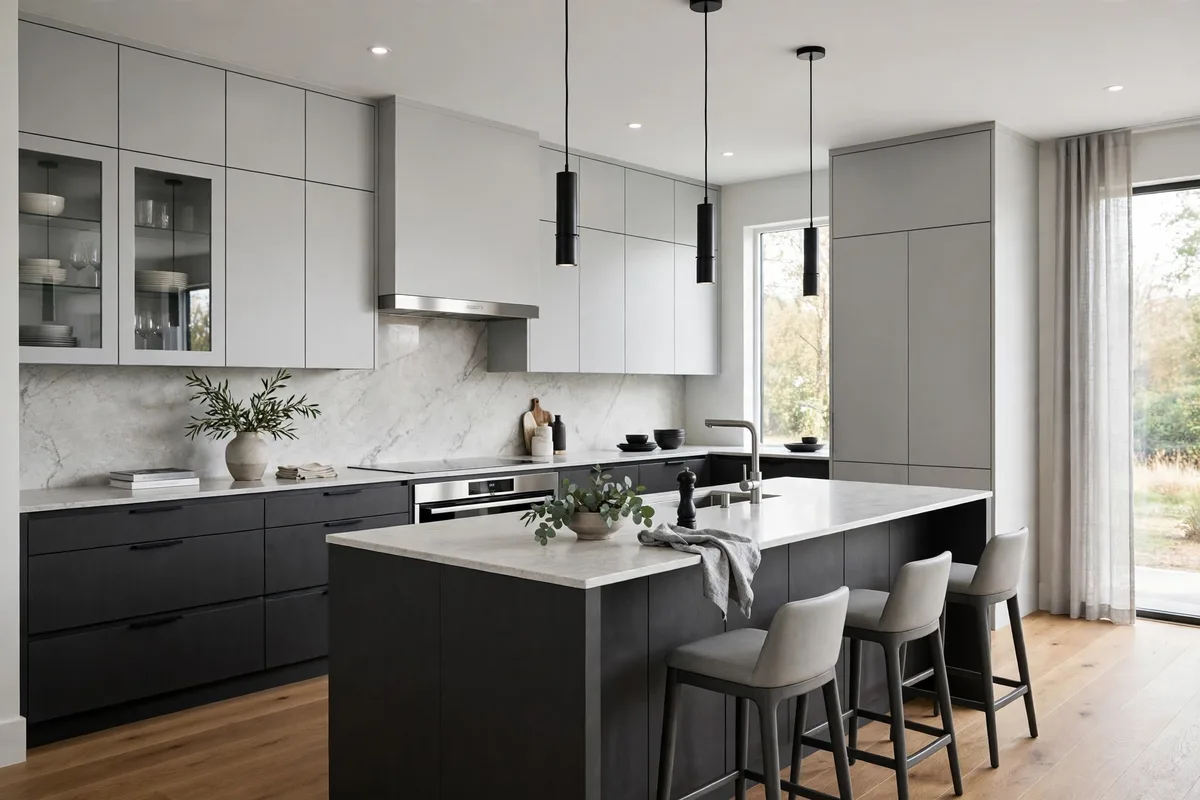
Two-tone does not require colour at all: two neutrals separated by a wide value gap — light grey or off-white above, charcoal or near-black below — deliver the same architecture with the volume down. Designers call it the tuxedo scheme, and its virtue is longevity: there is nothing in it to date. It is also the safest scheme to light, because neither tone changes personality much between daylight and evening.
The discipline is distance: the two neutrals must be unmistakably different in value. Close greys — one a half-shade deeper — read as a matching error, the single most apologised-for look in kitchen design. If you cannot tell the two samples apart across the room, they are not a pair; they are a mistake with good PR. Charcoals in the family of Farrow & Ball’s Railings sit at the deep end; keep the light grey warm-leaning, or the pair turns cold under evening light.
8. Proportion: One Colour Leads, the Other Answers
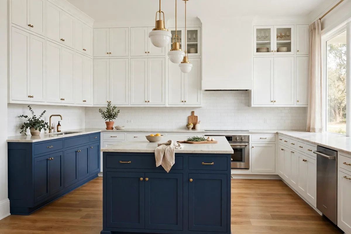
Two colours need a hierarchy. The working ratio is roughly two-thirds to one-third — one colour clearly dominant, the other clearly supporting. A fifty-fifty split has no primary, and the room reads undecided no matter how good each colour is alone. In practice the dominant share is usually the lighter tone (uppers plus tall units), with the deeper tone concentrated where it earns its keep: lowers, island, or one tall block.
This is the same dosing logic as the neutral-base system in our year-round neutral base ideas: a fixed majority that stays calm, a minority that carries the personality. Keep the minority repeatable elsewhere in small doses (§2’s stools and shelves) and the scheme feels woven rather than pasted.
9. Small and Dark Kitchens: Soften the Contrast, or Split Only the Island
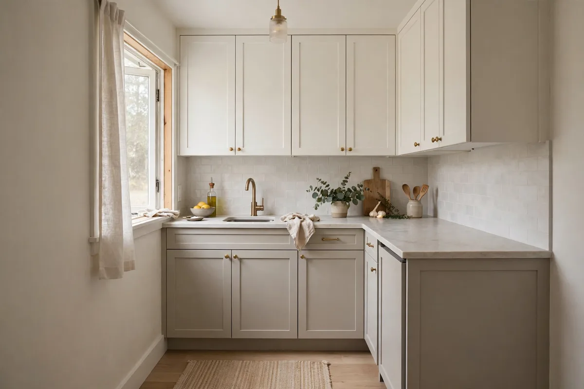
The golden rule bends where light is scarce. In a small or north-facing kitchen, saturated dark lowers can make the room feel like a basement — so the split softens (warm white over greige, off-white over light wood) or retreats to the island alone, keeping the perimeter light and the contrast where it cannot crowd the walls. Gentle pairings make a small kitchen feel taller, because the eye travels up toward the lighter tone.
The small-kitchen context is the one our best small kitchen design guide plans around: in a tight footprint every surface is close to every other, so soft contrast and matched undertones matter more, and brave colour is best spent on the one object — the island — that can carry it alone.
10. Constants: One Hardware, One Door Style, Samples in Your Light
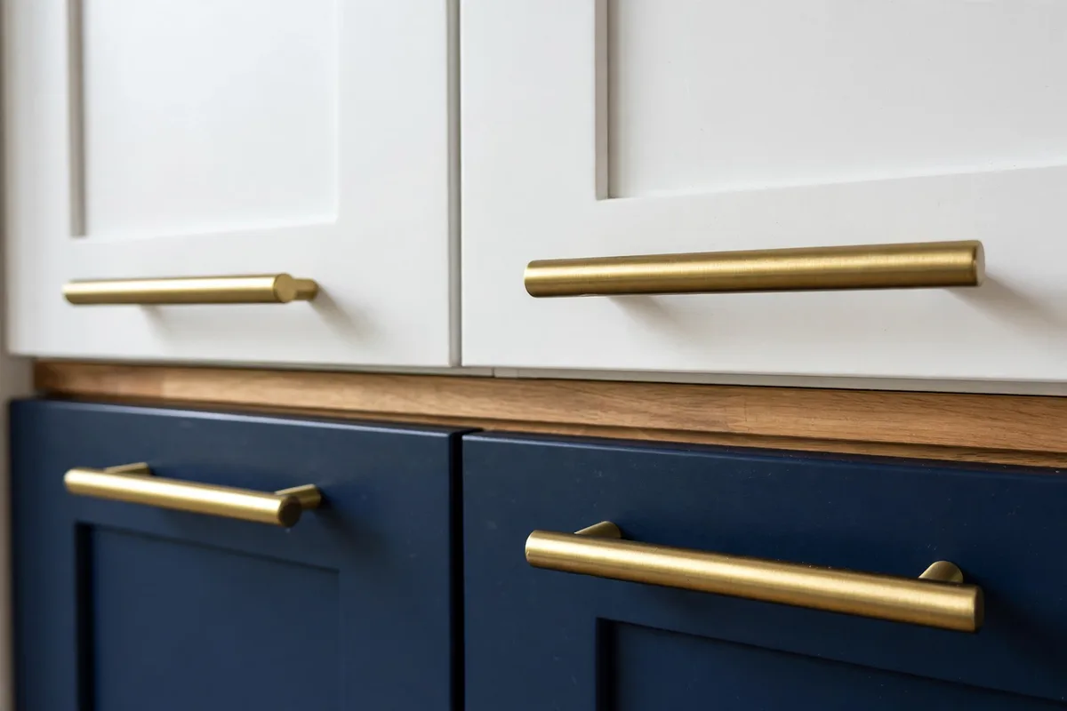
What turns two colours into one kitchen is everything that does not change. Hardware: identical style and finish across both colours — the thread running through both halves, in the words of the cabinet guides. Door style: one style clearly dominates, the second appears in one contained place (the island or a hutch), and hardware, sheen and frame reveals match across both. And the final constant is process: samples painted large, judged in your light, at your hours, before a single door is ordered.
The confidence to run colour at all is worth cultivating — the kitchens people remember are the ones where a colour was chosen on purpose, the way the warm, personality-led scheme in our Jenna Bush Hager kitchen design feature commits to its palette. Two-tone is simply that confidence with a structure: one rule for placement, one for undertone, one for proportion — and then your colour, on purpose.
| Pairing family | Hardware that completes it |
|---|---|
| Warm pairings (wood, sage, cream) | Brushed brass — it warms both tones |
| High-contrast pairs (white with navy, charcoal or black) | Matte black — it repeats the dark tone’s discipline |
| Grey-and-white and tuxedo schemes | Brushed nickel or chrome — cool metals for cool families |
Whatever the colours, keep both tones in the same sheen family — a mismatched sheen reads as an error even when the colours themselves are right.
Frequently Asked Questions About Two-Tone Kitchen Cabinets
Should the darker colour go on the upper or lower cabinets?
Lower, in almost every case. Dark below grounds the room and hides the scuffs lowers collect; light above keeps the ceiling feeling high. Dark uppers only work with tall ceilings and strong natural light — under a standard ceiling they compress the space.
What is the most popular two-tone combination?
Navy lowers with warm white uppers is the classic high-contrast pair; white or off-white uppers over natural wood lowers is currently the most-chosen direction in new-kitchen round-ups. Both obey the same rules — warm undertones together, one colour clearly leading.
Does the island have to match the cabinets?
No — the island is the best place not to match. It is a self-contained object, so a contrasting island is the lowest-risk two-tone move there is. Repeat its colour once more in something small (stools, a shelf) so it reads chosen.
Can a small kitchen do two-tone cabinets?
Yes, with softened contrast: warm white over greige or light wood, or keep the perimeter light and split only the island. Saturated dark lowers in a tight, dim room are the trap — they shrink it. Gentle value contrast actually makes small kitchens feel taller.
How many colours can a two-tone kitchen have?
Two cabinet colours — plus wood tones and one metal, which read as materials rather than colours. A third paint colour (often on the island) can work when the other two are quiet, but every addition raises the coordination cost; two is the discipline that keeps it calm.
Should hardware match on both colours?
Yes — same style, same finish, everywhere. Hardware is the constant that ties two colours into one kitchen. Two colours plus two hardware finishes is exactly where two-tone starts to look accidental.
What if my two colours clash after painting?
It is almost always undertones, not colours: a warm white against a cool grey. The fix is to move one colour into the other’s temperature family — repainting the smaller share (usually the island or uppers) is the cheap version. Sample boards in the room’s real light prevent the whole problem.
Where should the colour change happen?
On an architectural line: the countertop horizon, a corner, a run change, a tall unit’s edge, or the island’s boundary. Never mid-run without structure behind it — a split without a line reads as a stock error, not a design.
Will two-tone cabinets date quickly?
The structure won’t — grounded-low, light-high contrast is older than the trend. Colours date faster than layouts, so keep one tone a timeless neutral and put the fashionable colour where repainting is cheapest (island first, lowers second). A classic door style helps too.
Can I mix door styles as well as colours?
Better not. Two colours and two profiles is effectively two kitchens in one room, and the profile mismatch is what visitors notice without naming. Keep the door style constant and let colour do all the work.
Can you mix door styles in a two-tone kitchen?
Yes, under conditions: one style must clearly dominate — the perimeter, say — while the second appears in one contained place such as the island or a hutch, and hardware, finish sheen and frame reveals match across both. Two styles at equal weight with different hardware reads as two kitchens colliding; that is the version to avoid.
Conclusion
Two-tone is not two decisions; it is one decision with rules. Dark below and light above, the split on a real line, undertones pulling the same way, one colour leading at two-thirds, and hardware and door style held constant — inside that structure, almost any pairing you love will work, from navy-and-cream to the quietest tuxedo greys. Choose the colour on purpose; the rules will make it look like you meant it. Because you did.


Pingback: 10 Kitchen Backsplash Colors Ideas (By Cabinet Colour)
Pingback: 10 Kitchen Island Lighting Ideas (Heights, Counts, Spacing)
Pingback: 10 Open Shelving Styling Ideas for Real Kitchens
Pingback: 10 Modern Farmhouse Kitchen Look Ideas (Fresh, Not Themed)
Pingback: 10 Kitchen Cabinet Hardware Ideas (Sizes, Finishes, Placement)