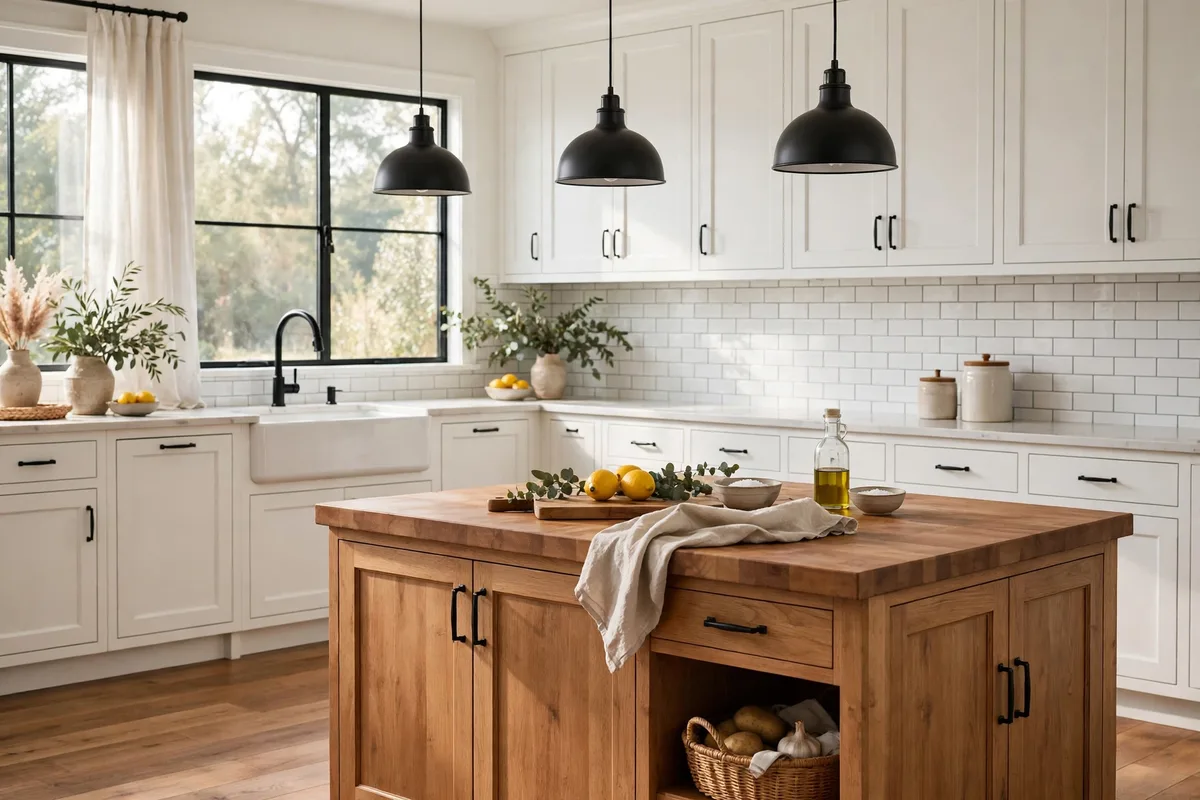
Modern farmhouse is the most requested kitchen look of the decade and the easiest to get wrong. Done badly, it is a theme park: shiplap on every wall, a sign over every surface, everything distressed whether it earned the wear or not. Done well, it is a formula — roughly seventy percent modern (clean lines, flat planes, edited surfaces) carrying thirty percent farmhouse character (honest materials, a few icons, real wear in real places). Every decision in this article is dosed against that ratio.
Ten ideas in build order: the formula, the surfaces, the icons, the materials, and finally the avoid-list that protects all of it.
The Modern Farmhouse Formula at a Glance
| Element | Modern farmhouse dose | Why |
|---|---|---|
| The formula | 70% modern lines, 30% farmhouse character | Character is an accent; structure stays clean |
| Cabinets | Shaker, one colour or one two-tone split | The quiet background everything plays against |
| Sink | Apron-front, about 30 in, single basin | The style’s one true icon |
| Shiplap | One surface only | Texture without the barn costume |
| Metals | Matte black lead, one warm metal in support | Definition without shine |
1. The 70/30 Formula: Modern Bones, Farmhouse Skin
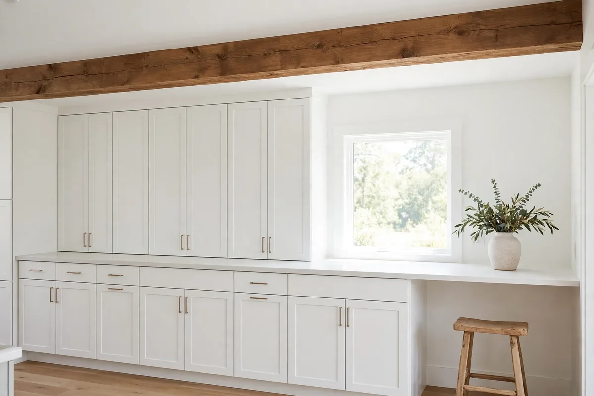
Start with the ratio, because it settles every argument the project will have. The seventy percent is modern: long unbroken cabinet runs, flat planes, simple handle lines, quiet appliances, counters mostly empty. The thirty is where the farmhouse lives: wood with visible grain, an apron sink, a plank texture somewhere, objects that look used because they are. If a purchase cannot say which side it serves, it serves the theme — and the theme is what dates.
The test is subtraction. Remove the farmhouse thirty in your mind: what remains should still be a calm, well-proportioned modern kitchen. Remove the seventy instead: what remains should be a handful of strong character pieces, not a set. Rooms that pass both tests feel collected; rooms that fail feel decorated.
2. Shiplap, Dosed: One Surface, Not Every Surface
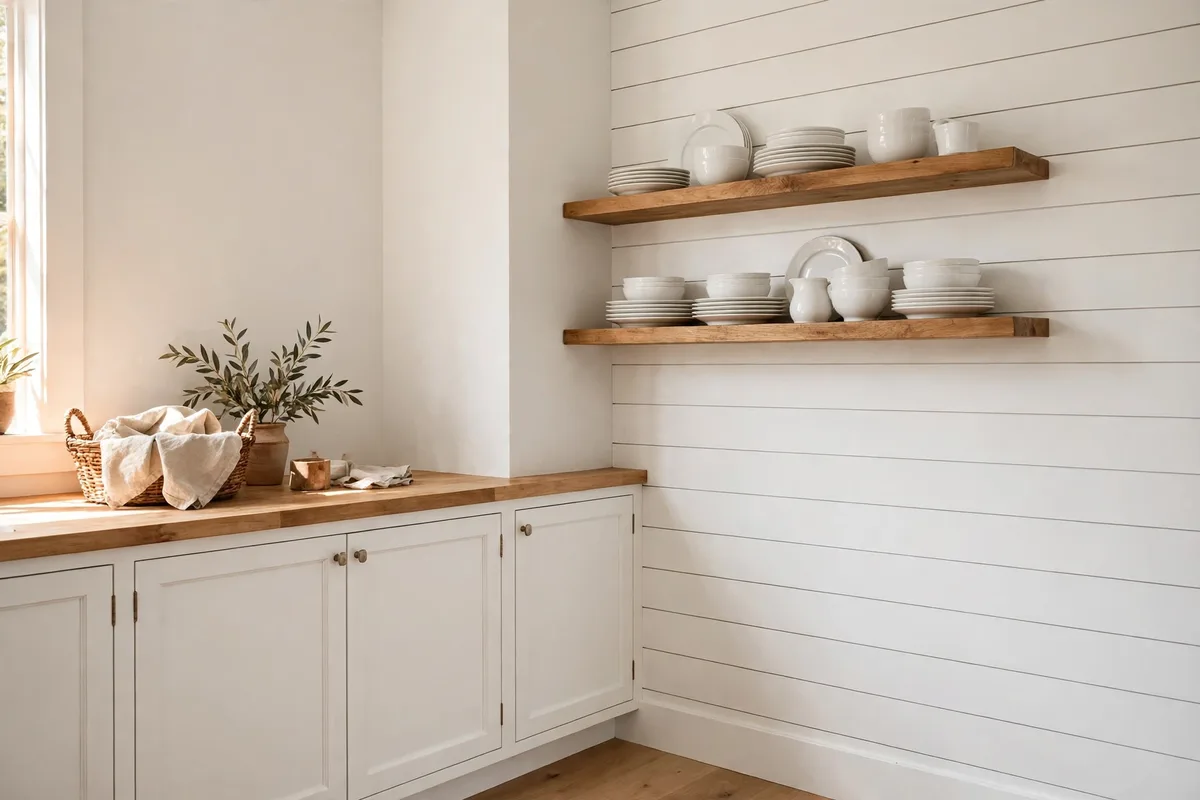
Shiplap is the style’s most abused material — a lovely plank texture that becomes a costume the moment it wraps a room. The modern dose is one surface: the wall behind the open shelves, the island’s back, a range hood surround, a nook ceiling. One planked surface reads as architecture; four read as a barn interior, the clean lines drowning in stripes that compete with every cabinet line.
Run it in the direction that serves the room — horizontal to widen, vertical to lift a low ceiling — and paint it the same white as the walls so the texture works through shadow, not contrast. The moment shiplap is stained, grey-washed, or paired with a second planked surface, it stops being the thirty and starts eating the seventy.
3. The Apron-Front Sink: One Icon, Chosen Well
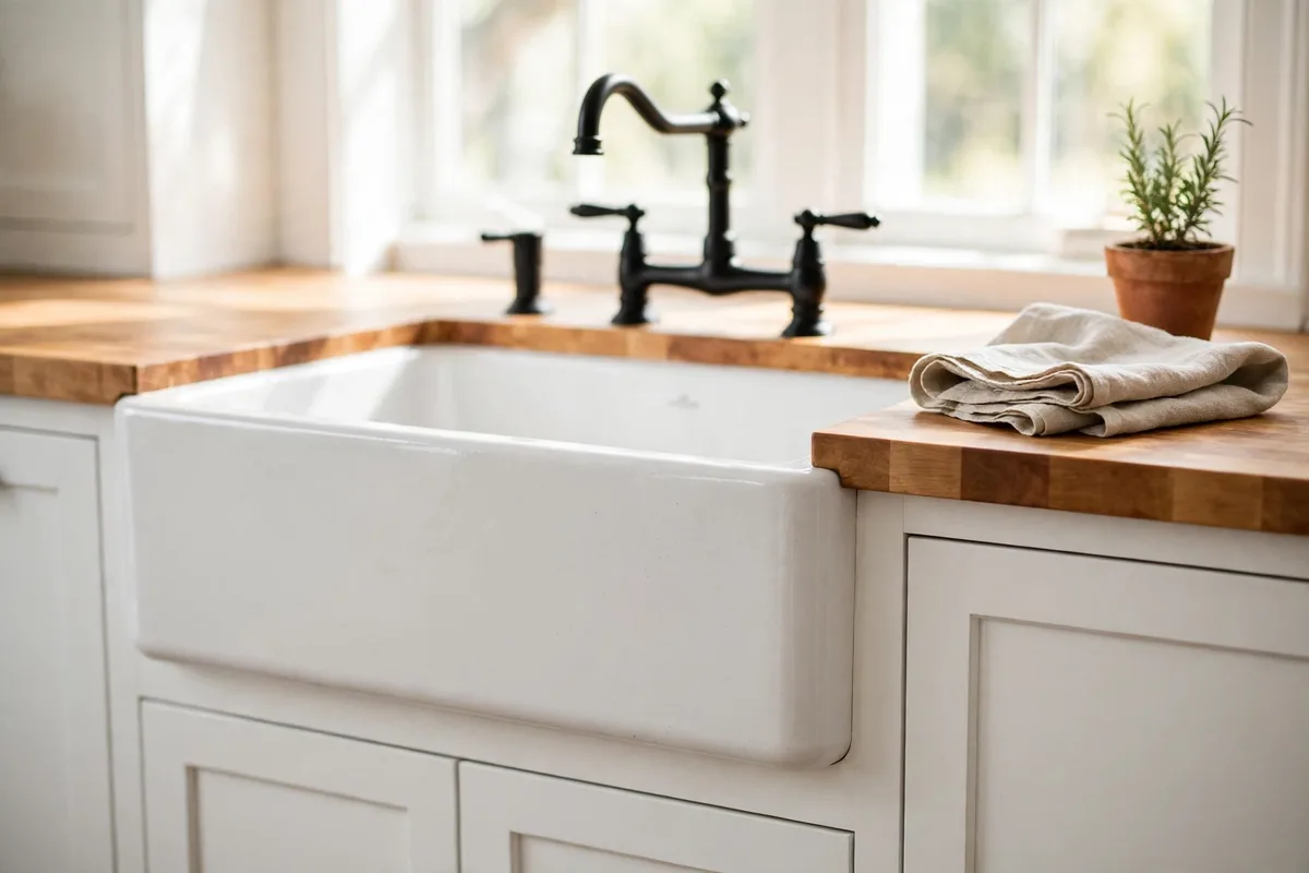
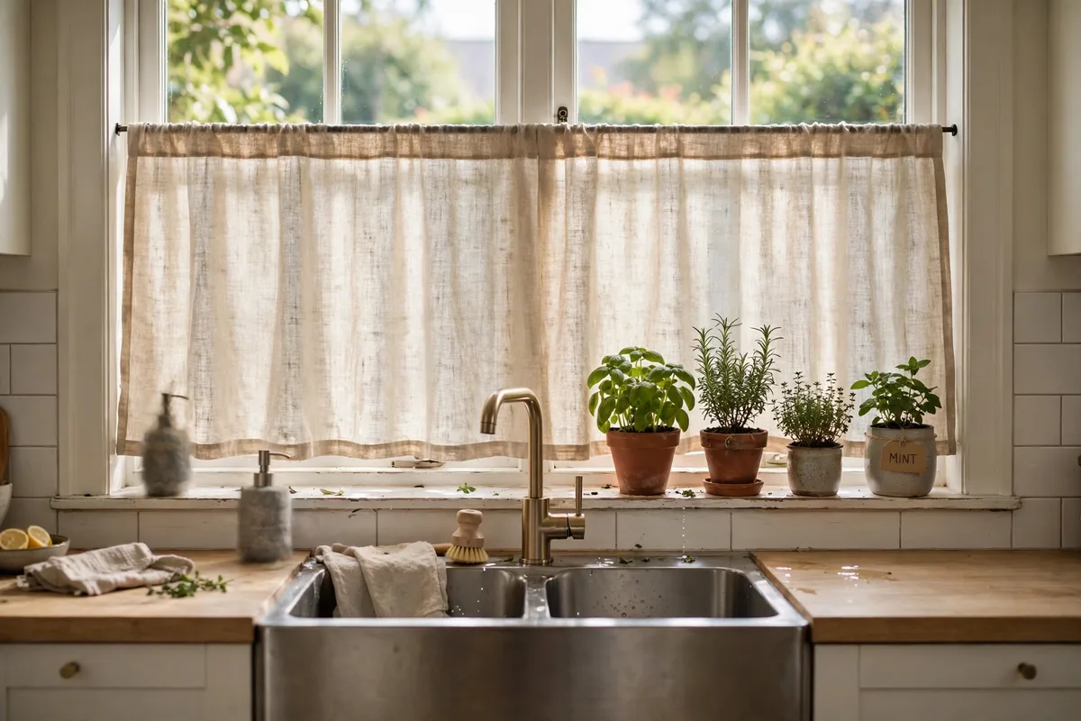
If modern farmhouse has one non-negotiable icon, it is the apron-front sink — the deep exposed-front basin borrowed from working farm kitchens, where it earned its place by swallowing roasting pans whole. Chairish’s farmhouse kitchen guide puts it first among the style’s essential elements and sizes it practically: standard widths run 24 to 36 inches, with 30 inches the sweet spot for most kitchens — big enough for sheet pans, small enough not to swallow the sink run.
Choose it like the workhorse it is: fireclay or cast iron for the weight and gloss, a single deep basin over a divided one (dividers are where big pans fail), and a faucet with presence — bridge style or tall gooseneck, in the room’s lead metal. One icon, bought well, out-carries a dozen themed accessories.
4. Shaker Cabinets: The Quiet Workhorse
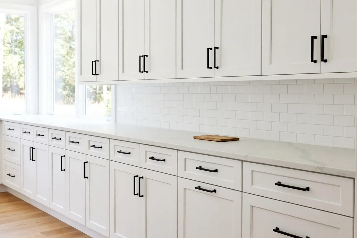
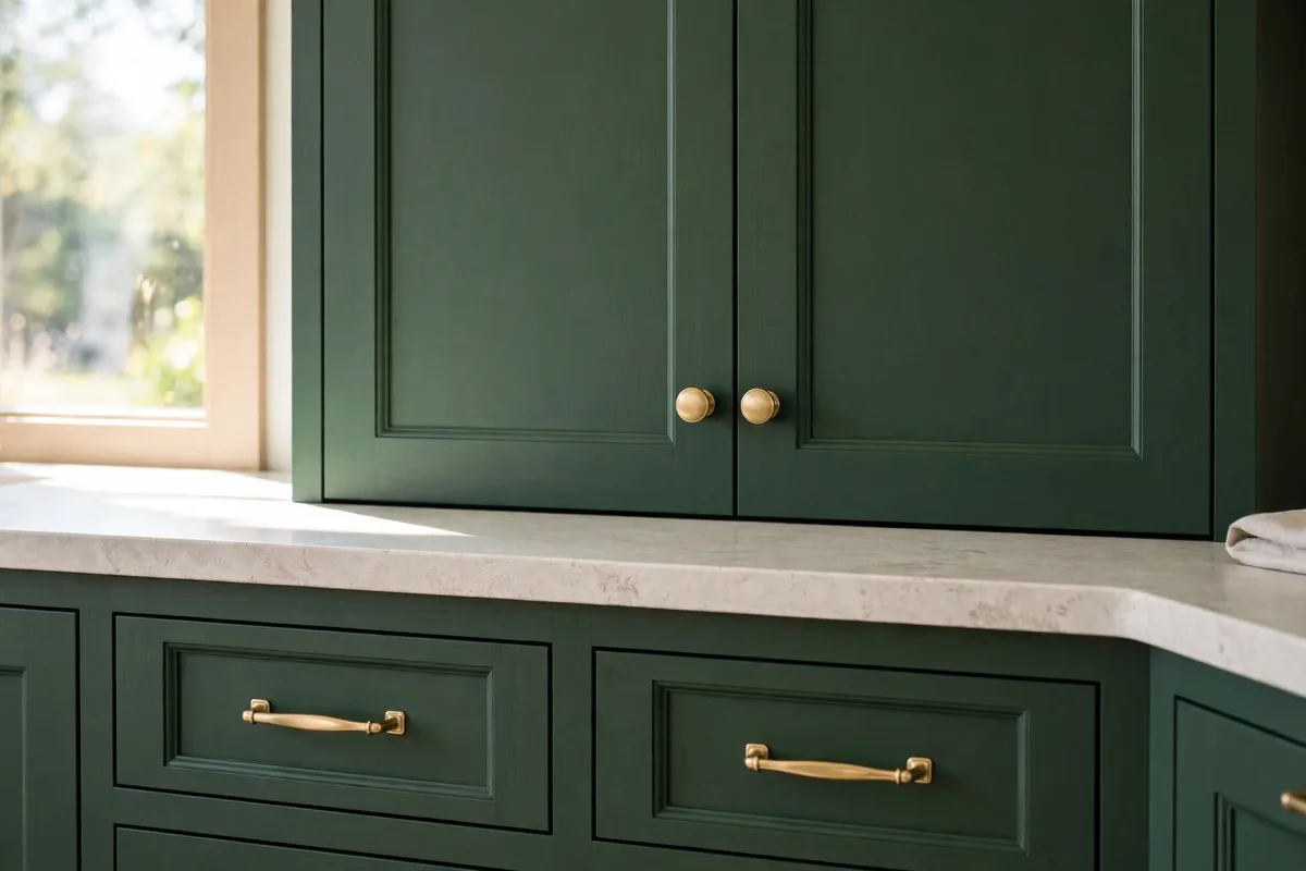
The cabinet door that makes the formula work is the Shaker: a flat centre panel in a simple frame, detailed enough to cast a shadow line, plain enough to disappear. It belongs fully to both sides of the ratio — farmhouse by ancestry, modern by restraint — which is why it survives every swing of kitchen fashion. Painted finishes lead (white, cream, soft sage), in matte or satin, never gloss.
Colour discipline follows the formula: one cabinet colour across the room, or a single split — the island in a grounded tone against pale perimeter cabinets, exactly the split logic of our two-tone kitchen cabinets ideas. A third colour, a distressed finish, or mixed door styles each spend character the room has not budgeted for.
5. Warm Wood and Butcher Block: Warmth Where Hands Land
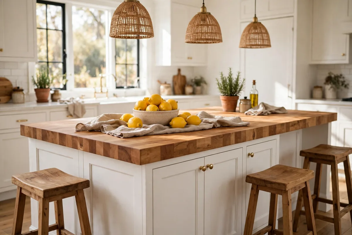
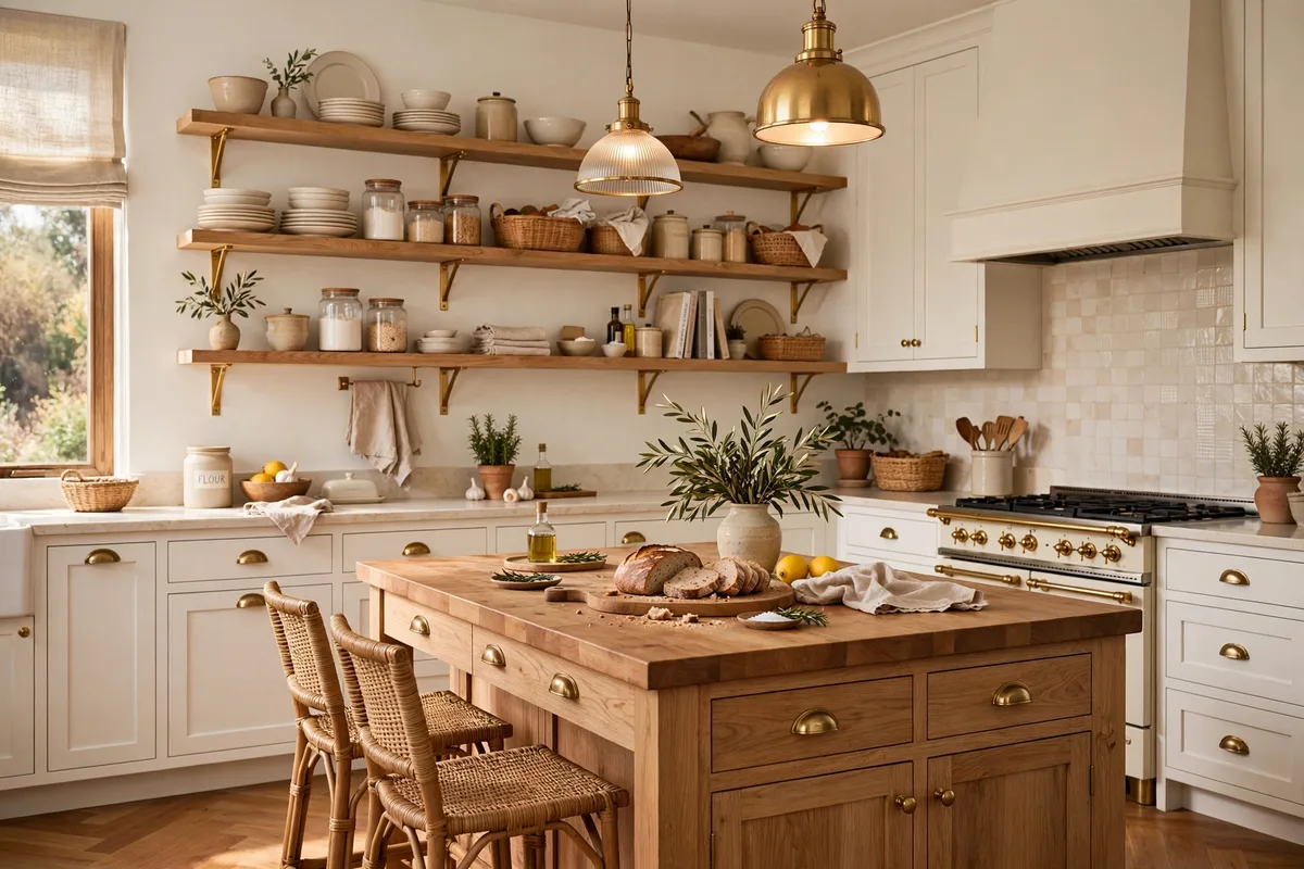
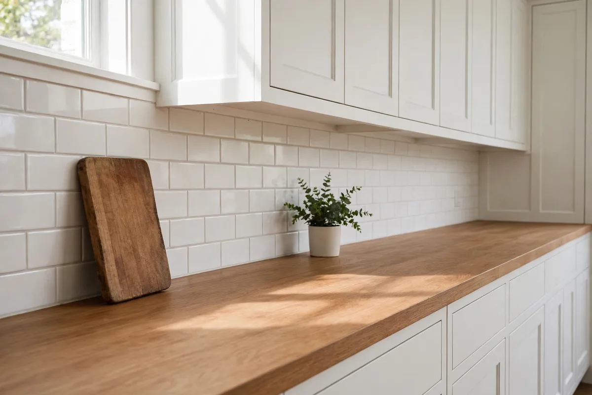
Wood is the farmhouse thirty’s main carrier, and its placement rule is touch: it warms most where hands and eyes land — the island top, the stools, the shelf run, the boards that live out. Butcher block is the style’s signature counter, honest and repairable, best dosed to the island or a prep run, with stone or quartz taking the wet and hot zones. The species and stain discipline is the one in our warm wood kitchen finishes ideas: one warm species, repeated, finished to show grain.
What wood should not do is multiply. A wood island, shelves, stools and floors in four different tones is not warmth — it is a timber yard. Pick the tone once, repeat it at least three times, and let the other surfaces stay quiet enough for the repetition to read as a decision.
6. Matte Black: The Modern Counterweight
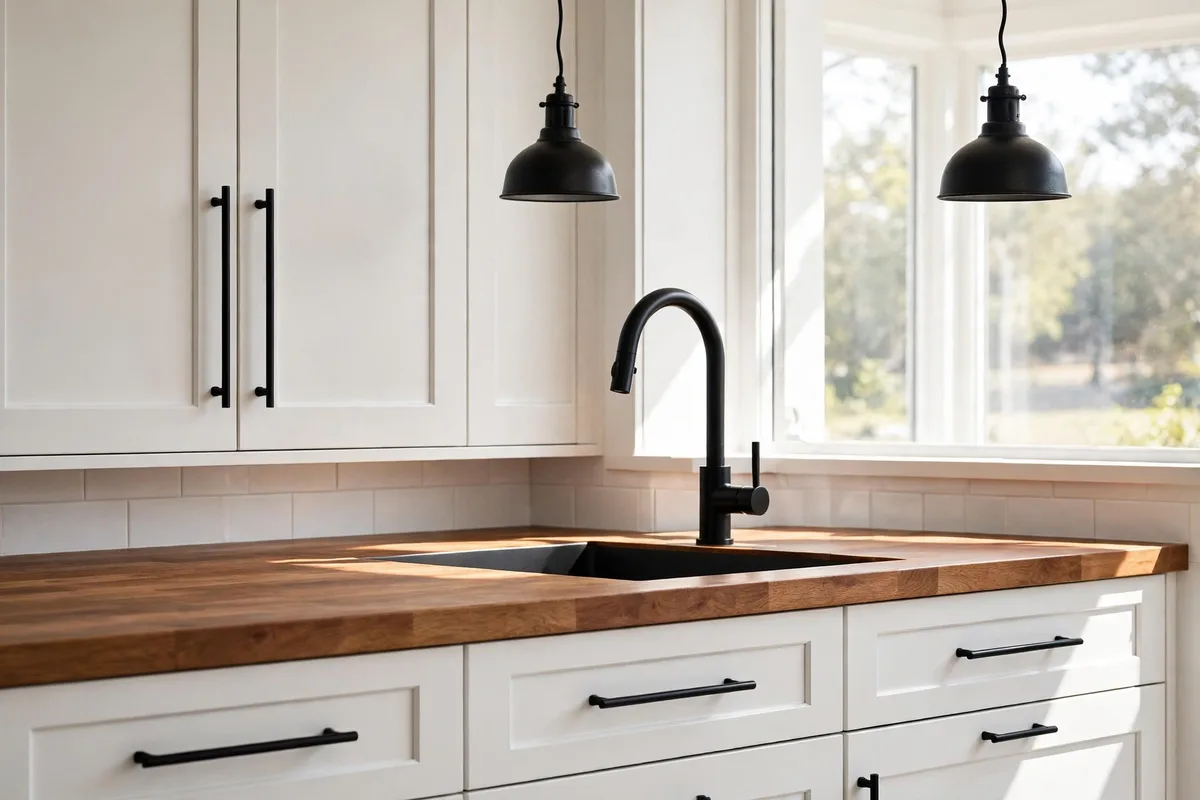
Every soft, pale, wood-warmed room needs a counterweight, and in modern farmhouse it is matte black: pulls, faucet, pendants, a stool frame, the window muntins if you are lucky. Black is the seventy talking — crisp, graphic, unmistakably current — and it is what stops the creams and woods from dissolving into a beige sigh. The dose is planned points, repeated: the same dosing discipline used for black in our white kitchen accents ideas, where black appears at chosen places and nowhere else.
One warm metal may support it — aged brass on the pendants, say, while hardware and faucet stay black — but two rules hold: black is always matte (gloss reads appliance, not architecture), and the black shapes should rhyme, pendants echoing the faucet’s curve, pulls sized consistently throughout.
7. Open Shelving: A Short Run That Works Daily
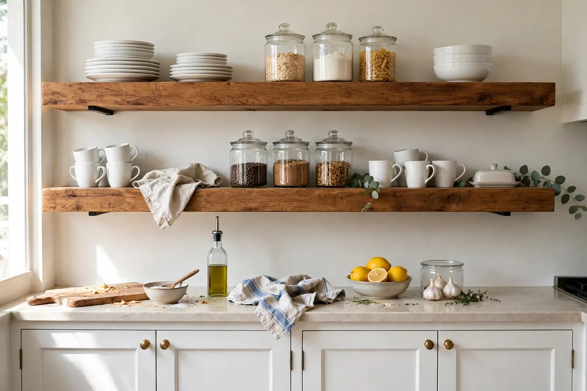
Open shelving is farmhouse character with a modern condition: it earns its place only as a working system, never as a display of themed objects. One short run — two shelves, rarely three — of thick wood in the room’s chosen tone, holding the daily dishes, glasses and canisters that rotate through the dishwasher too fast to gather dust. The full working system, from shelf heights to grease-honest placement near the range, is the one in our open shelving styling ideas.
In this style the palette does extra duty: white and cream dishware, clear glass, the one wood tone, black only in a single crock. The shelves are the room’s most photographed and most honest surface — if the everyday objects cannot carry the styling, the answer is fewer, better everyday objects, not decor bought for the shelf.
8. Vintage Touches, Edited Hard
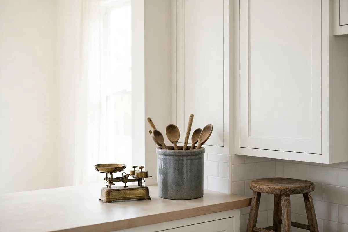
Real age is the one thing the farmhouse thirty cannot fake, so the few genuinely old pieces in the room carry disproportionate weight: a stoneware crock that holds actual spoons, a worn stool, a scale, a board with a decade of knife marks. The editing rule is severe — two or three pieces per room, each useful or beautiful enough to survive a clear-out, each given empty space around it so the eye can find it. Vintage displayed in crowds reads as a flea-market stall; vintage displayed alone reads as heritage.
Source them slowly and prefer the real over the reproduction: one authentic worn object does what ten factory-distressed ones cannot, because its wear sits where hands actually touch. If a piece’s only job is to announce the style, it is set dressing — and §10 is waiting for it.
9. Statement Lighting: The Room’s One Loud Voice
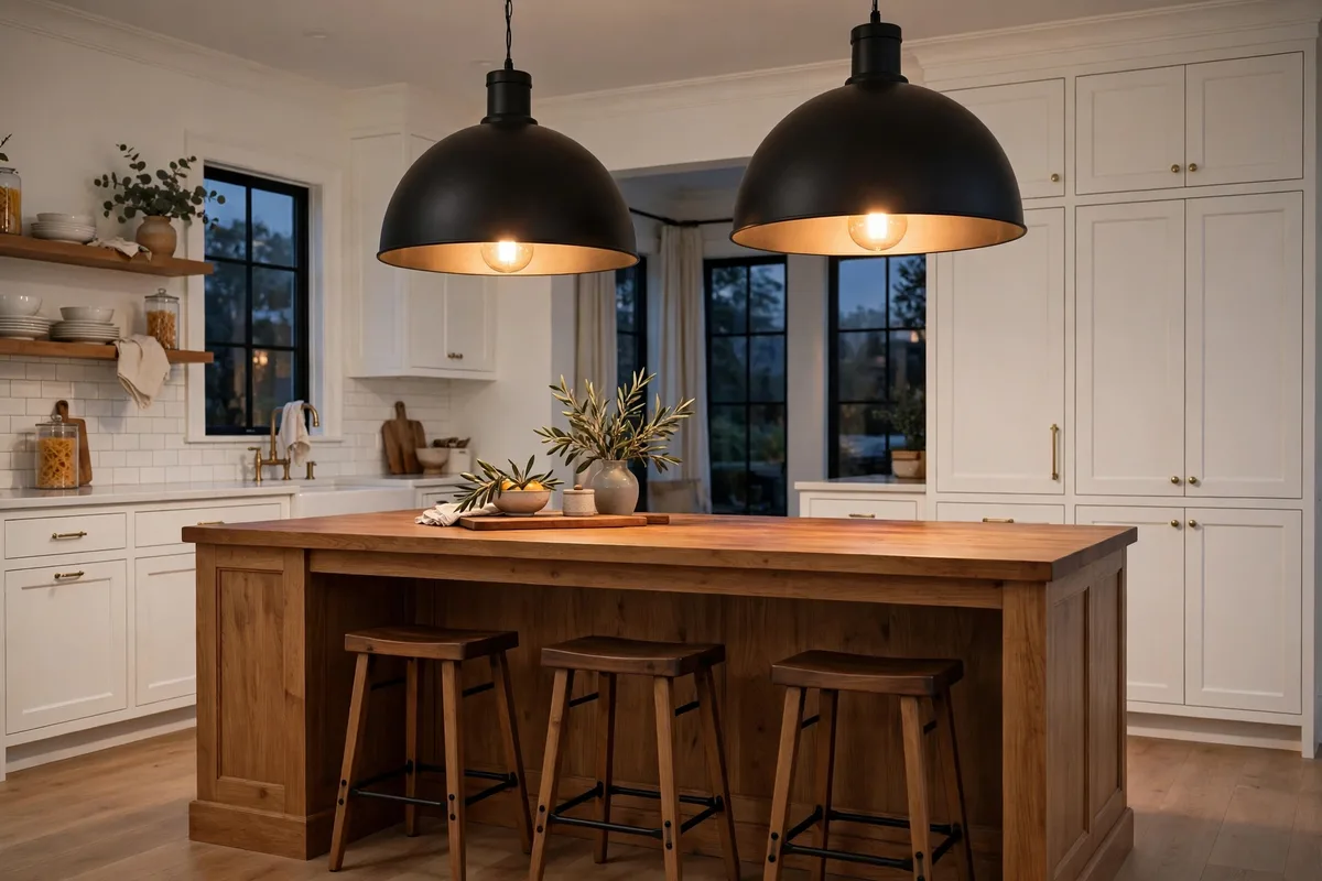
A kitchen of quiet cabinets and edited surfaces earns one loud voice, and lighting is where to spend it: oversized matte black dome pendants over the island, a linear fixture with real span, or one sculptural piece over the table. Scale is the statement — pendants sized to the island rather than to caution, hung thirty to thirty-six inches above the counter, on dimmers, at a warm 2700–3000K so the evening kitchen glows instead of glaring.
What the statement replaces matters as much: the matching lighting set, the mason-jar pendants, the wagon wheel. One fixture family, chosen boldly, competing with nothing. When lighting is the room’s single piece of theatre, everything else is required to stay calm.
10. The Avoid List: Where Farmhouse Tips Into Theme
The difference between farmhouse and themed is mostly a list of refusals. House Decor Ideas’ farmhouse mistake roundup names the big three: buying complete matching sets (coordinated product reads as showroom, not home), over-distressing (fake wear on every surface announces itself as manufactured), and walls of word signs repeating slogans until the room is labelled instead of designed. Add mason-jar overload — a jar is storage, not a lighting-and-vase programme — and the theme park is complete.
The fix is never more farmhouse; it is more editing. Keep one sign if it genuinely means something and give it a wall to breathe on; let one piece carry real wear; break every matching set with one contrasting material. The goal is a kitchen a stranger reads as warm, modern and collected — the word “farmhouse” should arrive as their second thought, not their first.
Frequently Asked Questions About Modern Farmhouse Kitchen Look
What is the difference between farmhouse and modern farmhouse?
Traditional farmhouse layers everything: more wood, more objects, more texture, more colour. Modern farmhouse keeps the warmth and edits the volume — seventy percent clean modern lines carrying thirty percent farmhouse character, and icons chosen singly instead of in sets.
Is modern farmhouse going out of style?
The themed version is fading; the formula version is not. All-white, shiplap-everywhere, sign-covered kitchens date because they are costumes. Shaker cabinets, apron sinks, warm wood and matte black — the substance underneath — remain among the most requested kitchen elements, especially in warmer, quieter palettes.
What are the must-have elements of a modern farmhouse kitchen?
Shaker cabinets in a matte painted finish, an apron-front sink around thirty inches wide, one warm wood repeated through the room, matte black hardware and lighting, and one plank texture on a single surface. Everything else — shelves, vintage, beams — is optional seasoning.
What colours work best in a modern farmhouse kitchen?
Warm whites and creams as the base, one grounded cabinet or island colour if you split (sage, charcoal, deep green), warm natural wood, and matte black as the punctuation. The palette stays at two or three colours total; colour arrives in textiles and objects that can leave.
How much shiplap is too much?
More than one surface. A single planked wall, island back or hood surround reads as texture; walls plus ceiling plus island reads as a barn set. Paint it the same colour as the room so it works through shadow, and let the other walls stay plain.
What size apron-front sink should I buy?
Thirty inches is the sweet spot for most kitchens — wide enough for sheet pans and roasting dishes, in proportion with a standard sink base. Smaller kitchens take 24–27 inches; committed cooks with the cabinet run for it go to 33–36. Choose a single deep basin over a divided one.
Can I get the look without replacing my cabinets?
Yes, if the existing doors are simple. Paint is the great converter: a matte warm white or sage on plain doors, new matte black pulls, an apron-look sink is harder to fake — but butcher block on the island, one planked surface, a short shelf run and bold pendants will carry a room whose cabinets merely behave.
Butcher block or stone counters — which suits the style?
Both, dosed by zone. Butcher block brings the warmth and suits the island or a prep run; it asks for oiling and hates standing water. Quartz or honed stone takes the sink and range zones and the maintenance anxiety with them. The mixed counter is the modern farmhouse norm, not a compromise.
How do I stop the kitchen looking themed?
Audit the announcements: word signs, matching sets, distressed everything, jars doing five jobs. Remove most of them and let materials make the argument instead — real wood grain, a real sink, real wear on one or two pieces. If the style needs a label in the room, it is a theme.
Where should I spend first on a budget?
In formula order: paint and hardware on the cabinets (the largest surface in the room), then the sink if a renovation allows it, then lighting — the statement piece — then wood in one place, bought well. Decor comes last and least; a small budget spent on the bones beats the same money spread across accessories every time.
Conclusion
Modern farmhouse lasts when it is treated as a ratio instead of a shopping list: modern bones doing seventy percent of the work, farmhouse character — the sink, the shaker line, one planked surface, warm wood, matte black, a few honest old things — dosed at thirty and edited without mercy. Build the bones clean and refuse the theme; the result still feels like itself in ten years.