
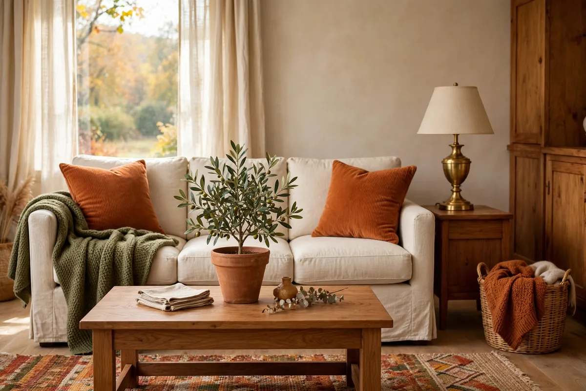
Autumn colour goes wrong in one of two ways: a timid beige room with a single orange cushion apologising in the corner, or a pumpkin-spice explosion that has to be packed away by November. The fix is to work from a palette — a small, tested set of colours with assigned jobs — instead of collecting “fall things” one impulse buy at a time.
Here are five palettes that have never missed, how to dose them with the 60-30-10 rule, and where each one shines. Pick one. Your whole home can share it.
In this guide: The Five Palettes at a Glance · 1. Palette One: Rust, Cream and Warm Wood · 2. Palette Two: Olive, Tan and Deep Brown · 3. Palette Three: Terracotta, Mustard and Cream · 4. Palette Four: Aubergine, Charcoal and Brass · 5. Palette Five: Sage, Oatmeal and Clay · 6. Dose Every Palette With 60-30-10 · 7. Let Texture Carry Half the Colour · 8. Room by Room: Where Each Palette Shines · 9. Test Before You Commit · 10. Carry One Palette Through the Whole House · Frequently Asked Questions About Autumn Colour Palettes · Conclusion
The Five Palettes at a Glance
| Palette | The colours | The mood | Best room |
|---|---|---|---|
| 1. Classic | Rust, cream, warm wood | Welcoming, timeless | Living room |
| 2. Understated | Olive, tan, deep brown | Calm, earthy | Bedroom |
| 3. Cosy-sunny | Terracotta, mustard, cream | Warm, cheerful | Kitchen / dining |
| 4. Moody luxe | Aubergine, charcoal, brass | Dramatic, evening | Dining room |
| 5. Calm modern | Sage, oatmeal, clay | Soft, modern-organic | Anywhere; renters’ favourite |
1. Palette One: Rust, Cream and Warm Wood
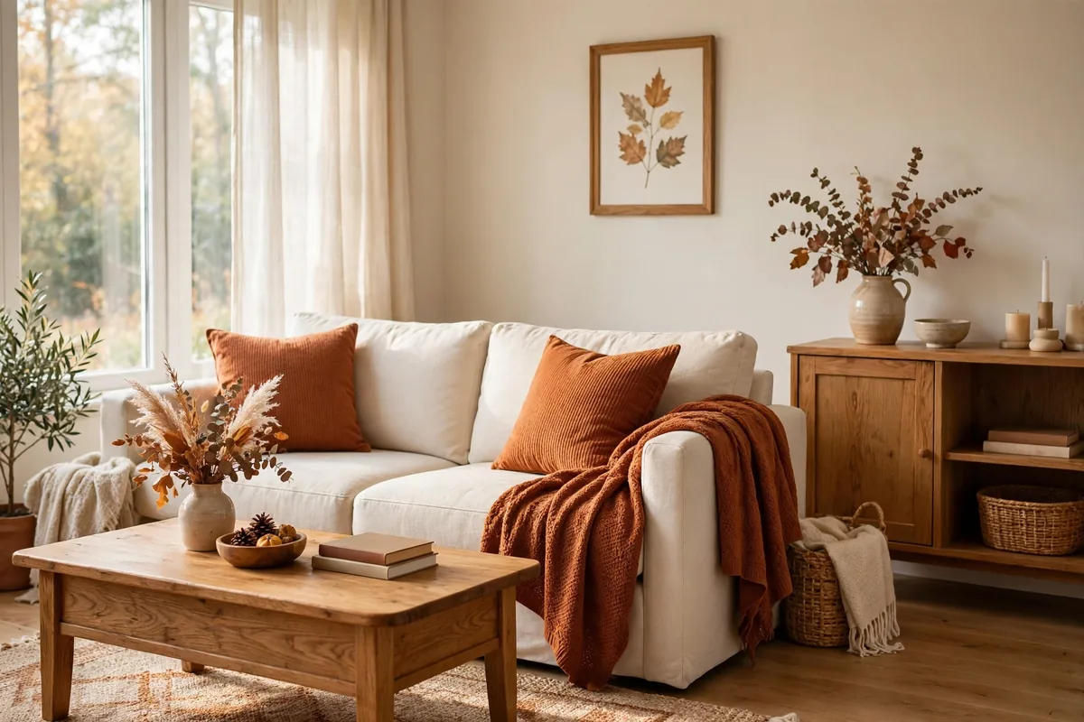
The palette designers reach for first, and the one autumn styling advice repeats for a reason: rust carries the season, cream keeps it light, and warm wood grounds both so nothing floats or shouts. On a cream sofa it is literally two rust cushions and a rust throw; on wooden floors the wood is already your third colour working for free.
This is the safest palette for a first autumn — it flatters warm and neutral rooms alike and reads “seasonal” without a single pumpkin in sight. It is also the palette doing the work in our fall entryway styling ideas, where the same rust-and-wood pairing welcomes guests at the door.
2. Palette Two: Olive, Tan and Deep Brown
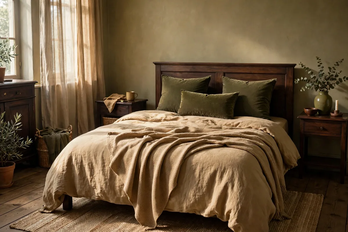
The understated option: olive instead of orange, tan instead of cream, deep brown (leather, dark wood, a chocolate throw) as the anchor. Mood-based palette guides describe the rustic family exactly this way — earthy browns, pumpkin softened into tan, and olive green — and it suits bedrooms and quiet rooms where rust would feel too energetic.
Olive has a bonus: it is a bridge colour. It pairs with the greens of houseplants you already own and transitions gracefully into winter’s evergreens without a full re-style.
3. Palette Three: Terracotta, Mustard and Cream
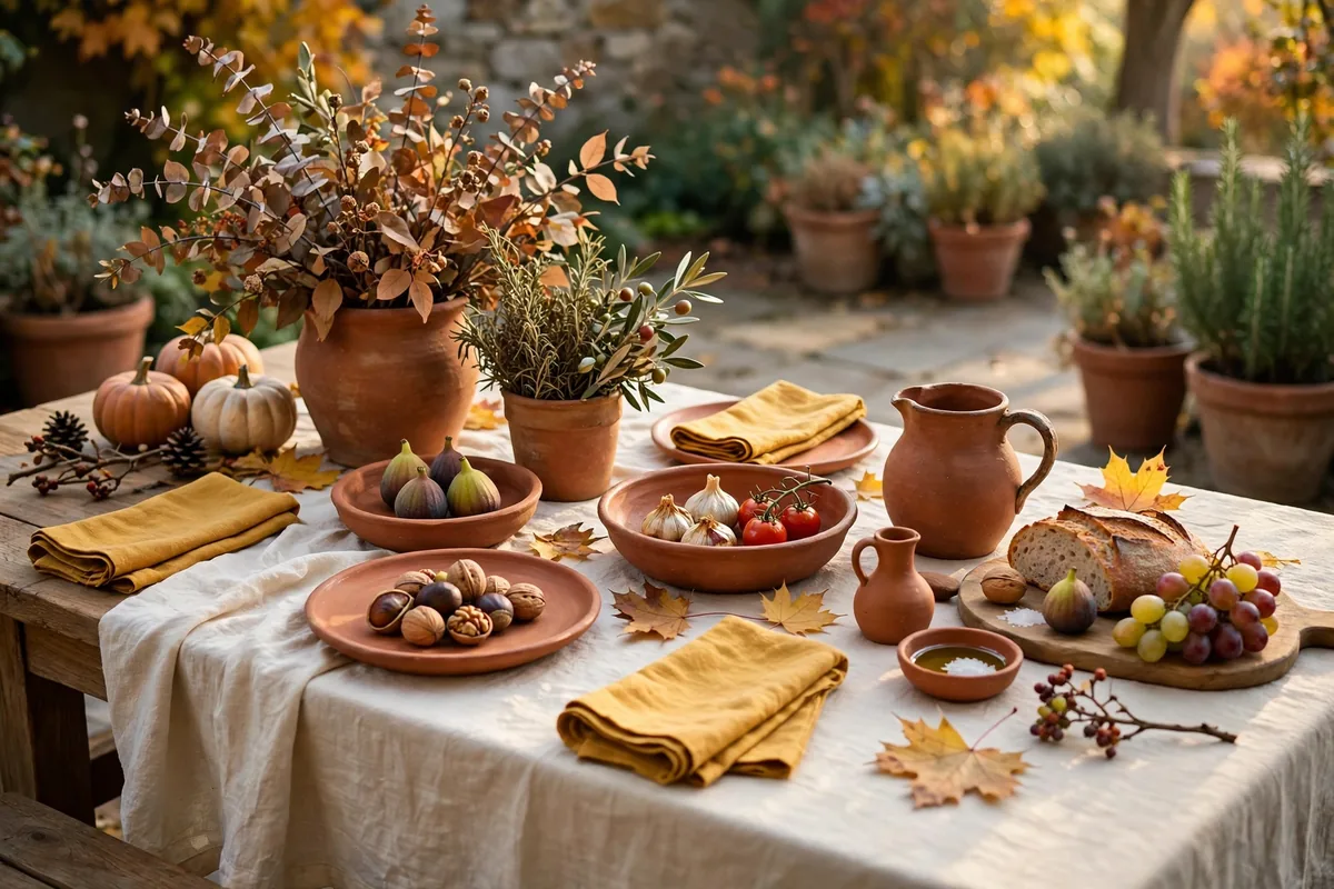
The cosy-sunny palette, named in design guides as the classic “cozy” trio: terracotta, mustard and rust-family warmth lifted by cream. It suits rooms that gather people — kitchens and dining spaces — because both colours stimulate appetite and read beautifully in lamplight and candlelight.
Dose matters: mustard is a spice, not a base. A set of napkins, two cushions, a single vase — then let terracotta (pots, ceramics, a rug border) do the heavier work and cream keep the air in the room.
4. Palette Four: Aubergine, Charcoal and Brass
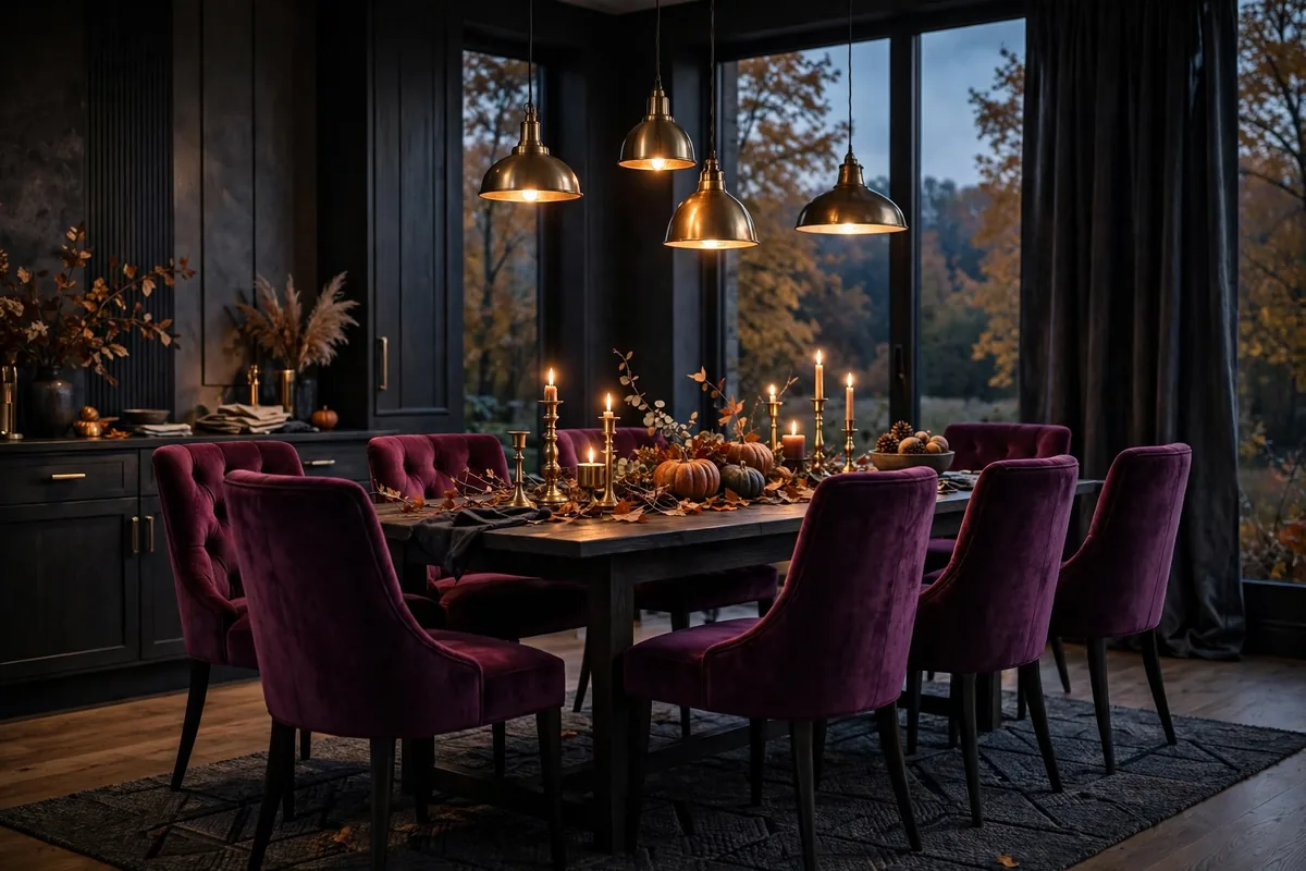
For rooms that come alive after dark: aubergine (deep plum) as the jewel, charcoal as the shadow, brass as the glint. Palette roundups file aubergine, charcoal and burgundy among the “moody accents” — and brass is what keeps them luxurious rather than gloomy, reflecting warm light back into the room.
Use it where evenings happen: dining room, a reading corner, a bedroom for cocooning. In removable pieces first — velvet cushions, a throw, lampshades — unless you are ready to commit to a wall.
5. Palette Five: Sage, Oatmeal and Clay
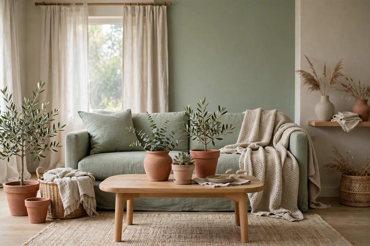
The calm modern palette: dusty sage and oatmeal as the quiet field, clay (a muted terracotta) as the gentle warmth. Guides describe the calm version of autumn as soft beige, oatmeal and dusty sage — this palette simply gives that calm a clay-coloured pulse so it reads seasonal rather than merely neutral.
It is the renter’s and the minimalist’s favourite: nothing clashes with existing grey or white furniture, everything stores flat, and the whole palette can live in textiles alone.
Named Starting Points: Paints to Sample
Colour words cannot be taken to a paint counter, so here are the registers in purchasable form — starting points to test, never verdicts. For the rust and clay of the Classic and Cosy-Sunny palettes, sample the register of Sherwin-Williams Redend Point. For the Understated palette’s olive, the register of Little Greene’s Olive Colour. The warm cream that underlies three of these palettes lives in the class of Benjamin Moore Montgomery White. Moody Luxe’s aubergine and Calm Modern’s sage are best sampled as chips cut against the palette’s own fabrics. Every one of these goes through Section 9’s protocol — 12×12-inch swatches, morning and evening light, the tray test — before a wall is committed.
6. Dose Every Palette With 60-30-10
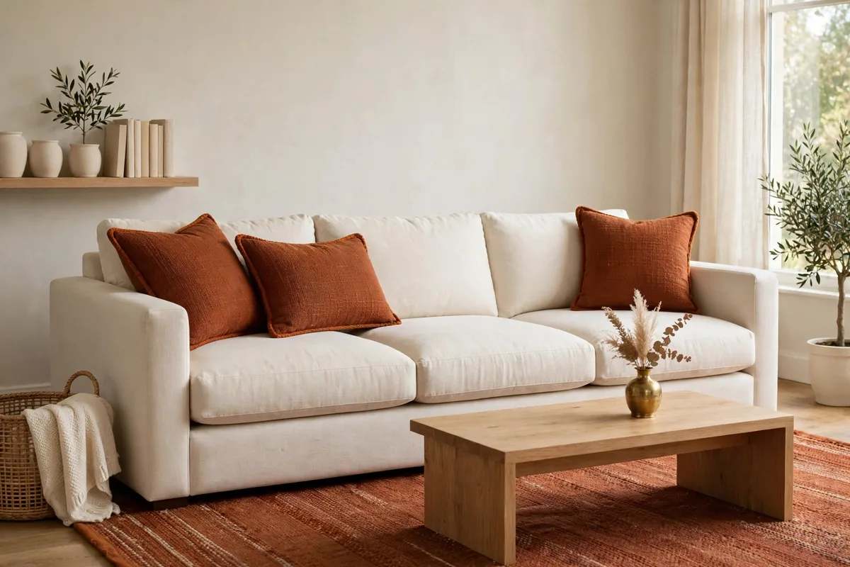
Whichever palette you chose, the proportions make it work: the classic 60-30-10 rule from Jessica Welling Interiors’ fall palette guide — 60% dominant colour (walls, large furniture), 30% secondary (rugs, curtains, bedding), 10% accent (cushions, vases, candles). Most homes already own the 60%: your walls and biggest pieces are the base, and autumn arrives in the 30 and the 10.
That is why a palette costs so little to run: on an existing neutral sofa — styled per our neutral sofa styling ideas — the whole season can be two cushion covers, one throw and one rug.
7. Let Texture Carry Half the Colour
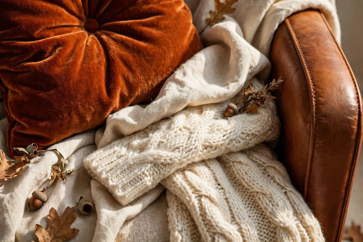
A flat colour in one fabric reads as a swatch; the same colour across textures reads as a room. Palette guides assign fabrics to colours deliberately: velvet for the saturated jewel tones (rust, aubergine, forest), linen for the neutrals, leather in caramel or cognac for depth, wool and bouclé for instant cosiness. Follow the assignments and even a three-cushion change looks considered.
Metals finish the thought: antique brass, blackened bronze or copper, used sparingly — a lamp, a frame, tray — as the palette’s jewellery.
8. Room by Room: Where Each Palette Shines
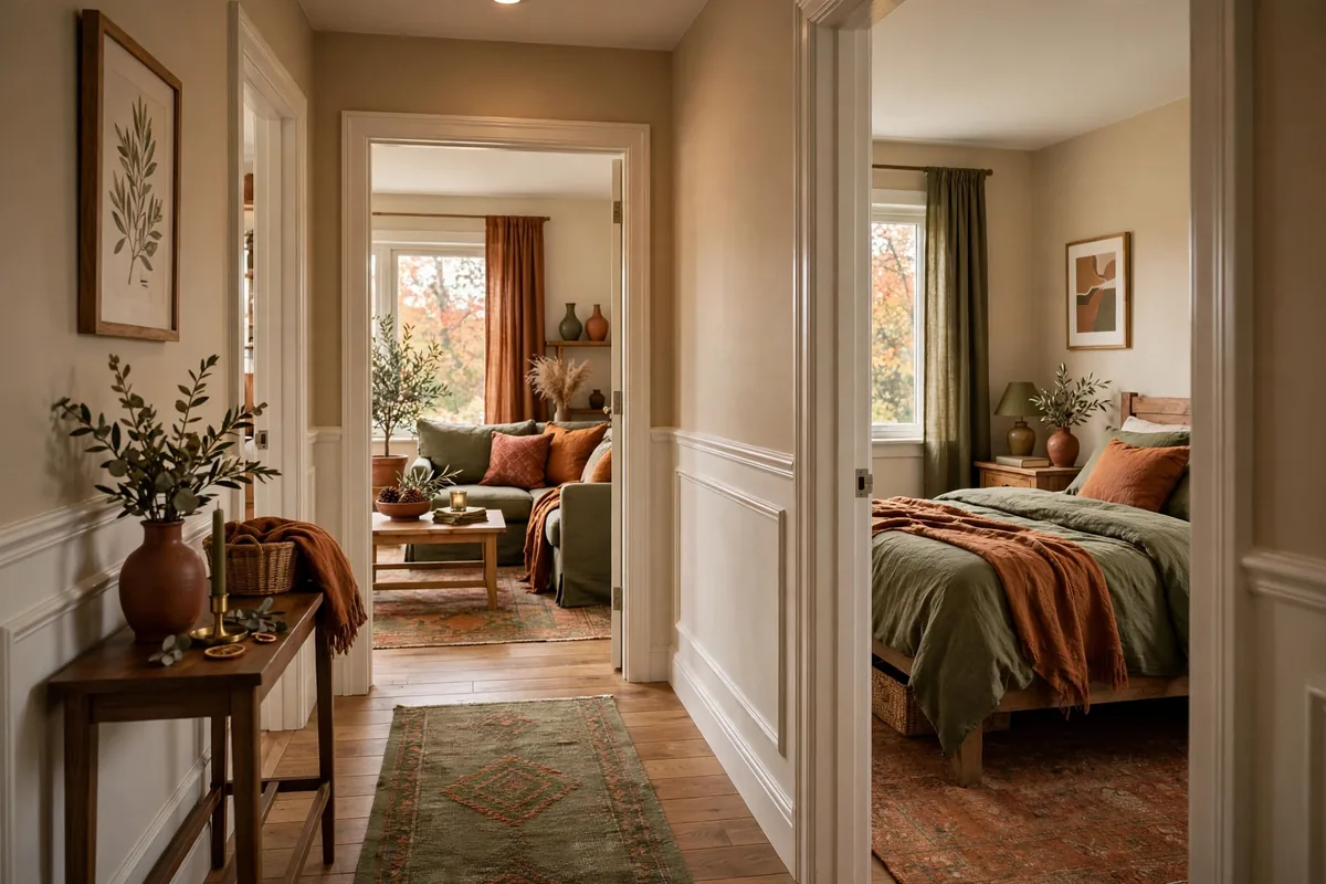
Quick assignments from the palette guides: living rooms take the layered, welcoming palettes (Classic, Calm Modern); bedrooms take the enveloping or the restful (Understated, Moody at low dose); dining rooms can carry the deepest richness (Moody Luxe, Cosy-Sunny) because they are evening rooms by nature; kitchens warm up through textiles, ceramics and hardware finishes rather than paint.
The base under all of it is the same neutral foundation the reusable seasonal decorations system builds — the palette changes seasonally, the base never does. These palettes do not float free: they are the rotating layer on the year-round neutral base — the hub fixes 90 percent and rotates 10, and inside that rotating layer, this page’s 60-30-10 does the dosing. Two rules, nested, one system.
The Palettes by Room
| Room | Lead palette | Second choice | Why |
|---|---|---|---|
| Living room | Classic | Calm Modern | The layered, welcoming palettes |
| Bedroom | Understated | Moody Luxe, at low dose | The enveloping or the restful |
| Dining room | Moody Luxe | Cosy-Sunny | Evening rooms by nature — they can carry the deepest richness |
| Kitchen | No paint lead — textiles and ceramics carry the palette | — | Kitchens warm up through textiles, ceramics and hardware finishes rather than paint |
9. Test Before You Commit
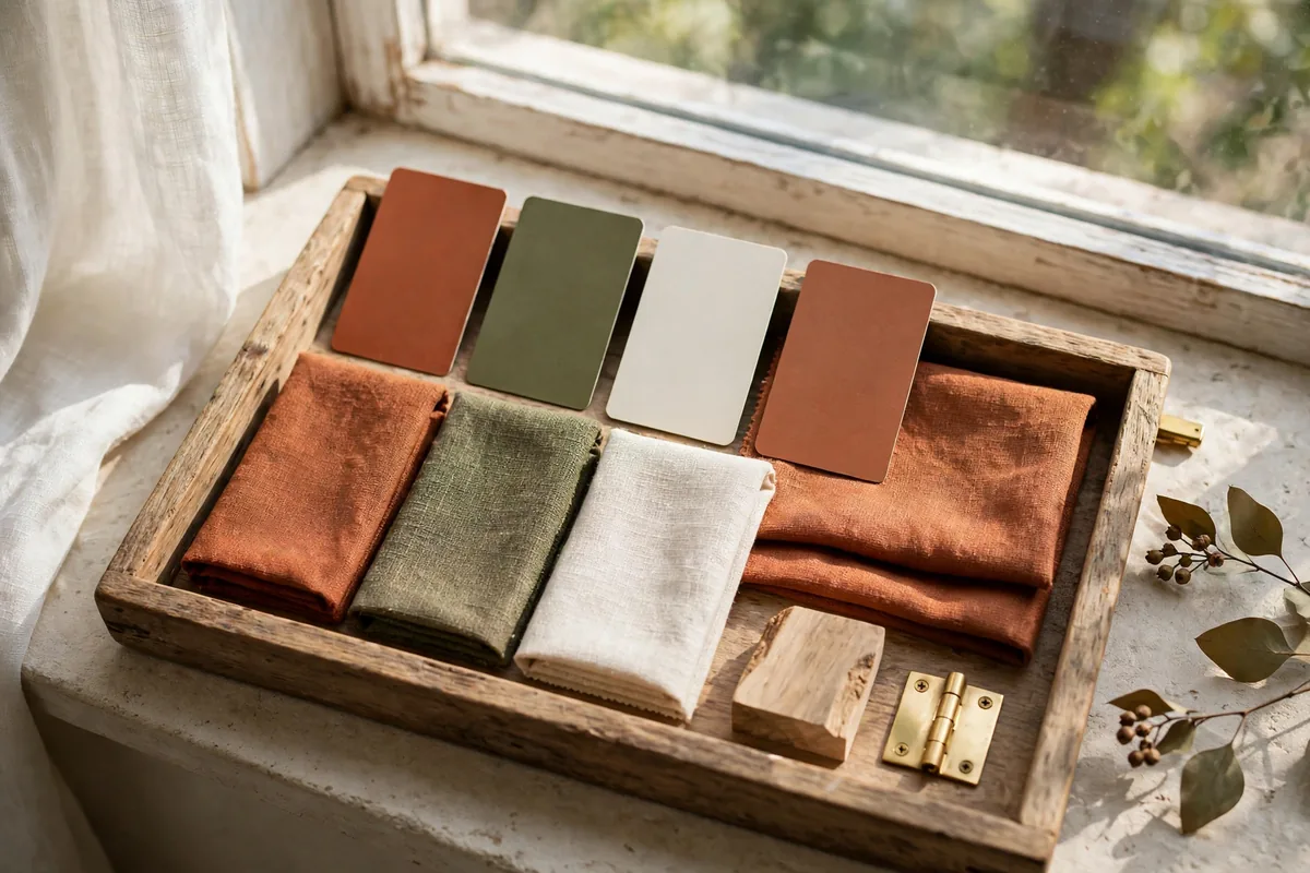
Three cheap tests save every palette: sample big (12×12-inch swatches, checked morning and evening, because rooms with strong natural light can carry deeper shades while dim or north-facing rooms need the lighter end of the palette); build a tray (fabric scraps, wood, metal finishes in the palette, seen together before money moves); and check your light bulbs — warm LEDs at 2700–3000K flatter autumn colours, while cool bulbs can kill the mood entirely.
Nature is the free consultant: a photo of the woods, a handful of leaves, dried flowers — if the colours coexist outside, they will coexist in your living room.
10. Carry One Palette Through the Whole House
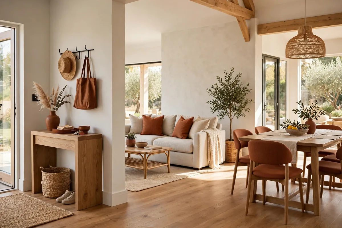
The designer move that costs nothing: repeat. Designer advice on cohesive fall decorating is consistent — choose two or three complementary colours and repeat those shades in different rooms, so the home connects without every room looking identical. Echo your accent two or three times per room (a cushion, a vase, a book spine) and vary which palette colour leads in each space.
When winter comes, the warm end of your palette deepens into the textile layers of our winter cozy textiles ideas — the palette evolves instead of being packed away, which is the whole point of choosing one properly.
Frequently Asked Questions About Autumn Colour Palettes
What is the easiest autumn palette for a beginner?
Rust, cream and warm wood (Palette One). It flatters almost every existing room, works in removable pieces only, and reads unmistakably seasonal without any themed decorations.
How many colours should an autumn palette have?
Three working colours plus a metal is the sweet spot: a base, a secondary and an accent, dosed 60-30-10. More than four colours and the room stops reading as a palette and starts reading as a collection.
Can I use autumn colours with a grey sofa or cool-toned room?
Yes — choose the palettes with cool-compatible members (Calm Modern’s sage and oatmeal, or Moody Luxe’s charcoal and aubergine) and keep undertones consistent: warm with warm, cool with cool, as palette guides advise.
Do I need to paint walls for an autumn palette?
No. Your existing walls and largest furniture are the 60%. Autumn lives in the 30 (rug, curtains, bedding) and the 10 (cushions, ceramics, candles) — all removable, all storable.
Which autumn colours suit a dark, north-facing room?
The lighter, warmer end: cream bases, mustard and terracotta accents, pale sage. Deep palettes need light to stay luxurious; in dim rooms they turn heavy. Warm bulbs at 2700–3000K help every colour.
What if I hate orange?
Skip Palettes One and Three. Olive-and-brown, aubergine-and-brass and sage-and-clay all deliver autumn’s mood — depth, warmth through texture, evening glow — with no pumpkin tones anywhere.
How do autumn palettes work in a small home?
One palette, everywhere, in small doses: a repeated accent prevents the visual chopping that makes small homes feel smaller. Cushion covers rotate seasonally and store flat — the small-space-friendly way to run any palette.
Should every room use the same palette?
The same palette, different doses. Let one colour lead in the living room, another in the bedroom, and keep the metal finish consistent throughout — connection without copy-paste.
How do I move my autumn palette into winter?
Deepen rather than replace: keep the base, swap mustard for burgundy, add evergreen and metallic accents, and layer the textiles heavier. A good autumn palette is winter’s first draft, not a separate project.
Where should I spend money in a palette — and where not?
Spend on the pieces that stay (neutral sofa, large rug — buy them in your palette’s neutral for longevity). Save on the bold pieces (accent cushions, throws, ceramics) — they are the seasonal layer and should be easy to swap.
What paint colours work for an autumn palette?
Start from the registers named above: a rust-clay in the Sherwin-Williams Redend Point class for Classic and Cosy-Sunny, an olive in the Little Greene Olive Colour register for Understated, a warm cream in the Benjamin Moore Montgomery White class underneath. Then let Section 9 decide — 12×12-inch swatches in morning and evening light, against your own fabrics. A shade that fails the tray test fails, however good it looked on the chart.
Conclusion
Autumn colour is not a shopping list; it is a small set of decisions made once and repeated with discipline: one palette, dosed 60-30-10, carried by texture, tested in your own light, and echoed from room to room. Choose your five-colour family today and every autumn after this one becomes a one-hour restyle.



Pingback: 10 Two-Tone Kitchen Cabinets Ideas (Splits, Pairs, Rules)
Pingback: 10 Kitchen Backsplash Colors Ideas (By Cabinet Colour)
Pingback: 10 Warm Wood Kitchen Finishes Ideas (Oak, Walnut, Maple)