
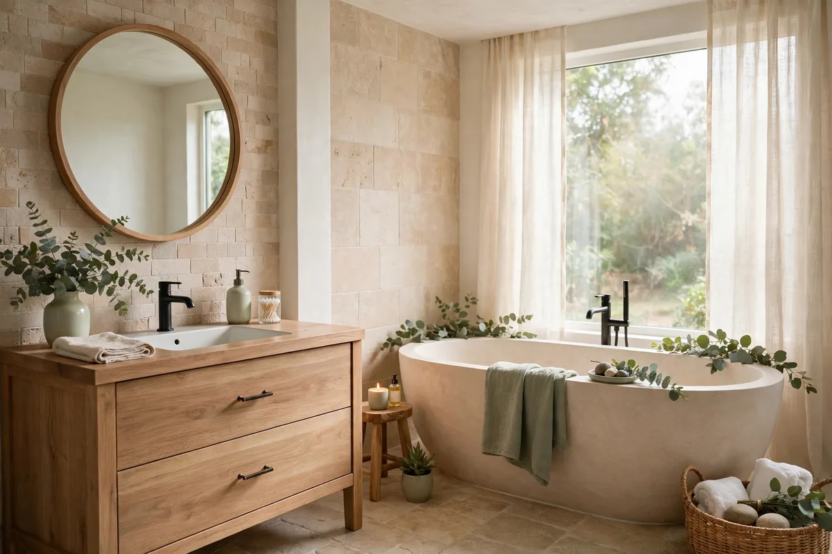
A spa bathroom is not a style of fixture or a brand of tile. It is a colour discipline: a short list of low-saturation, nature-borrowed tones, repeated with restraint until the room’s visual noise drops to nearly zero. That is why spa palettes are so copyable — you do not need the spa’s budget, only its palette rules. Choose the wrong colours, though, and the same room reads clinical, muddy or accidentally themed. The ten ideas below are the palettes that work, and the system that keeps any of them working.
One formula first, then the palettes themselves — warm, green, cocooned and watery — and the texture, metal and testing rules that finish them.
In this guide: The Spa Palette System at a Glance · 1. The Formula: Low Saturation, Dosed 70/25/5 · 2. Warm White + Natural Wood + Brass: The Spa Classic · 3. Sage + Cream + Stone: The Earthy Calm · 4. Greige + Beige Stone + Warm Gold: The Warm Cocoon · 5. Eucalyptus Mist + Pale Aqua: The Water Palette · 6. Texture Is a Colour: Linen, Teak, Pebble, Woven · 7. One Deep Anchor: Charcoal or Deep Teal at 5% · 8. Metals in One Temperature · 9. Test Every Colour in Three Lights · 10. The Five-Minute Palette: Towels, Mat, Scent · Frequently Asked Questions About Spa-Style Bathroom Palettes · Conclusion
This page is the colour half of the spa bathroom: the palettes, the dosing, the testing. The other half — in what order to assemble the room, layer by layer — lives in our bathroom decor guide.
The Spa Palette System at a Glance
| Layer | Share of the room | What lives there |
|---|---|---|
| Base | ~70% | Warm white, cream, pale stone — walls, big tile, tub |
| Secondary | ~25% | Sage, greige, wood, beige stone — vanity, floor, textiles |
| Accent | ~5% | One deep tone — charcoal, deep teal, black — hardware, a stool |
| Texture | Everywhere | Linen, teak, pebble, woven fibre — colour without hue |
| Metal | One family | All warm (brass, gold) or all cool (chrome, nickel) — never both |
1. The Formula: Low Saturation, Dosed 70/25/5
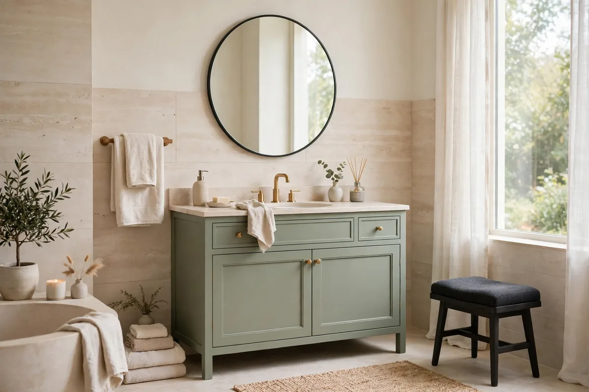
Every spa palette obeys the same physics: saturation down, contrast gentle, and the colours dosed like the 60-30-10 rule’s quieter cousin — roughly 70% base, 25% secondary, 5% accent. Stella’s Wardrobe’s spa design guide phrases the underlying law as “restraint reads as calm”: two or three hard-finish families, repeated, with texture doing the work that extra colours would otherwise be hired to do.
The formula is also your editing tool. When a bathroom feels almost-spa but not quite, audit the doses before changing a single colour: a fourth hue sneaking in via towels, a second metal family, an accent swollen to 25% — the palette rarely needs new ingredients, only its proportions back.
The Four Palettes at a Glance
| Palette | Base (about 70%) | Secondary (about 25%) | Accent (about 5%) | Metal | The finishing layer |
|---|---|---|---|---|---|
| The Spa Classic | warm white | natural wood | charcoal or black, at hardware scale | brushed brass | warm light; linen and teak lead the textures; a clean, green scent register |
| The Earthy Calm | cream | sage | matte black | — | soft, balanced light; stone and woven textures; a herbal scent register |
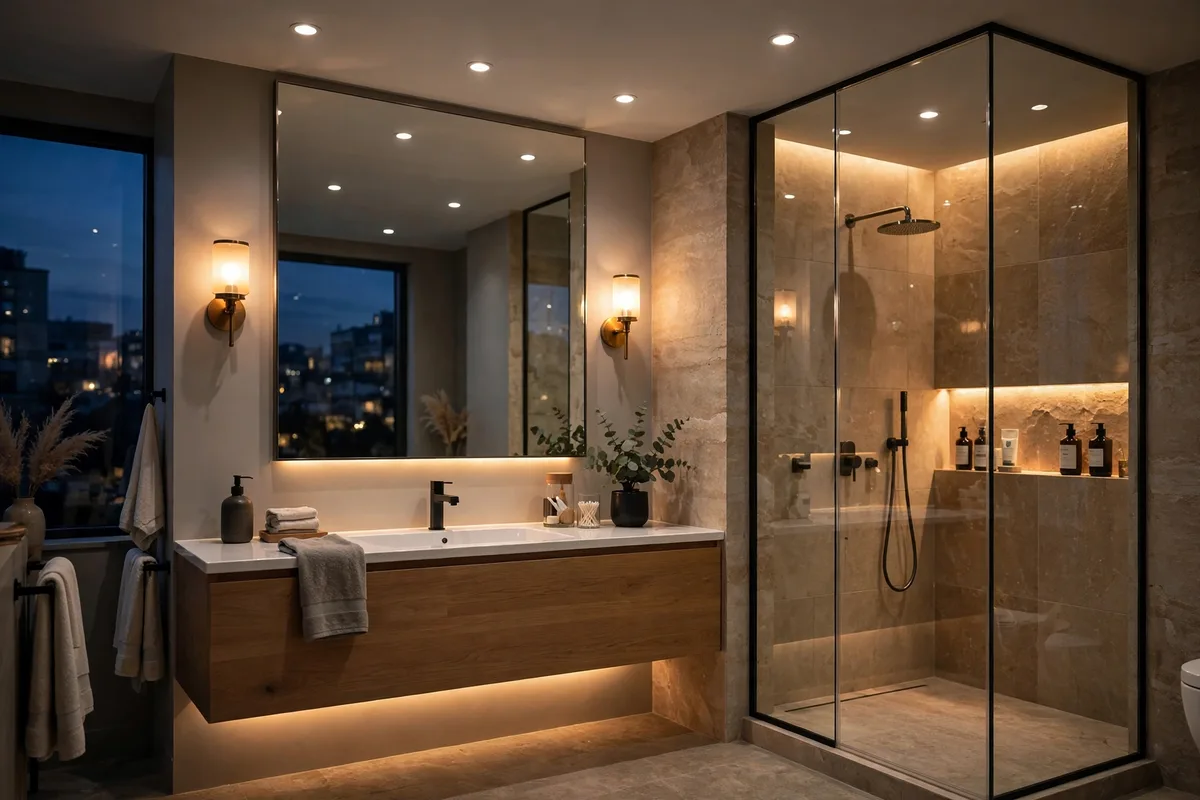
| The Warm Cocoon | greige | beige stone | a deep anchor tone | warm gold | 2,700–3,000K light; soft, layered textiles; a warm scent register |
| The Water Palette | eucalyptus mist | pale aqua | a deeper blue-green | cool metals | clean, cooler light; smooth stone and glass; a fresh green scent register |
Start from what will not change: White tile takes any of the four palettes. Beige tile wants the Warm Cocoon — fight it and both lose. Grey tile wants the Water Palette’s cool branch, with extra wood added for warmth. Choose by the fixed surfaces first; the paint is the cheap part.
2. Warm White + Natural Wood + Brass: The Spa Classic
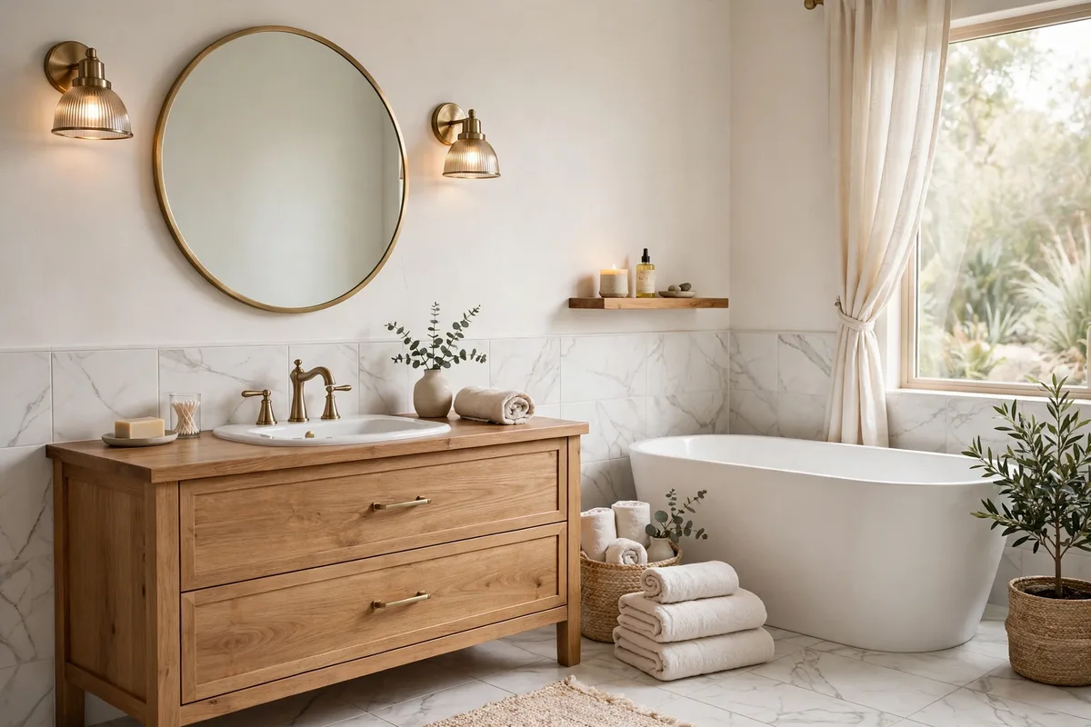
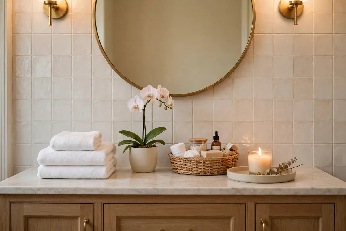
The most proven palette in the genre, named the “Spa Classic” in Cozy Home Vibes’ calming paint guide: warm white walls, white marble-look tile, a natural wood vanity and brushed brass. It works because each element covers another’s weakness — the white could read clinical, but the wood grounds it; the wood could read rustic, but the brass refines it; the layers of white-on-white create depth without a single loud decision.
The one specification that matters: the white must be warm. A blue-white under flat bathroom light is the difference between a spa and a clinic, and it is decided at the paint counter, not in the room. If your NKBA-era instincts agree, you are in the majority — Stella’s guide cites NKBA 2026 research finding 62% of respondents favoured wood-faced vanities, with matte and brushed finishes outranking polished ones. Sample-first starting points in this family: Benjamin Moore Swiss Coffee OC-45 or Sherwin-Williams Alabaster for the warm white — chips first, then Section 9’s three-lights test before any wall is committed.
3. Sage + Cream + Stone: The Earthy Calm
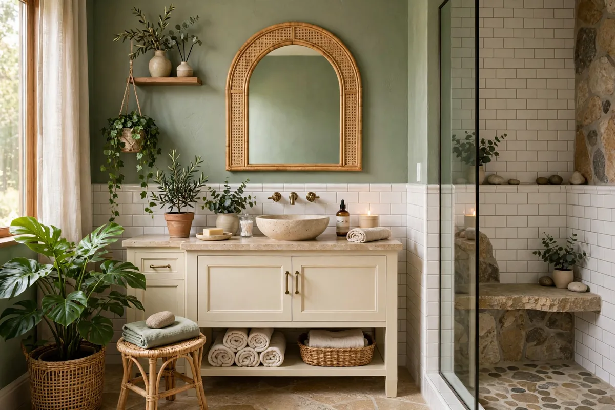
The palette with the most personality that still qualifies as calm: sage walls (the “Earthy Calm” combination pairs them with white subway tile, a cream vanity and matte black hardware), grounded by stone somewhere real — a floor, a counter, a pebble shower base. Sage earns its place because it is green with the volume turned down: grey and beige undertones keep it botanical rather than minty, and living plants sit inside it like they were painted there.
Dose it by light. A bright room can carry sage on all four walls; a windowless one often does better with sage demoted to the vanity or wainscot and cream promoted to the walls — same palette, formula (§1) rebalanced. Either way, keep the black hardware to the 5% accent role; more, and the room tips from spa to farmhouse-modern. Sample-first starting points in this family: a sage in the class of Benjamin Moore Saybrook Sage HC-114, read against the cream — Section 9’s three-lights test decides before any wall is committed.
4. Greige + Beige Stone + Warm Gold: The Warm Cocoon
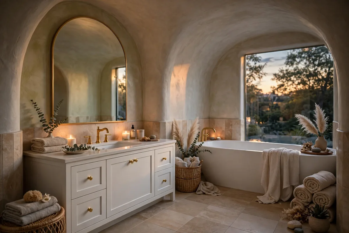
Not every spa whispers “bright”. The Warm Cocoon palette — greige walls, large-format beige tile, a white vanity, warm gold fixtures — trades airiness for embrace, and it is the right answer for bathrooms used mostly at night, or in cold climates where a white room feels like a fridge. The large-format tile is doing quiet work too: fewer grout lines means a more seamless, enveloping field of colour.
The cocoon’s failure mode is mud: beige on beige on beige with no relief. The white vanity is the relief — keep it, and keep one texture rough (a woven basket, a slatted wood mat) so the warmth reads chosen rather than beige-by-default. Light it warm (2700–3000K) or the greige turns grey and the cocoon collapses. Sample-first starting points in this family: a warm greige in the register of Sherwin-Williams Accessible Beige, read against your stone — Section 9’s three-lights test decides before any wall is committed.
5. Eucalyptus Mist + Pale Aqua: The Water Palette
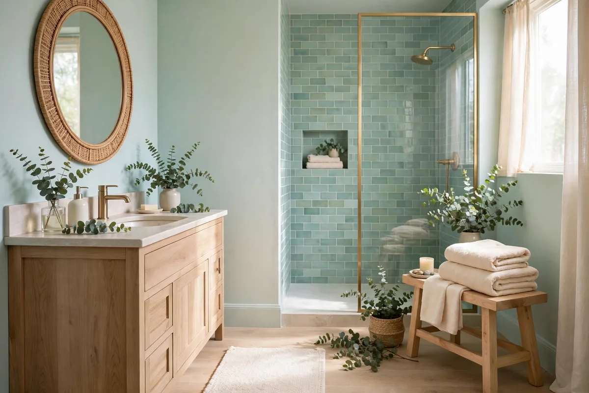
The cool branch of the family: seafoam, misty aqua and eucalyptus — the hues of water and steam. Done entirely in cool tones it turns chilly; the palette’s rule is that every cool surface must be answered by a warm one. Cream towels against aqua tile, a wood stool beside a seafoam wall, warm light over all of it. The balance, not the hue, is the spa-ness.
This is also the palette that flatters the continuity tricks in our small bathroom visual space ideas: pale aqua in one tonal family, walls to ceiling, is exactly the “one light palette” that makes a small room read bigger — the water palette and the visual-space system were made for each other. Sample-first starting points in this family: a pale blue-green in the class of Benjamin Moore Palladian Blue HC-144 or Sherwin-Williams Sea Salt — Section 9’s three-lights test decides before any wall is committed.
6. Texture Is a Colour: Linen, Teak, Pebble, Woven
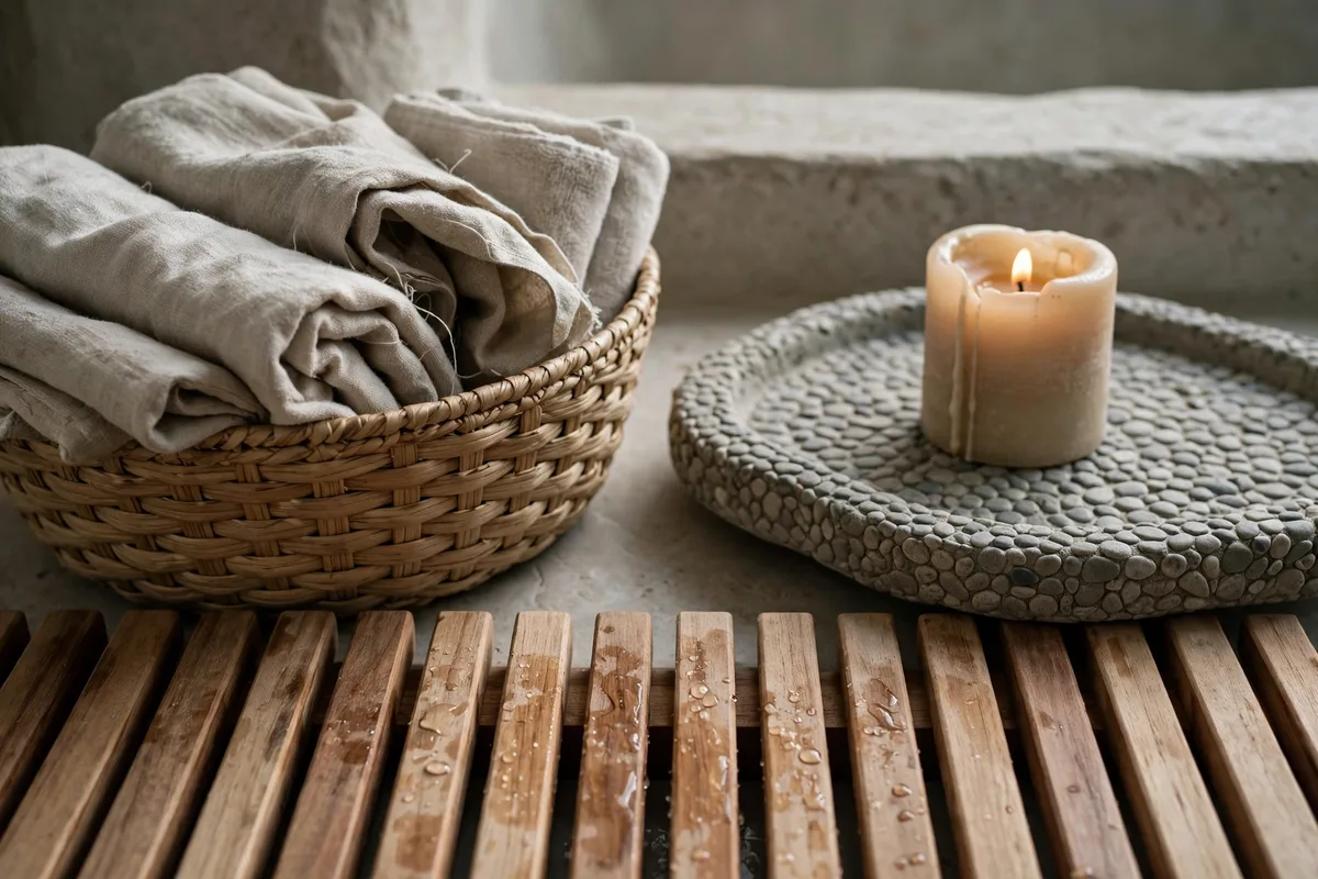
Ask what makes a three-colour room feel rich instead of empty, and the answer is the invisible fourth colour: texture. Linen’s slub, teak’s grain, a pebble floor’s shadow-play, woven fibre’s irregularity — each adds visual information at zero saturation, which is precisely the spa economy. Stella’s guide’s advice to repeat two or three material families is the same law from the other side: texture varies, materials don’t multiply.
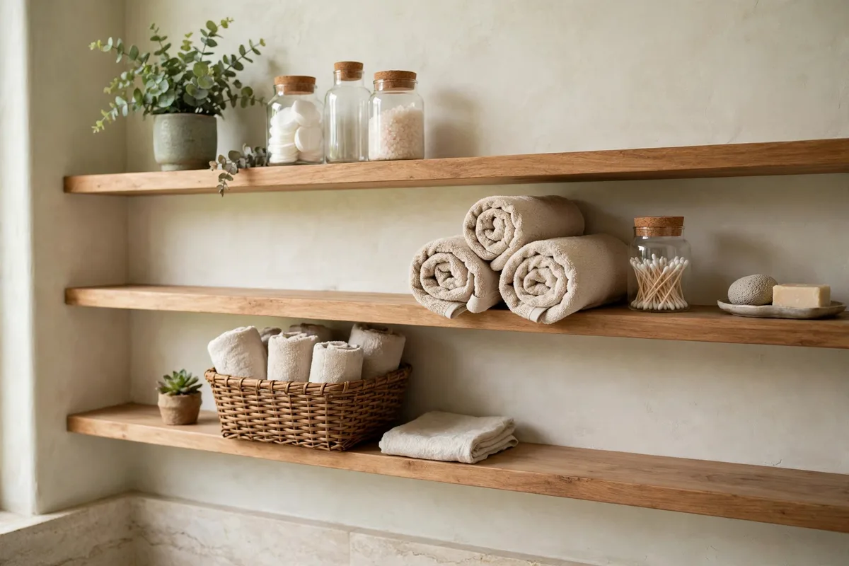
The cheapest single dose is underfoot: a slatted bamboo or teak bath mat — real wood, folds away, and dries between uses instead of sitting damp the way fabric mats do. From there, one woven basket and linen-look towels complete most rooms. This is also where the counter joins in: the tray-and-vessel compositions in our bathroom vanity styling ideas are texture exercises wearing a styling hat.
7. One Deep Anchor: Charcoal or Deep Teal at 5%
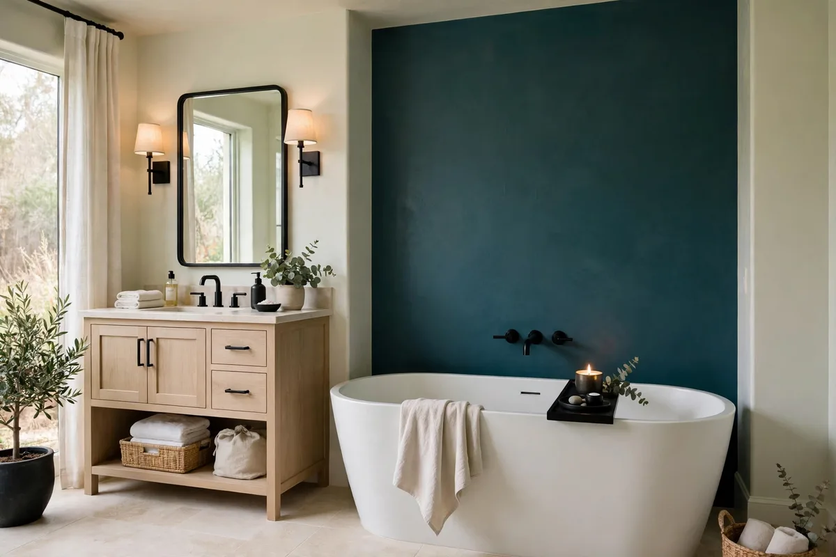
A room of only pale tones can drift into vagueness — pleasant, forgettable, slightly unfinished. Spas solve it with one deep note at accent dose: charcoal hardware, a deep teal towel set, a single dark stool. The anchor gives the pale layers something to be pale against, and the eye a place to land. Five percent is the discipline; the anchor is a punctuation mark, not a second theme.
Choose the anchor from inside the palette’s family: charcoal for the Classic and Cocoon, deep teal or forest for the sage and water palettes. And let it be the only dark thing — the tone-on-tone discipline from our shower tile combinations ideas applies room-wide: contrast is a budget, spent in one place.
8. Metals in One Temperature
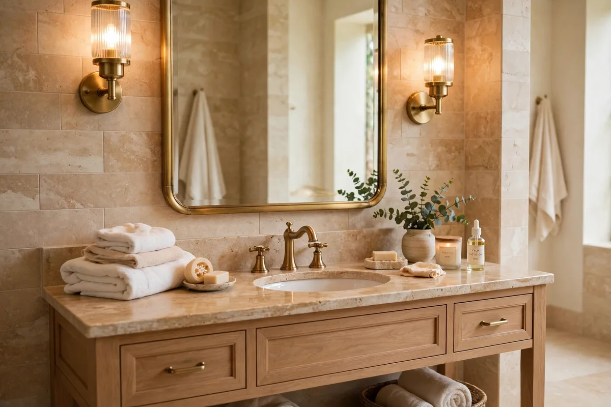
Metals are colours too, and they come in two temperatures that do not shake hands. Warm family: brass, gold, copper, bronze. Cool family: chrome, nickel, stainless, matte black (a neutral that adopts the family it joins). A spa palette picks one family and enforces it across faucet, frame, sconces, hooks and hardware — the enforcement, more than the choice, is what reads as expensive calm.
Finish matters as much as family: matte, brushed and satin outrank polished in spa rooms because they soften reflections instead of multiplying them. If your existing metal is fixed (a renter’s chrome, say), the palette adapts — build the cool branch (Water palette, §5) around it rather than fighting it with brass accessories it will never match.
9. Test Every Colour in Three Lights
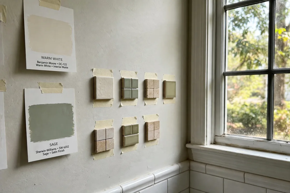
Bathroom colour lies more than any other room’s, because the light changes completely three times a day: morning daylight, afternoon bounce, and the evening fixtures under which most baths actually happen. Stella’s guide’s protocol is the professional one — test paint and finish samples in the actual bathroom in all three lights before committing. Sage that is serene at noon can go swampy under warm bulbs; warm white can turn pink at dusk.
Tape the samples at the height they will live, live with them a full day, and judge at bath time, not at shopping time. It is the palette version of the mirror tape test: an hour of rehearsal that prevents a year of almost-right. One specification the palettes assume throughout: bathroom walls belong in a moisture-tolerant finish — satin, or a purpose-made bathroom paint — the widely used guideline for rooms that steam daily.
10. The Five-Minute Palette: Towels, Mat, Scent
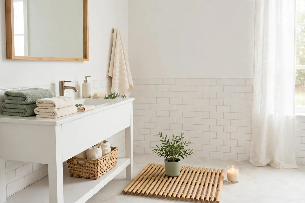
Renters and the renovation-weary can run any palette in this article at textile scale, in five minutes: towels in the secondary colour, a wood mat as the texture, one plant as the living accent, a candle in the palette’s scent register. The room’s hard surfaces stay whatever they are; the palette lives in the layer you can carry away. It is the same trick as the accent layer in our guest bathroom accents ideas — small objects, one idea, total effect.
Choose the quick palette by what your fixed surfaces already are: white tile takes any of §2–§5; beige tile wants the Cocoon; grey tile wants the Water palette’s cool branch with extra wood warmth. Work with the room’s fixed votes, and the five-minute layer looks like a renovation.
Frequently Asked Questions About Spa-Style Bathroom Palettes
What colours make a bathroom feel like a spa?
Low-saturation, nature-borrowed ones: warm whites and creams as the base, sage, eucalyptus, pale aqua or greige as the secondary, natural wood for warmth, and one deep accent (charcoal, deep teal) at about 5%. The specific hues matter less than the saturation and the dosing — calm is a ratio before it is a colour.
How many colours should a spa bathroom have?
Three hues, plus texture and one metal family. A base (~70%), a secondary (~25%) and an accent (~5%). Every additional hue raises the room’s visual noise; when a spa bathroom feels “off”, the fix is usually removing a colour, not adding one.
Is an all-white bathroom a spa palette?
Only if the white is warm and the texture does the talking. Warm white layered with wood, linen and stone reads spa; a blue-white room with polished chrome and no texture reads clinic. White is a base, not a palette — it still needs its secondary, accent and texture layers.
Can a dark bathroom be spa-style?
Yes — the Warm Cocoon direction, or a deep sage cocoon, trades brightness for embrace. The rules hold: low saturation, one palette family, warm light (2700–3000K), and a pale relief surface so the dark reads chosen. Dark spas fail on cold light and clutter, not on darkness.
Which palette is best for a small bathroom?
A pale one run continuously: the Spa Classic or the Water palette in one tonal family, walls to ceiling, with large-format tile and matched grout to minimise visual breaks. Small rooms gain calm and size from the same move — fewer colours, fewer lines.
Can I mix brass and chrome in a spa bathroom?
It is the fastest way to break one. Metals are colours with temperatures; brass (warm) and chrome (cool) in the same small room read as two half-finished renovations. Pick the family your fixed fixtures already belong to and enforce it everywhere else.
What if I can’t repaint or retile?
Run the palette in textiles and objects: towels, mat, basket, plant, candle and vessels in one palette’s colours, over whatever surfaces you have. Choose the palette that agrees with your fixed tile (§10) and the effect is most of the renovation at a fraction of the cost — and fully reversible.
How do I stop a sage bathroom looking cold or muddy?
Warm the company it keeps: cream instead of bright white beside it, real wood and stone for grounding, warm light bulbs, and plants to echo it. Sage goes muddy next to yellow-beige and cold next to blue-grey — audit the neighbours before blaming the sage.
Where should the accent colour appear?
In the smallest, most changeable places: hardware, a stool, the towel set, one framed print. Accent dose is about 5% — enough to anchor the pale layers, small enough to swap when you tire of it. Never split the accent between two competing deep colours.
Do spa palettes date quickly?
The structure doesn’t — low saturation and natural materials are closer to a constant than a trend. Individual secondaries drift (sage is having its decade), but because the secondary lives mostly in paint and textiles, refreshing the palette is a weekend, not a renovation.
What is the most calming bathroom colour?
There is no single colour — calm comes from the system, not the swatch. A warm or nature-led base at about 70 percent, one secondary at 25, one deep anchor at 5, metals in a single temperature, and every colour passed through the three-lights test in Section 9. The four palettes above are four different roads to the same quiet.
Conclusion
A spa palette is a promise the room keeps at every glance: few colours, softly spoken, dosed with discipline, warmed by wood and texture, anchored by one deep note. Pick your branch — Classic, Earthy, Cocoon or Water — run it at 70/25/5, test it in three lights, and enforce it down to the last hook. The calm people pay resorts for turns out to be mostly arithmetic, and arithmetic is free.

Pingback: 10 Bathroom Shelf Styling Ideas (Heights, Groups, Gaps)
Pingback: Bathroom Wall Ideas: Tile, Panels, Paint & Pattern by Zone