
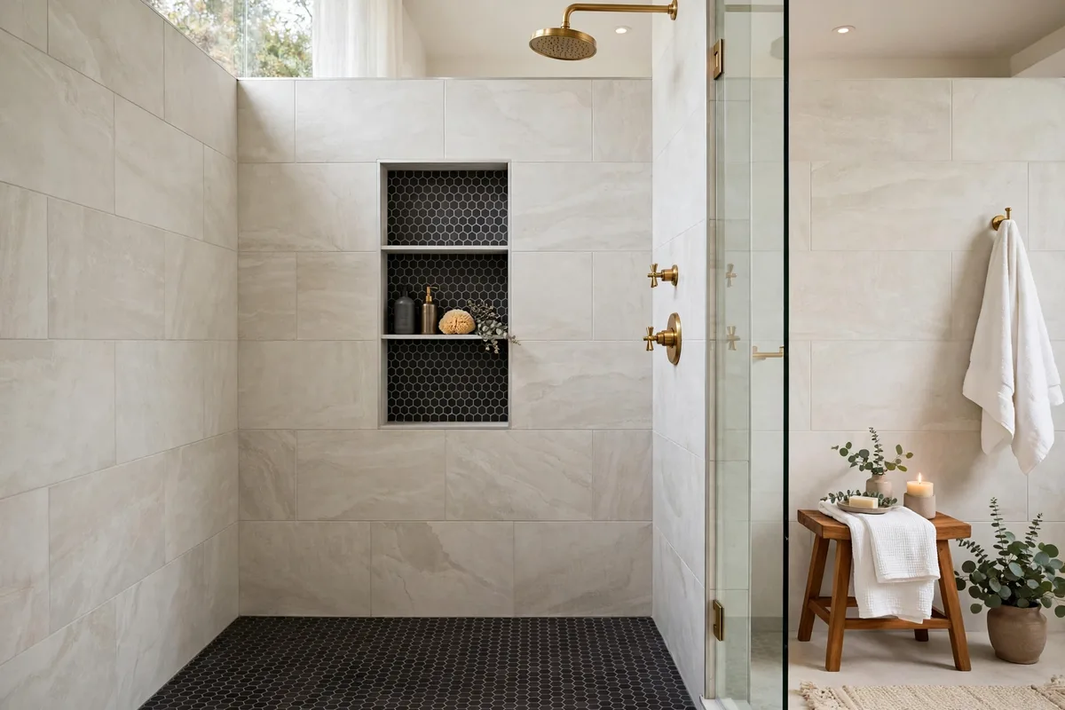
A shower is the one place in the home where two or three tiles must perform together, in a small glass box, under unforgiving light. Get the pairing right and the shower looks designed; get it wrong — two stars fighting, a 50/50 split, clashing undertones — and no fixture upgrade will save it. The good news: combinations obey rules, and the rules are learnable. If your shower needs function fixes too, start with our ways to make your shower better; this article is purely about which tiles belong together, and why.
One governing rule first, then nine pairings that always work — each with the logic that makes it safe.
In this guide: The Pairing Rules at a Glance · 1. The 70/30 Rule: Pick a Lead and a Supporting Act · 2. Marble-Look Walls + Hex Mosaic Floor: The Timeless Pair · 3. White Subway + Black Hex: The Contrast Classic · 4. Handmade-Look Zellige + Plain Large-Format: Texture Does the Talking · 5. One Feature Wall + Three Quiet Walls · 6. The Niche Echo: Repeat the Floor Inside the Niche · 7. Wood-Look Planks + Stone-Look Walls: Warm Meets Cool · 8. Jewel-Tone Walls + a Neutral Floor: Commit Up High · 9. Tone-on-Tone: Same Colour, Different Shape and Finish · 10. Grout: The Third Tile You Already Bought · Frequently Asked Questions About Shower Tile Combinations · Conclusion
Small shower? Work from three of the eight pairings: marble-look walls with a small hex floor (Section 2), one feature wall against three quiet ones (Section 5), and tone-on-tone in two finishes (Section 9). Add the continuous floor — run the same tile from the bathroom floor straight into a curbless shower — and a small shower reads as one calm surface instead of a tiled box.
The Pairing Rules at a Glance
| Rule | What it means |
|---|---|
| 70/30 dominance | One tile leads (~70%), one accents (~30%) — never 50/50 |
| One shared thread | Colour family, undertone or material story links the pair |
| Scale contrast | Large format pairs with small mosaic; equals compete |
| Finish by function | Gloss can shine on walls; floors need grip |
| Maximum three tiles | Walls + floor + one accent is the ceiling |
| Grout is a decision | Matching grout blends; contrast grout draws the pattern |
1. The 70/30 Rule: Pick a Lead and a Supporting Act
Every successful combination starts with casting. As Edward Martin’s guide to mixing two tile styles puts it, the most common mistake is the 50/50 split — half one tile, half another — which reads indecisive rather than designed. Aim instead for a dominant-to-accent ratio around 70/30: the main tile owns the room’s mood, the accent is a highlight, never an equal partner.
Cast conservatively: the lead tile is the one you must love in ten years (usually the large, plain, durable one), and the accent is where trend and personality are allowed to live — a niche, a floor, one wall. If both tiles are screaming for the lead role, one of them has to be recast; two stars is the definition of a clash. For the tile types themselves, our best bathroom tile ideas covers materials and finishes in depth.
The Eight Pairings at a Glance
| Pairing | Lead tile (about 70%) | Accent (about 30%) | Where the accent goes |
|---|---|---|---|
| Marble-look walls + hex mosaic | Marble-look large format | Hex mosaic | The floor |
| White subway + black hex | White subway | Black hex | The floor |
| Zellige + plain large-format | Plain large-format, by area | Zellige, by eye — the one inversion | The feature wall |
| One feature wall + three quiet walls | The three quiet walls | The feature tile | The one wall |
| The niche echo | The wall tile | The floor tile, repeated | Inside the niche |
| Wood-look planks + stone-look | Stone-look walls | Wood-look planks | The floor |
| Jewel-tone walls + neutral floor | Jewel-tone walls | The neutral floor — the rest, not an accent | The floor |
| Tone-on-tone, two finishes | The base tile | The second finish | One surface — the finish is the accent |
2. Marble-Look Walls + Hex Mosaic Floor: The Timeless Pair
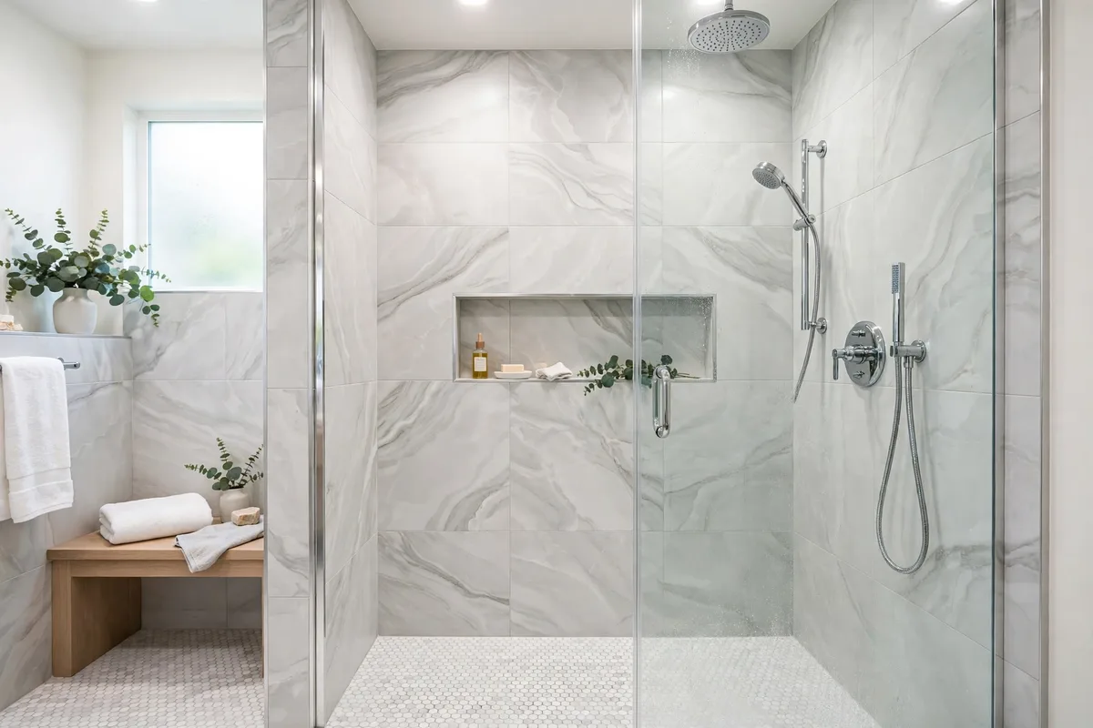
The most proven pairing in the book: large-format marble-look porcelain on the walls, small hexagon mosaic underfoot. It works on two levels at once. Visually, the scale contrast is the design — calm, wide veining above; a fine, textured field below. Functionally, the mosaic’s many grout lines are grip, which is why small tiles own shower floors everywhere.
Keep the marriage believable: the floor’s marble should be the same marble family as the walls (same background tone, similar vein colour), ideally from the same manufacturer’s coordinating line. A warm-veined wall with a cool-grey hex floor is the undertone clash that makes people say a finished shower “feels off” without knowing why. The floor half of this pairing also does quiet double duty: run it continuously into a curbless shower and the whole room reads larger — the principle behind our small bathroom visual space ideas.
3. White Subway + Black Hex: The Contrast Classic
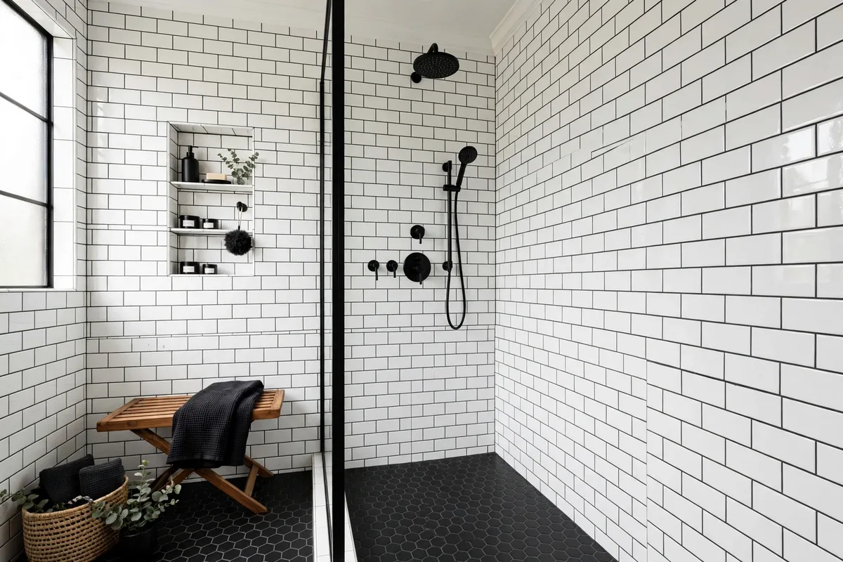
Black and white is the combination that cannot date because it never belonged to a decade. Glossy white subway on the walls (the shine bounces light around a small shower), matte black hexagons on the floor, and the pairing’s secret weapon between them: the grout. Dark grout on the subway draws the brick grid and ties the walls to the floor’s darkness; white grout would leave the two tiles as strangers.
Finish the triangle with matte black fixtures and the combination looks deliberate from every angle. The one discipline: keep every other element quiet — pale towels, clear glass, no third pattern anywhere. Contrast classics fail by addition, not by concept. Layout is half this pairing: run the subway in a brick grid and the grout draws the classic pattern across the walls; stack it vertically and the same tile reads modern and taller — the hex floor works either way.
4. Handmade-Look Zellige + Plain Large-Format: Texture Does the Talking
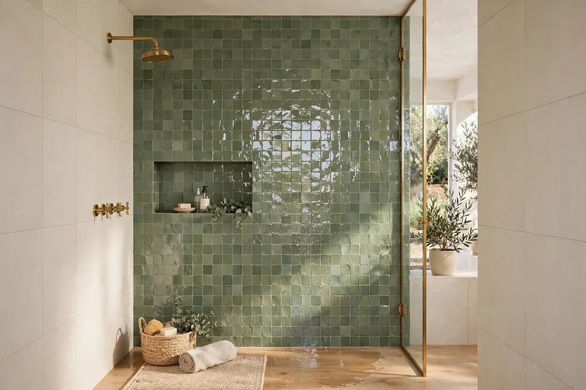
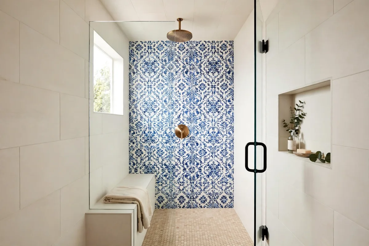
Zellige and its porcelain imitators bring rippled surfaces and varied glaze — a wall that shimmers as light moves. That much life needs a calm partner: pair it with the plainest large-format tile you can find, in a tone pulled straight from the zellige’s own colour family. The handmade-look tile supplies all the texture; the plain tile supplies the rest.
Two cautions make this pairing succeed. Keep the zellige to one or two walls (its variation multiplies fast in a small box), and lay the plain tile in the largest format available — fewer grout lines next door means the eye reads calm versus character, not two patterns arm-wrestling. The large-format half stays calm by discipline: a simple offset and few grout lines, so the zellige’s handmade variation carries all the movement in the room.
5. One Feature Wall + Three Quiet Walls
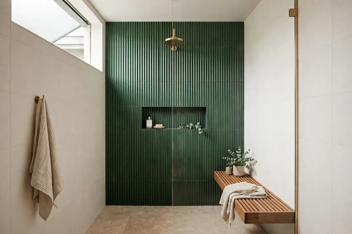
The 70/30 rule expressed architecturally: one wall — usually the one facing the door or behind the shower head — carries the pattern, the fluting, the bold colour or the kit-kat mosaics, and the other walls step back in a complementary plain tile. It is consistently the most successful configuration in real renovations because it gives the eye one destination and three rests.
Choose the feature wall by sightline: the wall you see from the bathroom door is the one that earns the budget. Specify both tiles and both grout colours together, on one oard, before anything is ordered — a transition that reads deliberate is planned, never improvised at the installer’s van. A feature wall in kit-kat or fluted tile is a vertical layout by construction — the lines run up, and the three quiet walls are what let them.
6. The Niche Echo: Repeat the Floor Inside the Niche
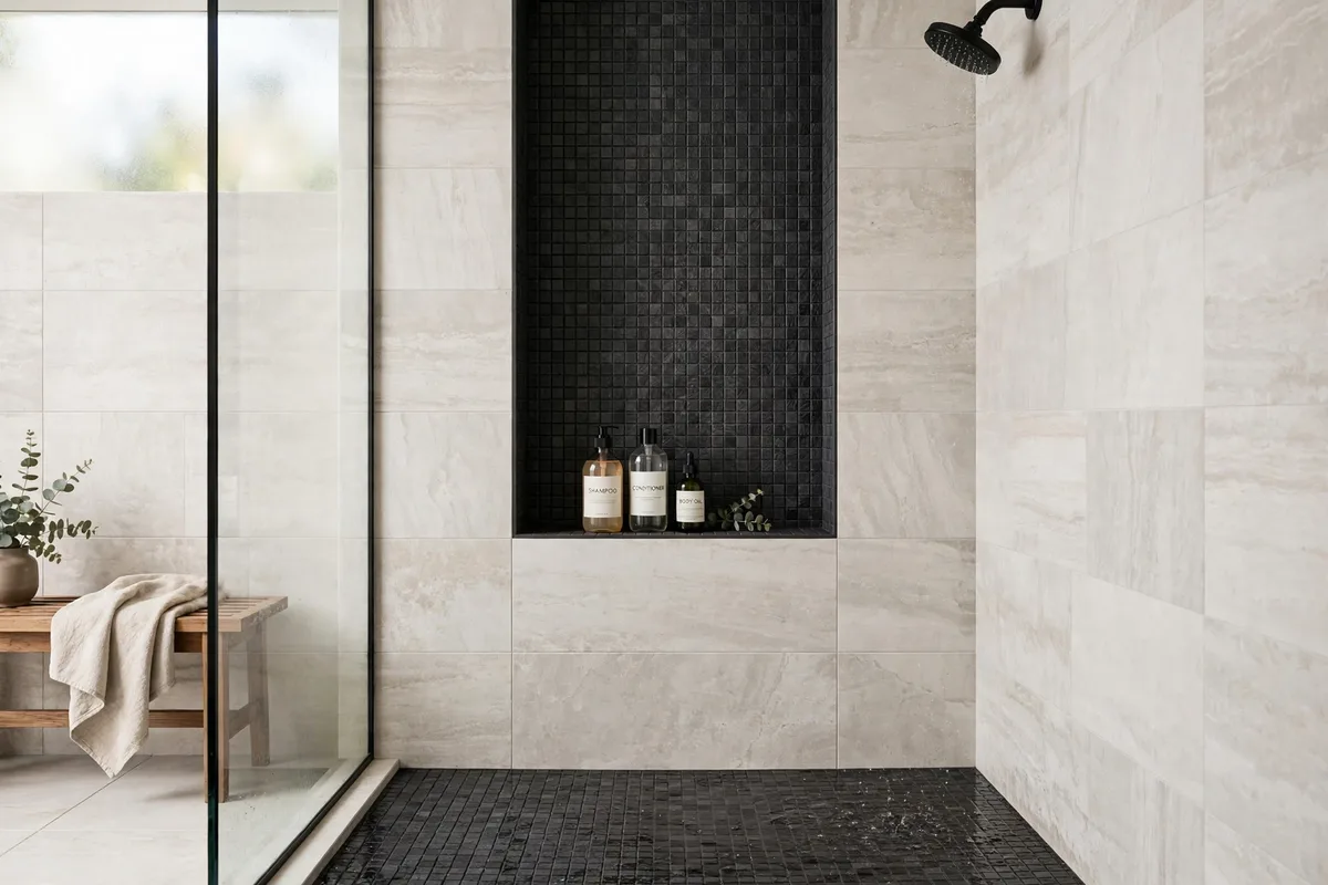
The cleverest cheap trick in shower design: tile the niche with the floor tile. As Daltile’s floor-and-wall coordination guide shows, the niche is the perfect place to layer contrast — and echoing the floor tile there (their example runs a dark marble through floor, statement wall and niche alike) makes a two-tile shower read as a three-part composition, with the repetition doing the design work.
The echo also solves the third-tile problem: instead of introducing a new material for the niche (and risking the three-tile ceiling), you reuse one you already have. Floor-to-niche works in reverse too — a niche tiled in the wall’s accent is the quieter version for calmer schemes.
7. Wood-Look Planks + Stone-Look Walls: Warm Meets Cool
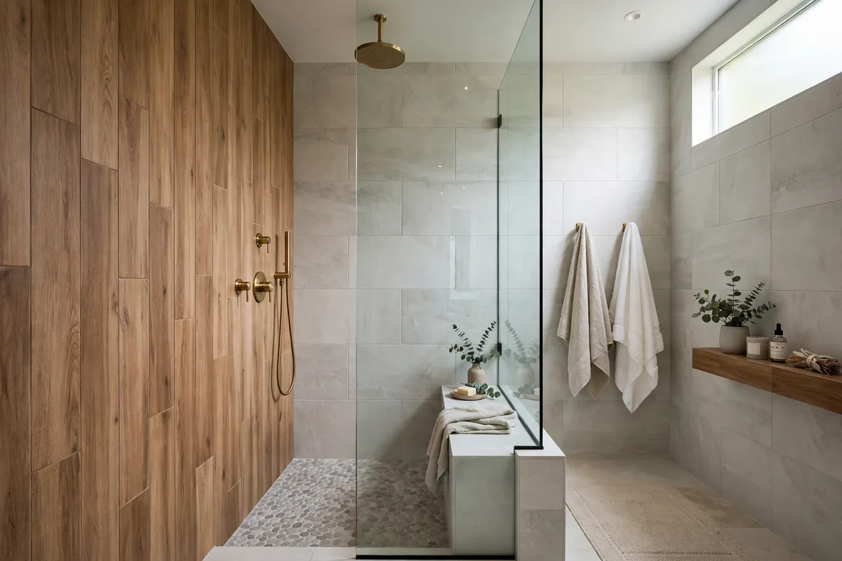
Porcelain wood-look tile lets a shower borrow the spa’s oldest pairing: warm timber against cool stone. Run the planks on the floor (their length draws the eye and elongates a small shower) or up one wall as a slatted-look panel, and let large stone-look tiles keep the remaining surfaces pale and calm. Temperature contrast is the design — neither tile needs pattern at all.
Discipline points: the wood-look must be porcelain rated for wet floors (real wood in a shower is a renovation documentary waiting to happen), its tone should lean warm-neutral rather than orange, and the stone’s undertone must agree with it. Bring both samples into the room’s actual light before committing; this pairing lives or dies on undertones.
8. Jewel-Tone Walls + a Neutral Floor: Commit Up High
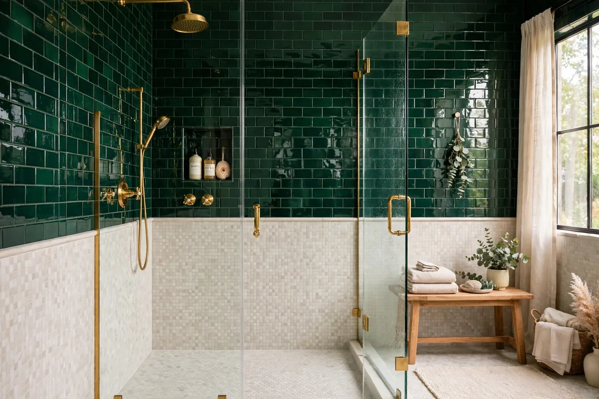
Deep green, navy and burgundy showers are 2026’s drama of choice — a contained glass box is exactly where saturated colour belongs. The pairing rule that keeps it luxurious instead of loud: the colour commits on the walls, and the floor stays neutral. A pale, fine mosaic underfoot grounds the jewel tone and keeps the small space from closing in.
Metal is this pairing’s third voice, so cast it deliberately: brass warms green and navy toward boutique-hotel; matte black sharpens them toward modern. What never works is a coloured floor competing with coloured walls — saturation needs a rest surface, and the floor is the cheapest place to provide it.
9. Tone-on-Tone: Same Colour, Different Shape and Finish
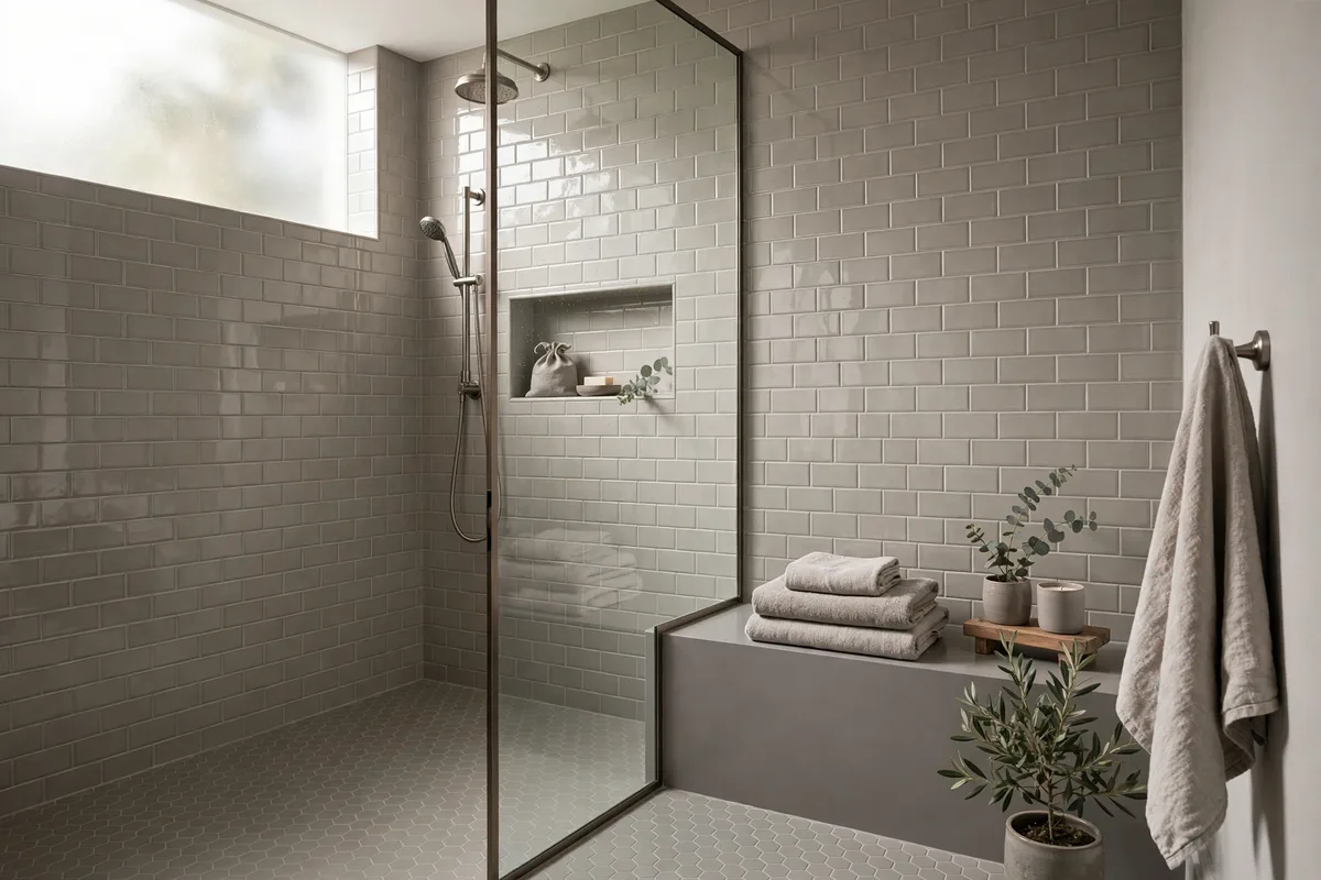
The quietest combination of all: one colour, expressed in two shapes and two finishes. Glossy subway on the walls, matte hexagons in the same warm grey on the floor; the tiles differ in everything except hue, so the interest is all geometry and light-play, and the mood stays spa-calm. Designers reach for this when the brief is “interesting but restful.”
It is also the safest pairing for the colour-uncertain: because nothing contrasts, nothing can clash — the only real risk is monotone flatness, which the finish contrast (shine versus matte) exists to prevent. Juxtaposing matte and gloss within one palette is the professional’s trick for depth without colour.
10. Grout: The Third Tile You Already Bought
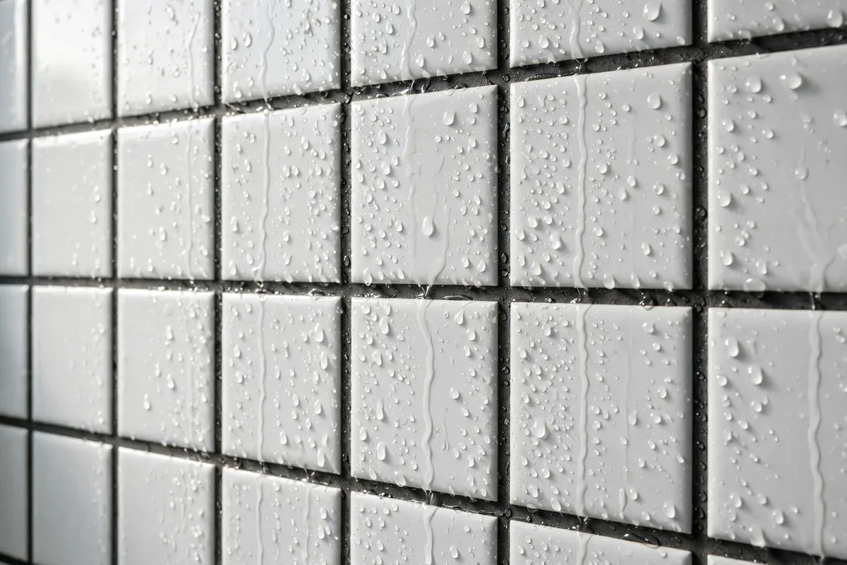
Every pairing above is actually a trio, because grout redraws each tile it touches. Matching grout dissolves the grid and lets two tiles blend into fields of colour — the right call for tone-on-tone and marble pairings. Contrasting grout draws the pattern, doubling the geometry — right for subway-and-hex, risky anywhere a tile is already busy. Decide grout per surface, not per room: a common professional pattern is matched grout on the quiet tile, contrast on the star.
Close the loop with the rest of the room: the shower’s palette should hand over to the vanity wall and backsplash without a seam in the story — the counter composition in our bathroom vanity styling ideas uses the same palette discipline at sink scale. Two tiles, one grout decision each, one shared thread of colour: that is the whole craft, and your shower will look like you hired it done.
The Other Surfaces: Bench, Curb and Ceiling
The pairings assign walls, floor and niche; a real shower also has a bench, a curb and sometimes a ceiling, and the same rules cast them. The bench takes the wall tile, or echoes the floor by the niche logic of Section 6 — one of the set, never a fourth tile. The curb is a grout-and-finish decision under the doctrine of Section 10: grip and a grout line that reads as design, not residue. And a tiled ceiling takes the quietest tile in the set, in its calmest finish — the surface nobody should notice is the one overhead.
What is being chosen most right now: In current retailer and magazine round-ups, the shower finishes that keep recurring are jewel-tone walls, fluted and kit-kat feature walls, handmade-look zellige texture, and vertical emphasis in the laying pattern. All four already live in this guide’s pairings — the 70/30 rule and the three-tile ceiling decide which of them your shower can host without a clash.
Frequently Asked Questions About Shower Tile Combinations
How many different tiles can I use in one shower?
Three at the very most — walls, floor and one accent — and two is usually better. Every added tile multiplies the undertone, grout and scale decisions that can go wrong. If a fourth surface needs interest, echo an existing tile there (the niche trick) instead of introducing a new one.
Should shower floor tile match the wall tile?
It should coordinate, not necessarily match. The safest coordination is family resemblance: same colour family and undertone, different scale and finish — large walls, small floor. An exact match everywhere can look seamless and spa-like in large-format porcelain, but it forfeits the grip and scale contrast that make mixed pairings work.
What is the best tile size combination for a small shower?
Large-format walls (fewer grout lines, calmer field) with a small mosaic floor (1–2 inch hexagons or penny rounds) for grip. The scale contrast also makes small showers read bigger: the floor’s fine texture recedes while the walls feel expansive. Avoid medium tiles on both surfaces — equals compete and shrink the room.
Can I mix matte and glossy tiles in a shower?
Yes — deliberately. Gloss on the walls bounces light and wipes clean; matte or textured on the floor provides grip. Within one colour family, a matte/gloss split is one of the most reliable combinations there is. What fails is mixing finishes randomly on the same surface.
Which tile should be the accent: the expensive one?
Usually, yes — and that is the 70/30 rule’s economic gift. The costly patterned, handmade-look or natural stone tile covers only the accent surface (a wall, the niche, the floor), while an affordable large-format porcelain does the heavy lifting everywhere else. The shower reads expensive; the invoice disagrees.
What grout colour works with mixed tiles?
Choose per surface: match the grout to the quiet tile so it disappears, and let the star tile’s grout either match it (calm) or contrast it (graphic) — one graphic surface per shower is plenty. Mid-grey grout is the peacemaker between two tiles of different depths, and it hides wear better than white.
Do the undertones really matter?
They are the number-one reason finished showers “feel off.” A warm-veined marble with a cool grey floor, or a pink-beige tile beside a yellow-beige one, clashes invisibly until it is installed permanently. Compare samples together, in the bathroom’s own light, wet if possible — and choose pairs from one manufacturer’s coordinating line when in doubt.
Can I combine a patterned floor with plain walls?
Absolutely — the statement-floor arrangement is a classic: encaustic-look or patterned mosaic underfoot, the quietest walls you can find above it. The same dominance rule applies flipped: the floor is the star (keep it the only pattern in the room), walls and fixtures stay plain, and towels pick up one of the pattern’s colours.
Should the niche tile match the floor or the walls?
Either works; matching the floor is the bolder, more designed-looking choice because the repetition reads as intention, while matching the walls makes the niche disappear for a calmer effect. A completely different niche tile is the third option — allowed, but it spends your third-tile budget, so the rest of the shower must stay at two.
What is the most common shower tile combination mistake?
The 50/50 split: two tiles given equal area, so neither leads and the shower reads undecided. Close behind are undertone clashes and a third pattern sneaking in via the niche. Cast a lead, give it roughly 70%, keep one shared colour thread — most combinations fix themselves from there.
Which tile goes on a shower bench?
One of the set you already have: the wall tile, or the floor tile echoed up by the niche logic in Section 6. Never a fourth tile — the three-tile ceiling counts the bench too. Match the finish to the job: the bench is sat on, so it takes the calmer, grippier surface of the two.
Conclusion
Combinations are casting, not collecting: one tile leads at 70%, one supports, a third appears only as an echo. Marble with hex, subway with black, zellige with plain, jewel tones over a neutral floor, tone-on-tone in two finishes — all of them are the same rule wearing different clothes, and grout conducts the whole orchestra. Pick your lead first, choose its partner by family and contrast, and the smallest room in the house becomes the one guests ask about.



Pingback: Bathroom Mirror Placement Ideas: Exact Heights & Widths