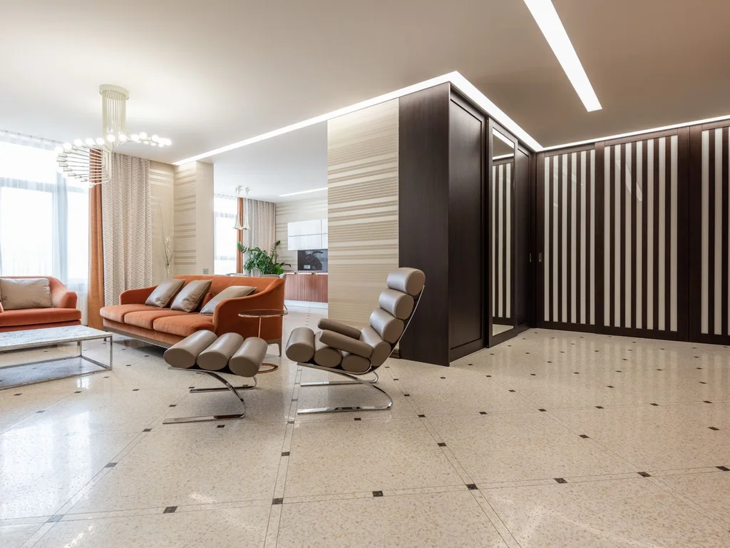
A house only feels finished when its rooms feel like they belong together. You can love every room on its own and still walk through a home that feels disjointed, because the colours clash at doorways, the flooring changes without reason and the lighting jumps from warm to cold. This guide collects 100 house interior design ideas that treat your home as one connected whole, room by room, so every space supports the next.
Start with the rooms you use most and let the ideas spread outward. Our small bedroom design ideas show how to make compact sleeping spaces work harder, and our greenery bedroom ideas prove how plants can soften a whole house, not just one room. For broader inspiration on timeless interiors, House Beautiful is a reliable place to study how professionals carry one look through an entire home.
Where should you start? With the three connectors: one neutral base colour (Idea 1), one wood tone carried through doors and floors (Idea 5), and the same white on all trim and ceilings (Idea 7). Fix those three and every later room decision gets easier — the house starts to feel designed as one home instead of decorated as separate rooms.
In this guide: Whole-House Colour Flow · Living Room as the Heart of the Home · Bedrooms That Rest the Whole House · Kitchen as the Connected Hub · Bathrooms, Small but Mighty · Dining, Entry and Hallways · Home Office and Work Corners · Laundry, Storage and Utility Spaces · Light, Texture and Materials Across the House · Styles That Tie the House Together
How to Plan a Whole House, Room by Room
Step 1 — Set the skeleton first. Base colour, wood tone, trim white, one metal finish. Four decisions, made once, applied everywhere.
Step 2 — Do the living room properly. It is the room guests judge and the family lives in: conversation seating, one large anchoring rug, curtains high and wide.
Step 3 — Make bedrooms restful on purpose. Bed as the only statement, blackout layers, technology off the bedside wall. Sleep quality is a design outcome.
Step 4 — Connect the kitchen. An island that faces the room and flooring that flows into the living space stop the kitchen feeling like a separate workshop.
Step 5 — Sweat the in-between spaces. Entries, hallways and stairs are the connective tissue: runners that guide the eye, one gallery wall, a console that catches the day. Houses feel disjointed when these are ignored.
Step 6 — Write your house style document. A one-page note of your colours, woods, metals and rules, kept on your phone for every future purchase — it protects every other decision in this guide.
Key Measurements Worth Knowing
| Job | The guideline | Free tool |
|---|---|---|
| Rug size | Front legs of furniture on the rug, roughly 18 inches of bare floor at the walls | Rug Size Calculator |
| Room size | Measure the room before buying anything large | Room Size Calculator |
| Paint quantities | Wall area minus doors and windows, two coats as standard | Paint Calculator |
1. Whole-House Colour Flow
1. One Neutral Base That Runs Through Every Room
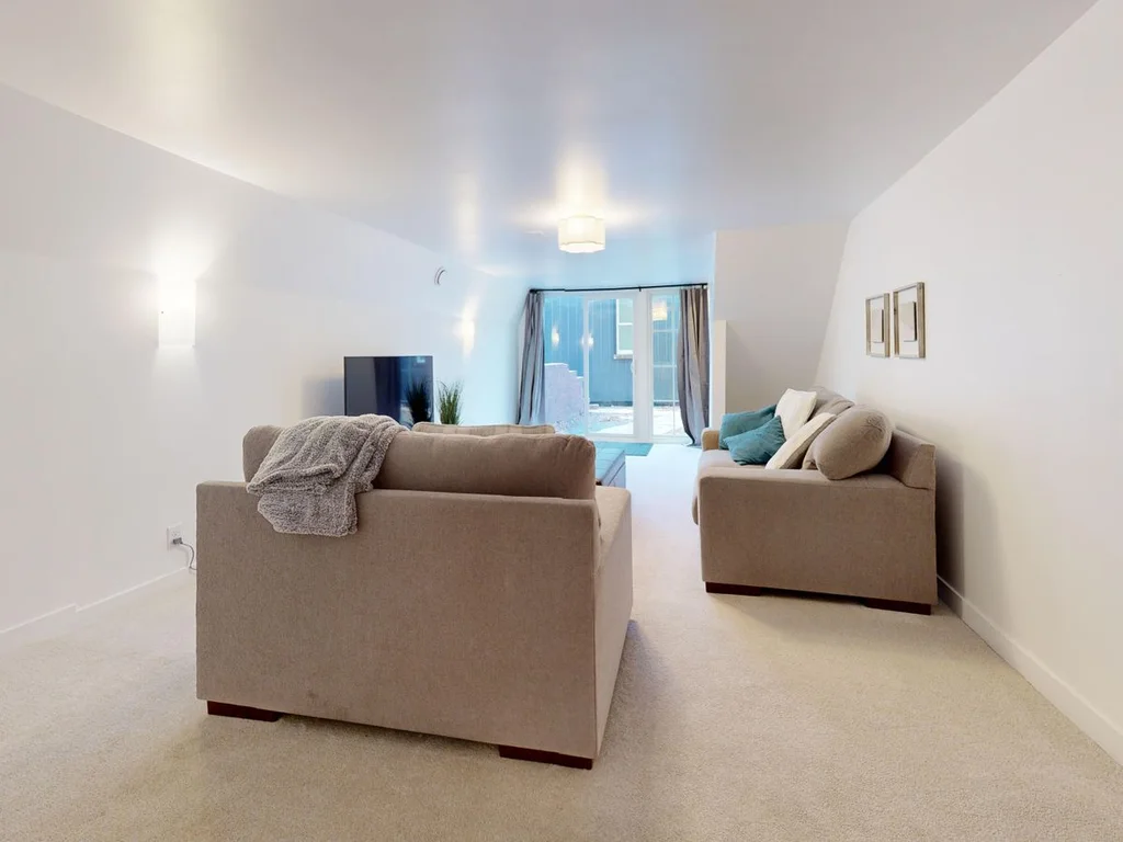
Pick a single warm or cool neutral and carry it through every room’s walls, trim or large furniture pieces. The repetition makes doorways disappear visually, so even small homes feel larger and calmer. You are not painting everything the same colour — you are giving every room the same quiet background to build on.
2. A Three-Colour Palette Per Room, One Shared Anchor
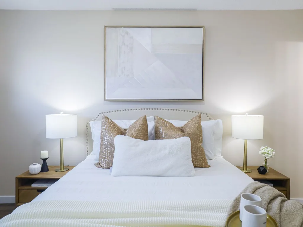
Give each room its own three colours, but keep one anchor colour — a deep green, navy or warm wood tone — present in all of them. The anchor appears in a cushion here, a rug there, a painted door somewhere else, and the house reads as a family of rooms rather than a set of strangers.
3. Paint the Hallway the Colour of the Rooms It Connects
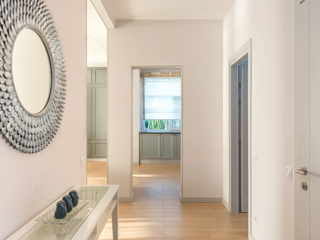
Hallways are often painted white by default, which breaks the flow between rooms. Instead, paint the hall a softened version of the colours it connects — a pale blend of the living room and bedroom shades. The journey between rooms then feels intentional, not like a gap in the design.
4. Repeat One Accent Colour in Every Room
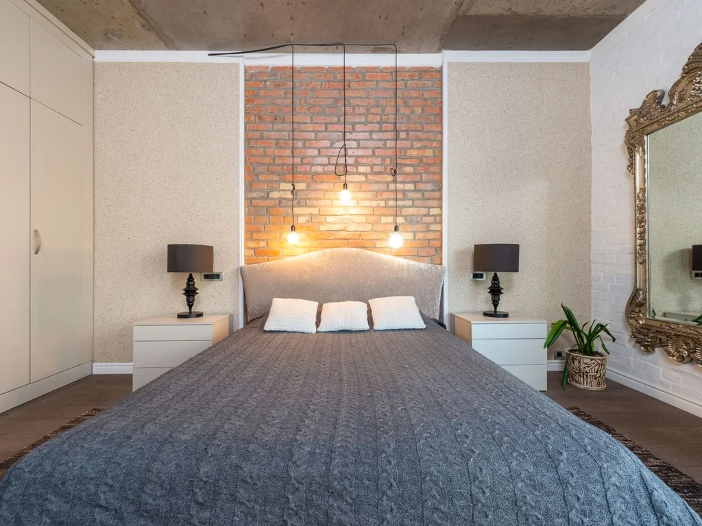
Choose one accent — brass, terracotta, sage or black — and repeat it in small doses in every room: a frame, a lamp, a vase, a cushion. The eye picks up the pattern as it moves through the house, and the repetition quietly ties spaces together even when their main colours differ.
5. Carry One Wood Tone Through Doors, Floors and Furniture
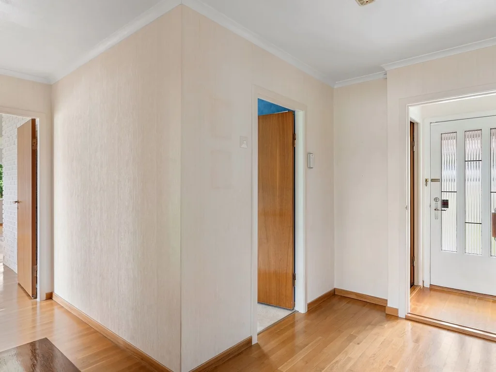
When door frames, flooring and key furniture share one wood tone, the house gains a warm skeleton that holds everything together. You do not need matching furniture — just a consistent undertone, warm or cool, running through the timber the eye keeps meeting.
6. Let Each Room Go One Shade Deeper or Lighter
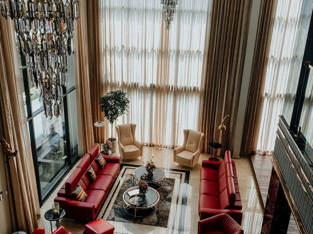
A simple flow trick is to step the wall colour one shade deeper as you move toward private rooms and one shade lighter toward social ones. The gradient gives the house a natural rhythm: brighter where you gather, moodier where you rest, with no jarring jumps in between.
7. Use the Same White on All Trim and Ceilings
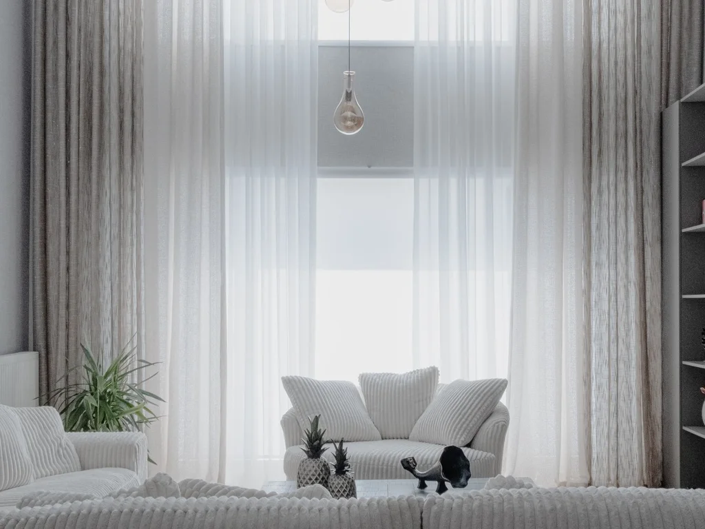
Even if every room has a different wall colour, using one consistent white on all trim, doors and ceilings creates a crisp frame that unifies the house. It also makes repainting a single room far easier, because the edges always match the rooms beside them.
8. Match the Front Door to the Interior Story
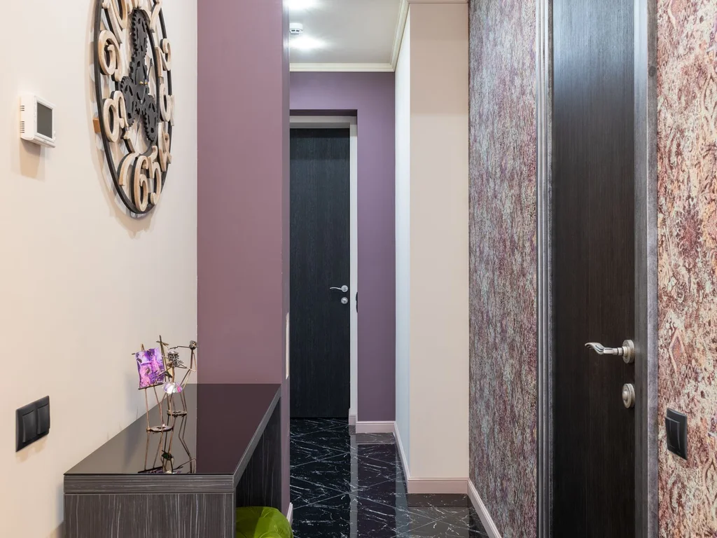
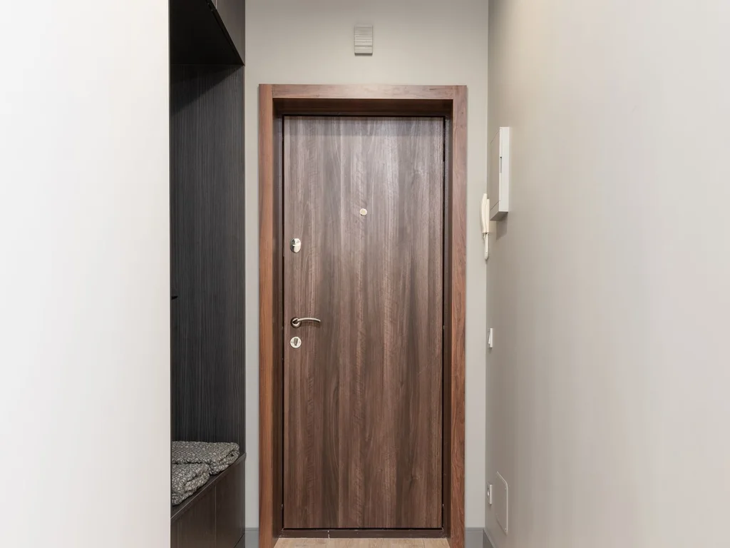
The front door is the first colour a visitor meets, so let it preview the interior: a deep green door for a nature-led home, navy for a classic one, a warm wood stain for a rustic one. Repeat that colour once inside — on a console, a stair runner or a piece of art — to complete the welcome.
9. One Bold Wall Per Floor, Not Per Room
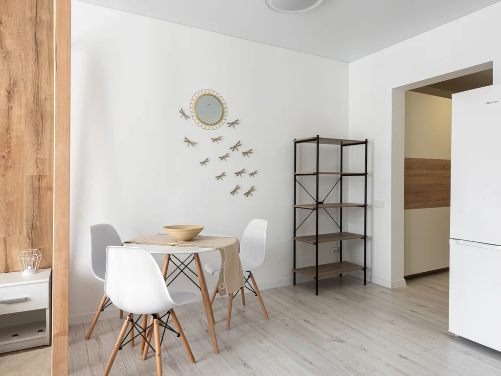
Bold feature walls lose their power when every room has one. Limit yourself to one statement wall per floor — a fireplace wall downstairs, a bed wall upstairs — and let the other walls stay calm. The house keeps its drama, but the drama has somewhere to rest.
10. Test Colours in Doorways, Not Just on Walls
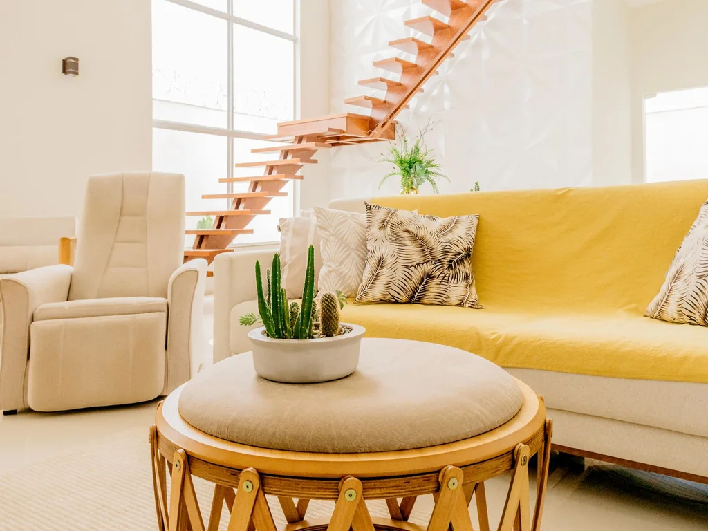
Before committing to a palette, paint large swatches on boards and prop them in doorways, where two rooms meet. Colours that look perfect alone can clash badly side by side, and the doorway test shows you the relationship your eye will actually live with every day.
2. Living Room as the Heart of the Home
11. Arrange Seating for Conversation, Not for the Television
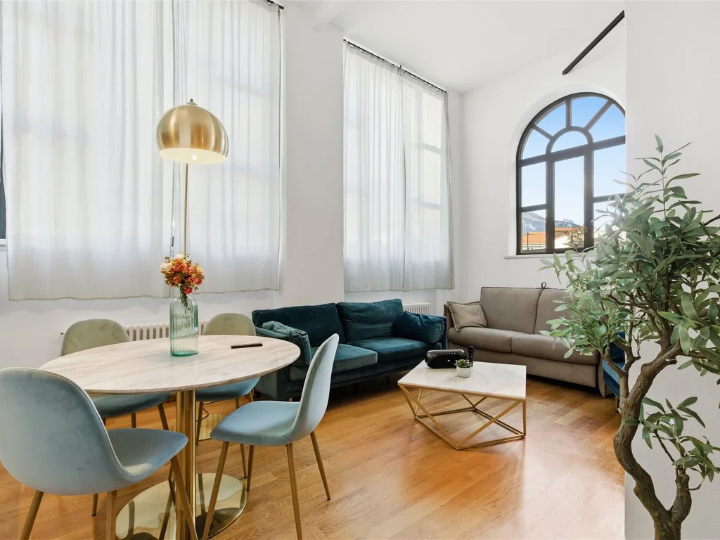
Start the living room layout with chairs and sofas facing each other, and let the television be a secondary guest. Conversation-first seating makes the room the social heart of the house, and guests naturally gather there instead of drifting to separate corners with their phones.
12. One Large Rug That Anchors All the Furniture
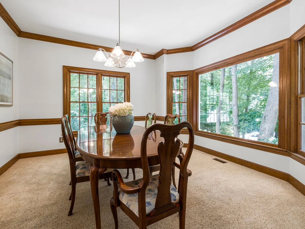
A rug that is too small makes furniture look like it is floating away from itself. Choose one large enough for the front legs of every seat to rest on it, and the whole seating group becomes one island. The rug also sets the room’s colour story for the rest of the house to echo.
13. A Fireplace Wall That Earns Its Focus
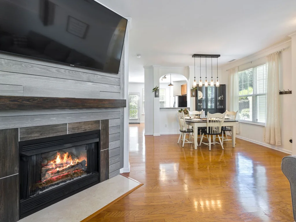
If the living room has a fireplace, give it a proper moment: a mantel styled simply, art or a mirror above, and seating angled toward it. A fireplace that is ignored becomes a dead wall; one that is honoured becomes the room’s hearth and the house’s gathering point.
14. Open Shelving That Shows the Household’s Story
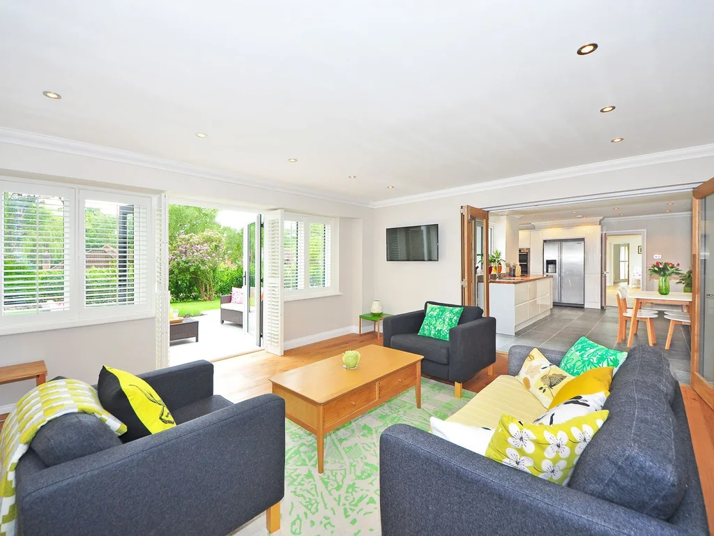
A few open shelves with books, travel finds and family pieces turn a living room from a showroom into a home. Keep the shelves edited — one group of objects per shelf, with breathing space — so the story reads clearly instead of collapsing into clutter.
15. A Reading Corner Beside the Best Window
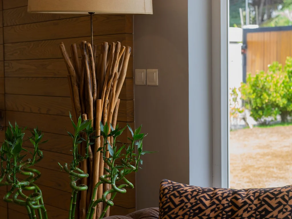
Every living room deserves one chair placed purely for reading, angled to the best window with a small table and a good lamp. It gives the room a quiet purpose beyond entertaining, and it is usually the seat everyone quietly competes for on a lazy afternoon.
16. Coffee Table Height Matched to the Sofa Seat
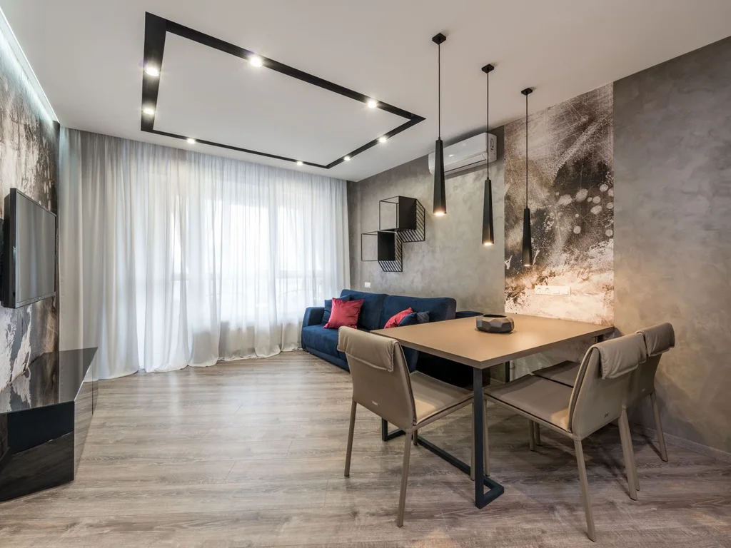
A coffee table should sit within a couple of inches of the sofa seat height, so reaching for a cup feels natural and the proportions look right. Too high and the room feels stiff; too low and it feels awkward. This small measurement fixes more living rooms than any new purchase.
17. Curtains Hung High and Wide for Taller Walls
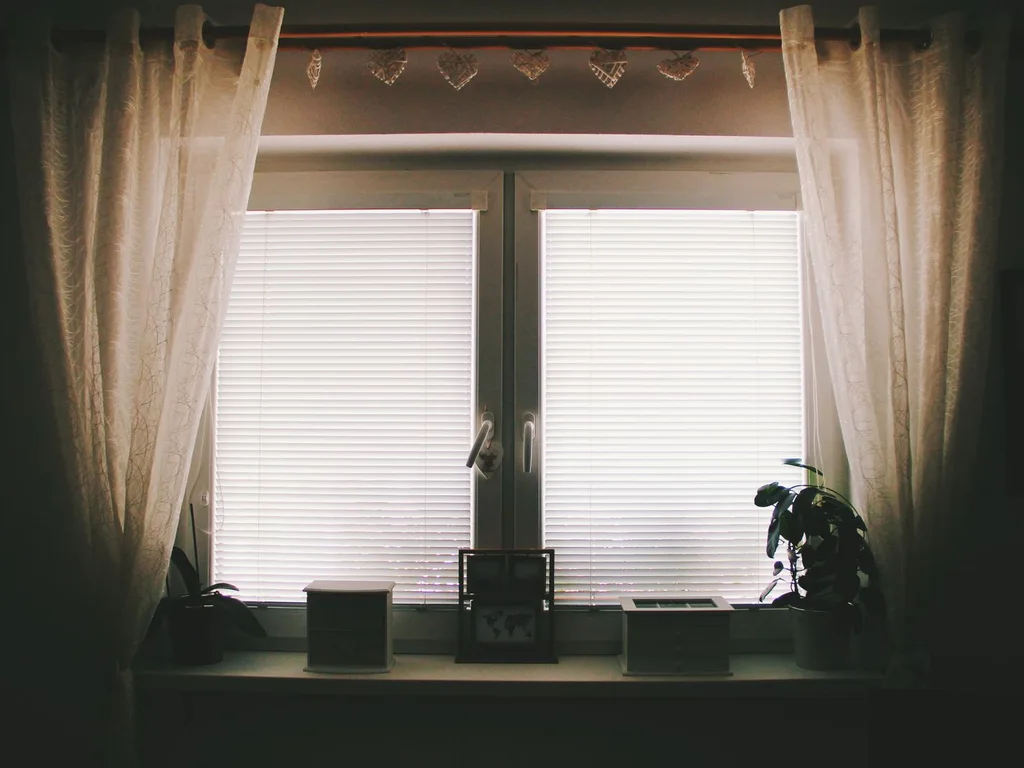
Hang curtain rods close to the ceiling and wider than the window frame, so the fabric draws the eye upward and outward. The window looks larger, the ceiling looks higher, and the whole room gains a sense of generosity that no amount of furniture can fake.
18. A Second Seating Zone for Larger Rooms
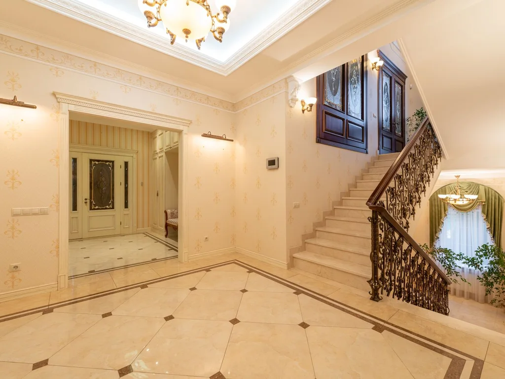
In a big living room, one seating group leaves half the room empty and unused. Add a second zone — two chairs and a side table by the window, or a games table in the corner — and the room suddenly works for both a crowd and a quiet couple at the same time.
19. Plants That Connect the Living Room to the Garden
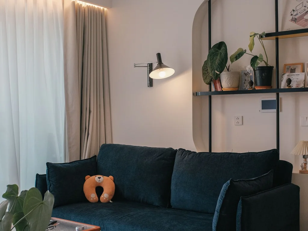
A tall plant beside the garden door and a trailing plant on a high shelf blur the line between inside and outside. The living room feels like it continues into the garden, which makes both spaces feel bigger. Choose plants that tolerate the light by that door and water them on a fixed day.
20. A Console Table Behind the Sofa as a Room Divider
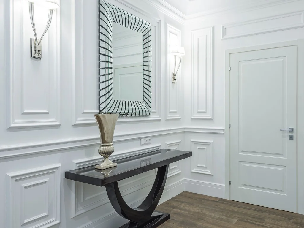
When the living room opens into a dining area, a console behind the sofa marks the boundary without a wall. Style it with a lamp, a stack of books and a low plant, and both zones gain definition while the open-plan feeling stays intact.
3. Bedrooms That Rest the Whole House
21. The Bed as the Room’s Only Statement
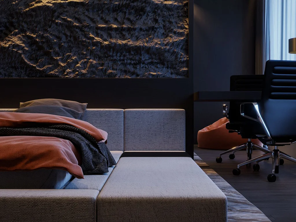
In the bedroom, let the bed carry the design and keep everything else quiet. A beautiful headboard, layered bedding and one strong cushion story are enough; when every surface competes, sleep suffers. A calm bedroom lifts the whole house, because rest is the foundation every other room builds on.
22. Bedside Tables That Actually Hold a Life
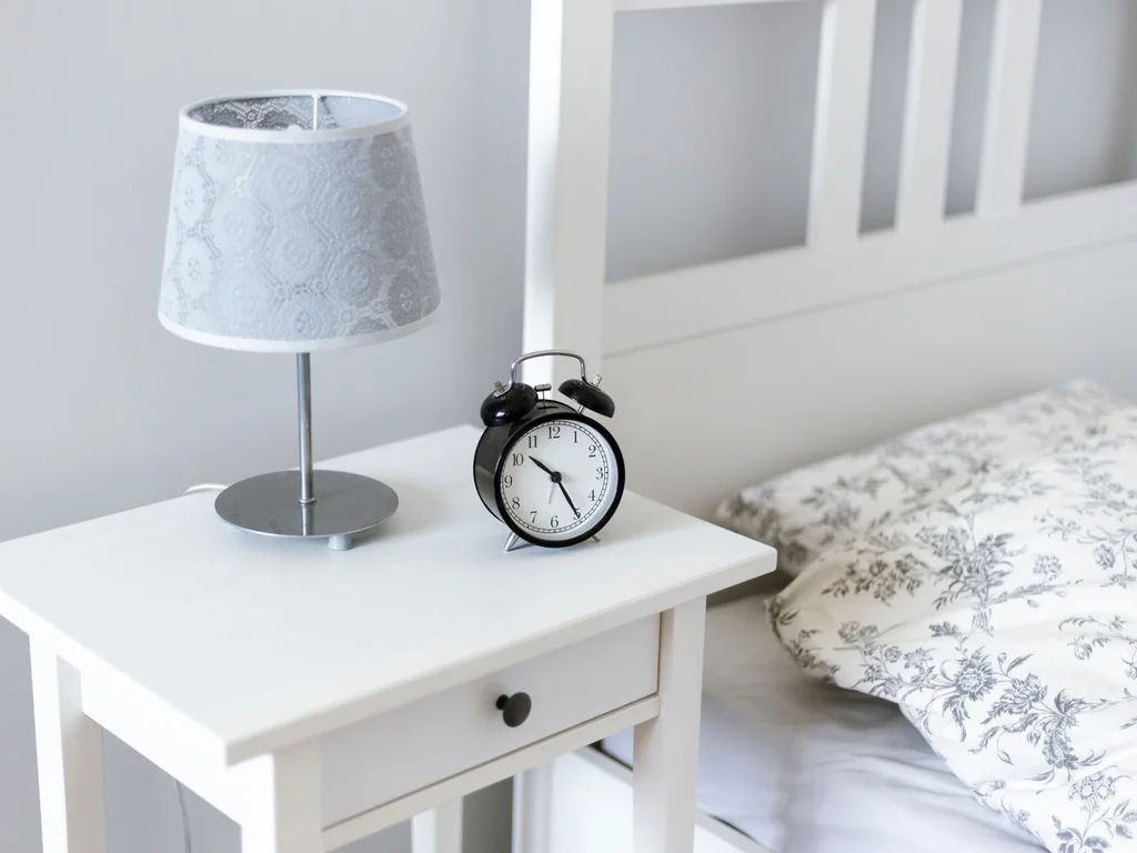
A good bedside table holds a lamp, a book, water and a phone charger without crowding — measure before you buy, and choose one with a drawer if clutter creeps. When the nightstand works, the bedroom stays tidy with almost no effort, and mornings start calmer.
23. Blackout Layers for Deep, Unbroken Sleep
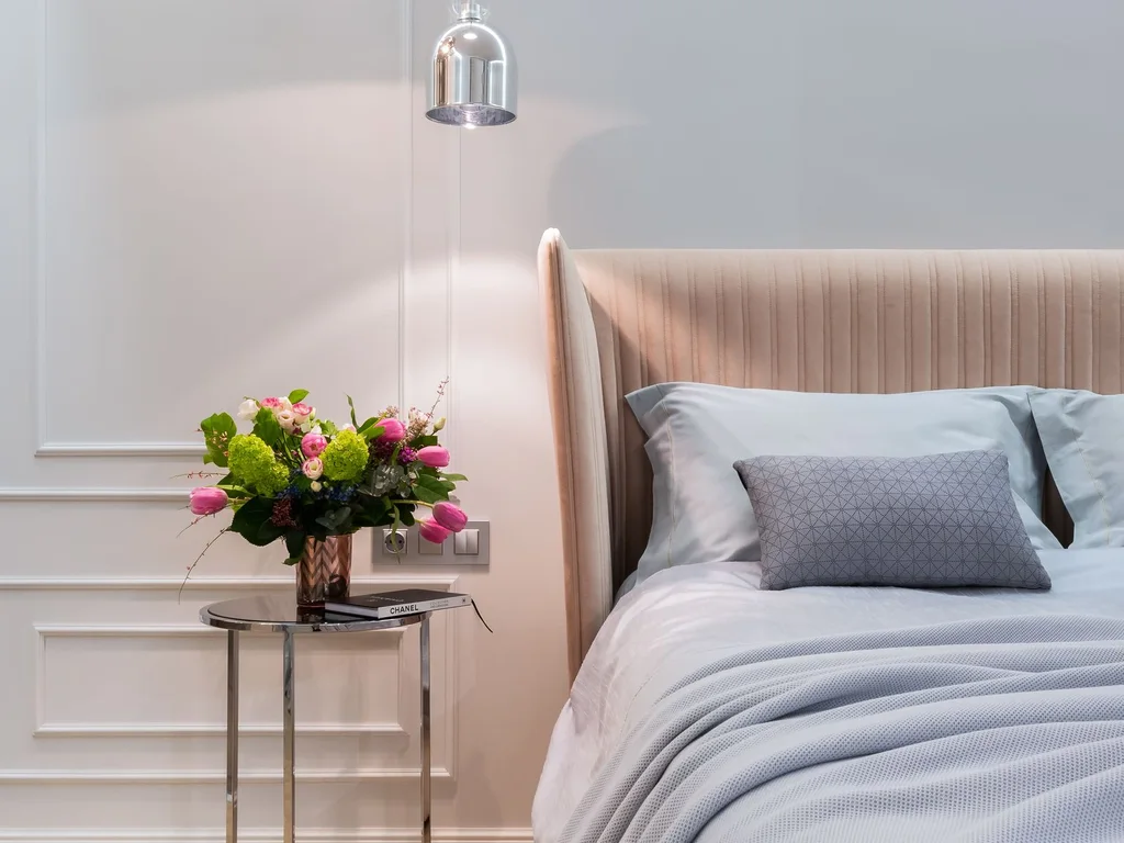
Layer sheer curtains for daytime softness with blackout curtains or blinds for night, and sleep quality improves measurably. The layered window also looks far more finished than a single blind, and it gives the bedroom the hotel feeling that makes the whole house feel cared for.
24. A Bedroom Colour That Lowers the Heart Rate
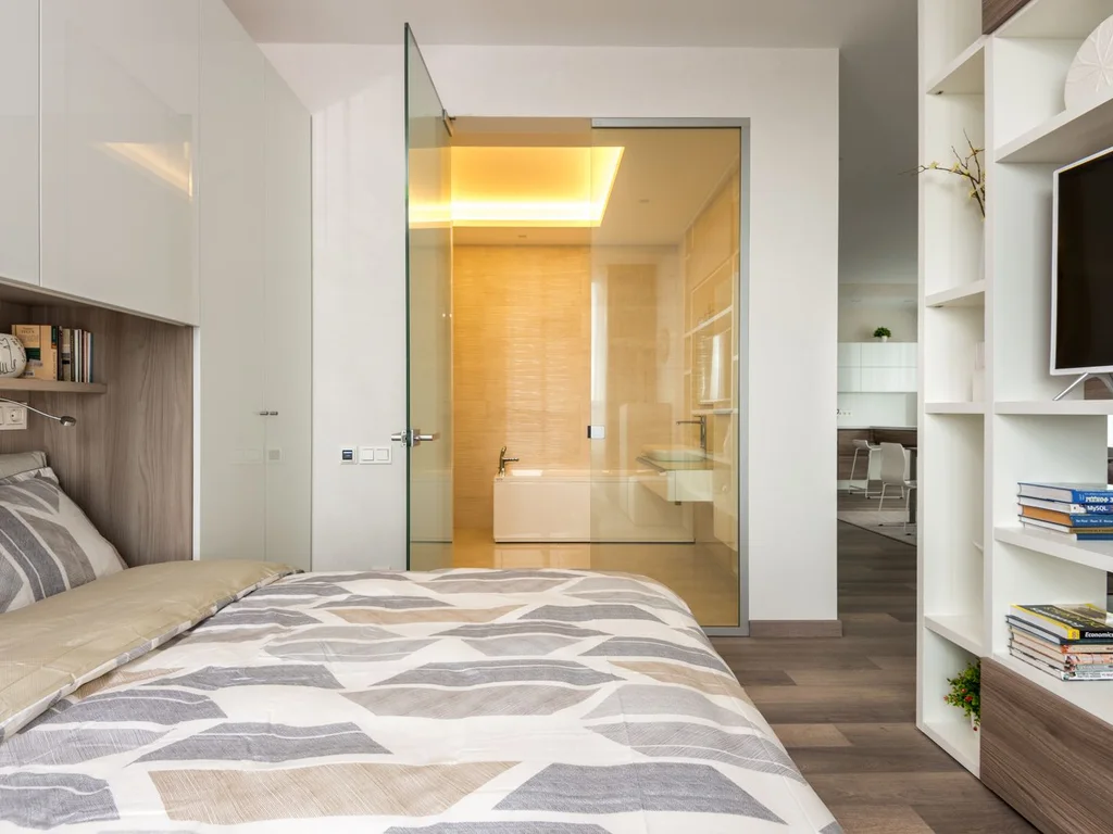
Soft sage, dusty blue, warm clay or muted lavender all slow a room down in a way bright white cannot. Pick one restful shade for the bedroom walls or bedding and keep the rest of the room neutral, and the bedroom becomes the house’s exhale at the end of every day.
25. Storage That Hides the Chaos Completely
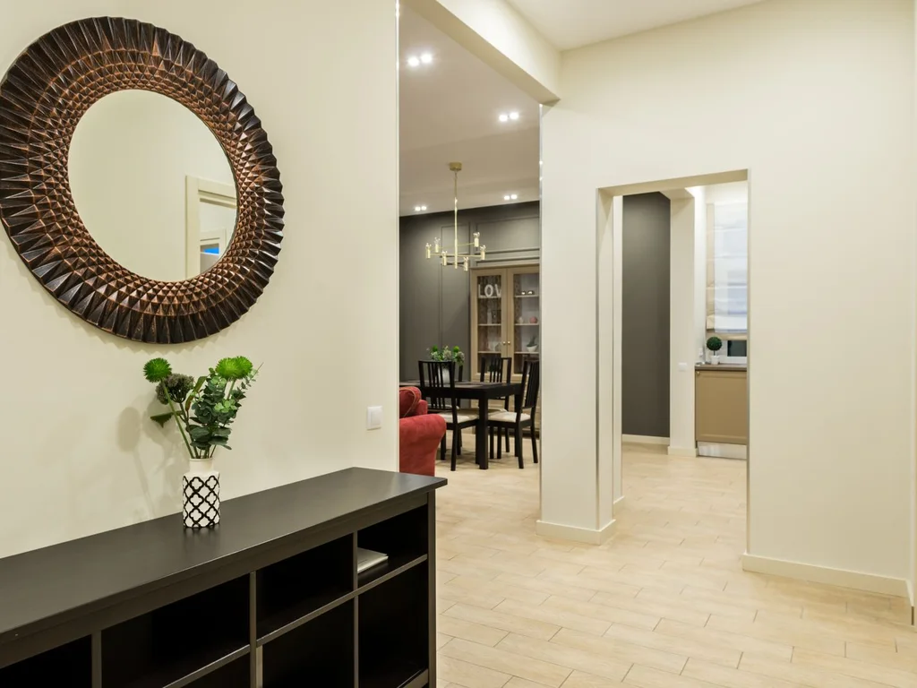
Bedrooms collect laundry, chargers and half-finished projects, so closed storage matters more here than anywhere. A wardrobe with doors that shut fully, a bench with hidden storage and a drawer for chargers keep the room visually silent — and a silent bedroom makes the whole house feel orderly.
26. A Full-Length Mirror That Doubles Light and Space
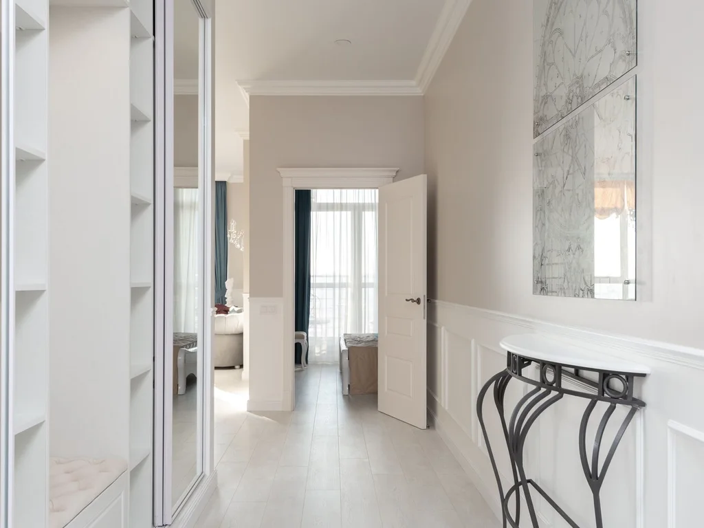
A tall mirror opposite or beside a window bounces daylight deep into the bedroom and makes a small room feel twice its size. Lean it against the wall for a relaxed look, or hang it for a tailored one; either way, it is the cheapest square footage a bedroom can gain.
27. One Textured Throw That Makes the Bed Inviting
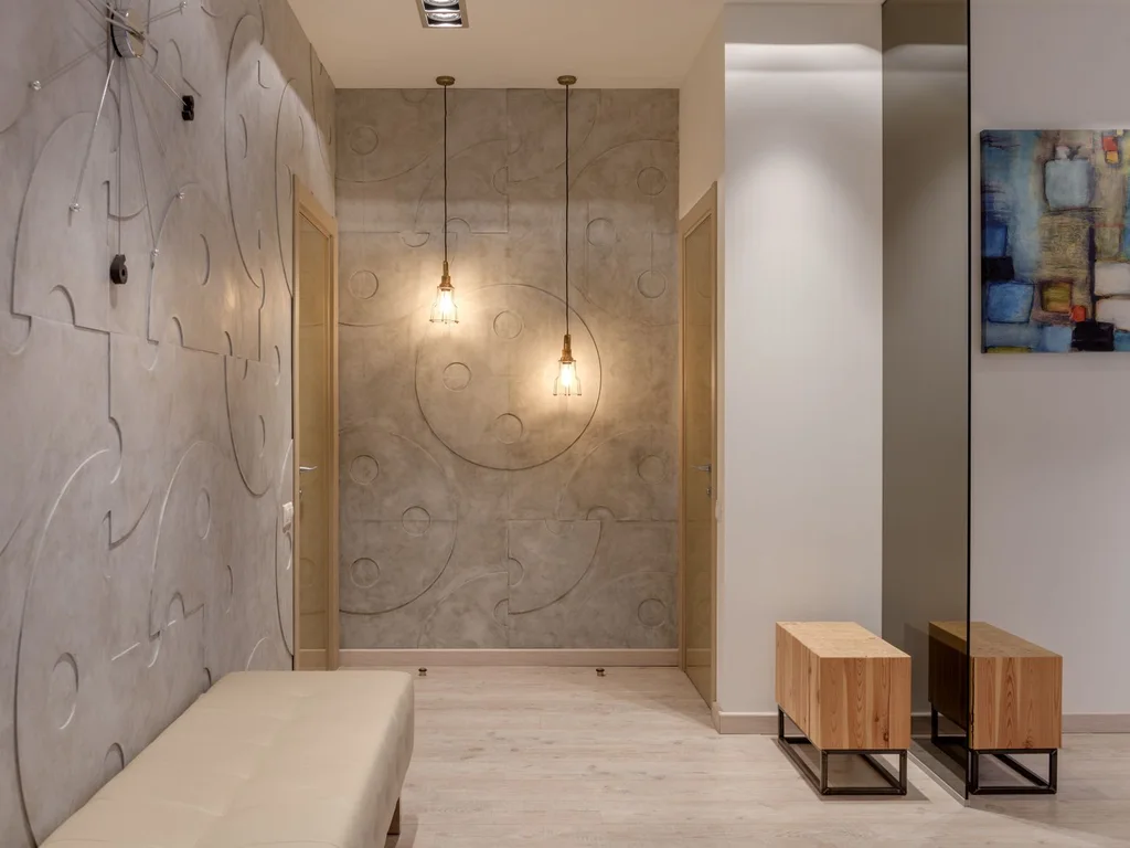
A single chunky knit, waffle or linen throw across the foot of the bed changes the whole room’s invitation. It adds texture the eye can feel, warmth for cool evenings and a finished look that takes two seconds to arrange. Swap it seasonally and the bedroom refreshes without redecorating.
28. Art Above the Bed at Eye Level From the Door
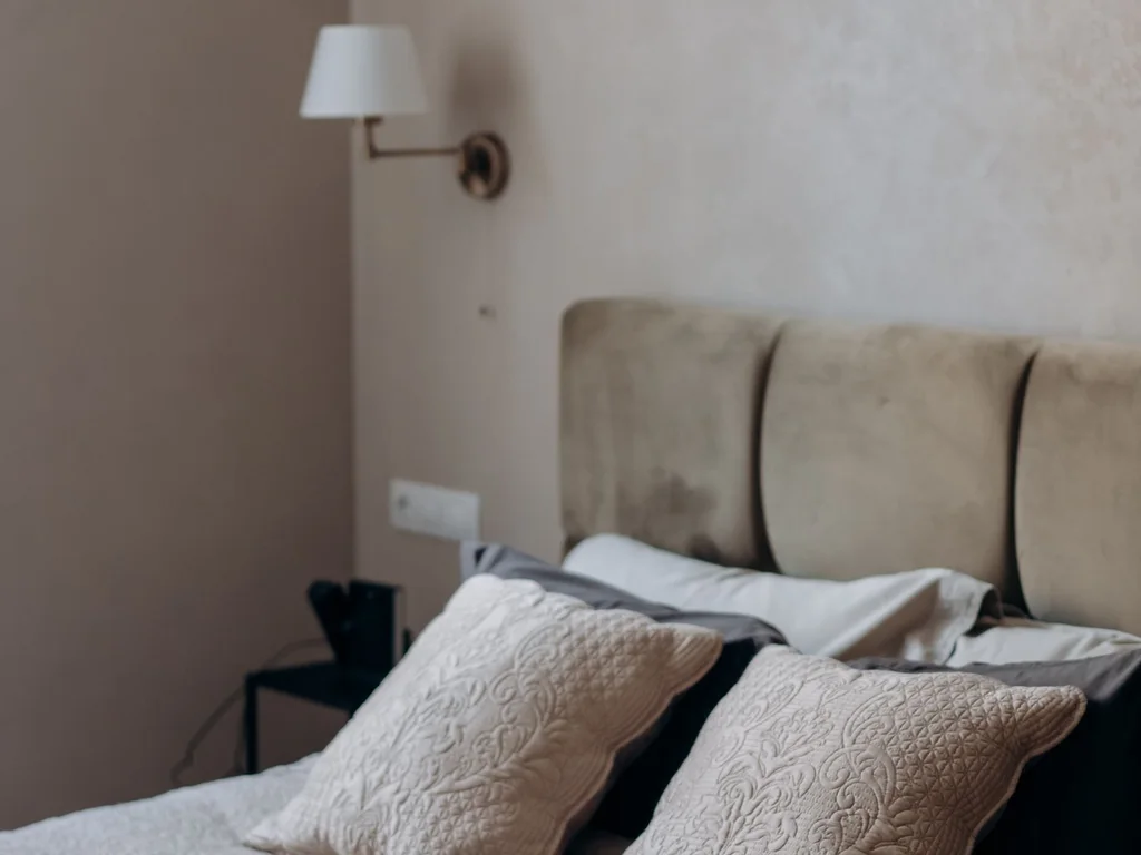
Hang bedroom art so it looks right from the doorway, not just from the pillow — that is the view you live with. One large piece or a calm pair works better than a busy gallery wall here, because the bedroom wall should settle the mind, not stimulate it.
29. A Small Chair That Gives the Bedroom a Second Use
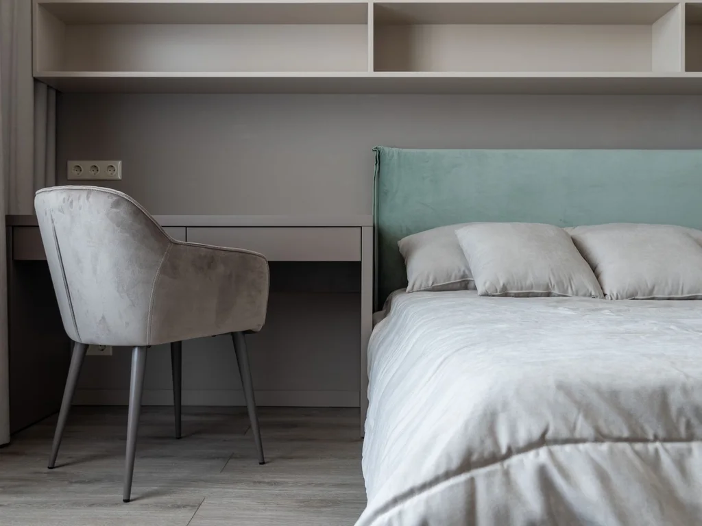
A single comfortable chair turns a bedroom into more than a sleeping box: a place to read, dress slowly or sit with morning coffee. Even a small room can fit a slim chair in a corner, and that one seat makes the room feel like a suite rather than a cell.
30. Keep Technology Off the Bedside Wall
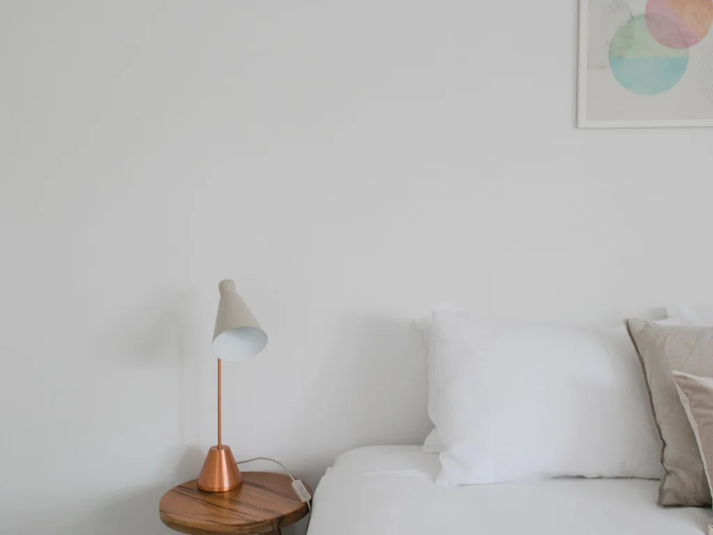
Move the charging station to a dresser across the room and keep the bedside wall free of screens, cables and blinking lights. Sleep improves, the room looks cleaner, and the bedroom keeps its job as the house’s quietest room instead of becoming another office.
4. Kitchen as the Connected Hub
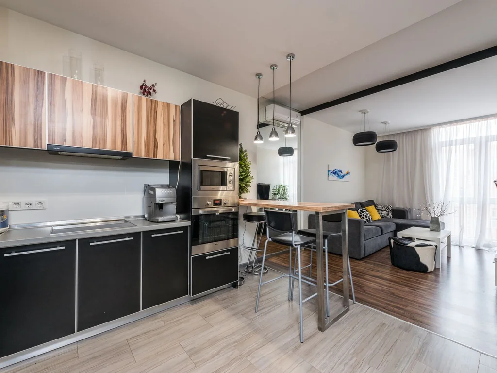
31. An Island That Faces the Room, Not the Wall
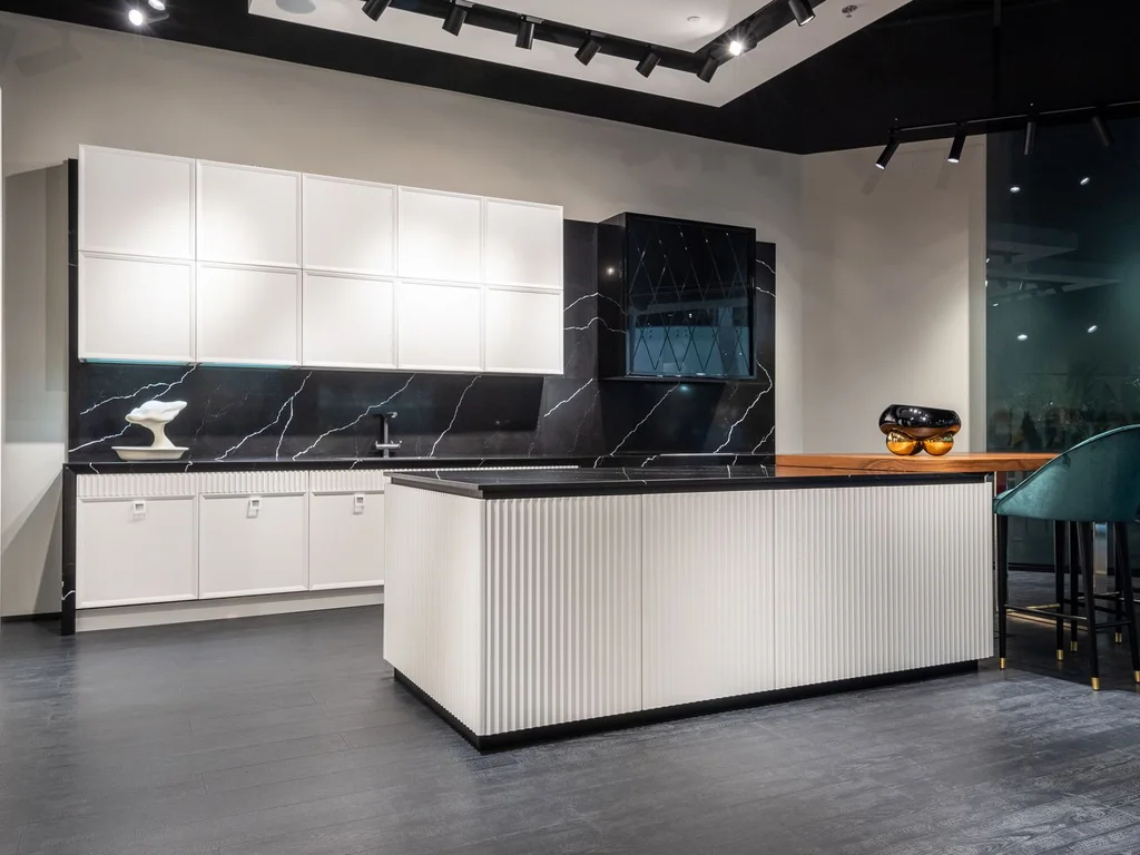
Design the kitchen island so the cook faces family and guests, with seating on the living side. The kitchen then becomes the house’s social hub instead of a workstation with its back turned, and conversation flows naturally while meals are made.
32. Open Shelving for Daily Items, Closed for the Rest
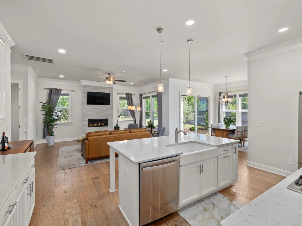
Keep everyday plates, glasses and mugs on one or two open shelves where they are beautiful and reachable, and hide everything else behind doors. The kitchen looks curated rather than cluttered, and the open shelves give the room the warmth of a lived-in space.
33. A Breakfast Nook That Anchors the Morning
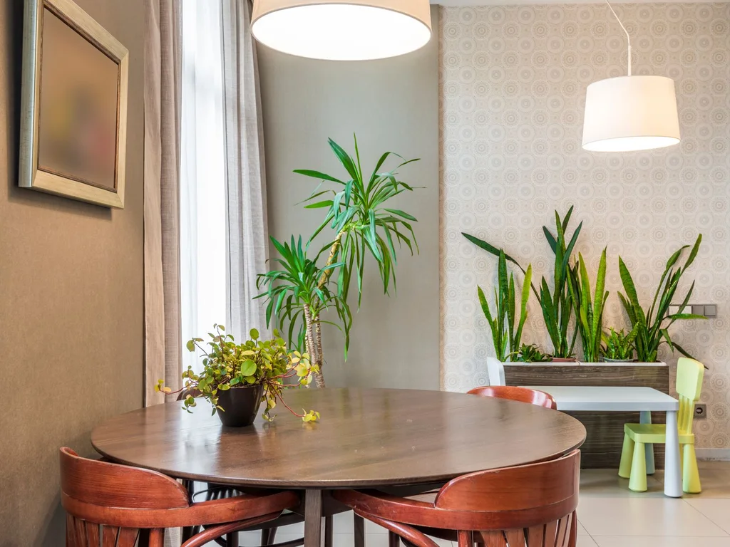
A small table and bench by the kitchen window creates a morning ritual spot that the whole household gravitates toward. Even a tiny nook with a built-in bench saves floor space, seats more people than chairs, and gives the kitchen a heart beyond the cooking zone.
34. One Work Surface Kept Permanently Clear
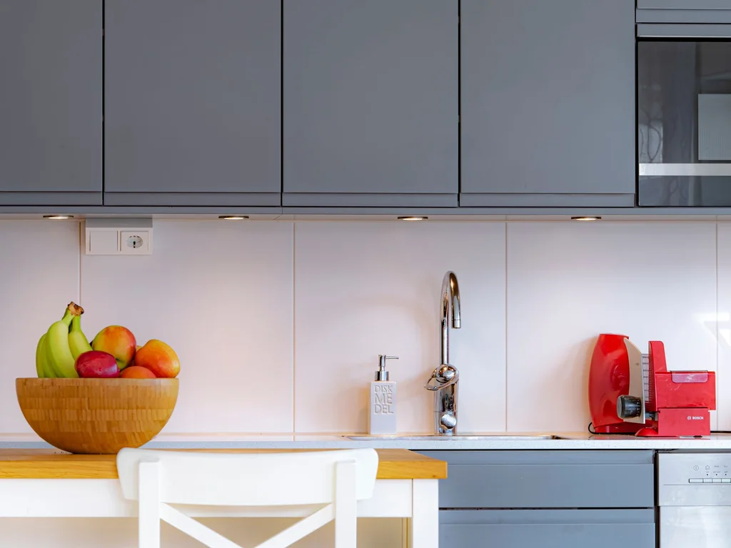
Protect one stretch of countertop from appliances, mail and clutter, and the kitchen instantly feels larger and more usable. A clear surface is where baking, homework and unpacking actually happen, and it signals that the kitchen is a working room, not a storage shelf.
35. Lighting in Three Layers Over Work Zones
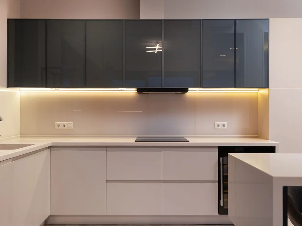
Kitchens need ceiling light for the room, under-cabinet light for the counters and pendant light over the island — one layer alone always leaves shadows where knives and hot pans live. Three layers make the kitchen safer, prettier and far more pleasant at night.
36. A Pantry Wall That Ends the Cupboard Hunt
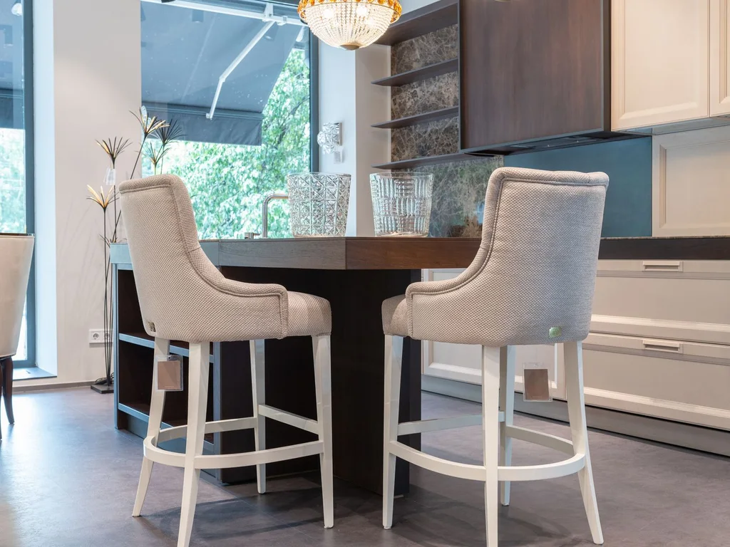
One tall pantry wall with pull-out shelves ends the daily hunt through deep cupboards and keeps bulk food, appliances and cleaning supplies in a single, findable place. Label the shelves once, and the whole household can put things back where they belong.
37. Flooring That Flows From Kitchen to Living Room
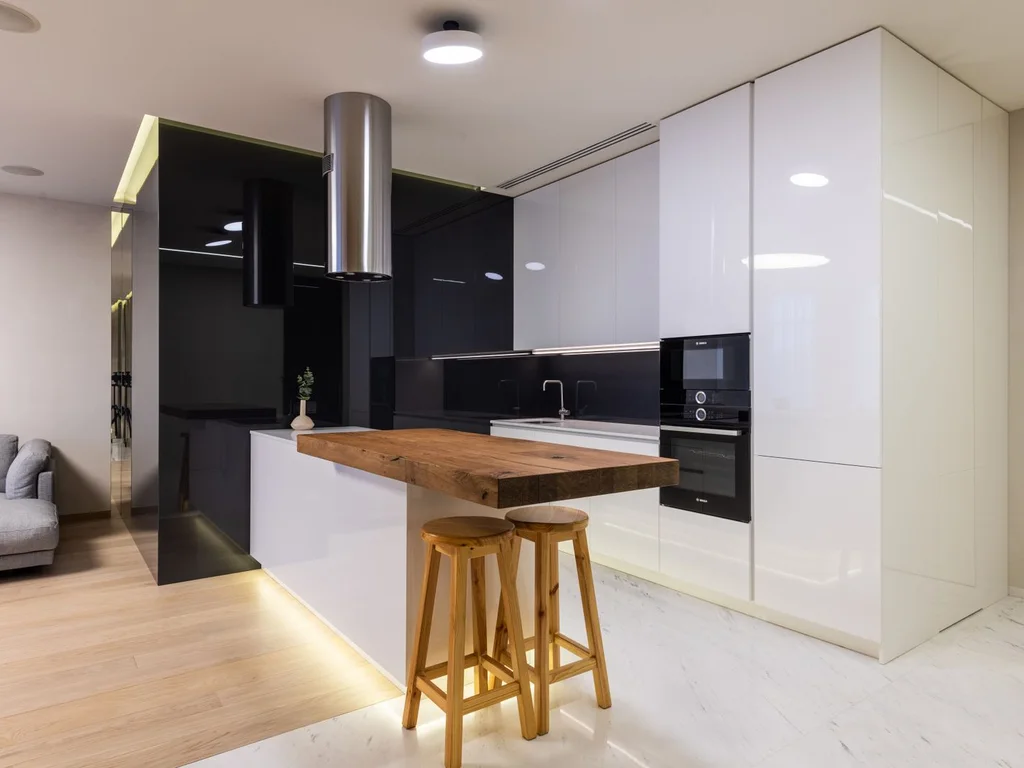
Running the same flooring from the kitchen into the adjoining living space erases the visual border between them and makes open-plan homes feel genuinely open. Choose a hard-wearing, easy-clean surface for the kitchen side and let it continue, so the eye travels without interruption.
38. A Herb Rail by the Kitchen Window
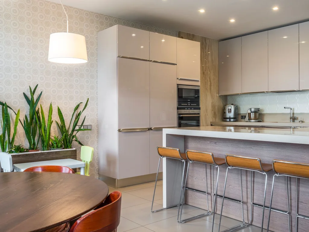
A simple rail or narrow shelf of potted herbs by the kitchen window adds life, scent and flavour within arm’s reach of the stove. Basil, mint and parsley thrive in the light, and snipping fresh herbs while cooking turns an ordinary meal into a small daily pleasure.
39. Bar Stools That Tuck Fully Under the Counter
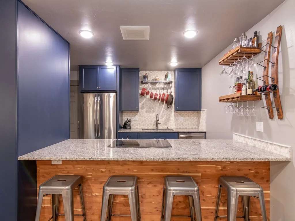
Stools that slide completely under the island overhang keep walkways clear and the kitchen looking tidy when no one is sitting there. Backless stools tuck best in tight spaces; low backs suit rooms where people linger. Measure the overhang before buying, not after.
40. A Display Shelf for the Kitchen’s Beautiful Tools
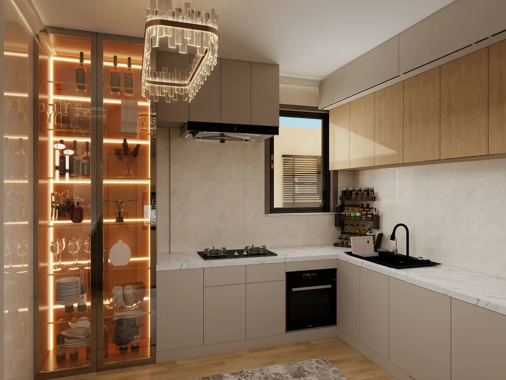
Wooden boards, copper pans and ceramic bowls are beautiful enough to display, so give a few of them one open shelf instead of hiding them all. The kitchen gains personality and the cook gains tools that are actually within reach, which is the point of a working kitchen.
5. Bathrooms, Small but Mighty
41. A Large Mirror That Doubles the Bathroom
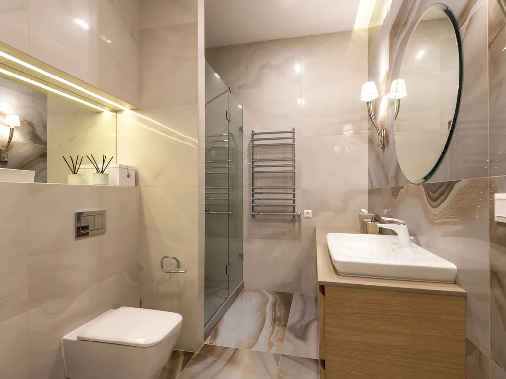
In a small bathroom, one large mirror over the sink does more than any renovation: it doubles the light, doubles the perceived space and gives the room a finished, hotel-like polish. Take the mirror as wide as the vanity, and frame it simply or leave it frameless for a clean look.
42. Wall-Hung Storage That Frees the Floor
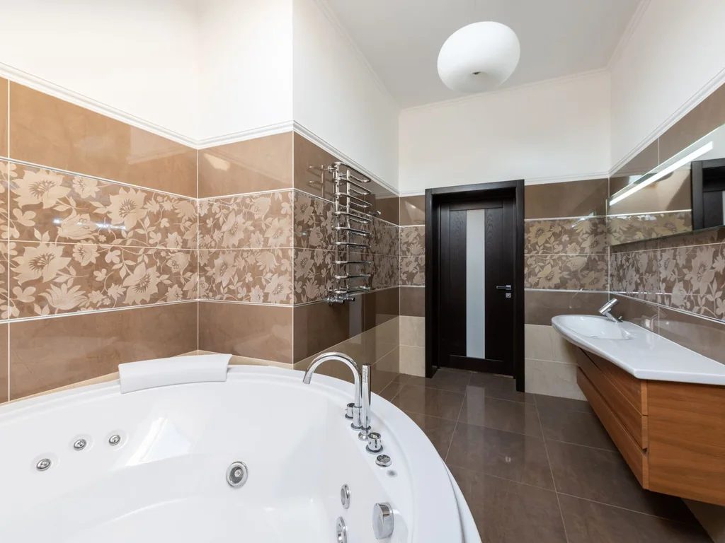
Wall-hung vanities and cabinets leave the floor visible, which makes a small bathroom feel noticeably larger and far easier to clean. The floating look also reads modern without trying hard, and the freed floor space keeps the room from feeling cramped at the door.
43. One Luxurious Detail in an Ordinary Bathroom
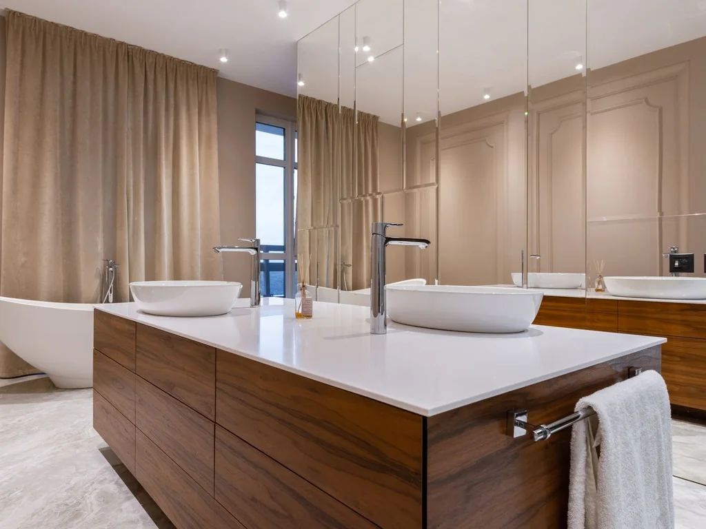
Even a modest bathroom feels special with one luxury: thick towels on a heated rail, a rainfall showerhead, a stone soap dish or a small stool with a plant. One indulgence lifts the whole room, while five competing upgrades just look busy. Pick the one you will notice every single day.
44. Tiles That Run From Floor to Ceiling in the Shower
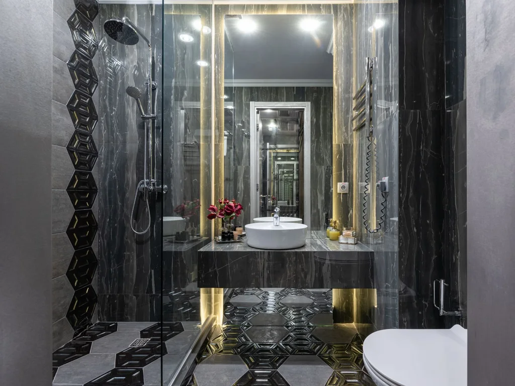
Running the same tile from the shower floor up the wall to the ceiling makes a small shower feel like a designed wet room rather than a tiled box. The unbroken surface draws the eye upward, and using one tile everywhere keeps the room calm instead of choppy.
45. A Small Stool That Adds Spa Calm
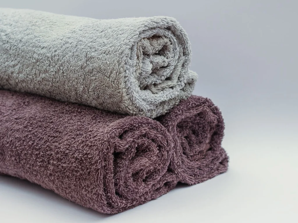
A wooden stool beside the bath holds a towel, a candle and a book, and instantly gives the bathroom a spa atmosphere. It costs almost nothing, works in the tiniest room, and turns a rushed wash into a slower ritual — which is exactly what bathrooms are for.
46. Towels in One Colour Family, Hung Neatly
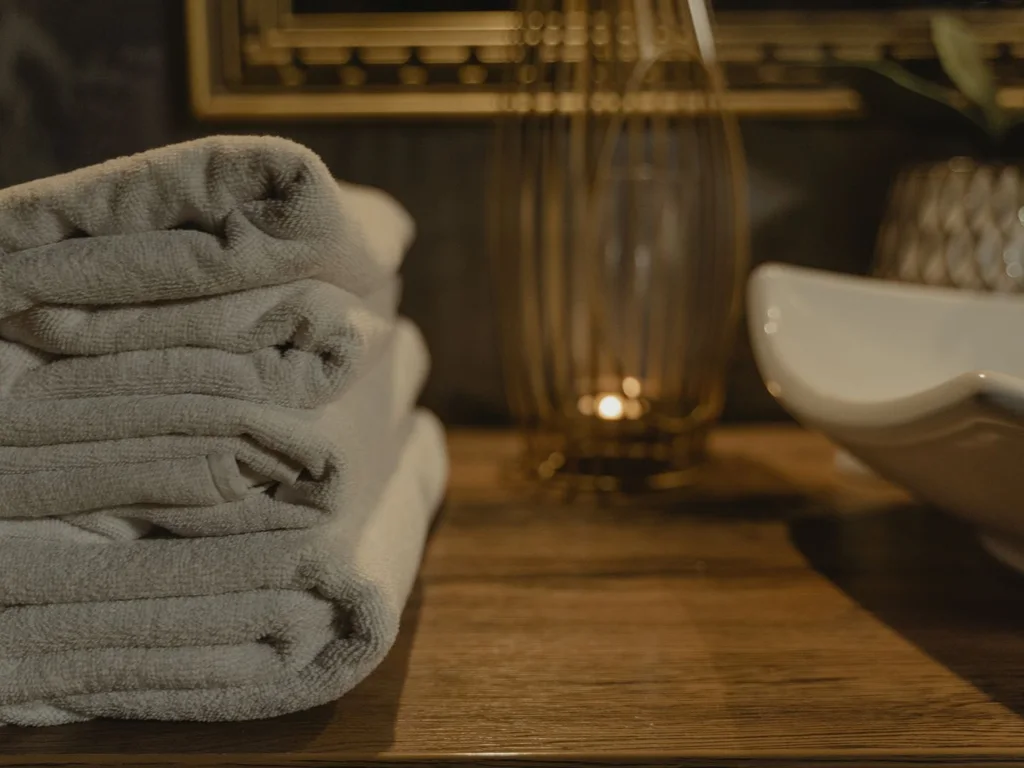
Mismatched towels are the fastest way to make a bathroom look untidy. Keep all towels in one colour family — all white, all sage, all charcoal — and hang them folded the same way, and the room looks intentional even when nothing else has changed.
47. A Plant That Loves Bathroom Humidity
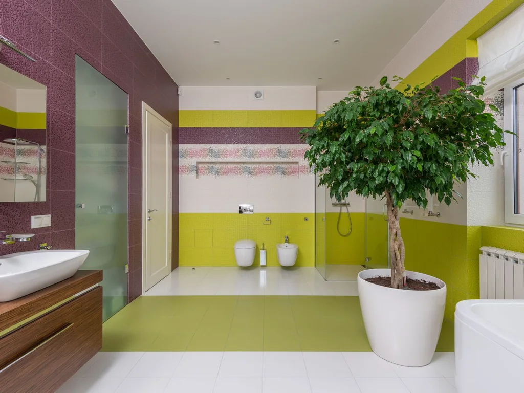
Bathrooms are naturally humid, which ferns, pothos and peace lilies love. One trailing plant on a high shelf or a small fern on the windowsill softens all the hard tile and porcelain, and the humidity does half the watering work for you. Just keep leaves off the shower spray.
48. Lighting at Face Height, Not Just Overhead

Overhead bathroom light casts shadows on the face, which is why sconces at mirror height flatter everyone and make morning routines easier. Add one pair of sconces beside the mirror and keep the ceiling light dimmable, and the bathroom works for both grooming and relaxing.
49. A Shower Niche Instead of a Caddy
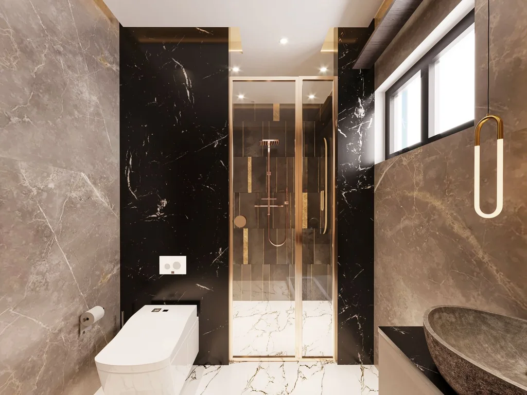
A recessed niche in the shower wall holds bottles neatly inside the tile line, replacing rusting caddies and crowded ledges. Plan the niche at chest height while tiling, tile its inside in an accent tile if you like, and the shower stays clean with almost no effort.
50. The Same Metal Finish on Every Fixture
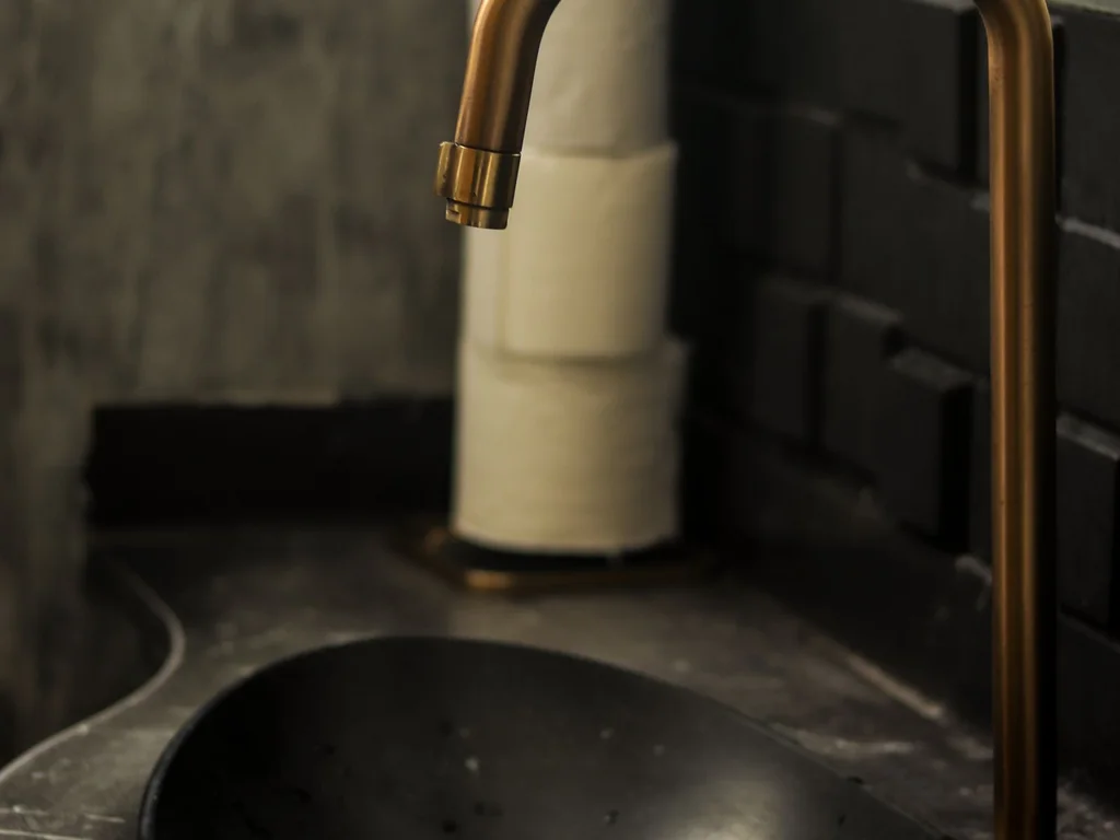
Matching taps, shower fittings, towel rails and cabinet handles in one metal finish — brass, chrome or matte black — is a quiet detail that makes a bathroom feel professionally designed. Mixed finishes are the detail most people cannot name but always notice.
6. Dining, Entry and Hallways
51. A Dining Table Sized for Daily Life, Not Just Guests
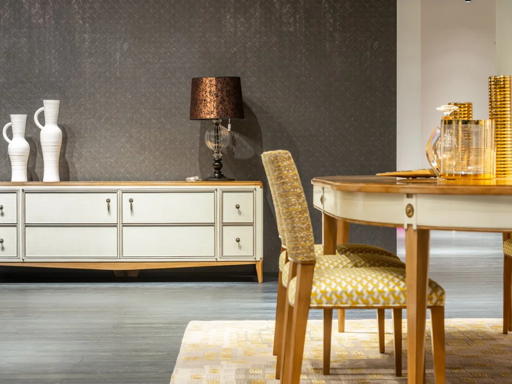
Choose a dining table for the meals you actually eat — weeknight dinners, homework, board games — and extend it only when guests arrive. A table that fits daily life gets used daily, while a huge formal table mostly gathers dust and blocks the room it was meant to serve.
52. A Pendant Light That Marks the Table’s Territory
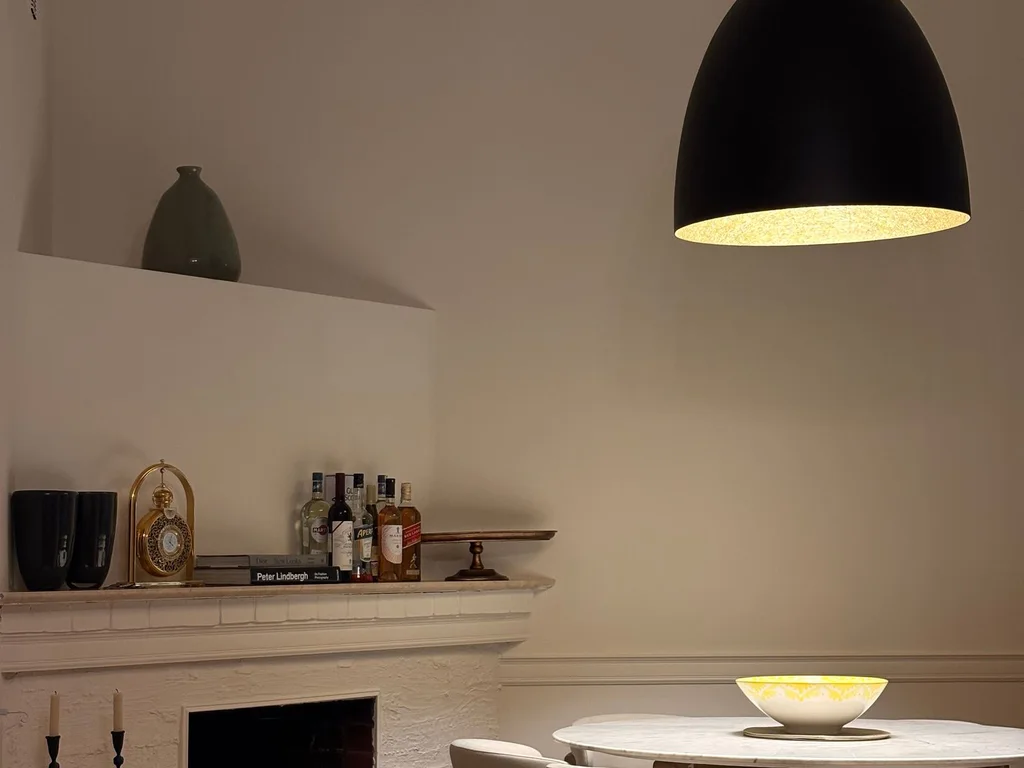
One pendant, or a row of them, hung low over the dining table marks the dining zone clearly and makes evening meals feel special. Hang it about 75 centimetres above the tabletop, dimmable if possible, and the dining area gains its own atmosphere without any walls.
53. A Bench on One Side for Flexible Seating
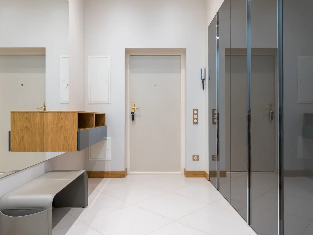
A bench along one side of the dining table seats children squeezed together, slides fully under the table when not needed, and makes the dining area feel relaxed rather than formal. It is also the easiest way to fit one more guest at a crowded table.
54. An Entry Console That Catches the Whole Day
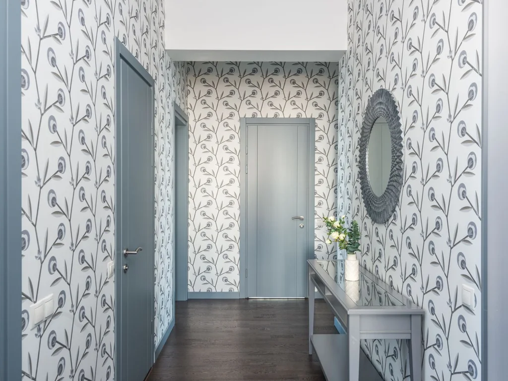
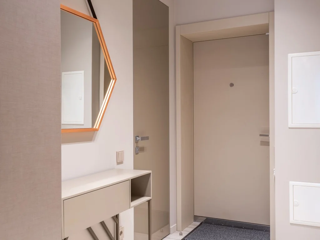
The entry needs a console with a bowl for keys, hooks for bags and a tray for mail — one landing spot for everything that enters the house. When the entry works, clutter never reaches the living room, and the whole house stays calmer from the front door inward.
55. A Mirror in the Entry for Last Looks
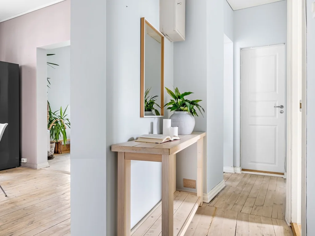
A mirror by the front door serves the practical last look before leaving and bounces light into what is often the darkest part of the house. Hang it at face height above the console, and the entry instantly feels brighter, larger and more welcoming.
56. Hallway Runners That Guide the Eye Forward
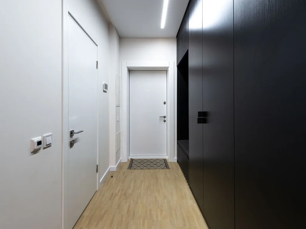
A long runner down a hallway pulls the eye toward the rooms beyond and makes a narrow passage feel like a designed gallery. Choose a washable, low-pile runner that covers most of the hall’s length, and the hallway stops being a corridor and starts being a room.
57. One Gallery Wall Along the Staircase
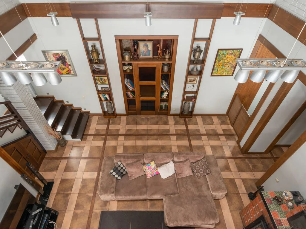
The staircase wall is the house’s natural gallery: it is seen from many angles and it rises through the home. Hang a planned gallery — consistent frames, even spacing, following the stair’s slope — and an overlooked wall becomes the family’s favourite display.
58. A Shoe Bench That Ends the Doorway Pile
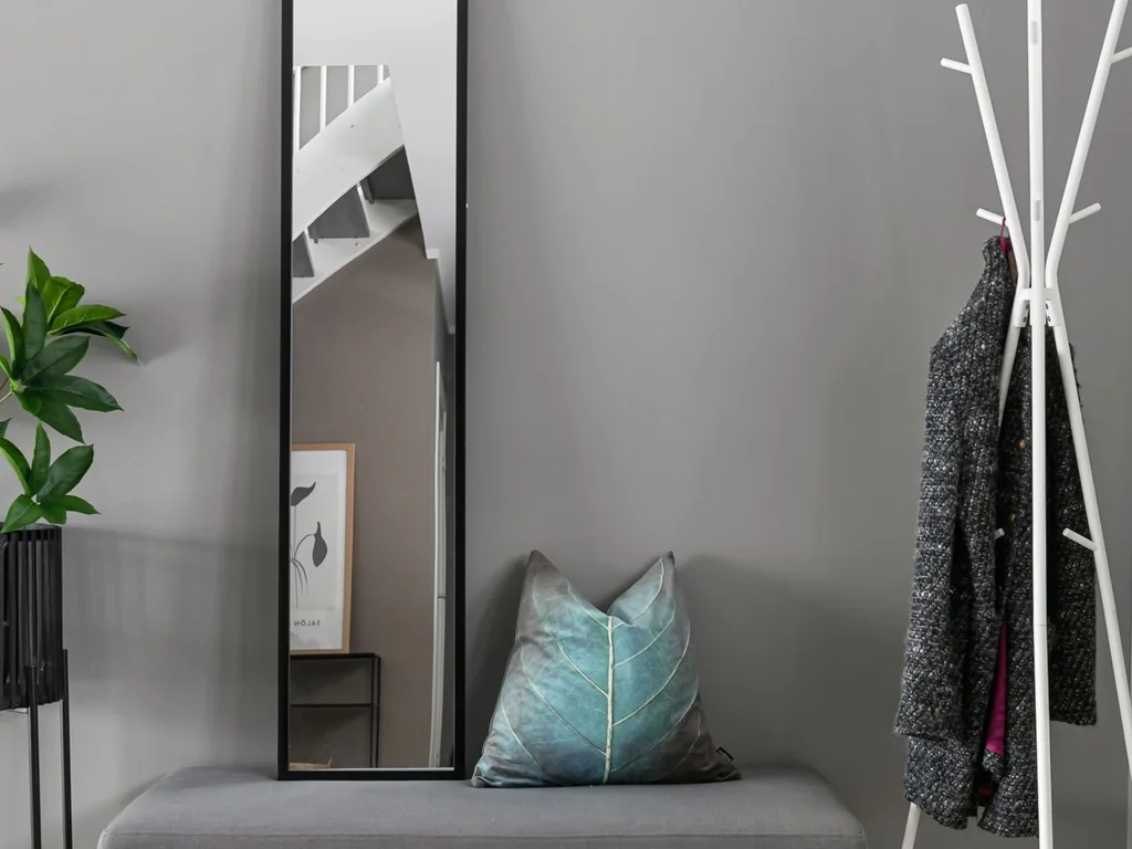
Shoes by the door are the first mess every visitor sees, so a bench with cubbies or baskets ends the pile in one move. Sit to remove shoes, slide them underneath, and the entry stays clear. The bench also gives children a place to manage their own shoes.
59. Dining Chairs That Mix, Not Match
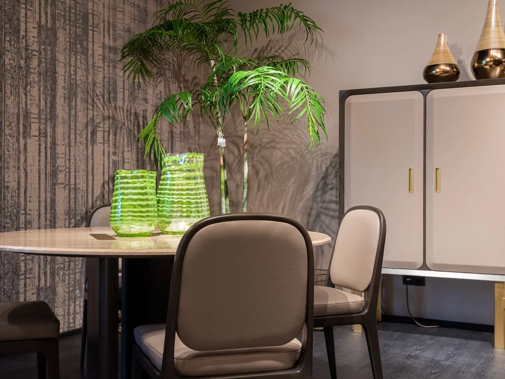
Mixing two chair styles around a dining table — for example, upholstered ends with wooden sides — looks collected and personal rather than bought as a set. Keep one element consistent, like the wood tone or seat height, so the mix reads intentional instead of accidental.
60. A Small Bar Cart for Dining Room Flexibility
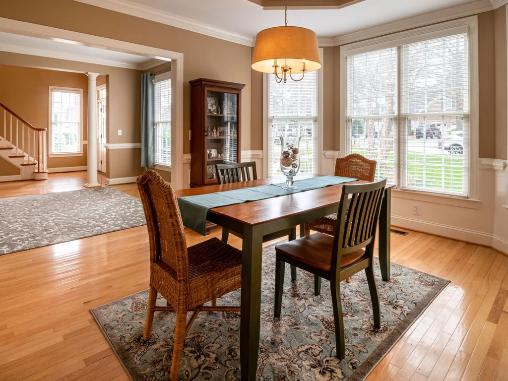
A bar cart beside the dining table serves drinks at dinner, dessert at a party and extra serving space at holidays, then rolls away when not needed. It adds a touch of occasion to ordinary meals and keeps the dining table itself free for food and conversation.
7. Home Office and Work Corners
61. A Desk That Faces the Room, Not the Wall
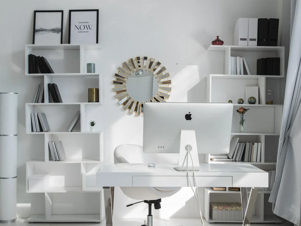
When space allows, place the desk facing into the room with a view, rather than pushed against a wall staring at plaster. The workday feels longer and lonelier facing a wall, while a room-facing desk keeps you connected to the house and makes video calls look far better.
62. One Closed Cabinet for Office Clutter
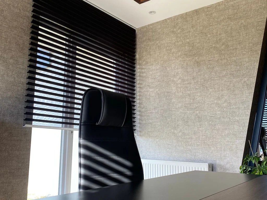
Home offices collect papers, cables and supplies that look messy the moment they are visible. One closed cabinet — doors shut, everything inside — lets you end the workday by closing the doors, and the room instantly becomes part of the house again instead of a visible office.
63. A Proper Chair Before a Pretty Desk
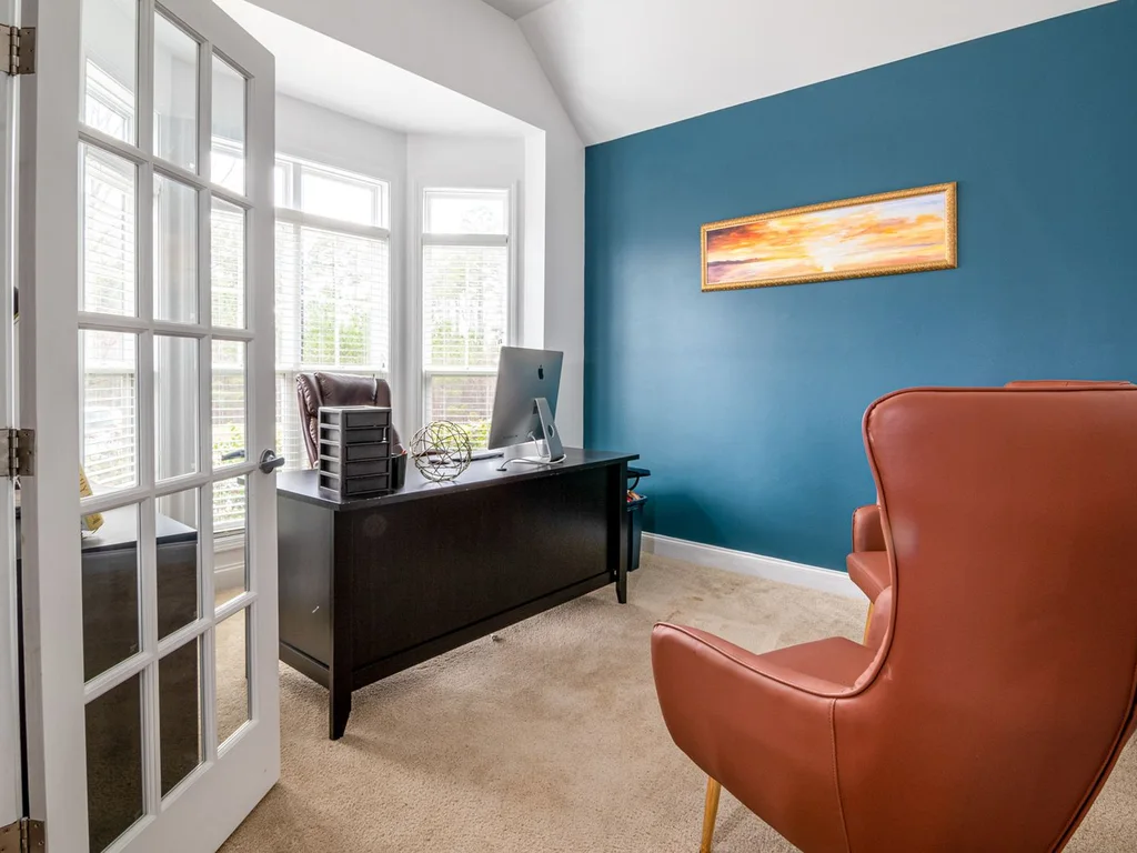
Spend the office budget on the chair first: your back will notice the difference within a week, while a beautiful desk only pleases the eye. Choose an adjustable chair with lumbar support, then pick a desk that simply fits the room and the work you do.
64. Task Lighting That Protects Your Eyes
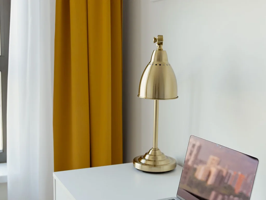
A single overhead light is not enough for desk work — it creates screen glare and tired eyes. Add an adjustable desk lamp that washes the work surface without shining into the screen, and keep the room’s general light soft. Your eyes will thank you by the end of every day.
65. A Work Corner Carved From a Spare Nook
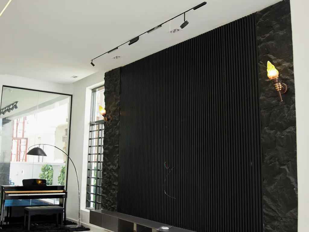
Not every home has a spare room for an office, but most have an unused nook: under the stairs, a wide landing, a bedroom alcove. A floating desk, one shelf and a chair turn that dead space into a real workstation, and closing a curtain or screen ends the workday cleanly.
66. Shelves Above the Desk for Reachable Reference
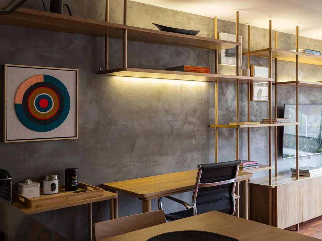
Two shelves above the desk hold the books, files and tools you reach for daily, keeping the desktop itself clear for actual work. Keep the shelves shallow and the items edited — a shelf that holds everything quickly holds nothing you can find.
67. A Plant on the Desk for Calmer Workdays
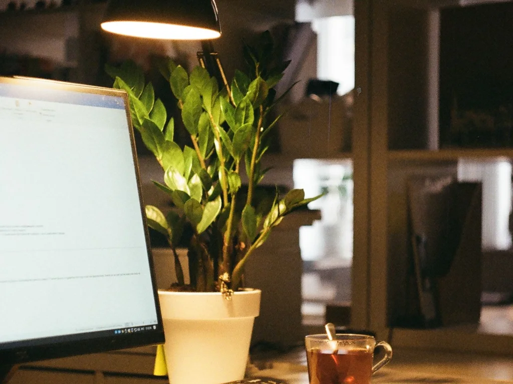
A small plant on the desk gives tired eyes somewhere green to rest and makes long work sessions feel less sterile. A pothos, a succulent or a small fern needs almost no attention and survives the occasional forgotten watering, which is exactly what a work plant should do.
68. Cable Management That Makes the Room Look Finished
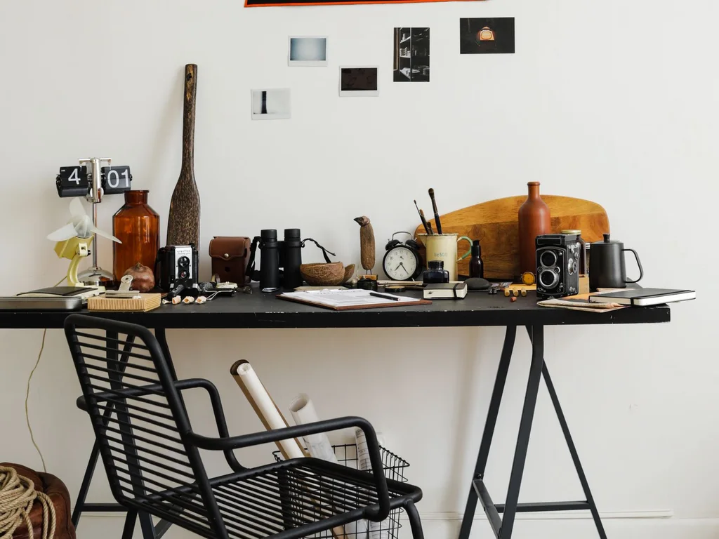
Tangled cables under a desk ruin even a beautiful office, so route them through a tray or trunking and label the power strip. The ten minutes it takes transforms the room’s appearance and makes cleaning, moving and unplugging things dramatically easier.
69. A Pinboard That Keeps Ideas Visible
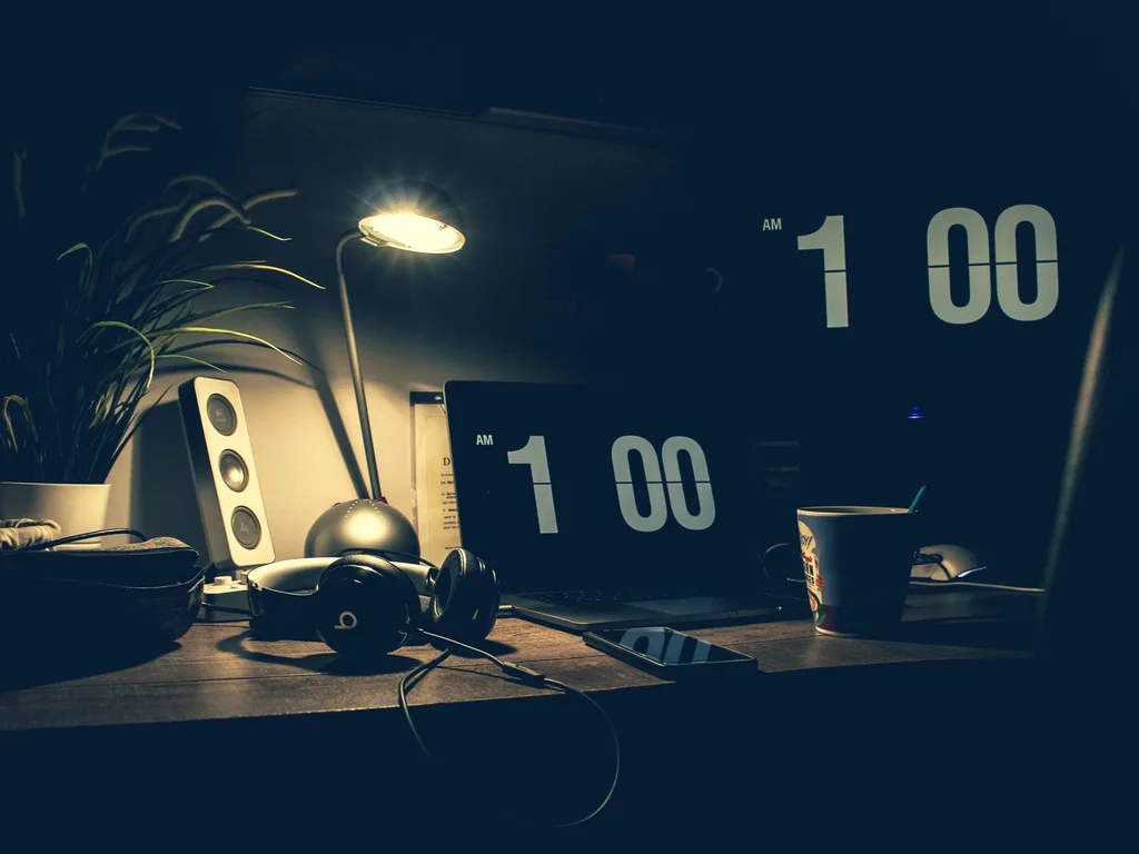
A pinboard or magnetic board above the desk keeps current projects, inspiration and reminders visible without covering the desk or the walls with paper. Swap its contents monthly as projects change, and it stays a working tool instead of becoming wallpaper.
70. A Door, Curtain or Screen That Ends the Workday
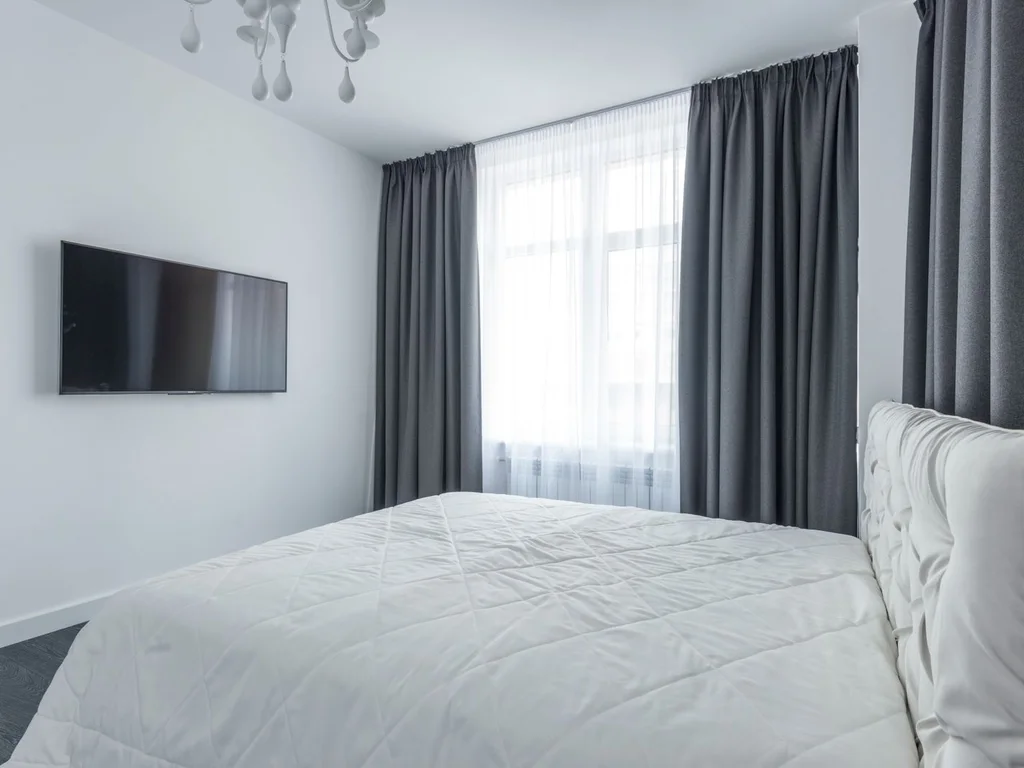
The most important home-office idea is a boundary: a door that closes, a curtain that draws or a screen that folds. A physical end to the workspace protects evenings and weekends, and it tells the rest of the household — and yourself — that work has finished for the day.
8. Laundry, Storage and Utility Spaces
71. A Folding Surface Above the Machines
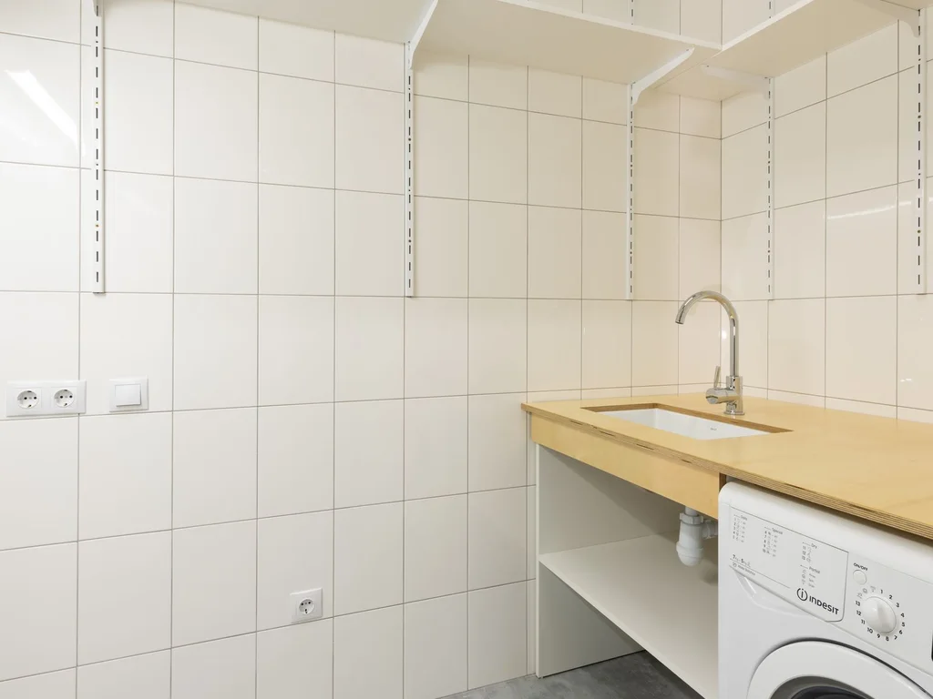
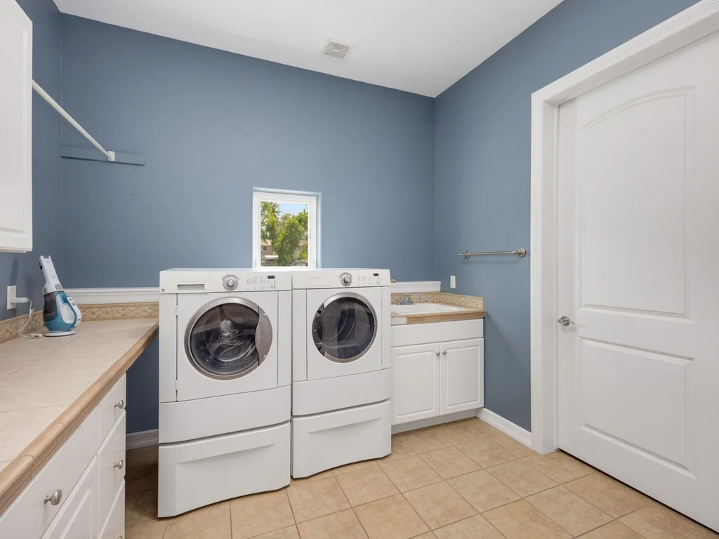
A countertop over the washer and dryer turns laundry from a floor-pile chore into a standing-height task, and it gives sorted clothes somewhere to go that is not the bed. Even a simple board across two machines works, and it makes the laundry room feel like a real room.
72. Open Shelves for Detergent and Daily Supplies
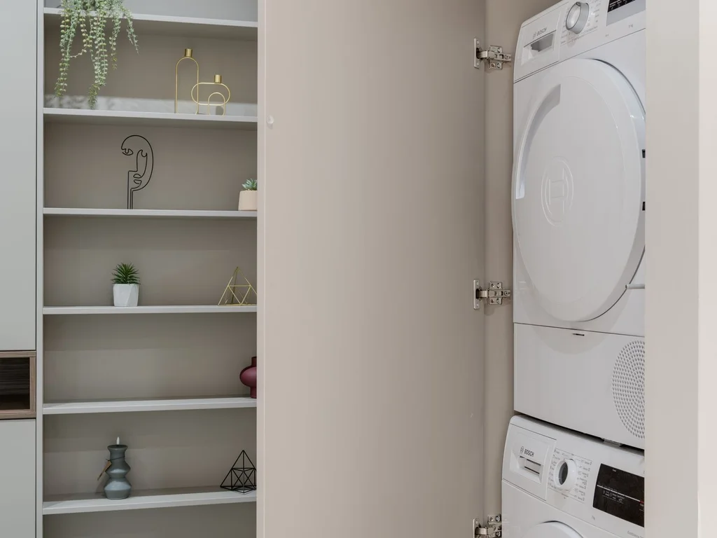
Detergent, stain remover and cleaning cloths belong on open shelves at eye level, where they are grabbed without hunting. Decant supplies into matching jars and bottles and the utility shelf looks as considered as any kitchen shelf, instead of a jumble of packaging.
73. A Drying Rail That Folds Away

A wall-mounted drying rail that folds flat when not in use saves floor space and keeps laundry off radiators and door frames. Hang it near a window or vent for faster drying, and the laundry room stays usable even on wash day.
74. One Basket Per Person to End the Sorting
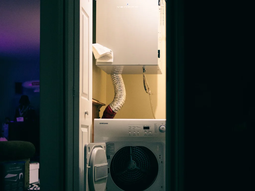
Labelled baskets — one per person, or one per load type — end the endless sorting pile, because clothes go straight into their basket from the hamper. The system only works if the baskets are visible and reachable, so place them where laundry actually happens.
75. A Utility Sink That Saves the Kitchen
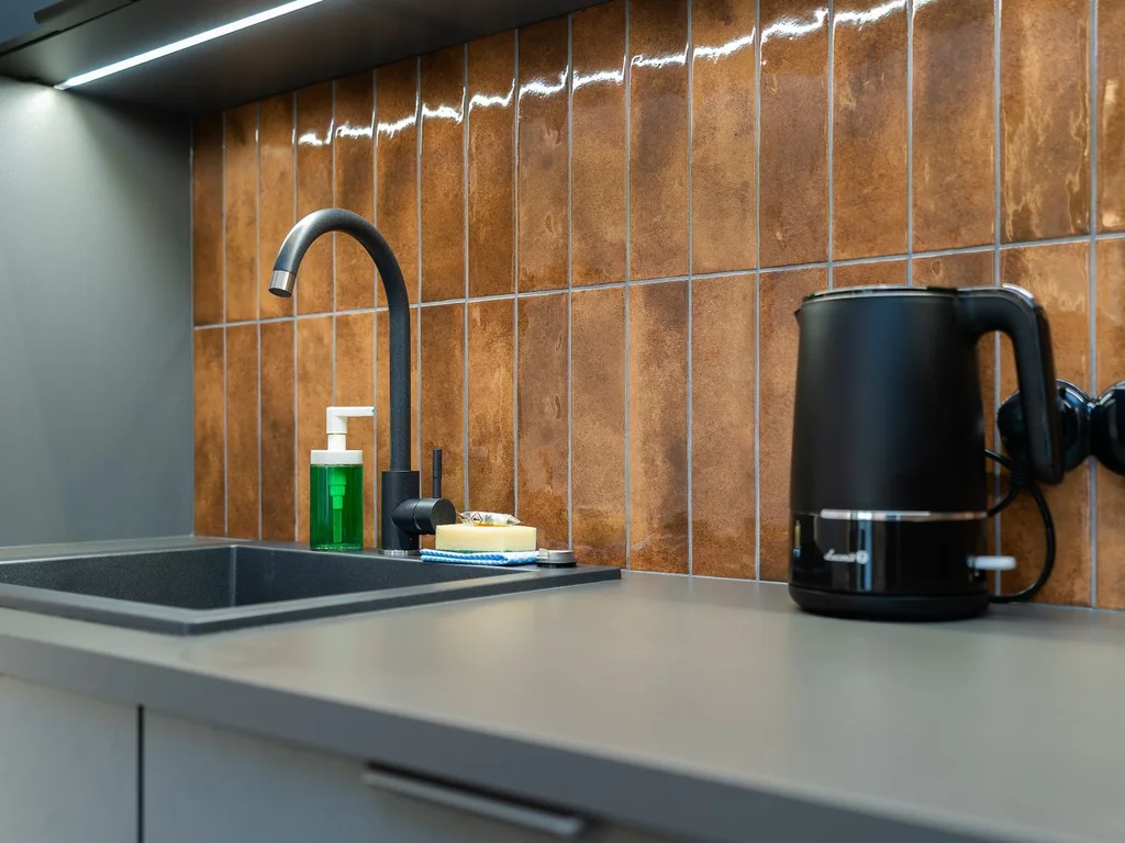
A deep utility sink in the laundry room handles muddy shoes, paintbrushes, pet washing and hand-washing delicates, keeping all of it out of the kitchen sink. It is one of the most practical upgrades a house can have, and it protects the rooms you actually show guests.
76. Under-Stair Storage With Pull-Out Drawers
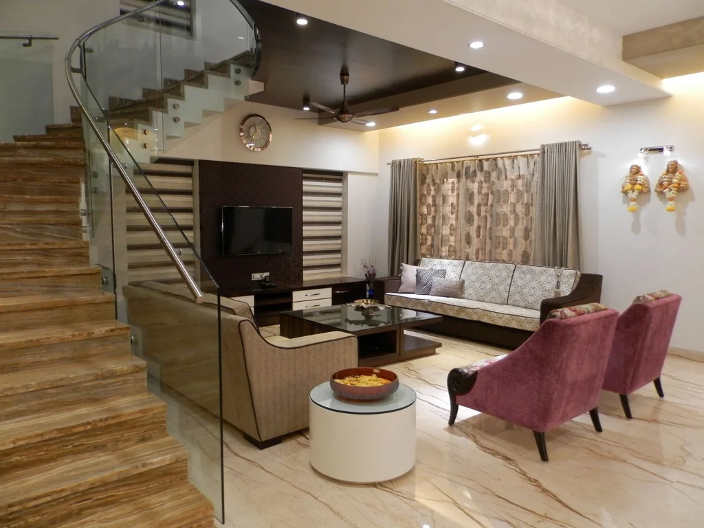
The space under the stairs is usually wasted on a dark cupboard nobody reaches into. Fit pull-out drawers or rolling bins and it becomes genuinely useful storage for shoes, tools, luggage and seasonal items — the things that otherwise colonise every other room.
77. A Linen Cupboard Sorted by Room
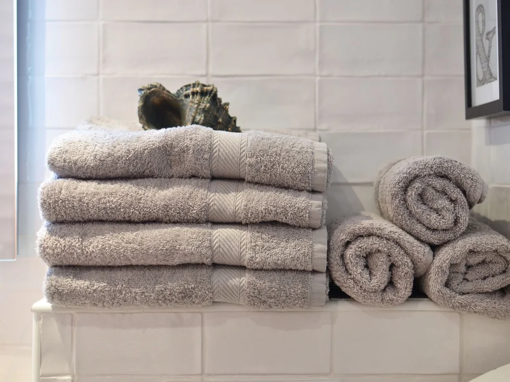
Sort the linen cupboard by room — one shelf per bedroom, one for bathrooms — and label the shelves, so making a bed or changing towels takes minutes instead of a hunt. Fold sheet sets inside their own pillowcase and the whole cupboard stays neat by itself.
78. Hooks Inside Cupboard Doors for Small Tools
The inside of a cupboard door is free storage: hooks there hold measuring tapes, scissors, lint rollers and pet brushes exactly where they are needed. Small tools stop disappearing into drawers, and the cupboard itself stays tidy because its extras live on the door.
79. Seasonal Rotation Boxes, Labelled and Dated
One labelled box per season, stored high and dated, holds the decorations, heavy blankets and summer gear that only appear for part of the year. Rotation day becomes a quick swap instead of a weekend of digging, and the house never carries a full year of stuff at once.
80. A Charging Drawer That Hides the Cables
A drawer fitted with a power strip becomes the house’s single charging station, hiding phones, tablets and their cables behind a closed front. Counters stay clear, chargers stop vanishing, and the utility corner earns its keep without looking like a tech shop.
9. Light, Texture and Materials Across the House
81. Warm Light Everywhere, Cool Light Nowhere
Keep every bulb in the house at the same warm temperature — around 2700K — and the rooms stop clashing when doors open. Mixed warm and cool light is one of the most common reasons a house feels disjointed, and fixing it costs only a box of bulbs and an afternoon.
82. Dimmers in Every Room That Matters
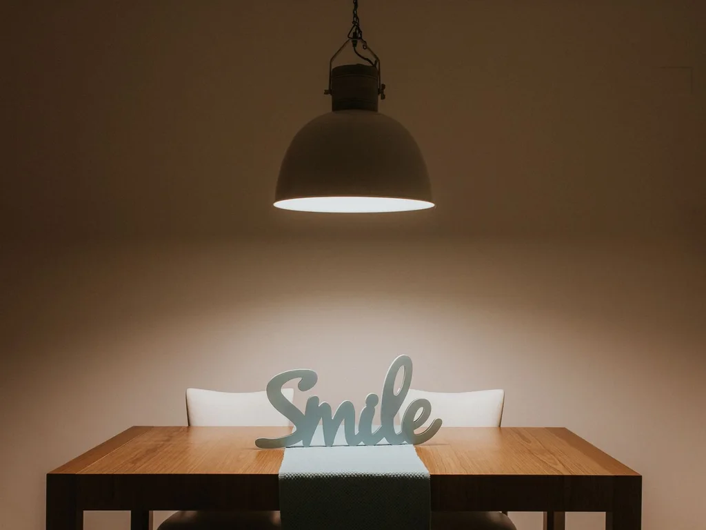
Dimmers let one room serve many moods: bright for cleaning and homework, low for dinner and evenings. Fit them in living rooms, bedrooms and dining areas first, and the house gains an evening atmosphere that no new furniture can provide.
83. One Natural Material Repeated in Every Room
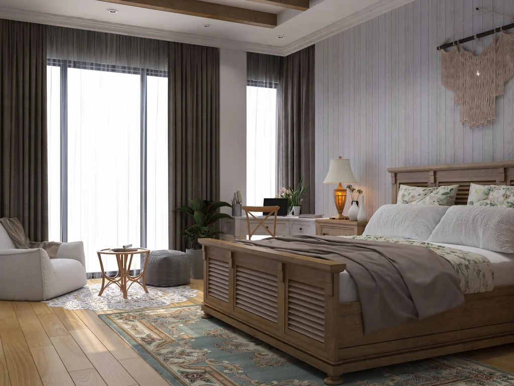
Pick one natural material — oak, rattan, linen, stone — and let it appear in every room in small doses: a tray, a basket, a frame, a throw. The repeated texture gives the house a tactile thread that ties rooms together even when their colours and styles differ.
84. Sheer Curtains That Soften Every Window
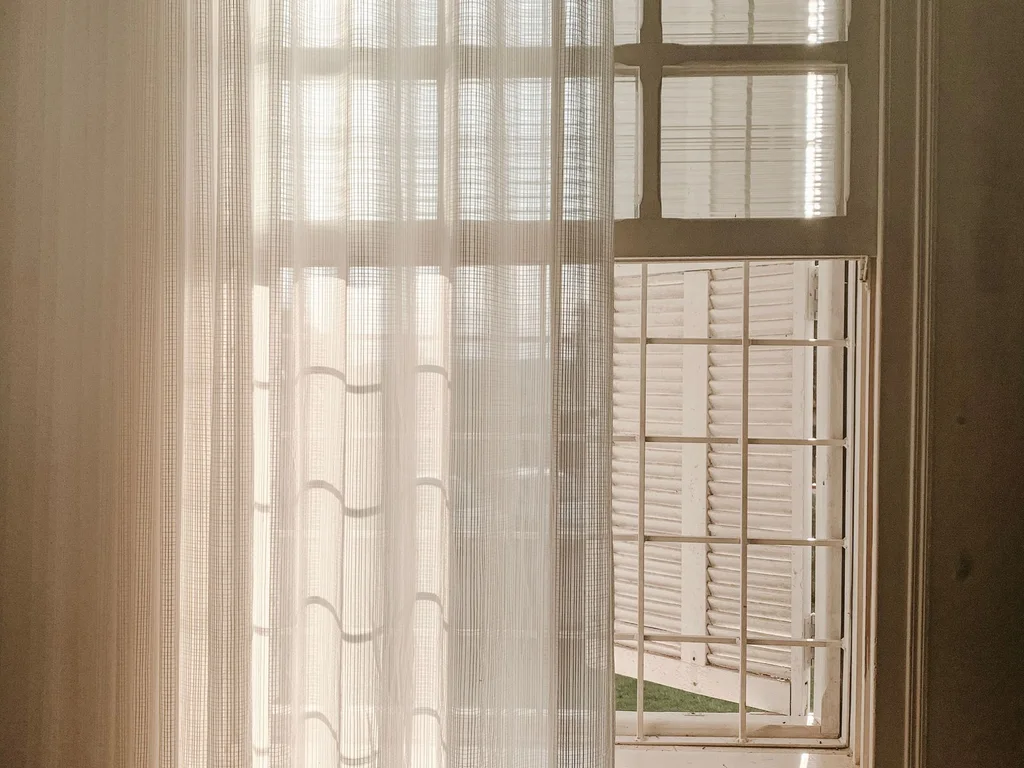
Sheer curtains on every window soften daylight, add privacy without darkness and give the whole house a consistent, gentle light. They are inexpensive, easy to wash and they make even plain windows look dressed, which lifts every room they touch.
85. Rugs That Define Zones Without Walls
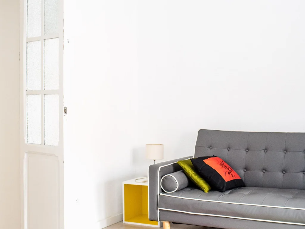
In open-plan homes, rugs are the walls: one under the seating group, one under the dining table, one in the entry. Each rug marks its zone clearly while the floor flows beneath, so the house feels both open and organised at the same time.
86. Mirrors Placed to Borrow Views and Light
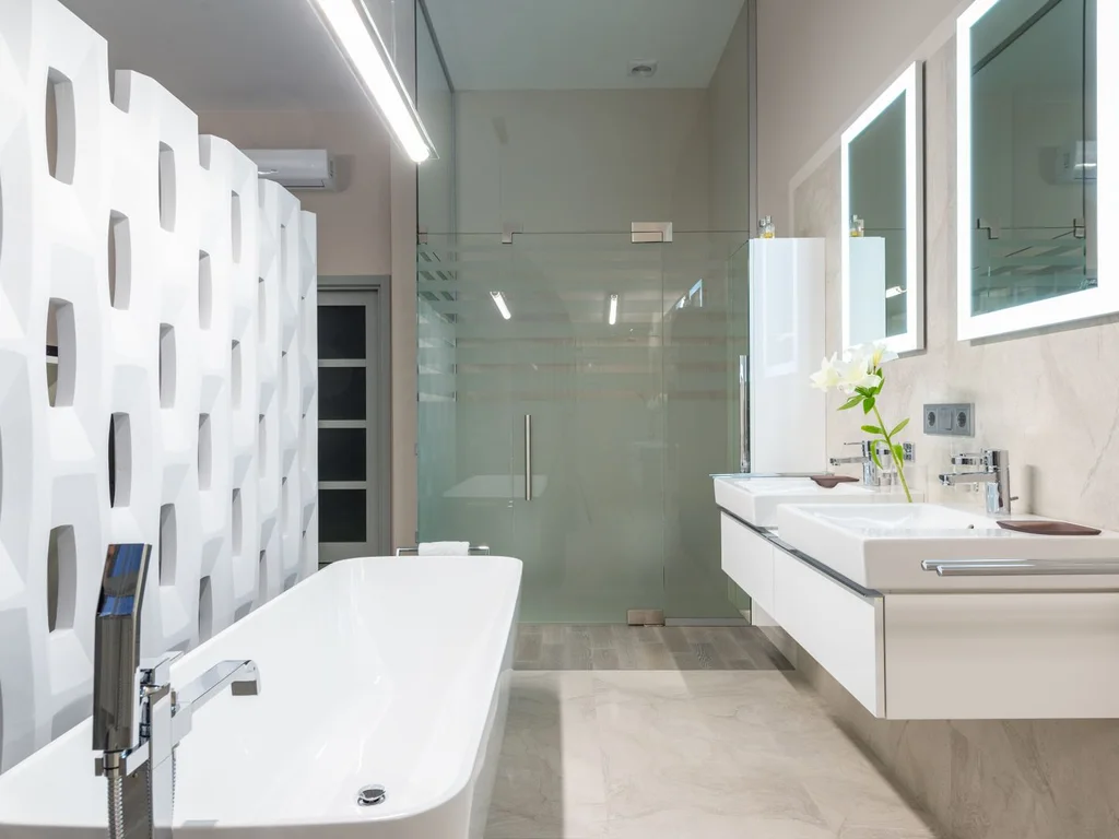
Hang mirrors where they reflect a window, a garden view or a beautiful room, never where they reflect clutter or a blank wall. A well-placed mirror doubles light and view for free, and a house full of them feels brighter without a single new lamp.
87. Layered Textures Instead of More Colour
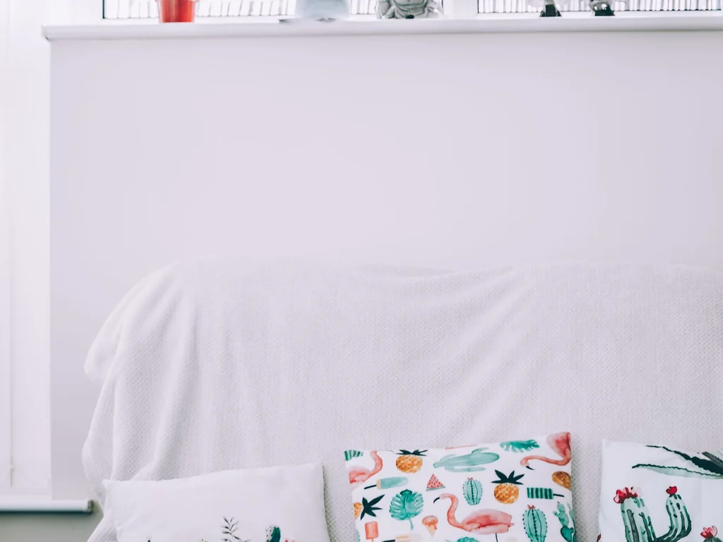
When a room feels flat, add texture before colour: a nubby throw, a woven basket, a linen cushion, a wooden tray. Texture gives the eye something to explore without changing the palette, and a house layered with texture feels rich even in quiet neutrals.
88. The Same Curtain Fabric in Adjoining Rooms
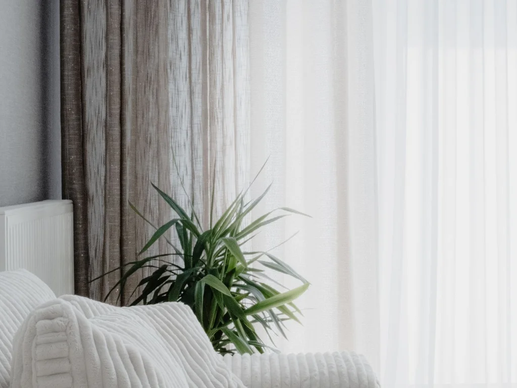
Using the same curtain fabric — or at least the same colour family — in rooms that open into each other makes the spaces read as one larger room. The eye travels through the doorway without a visual jolt, and the house gains a sense of calm continuity.
89. Scent as the House’s Invisible Design
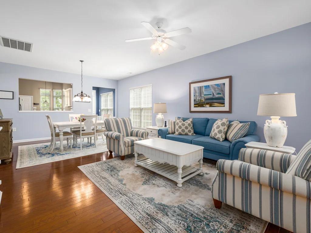
A consistent house scent — one candle family, one diffuser oil, fresh herbs in the kitchen — is design you cannot see but always notice. Keep the scent the same in hallways and shared rooms, and the house feels coherent the moment someone walks in.
90. One Metal Finish Carried Through the House
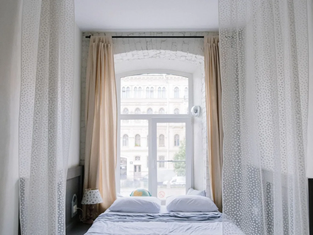
Just as bathrooms benefit from one metal finish, so does the whole house: brass door handles, brass lamps and brass frames, or matte black throughout. The repeated finish is a quiet signature that makes the house feel designed rather than accumulated.
10. Styles That Tie the House Together
91. Modern Farmhouse Warmth Without the Clichés
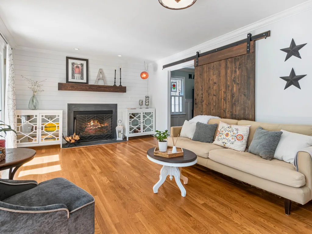
Modern farmhouse works when it keeps the warmth — wood, linen, honest materials — and skips the word signs and themed props. Let the style come from texture and simplicity, and it will age gracefully instead of dating the whole house within a few years.
92. Scandinavian Calm for Small Houses
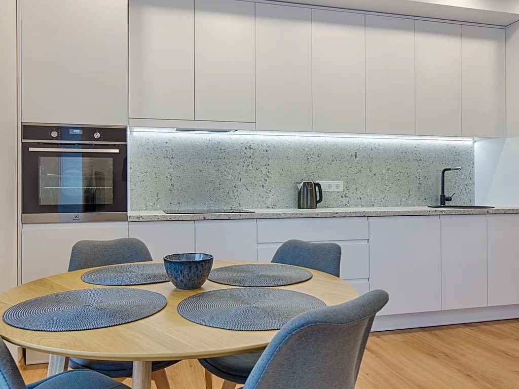
Scandinavian style suits small homes because it is built on light walls, pale wood, functional furniture and very little clutter. Keep surfaces clear, let daylight do the decorating, and add warmth with wool, wood and candles rather than with more objects.
93. Mid-Century Pieces as the House’s Backbone
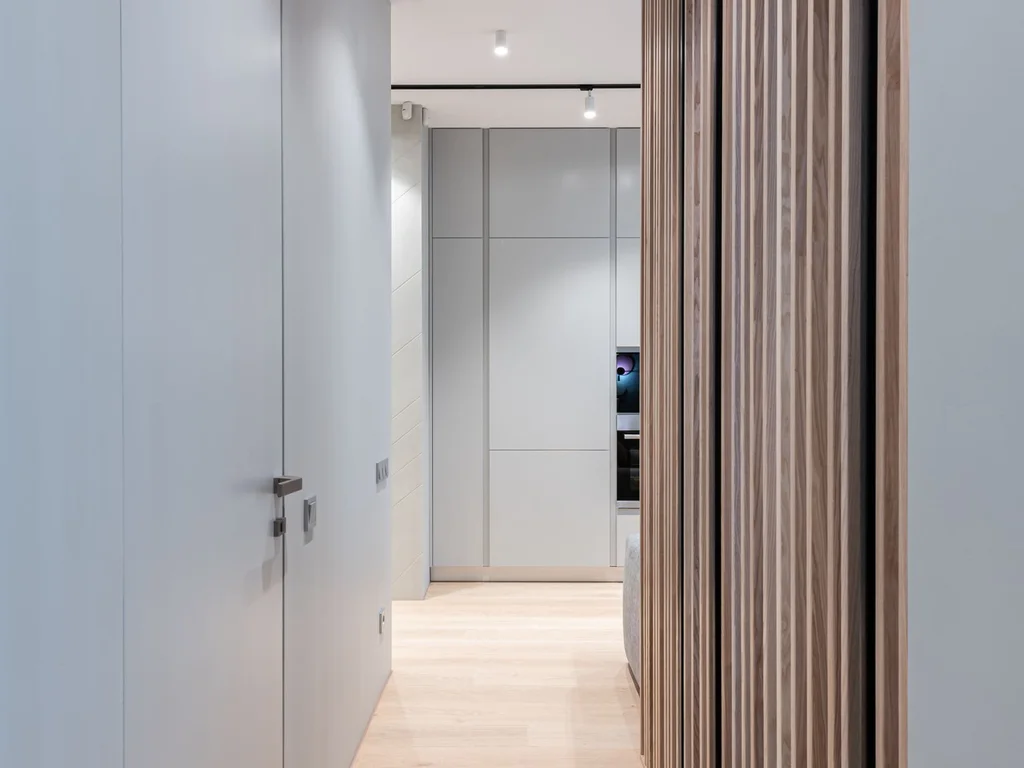
A few genuine mid-century shapes — a low sideboard, a teak chair, a simple pendant — give a house a timeless backbone that other pieces can gather around. Their clean lines and warm wood suit almost any room, which is why they anchor whole houses so well.
94. Coastal Ease That Works Inland Too
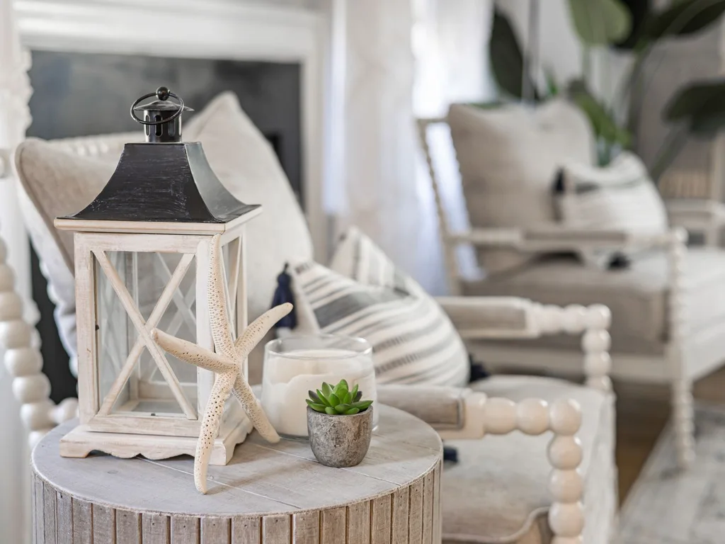
Coastal style is really about light and air: white walls, natural fibres, pale wood and breathing space. You do not need a sea view to use it — strip the nautical props, keep the palette and the lightness, and any house feels fresher and calmer.
95. Classic Details That Never Date
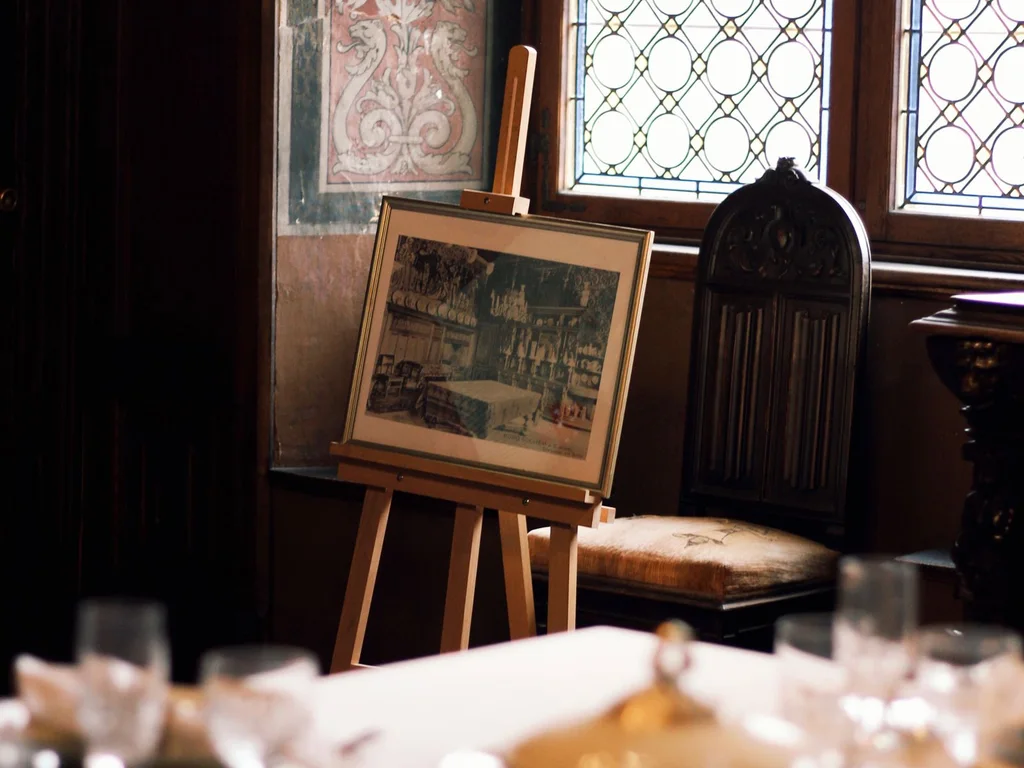
Panelled walls, crown moulding, a marble-topped console and symmetry are classic details that have survived a century of trends. Use them sparingly — one panelled wall, one symmetrical arrangement — and the house gains permanence without feeling like a museum.
96. Bohemian Layers With an Edited Hand
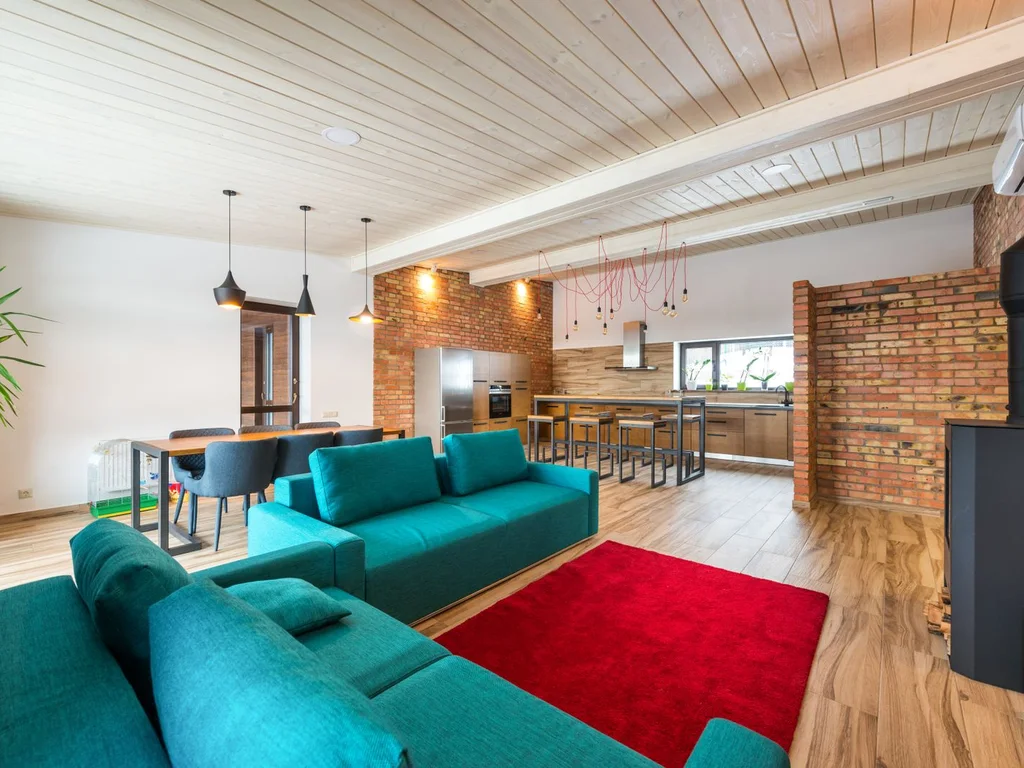
Bohemian style loves layers — rugs on rugs, plants everywhere, textiles from everywhere — but it still needs editing. Keep one colour family dominant and leave some surfaces empty, and the house feels collected and soulful rather than chaotic and dusty.
97. Industrial Touches in Soft Rooms
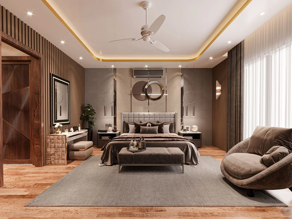
A black metal frame, an exposed bulb or a concrete-look pot adds industrial edge to an otherwise soft room, and the contrast makes both styles stronger. One or two industrial pieces per room is enough; a whole house of them feels like a warehouse.
98. Minimalism That Still Feels Like Home
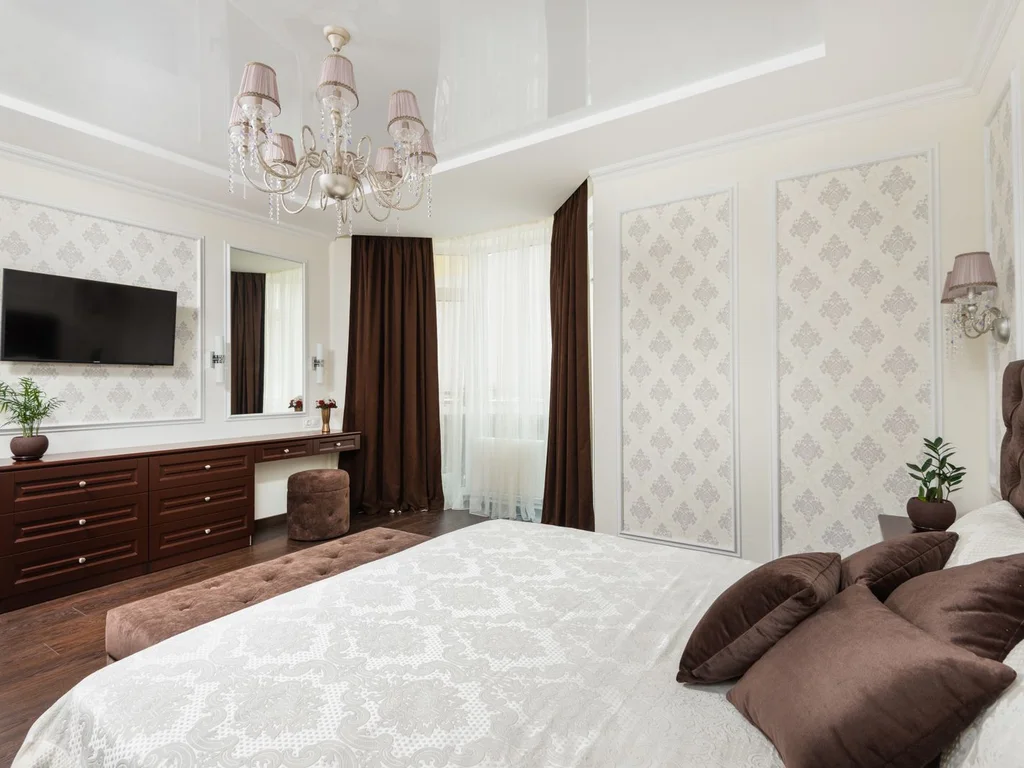
Real minimalism is not empty rooms — it is rooms where everything present is chosen and loved. Keep only what you use or love, give each object space, and warm the result with wood, wool and plants, so the house feels serene rather than stark.
99. One Statement Piece Per Room, No More
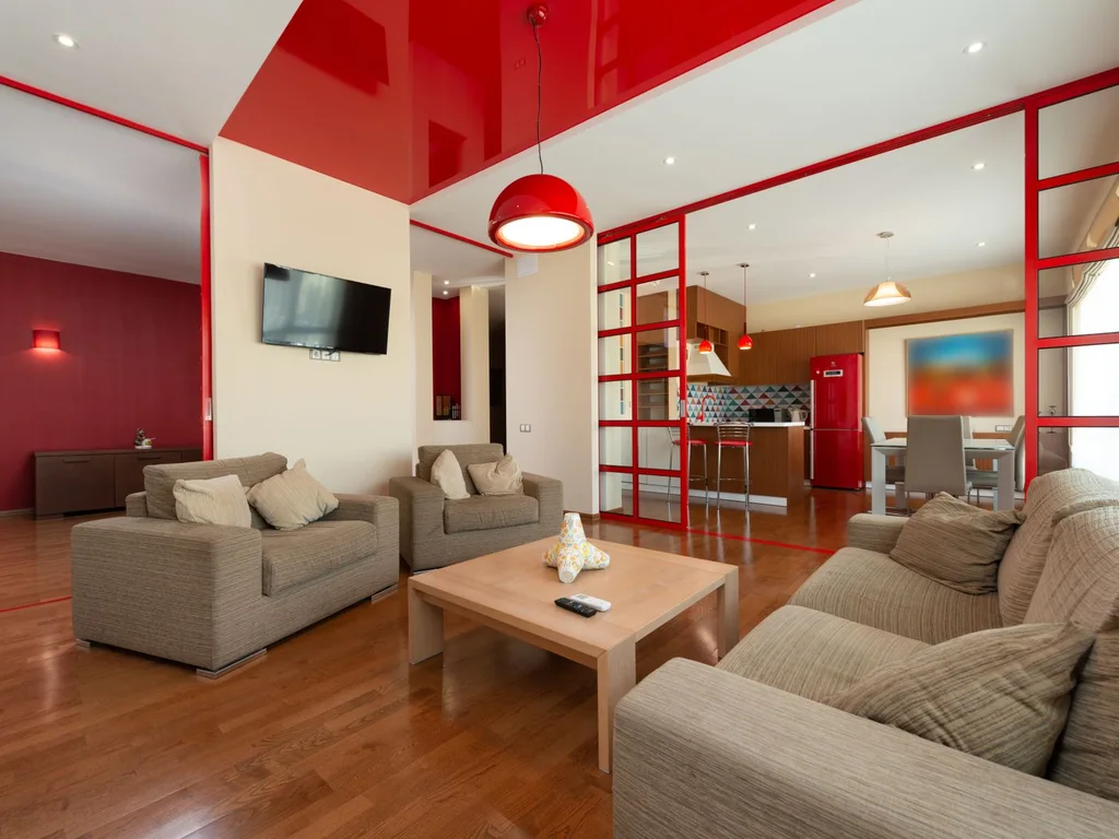
Give every room exactly one star — a bold sofa, a dramatic light, a large artwork — and let everything else support it. When every object shouts, nothing is heard; when one piece leads, the whole house feels curated and calm.
100. A House Style Document You Actually Keep
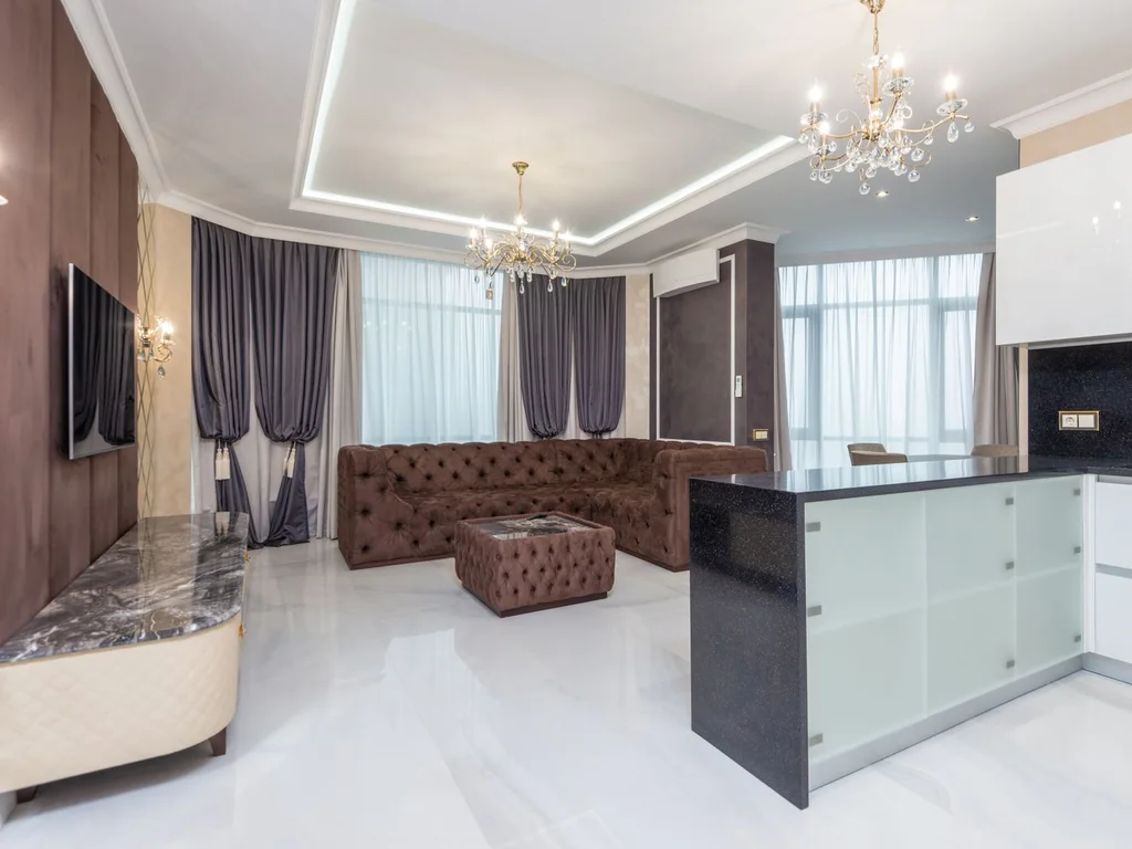
Write down your house’s palette, wood tones, metal finishes and favourite materials in one note, and check it before every purchase. The document stops impulse buys that clash, keeps gifts and replacements on track, and turns a collection of rooms into one coherent home over time.
Common House Design Mistakes to Avoid
The biggest whole-house mistake is designing each room in isolation, buying for one space without checking the rooms beside it. The second is following every trend at once, which dates a house fast. The third is ignoring light: paint and furniture chosen in a shop look different at home, so always test samples in the actual room, at different times of day, before committing.
Another common trap is filling every wall and surface, leaving the eye nowhere to rest. Empty space is part of design, not a failure of it. Finally, do not forget the rooms nobody photographs — hallways, laundry rooms and entries set the tone for everything else, and a house that treats them well feels finished in a way a perfect living room alone never can.
Frequently Asked Questions
How do I make all the rooms in my house feel connected?
Repeat a small set of elements everywhere: one neutral base colour, one accent colour, one wood tone and one metal finish. When the eye meets the same few threads in every room, the house reads as one home even if each room has its own personality.
Should every room in a house have the same style?
No — every room can have its own mood, but they should share a family resemblance through colour, materials or finish. A moody bedroom and a bright kitchen can absolutely live together if they share a wood tone, a metal finish or an accent colour.
What is the easiest way to refresh a whole house cheaply?
Start with light and paint: switch all bulbs to one warm temperature, paint the hallways a colour that connects the rooms, and add one large rug per main room. Those three changes transform how a house feels for far less than new furniture.
How do I design a house with an open-plan layout?
Use rugs, lighting and furniture placement to define zones instead of walls. A rug marks the living zone, pendants mark the dining zone, and a console or island marks the kitchen boundary, while the same flooring and palette keep the space feeling open.
Which rooms should I design first?
Start with the rooms you spend the most waking hours in — usually the living room and kitchen — then let their palette and materials spread into the bedrooms, bathrooms and hallways. Designing the busiest rooms first gives the rest of the house its direction.
How do I keep a house looking designed but still lived-in?
Leave some surfaces deliberately empty, keep everyday objects in closed storage, and let a few personal things — books, plants, travel pieces — stay visible. A house that shows its life, tidily, feels warm; a house that hides everything feels like a display.
Can I mix styles in one house?
Yes, if one element stays constant — for example, the same wood tone or the same neutral walls across rooms. Mixing a mid-century chair into a farmhouse room works when the materials speak to each other; mixing everything with nothing in common just looks random.
In what order should I decorate the rooms of a house?
Start with the rooms you live in most — usually the living room and main bedroom — after fixing the whole-house skeleton of base colour, wood tone and trim. Kitchens and bathrooms follow (they are the most expensive to change), then secondary bedrooms, and finally hallways and entries, which are quick to finish once the rooms they connect are decided.
Conclusion
A well-designed house is not a collection of perfect rooms — it is a set of rooms that agree with each other. Carry one palette, one wood tone and one metal finish through the home, give each room a single star, and let light and texture do the quiet work. Start with the hallway, the living room or the kitchen, and let the rest of the house follow. For more room-by-room inspiration, explore our interior design ideas collection.