A small kitchen has two problems that share one solution. It must WORK — three stations, tight distances, room to move — and it must LOOK bigger than it is, because a cramped-feeling kitchen is a kitchen nobody wants to cook in. Layout is where both are decided: the shape you choose (one-wall, galley, L, U) sets the working geometry, and the same choices — where the visual weight sits, how far the eye can travel, how few breaks interrupt a run — set the perceived size. Get the geometry right and the room cooks well; get the visual layer right and the same square footage feels a size up.
Ten layout ideas: the numbers first (triangle, aisles), then the shapes, then the sight-line rules that make any of them feel bigger.
The Layout Numbers at a Glance
| Decision | Working number | Notes |
|---|---|---|
| Work triangle legs | 4–9 ft each, ≤26 ft total | NKBA guideline; sink is the hub |
| Work aisle | 42 in (one cook), 48 in (two) | Plain walkway can be 36 in |
| Prep run | 36–48 in continuous, beside the sink | The last inches you ever give up |
| Layout shape | Galley / L / U / one-wall | Chosen by footprint, not fashion |
| Visual rule | Fewer breaks, weight low | The eye should travel unstopped |
1. Layout Is Two Jobs: Working Geometry and Perceived Size
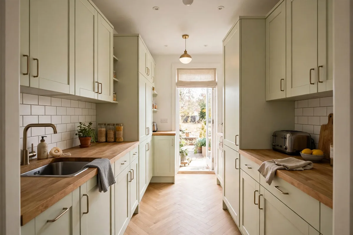
Think of a small kitchen plan as two drawings on one sheet. The first is geometry: distances between sink, stove and fridge, aisle widths, landing space. The second is perception: where the eye enters, what stops it, how far it can travel before a dark mass or a broken line ends the trip. SB Remodeling’s small-kitchen guide compresses the second drawing into three principles — light wins, fewer breaks in the line, hidden function — and they are really layout principles: each is decided by where things are placed, not by what you buy.
This article is the layout layer of the wider plan in our best small kitchen design guide. Read together: that guide chooses the kitchen; this one arranges it — and arranges what the eye does inside it.
2. The Work Triangle, Sized for Small
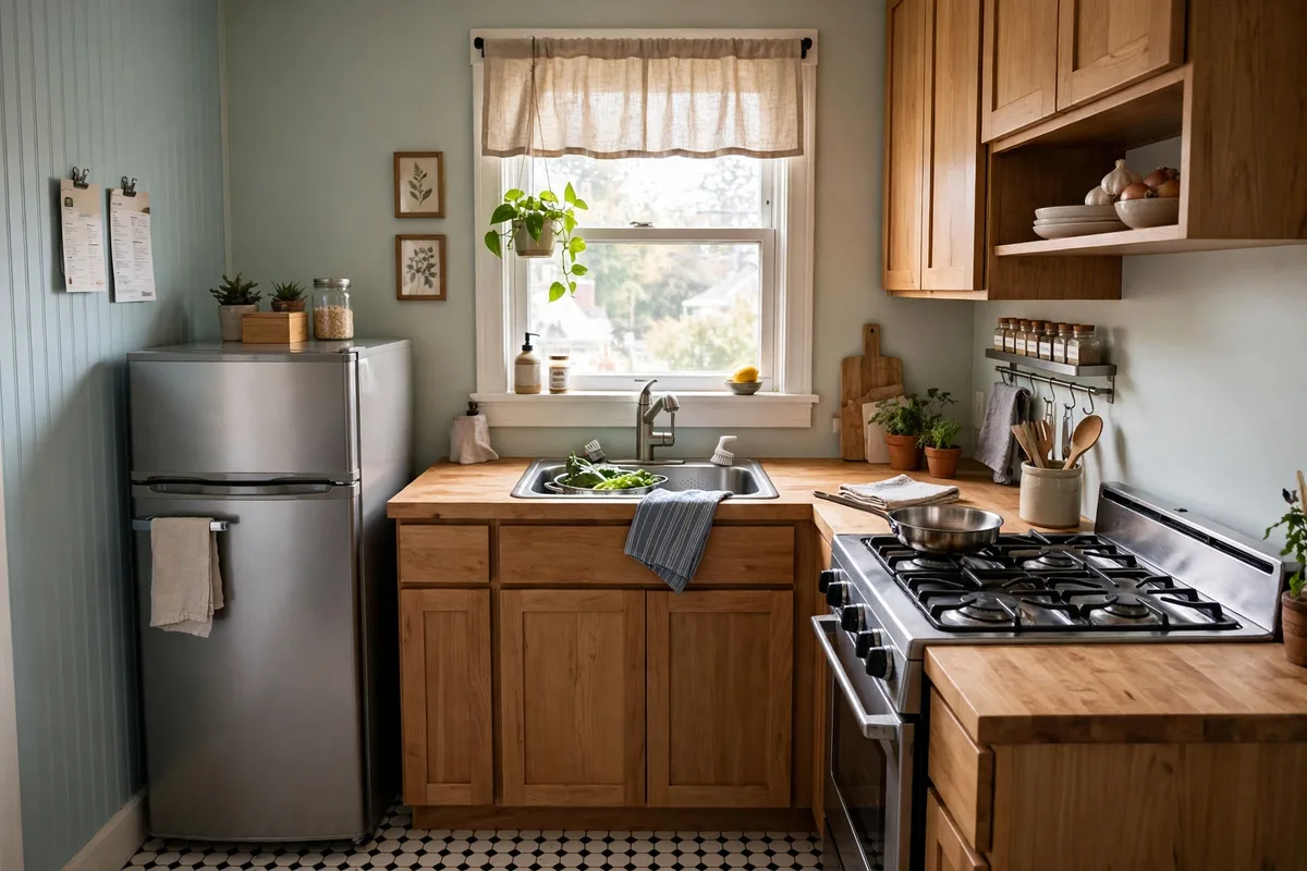
The classic planning check still earns its keep: the three legs between sink, cooktop and refrigerator should each run 4–9 feet, with the total at or under 26 feet — the NKBA guideline set out in Learn Architecture’s work triangle guide. Under 4 feet, stations crowd each other with no landing room; over 9, every meal costs steps. Small kitchens pass the total easily — their risk is the other direction: stations so tight that the fridge door, the oven door and the cook all want the same square of floor.
Two small-kitchen corollaries: no leg should be cut by an island or peninsula by more than about 12 inches, and no traffic route to another room should cross the triangle. In a compact plan the sink is the hub — it gets the biggest landing areas (24 inches one side, 18 the other is the planning standard) because everything passes through it twice.
3. Aisle Honesty: 42 Inches Is the Feeling of Space
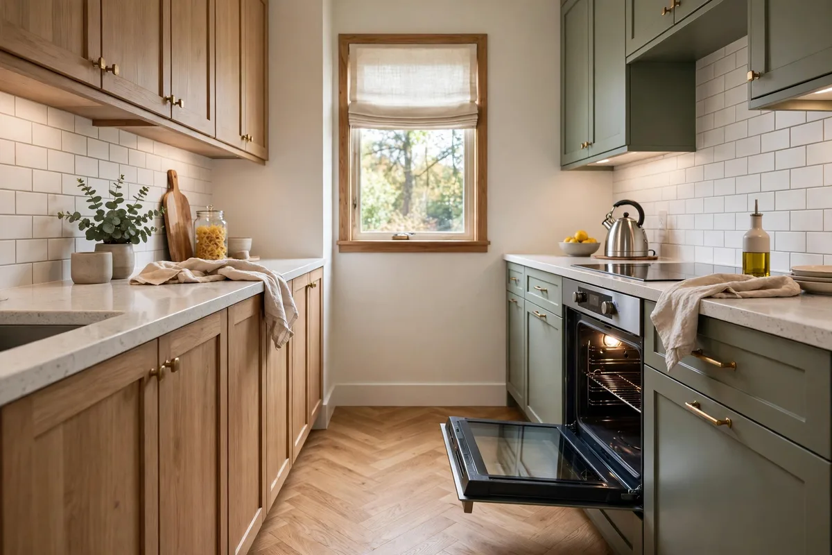
Nothing makes a small kitchen feel smaller than a too-narrow aisle — it is perceived size measured in shoulder room. The planning numbers (same NKBA source): a work aisle of 42 inches for one cook, 48 where two cooks pass; a walkway that is not a work aisle can drop to 36. Below 36 between counters, appliance doors start seizing the whole passage, and the kitchen becomes a one-person corridor whether you planned it that way or not.
If the footprint will not yield 42, steal from depth before width: shallower base cabinets on one run, a slimmer fridge, a single rather than double sink (which alone can return up to 12 inches of counter). Floor space reads as room size more honestly than storage volume does — in a small kitchen, the aisle IS the room.
4. The Galley and One-Wall: Corridor Discipline
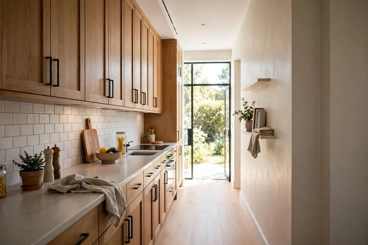
The galley — two parallel runs, or one wall in a studio — is the natural small footprint, and its efficiency is real: everything within a few steps, the triangle folding into a tight line or shallow U. Its discipline is flow: arrange fridge → sink → prep → cooktop in one direction so the cook never crosses their own path, and keep the main work zone out of any through-route to other rooms, or the corridor becomes a hallway with appliances.
Visually, the galley lives or dies by its end wall. A bright end — window, light colour, the run continuing visually — stretches the corridor; a dark tall unit parked at the end stops the eye like a wall. Keep tall storage at the entry end, work surfaces toward the light, and the sight line runs the full length of the room.
5. The L-Shape: The Open Corner Buys Air
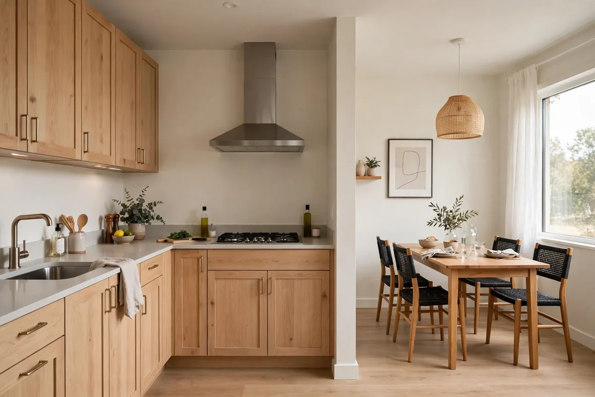
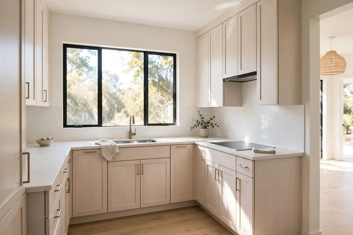
Two adjoining walls of cabinets, two walls open: the L is the most forgiving small layout because its open corner borrows space from whatever it touches — dining area, living room, garden door. The triangle sits naturally (sink on one leg, range on the other), traffic flows around rather than through the work zone, and the cook faces into the home instead of at a wall.
The L’s one liability is its corner cabinet — the deep blind square where things go to be forgotten. Pull-outs or a lazy Susan fix the function; visually, keep the corner’s counter clear rather than letting it become the appliance graveyard, because a cluttered corner sits exactly where the two sight lines of the L cross.
6. The U-Shape: Most Counter, Watch the Enclosure
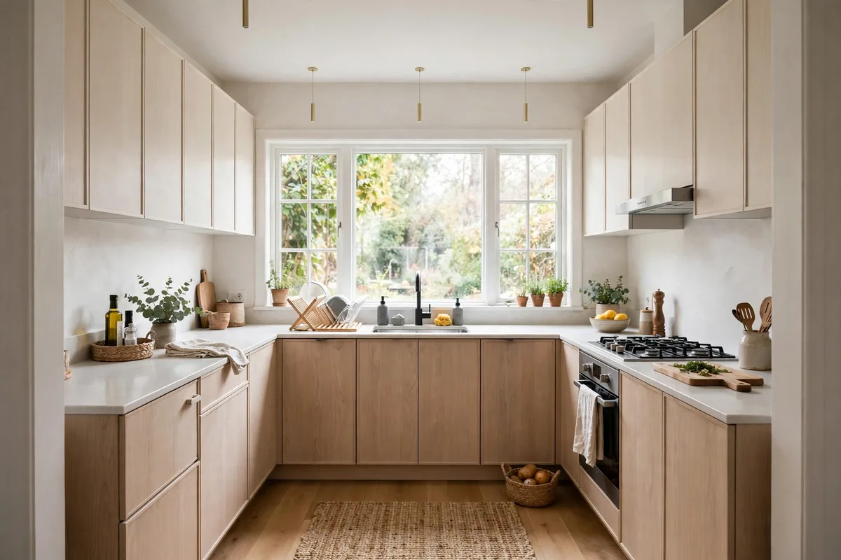
Three walls of cabinets give the small kitchen its maximum counter and storage, with clean zones (prep on one leg, cooking on another, sink on the base of the U) and no through-traffic at all. For households that cook seriously in a small footprint, the U is the worker’s choice — provided the middle stays honest: the two facing runs still need their 42 inches, or the U becomes a trap with counters.
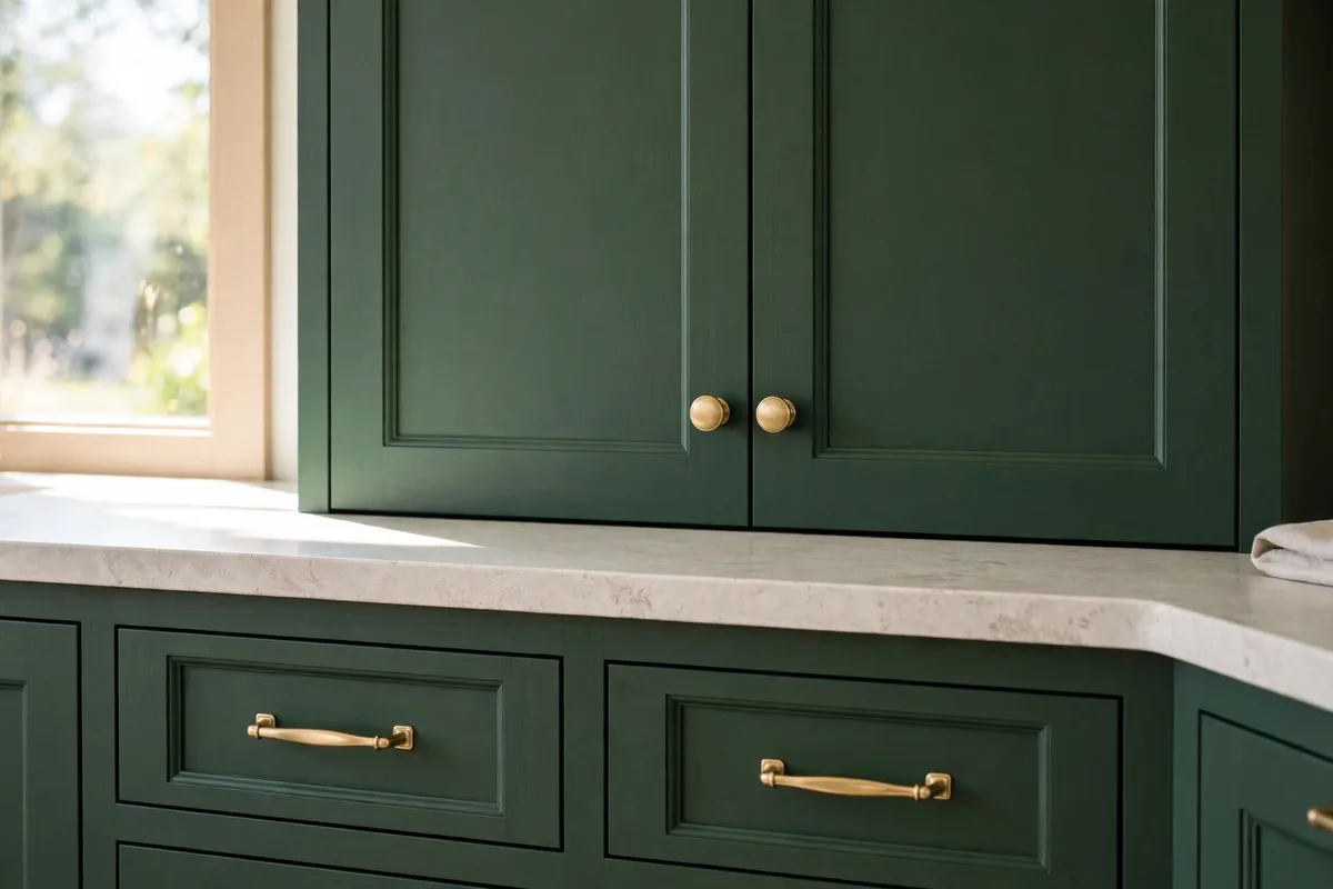
The enclosure risk is visual: three walls of cabinetry can feel like standing inside a cupboard. The counters are the fix this article keeps returning to — keep the upper half light. Pale or open uppers, as in the softened splits of our two-tone kitchen cabinets ideas for small kitchens, let a U read as workspace rather than walls closing in.
7. Lighten the Upper Half: Shelves, Glass, Air
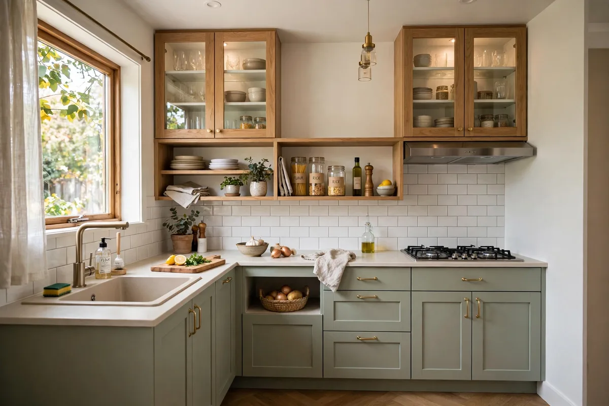
Perceived size is decided at eye level, and eye level in most kitchens is a wall of boxes. Swapping some uppers for open shelves or glass fronts is the single biggest visual enlargement available to a small layout: the wall recedes, light passes, and the room’s upper half becomes air instead of mass. The working version of the swap is the system in our open shelving styling ideas — daily dishes on shelves where uppers would loom, display at the top.
Partial is fine — even one run of shelves on the lightest wall changes the room’s weight map. Keep the heaviest storage low and at the room’s edges; the centre of the visual field should hold the room’s lightest objects, or none.
8. Fewer Breaks: Continuous Colour, Tall Cabinets, One Floor
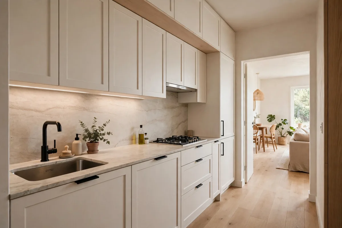
SB Remodeling’s second principle — fewer breaks — is pure layout. Cabinets run to the ceiling remove the dust-catching gap that chops the wall’s height; a counter material run up the wall as a slab removes the tile-grid break (the full-height option in our kitchen backsplash colors ideas); and flooring that continues into the next room without a threshold strip tells the eye the kitchen is part of a larger space. Every unbroken run is perceived square footage you did not have to build.
Colour continuity is the same decision in paint: cabinets, walls and ceiling within one light family, contrast saved for one element. Low contrast between adjacent surfaces is precisely why pale kitchens feel bigger — the eye finds no hard line to stop at.
9. Floor Lines: Run Them Long, or Run Them Diagonal
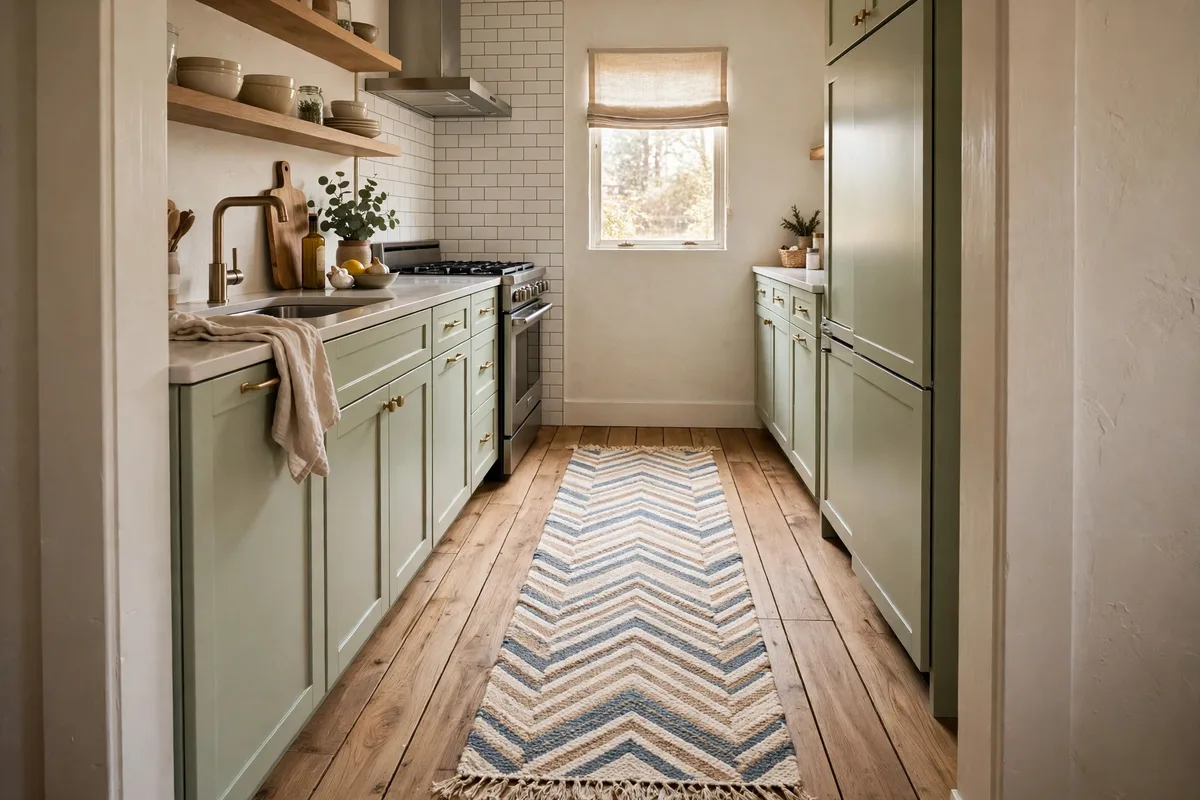
The floor is the largest uninterrupted surface in a small kitchen, and its lines are arrows. Planks or tiles run along the room’s long axis stretch it; run across, they widen a narrow galley. Diagonal and chevron lays are the strongest trick — the eye follows the longest possible path, corner to corner — and even a runner in a chevron or striped pattern borrows the effect without touching the floor itself.
Keep the pattern scale honest: tiny busy mosaics shrink a floor into fuss, while large-format tiles with few grout lines (another “fewer breaks” application) make the same floor read as one calm plane. The floor should be the quietest voice in a small kitchen — it is carrying the size illusion, and it cannot do it while shouting.
10. Protect the Prep Run — and Skip the Island You Cannot Afford
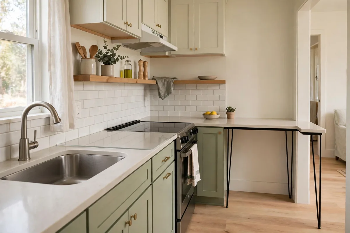
When inches must be surrendered, the hierarchy is fixed: the continuous prep run beside the sink — 36 to 48 inches of uninterrupted counter — is the last thing that gives. Steal from landing zones, appliance size, even storage; a small kitchen with one real prep surface cooks better (and, being clear, looks bigger) than one where every counter is a 14-inch fragment between appliances.
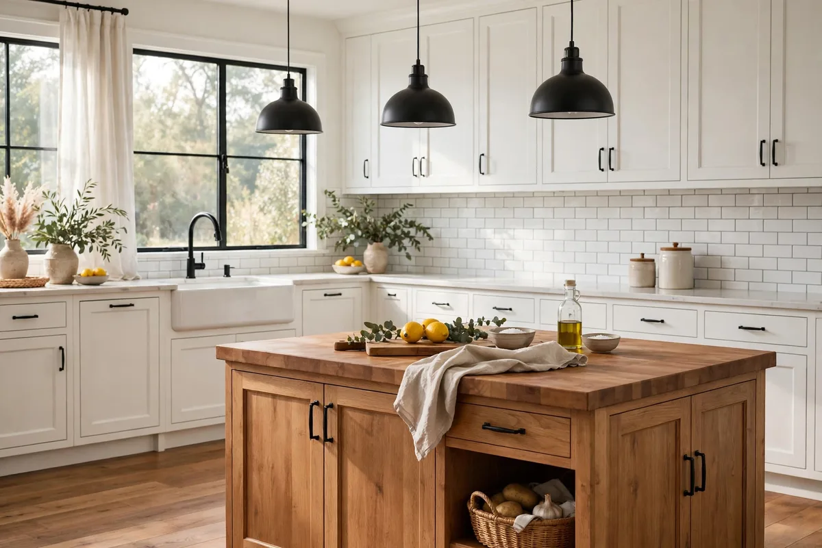
And the island question, answered by arithmetic: an island needs roughly 36–42 inches of clearance on every working side, which means most genuinely small kitchens cannot afford one — what they can afford is a slim peninsula or an open-legged cart that adds a surface without adding a visual boulder. In small layouts, anything the eye and the cook must walk around must earn double.
Frequently Asked Questions About Small Kitchen Visual Layout
What is the best layout for a small kitchen?
The one the footprint dictates: galley or one-wall for narrow rooms, L where an open corner can borrow space, U where three walls exist and 42 inches of aisle survives. All three work; the failures come from forcing a shape the room cannot hold.
How big should the work triangle be?
Each leg (sink–stove, stove–fridge, fridge–sink) between 4 and 9 feet, total no more than about 26 feet, per NKBA planning guidelines. In small kitchens watch the lower end: under 4 feet means doors and cooks collide.
How wide should the aisle be in a small kitchen?
42 inches between counters for one cook, 48 for two; a pure walkway can be 36. Below 36 the kitchen becomes a one-person corridor and open appliance doors block the whole passage.
How can I make a small kitchen look bigger without renovating?
Apply the perception rules: lighten the upper half (shelves or glass fronts on one run), remove visual breaks (clear counters, one light colour family), run a long or diagonal runner, keep tall storage at the edges, and clear the prep run. Layout perception is mostly subtraction.
Is a U-shaped layout too much for a small kitchen?
Not if the facing runs keep 42 inches between them. The U gives the most counter and storage of the small layouts; its risk is visual enclosure, fixed by pale or open uppers and continuous colour.
Can a small kitchen have an island?
Only if 36–42 inches of clearance survive on every working side — rare in genuinely small rooms. A slim peninsula or open-legged cart gives the extra surface without the visual and physical bulk.
Which colours make a small kitchen feel bigger?
Light, low-contrast, and continuous: one pale family across cabinets, walls and ceiling, with contrast reserved for a single element. It is the continuity more than the colour — the eye stops at hard lines, so remove them.
Do open shelves make a small kitchen look bigger?
Yes — they remove the eye-level mass of upper cabinets and let the wall recede. The condition is discipline: daily items, tight palette, gaps left bare. Crowded shelves reverse the effect instantly.
What flooring makes a small kitchen look larger?
Long planks run along the room’s length, large-format tiles with minimal grout lines, or a diagonal/chevron lay that draws the eye corner to corner. Continuing the same floor into the adjacent room removes the boundary entirely.
Where should the sink go in a small kitchen layout?
At the hub of the triangle, with the largest landing areas (about 24 inches one side, 18 the other) and the protected 36–48 inch prep run beside it. Everything passes the sink twice; the layout should honour that.
Conclusion
A small kitchen that works and looks bigger is one plan, not two: triangle legs in the 4–9 foot band, aisles at an honest 42 inches, the shape the footprint asks for, weight kept low and light kept high, breaks removed until the eye can travel the whole room unstopped. Measure the geometry, then edit the perception — the square footage never changes, and nobody will believe that.